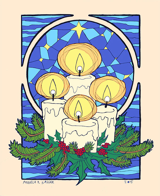
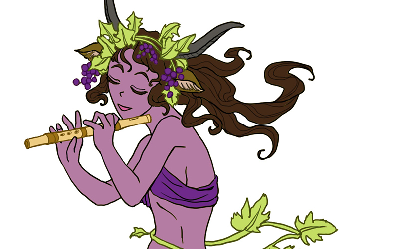
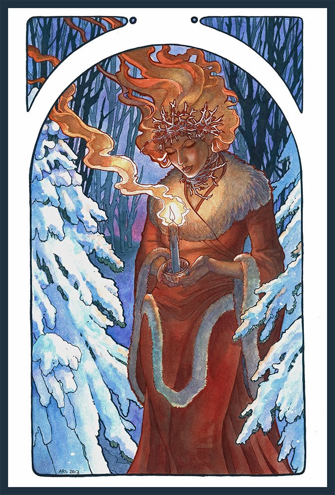
Inspiration: Every year I do a painting to spread the cheer of the winter holidays to my fans, friends, and family. Keeping in that tradition, I created this piece entitled “Winter Offering” for 2015.
I wanted to capture the quiet warmth of candles, which are one of my favorite decorative elements of the season, and pay homage to some of the Celtic traditions that define the holidays with the presence of evergreen holly and pine. I also wanted a celestial theme for the window to represent the dark, cold winter nights which the light guides us through.
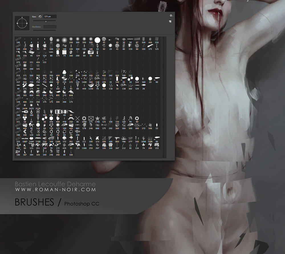
Tools and Techniques
For this painting, I used Photoshop CC and a Wacom Cintiq 21UX.
References
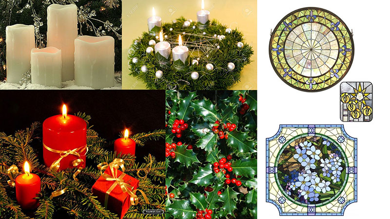
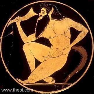
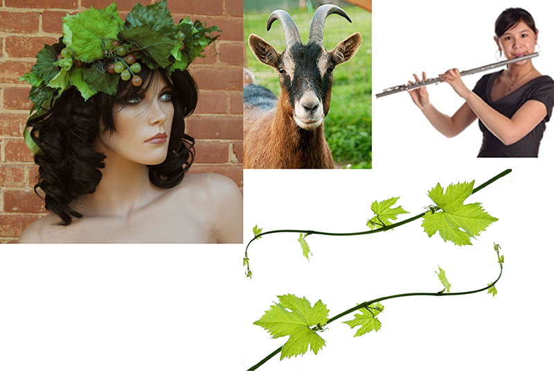
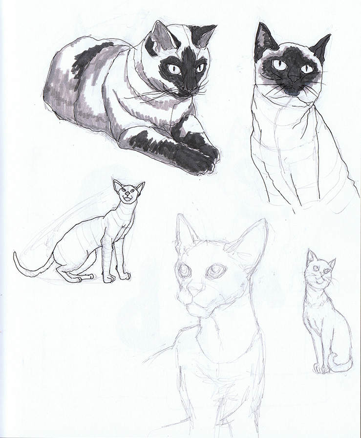
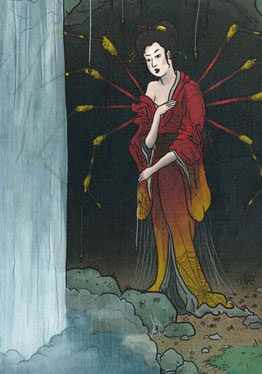
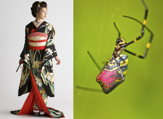
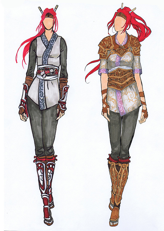
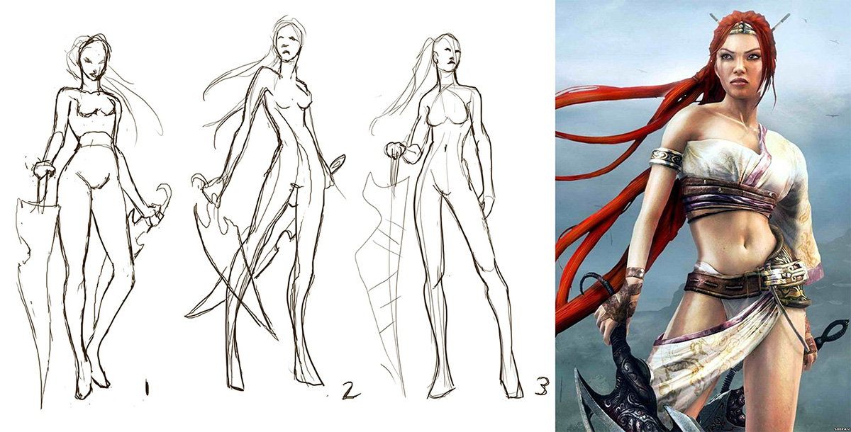
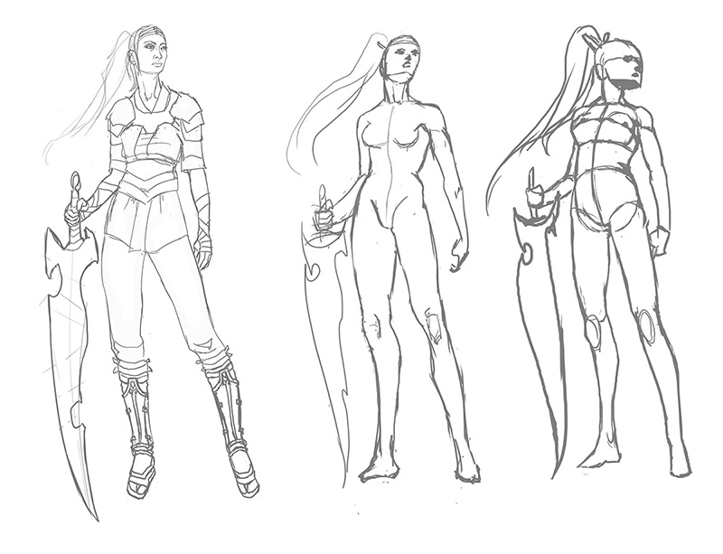
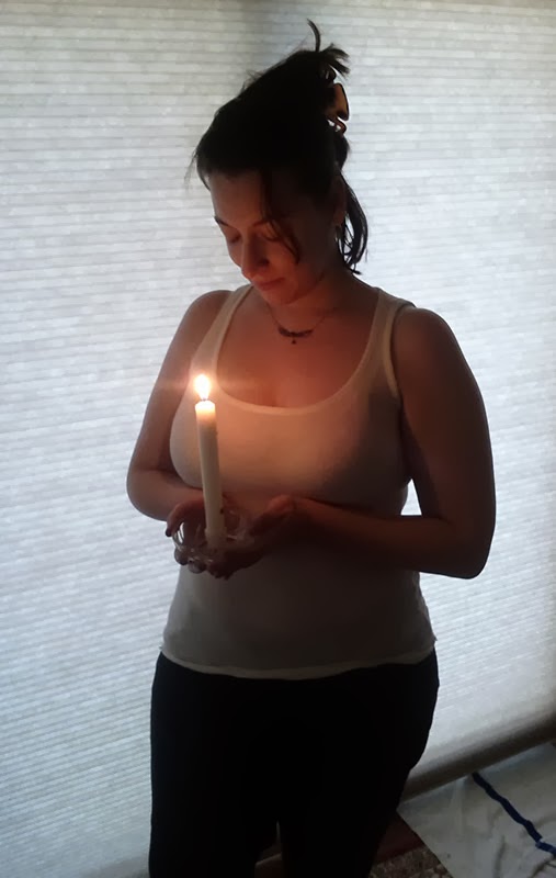
A selection from my references.
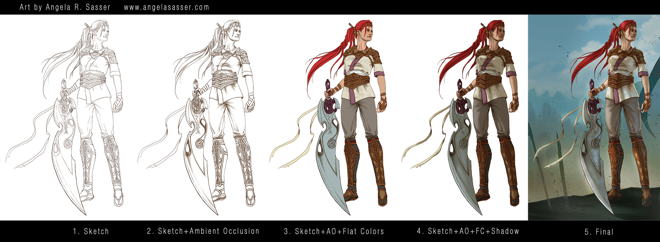
Art Process
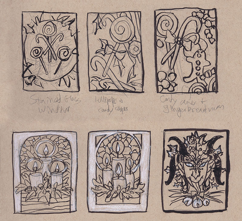
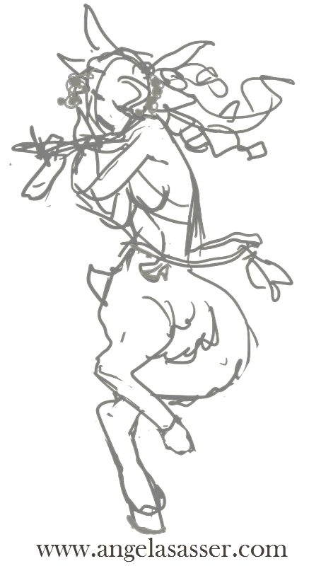
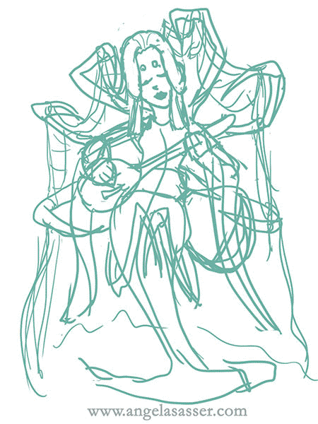
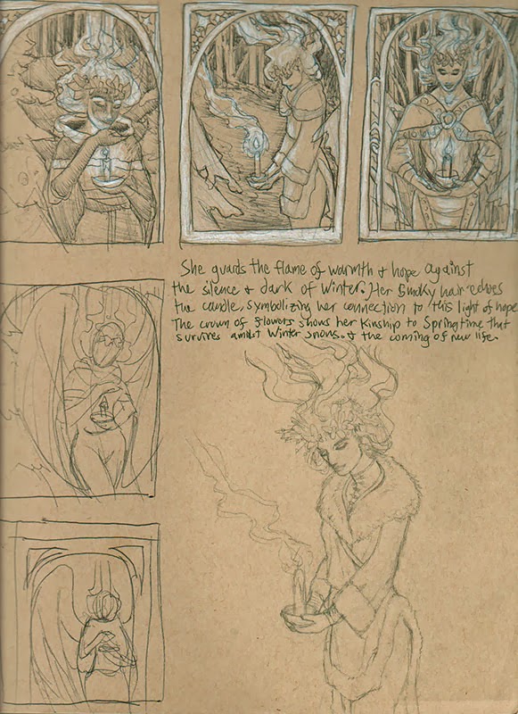
Step 1 – Thumbnail sketching with ink and white color pencil on toned paper to find the right idea. At first, I wanted to do a candy theme, but the candles struck me with their simplicity and elegance. The Krampus one was also a fun contender, but I decided to save him for another time.
Step 2 – Reference gathering! I looked at many Tiffany glass windows, wreaths, and white candles for inspiration. I keep a secret reference board for my yearly holiday images on Pinterest.
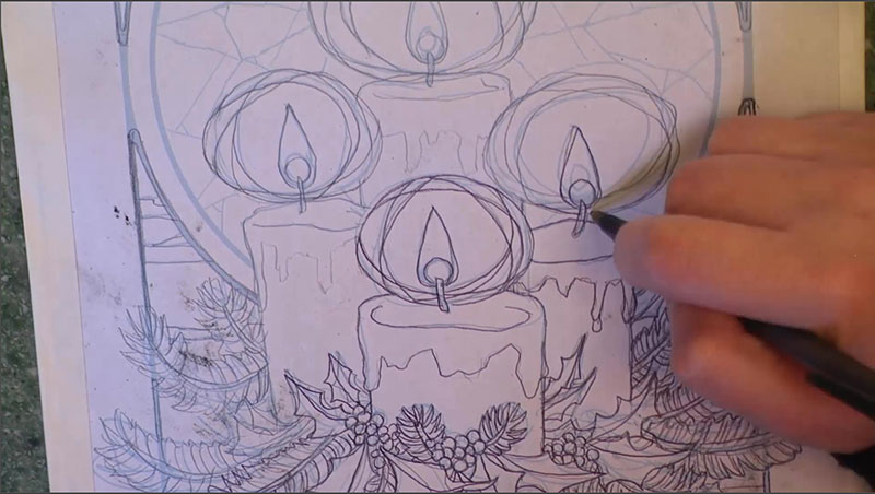
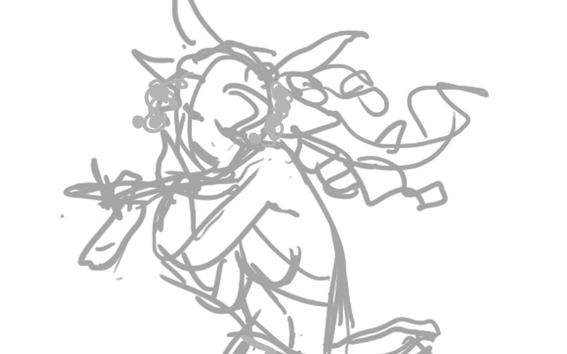
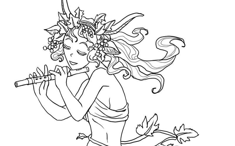
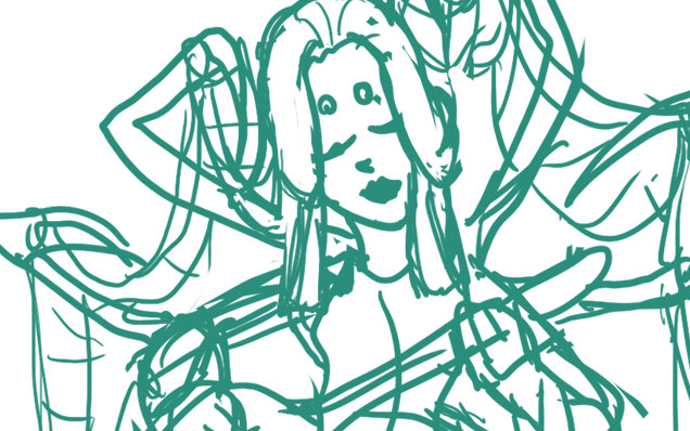
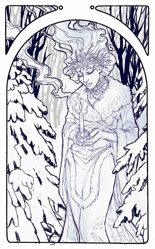
Step 3 – I did a rough sketch in Photoshop keeping loose and quick. The sketch was then printed out and refined with pencil sketching on top of the lightly printed line work.

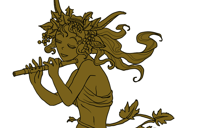
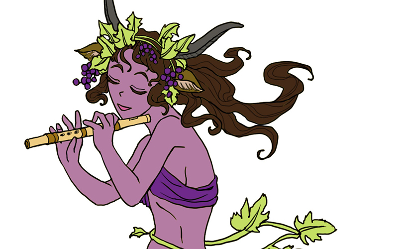
Step 4 – This refined sketch was then scanned in and the lines turned blue so they could be easily transferred. I also used the same refined sketch to do a digital color test so I had an idea of my colors before I put paint on paper.
Step 5 – The refined sketch with blue line work was then printed and transferred with graphite dust applied to the back of the printout.
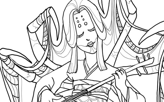
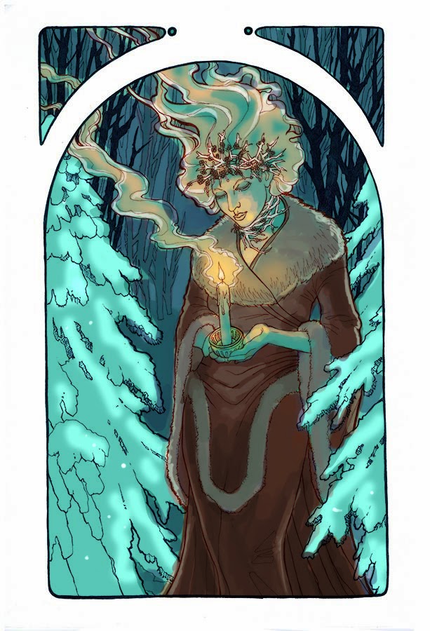
Step 6 – The transferred line work on the illustration board were inked with various colors of mechanical pens for visual contrast and interest.
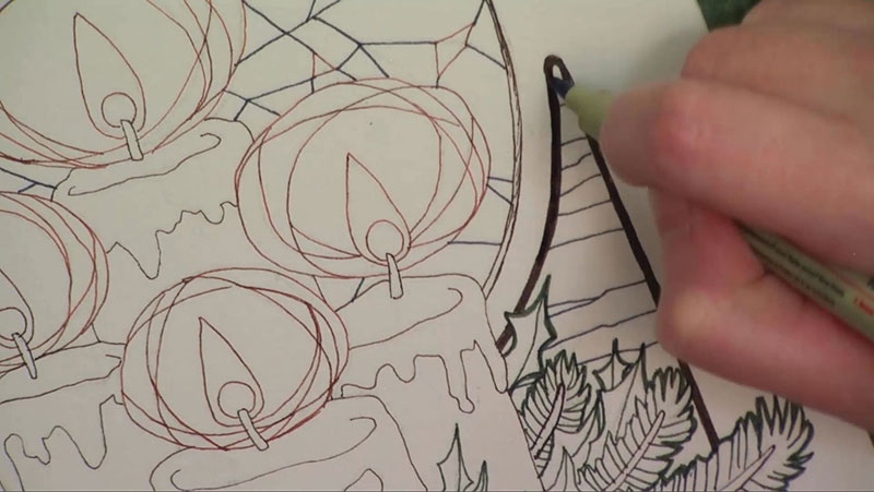
Step 7 – The ink drawing was finished with watercolor paints.

You can also watch the 5 minute time lapse video of how I created this painting here!
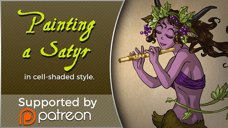
For more in-depth instruction on how I created this image, including the brands of materials I used, tips on creating a stained glass style in watercolor, etc., pledge to any $10 and up level on my Patreon to gain access to the narrated video tutorial!
You can also buy the individual tutorial separately at my Gumroad shop, but you won’t receive the other extras you would by purchasing via Patreon.


:origin()/pre04/ff33/th/pre/f/2014/171/2/a/lady_of_december_by_angelasasser-d5nvtqd.jpg "Lady of December by AngelaSasser")


