It’s that time of year again! Harvest time has passed, a chill is in the air, and I’m rushing to get my annual Christmas card finished in time for the holidays! (For more about my past Christmas images, read on here)
As it stands, I am one of those people who adores harvest and pumpkins and Halloween. It wounds me to ignore my favorite season (Autumn) by starting to think about the encroaching winter. Admittedly, hearing Christmas carols before Thanksgiving just feels wrong to me! Sadly, if I ever want to get a card ready by the time people are looking for them, I really need to start my annual card earlier.
One day it’ll happen. One day…
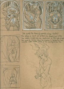
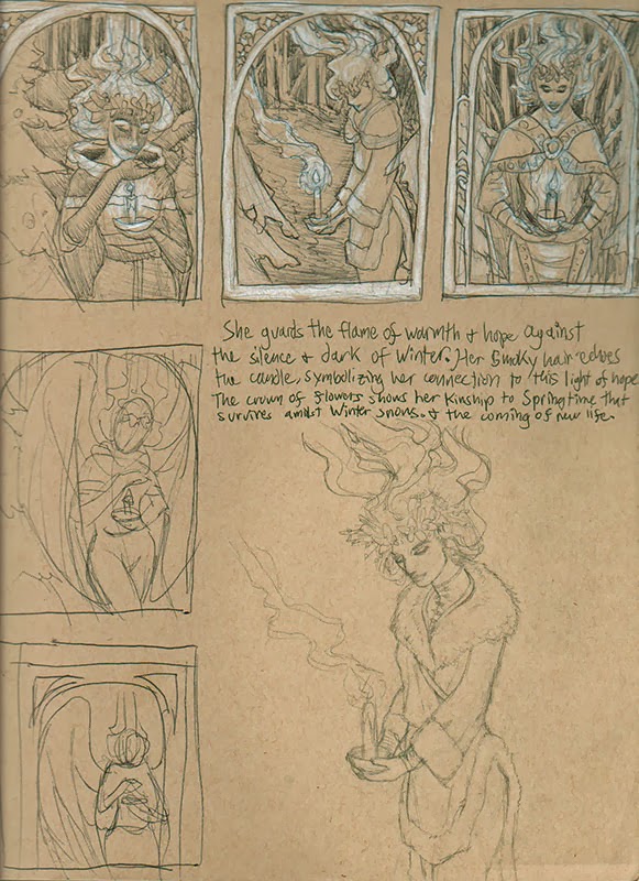
But for now, enjoy this look at the process of this year’s card which I’m just slightly earlier in creating than past years! It all began with a sketch sheet with ballpoint pen and white color pencil on toned paper, my current go-to formula for getting across small comps with a hint of value very quickly:
 |
I’m trying to get into the practice of writing a blurb about the concept of the piece before I draw so that I can figure out the story of my image before I start going off in too many directions and muddling my message (The About, for you Oatley Academy folks that might be reading).
My chicken scratch reads as follows:
She guards the flame of warmth and hope against the silence and dark of Winter. Her smoky hair echoes the candle, symbolizing her connection to this light of hope. The crown of flowers shows her kinship to Springtime that survives amidst Winter snows and the coming of new life.
The thumbnails on the left that aren’t detailed show rejected concepts where I played about with making this regal Winter Lady an angel. However, I decided to leave the wings out because they would have covered the background of snowy woods which encroach on the light of the candle, symbolizing the light of hope that burns in the darkest winters. Without that contrast between the desolate background and the candle, the theme wouldn’t be as visibly present in the piece.
So I resisted adding wings. Hard to believe, I know!
Each of these thumbnails had something I liked about them, which made it very hard for me to choose! In the end, I found the first one to be too static and too solemn. She seems more as if she is mourning than protecting. The third thumbnail almost won out because of the strong composition, but she also seems far more cold and intimidating than I wanted her to be. There’s also no visual tension between the warm flame and the cold of the winter forest behind her as there is in the middle thumbnail, which was my winner.
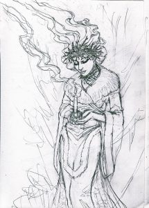
Next came snapping several reference images with a white candle to make sure I get the light and shadow on the figure just right. After narrowing down from about 20 photos, my favorite pose was this one:
 |
| Check out the WiPNation thread for the step-by-step process. |

