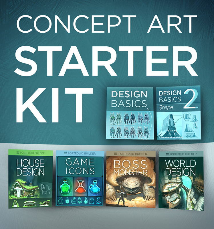
I’ve recently started up CtrlPaint’s Concept Art Starter Kit with artist, Matt Kohr, as a way to brush up my own character design skills. While I’m not quite going into Concept Art as a profession (yet?), I still think the basic skills will improve my artist’s eye, overall. Plus, it’s just tons of fun designing characters for my own personal projects!
Since I’m coming mainly from an illustrator’s background, I felt like I needed to start at level 0. I’ve read a lot of tutorials on concept design, but almost all of them assumed prior knowledge of industry jargon and familiarity. It’s been refreshing to see something that starts off very simple with tons of visual examples. The videos thus far are more lecture with examples than they are technique, but that’s just what I wanted and needed at this point. (Expect a review of the course kit over at The Muse’s Library once I’ve completed it!)
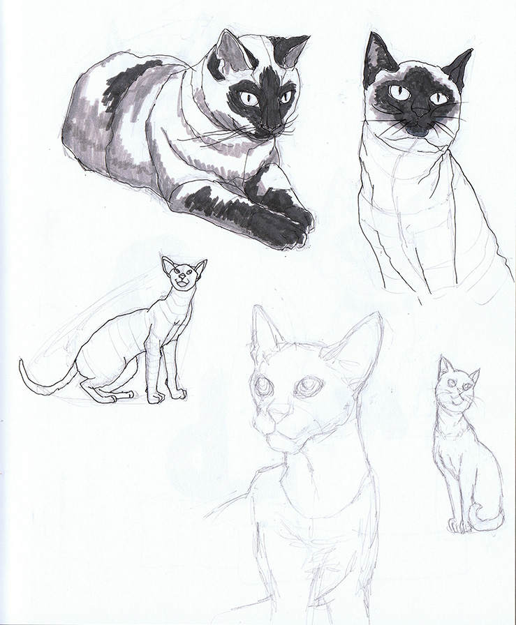
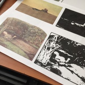
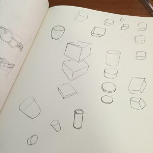
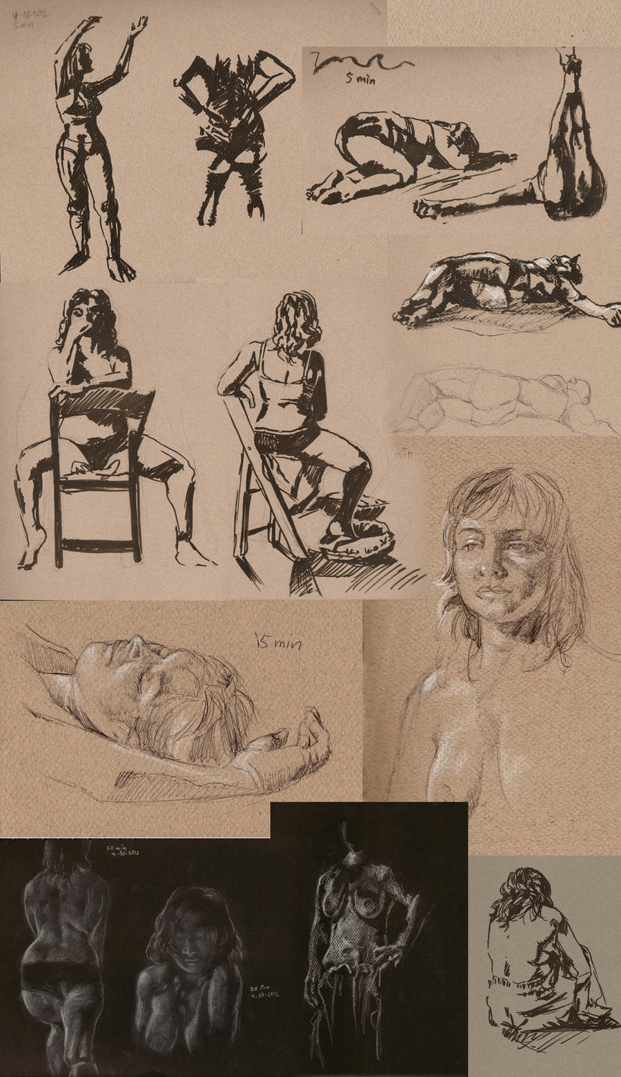
Shape Design covers the fundamentals of interpreting shape language and image recognition. I tried out the suggested exercise of taking reference photos and not merely copying what I see, but trying to get a better idea about how the subject works via closer study and contouring. The cat on the bottom right corner was drawn from memory after my studies were complete.
While this method does take longer, I think Kohr’s on to something with this more scientific approach, as I seemed to retain more info this way. Admittedly, I’m used to copying and pasting references to get my final art done quicker. Creating more in-depth studies is a good habit I need to get back into!
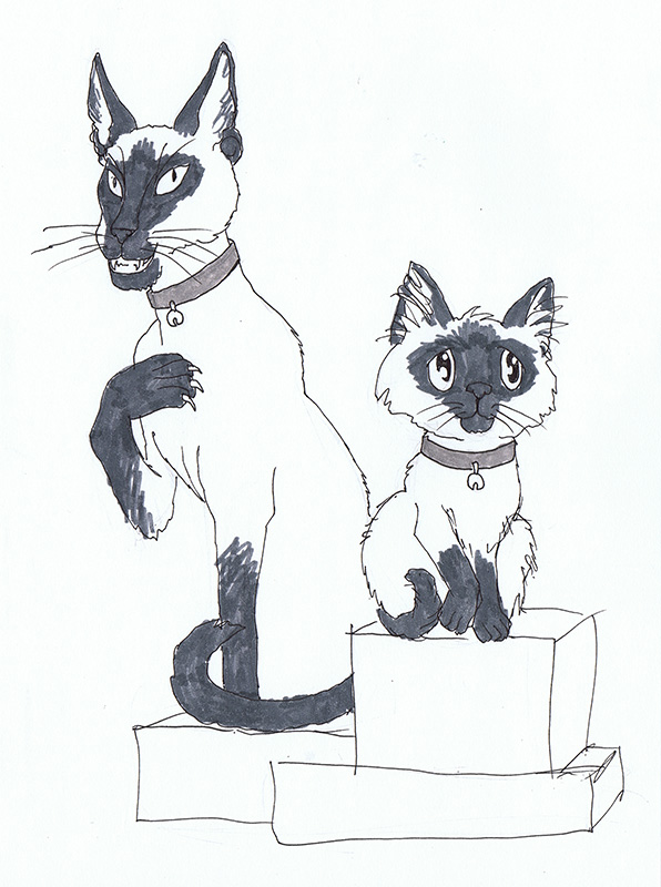
Next, I tried another suggested exercise where I took what I learned from doing my studies and drew a ‘good’ version and an ‘evil’ version of the same animal from memory using no reference. Can you tell which one is which?
If you guessed evil for the cat on the left and good for the cat on the right, I have succeeded!
For the evil cat, I went with the ‘modern’ body style of Siamese cat, which is sleeker and more pointed than the rounded ‘classical’ body style I used for the cat on the right. I also made intentional choices to give the evil cat claws, pointed ears, pointed eyes, and to be showing his teeth while good cat is softer with rounded eyes and an overlarge head. Both were drawn from memory based on what I’ve retained from my studies.
I’m looking forward to the next lesson! Delving into the psychology of shape is utterly fascinating to me. I think most of us understand this language instinctively, but learning how to purposefully implement it in our art can bring it to a whole other level.
Next Lesson: Design Basics 2
