Continuing from Sketch Diary: Winter Light – Christmas Card 2013 – Part 1
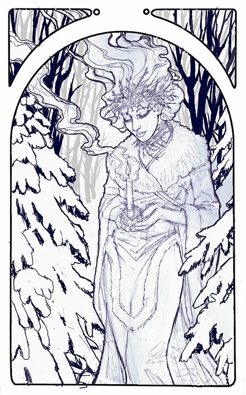
After gathering references, taking photos for anatomy reference, and composing the pencil draft, I took the scanned image into Photoshop where I arranged the image digitally and composed background elements.
I wanted to be sure that she was a part of her background and not merely a pretty lady pasted on top of it, so I purposefully arranged some of the branches to overlap her in space. This was also important for maintaining the theme of ‘protection of the light’ from winter’s darkness, as the branches encircling the figure from the foreground and the background give it that sense of an encroaching forest trapped in winter with their physical arrangement.
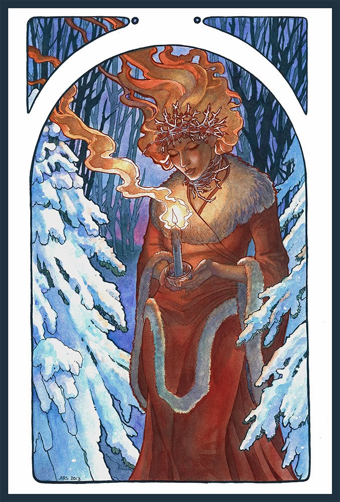
In the past, I have always inked with black ink, but it occurred to me I could push the theme of cold vs. warm in this by doing the same with the inks. I used Micron indigo color ink for the background and sepia color for the figure to help the warmth of her figure move forward while the cool background hues and lines recede.
The effect of using color inks popped the figure, as I hoped it would! Black inks have a way of flattening the image and decreasing the illusion of value in certain shapes. Note to self: use this technique more!
Other tips and tricks. I admit to using white gel pen to pop the whites in the tips of her icy branch necklace and circlet, the highlights on her face, and the candle’s flame. I did use masking fluid to preserve my paper white in specific areas, but sometimes the shapes are not clean after peeling the masking fluid off and that is where white gel pen can save the day!
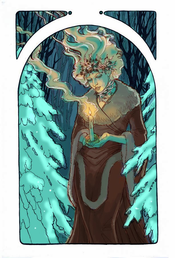
You may also notice a vast difference between the color test and the final image. Why is that?
Sometimes when you’re painting, you make snap decisions to change course which can lead to good or ill. In this case, it occurred to me that the yellow in the color test just wasn’t popping enough against the cool green. The image felt too muted. By the time I had finished applying the first layers of the Indigo background, I decided to give it a more purple sunset, which gave the image a complementary palette of Purple/Yellow, which helps pop the flame and warmth in the figure moreso than the color test.
I would have liked to achieve the greater value shifts shown in the color test, but my board was saturated with color and would not allow me to add more layers. You can see where this happened particularly in the shadows of the dress where the colors start to look as if they’re unevenly separated instead of uniformly painted. The board just would not accept more pigment!
Perhaps there is a shift to watercolor paper in my future? I’ve had better luck with tons and tons of layers on Arches paper.
Finally, here’s an animated GIF of this painting’s progress!
If you can’t see the GIF, you can watch the video here:


