Category: The Christmas Series

Sketch Diary: Christmas Angel Part 2

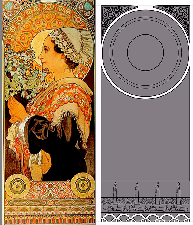
Before I get sucked into character details, I have to first design the frame, which I quickly do by drawing shapes in Photoshop.  I set the layer with the grey shapes that form the frame to the Blending Option, Stroke, which creates an outline around the shapes that I don’t have to manually draw myself.

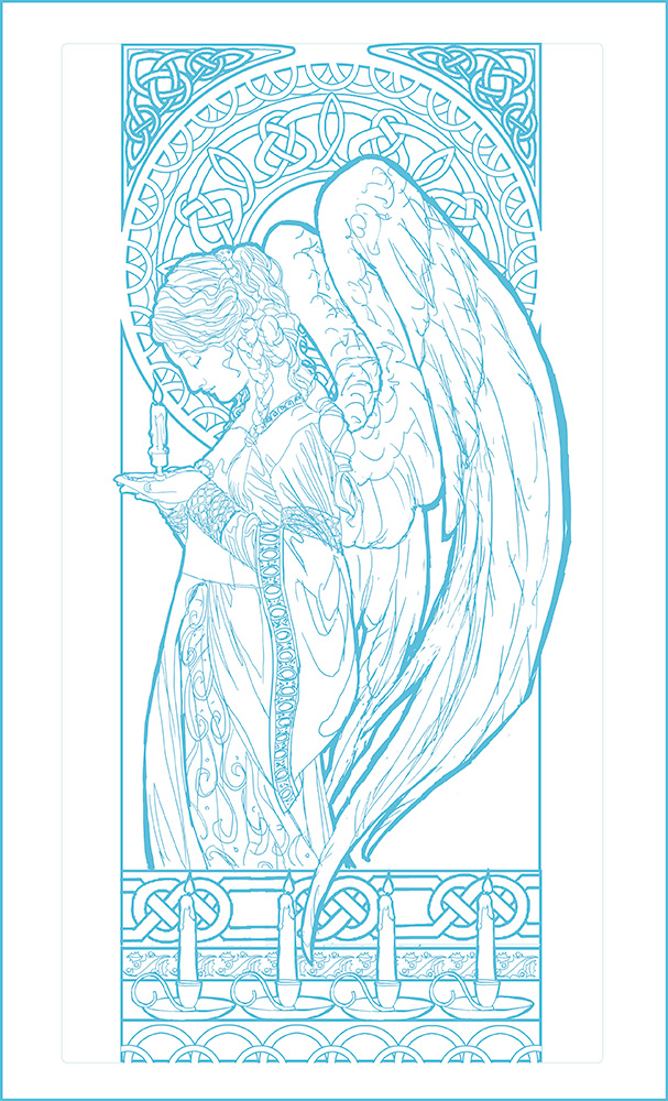
I used similar partitions for the division of the frame to Mucha’s piece (why change a working formula?).  The corner knotwork, holly border, and candles were all designs I created once, then replicated multiple times and repeated across the piece.  Working digitally makes this preliminary work a lot faster

frame

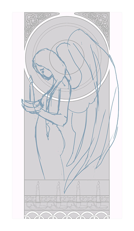
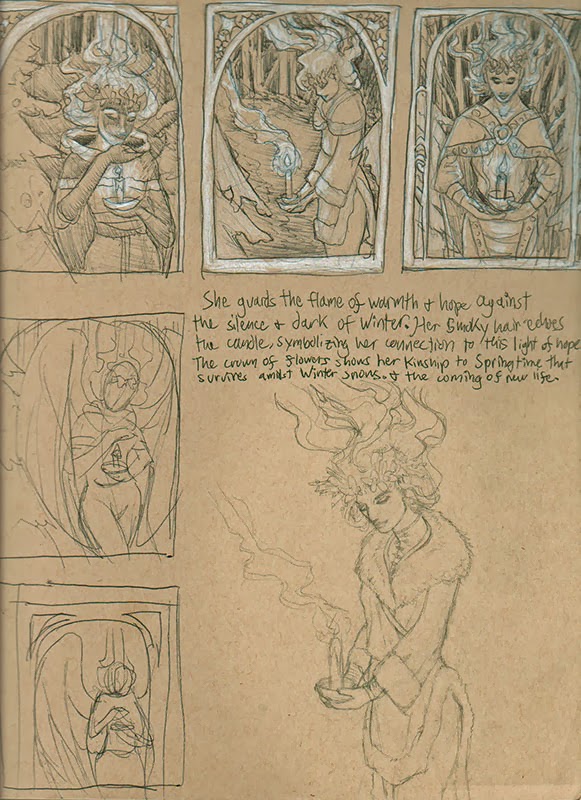
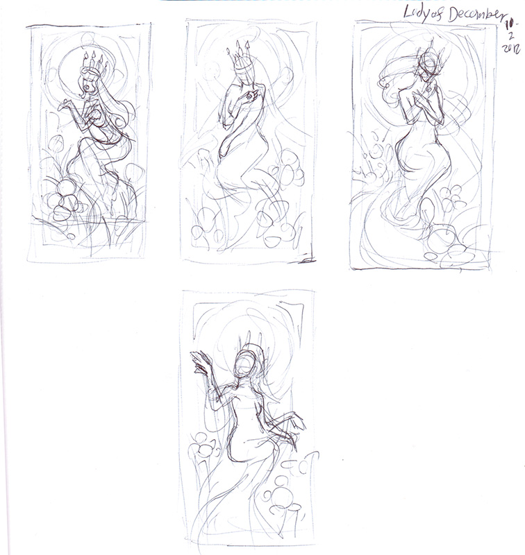
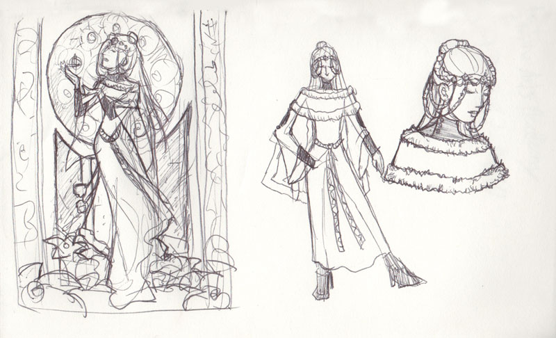
A quick sketch helps me establish how I want the figure to flow through the frame and also aids with refining the rather wonky anatomy of the original thumbnail sketch:

sketch
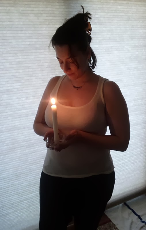
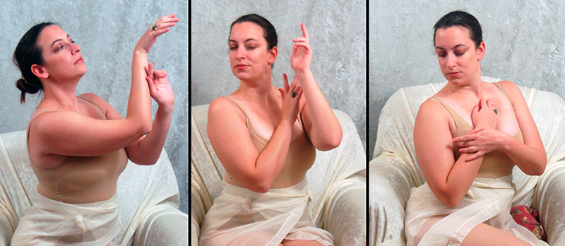
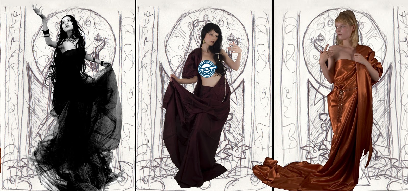
Further reference gathering helps me collect images of candles, velvet dresses, wings, and poses that will help me make this pose look less fudged.  I lean on Pinterest very heavily for this purpose and am constantly gathering inspiration on a daily basis for my projects.

christmasangelrefboard

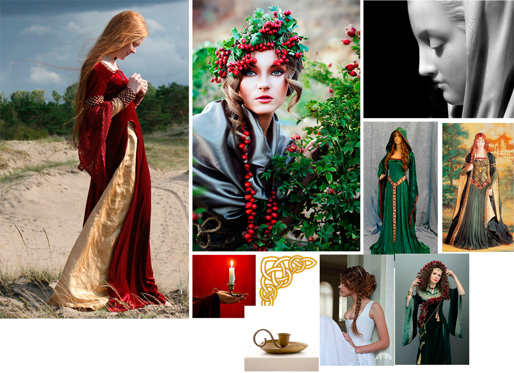
This is a VERY important step!  There’s nothing that can ruin a painting faster than a completely fudged pose that just looks ‘off’, unless you are very, very experienced and have done so many studies you can draw things from memory.  This is rare even for the best of artists, mind!

Gathering reference can also help you save time revising later because you didn’t get that hand quite right or didn’t get the drapery quite right.  The trick is uniting your references and reinterpreting them in such a way that you still have something unique and you don’t lose the energy of your rough sketches.

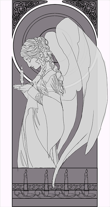
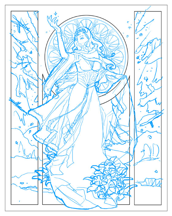
I eventually arrived at something like this for the base sketch.  At this point, everything is still on its own layer in Photoshop to allow me to re-position any element I please:

base-sketch


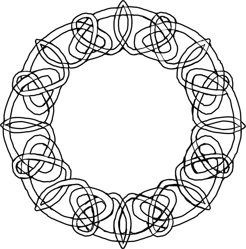
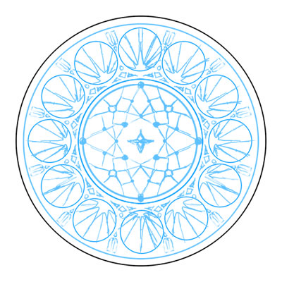
Now, designing the window!  The window knotwork begins with a freehand sketch that fills up 1/4th of the circle.  This 4th is then copied, pasted, and flipped horizonatally so the design is symmetrical.  I use the layer’s Blending Option set to Stroke again to create an outline automatically while I draw.

Admittedly, I’m not very structured with my circular knotwork. I sketch until it looks right, rather than drawing guidelines and graphs.

window-knots-sketch

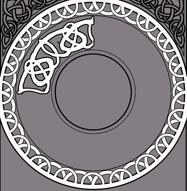
I wanted the design to emulate a snowflake with the radial spires, so I made sure the main junctures had points in the most important places (the center lines of the shape).  I also wanted a thicker strands in this design to help fill up the space, since a design with too many thin strands would start to make the background window too busy and distract from the main character.  I used two total strands for this design, a thin strand and a thick strand.

Next, I lock the transparency on the layer and draw all the intersections of the knots.  The locked transparency keeps me from drawing outside of the shape.  The reason I draw the knots as if they were invisible is to help me clean up the angles of the strands and intersections, which were a bit sloppy before.  You can see towards the bottom of the circle where the knots are still sloppy.

window-knots-sketch2

Next, I meticulously defined the underlap/overlap pattern of the knots.  Traditionally, knotwork always has a pattern of any one strand going over and under.  I broke this pattern somewhat so the radial spires stand out, bringing emphasis to the snowflake shape.

window-knots-sketch3


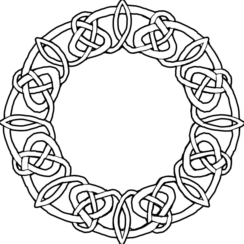
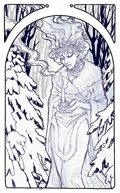
Phew!  That was a lot of tedious detail (and I loved every second of it!).  A few cups of coffee later, here’s the finished line art!  I’ve changed the line work to blue so as to make it easier to tell which areas I’ve transferred when I’m transferring this to illustration board.  This line art is still a little rough as well, since I’ll be cleaning those lines up once she’s been transferred to the board.

christmas-angel-wip12

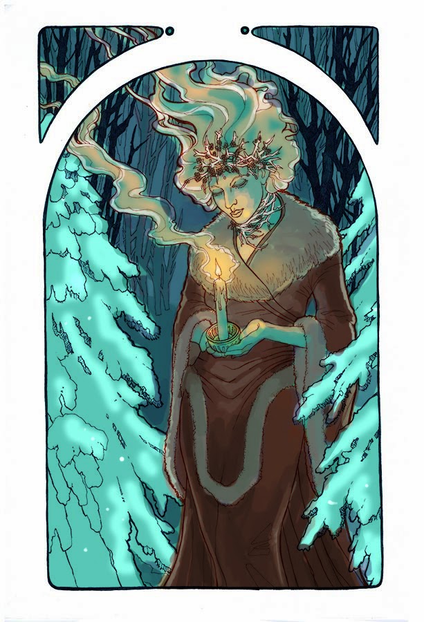
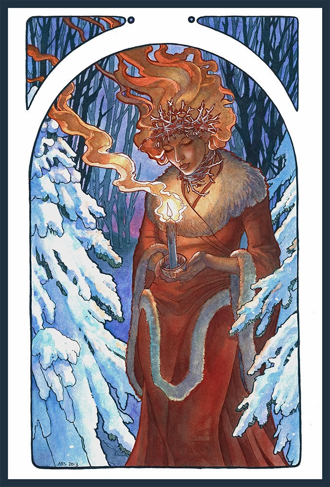
Next up: The finished painting!

Back to Part 1


Sketch Diary: Christmas Angel Part 1

It’s that season again!  Time for this year’s Christmas painting!

Be sure to sign up for my annual Christmas list if you haven’t already.  It’s FREE and my way of spreading a little holiday cheer to you all. It’s all thanks to the wonderful support of my Patreon patrons. You guys rock!

For this year’s painting, I wanted to top last year’s, which did not have enough candles, in my opinion. I wanted MOAR candles!  There is something about these elegant points of light that always makes me think of the holidays.  From the lighting of advent wreaths to candlelit Christmas pyramids, I just love the part they play in the season and the beautiful light they cast.  This theme became my jumping off point for inspiration.

I also wanted to channel my love of Alphonse Mucha’s close up portraits.  I love the simplicity of the composition and focus on clothing and hair details instead of grand borders.  Clothing, hair, and faces being some of my favorite things to draw and paint!
mucha_portraits_by_angelasasser-d87mrl8[1]
My thumbnail sketching began on toned paper with pencil, ballpoint pen, and white color pencil.  My first sketch (top left thumbnail) drew directly upon one of Mucha’s close up portraits, mimicking the pose.

 christmas_angel_thumbnails_by_angelasasser-d87msjs[1]

The next few thumbnails focus on the concept of an angel inspired by Mucha’s portraits of ladies in profile. In the end, I chose the concept of the angel in profile because it feels more festive and cheery than my initial thumbnail.  I may just have to save the candle woman from the first thumbnail for another painting. Next year, perhaps?

The thumbnail with the asterisk by it is my winner!  The pose of the wings feels more natural and elegant and the piece just flows down through the wings, her braid, and her dress.  The other angel thumbnails felt too claustrophobic and unnatural when the wings were added.  The lines and flow were too broken up and led the eye off the page at odd places.

I’d actually do more thumbnails than this usually, but since I’m starting pretty late this year, I’ve got to make my decisions quickly or this won’t get done by Christmas!  One of these years, I’ll learn to start earlier…

Next, I’ll need to hunt for references on design motifs for the Celtic knotwork, candle holders, and the inner window.  I’ll also need to take reference photos for the angel.  The color scheme is going to be green and gold with accents of red.

The detail addict in me is so excited to dive into this one!

Next: Design motifs, rough sketches, etc.

Sketch Diary – Winter Light – Christmas Card 2013 – Part 2

After gathering references, taking photos for anatomy reference, and composing the pencil draft, I took the scanned image into Photoshop where I arranged the image digitally and composed background elements.  
I wanted to be sure that she was a part of her background and not merely a pretty lady pasted on top of it, so I purposefully arranged some of the branches to overlap her in space.  This was also important for maintaining the theme of ‘protection of the light’ from winter’s darkness, as the branches encircling the figure from the foreground and the background give it that sense of an encroaching forest trapped in winter with their physical arrangement.
In the past, I have always inked with black ink, but it occurred to me I could push the theme of cold vs. warm in this by doing the same with the inks.  I used Micron indigo color ink for the background and sepia color for the figure to help the warmth of her figure move forward while the cool background hues and lines recede.
The effect of using color inks popped the figure, as I hoped it would!  Black inks have a way of flattening the image and decreasing the illusion of value in certain shapes.  Note to self: use this technique more!
Other tips and tricks.  I admit to using white gel pen to pop the whites in the tips of her icy branch necklace and circlet, the highlights on her face, and the candle’s flame.  I did use masking fluid to preserve my paper white in specific areas, but sometimes the shapes are not clean after peeling the masking fluid off and that is where white gel pen can save the day!
You may also notice a vast difference between the color test and the final image.  Why is that?  
Sometimes when you’re painting, you make snap decisions to change course which can lead to good or ill.  In this case, it occurred to me that the yellow in the color test just wasn’t popping enough against the cool green.  The image felt too muted.  By the time I had finished applying the first layers of the Indigo background, I decided to give it a more purple sunset, which gave the image a complementary palette of Purple/Yellow, which helps pop the flame and warmth in the figure moreso than the color test.

I would have liked to achieve the greater value shifts shown in the color test, but my board was saturated with color and would not allow me to add more layers.  You can see where this happened particularly in the shadows of the dress where the colors start to look as if they’re unevenly separated instead of uniformly painted.  The board just would not accept more pigment!

Perhaps there is a shift to watercolor paper in my future?  I’ve had better luck with tons and tons of layers on Arches paper.

Finally, here’s an animated GIF of this painting’s progress!
If you can’t see the GIF, you can watch the video here:

Sketch Diary: Winter Light – Christmas Card 2013 – Part 1

It’s that time of year again!  Harvest time has passed, a chill is in the air, and I’m rushing to get my annual Christmas card finished in time for the holidays!  (For more about my past Christmas images, read on here)

As it stands, I am one of those people who adores harvest and pumpkins and Halloween.  It wounds me to ignore my favorite season (Autumn) by starting to think about the encroaching winter. Admittedly,  hearing Christmas carols before Thanksgiving just feels wrong to me!  Sadly, if I ever want to get a card ready by the time people are looking for them, I really need to start my annual card earlier.

One day it’ll happen. One day…

But for now, enjoy this look at the process of this year’s card which I’m just slightly earlier in creating than past years!  It all began with a sketch sheet with ballpoint pen and white color pencil on toned paper, my current go-to formula for getting across small comps with a hint of value very quickly:

I’m trying to get into the practice of writing a blurb about the concept of the piece before I draw so that I can figure out the story of my image before I start going off in too many directions and muddling my message (The About, for you Oatley Academy folks that might be reading).

My chicken scratch reads as follows:

She guards the flame of warmth and hope against the silence and dark of Winter.  Her smoky hair echoes the candle, symbolizing her connection to this light of hope.  The crown of flowers shows her kinship to Springtime that survives amidst Winter snows and the coming of new life.

The thumbnails on the left that aren’t detailed show rejected concepts where I played about with making this regal Winter Lady an angel.  However, I decided to leave the wings out because they would have covered the background of snowy woods which encroach on the light of the candle, symbolizing the light of hope that burns in the darkest winters.  Without that contrast between the desolate background and the candle, the theme wouldn’t be as visibly present in the piece.

So I resisted adding wings.  Hard to believe, I know!

Each of these thumbnails had something I liked about them, which made it very hard for me to choose!  In the end, I found the first one to be too static and too solemn.  She seems more as if she is mourning than protecting.  The third thumbnail almost won out because of the strong composition, but she also seems far more cold and intimidating than I wanted her to be.  There’s also no visual tension between the warm flame and the cold of the winter forest behind her as there is in the middle thumbnail, which was my winner.

Next came snapping several reference images with a white candle to make sure I get the light and shadow on the figure just right.  After narrowing down from about 20 photos, my favorite pose was this one:

Using my references as a guide, I came up with this rough sketch in pencil on 60lb paper:
Check out the WiPNation thread for the step-by-step process.
I went through several changes of her crown and collar, shifting from gaudy icicle-like diamonds to a more naturalistic gathering of twigs and berries.  The berry crown just seemed to fit her look of being an elegant wintry nature goddess moreso than an ice cold glam goddess.  She’s meant to be warm, hopeful, and inviting, despite her unearthly presence.
Next up, I’ll be scanning this image to refine the sketch digitally and fitting it to its decorative borders.  Eventually, this sketch will be transferred onto illustration board where I’ll be finishing it off with watercolors and color pencil.

Sketch Diary – Lady of December Part 1

It’s that time of year again! Time for my yearly Christmas card for fans, friends, and family! I have a bad habit of starting this project late every year, which barely gives anyone time to pick up some cards to send out to their loved ones, but THIS year, I am making it a point to be early! It took some effort to even begin thinking of Christmas themes while my beloved harvest and Halloween season was going on. I am one of those types who hates seeing Christmas ornaments out before I’m done enjoying my pumpkin pie and colorful leaves.

 This year I am admittedly rebooting an old theme you might remember, the Angels of the Months. You all might remember the Advent Angel, who incorporated themes of December’s flowers, as well as Angel of January, who had flowers and birthstone symbolism. Each one had its strengths, but I always felt as if they missed the mark, compositionally. Either the wings blocked the stained glass or the winged figure competed visually with the stained glass window for the attention of the viewer with too much ’empty’ space left around both. I was flipping through my favorite Mucha reference book when inspiration struck me like lightening!

Mucha’s Semi-Precious Gemstones series.

I adore the simple focus, the elegant ladies, and the detail in the windows and flowers! Lady of December will be in a similar composition with a focus on her adornments, the flowers of the months, and the representational birthstones.  I do miss the wings, but (as loathe as I am to say this), sometimes I have to make pictures without them! For shame.

With all that in mind, thumbnailing begins!  These were rough and dirty ink sketches to help establish the composition’s flow, the figure’s posing, the arrangement of the borders, window pane, and flowers.  I knew I wanted the central theme to be a ring of Turquoise, inspired by the Gregorian poems for the birthstones, so the poses had to bring the hand into play as a point of interest.
1 and 3 are my favorites.
 Next up, I wasn’t too sure of the pose yet, so I decided to explore them in a photoshoot with a chair and some curtain sheets.  I took quite a few variations, but here are some of my favorites:
Just ignore my horrid farmer’s tan…

So many to choose from! But the pose on the left had a really interesting flow created by the hands and the focus I wanted on the ring.  Meanwhile, the other photos will be filed away for reference use for the rest of this series!  Some of these may make their way to my stock art gallery, so keep an eye out over there, if they strike your fancy!

Then came the reference hunt!  Have a montage of pretty jewelry, Mucha dresses, and other things which I hope will inspire the final look of Lady December’s dress and jewelry.
Coming next: Studies and Line Art
Want to see a step-by-step as this project develops?
Check out the thread at WiPNation!

The Snowflake Lady – Part 2 – Preliminary Sketches

In the last process post, I covered the basic planning sketches for The Snowflake Lady. With thumbnails and the basic gist of the image figured out, it was time to start getting detailed!

I started out by browsing my collection of stock images and seeing if there were any poses that could work for what I had in mind. I like to use photo references when they’re available to help add a level of realism that I still find difficult to draw directly out of my head.  Eventually, I narrowed my choices down to the following three poses, which all conjure the image of a graceful lady reaching for a snowflake.  I quickly dropped out the background on these images using Photoshop’s Magic Eraser tool, then overlayed them on top of my window layout:

Pose 1 courtesy of Nanfe-stock. Poses 2 & 3 courtesy
of Almudena-Stock.

Pose 1 added a level of movement to the composition with her outstretched arm, tilted head, and swirling dress.  The other two poses were both lovely, but somewhat static, in comparison.  After consulting with a few friends for a second opinion, I finally went with pose 1.

Next came a preliminary sketch done in digital blue! Which I like to use since it’s easier to transfer tell where you’ve drawn over when you are transferring the image using graphite transfer paper (or the ‘poor man’s transfer paper’, which is rubbing charcoal on the back of the image and then bearing down hard as you trace the lines on the front side).  I refined the details in this blue sketch phase, though you’ll notice I left some things generic, like the poinsettia, because it’s easier to refine specifics like that after you’re done transferring.


The stained glass window was actually designed first without the figure in front so I could get a better sense of how I wanted the patterns to look and flow.  Doing this digitally meant I could hide and unhide the figure to see how the stained glass lined up in the composition, making it easier to adjust as needed.  I also could easily copy and paste sections of the window to make it perfectly geometric instead of drawing it all by hand.  The stained glass utilizes a simple starry night theme.

Next, she was transferred to 11×14 in. illustration board where she received a good deal of refinement in pen (Copic Multiliner SP pen with a 0.1 mm and .003 mm tips).  I had to tape two 8.5×11 in. print outs together in order to cover the whole 11×14 in. piece of board.  I made a few mistakes in the stained glass while I was inking because I trusted my hands instead of using a circle template.  Too much coffee & green tea do not steady hands make!  Compass and circle templates are your friend.  I have a circular drawing ruler that’s especially useful for this purpose!

The Snowflake Lady – Part 1 – Brainstorming

Lately I’ve been working hard to beat my own procrastination for this year’s Christmas card for my family, friends, and fans. Seems I always get them out late because I always bite off more than I can chew! This year is no different with an image I’m temporarily calling ‘the Snowflake Lady’ (because, well, she’s surrounded by snowflakes and has a very snowy theme? Original, I am not.)

Brainstorming for her began with pondering on just what in particular about the last Christmas cards people liked the most.  Holiday Nouveau (my 2nd Christmas image) has been pegged as the crowd favorite, even after several years of images.  The contrast of crisp lines to soft watercolor and her Mucha-inspired pose, which leaves little white space for us to lag on, stood out to me as things which made her more successful than the others.

And so, a sketch was born!  I wanted to escape the usual green and red themes,but keep the soft stained glass look of past designs that made them so popular.  Snowflake lady emerged from the desire to conjure the delight of silver ribbons, deep wintry nights, and quiet snowfalls.  She would be more elegant than warm, an embodiment of snowy silence and the introspection of the season. (Notice her long sleeves and boot gear! I wanted a winter lady who actually looked like she was dressed halfway appropriate for the weather)

Preliminary thumbnail with fashion sketches.  

Nothing says holidays like fur trim, silver ribbons, heavy velvet, and snowflake tiaras! The full thumbnail came first so I could figure out the movement of her overall pose. The fashion sketches came next to help clarify the details of her outfit from the fuzzy mess of the thumbnail. All done on a single page of my travel 6×9 in. sketchbook in ballpoint pen with no erasing.  Working in pen keeps me from adding too much detail and taking too much time on what is meant to be a very rough idea splurge.