Category: Work-In-Progress

Sketch Diary: Christmas Angel Part 1

It’s that season again!  Time for this year’s Christmas painting!

Be sure to sign up for my annual Christmas list if you haven’t already.  It’s FREE and my way of spreading a little holiday cheer to you all. It’s all thanks to the wonderful support of my Patreon patrons. You guys rock!

For this year’s painting, I wanted to top last year’s, which did not have enough candles, in my opinion. I wanted MOAR candles!  There is something about these elegant points of light that always makes me think of the holidays.  From the lighting of advent wreaths to candlelit Christmas pyramids, I just love the part they play in the season and the beautiful light they cast.  This theme became my jumping off point for inspiration.

I also wanted to channel my love of Alphonse Mucha’s close up portraits.  I love the simplicity of the composition and focus on clothing and hair details instead of grand borders.  Clothing, hair, and faces being some of my favorite things to draw and paint!
mucha_portraits_by_angelasasser-d87mrl8[1]
My thumbnail sketching began on toned paper with pencil, ballpoint pen, and white color pencil.  My first sketch (top left thumbnail) drew directly upon one of Mucha’s close up portraits, mimicking the pose.

 christmas_angel_thumbnails_by_angelasasser-d87msjs[1]

The next few thumbnails focus on the concept of an angel inspired by Mucha’s portraits of ladies in profile. In the end, I chose the concept of the angel in profile because it feels more festive and cheery than my initial thumbnail.  I may just have to save the candle woman from the first thumbnail for another painting. Next year, perhaps?

The thumbnail with the asterisk by it is my winner!  The pose of the wings feels more natural and elegant and the piece just flows down through the wings, her braid, and her dress.  The other angel thumbnails felt too claustrophobic and unnatural when the wings were added.  The lines and flow were too broken up and led the eye off the page at odd places.

I’d actually do more thumbnails than this usually, but since I’m starting pretty late this year, I’ve got to make my decisions quickly or this won’t get done by Christmas!  One of these years, I’ll learn to start earlier…

Next, I’ll need to hunt for references on design motifs for the Celtic knotwork, candle holders, and the inner window.  I’ll also need to take reference photos for the angel.  The color scheme is going to be green and gold with accents of red.

The detail addict in me is so excited to dive into this one!

Next: Design motifs, rough sketches, etc.

Sketch Diary – Winter Light – Christmas Card 2013 – Part 2

After gathering references, taking photos for anatomy reference, and composing the pencil draft, I took the scanned image into Photoshop where I arranged the image digitally and composed background elements.  
I wanted to be sure that she was a part of her background and not merely a pretty lady pasted on top of it, so I purposefully arranged some of the branches to overlap her in space.  This was also important for maintaining the theme of ‘protection of the light’ from winter’s darkness, as the branches encircling the figure from the foreground and the background give it that sense of an encroaching forest trapped in winter with their physical arrangement.
In the past, I have always inked with black ink, but it occurred to me I could push the theme of cold vs. warm in this by doing the same with the inks.  I used Micron indigo color ink for the background and sepia color for the figure to help the warmth of her figure move forward while the cool background hues and lines recede.
The effect of using color inks popped the figure, as I hoped it would!  Black inks have a way of flattening the image and decreasing the illusion of value in certain shapes.  Note to self: use this technique more!
Other tips and tricks.  I admit to using white gel pen to pop the whites in the tips of her icy branch necklace and circlet, the highlights on her face, and the candle’s flame.  I did use masking fluid to preserve my paper white in specific areas, but sometimes the shapes are not clean after peeling the masking fluid off and that is where white gel pen can save the day!
You may also notice a vast difference between the color test and the final image.  Why is that?  
Sometimes when you’re painting, you make snap decisions to change course which can lead to good or ill.  In this case, it occurred to me that the yellow in the color test just wasn’t popping enough against the cool green.  The image felt too muted.  By the time I had finished applying the first layers of the Indigo background, I decided to give it a more purple sunset, which gave the image a complementary palette of Purple/Yellow, which helps pop the flame and warmth in the figure moreso than the color test.

I would have liked to achieve the greater value shifts shown in the color test, but my board was saturated with color and would not allow me to add more layers.  You can see where this happened particularly in the shadows of the dress where the colors start to look as if they’re unevenly separated instead of uniformly painted.  The board just would not accept more pigment!

Perhaps there is a shift to watercolor paper in my future?  I’ve had better luck with tons and tons of layers on Arches paper.

Finally, here’s an animated GIF of this painting’s progress!
If you can’t see the GIF, you can watch the video here:

Sketch Diary: Winter Light – Christmas Card 2013 – Part 1

It’s that time of year again!  Harvest time has passed, a chill is in the air, and I’m rushing to get my annual Christmas card finished in time for the holidays!  (For more about my past Christmas images, read on here)

As it stands, I am one of those people who adores harvest and pumpkins and Halloween.  It wounds me to ignore my favorite season (Autumn) by starting to think about the encroaching winter. Admittedly,  hearing Christmas carols before Thanksgiving just feels wrong to me!  Sadly, if I ever want to get a card ready by the time people are looking for them, I really need to start my annual card earlier.

One day it’ll happen. One day…

But for now, enjoy this look at the process of this year’s card which I’m just slightly earlier in creating than past years!  It all began with a sketch sheet with ballpoint pen and white color pencil on toned paper, my current go-to formula for getting across small comps with a hint of value very quickly:

I’m trying to get into the practice of writing a blurb about the concept of the piece before I draw so that I can figure out the story of my image before I start going off in too many directions and muddling my message (The About, for you Oatley Academy folks that might be reading).

My chicken scratch reads as follows:

She guards the flame of warmth and hope against the silence and dark of Winter.  Her smoky hair echoes the candle, symbolizing her connection to this light of hope.  The crown of flowers shows her kinship to Springtime that survives amidst Winter snows and the coming of new life.

The thumbnails on the left that aren’t detailed show rejected concepts where I played about with making this regal Winter Lady an angel.  However, I decided to leave the wings out because they would have covered the background of snowy woods which encroach on the light of the candle, symbolizing the light of hope that burns in the darkest winters.  Without that contrast between the desolate background and the candle, the theme wouldn’t be as visibly present in the piece.

So I resisted adding wings.  Hard to believe, I know!

Each of these thumbnails had something I liked about them, which made it very hard for me to choose!  In the end, I found the first one to be too static and too solemn.  She seems more as if she is mourning than protecting.  The third thumbnail almost won out because of the strong composition, but she also seems far more cold and intimidating than I wanted her to be.  There’s also no visual tension between the warm flame and the cold of the winter forest behind her as there is in the middle thumbnail, which was my winner.

Next came snapping several reference images with a white candle to make sure I get the light and shadow on the figure just right.  After narrowing down from about 20 photos, my favorite pose was this one:

Using my references as a guide, I came up with this rough sketch in pencil on 60lb paper:
Check out the WiPNation thread for the step-by-step process.
I went through several changes of her crown and collar, shifting from gaudy icicle-like diamonds to a more naturalistic gathering of twigs and berries.  The berry crown just seemed to fit her look of being an elegant wintry nature goddess moreso than an ice cold glam goddess.  She’s meant to be warm, hopeful, and inviting, despite her unearthly presence.
Next up, I’ll be scanning this image to refine the sketch digitally and fitting it to its decorative borders.  Eventually, this sketch will be transferred onto illustration board where I’ll be finishing it off with watercolors and color pencil.

What I Learned from Master Copying – Offering to Venus

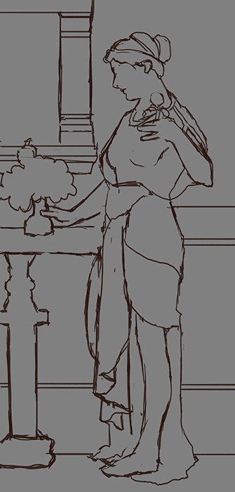
I recently finished a master copy of John William Godward’s painting, Offering to Venus.  This was my first ever attempt at copying a masterwork and it’s proven to be a most enlightening experience!  Many thanks to Sam Hogg for her suggestion to try this exercise and her tutorials on the matter.

See a step by step with detailed notes at WiPnation.

Why Do This?

Why would someone drive themselves insane this way, you ask?  For me, I did this exercise to prime myself for another painting which I had hit a dead end with.  I wanted skin glow, gorgeous roses, a classical painterly feel, and translucent material, but it all seemed flat and plastic no matter what I did with it.  I needed some time away from the piece to figure out how this was done.

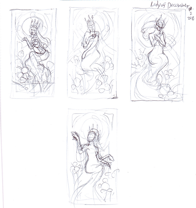
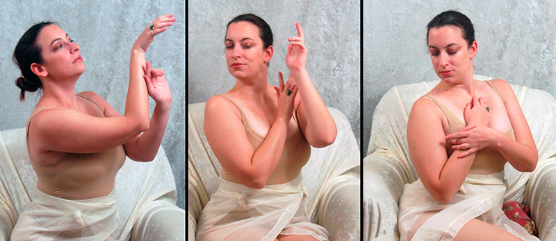
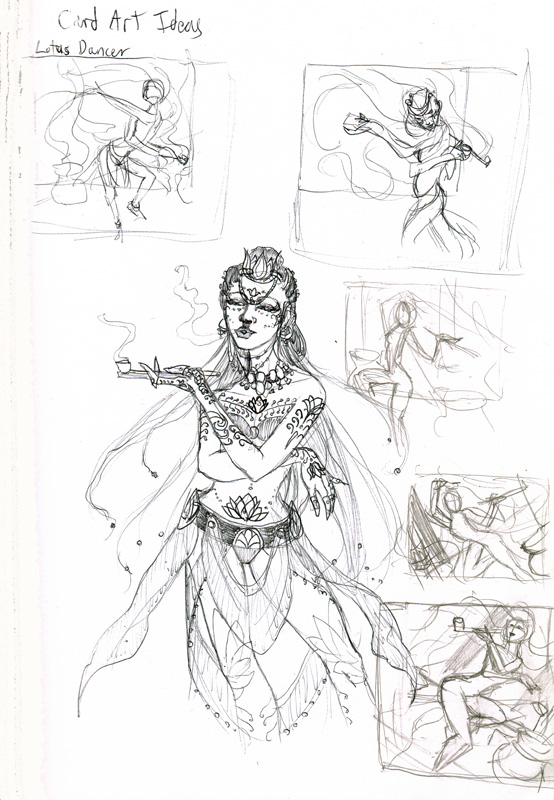
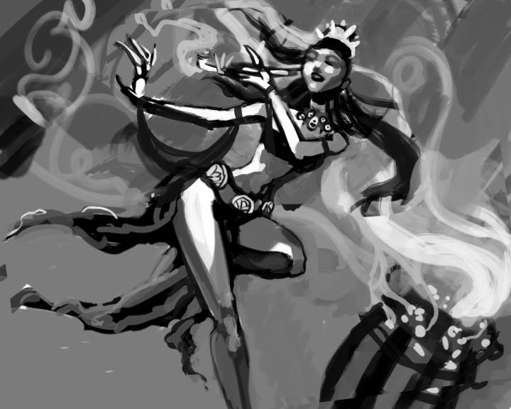
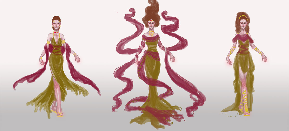
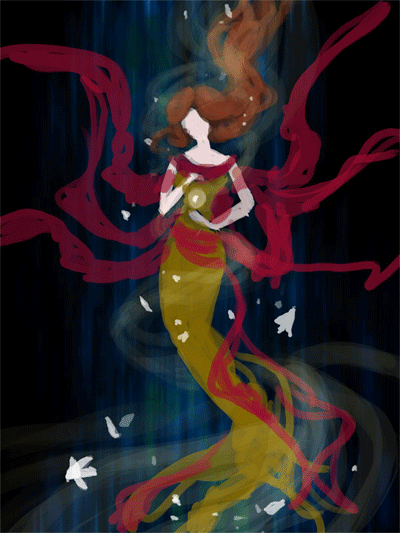
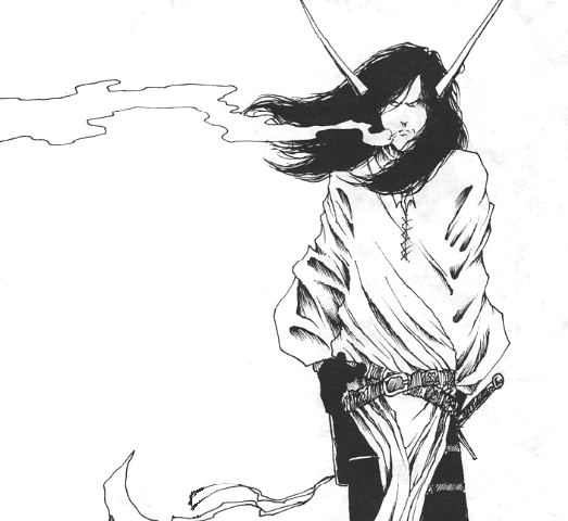
The ‘other’ painting, a reinterpretation of the cover of
Kushiel’s Dart by Jacqueline Carey.

That’s when I came upon John William Godward’s Offering to Venus.  This painting had everything I wanted in my own – glowing soft skin, roses, sheer cloth, and a classical feel.

How Did I Do This?

In order to get the most out of this exercise, I followed Sam’s established rules:


1. NO tracing!
Hone my artist’s eye for proportions by using a grid.  Using this method also forced me to pay attention to the volume of objects in the image, rather than simply tracing the lines in a mechanical fashion.  I set the grid up using Guides in Photoshop.

2. NO color fills!
Paint in the gradient of the first layer with brush strokes instead. Color fills just make the image look mechanical and plastic if you paint because the gradient is too perfect.

3. NO color picker!

Learn to eyeball color instead of using the color picker to pick them from the original. This is to force me how to guess how it was mixed and be mindful of layering, as it’s important to digital as well as traditional painting.


What Did I Learn?

Copying is NOT the Point! – I could have copied each and every detail, but that wasn’t the point of this assignment and would take far longer than a practice exercise should. I went in with the mindset of expecting to learn specific skills and make specific observations.  Doing this beforehand gave me some goals to meet, other than ‘drive myself crazy with copying things down to the brushstroke’.
Know When to Find Edges – Achieving a soft, painterly feel in a piece is all a matter of losing edges.  Having solid lines throughout only flattens the image instead of giving a sense of light bouncing off surfaces.  By the same token, there are key outlines around the bottom of the nose, the toes, where cast shadows are deepest in the folds of the cloth to show where fabric overlaps and many other areas.  
Outlining in key places can really pop those soft edges, by contrast!  Losing detail also helps bring the viewer’s eye where the painter wants it as well as create a depth of field for a more immersive quality.  The roses are a perfect example of this. Notice how the roses around the edges of the grouping in the vase are barely more than blobs with a few key brushstrokes to intimate petals while the ones in the middle of the vase (closer to the viewer) are in more sharp detail.
Color Circulation – I noticed a method the artist used to tie the model to the background and make the whole image feel cohesive was to repeat colors around the image.  Her hair is the same hue as the terra cotta red of the background statue which is also repeated in various veins and coloration of the marble.  The pink and reds of the dress are repeated in the roses.  The blue of the background marble repeats again in the ribbons and sleeve seems of her dress and the bounced light of the sheer cloth as well as a spot of blue marble towards the bottom of the piece.  It’s all so perfectly balanced and you don’t really understand that till you’re looking at it up close like this.

Delicate Features – I have a bad habit of making eyes and chins of my characters very sharp and harsh.  Feminine edges are hard for me, which made her face a particular challenge!  Almost all the planes of her face are lost to soft transitions relying on highlighting and the inset of the lips and eyes to orient the viewer.  The eyelashes, for example, are softened by shadow, which gives her a much more realistic and delicate appeal than if I’d given her harsh, mascara-laden eyelashes and super defined lips as I usually do for my characters.
Do Not Fear the Darkness! – For as soft and glowing as everything seems, this painting has a deceiving level of near-black shadows in it, all of which are in the dark brown range.  I realize I almost never use near-black in my paintings and this was a great exercise to force me to do so.
Mark-Making isn’t Just for Traditional Painters – Zooming in close on the original image revealed so many value transitions that are not just smooth gradients.  The cloth of her dress, marble, and sheer robes, for example, were very hard for me to replicate because while the overall forms and texture are smooth, the highlights have a subtle dappling that give these items a vaguely textured feel.  
Directional mark-making by hatching my color transitions instead of blending them with a huge translucent brush helped to bring back that painterly feel that digital is naturally disinclined to.  It’s so easy to try to get EVERY pixel perfect when that painterliness factors in due to the mistakes and imperfections of a brush.
Skin and Light – It’s so easy to just paint in the flat colors, blend them, and call it done with digital, only to discover you’ve made a muddy plasticine mess!  This happened to me with the skin, at first, till I realized that by laying the vibrant oranges and pinks down initially, then layering base tones and white highlights on top that I could preserve that glowing luminosity that makes Godward’s works shine.  I feel I should have known this, as a watercolor artist, considering laying in the skin blush is what I usually did first.  Digital painting shares a lot more with traditional painting techniques than I had originally thought! 
All in all, this has been a great exercise for me. I hope you all will try it out for yourselves and tell me what you learn!
Finally, here is an animated gif of my copy’s progression!
And a video link for those who can’t see the GIF properly:

Sketch Diary – Lady of December Part 1

It’s that time of year again! Time for my yearly Christmas card for fans, friends, and family! I have a bad habit of starting this project late every year, which barely gives anyone time to pick up some cards to send out to their loved ones, but THIS year, I am making it a point to be early! It took some effort to even begin thinking of Christmas themes while my beloved harvest and Halloween season was going on. I am one of those types who hates seeing Christmas ornaments out before I’m done enjoying my pumpkin pie and colorful leaves.

 This year I am admittedly rebooting an old theme you might remember, the Angels of the Months. You all might remember the Advent Angel, who incorporated themes of December’s flowers, as well as Angel of January, who had flowers and birthstone symbolism. Each one had its strengths, but I always felt as if they missed the mark, compositionally. Either the wings blocked the stained glass or the winged figure competed visually with the stained glass window for the attention of the viewer with too much ’empty’ space left around both. I was flipping through my favorite Mucha reference book when inspiration struck me like lightening!

Mucha’s Semi-Precious Gemstones series.

I adore the simple focus, the elegant ladies, and the detail in the windows and flowers! Lady of December will be in a similar composition with a focus on her adornments, the flowers of the months, and the representational birthstones.  I do miss the wings, but (as loathe as I am to say this), sometimes I have to make pictures without them! For shame.

With all that in mind, thumbnailing begins!  These were rough and dirty ink sketches to help establish the composition’s flow, the figure’s posing, the arrangement of the borders, window pane, and flowers.  I knew I wanted the central theme to be a ring of Turquoise, inspired by the Gregorian poems for the birthstones, so the poses had to bring the hand into play as a point of interest.
1 and 3 are my favorites.
 Next up, I wasn’t too sure of the pose yet, so I decided to explore them in a photoshoot with a chair and some curtain sheets.  I took quite a few variations, but here are some of my favorites:
Just ignore my horrid farmer’s tan…

So many to choose from! But the pose on the left had a really interesting flow created by the hands and the focus I wanted on the ring.  Meanwhile, the other photos will be filed away for reference use for the rest of this series!  Some of these may make their way to my stock art gallery, so keep an eye out over there, if they strike your fancy!

Then came the reference hunt!  Have a montage of pretty jewelry, Mucha dresses, and other things which I hope will inspire the final look of Lady December’s dress and jewelry.
Coming next: Studies and Line Art
Want to see a step-by-step as this project develops?
Check out the thread at WiPNation!

Sketch Diary: Dreaming Butterfly v2

Concept and Inspiration

A detail of Dreaming Butterfly.

I’m currently working on a painting I hope to include in my portfolio which is a redo of one of my most popular (and personal favorite) pieces entitled Dreaming Butterfly.  The character in this piece is Aurora, my old Shadowrun character who was the first character I really got attached to during my dice-rolling days.

She is like my own Pepper, for those of you who know Artgerm over at DA.  I’m always using Aury to experiment with new art styles, random fashions, and whatever comes to mind.  While she may disappear from my gallery at times, I always come crawling back to her when my muse is in search of inspiration.  Ironically, she almost always comes out looking peaceful and surrounded by symbolic butterflies when she’s actually an ill-temper, foul-mouthed, speed ganger Yakuza Elf, but I digress.

I admit to having ulterior motives for composing this piece, namely so I have something new to submit to DeviantART’s Draw it Again contest due on the 30th of this month and for The Rising Stars competition IFX and Corel are running (due next month). Yup, that’s right! I double-dip my chips!

Thumbnailing

I came up with just four thumbnails for this because I felt I had nailed my concept in the very first one, which was the closest to the original piece. I still like the 2nd one a lot, which may become another painting in the future.  I’m trying a new method of thumbnailing on kraft paper so that the brown of the paper acts as a midtone, with ink and white color pencil acting as my shadow and highlights.  That way, I am not using white paper to start off with, which sometimes confuses my sense of value and tone.

Gathering Reference

I’ve taken Dan Dos Santos and Justin Gerard‘s advice from Dragon*Con to heart when it comes to shooting my own reference photos.  The theory is that if you merely use a publicly available stock photo, you’re inviting the chance that another artist will have used the same stock photo to compose a very similar image.  It’s true that I can almost instantly recognize mjranum-stock‘s photos as soon as I see them.

So in the interest of being unique, I lit and photographed my own reference photos, totaling at around 100 I had to sift through for the perfect shot.  This involved folding 47 red origami butterflies as well as roping a family member into helping out or using the self-timer while I got up and down and up and down to line up the camera and then rush back to lay on the ground before the timer went off.  The results speak for themselves:

(I plan to post the ‘rejects’ from this photo shoot for public use up at my stock art account, so keep an eye on that gallery!)

Preparatory Painting

I ended up using the top right pose, rotating it 90 degrees then tweaking the neck so there was more of a flowing S-curve through the body and composition.  I also replicated the butterflies in the background to make it seem as if she’s laying in a bed of red butterflies (no relation to that scene from American Beauty!)

Now, I’m hopeful I can just blast through the painting phase without having to alter my composition and anatomy on the fly so much, which I’ve been prone to do in the past.  I’ve figured out these complicated aspects in the planning phase first, which is a new habit for me.  I suspect my biggest challenges from here on out will be making this look less like a photomanip and more like my own painting, as I am doing this digitally.
If I can get a screen capture app working, I may be hopping on my Livestream channel while I paint, we’ll see!  If so, I’ll be making such announcements on my DeviantART, Facebook, and Twitter streams.

Finally, keep up at this painting’s WIPnation thread to see a step-by-step comparison of each phase of this image and give redlines and crits.  I highly recommend participating at this website, as it’s a great resource for critique, as well as a good archive of your own workflow for your own educational purposes.

Sketch Diary: The Lotus Dancer

In the last entry I talked about how I’m working on a portfolio to target playing card and RPG book art industries. Much to my joy, I’ve found that my own set of original characters and stories lend themselves quite well to this kind of subject matter.  I have been longing for ages to get back to writing about my own characters, but writing has always taken a back seat to improving my art.

Now, it seems I can finally combine these passions by exploring these characters visually for character-driven art for my portfolio, starting with card art.  What is card art?  The best examples I can think of are the lovely works created for Magic the Gathering and World of Warcraft playing card games.  Many of these card games include the kinds of things I love to draw and are a great entry level field for me to start in.  Competition is high, but there are plenty of game companies out there and we all have to start somewhere, don’t we?

Card art entails working on images with character and narrative driven compositions.  Studying the World Of Warcraft: The Art Of The Trading Card Game Vol. 1 provided me with fantastic insight into the quality of art I can expect to match and the usual mode of presentation for characters and settings within the card format.  Most cards involve a single character with compositions that emphasize easily identifiable shapes and movement, since a card is meant to be printed at a smaller size.  I was pleasantly surprised as well at the amount of traditional art included in this collection.  Most would have you believe trad art is dead, as far as illustration goes, but this gave me a glimmer of hope (despite the fact I still intend to work more digitally now for my own benefit).

To get started with my first mock art card, I began by writing myself a brief of the character concept so I have more specific direction.  A lot of my own original characters and worlds are still not quite fleshed out, so this forces me to solidify a few concepts so that they more easily translate into a visual mode.


CARD BRIEF – The Lotus Dancer

 “A desert oasis kingdom setting. Lotus Dancers specialize in ‘captive’ audiences  high on the smoke of lotus, their costumes reflecting this connection to the flower.  They use the altered states of their onlookers to create a dreamlike atomsphere with twisting smoke, twirling scarves, and flowing hair.  They move as if they were casting a spell on their onlookers.  The bells on their costume create accompanying music as they dance.  

If one has the money, they might even be able to afford a ‘private’ audience.  Their nack for getting close to incapacitated political figures at gatherings has proven a perfect cover for assassins in the past.”


The Doodle Sheet

I always start with one of these as a ‘getting to know you‘ exercise.  Typically done without reference so that I can channel the mental image without any visual biases. Also done in pen so I won’t obsess too much about making the doodle too detailed.  This is where I rough out basic ideas for compositions.

The last few thumbnails towards the bottom of the sheet show how I’ve tilted the perspective for a more interesting skew, as if we were one of the entranced onlookers.  It also made it easier to fit in more of the dancer’s body in motion, which just wasn’t fitting in the card format otherwise.

 The Reference Sheet


I also gather references from my own stock art poses and all over the net, baring in mind that lotuses have been translated into many visual forms, from more naturalistic to the abstract lotuses we see in Egyptian art.  A big challenge will be to make her setting read as a fantasy setting and not too heavily inspired by one culture or another.  These references will all play a big part of the detail in her costume and decor of the background hall she’s dancing in.

The last thumbnail on the bottom right of the doodle sheet won out for the delightful curve of the dancer’s body through the composition.  I took the scan of the thumb into Photoshop, which leads us to…

The Tonal Study

I’m trying something different and working in grayscale to establish tones first.  This should, in theory, help me to more efficiently come up with a composition with strong tonal focus that will be effective for the card art size.  I ended up tweaking the arm from the thumbnail so that it leads the eye through the page more without closing off the figure, where I would like to show more costume detail.

I’m also trying to overcome my propensity for work with low contrast and minimal settings as well as my habit to work in far too many layers digitally so that I take far too long tweaking every detail. I’m making a concerted effort to be fearless and paint all on one (or two) layers!  One for figure, one for background.  Possibly anther for tattoos and costume.  Having too many layers has resulted in huge files that slow down my computer so I must find a way to solve this workflow problem.

Next: The Gritty Details
See this image’s thread over at WipNation.com for step-by-step process shots

Sketch Diary: Persephone Queen of the Underworld

Recent days of self-critique have had me determined to push my fundamental skills even more this year.  To that effect, CGhub’s CharacterForge challenges have proved a really fun and loose way to play around with a predetermined concept for my own whims (while also giving me the incentive of a deadline).  The latest CharacterForge challenge was to design Persephone Queen of the Underworld.

There was just enough physical description given that I had a few concrete elements to work with while the rest was left up to my imagination.  The kidnapping of Persephone and the turning of the seasons has always been a myth near and dear to my heart, so I couldn’t resist trying this out!  It began with thumbnailing to work in the Challenge’s requirement that the image be laid out as a book cover.

Choosing a thumbnail was a tough call for me, as each one of them has something I like!  I love the dangerous gaze of the first image with the focus on character details like jewelry and her outfit.  The 2nd  has a wonderful up and down flow and an air of queenly presence the others don’t.  It boiled down to whether I wanted to go with a Persephone who was still mourning over her confinement to the Underworld or perhaps a Persephone more adjusted to her role as a queen, which, in the end, I felt worked better if she was to be entitled “Queen of the Underworld” in this composition.

I ended up going with thumbnail 4 for it’s compositional flow and the balance of a somber character who still demands some power and presence, as she does with her regal clothing and the ability to nurture a seed of life in the darkest places.  She hasn’t given up hope and obediently awaits the day she will bring Spring back to the world of the living.

I also chose the thumbnail I did because I wanted to push myself away from my usual composition habits, which generally cut the character off at the thighs. I very rarely do full figures so it was time for a change!

The next step was to figure out exactly what I wanted to dress this venerable lady in.  I got the creative juices flowing looking up fashions by Alexander McQueen and a cursory google search of catwalk fashions inspired by Greek mythology, which turned up some interesting stuff!  The 2nd dress in this group really caught my eye with the trailing gauzy fabric.  I knew then I needed LOTS of trailing gauzy fabric for that mystical smokey touch!

Image via Top and Trends Fashion Design.

I already had the basic color scheme and physical features defined by the thumbnails and Challenge description so I decided to use a more fleshed out base rather than a simple nondescript figure (which is commonly referred to as a croquis template, in fashion design terms).

I only had time to do three of these, due to time constraints.  I leaned towards the wrapped bodice style of Greek clothing with sashes and tattered edges to get across the feel of a character who has a sense of decay about her, due to her surroundings, which contrasts with her ability to remain pure and beautiful in the dank Underworld.  Again, something I like about all of them!  Eventually went with the middle because it felt like it had the most presence and flow.  There’s also something intriguing about the first dress, which I may have to revisit later (modern day corporate mogul Persephone, perhaps?).

Then began the fevered late night movie marathon to keep me awake while I worked, since I only had three days to finish!  On my ‘girl goes to underworld’ inspiration playlist:

– Legend – Girl kidnapped by giant lonely red devil for touching a unicorn (another childhood fave).
– Pan’s Labyrinth – Girl has magical adventures while living in an oppressive household. At one point journeys into the underworld realm of the Pale Man (my favorite scene!).
– Labyrinth – Girl ventures into the world of the Labyrinth to save her brother and defeat the Goblin King, who is oddly enamored with her.  Love this movie ever since  I was a kid! It’s Jim Henson at his best.

Five cups of coffee and two Cadbury bars later, we have progress!

Adobe Photoshop CS2, Wacom Cintiq 12WX.

She’s still in need of critique so I can clean her up for my portfolio. Feel free to comment on DeviantART or at WiPNation! I’d value any input on how to make her the best image she can be.
If you’re part of CGhub, go vote for me in the challenge if you like my entry! 
(Voting thread should be up soon.)

DragonCon 2011 Workbench Part 2

The saga of ‘Angela why did you decide to have a book signing and a gallery show just before DragonCon and then start your gallery panel stuff too late?’ continues!  Spent the last 3 days painting like a madwoman!  You saw the naked leather masks, now see them with COLOR!

Behold my PRETTEHS! That’s a little pile of stuff to be turned into jewelry and
bookmarks at the end.

A Black Swan mask. Heavily inspired by the look of
the movie with Natalie Portman. Still need to add
crystals to the crown in this one!

Seraphim mask. If my brain wasn’t broke before,
it was after this mask. Possibly adding gold chains
to this?
Tarot: The Moon mask. Or also “Moon Bonnet”.
She’s going to have a ‘necklace’ of fresh water
pearls attached.
And finally, the DRAGON Mask!  Totally dig how this came
out.

 They all still need varnishing, which will add an extra layer of candy-like awesome, but are otherwise done for the most part!  Stuff I still need to do:

– Finish displays for the bookmarks
– Finishing touches on the masks/jewelry that need dangly parts
– Mat and frame things. Embellish mats that are not LE
– Label everything properly for the art show
– Finish presentation for E-marketing panel in the art track
– Maybe do costume bits for a Lusiphur cosplay?
– EAT YOUR BRAINZ!
I can haz yer brainz? ;_;

DragonCon Workbench & Reminders

Pulse check since I have been too busy working to post here!  I am alive, for the most part.  Neck deep in DragonCon prep!  Just wanted to remind folks of a few things:

  • I will NOT have a table this year.  I will, however, have a large gallery bay where you can see and purchase paintings, matted embellished prints, masks, and other handmade specialty items.
  • In lieu of a table, I’ll also have a space in the art show’s Print Shop, where I’ll be debuting lots of new pieces never before available in prints (such as Keeper of Secrets, Angel of January, and Dragon Whisperer).
  • I will be hosting a panel on the basics of E-marketing for artists in the Art Track (based on a blog post of mine). Check your D*CON schedules for exact listings!

And now for some image spam of my current workbench, which is full of masks and leather things!


A closer look at that dragon mask. Cuz I just love it!

Tentatively titled “Seraphim” and jokingly titled
“Flouncy Hawkgirl”
 Now, just got to survive till the con! With the power of Greyskull, chocolate, Advil, and coffee!