Continuing from the last sketch diary entry detailing the battle of wills against horrible color schemes. I wasn’t quite sure how to compose this next entry, as I couldn’t quite figure out how to record my many hours of tweaking in Photoshop nor do I want to confuse you with the cluttered mess that is my digital coloring method.
I am relatively new to digital painting so I haven’t quite figured out the most efficient way to paint yet. How about a list of things I learned during this painting that made me fear digital coloring less instead?
Learn the use of Layer Masks and Adjustment Layers!
Being able to tweak the contrast, color, etc. of an image without destroying the integrity of your original image will save you many headaches in the end. Layer Masks are especially helpful if you want to integrate textures into your image with a more natural feel while Adjustment layers let you tweak elements such as Levels, Contrast, etc. while still keeping your original image untouched. For example, I used a Gradient via a Fill Adjustment Layer to get the subtle green glow in the texture of the marble behind my angel in this painting.
Creating convincing light beams is totally easier in digital.
Wish I could say it was my brilliant idea that resulted in the light beams coming from the top left on my painting, but it was from this jewel of a tutorial. I used the thicker beams they mentioned in another tut by the same person. A gal could get used to not having to mask off with tape or masking fluid or painting around the light shafts like I would in watercolor. Hoorah for saving time!
Blending takes time…even in digital.
90% of my time on this image was spent blending and blending and BLENDING some more, especially in the area of her skin. I used default brushes set to Pen Pressure and an Intuos3 Wacom tablet to color this image. In my experience so far, if you want your image to maintain that painterly feel, it’s better to blend with brush strokes than rely on gradients or fills. It’s far too easy for things to look sleek and plastic in digital so watch yourself!
Another trick I used to maintain a subtle texture in this painting was to insert texture from free texture sites in layers set to Overlay and attached to the various elements of my image with Clipping Masks.
For things like the skin and hair, I used roughly three default Brushes set to varying Opacity and Scatter settings. I’m sure there’s a whole world of custom brushes to discover, but these are the ones I used, in addition to the default Chalk brush, which I used to simulate the color pencil lines when I needed to touch up my color pencil layer I had scanned in from my original drawing.
A little texture goes a long way!
Critique is priceless, no matter the medium!
As much as I’d like to say this image popped out of my head sparkling and awesome, it looked like crud during a midpoint when the angel’s skin was purple, the window was floating and overwhelming, and I was frustrated with it. That’s when turning to more experienced digital artists really saved the day!
Sam Hogg and Stephanie Reeves gave me wonderful advice, paint overs, and encouragement and that is just what we need when learning a new medium, so don’t be afraid to check out places like CGsociety and Conceptart.org (or your own arty friends) for critique!
I did a time lapse video of all of my progress shots. Next time, I’ll try a screen recording program (any reccomendations from you guys?)
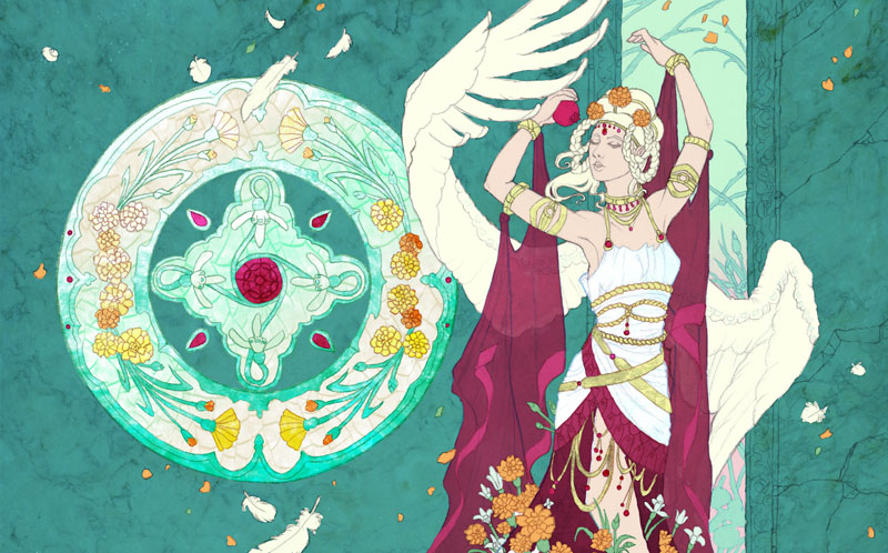
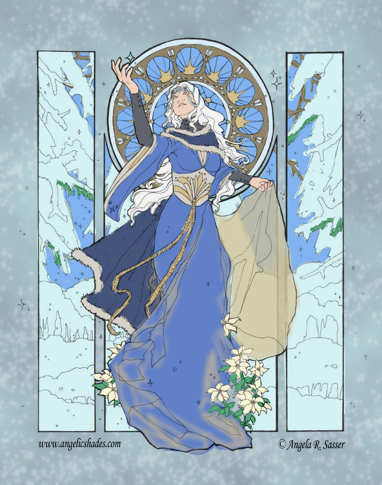
And finally, the finished image!
“Angel of January”, 11×17 in. Digital painting over color pencil outline. Download a wallpaper of this image.
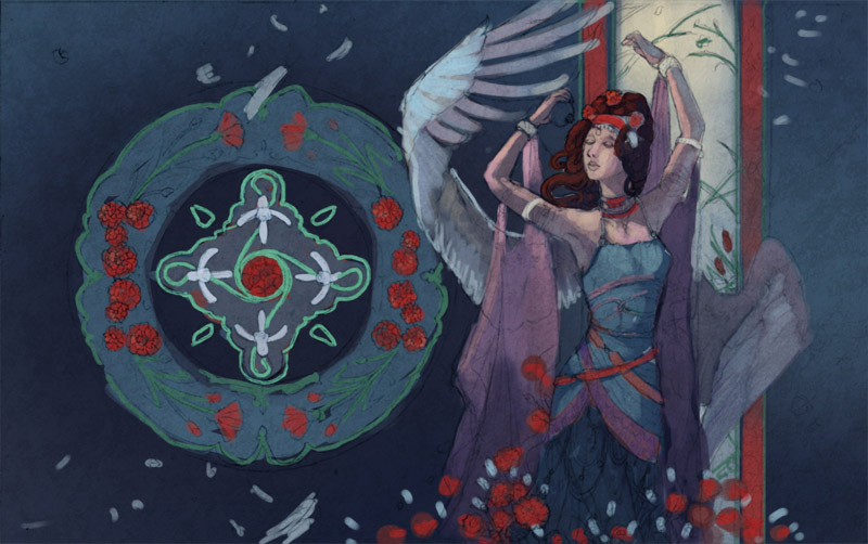
The ideas have broiled, the sketches have been kneaded to perfection, and now we reach the most difficult phase of this image for me – coloration. Normally, this is the phase that’s the most fun, but this image fought with me tooth and nail to defy my whims!
Problem #1 – Being a monthly series, I have a limited palette of pre-defined colors to work with which are restricted by the main elements, the flowers and birthstones for each month. In this case, my choices for January are garnet, carnations, and snow drops.
Add on top of that I want to have a ‘stepping into sunlight’ theme with sunbeams streaming in and the challenge becomes even more tricky! Lucky for me at least that carnations come in many colors and snowdrops are a neutral white. I’m not sure how lucky I’ll be with the rest of these angels that have flowers available in one color only!
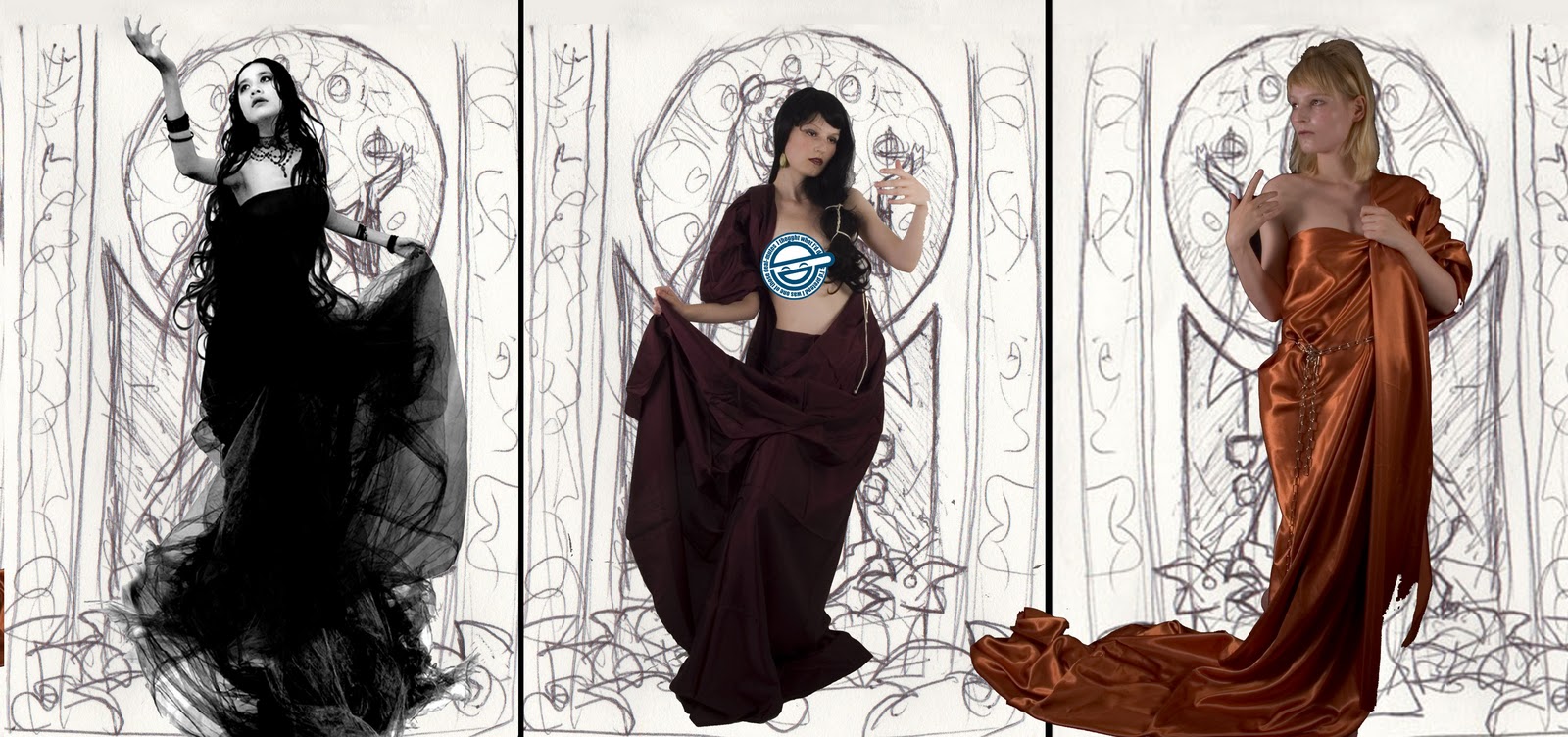
The first idea I had was to have the realm of Spring beyond the ‘doorway’ in the image, so that bright area of contrast was fighting with me as well. I did quite a few color tests in digital and watercolor, the disasters of which I’m almost embarrassed to share:
After doing these, the idea of a glowing halo around her body was dropped in favor of not going insane from dueling colors and light sources.
The talented Sam Hogg took a stab at it with her digital awesome powers:
While I like the simplicity and contrast of Sam’s color scheme, the window felt too dark for my tastes.
Springboarding from Sam’s theme, I lightened it up with sunbeams and a sunrise themed ‘spring’ realm behind her.
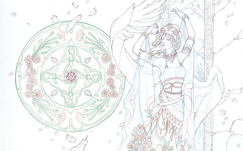
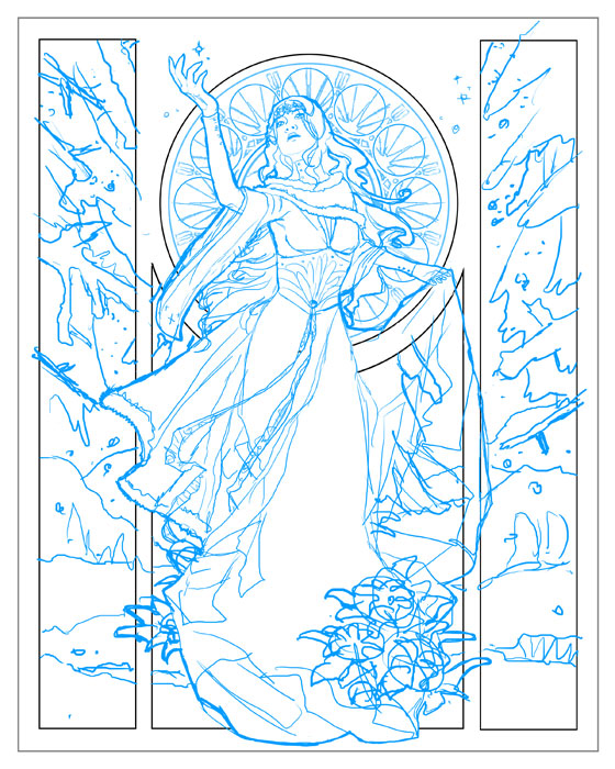
Before the end of this color testing phase, I decided I wanted to try this image digitally instead of in watercolor to help me brush up on my cg skills (and also because the color richness demanded something more bold than watercolors). To keep that subtle texture of my line art, I scanned in the color pencil outline version to use as a base to color on:
Outlined in Prismacolor Color Pencils. The color of the lines gives a deeper optical richness to the final piece than simply using black outlines.
Eventually, I arrived at this final complimentary color scheme with orange accents. The idea shifted to sunbeams penetrating a subterranean underworld which pushed everything green! (Thanks to Hayley‘s critique)
It’s at this step that I’ve added textures from free texture sites and my own references to help add texture and interest to my digital shading. The color pencil outline layer sits above all of my other color layers and is set to Multiply so that all the color layers beneath it will be visible while maintaining their color value and the color tint of the outline layer.
The color layers each have texture layers above them set to Overlay so that the texture will be very subtle and show the colors beneath it. In the next entry, I’ll go more into depth about my digital color process. It’s all very experimental at the moment. Maybe a video will be more helpful here?
Sunbeams, glimmering dust motes, and jewels glittering in the dark await! I’m excited to get started shading this painting digitally. Got to keep my digitalart-fu strong!
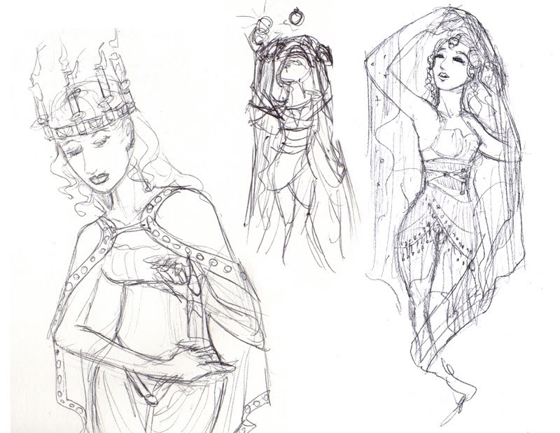
You all might remember my last sketch diary entry for this image? If not, go check it out for idea development and thumbnail sketches. Wow, has it really been nearly a YEAR since I’ve come back to this piece? Guess that burnout wave hit me harder than I thought! (More on that later, as it’s been on my mind a lot lately)
My favorite thumbnail sketch.
Next up, developing the final draft! With my favorite thumbnail sketch out of the many in mind, I shot some stock reference for myself with the idea of a veiled or draped figure stepping into sunlight to echo the themes of the emergence of Persephone (which is associated with the gemstone for January with its pomegranate seed-like clusters of garnets).
January is also named for Janus, the god of doorways and transitions, signaling the coming of the new season and new year.
This particular stock pose caught my eye most with the inquisitive angle of the head, the assymetrical sweep of the arms, and the idea of ‘stepping into the sunlight’ echoed in the pose.:
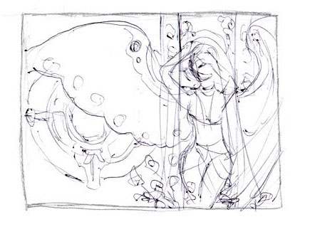
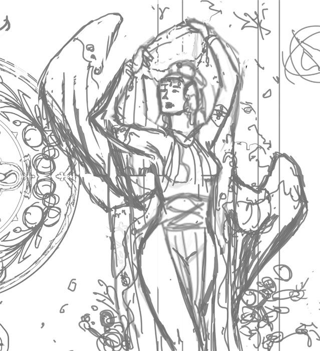
The first base sketch. The wings cover too much of the stained glass window.
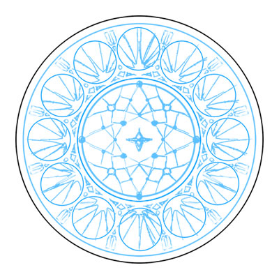
With that stock pose in mind, I did several rough sketches in Photoshop and finally arrived at a base figure, with all of my background elements on separate layers so I could tweak them individually. This phase also involved doing a rough sketch of the stained glass window pane with its Snow Drop and Carnations motif with no attention paid to exact symmetry just yet, but rather scribbles filling out the main idea of the design and how it might integrate with the figure first.
However, I kept running into a problem with the wings. They seemed either covered up too much of the lovely window, were too flat, or too cramped into the space I had in mind.
Too cramped and thin…
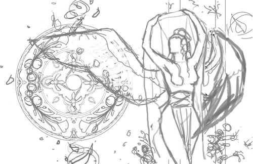
Much better flow that leads the viewer’s eye through the figure!
With the main figure taken care of, I refined the window by copying, pasting, and flipping parts of the window as needed to create a more symmetrical shape. I then transferred the sketch to illustration board, refining the details as I went along until I arrived at this:
The last process post for the Snowflake Lady talked about choosing stock reference, line art, and sketch transferring. Now, it’s time to get to the fun part – coloring!
Color test for Lady Snowflake
Most of the time I like to start off with a color test which is made very quickly in several layers in Photoshop. I like to keep the background, important parts of the figure, and important wardrobe details on their own layers so I can tweak the colors individually till I’m satisfied.
A tip to arrive at color schemes you might never have thought of is to flatten your image and play with the Hue slider under the Adjustments>Hue/Saturation menu in Photoshop. This option lets you change the colors in your image without messing around with your shading or line integrity.
I don’t do a color test for EVERY image I paint, however! Sometimes it’s fun to let the colors develop organically. Other times, I’ve spent so long inking or sketching the image that I’m afraid to mess it up, so I do all the prep I can before touching it.
With nerves steeled, painting begins! She was a very tough customer because all the blues were fighting for dominance. The original idea to make the inner window pane an antique gold failed horribly and just didn’t gel with the rest of the image. I ended up having to layer various blues to make the window colors harmonize with the rest of the image. I also used the wrong shade of yellow for the starbursts in the stained glass, which still stand out awkwardly to me.
Just goes to show you that sometimes pictures don’t work out the way we want, no matter how much planning is involved! At the very least, watercolors are forgiving in that their translucency allows you to lift color and layer till you can get your colors talking nicely to one another, even if the first color put down is just butt ugly. I ended up pushing the pale yellows as a way to make the figure pop out more and to unify the overall colors more than originally planned in the color test. I used white gel pen and silver leafing to add the final touches of snowflakes and shine in the window tracing and throughout the image.
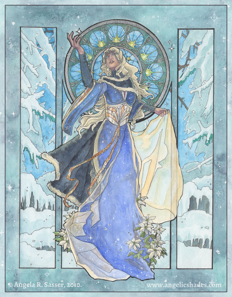
For a more detailed step-by-step of my painting process, I refer you to my upcoming book, Angelic Visions! Meanwhile, enjoy the finished Lady Snowflake:
In the last process post, I covered the basic planning sketches for The Snowflake Lady. With thumbnails and the basic gist of the image figured out, it was time to start getting detailed!
I started out by browsing my collection of stock images and seeing if there were any poses that could work for what I had in mind. I like to use photo references when they’re available to help add a level of realism that I still find difficult to draw directly out of my head. Eventually, I narrowed my choices down to the following three poses, which all conjure the image of a graceful lady reaching for a snowflake. I quickly dropped out the background on these images using Photoshop’s Magic Eraser tool, then overlayed them on top of my window layout:
Pose 1 added a level of movement to the composition with her outstretched arm, tilted head, and swirling dress. The other two poses were both lovely, but somewhat static, in comparison. After consulting with a few friends for a second opinion, I finally went with pose 1.
Next came a preliminary sketch done in digital blue! Which I like to use since it’s easier to transfer tell where you’ve drawn over when you are transferring the image using graphite transfer paper (or the ‘poor man’s transfer paper’, which is rubbing charcoal on the back of the image and then bearing down hard as you trace the lines on the front side). I refined the details in this blue sketch phase, though you’ll notice I left some things generic, like the poinsettia, because it’s easier to refine specifics like that after you’re done transferring.
The stained glass window was actually designed first without the figure in front so I could get a better sense of how I wanted the patterns to look and flow. Doing this digitally meant I could hide and unhide the figure to see how the stained glass lined up in the composition, making it easier to adjust as needed. I also could easily copy and paste sections of the window to make it perfectly geometric instead of drawing it all by hand. The stained glass utilizes a simple starry night theme.
Next, she was transferred to 11×14 in. illustration board where she received a good deal of refinement in pen (Copic Multiliner SP pen with a 0.1 mm and .003 mm tips). I had to tape two 8.5×11 in. print outs together in order to cover the whole 11×14 in. piece of board. I made a few mistakes in the stained glass while I was inking because I trusted my hands instead of using a circle template. Too much coffee & green tea do not steady hands make! Compass and circle templates are your friend. I have a circular drawing ruler that’s especially useful for this purpose!
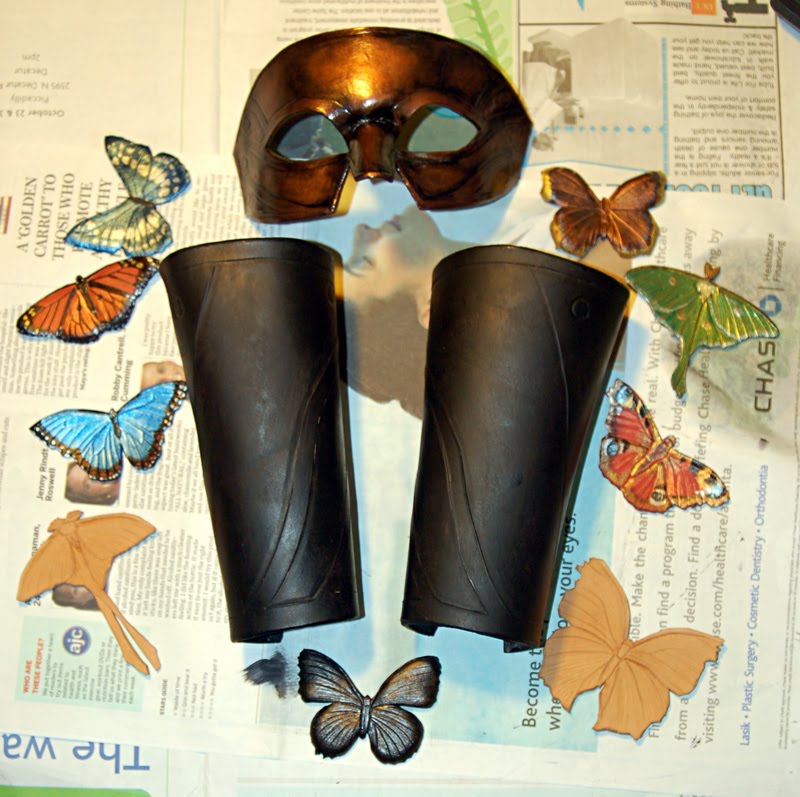
Been a little quiet around these parts, for I am hard at work once again trying to make things for this weekend’s upcoming Anime Weekend Atlanta! I’ll also be unveiling a new variation on my Ichigo Hollow mask at the con. Probably the coolest version yet!
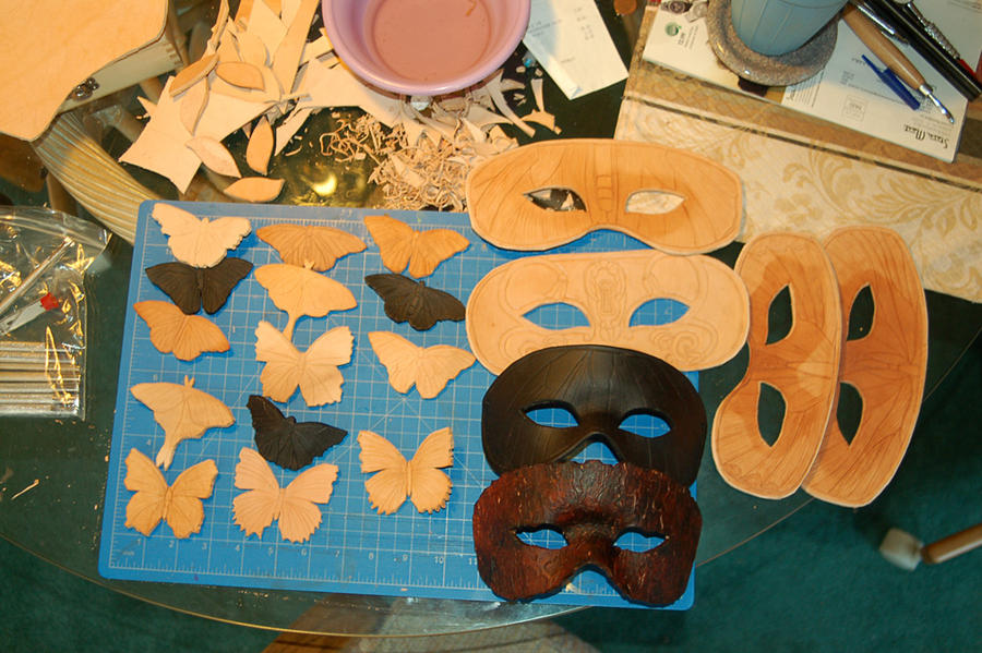
Here’s a sneak peek at all the new leathery bits on my workbench:
Butterfly keychains/barrettes & domino masks in various stages of completion.
As always, if you’ll be at the convention and want me to bring something specific for you, let me know! I’ll be chilling in the artist alley all weekend with some special hand-embellished prints on display in the AWA Art Show.
Chillin’ like a villain.
I’ll also be debuting my Assassin’s Creed X of Swords prints at AWA, which will be available in a limited number in ACEO (2.5×3.5″) and 9″x12″ sizes. I’ve been hard at work on this piece for the AC Tarot Project for some time! I hope it will be the first of many cool new digital things to emerge from my attempts at re-acclimating to the Wacom.
These prints will NOT be available anywhere else except from me directly in the artist alley!
After this, I’m happy to report I’ll have a 2 month break till my next convention (Atlanta Comic Con), which means HOPEFULLY that I’ll be able to get some new 2D artwork done and, with luck, some writing! I’m feeling the twitch again to get back to narrative works, which means I need to stop marshmellowing and get some writing done! I do so love meeting everyone at cons, but it will be nice for a tiny break to dedicate to non-con related work.
Hope I’ll see some of you this weekend! If not, stay frosty, people!
Faerie Escape Atlanta has definitely monopolized my time of late and drawn me deep into a frenzy of leather carving, rather than my usual 2D fair. Normally, I’d lament not drawing or painting anything for months, but this is a much needed break after being hard at work for nearly a year and a half making all new work for Angelic Visions.
That doesn’t mean I’ve forgotten my other projects, however! I know many of you like to see the creative process, so here’s a little peek into my next big series, the Angels of the Months.
I started this series a couple of years ago with the Angel of December, but was never quite satisfied with the amount of empty space left behind the figure and the window so never got past December. This was a design problem that needed solving.
So with a glint in my eye and a pen in my hand, redesign began!
I like to draw thumbnails almost exclusively in BIC ballpoint pen because it is a very ‘loose’ medium. Ballpoint pen responds very well to pressure, meaning you can get very light pencil-like marks by pressing lightly or pressing harder for darker lines. It’s the controllability of the pencil without the fuss of erasing. Not being able to erase is also a good thing for me. Since these are just thumbnails, I didn’t want to spend ages on them, which I very well might if given the option to erase! I banged these thumbnails out in an hour or so.
The first thumbnail took the idea of the original Angel of December and translated her into a wholly new composition. The full figure was cropped to allow more detail to be poured into the face, costume, and wings. The 2nd, 3rd, and 4th thumbnails deal with the Angel of January, whose themes include stepping into sunlight and the inclusion of a pomegranate as an allusion to Persephone. I played with the pose trying to figure out the design problem of the wings. Did I want them attached to the figure? As decorative carvings in the stone to the sides? Folded? Spread? Nothing seemed to fit the composition the way I wanted. Everything was too static with no flow!
Finally, the 5th thumbnail represents my ‘Eureka’ moment. Turning the composition to a landscape format allowed me to fit more of the gorgeous wing flow while also allowing more space for a full-fledged stained glass window, an element I thoroughly enjoyed drawing in the original Angel of December. This landscape format also works better for inclusion in a calendar format, which is a future plan I have for this series.
Next came the sketch phase where I doodled a more detailed concept of the figures. Again, playing with both the December and January angels. I continued the theme of January having a very Greek vibe. Still pondering how to include the pomegranate and if it will clash with the Carnations and Snowdrops which are going to be included in her portrait. I also photographed my own artistic references to help get my creative juices flowing.
And that’s where I’ve left off for now! The concept continues to percolate in the noggin while I prep for my next rush of shows. I’ve never had so many in one year so it’s been a learning experience for me to find the time to work AND to prep products for sale.
Once I get further along, I’ll be sure to keep you all updated!
Just a quick post tonight as it seems an unexpected workload has been dropped in my lap! Hayley informed me of an interesting little convention in my area called Faerie Escape Atlanta, a new age and mythic themed convention here in the metro Atlanta area! It was just the excuse I needed to use that neglected roll of shiny new leather in the corner of my room to make some fun things to add to my artist alley presence. I already have plenty of art tile pendants, mousepads, and art prints to sell. I thought it time to add something different to fill up my dealer space, which is bigger than I’ve ever had!
A fan on dA suggested making matching masks and bracers out of leather, which really got my brain going! Tree bark masks and bracers with mushrooms growing on them? Climbing ivy? Wings? The possibilities are endless! My muse is in overdrive (oh hello! I’ve missed you)
But first, I’m doing a simple prototype so I don’t spend a lot of time on something only to mess it up since I am a newb at designing armor. I’m basing this first set on my Centurion Mask. I’m also working on leather butterflies to sell as keychains and centerpiece pendants for necklaces.
My progress so far!:
The bracers still need to be buffed with copper paint, which I’m doing tonight before there will be any kind of sleep!
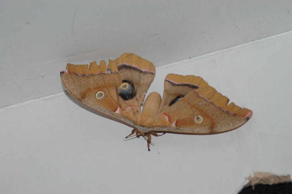
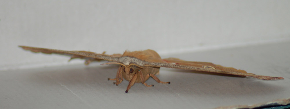
I also had a surprise encounter with a winged visitor to help spur my inspiration:
He’s a lovely Polyphemus moth who was about the size of my palm! I saved him from bees, but didn’t have the heart to add him to my collection. I let him go to live out the rest of his probably short lifespan.
Continuing my pattern of more art sharing, here’s the progress on the sketch I showed you last entry. Ms. Tude is coming along nicely and despite her small size at 5×7 inches, she’s holding her own.
For this image I’m testing out the new illustration board from Strathmore called the 500 Series Wet Media Board, which has been sized specifically to suit the needs of wet media. I’ve always had a problem with the paint drying too fast or the surface not absorbing enough hue to make such effects like salt blooms work consistently on regular cold press illustration board. I’ve also had issues with the vibrancy of colors being somewhat less brilliant than watercolor paper. I’m happy to report this new board seems more absorbent-friendly. I’ve been abusing it with wet-in-wet techniques and salt crystals without much sign of buckling or problems with color vibrancy.
The layering continues and I’ll be back next entry with the completed painting and the final verdict on the wet media board.


