Author: Angela S.

SKETCH DIARY: Lady of July Part 3

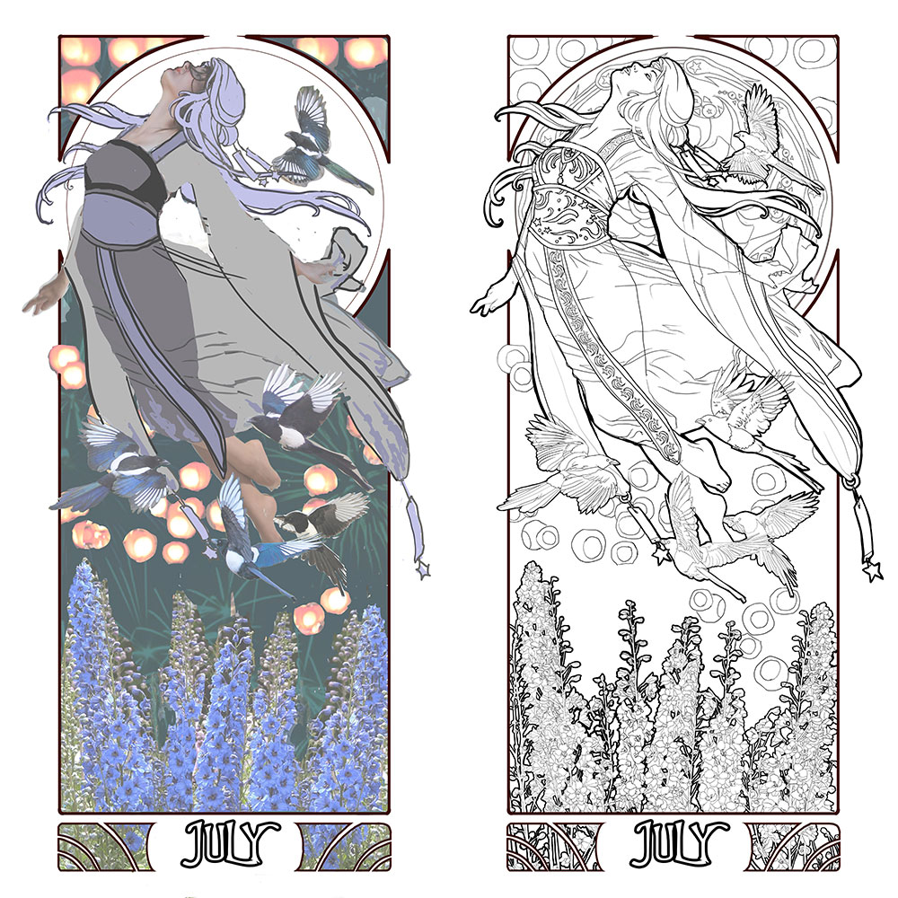
After I figured out my source inspiration for Lady of July in the Qixi and Tanabata festivals, she came together rather quickly!  I had the perfect pose in mind to depict her free flying nature thanks to this lovely pose by dazzle-stock on DeviantART, which served as a base.  

I arranged my elements, keeping in mind I wanted a simple background of a night sky to push the brightness of the lanterns and also to keep the image from being too busy since the main figure and elements were already very detailed.  I changed the pose by adding her far arm and refining the arc of the body with a different pose for the legs.  This gave her a stronger upwards arc and sense of direction.

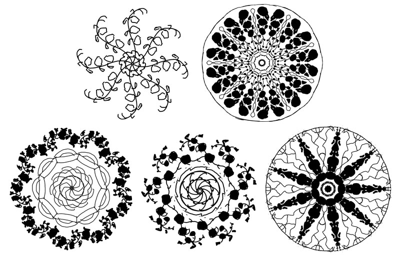
Next, I moved on to the window design, which proved more challenging than I expected!  The figure covers a good deal of the window, which meant the main decorative elements needed to be on the outer edge of the window.  The window also needed to have larger shapes in it so that it didn’t overwhelm the complexity of the main elements, which was a challenge with the detailed nature of Larkspur!

Sketched in the Amaziograph iPad app.

I went through a few variations before I found something that felt right!  These all felt a little too generic, with just the Larkspur and the lines.  The 3rd design with the tiling started to put me on the right track with an Asian-inspired tile feel.  I eventually settled on a final design inspired by the undulating star explosion caused by fireworks, which fit the themes of July so well!  The Larkspur became much more simplified as tendrils of abstract elements emulating the ‘arms’ of a firework’s shape.

With all of my line art figured out, it’s time to enter the final phase of prep where I figure out the colors and finally transfer this painting to paper!

This has been your Patreon-only sneak peek.
Thanks so much for your support!

Unknown Nouveau: Gaspar Camps

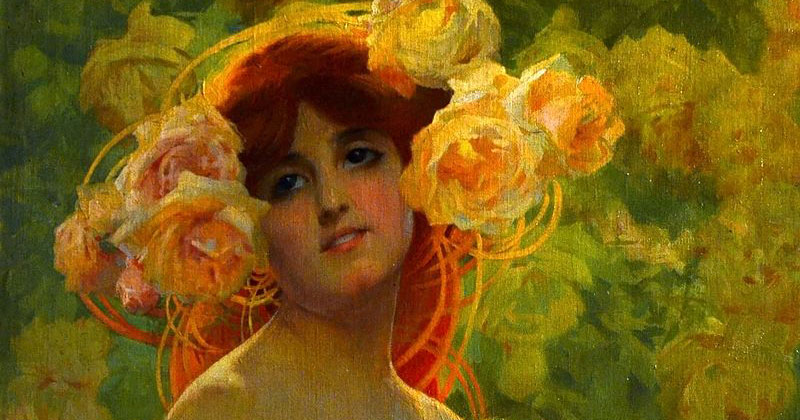
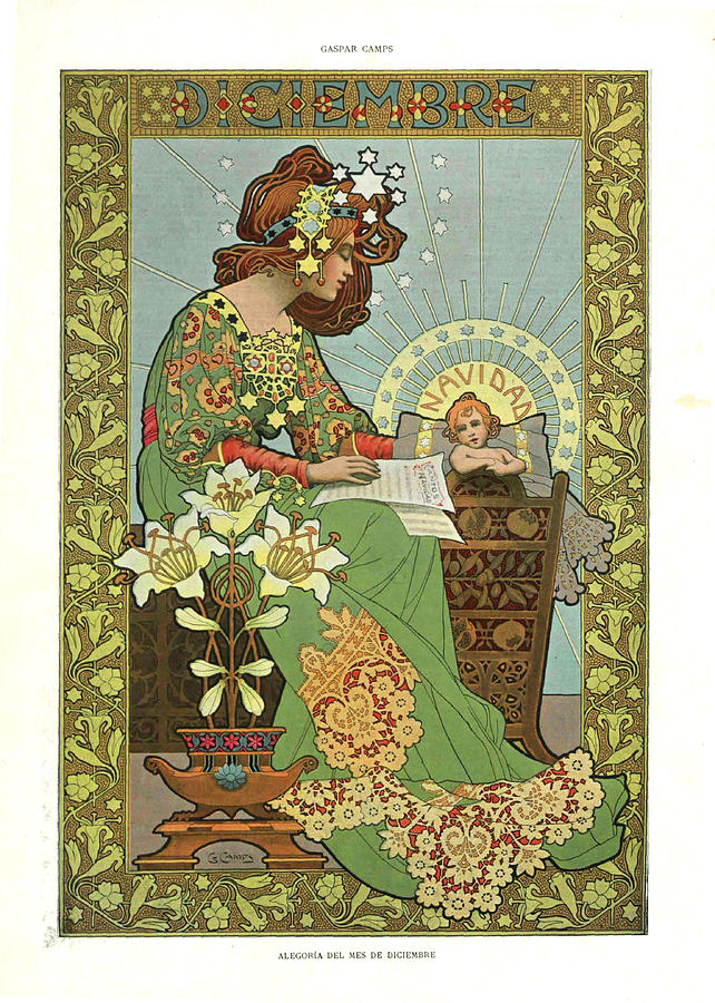
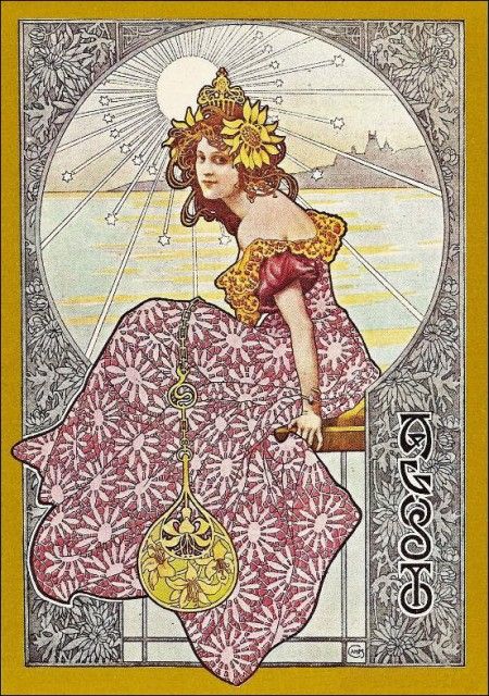
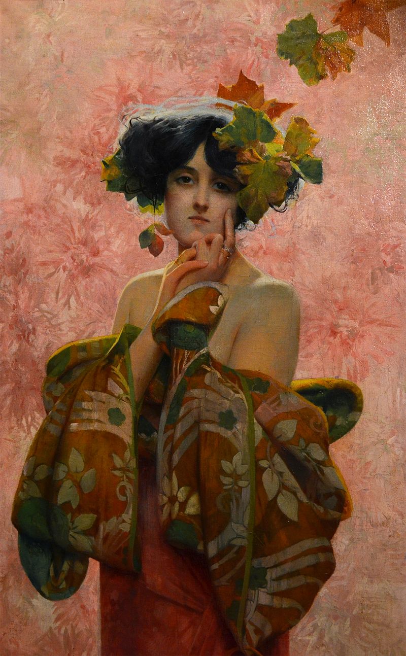
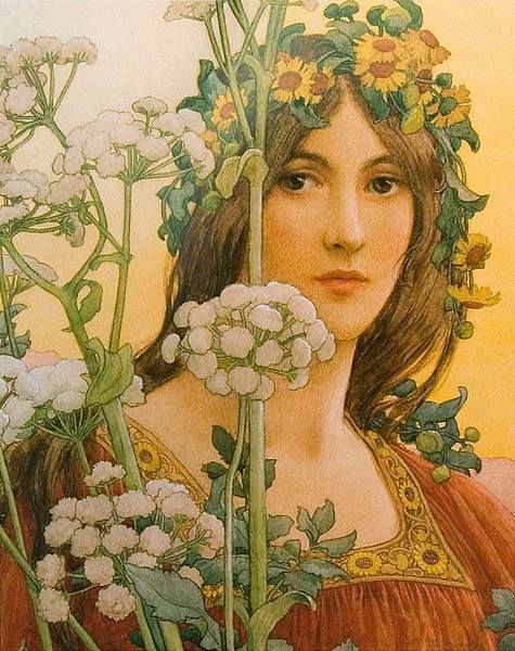
While I’m busy grinding away braincells on Lady of July ‘s many flower buds, I wanted to introduce you to another Art Nouveau artist I had never heard of!  Gaspar Champs hailed from Spain and spent a large part of his career in France.  He was very heavily influenced by Mucha, so much so that he became known as the ‘Catalan Mucha’.

Like my previous feature of Élisabeth Sonrel , I love how Camps brought his own unique flair to Alphonse Mucha’s line style.  At times, Camps’ work feels more abstract with his figures melting into the details of his images.

I also love the sense of light bouncing in his more painterly work.  What a joy it was to discover him!

If you want to see more of these art features, view them all at once here .

SKETCH DIARY: Lady of July Part 2

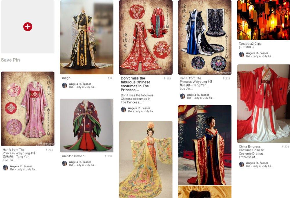
Now that I have a general gist of the pose and layout I want from my thumbnail sketches, I move on to creating the fashions for Lady of July.  Thinking on the romantic origins of Tanabata and Qixi, I found myself drawn to the graceful flow of ancient Chinese Hanfu dresses.  This style of clothing creates a fantastical element with its highly decorative representations in historical fantasy movies and costumery.  I also knew from the beginning I wanted to incorporate the star themes in the wish talismans of Tanabata.  

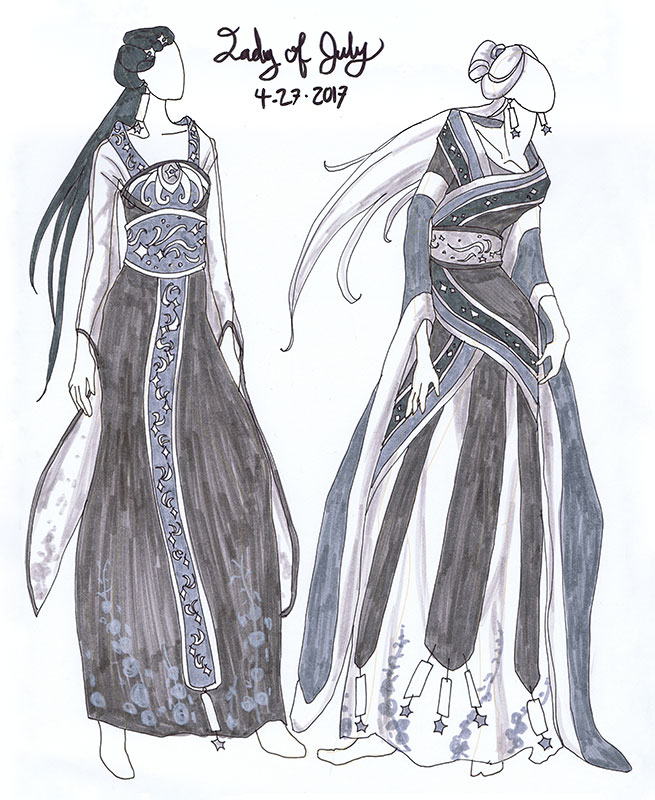
The Hanfu style also shares many characteristics with Japanese kimono, which helped me to push Lady of July’s fashion into a more fantastical realm, as I don’t want her to represent any specific period or culture.  Using my trusty croquis sketchbook, I worked up a couple of variations in gray marker.

In doing these variations, I wanted an outfit that would flow with her figure and also be light and airy, which makes the gauzy sleeves of the outfit on the left more fitting.  

The 2nd variation on the right explored a more layered, regal feel utilizing more of the talismans in the design.  I like this look quite a lot, though it feels too heavy and restrictive for this free flying Lady! 

If you look closely in the trim and sashes, I went with the decorative theme of shooting stars, again in homage to the Star festival and her kinship with the sky.  I’ve also worked in her Larkspur birth flower as a decorative element in the print of her skirt and sleeves.

In the end, I suspect I’ll be utilizing an outfit which relies mainly on elements of the design on the left, but with the star talismans and pale hair of the design on the right.

I realized in laying in basic values with the greys that I liked the idea of her hair being an unearthly white, as the final figure will be against a night sky.  This would help the figure stand out from the sky, as well as give her a supernatural presence as if she is the embodiment of a star.

I realize the further I go along with this series, the more fantastical these Ladies are becoming.  Not necessarily a bad thing!

Which outfits do you like?  What do you think of the fantastical direction I might be going with this one?  Let me know in comments!  Next up, I’ll be working on the composition and window designs. Stay tuned!

This has been your Patreon-only sneak peek.
Thanks so much for your support!

UNKNOWN NOUVEAU: Élisabeth Sonrel

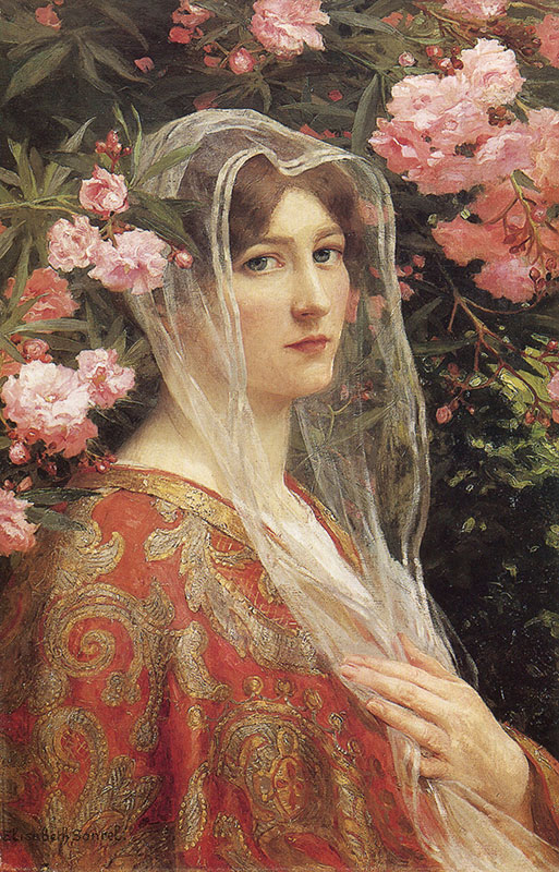
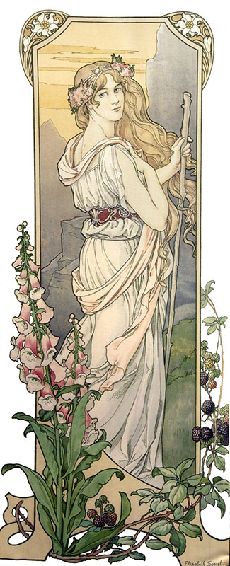
While I’m busy working on Lady of July, enjoy a look at this stunning work by female Art Nouveau artist, Élisabeth Sonrel!  While she was active at the same time as other artists of the movement, I had never heard of her until recently. 

She reminds so very much of Mucha with her line work, but has a sense of decorative layout that feels more detailed and layered at times.  Definitely check her out for a lovely array of painterly and graphical work!

If you want to see more of these art features, view them all at once here. 

PS.

I plan to start doing these little ‘Unknown Nouveau‘ entries, so I have something to share during those slow times when I’m busy working and don’t have much to show yet!  The art keeps me inspired and is something I love sharing with you all. What do you think?  

Also, do you know any other Art Nouveau artists I might not have heard of?  Let me know in comments!

DESIGN DIARY: Ladies of the Months Logo

As most of you know, I’ve been neck deep in the Ladies of the Months series for the past couple of years!  I’m over halfway done with the whole set of 12 paintings (and matching masks).  It’s high time I created a logo for this project!  Having a logo would provide the perfect professional touch to my branding!  I could use a sticker for envelopes, a symbol for a letterhead, or a stamp on wrapping.  Imagine the possibilities!

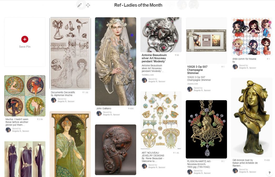
As ever, Pinterest was the first place I turned to for brainstorming!
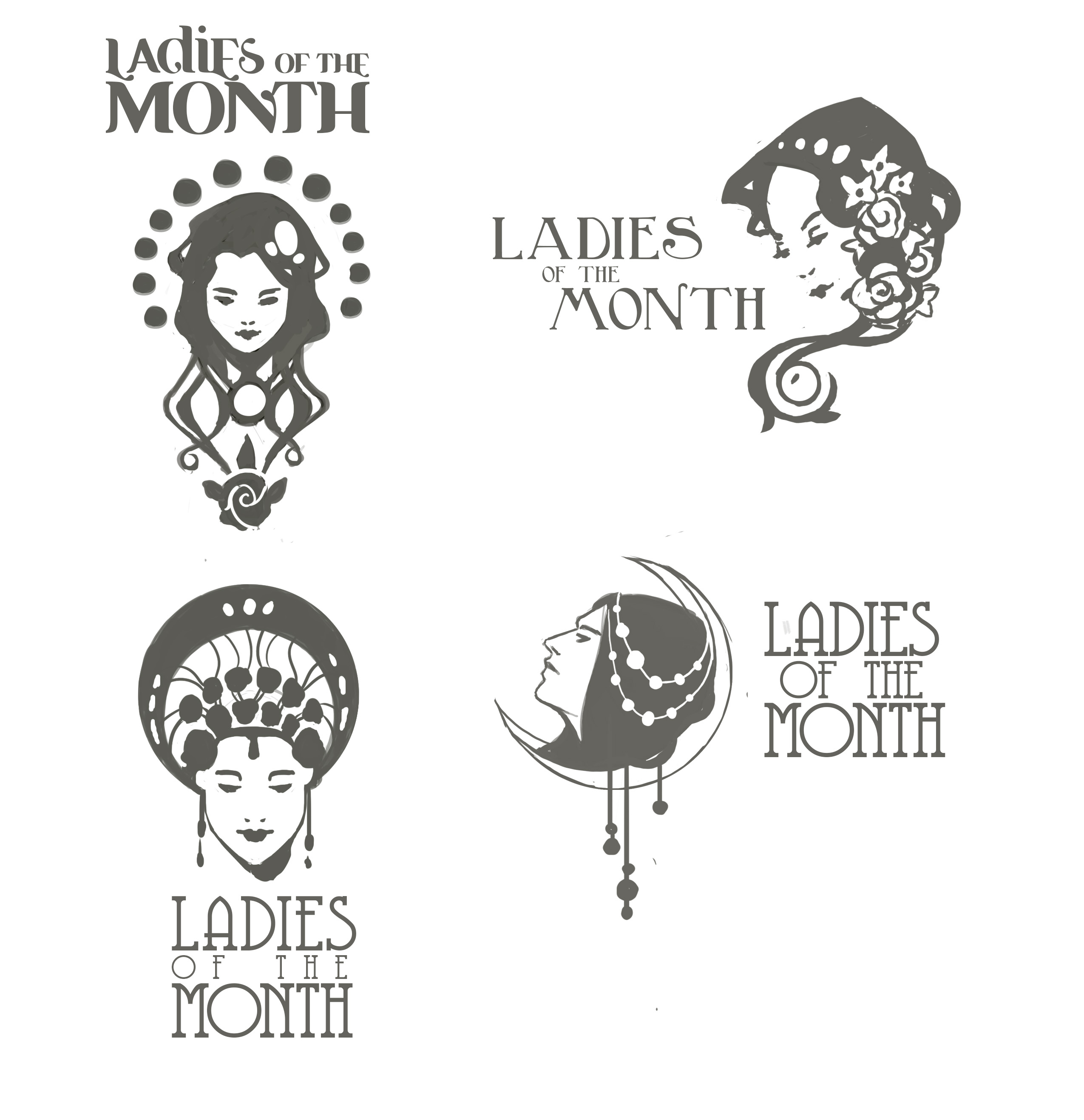
I actually began design work for this series when I first started the project, but the process has been difficult for me.  I don’t have much practice designing with text.  I’m also my worst client!   I wasn’t sure exactly what I wanted, but I knew what I didn’t want, which was every design I seemed to come up with.  I started with random doodling with some common Art Nouveau shapes to get the creative juices flowing.  The biggest problem with many of these designs is that they were too detailed to be clear and legible logos.  I wanted to include 12 circles to represent the birthstones, but this seemed to be asking too much!
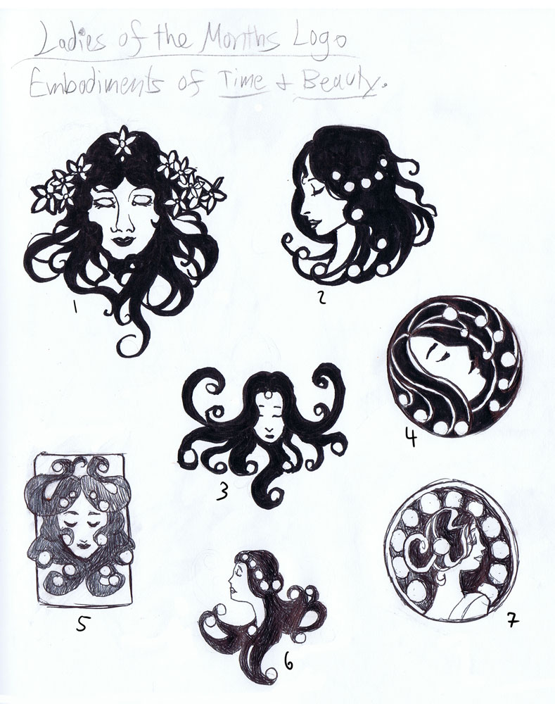
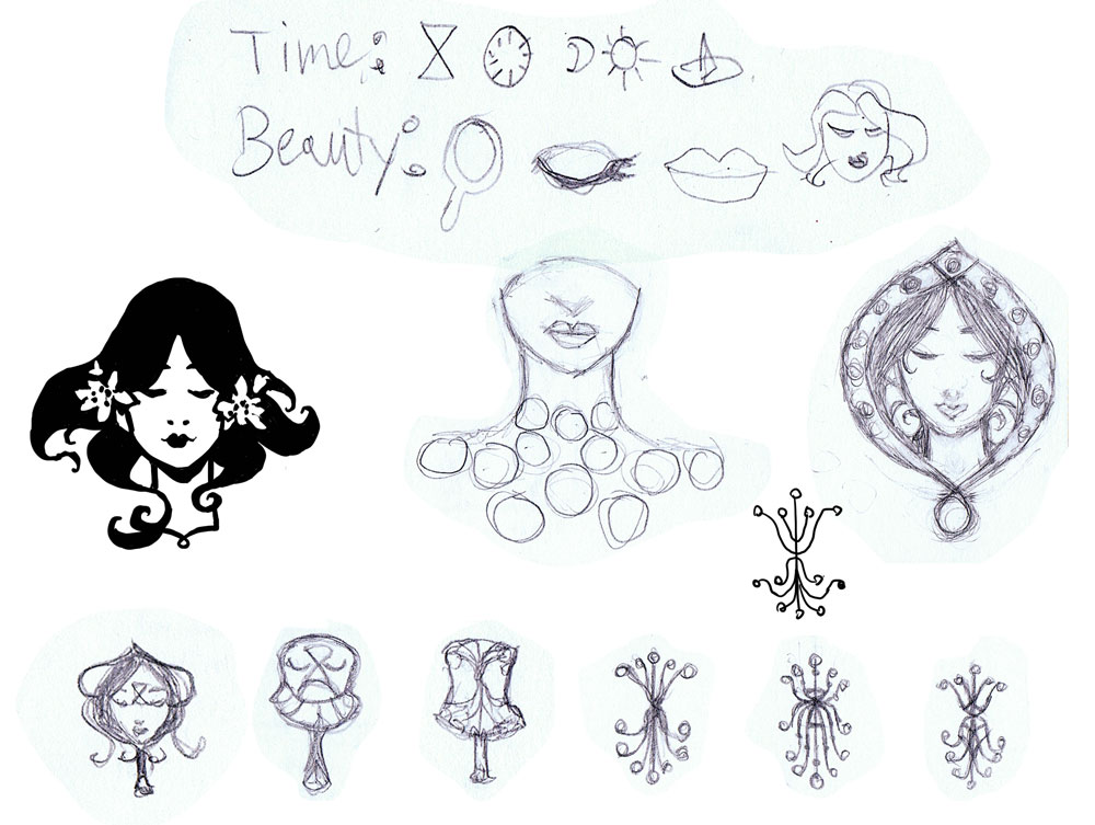
Next, I did even more sketches using an ideation exercise I learned from Greg Spalenka’s Artist As Brand book.  He suggested brainstorming for logos by using keywords from your brand and creating pictographs for the words.  Then, you could use the pictographs as starting shapes.  I went with the words ‘time’ and ‘beauty’ and came up with some interesting shapes that pervaded the logo ideas from this point onwards.

None of the logos from the pictograph sheet really worked either.  They were still too complex or just didn’t capture the themes in an appealing way. I was getting closer to what I wanted, however!


My design-minded friend, Sam Hogg, also took a bash at the Ladies logo, which helped me get more ideas of how to incorporate text as well as design, something I honestly hadn’t been thinking about!  Again, I found myself more attracted to the self-contained logos, like the one on the bottom left of Sam’s sheet.  I can’t express how important and helpful it was at this point that I had someone to bounce ideas off of!  Having feedback helped me get outside of my own head and limitations
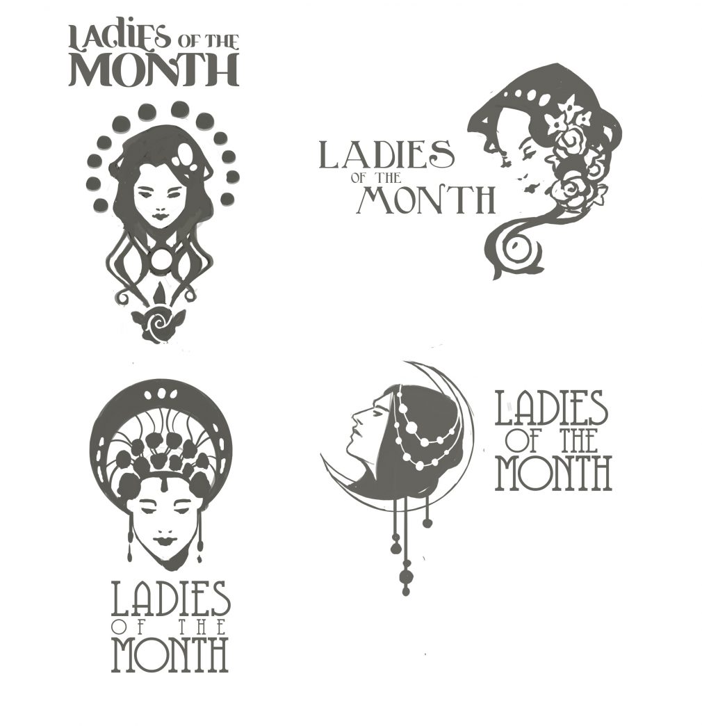
As serendipity would have it, I received my copy of Mucha’s Le Pater during this process, which inspired the moon-shaped container form in the next sheet.  Next, I researched countless references of Art Nouveau jewelry and cameos to see how Art Nouveau masters of the past utilized the shape of a woman’s head with a decorative backdrop.  I liked the container shape of a circle, but also the asymmetry the flowing hair creates, especially in number 4.


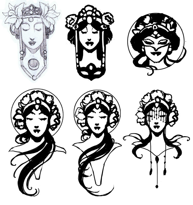
At this point, I left the design for awhile.  The ideas needed to gestate!  When I finally returned to my favorite idea on the last sheet, I decided to use it as another starting point, exploring the idea of bringing the mask back into the design, since the masks are also part of the series.  I also saw this sketch from Mucha’s Documents Decoratifs that triggered my ‘eureka’ moment.  I finally knew what I wanted!

I eventually ditched the mask in favor of simplification, as it is the flowers and the Lady who are still the most central themes of this series.  The middle logo in the bottom row is the one I’ve chosen to finalize, as it combines the appeal of the asymmetrical flowing hair with the container shape of the circle.  It hits all my sweet spots and manages to include flowers that aren’t overbearing!
I hope you’ve enjoyed your Patreon-only sneak peek at this historic milestone in the Ladies of the Months’ development.
Stay tuned for the final logo reveal!
JordanCon Art Show Award!

This past weekend, I went to a convention for the first time in 2 years!  I had honestly been anxious about it all week.  Would everyone at my panels think I was an imposter?  Would my work do well?  Would my breath be stinky???  Aaaah!  I was a wreck!

Thankfully, JordanCon was a small, chill convention full of really passionate,  chill people who loved fantasy, just like I do!  Imagine my surprise when I mosied in on Sunday and realized that my Lady of November  piece won Judge’s Choice?!

The judge this year was Stephen Hickman, an amazing artist in his own right who I’m so delighted to learn more about thanks to this interaction.  Stephen is also writing and illustrating his own fantasy work at a caliber I hope to reach some day, and that is very inspiring to me!

Stephen and other artists also gave me great feedback on just how professional my panel at the con looked, which means I’m doing something right with the multimedia setup I had been obsessing over for this series!

Also inspiring was meeting so many of the artists and fans of my work at the show (like Amanda Makepace , Melissa Gay , and Lea Evans , who are also fellow artists).   Their enthusiasm was infectious and just the shot in the arm I needed to get back to the Ladies of the Months series with gusto!

I’m hoping to make time to do a more business-oriented convention report regarding JordanCon sometime soon, but we’ll see!  I’ve got to get back to work on Lady of July, who has been more than a little neglected thanks to all this hubbub.

Till next time!

– Ang

Find Me at JordanCon 2017!

 
If you’re going to JordanCon this weekend, here’s my schedule and where you can find my work!
Hope to see you there!  It’ll be my first convention in awhile and I’m excited to be back in the scene.
 
– Find my Fantasy Art on dice bags and playmats in the Print Shop (in the Art Show area)
– Find my Art Nouveau birthstone series on prints in the Print shop, as well as matted and signed prints in the Art Show.
– Find my birthstone themed masks on display next to the matted prints in the Art Show.
 

My Panels at JordanCon:


FRIDAY, 4-21, 2:30-3:30 pm, Monroe.
 
Painting an Art Nouveau Lady
 

I’ll be showing a video, talking briefly about Art Nouveau, and giving a demo on drawing Art Nouveau style hair!


SUNDAY, 4-23, 1-2 pm, Washington.
 
Selling Your Art Online
 
I’ll be on a panel with multiple artists discussing everything related to selling art online, from Patreon and beyond!

[VLOG] Print Shop Prep!

Here’s a quick peek recorded live of the print shop prep for my next convention! I haven’t done a convention in a couple of years since I took the time to create a new body of work, but getting back into prep has been like riding a bike!

Some advice on buying and saving money:

– BAGS & BACKING – You can get backing made out of spare matboard for cheaper than the white boards. The Clearbags branded bags are also cheaper and have a tiny URL for the bag company on the adhesive strip.

– PRINTING & INK – I bought my Epson printer at Staples where they let me trade in an older printer for a $50 discount. They’ll also let you trade in used ink cartridges which earn you store credit vouchers. The Staples brand paper is also much cheaper than Epson branded paper and has more weight to it!

The Epson Artisan 1430 I have lets me print up to 13×19 inches, which is a nice size! Anything larger I will have printed at http://www.iprintfromhome.com. Tell them Angela Sasser sent you to earn some referral bucks!

(CORRECTION: They DO have gloss photo paper at Staples, but it never seems to be in stock at mine and I prefer matte or semi-gloss for printing my art, regardless.)

– MAT CUTTER – The Logan Compact Mat Cutter can be found in many of the hobby stores in the US like Michaels, Hobby Lobby, Joanns, etc. where you’re generally able to use a 40% off coupon on them!

(NOTE: I have a master list of my favorite suppliers with reviews of each online here.)

SUPPLIES:

– Epson Artisan 1430

– Staples Premium Matte Photo Paper

– Avery Full Sheet Labels

– Logan Compact Mat Cutter

– Paper Cutter

SUPPLIERS:

– Bags & Backing

– Custom Playmat Printing

– Dice Bags

SKETCH DIARY: Lady of June

My journey continues this month with Lady of June!  Lady of November represented a milestone of high quality and attention to detail in this series that was hard to beat!  How could I make the rest of the Ladies as good as November?  That was the difficult challenge I set for myself as I moved on to this month and ventured into the first of the Ladies of summertime!

After the dark whimsy of Lady of November, we’ve returned to the Ladies of Summer!  Admittedly, this Lady has been a challenge thus far.  While November had a lot of amazing imagery to play with, June is more of a subtle time of year.  Its celebration of youthfulness and young brides reminds of May’s themes, with one of the only unique events being the Summer Solstice.  I’ve been struggling to find Lady of June’s unique visual story to make her different enough from the other Ladies, but that’s what research is all about!

MOOD BOARD

One of the most prominent themes I found while researching the Summer Solstice via Pinterest image gathering was the celebration of Litha and the Sun Wheel.  The Solstice celebrates the reigning power of the Sun.  The Sun Wheel was an old tradition where a representation of the sun was set aflame and rolled down a hill to symbolize its shifting phases.  As soon as I saw the Wheel, I knew it’d be the perfect inspiration for the mandala window!

RESEARCH NOTES

Research for the Ladies always begins with the origin of the month’s name.  In this case, June was named for Juno, the goddess of marriage and well-being of women.  She was also wife to Jupiter/Zeus.  I look across different cultures and see what about this time of year strikes a chord with humanity.  June in the northern hemisphere is a high point of Summer, a time of divination, and a powerful phase of feminine power.

Writing notes helps me to search out the imagery and symbolism I want to include in this Lady’s painting.  I think of flowers, plants, and brides.  The symbol of the well as a tool of divination also struck a chord with me, which is why it shows up so much in my thumbnail sketches.


 THUMBNAIL SKETCHES

Many of these thumbnails explore using water in a well or pond as a divination tool.  2 and 4 feel a little close to Lady of March, with 4 feeling a bit more like a representation of Vanity.  3 captures a more traditional bridal theme, while 1, 5, 6, and 7 seem to capture that theme of a bride searching for her love in the reflection for a more unified theme.  In the end, my favorites are 1, 5, and 6, with 5 and 6 having the clearest shapes and classical feel.

Character Posing

Read more

NEW PATREON PERKS: Private Discord Server

Dear Patreon Patrons. Welcome to my secret Patreon Parlor!  The Patreon perks for those pledging at $5 and up now include access to a private Discord server where you can come chat with me about life, art, and more!  (Don’t have Discord yet? It’s a completely free chat and messaging app for your computer and phone that you can download here!)

Here’s a little rundown of what you can do on the server.  Watch the video for a visual look at Discord and/or read ahead to see what it’s all about! Read more