As most of you know, I’ve been neck deep in the Ladies of the Months series for the past couple of years! I’m over halfway done with the whole set of 12 paintings (and matching masks). It’s high time I created a logo for this project! Having a logo would provide the perfect professional touch to my branding! I could use a sticker for envelopes, a symbol for a letterhead, or a stamp on wrapping. Imagine the possibilities!
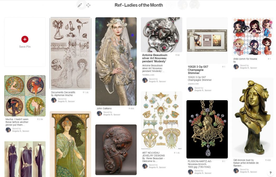
As ever, Pinterest was the first place I turned to for brainstorming!
I actually began design work for this series when I first started the project, but the process has been difficult for me. I don’t have much practice designing with text. I’m also my worst client! I wasn’t sure exactly what I wanted, but I knew what I didn’t want, which was every design I seemed to come up with. I started with random doodling with some common Art Nouveau shapes to get the creative juices flowing. The biggest problem with many of these designs is that they were too detailed to be clear and legible logos. I wanted to include 12 circles to represent the birthstones, but this seemed to be asking too much!
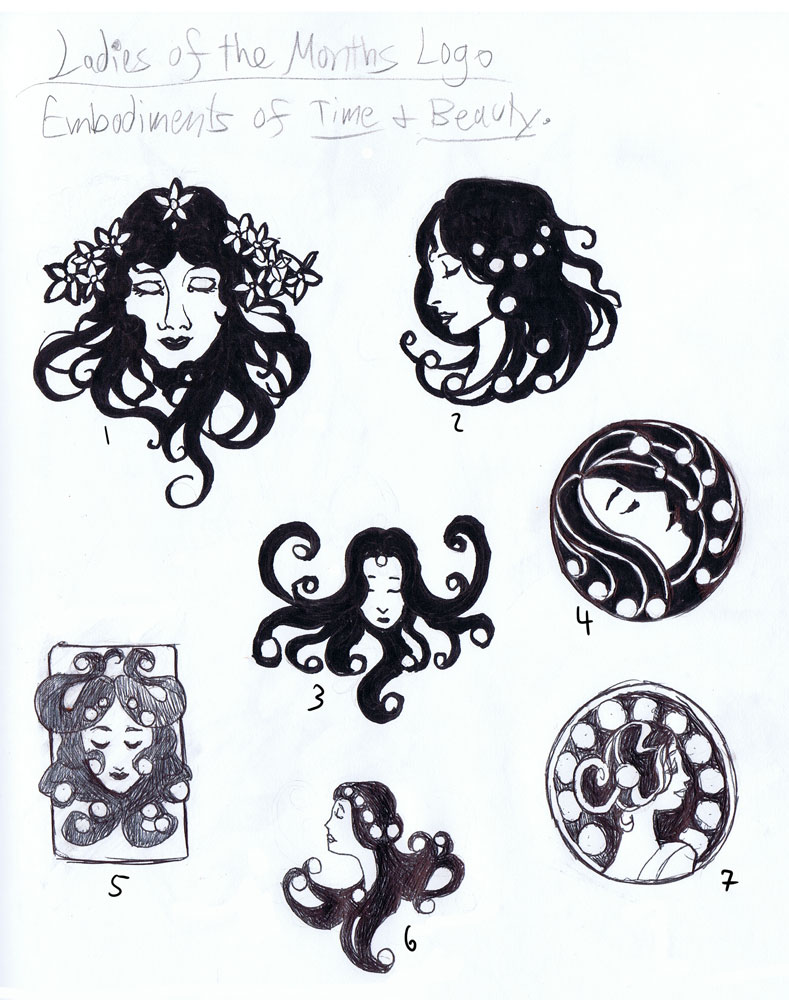
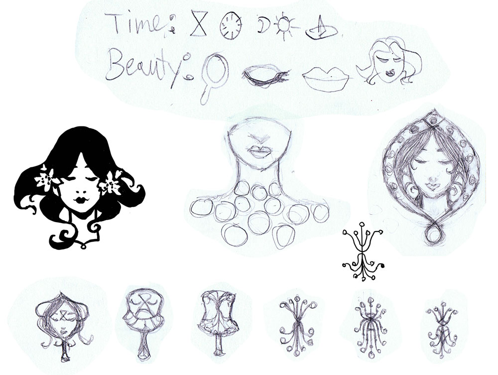 Next, I did even more sketches using an ideation exercise I learned from Greg Spalenka’s Artist As Brand book. He suggested brainstorming for logos by using keywords from your brand and creating pictographs for the words. Then, you could use the pictographs as starting shapes. I went with the words ‘time’ and ‘beauty’ and came up with some interesting shapes that pervaded the logo ideas from this point onwards.
None of the logos from the pictograph sheet really worked either. They were still too complex or just didn’t capture the themes in an appealing way. I was getting closer to what I wanted, however!
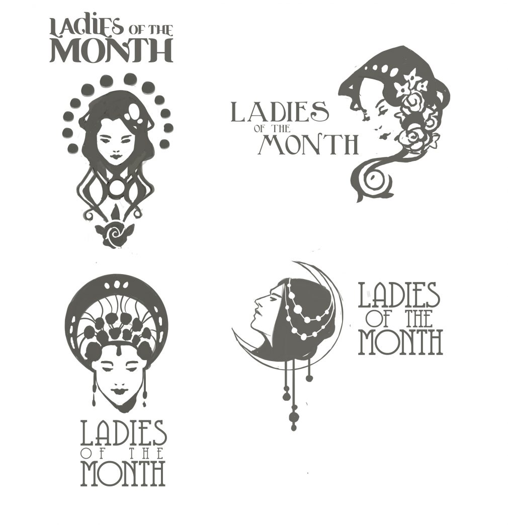
My design-minded friend, Sam Hogg, also took a bash at the Ladies logo, which helped me get more ideas of how to incorporate text as well as design, something I honestly hadn’t been thinking about! Again, I found myself more attracted to the self-contained logos, like the one on the bottom left of Sam’s sheet. I can’t express how important and helpful it was at this point that I had someone to bounce ideas off of! Having feedback helped me get outside of my own head and limitations
As serendipity would have it, I received my copy of Mucha’s Le Pater during this process, which inspired the moon-shaped container form in the next sheet. Next, I researched countless references of Art Nouveau jewelry and cameos to see how Art Nouveau masters of the past utilized the shape of a woman’s head with a decorative backdrop. I liked the container shape of a circle, but also the asymmetry the flowing hair creates, especially in number 4.
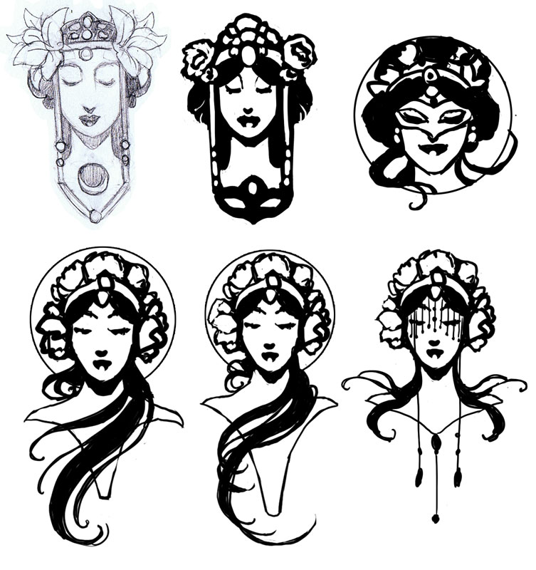
At this point, I left the design for awhile. The ideas needed to gestate! When I finally returned to my favorite idea on the last sheet, I decided to use it as another starting point, exploring the idea of bringing the mask back into the design, since the masks are also part of the series. I also saw this sketch from Mucha’s Documents Decoratifs that triggered my ‘eureka’ moment. I finally knew what I wanted!
I eventually ditched the mask in favor of simplification, as it is the flowers and the Lady who are still the most central themes of this series. The middle logo in the bottom row is the one I’ve chosen to finalize, as it combines the appeal of the asymmetrical flowing hair with the container shape of the circle. It hits all my sweet spots and manages to include flowers that aren’t overbearing!
I hope you’ve enjoyed your Patreon-only sneak peek at this historic milestone in the Ladies of the Months’ development.
Stay tuned for the final logo reveal!
