In the last process post, I covered the basic planning sketches for The Snowflake Lady. With thumbnails and the basic gist of the image figured out, it was time to start getting detailed!
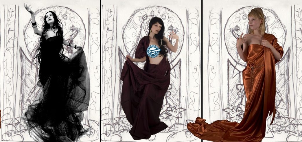
I started out by browsing my collection of stock images and seeing if there were any poses that could work for what I had in mind. I like to use photo references when they’re available to help add a level of realism that I still find difficult to draw directly out of my head. Eventually, I narrowed my choices down to the following three poses, which all conjure the image of a graceful lady reaching for a snowflake. I quickly dropped out the background on these images using Photoshop’s Magic Eraser tool, then overlayed them on top of my window layout:
 |
| Pose 1 courtesy of Nanfe-stock. Poses 2 & 3 courtesy of Almudena-Stock. |
Pose 1 added a level of movement to the composition with her outstretched arm, tilted head, and swirling dress. The other two poses were both lovely, but somewhat static, in comparison. After consulting with a few friends for a second opinion, I finally went with pose 1.
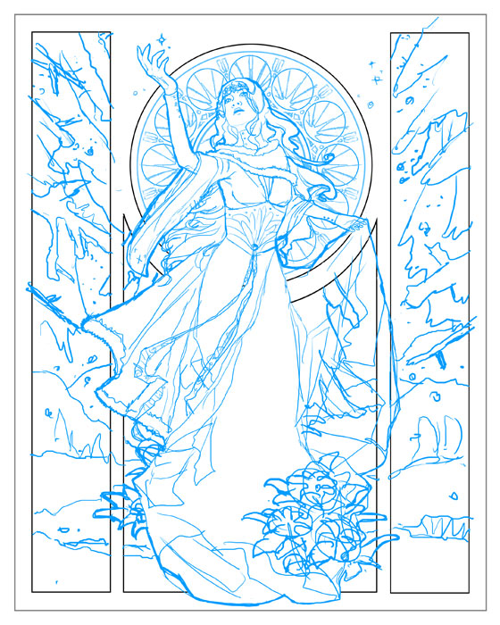
Next came a preliminary sketch done in digital blue! Which I like to use since it’s easier to transfer tell where you’ve drawn over when you are transferring the image using graphite transfer paper (or the ‘poor man’s transfer paper’, which is rubbing charcoal on the back of the image and then bearing down hard as you trace the lines on the front side). I refined the details in this blue sketch phase, though you’ll notice I left some things generic, like the poinsettia, because it’s easier to refine specifics like that after you’re done transferring.

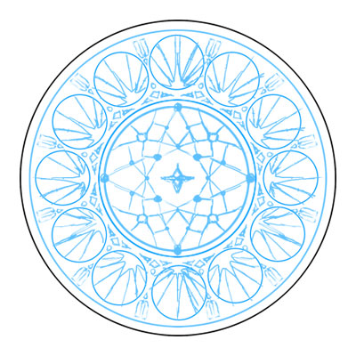
The stained glass window was actually designed first without the figure in front so I could get a better sense of how I wanted the patterns to look and flow. Doing this digitally meant I could hide and unhide the figure to see how the stained glass lined up in the composition, making it easier to adjust as needed. I also could easily copy and paste sections of the window to make it perfectly geometric instead of drawing it all by hand. The stained glass utilizes a simple starry night theme.
Next, she was transferred to 11×14 in. illustration board where she received a good deal of refinement in pen (Copic Multiliner SP pen with a 0.1 mm and .003 mm tips). I had to tape two 8.5×11 in. print outs together in order to cover the whole 11×14 in. piece of board. I made a few mistakes in the stained glass while I was inking because I trusted my hands instead of using a circle template. Too much coffee & green tea do not steady hands make! Compass and circle templates are your friend. I have a circular drawing ruler that’s especially useful for this purpose!
