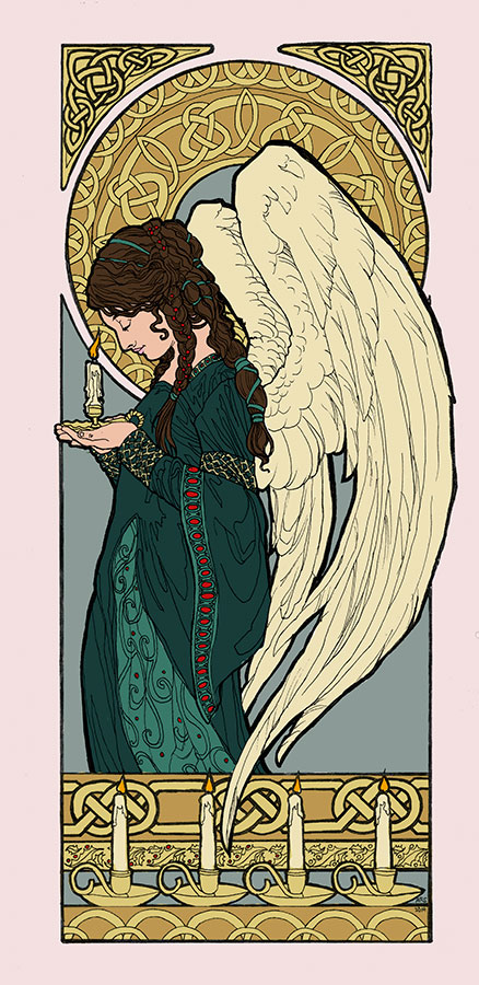
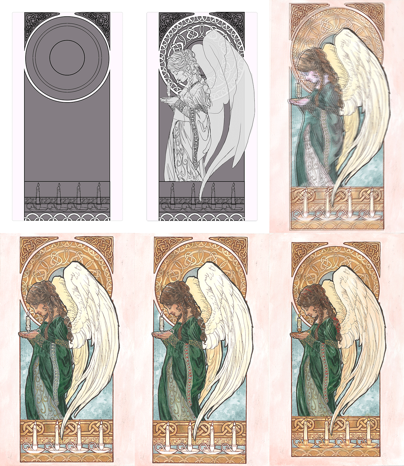
Progress continued on this painting with color testing in Photoshop. This one was a no brainer! I knew I wanted a more subtle color scheme that wasn’t so IN YOUR FACE CHRISTMAS! That meant keeping colors like the strong red to a minimum and relying a nice cool green, as opposed to the more yellow green you see for Christmas motifs.
I always recommend doing a color test so you don’t end up having to start all over again because a color ruined your entire piece. Traditional media is unforgiving like that.

The only element I was torn on were the candles. Should they be red or white? I ended up going with white just to keep with the theme of subtle Christmas hues.
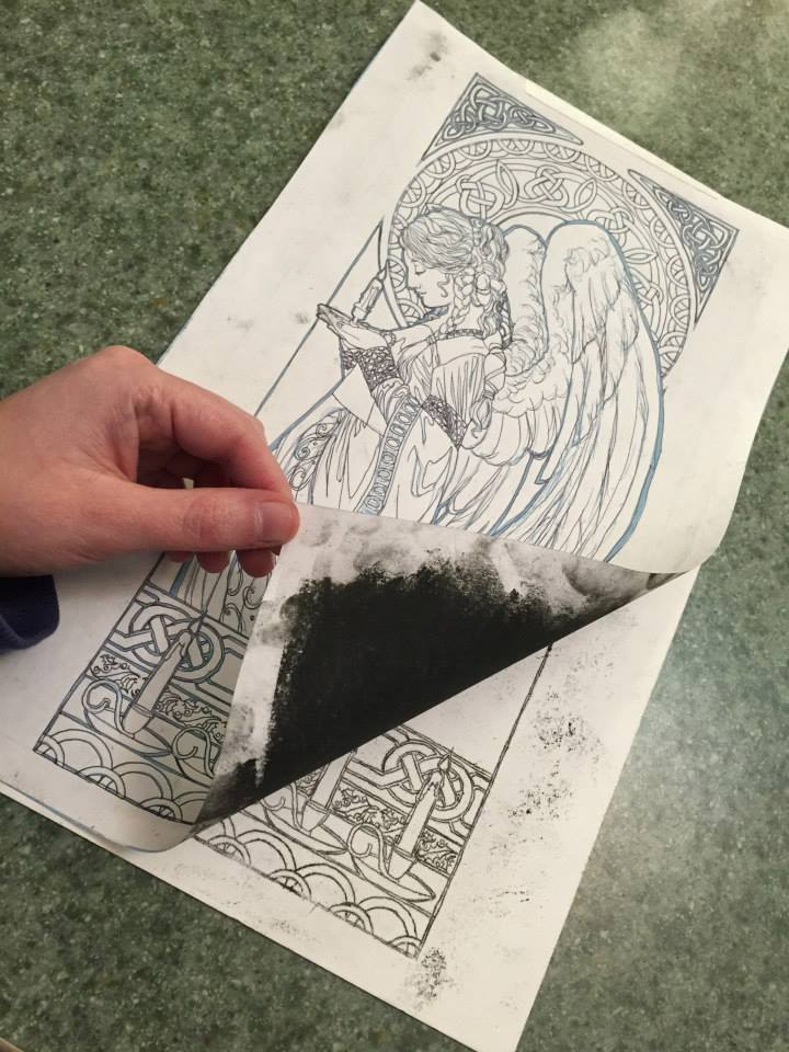
Next, I transferred the image to the illustration board by printing out the line art, rubbing the back of the print out with a soft (6b) graphite stick, then tracing the designs with a fine point pen. The line art is printed in blue on the print out so that when I trace the lines with a pen, I can tell where I’ve already traced. The pressure from the tracing transfers the drawing to the board. Be sure to wipe the excess dust off before you trace just so you don’t get speckles like I did in mine!
I ended up going with red ribbons by the end, since her hair would have been too monotone with the green ribbons.

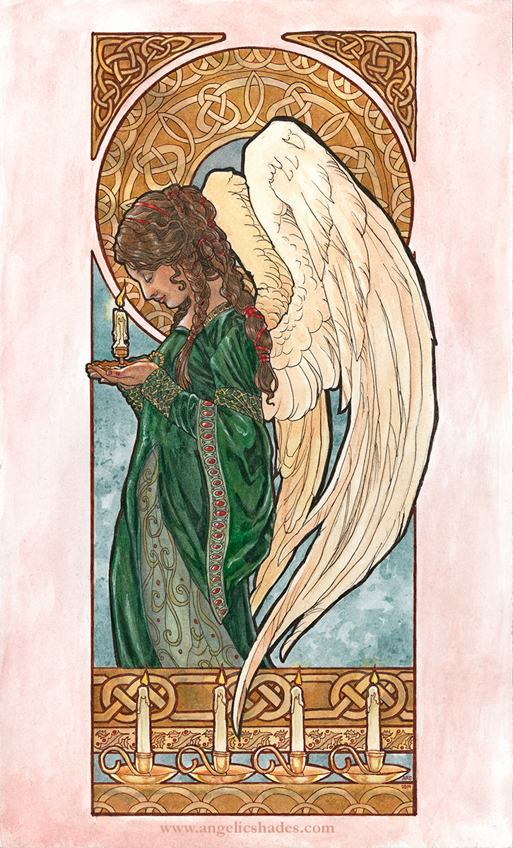
Without further ado, the finished painting!

Cards and Art Gifts – http://www.deviantart.com/print/37246289/
Original for Sale Direct From Artist:
– Unmatted – $650
– Matted and Framed – $750
* Shipping to be determined based on your location.
E-mail me if interested.
Materials Used:
- A mix of M Graham and Terry Madden paints.
- White gel pen for highlights.
- Strathmore wet media illustration board.
- Susan Schewe watercolor brushes.
- Brown and Sepia colored Micron pens (0.1 and 0.5mm sizes).
