Category: sketch diary
 Unlock with Patreon
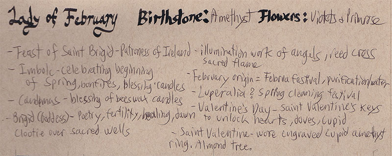
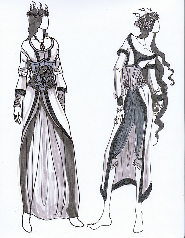
SKETCH DIARY: Lady of February Part 1
Sketch Diary – Winter Offering
Inspiration: Every year I do a painting to spread the cheer of the winter holidays to my fans, friends, and family. Keeping in that tradition, I created this piece entitled “Winter Offering” for 2015.
I wanted to capture the quiet warmth of candles, which are one of my favorite decorative elements of the season, and pay homage to some of the Celtic traditions that define the holidays with the presence of evergreen holly and pine. I also wanted a celestial theme for the window to represent the dark, cold winter nights which the light guides us through.
Tools and Techniques
For this painting, I used Photoshop CC and a Wacom Cintiq 21UX.
References

A selection from my references.
Art Process
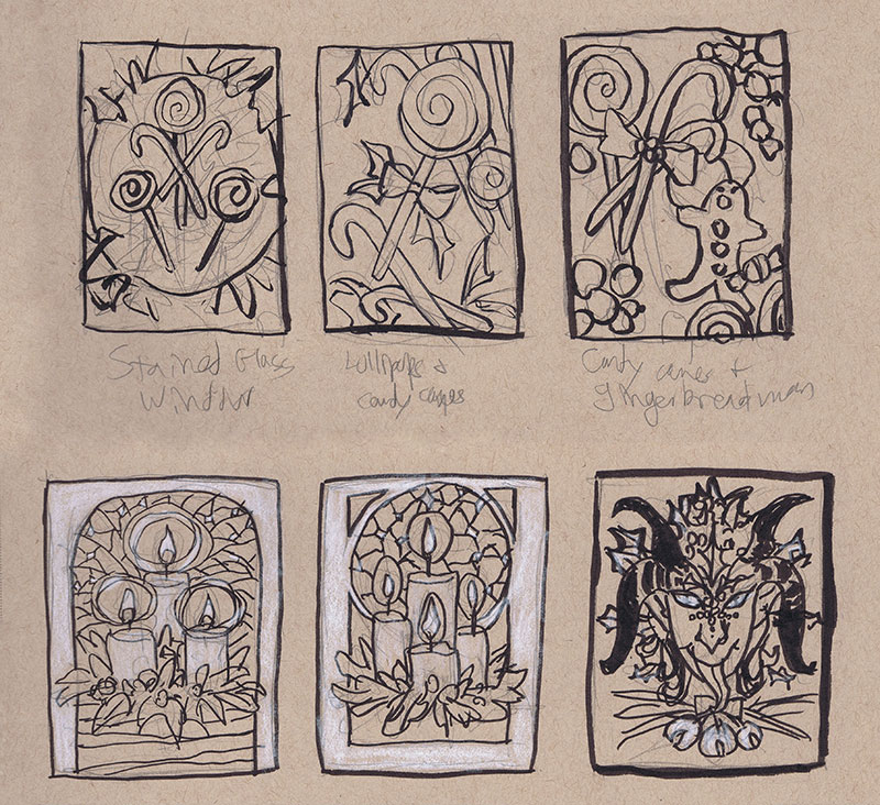
Step 1 – Thumbnail sketching with ink and white color pencil on toned paper to find the right idea. At first, I wanted to do a candy theme, but the candles struck me with their simplicity and elegance. The Krampus one was also a fun contender, but I decided to save him for another time.
Step 2 – Reference gathering! I looked at many Tiffany glass windows, wreaths, and white candles for inspiration. I keep a secret reference board for my yearly holiday images on Pinterest.
Step 3 – I did a rough sketch in Photoshop keeping loose and quick. The sketch was then printed out and refined with pencil sketching on top of the lightly printed line work.

Step 4 – This refined sketch was then scanned in and the lines turned blue so they could be easily transferred. I also used the same refined sketch to do a digital color test so I had an idea of my colors before I put paint on paper.

Step 5 – The refined sketch with blue line work was then printed and transferred with graphite dust applied to the back of the printout.
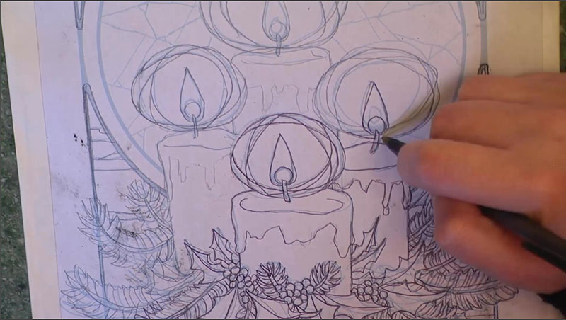
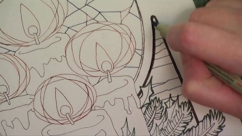
Step 6 – The transferred line work on the illustration board were inked with various colors of mechanical pens for visual contrast and interest.
Step 7 – The ink drawing was finished with watercolor paints.

You can also watch the 5 minute time lapse video of how I created this painting here!
For more in-depth instruction on how I created this image, including the brands of materials I used, tips on creating a stained glass style in watercolor, etc., pledge to any $10 and up level on my Patreon to gain access to the narrated video tutorial!
You can also buy the individual tutorial separately at my Gumroad shop, but you won’t receive the other extras you would by purchasing via Patreon.
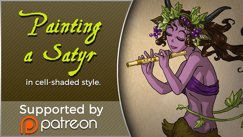
Sketch Diary – Satyr
Inspiration
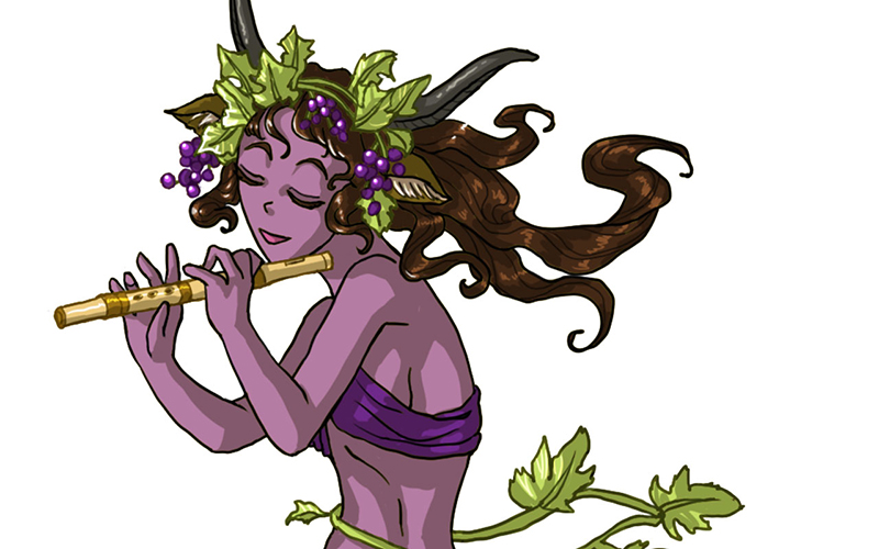
 Today I’ll be talking about how I created Satyr for the 30 Day Monster Girl Challenge. For my version of Satyr, I went with my own fantasy twist of a well-known figure from Greek and Roman mythology.
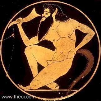
The Satyr of myth is usually a mischievous male with the lower body of a goat who is known to lecherously pursue nymphs and dryads. The Satyr were also drinking buddies with Dionysus, the god of wine and merriment.
For more about the Satyr, check out one of my favorite Greek mythology resources, http://www.theoi.com.
Tools and Techniques
For this painting, I used Photoshop CC and a Wacom Cintiq 21UX.
Concept Inspiration
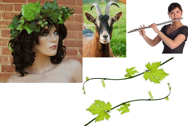
For my Satyr girl, I wanted to go with the theme of grapes to honor Dionysus and his wine, so she ended up with a purple complexion crowned with grapevine adornments. Like many Satyrs, she is also a player of instruments, in this case a flute.
References
A selection from my references for Satyr.
Art Process
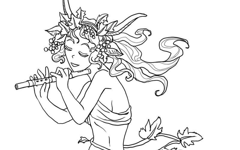
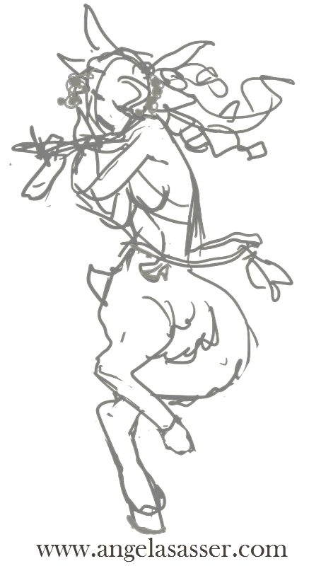
Step 1. Quick digital gesture drawing done to capture the movement and energy of the pose. This isn’t very precise and is more about energy than accuracy.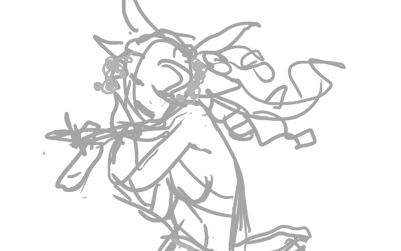
Step 2: A cleaner line art is drawn on a layer atop the gesture. I used Lazy Nezumi Pro set to ‘subtle’ to help stabilize my lines in Photoshop and make them smoother.
Step 3: Added a base layer of color so no background color will accidentally show through.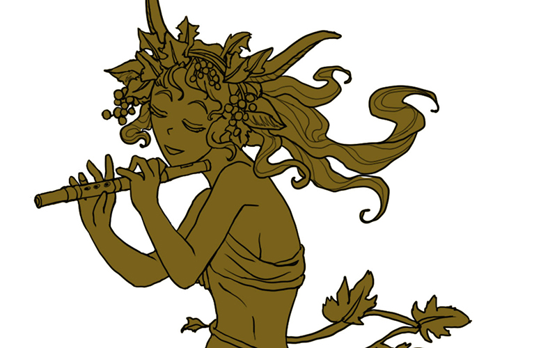
Step 4: Added the flat colors after much deliberation on what her skin color should be.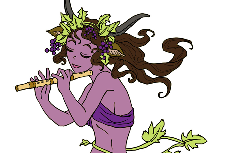
Step 5: Colorized the lines to make the grapes, grapevine, and flute stand out.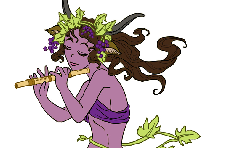
Step 6: Added a shadow layer using warm grey above everything clipped to the Group and set to Multiply.
Step 7: Added a highlight layer painting in white set to Overlay. Also clipped to the Group.
Step 8: Final touches of pure white in key places such as the leaves, grapes, and hair to help lead the strengthen the focus, flow, and dimensionality of the piece.
For more in-depth instruction on how I created this image, Pledge to any $10 and up level at my Patreon to gain access to the narrated video tutorial! You can also buy the individual tutorial separately at my Gumroad shop, but you won’t receive the other extras you would by purchasing via Patreon.
You can watch a video preview of the tutorial for Satyr without narration here:
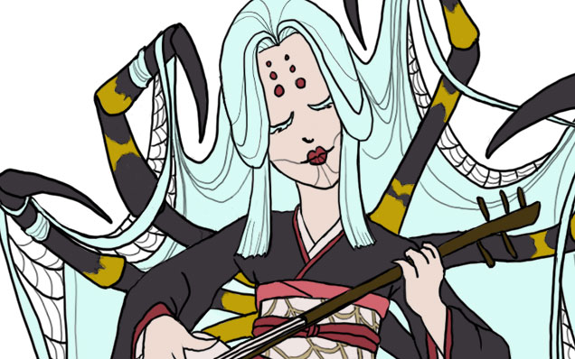
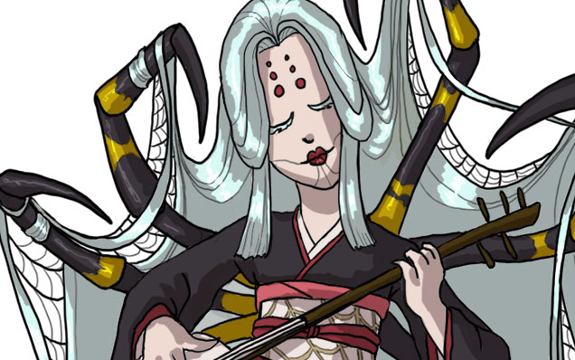
Sketch Diary – Monster Girl Spider
Inspiration
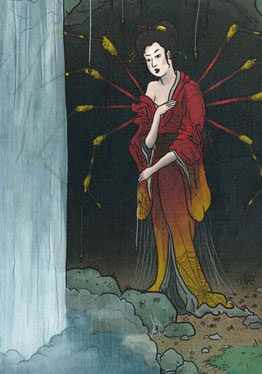
Today I’ll be talking about how I created Spider for the 30 Day Monster Girl Challenge. For my version of spider, I went with a Japanese inspired Jorōgumo.
The Jorōgumo is a mythological creature from Japanese folklore which was known for luring virile young men to their lairs, charming them with food and music, then binding them up in their webbing so they could devour them.
Jorōgumo means “binding bride” or “whore spider”, but is also a word which refers to a particular species of golden orb weaver spiders in Japan. For more info on this fascinating folklore, check out www.yokai.com
Tools and Techniques
For this painting, I used Photoshop CC and a Wacom Cintiq 21UX.
Concept Inspiration
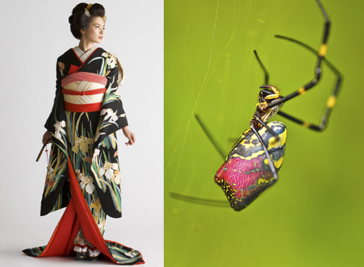
I took a lot of visual inspiration from the golden orb weaver (nephila clavata) of Japan. My Spider has many of the same markings as decorative designs on her kimono and her color palette echoes the spider’s. Her kimono is also inspired by a bride’s as a nod to the “binding bride” namesake.
References
A selection from my references. I had many more of the spider from multiple angles, but I’ll save you the nightmare fodder!
Process
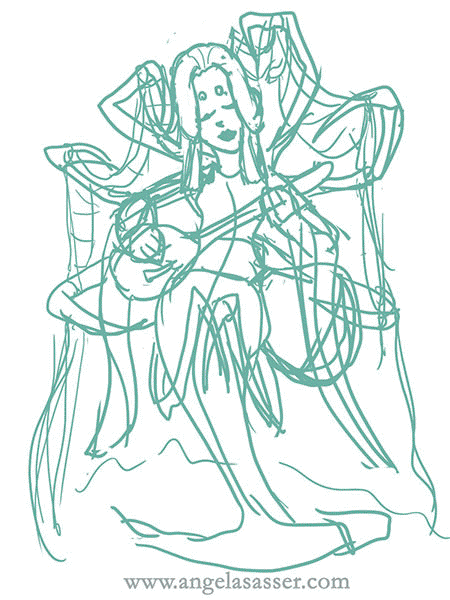
Phase 1 – I doodled a rough sketch in turquoise to make it easier to see when I inked on top.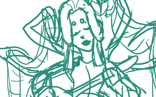
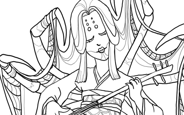
Phase 2 – Line art created with a hard round brush.
Phase 3 – I laid in flat colors using the selection magic wand to select areas and Edit>Fill.
Phase 4 – A shadow layer set to Multiply was created that was clipped as a mask to the entire Group of colors.

Phase 5 – A final touch of highlights was added with white. The highlight layer set to Overlay.
Animated process GIF.
You can also watch a sped up time lapse video of the process here.
For more in-depth instruction on how I created this image plus a downloadable PSD of the image, Pledge $10 and up on my Patreon to gain access to the narrated video tutorial! You can also buy the individual tutorial separately at my Gumroad shop, but you won’t receive the extra art goodies you would by purchasing via Patreon.
You can watch a preview of the narrated tutorial here:
Sketch Diary – Nariko of Heavenly Sword – Part 2
Now that Nariko’s design is figured out, it’s on to coloring! I decided to try a new coloring technique called the Ambient Occlusion method. This technique is a way to bring a structural quality to your images relatively quickly. I used Alex Negrea’s tutorial and also this helpful process post from David Lojaya.
Here’s a breakdown of the main layers in my painting.
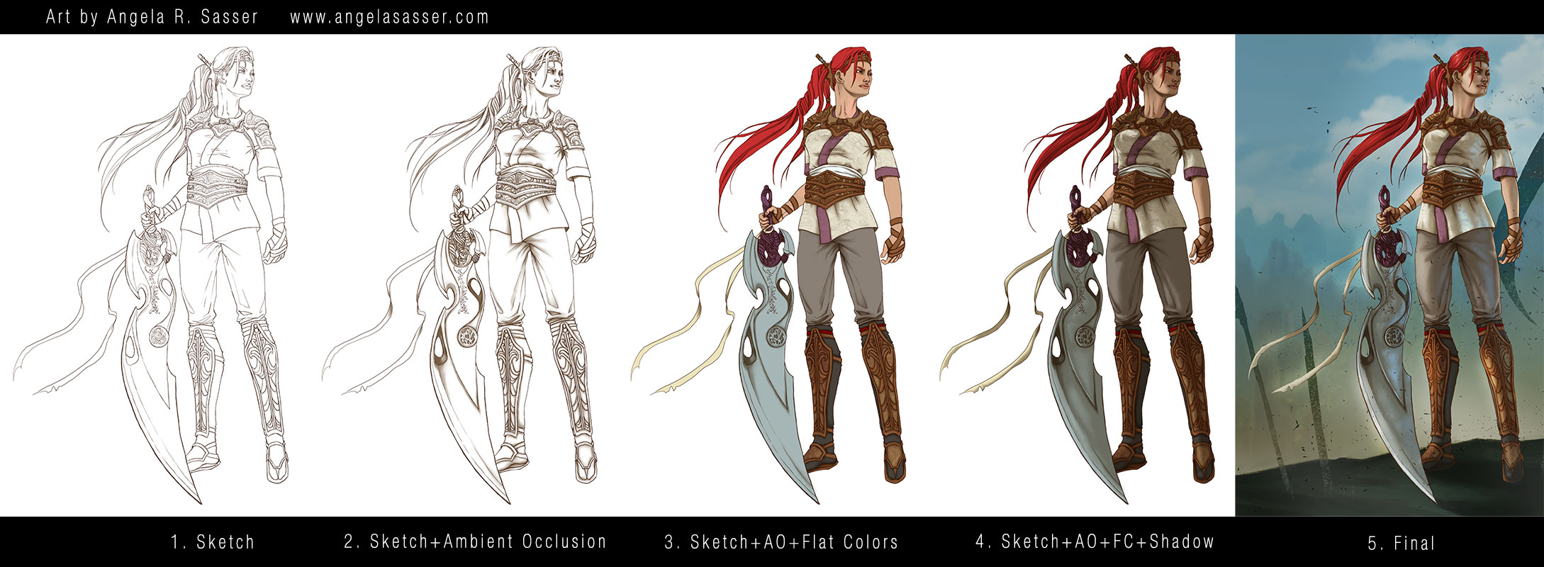
- Sketch – I produced a clean line art using the hard brush. This Sketch layer hovers above all of the other layers for the figure. Notice I didn’t sketch in pure black, but a very dark brown so as to keep my image from looking too stark. I wanted subtle warmth and for the line art to look natural. The same goes for the AO layer, which is not pure black, but a dark brown. You can tweak this coloration later to suit the mood of your piece.
- Sketch+Ambient Occlusion – The Ambient Occlusion layer sits below the Sketch and Flat Color layers and above the Shadow layer and represents places that are hard for light to enter, the deepest, darkest shadows where light is ‘occluded’. It is set to the blending option Multiply.
- Sketch+AO+Flat Colors – The Flat Colors are actually a group of layers, as I kept each color on its own layer just in case I wanted to change them later. The entire group is set to the blending option Multiply so they show the AO layer beneath them.
- Sketch+AO+Flat Colors+Shadow – The Shadow layer was clipped to a standalone layer that masked out the entire figure to keep my shadows from going outside of the lines. The Shadow layer is located below the Flat Colors group and above the AO layer.
- Final – In the final image notice I’ve actually masked out some of the Sketch layer so that the hard lines don’t look so unnatural (particularly in the area of the neck where lines are too harsh for the soft transitions there). Lighting effects have also been applied here.
NOTE: My Patreon Patrons at the $5+ reward tier have exclusive access to my .psd file, so be sure to pitch in there if you’d like to peruse my layer structure!
Tools Used:
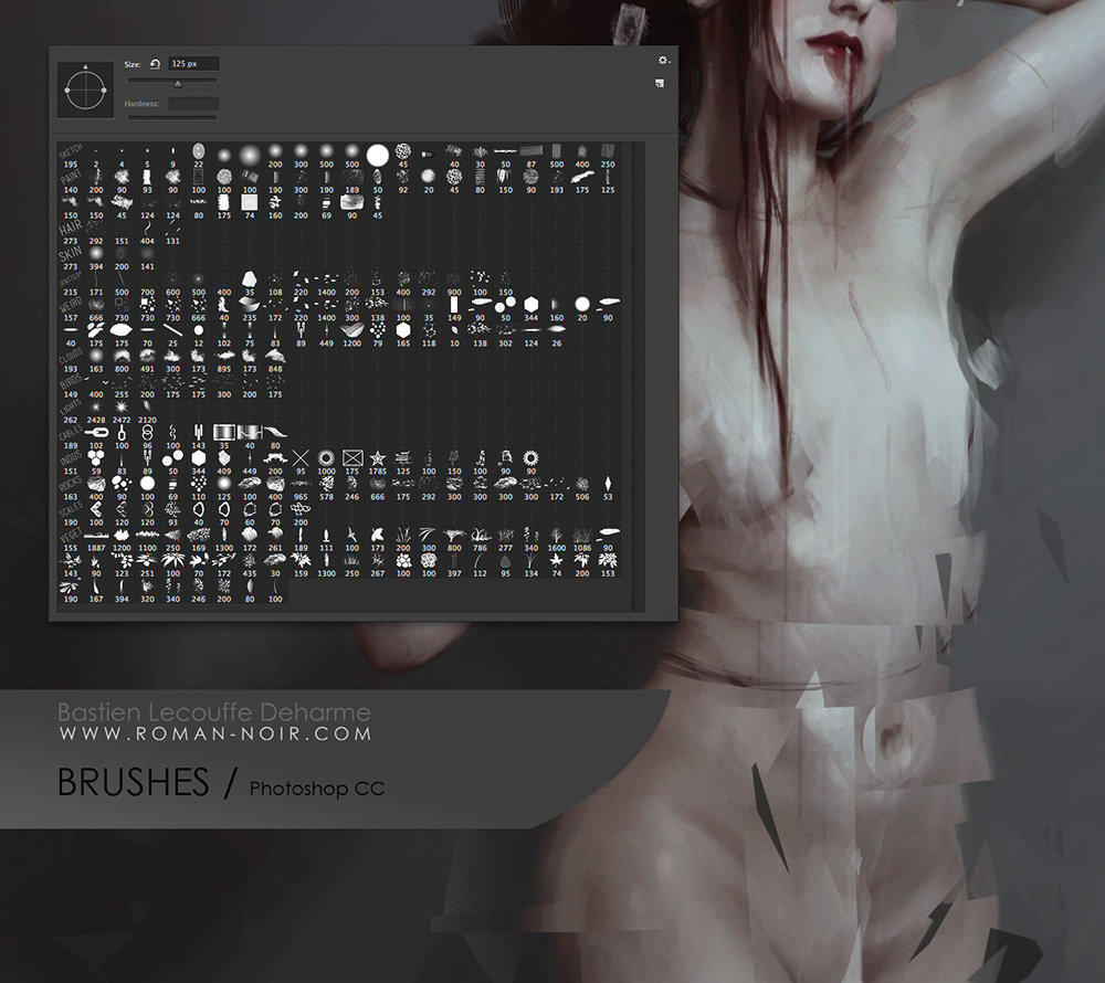
Deharme’s Brush set for Photoshop CC
Finally, here’s an animated GIF of my process (roughly 8 mb).
If you’d like to download wallpapers of the final image, I’ve provided the 1920×1080 size for free.
Also be sure to check out the article this image is featured in, What Women Want…In Women Characters for an interesting discussion of female character designs and representation.

Other sizes plus the .psd are available exclusively for my Patreon Patrons.
PRINTS AND PRODUCTS – Contact me privately if interested.
Back to Part 1
Sketch Diary – Nariko of Heavenly Sword – Part 1
I was challenged by an online art group I’m in to redesign a female character. This idea really appealed to me as a gamer and comic book fan, considering the amount of times as a female fan I’ve seen a character and found myself highly disappointed by the bland or over-sexualized design that detracted from the amazing female character at the core. Some of my candidates were my heroines growing up, from She-Ra to Psylocke!
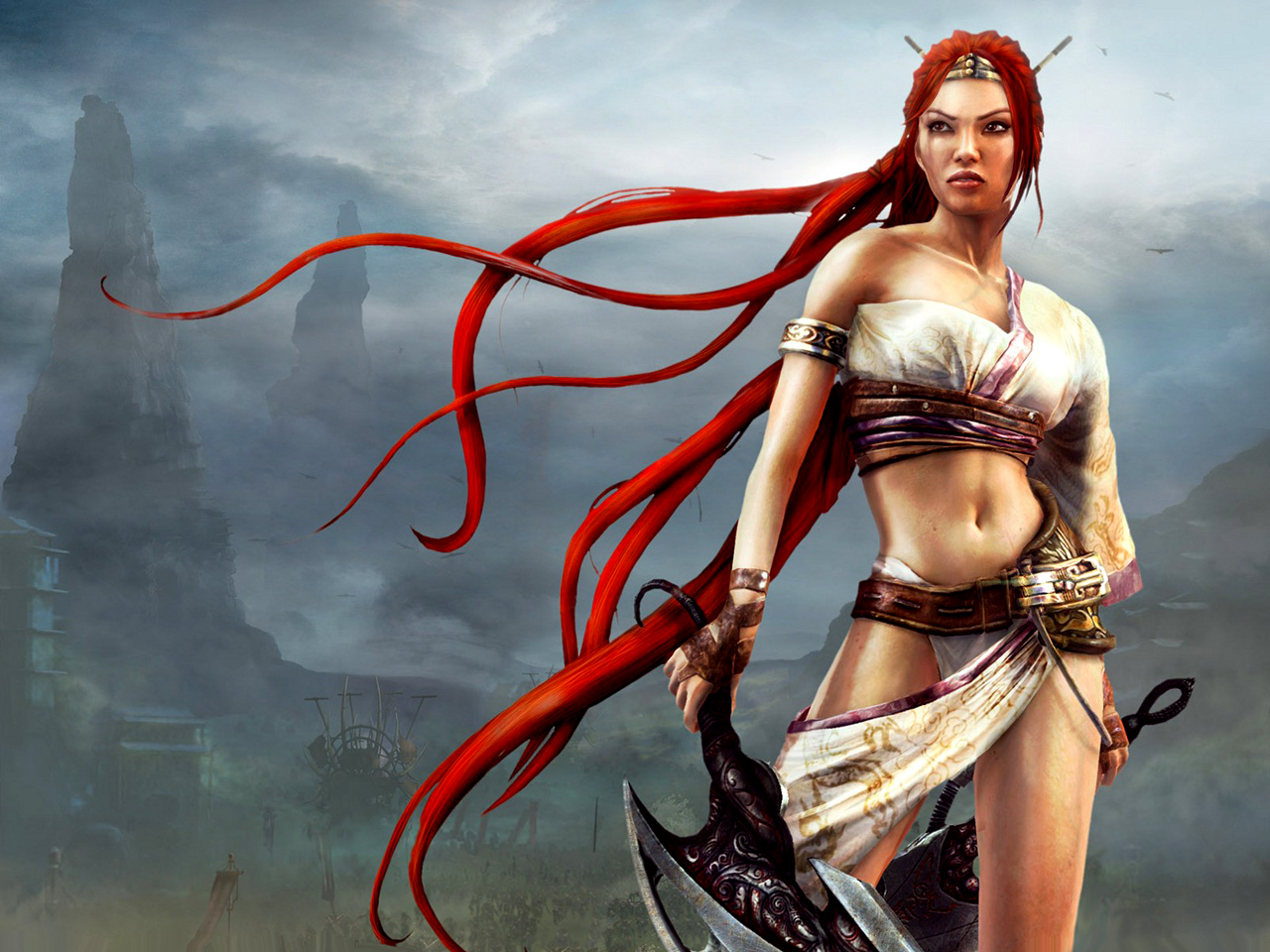
Eventually, I decided on Nariko of Heavenly Sword. Here was a tough, driven woman who chose to sacrifice herself to an ancient sword in order to defend her people, the same people who had viewed her as a cursed outcast.
But that outfit! I could barely take her seriously doing all of the amazing brutal fighting she does in such impractical gear, even given this was a fantasy setting.
And so my redesign began first with studying the designs of the other characters in the game. A fusion of European and Asian aesthetic pervades the armor designs of Heavenly Sword. I kept a massive private Pinterest board for this purpose.

I used a pre-printed fashion croquis sketchbook to knock out some quick costumes in ink and Copic marker for Nariko’s re-design. My thought process was to simply dress Nariko more closely in the fashion of her father, who was dressed in a kimono style top and pants covered with armor in key places. This look seemed appropriate considering the fact it was snowing and everyone else but Nariko was dressed appropriately for the climate and for the ensuing large scale battle.
I also found it baffling that while Nariko was trained to fight that she wasn’t at least wearing basic armor, even if she were not to be on the front lines or was intended to be more of a Gladiator type of fighter.
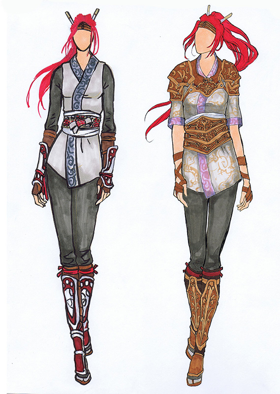
I chose the design on the right because I liked the way that it was both protective, channels the Gladiator-esque look of her original design with the tooled leather, and maintains the archetypal colors and shapes we’re used to for Nariko. The one on the left had too much crimson in it, which was too closely associated with her father and also doesn’t allow her hair to be the most red and striking part of her design, as I feel it was meant to be.
Next, I did quick gesture sketches in an attempt to capture a pose that felt heroic, but would also show off this new armor design. It was a tough decision, but I eventually settled on pose 3.
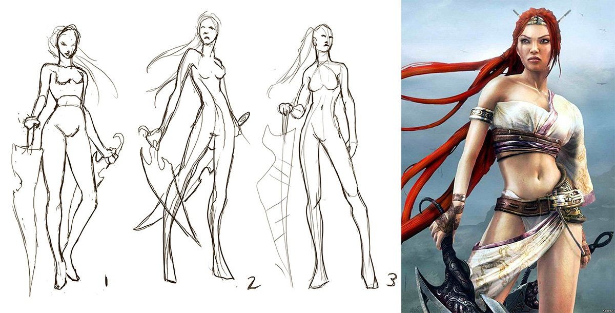
And yet, still 3 was not enough! I needed to push the heroic nature of the pose. She was still too straight on and seemingly staring off into the distance without much interest. Moving the camera level downwards so that we’re looking up at Nariko gives her so much more presence! The pose also feels more dynamic.
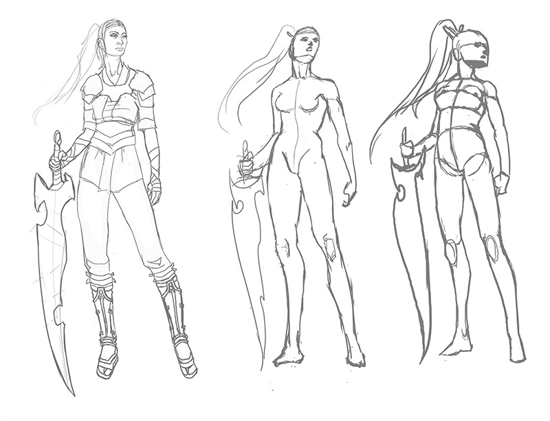
I have my hero. She has her armor. Now, it’s time to paint!
On to Part 2
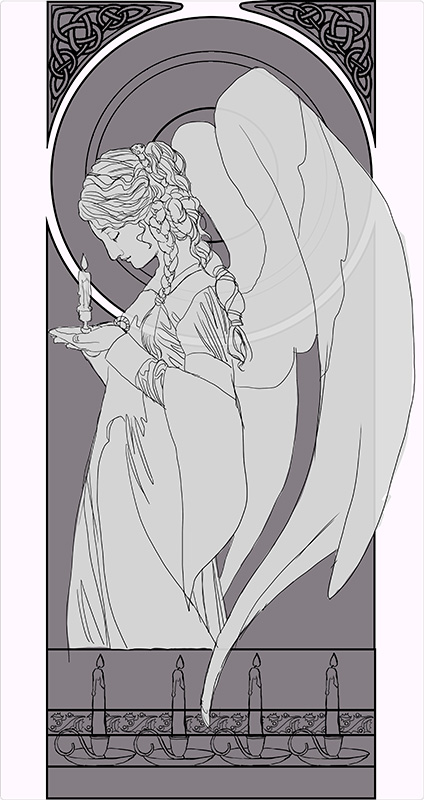
Sketch Diary: Christmas Angel Part 2
Before I get sucked into character details, I have to first design the frame, which I quickly do by drawing shapes in Photoshop. I set the layer with the grey shapes that form the frame to the Blending Option, Stroke, which creates an outline around the shapes that I don’t have to manually draw myself.
I used similar partitions for the division of the frame to Mucha’s piece (why change a working formula?). The corner knotwork, holly border, and candles were all designs I created once, then replicated multiple times and repeated across the piece. Working digitally makes this preliminary work a lot faster
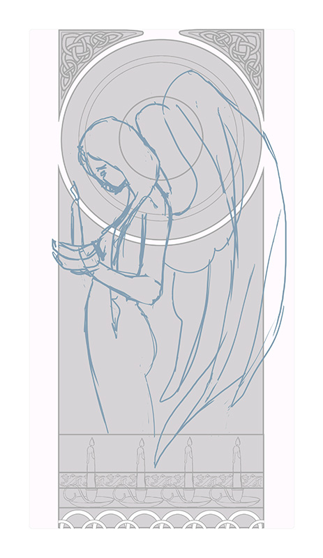
A quick sketch helps me establish how I want the figure to flow through the frame and also aids with refining the rather wonky anatomy of the original thumbnail sketch:
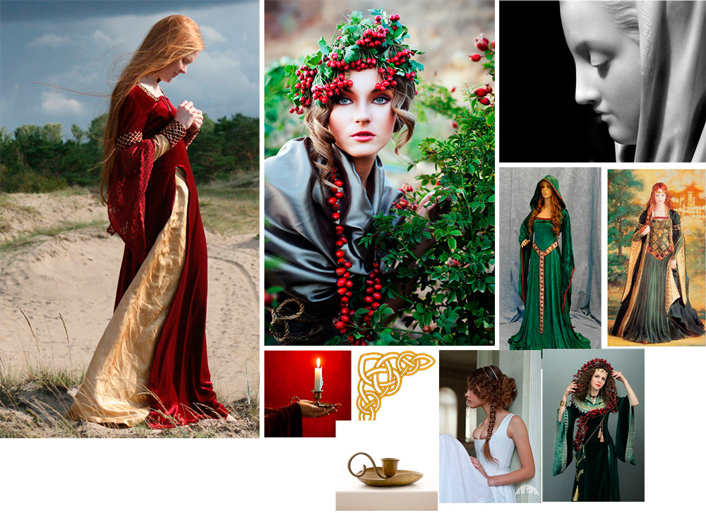
 Further reference gathering helps me collect images of candles, velvet dresses, wings, and poses that will help me make this pose look less fudged. I lean on Pinterest very heavily for this purpose and am constantly gathering inspiration on a daily basis for my projects.
This is a VERY important step! There’s nothing that can ruin a painting faster than a completely fudged pose that just looks ‘off’, unless you are very, very experienced and have done so many studies you can draw things from memory. This is rare even for the best of artists, mind!
Gathering reference can also help you save time revising later because you didn’t get that hand quite right or didn’t get the drapery quite right. The trick is uniting your references and reinterpreting them in such a way that you still have something unique and you don’t lose the energy of your rough sketches.
I eventually arrived at something like this for the base sketch. At this point, everything is still on its own layer in Photoshop to allow me to re-position any element I please:
Now, designing the window! The window knotwork begins with a freehand sketch that fills up 1/4th of the circle. This 4th is then copied, pasted, and flipped horizonatally so the design is symmetrical. I use the layer’s Blending Option set to Stroke again to create an outline automatically while I draw.
Admittedly, I’m not very structured with my circular knotwork. I sketch until it looks right, rather than drawing guidelines and graphs.
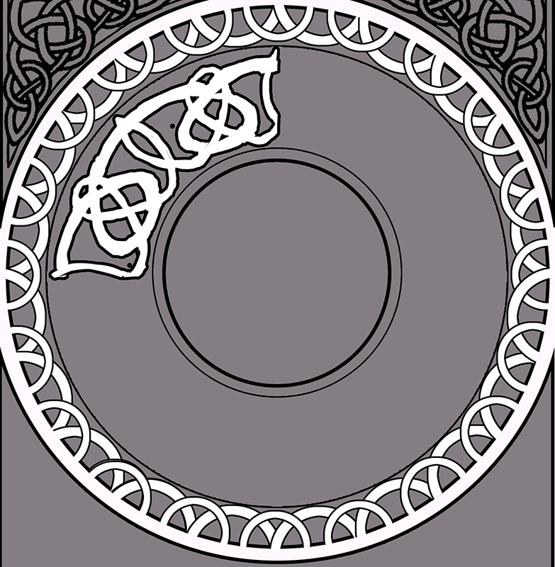
I wanted the design to emulate a snowflake with the radial spires, so I made sure the main junctures had points in the most important places (the center lines of the shape). I also wanted a thicker strands in this design to help fill up the space, since a design with too many thin strands would start to make the background window too busy and distract from the main character. I used two total strands for this design, a thin strand and a thick strand.
Next, I lock the transparency on the layer and draw all the intersections of the knots. The locked transparency keeps me from drawing outside of the shape. The reason I draw the knots as if they were invisible is to help me clean up the angles of the strands and intersections, which were a bit sloppy before. You can see towards the bottom of the circle where the knots are still sloppy.

Next, I meticulously defined the underlap/overlap pattern of the knots. Traditionally, knotwork always has a pattern of any one strand going over and under. I broke this pattern somewhat so the radial spires stand out, bringing emphasis to the snowflake shape.

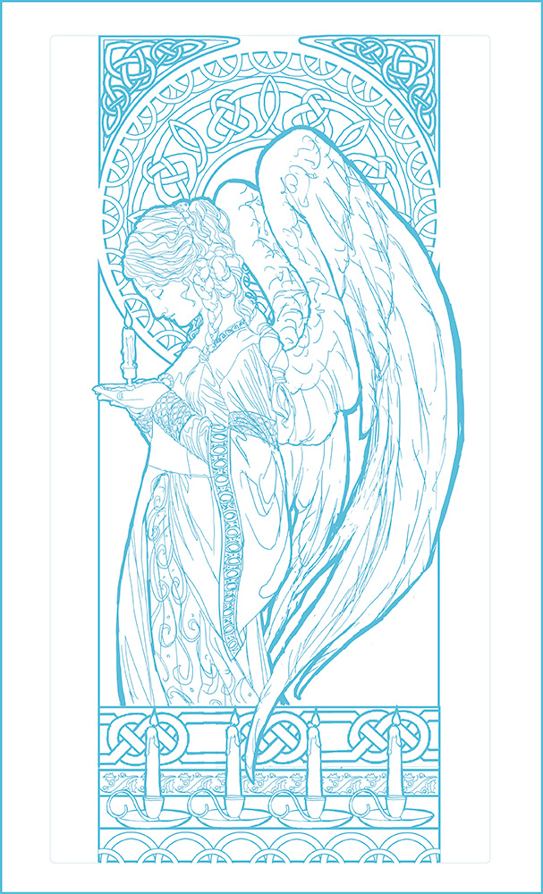
Phew! That was a lot of tedious detail (and I loved every second of it!). A few cups of coffee later, here’s the finished line art! I’ve changed the line work to blue so as to make it easier to tell which areas I’ve transferred when I’m transferring this to illustration board. This line art is still a little rough as well, since I’ll be cleaning those lines up once she’s been transferred to the board.
Next up: The finished painting!
Back to Part 1
Sketch Diary: Christmas Angel Part 1
It’s that season again! Time for this year’s Christmas painting!
Be sure to sign up for my annual Christmas list if you haven’t already. It’s FREE and my way of spreading a little holiday cheer to you all. It’s all thanks to the wonderful support of my Patreon patrons. You guys rock!
For this year’s painting, I wanted to top last year’s, which did not have enough candles, in my opinion. I wanted MOAR candles! There is something about these elegant points of light that always makes me think of the holidays. From the lighting of advent wreaths to candlelit Christmas pyramids, I just love the part they play in the season and the beautiful light they cast. This theme became my jumping off point for inspiration.
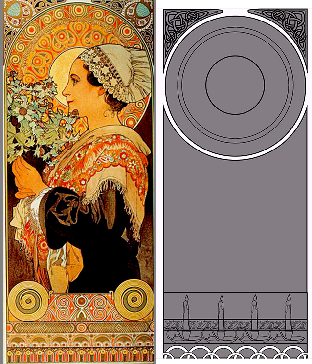
I also wanted to channel my love of Alphonse Mucha’s close up portraits. I love the simplicity of the composition and focus on clothing and hair details instead of grand borders. Clothing, hair, and faces being some of my favorite things to draw and paint!
![mucha_portraits_by_angelasasser-d87mrl8[1]](https://www.angelasasser.com/wp-content/uploads/2014/12/mucha_portraits_by_angelasasser-d87mrl81.jpg)
My thumbnail sketching began on toned paper with pencil, ballpoint pen, and white color pencil. My first sketch (top left thumbnail) drew directly upon one of Mucha’s close up portraits, mimicking the pose.
![christmas_angel_thumbnails_by_angelasasser-d87msjs[1]](https://www.angelasasser.com/wp-content/uploads/2014/12/christmas_angel_thumbnails_by_angelasasser-d87msjs1.jpg)
The next few thumbnails focus on the concept of an angel inspired by Mucha’s portraits of ladies in profile. In the end, I chose the concept of the angel in profile because it feels more festive and cheery than my initial thumbnail. I may just have to save the candle woman from the first thumbnail for another painting. Next year, perhaps?
The thumbnail with the asterisk by it is my winner! The pose of the wings feels more natural and elegant and the piece just flows down through the wings, her braid, and her dress. The other angel thumbnails felt too claustrophobic and unnatural when the wings were added. The lines and flow were too broken up and led the eye off the page at odd places.
I’d actually do more thumbnails than this usually, but since I’m starting pretty late this year, I’ve got to make my decisions quickly or this won’t get done by Christmas! One of these years, I’ll learn to start earlier…
Next, I’ll need to hunt for references on design motifs for the Celtic knotwork, candle holders, and the inner window. I’ll also need to take reference photos for the angel. The color scheme is going to be green and gold with accents of red.
The detail addict in me is so excited to dive into this one!
Next: Design motifs, rough sketches, etc.
SKETCH DIARY: Lady of January
This series began as my annual Christmas card back in 2012 and as a homage to Mucha’s stunning series “The Precious Stones”! I’m a long time fan of Alphonse Mucha ever since I discovered his work years ago in college and fell in love with his graceful, intricate compositions. I thought it’d be fun to challenge myself to an entire series in this detailed and decorative mode of work. The Lady of December sat alone as the only entry into this series until I recently decided to pick it up again!

“The Precious Stones” Female figures embodying the gemstones Ruby, Amethyst, Emerald, and Topaz.
:origin()/pre04/ff33/th/pre/f/2014/171/2/a/lady_of_december_by_angelasasser-d5nvtqd.jpg "Lady of December by AngelaSasser")
“Lady of December,” Digital Painting, 2012.
I had tried to do a monthly series before in the form of a series of angels, but I wasn’t quite satisfied with the layout of the composition of the first entry in this series. The window and the figure felt disconnected, while the background seemed too empty with too much wasted potential.

“Lady of January,” Digital Painting, 2011.