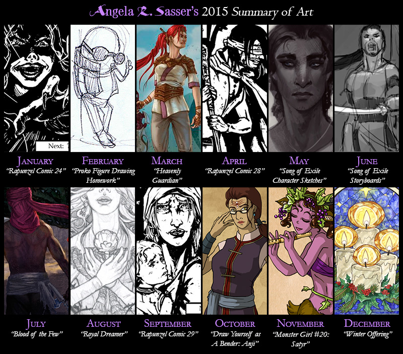
Thoughts on 2015 – It’s been a tough year, no lie. A lot of IRL challenges meant I spent a lot of time off instead of making art and that sent me into a spiral of depression that was hard to escape (I’m still not completely out of it). When I was finally able to get back to creating art, I had to drag it out of myself.
On the upside, I completed The Rapunzel comic, which has been in the making for years! I also finished the IP Development Mentorship with Robot Pencil and laid the seeds to a fantasy story I’ve been working on for over 10 years now and that’s something I’m majorly proud of!
My best piece this year was probably Blood of the Few. I really pushed myself to strive for something different and cinematic! This piece plus all the other work I did for the mentorship was yet another step in the direction of a personal project (Song of Exile) that I really want to push forward with in a major way in the near future.
Next Year – I’ve decided to do more writing and have planned to split my schedule between wrapping up some of my ongoing art projects so I can dedicate myself fully to Song of Exile. If there’s anything I’ve learned from our trials this year, it’s that life’s too short to wait on doing those things you’ve always wanted to do!
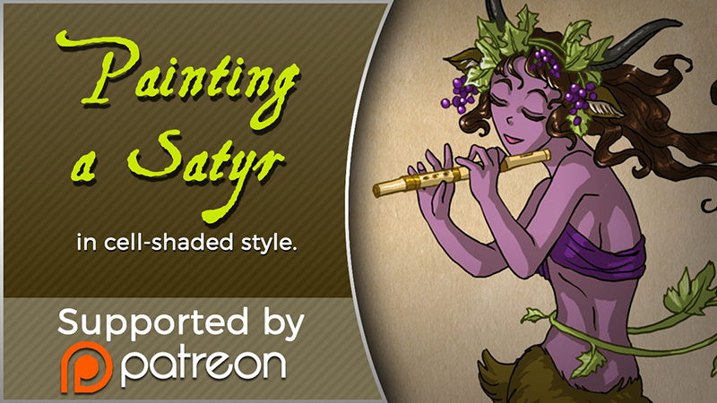
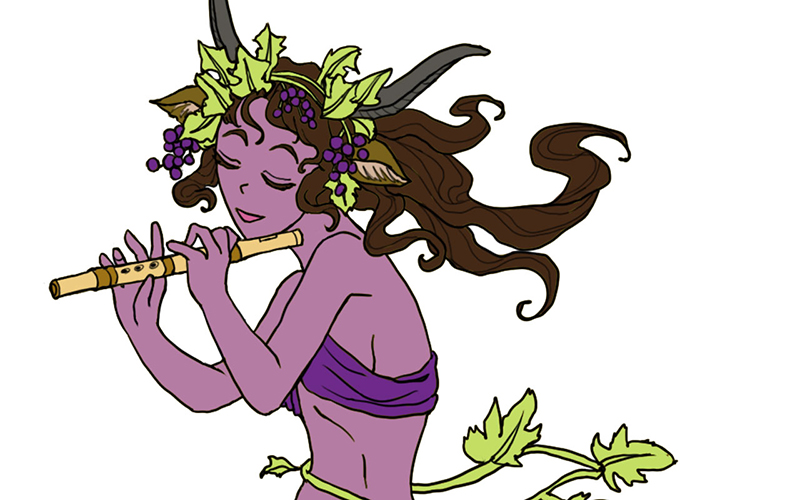
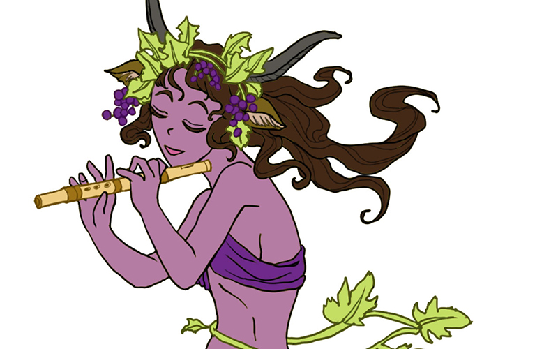
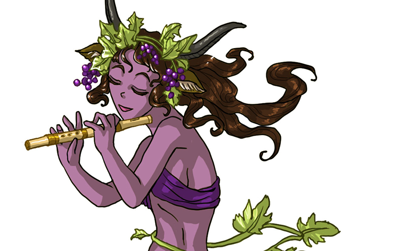
Today I’ll be talking about how I created Satyr for the 30 Day Monster Girl Challenge. For my version of Satyr, I went with my own fantasy twist of a well-known figure from Greek and Roman mythology.
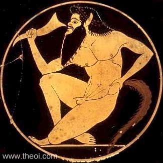
The Satyr of myth is usually a mischievous male with the lower body of a goat who is known to lecherously pursue nymphs and dryads. The Satyr were also drinking buddies with Dionysus, the god of wine and merriment.
For more about the Satyr, check out one of my favorite Greek mythology resources, http://www.theoi.com.
Tools and Techniques
For this painting, I used Photoshop CC and a Wacom Cintiq 21UX.
Concept Inspiration
For my Satyr girl, I wanted to go with the theme of grapes to honor Dionysus and his wine, so she ended up with a purple complexion crowned with grapevine adornments. Like many Satyrs, she is also a player of instruments, in this case a flute.
References
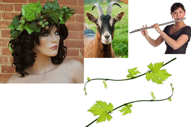
A selection from my references for Satyr.
Art Process
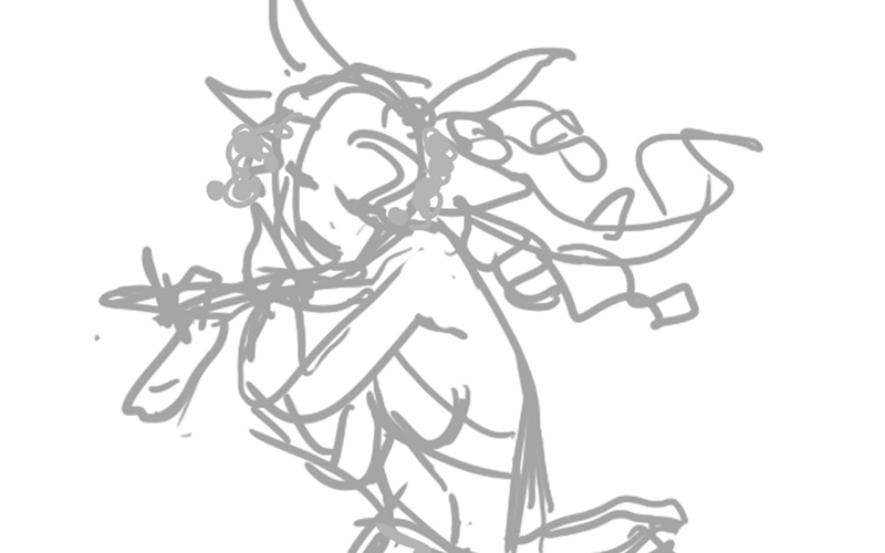
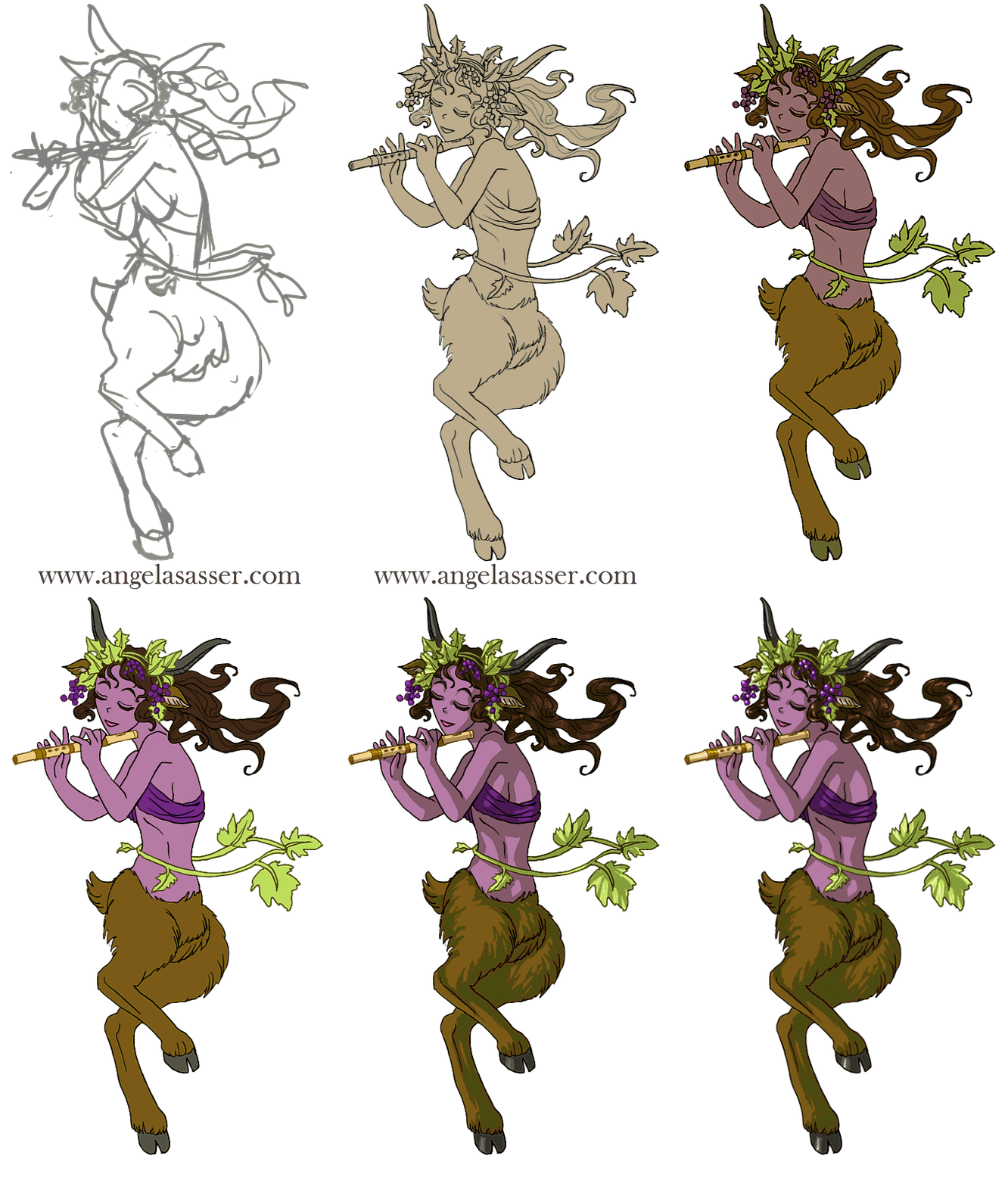
Step 1. Quick digital gesture drawing done to capture the movement and energy of the pose. This isn’t very precise and is more about energy than accuracy.
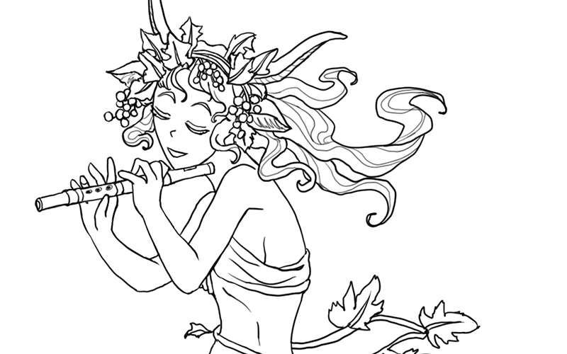
Step 2: A cleaner line art is drawn on a layer atop the gesture. I used Lazy Nezumi Pro set to ‘subtle’ to help stabilize my lines in Photoshop and make them smoother.
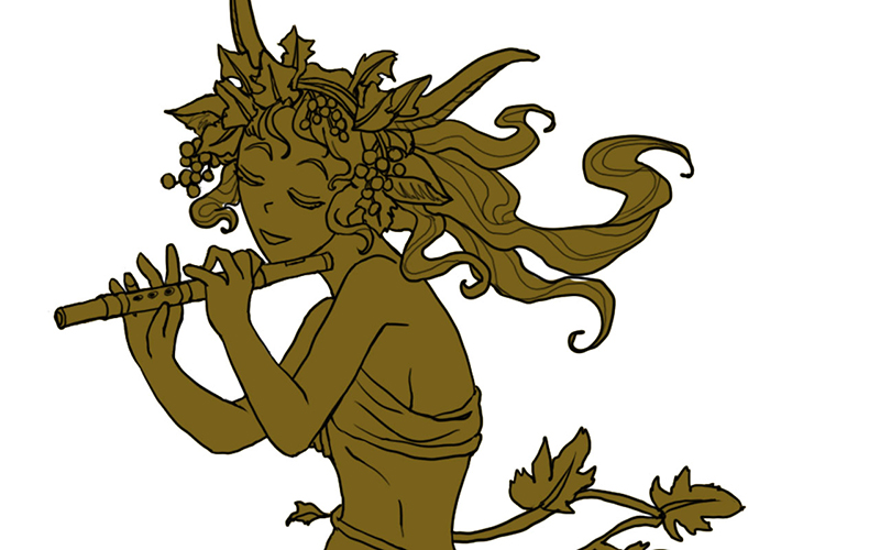
Step 3: Added a base layer of color so no background color will accidentally show through.
Step 4: Added the flat colors after much deliberation on what her skin color should be.
Step 5: Colorized the lines to make the grapes, grapevine, and flute stand out.
Step 6: Added a shadow layer using warm grey above everything clipped to the Group and set to Multiply.
Step 7: Added a highlight layer painting in white set to Overlay. Also clipped to the Group.
Step 8: Final touches of pure white in key places such as the leaves, grapes, and hair to help lead the strengthen the focus, flow, and dimensionality of the piece.
For more in-depth instruction on how I created this image, Pledge to any $10 and up level at my Patreon to gain access to the narrated video tutorial! You can also buy the individual tutorial separately at my Gumroad shop, but you won’t receive the other extras you would by purchasing via Patreon.
You can watch a video preview of the tutorial for Satyr without narration here:
Featuring some familiar faces and some of my own art and thoughts as well! I’ve struggled for years to find my artistic voice and sort out my passions from my wide array of interests. Hopefully these words of wisdom help others figure things out for themselves as well!
I’ve been on Patreon now for about a year since the site went live. I’ve tried a lot of different experiments in that time and have built a small, but dedicated following via this community-driven site. I’m a firm believer that crowd-funding is the wave of the future and the core building block of a growing breed of artist-entrepreneurs.
I thought I’d share that spirit of giving by sharing the structure, templates, and other resources that keep my Patreon ticking! I hope it helps other artists out there considering promoting their projects via this site. Let’s make a Patreon!
Release Schedule
When you set up your account, it’s important to have an idea of how and when your releases will occur and also other notices you’d like to send to your Patrons so you can be aware of how much you might be spamming them at once so they don’t get fatigued by your posts. Mine go something like this:
– Last Day of the Month. Patreon begins charging your Patrons on the 1st of the month, so let’s start there! The monthly image is uploaded. I only release one painting per month to keep things simple, but you may want to release more frequently! If I ever do more than one painting a month, I stagger out my releases so that there’s always one being posted per month. However, I do not charge monthly because I am a slow worker and I’d rather my Patrons only get paid when I release a painting, rather than taking a chance that they might not receive anything if I’m not productive enough.
– Within the First Week of the Month. Rewards for all levels are posted in individual posts (one for each tier) and a PM is sent out regarding my Keyword Inspiration sketch (an event I hold monthly for $5+ Patrons where they turn in prompts and I draw the most inspiring prompt).
– The 15th of Every Month. A mid-month reminder post reminding people to attend my monthly Studio Hangout (with a link to the Event on Google+), sharing a WiP of that month’s art, and any other important reminders that might be relevant. The 15th is also my internal deadline to have the physical Rewards mailed out.
– Last Wednesday of Every Month. A link to the recording of my live Studio Hangout is posted. The recording is auto-generated by Hangouts and posted to YouTube for me, which makes things easy.
Digital File Rewards
Digital Rewards are the cornerstone of any Patreon since they’re easy to fulfill and require less of an expense on the artist’s part. Here are a few ideas for distributing digital items.
– Patreon Attachments. The downside is a user might have to sift through a lot of posts to find the older Rewards that wouldn’t have been emailed to them. Storing a master list with links that you can link Patrons to in a private Rewards post is another idea to help keep track of older Rewards for new users.
– DeviantART’s Sta.sh. DA’s sta.sh allows for private viewing of file links for anonymous viewers who have the url. You can store any kind of file (image, video, etc.) and also ‘stack’ them if you have multiple releases you’d like to show at a single url. The current default limit for free users of DA is 2GB while Premium members get 10GB. Another random perk is that you can also hotlink to sta.sh files if you are embedding images into html on other sites.
– YouTube. YouTube allows you to upload videos at private links (called ‘unlisted videos’) that are only accessible to those who have the link. It’s a good alternative if you want to offer a streaming option for videos instead of requiring a complete download of the entire file.
Private Journal Entries
Sharing exclusive posts can really make Patrons feel special! However, Patreon’s current journal function is very limited and doesn’t allow images and text to be formatted easily. For this reason, here are some suggestions for ways to share private journals:
– WordPress Public Draft Previews. If you run a site built with WordPress, the Simple Preview plugin allows you to share a link to a Draft which is private and only accessible by those who know the url. The downside is comments currently don’t function on these posts. A workaround is to disable comments on the post and request that Patrons comment on the original Patreon post that led them, including a link so they can easily access the correct url to post their comments.
– DeviantART’s Sta.sh. While also useful for storing files, you can also use Sta.sh Writer to create more robust journal entries than Patreon currently does. These private journals also allow users to comment on them.
Physical Rewards
– Postcard and Greeting Card Mailings. I use www.postable.com for a fast, secure, and easy solution for mailing out postcards (ie. Christmas cards, Thank You cards, etc.) to my Patrons. You can personalize your cards online, though they will not be handwritten.
– Prints. I usually print off my own prints via an Epson Artisan 1430 which boasts lightfast inks and wide format printing (up to 13×19 inches), but when I need bigger and/or fancier prints (ie. giclee, canvas, mounted prints, etc.), I turn to www.iprintfromhome.com (tell them Angela Sasser sent you and we both get Thank You dollars when you make your first order!).
Reader Suggestions
Before I get to the Templates, I’d love to hear your reader suggestions in comments!
If you have any tips or resources you’d like to add that I find particularly helpful,
I’ll add your tip to this journal entry with a link to your Patreon page.
Let’s make this entry a great resource for the community!
Templates
It’s important to have a link to your Patreon wherever you promote your work. Here are a few buttons and banners to help you out with that!
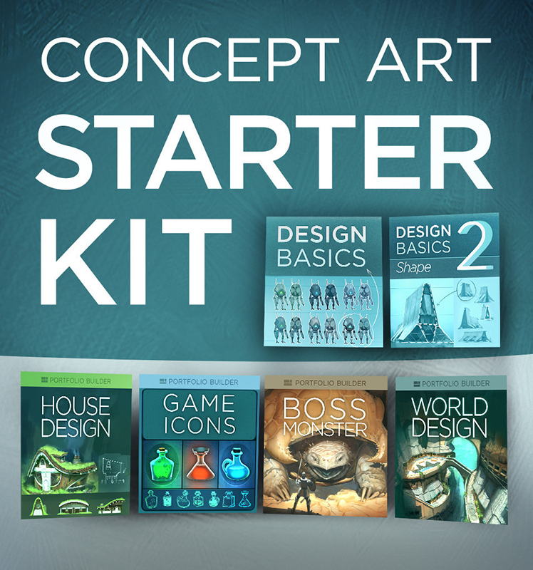
I’ve recently started up CtrlPaint’s Concept Art Starter Kit with artist, Matt Kohr, as a way to brush up my own character design skills. While I’m not quite going into Concept Art as a profession (yet?), I still think the basic skills will improve my artist’s eye, overall. Plus, it’s just tons of fun designing characters for my own personal projects!
Since I’m coming mainly from an illustrator’s background, I felt like I needed to start at level 0. I’ve read a lot of tutorials on concept design, but almost all of them assumed prior knowledge of industry jargon and familiarity. It’s been refreshing to see something that starts off very simple with tons of visual examples. The videos thus far are more lecture with examples than they are technique, but that’s just what I wanted and needed at this point. (Expect a review of the course kit over at The Muse’s Library once I’ve completed it!)
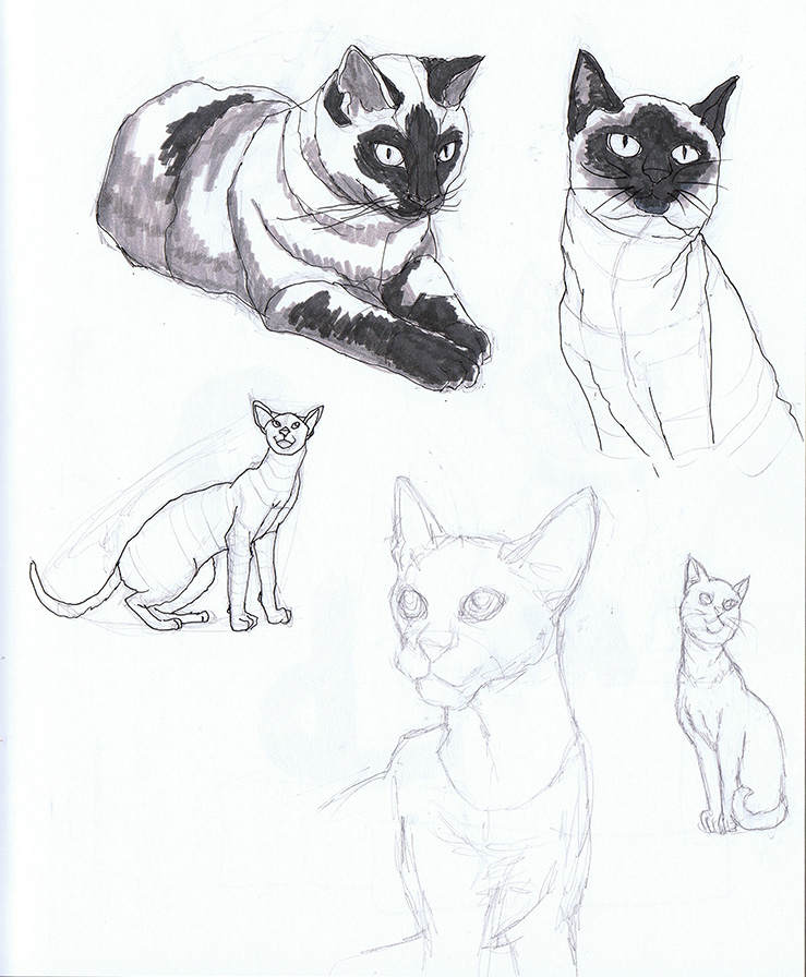
Shape Design covers the fundamentals of interpreting shape language and image recognition. I tried out the suggested exercise of taking reference photos and not merely copying what I see, but trying to get a better idea about how the subject works via closer study and contouring. The cat on the bottom right corner was drawn from memory after my studies were complete.
While this method does take longer, I think Kohr’s on to something with this more scientific approach, as I seemed to retain more info this way. Admittedly, I’m used to copying and pasting references to get my final art done quicker. Creating more in-depth studies is a good habit I need to get back into!
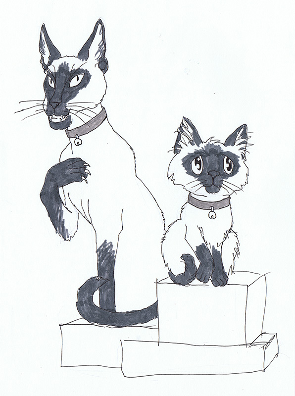
Next, I tried another suggested exercise where I took what I learned from doing my studies and drew a ‘good’ version and an ‘evil’ version of the same animal from memory using no reference. Can you tell which one is which?
If you guessed evil for the cat on the left and good for the cat on the right, I have succeeded!
For the evil cat, I went with the ‘modern’ body style of Siamese cat, which is sleeker and more pointed than the rounded ‘classical’ body style I used for the cat on the right. I also made intentional choices to give the evil cat claws, pointed ears, pointed eyes, and to be showing his teeth while good cat is softer with rounded eyes and an overlarge head. Both were drawn from memory based on what I’ve retained from my studies.
I’m looking forward to the next lesson! Delving into the psychology of shape is utterly fascinating to me. I think most of us understand this language instinctively, but learning how to purposefully implement it in our art can bring it to a whole other level.
It’s been a long time since I wrote a personal/art career post here. The main reason for that has been the absolutely disastrous year I’ve been having. Rather than continue putting on a happy face, I thought an entry of candidness might be more helpful. After all, I started this journal because I wanted to talk about my journey as an artist and I want to stay true to that instead of let this place devolve purely into WIP’s and self-promotion.
This year started with my partner nearly dying from heart complications from bronchitis. Nearly dying being terrible enough on its own, the ensuing mentally draining recovery topped with an icing of medical bills made a perfect cake of disaster. The funny thing is, we were more prepared for this than most and those savings got us through a difficult time, including the time immediately after his recovery where my partner was let go from his job.
I’ve said in the past we’re a single income household, with my art bringing in some income, but not a lot. There followed another extremely stressful and depressing period where we both weren’t sure what was going to happen next. Even still, my partner reassured me that it was okay to continue trying to do art as my living (because he’s awesome and so, so loving). We had enough to live off of and emergency measures in place.
But I had something to prove. I didn’t want to be a money sinkhole when we were in such a period of turmoil. Here I was in my own little dream world trying to squeeze every penny out of my art, which only made it harder to create anything with that pressure to make everything I made worthwhile and profitable. I spent more days tied up in a lack of motivation and depression than producing anything at all.
As this year wore on and other medical catastrophes and setbacks happened, I hit a low point. I gave up for the briefest milliseconds on the notion that any of this struggling to be a professional was worth the suffering it was putting me (us) through. It felt like everywhere I went, people I respect were bombarding me with the fact I was especially failing this year, that I should be farther than I am. I needed to be stronger! My insistence that I could never show weakness and should react by working harder and beyond my limits only worked against me because I turned all of that stress inwards, causing my own physical and mental health to decline.
In a strange way, finally accepting defeat this year has been freeing. I have become increasingly aware of the long game and the shortness of life here on this earth. Entering the IP Development Mentorship with Robot Pencil earlier this year was a game changer for me. I have a lot of ideas I’ve always discredited because they weren’t producing results RIGHT now, but here were several professionals telling me my ideas are “F**king awesome”. I’m not sure I would have entered this mentorship otherwise if I hadn’t been in the place where I was just so tired of struggling and really wanted to give those unacknowledged passions a chance they would not have gotten otherwise while I was obsessing over proving myself.
It’s funny how we need permission to just do the thing we always wanted to do…
Luckily, we’re doing much better now. Kev has been making leaps and bounds with his recovery and has also found employment. We continue our game plan to let me build my art career a. And while I feel guilty for having this privilege when so many other artists don’t, I’m not going to squander this opportunity with guilt anymore because I’m trying to impress those who quantify success as merely money, when success in life is so much more than that. That path leads to elitism and becoming the kind of person and artist I don’t want to be. With our income stable for now, I have also started saying no to a lot of jobs that I feel aren’t going to advance me as far as my personal projects might.
I’m still terrified of the unknown and of waiting for another bad thing to happen, but I’m hoping that surviving one terrible year means we’re better equipped the next time.
I suppose if there’s any advice for other artists to take away from this, it’s that sometimes you have to embrace failure because it’s one of the best ways to learn how to do anything right, that other artists who you admire more often than not are projecting a self-image of success (even when it’s not true), and that doing so doesn’t make them any less of an artist. Also, try to save up backup funds for those rough times because they are waiting to sucker punch you in the gut when you least expect it!
Meanwhile, I’m still here…a little older and a little wiser.
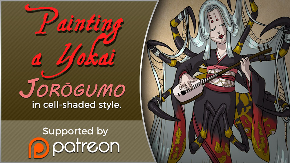
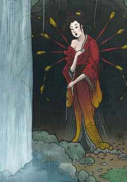
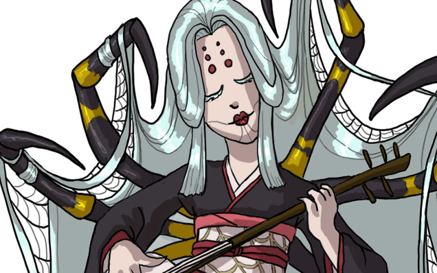
Today I’ll be talking about how I created Spider for the 30 Day Monster Girl Challenge. For my version of spider, I went with a Japanese inspired Jorōgumo.
The Jorōgumo is a mythological creature from Japanese folklore which was known for luring virile young men to their lairs, charming them with food and music, then binding them up in their webbing so they could devour them.
Jorōgumo means “binding bride” or “whore spider”, but is also a word which refers to a particular species of golden orb weaver spiders in Japan. For more info on this fascinating folklore, check out www.yokai.com
Tools and Techniques
For this painting, I used Photoshop CC and a Wacom Cintiq 21UX.
Concept Inspiration
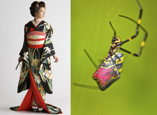
I took a lot of visual inspiration from the golden orb weaver (nephila clavata) of Japan. My Spider has many of the same markings as decorative designs on her kimono and her color palette echoes the spider’s. Her kimono is also inspired by a bride’s as a nod to the “binding bride” namesake.
References
A selection from my references. I had many more of the spider from multiple angles, but I’ll save you the nightmare fodder!
References for Spider
Process
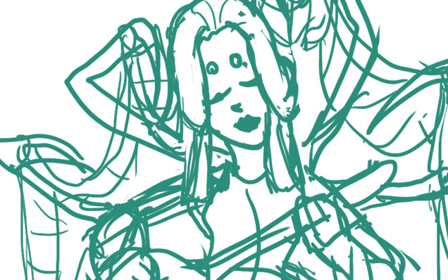
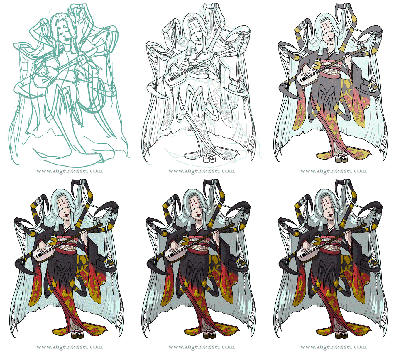
Phase 1 – I doodled a rough sketch in turquoise to make it easier to see when I inked on top.
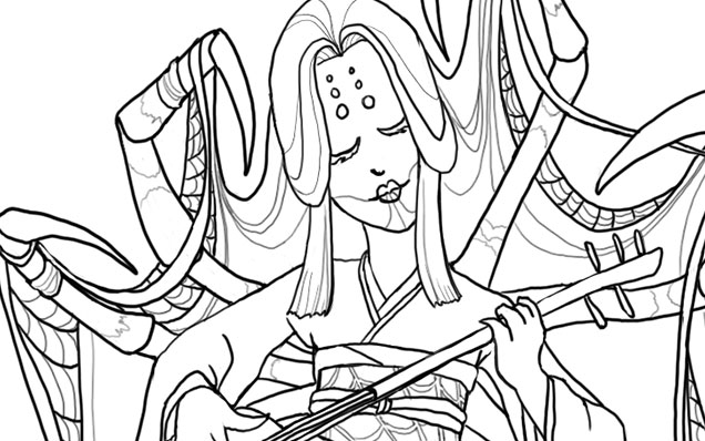
Phase 2 – Line art created with a hard round brush.
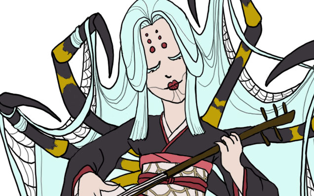
Phase 3 – I laid in flat colors using the selection magic wand to select areas and Edit>Fill.
Phase 4 – A shadow layer set to Multiply was created that was clipped as a mask to the entire Group of colors.
Phase 5 – A final touch of highlights was added with white. The highlight layer set to Overlay.
Animated process GIF.
You can also watch a sped up time lapse video of the process here.
For more in-depth instruction on how I created this image plus a downloadable PSD of the image, Pledge $10 and up on my Patreon to gain access to the narrated video tutorial! You can also buy the individual tutorial separately at my Gumroad shop, but you won’t receive the extra art goodies you would by purchasing via Patreon.
You can watch a preview of the narrated tutorial here:
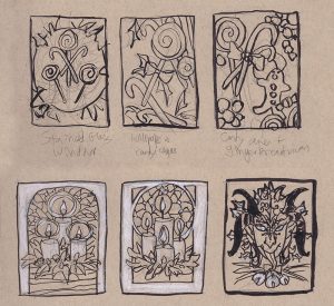
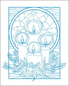
I’ve created a tutorial video for how I made a comic strip in a digital woodcut style for my Rapunzel comic! I walk you through how I designed the panel layouts to the finished product giving helpful tips along the way. A .PSD file of my comic strip is also included for your perusal!
To see this video, you’ll need to pledge to me on Patreon at the $10+ level! Alternatively, you can also buy this tutorial individually via my Gumroad shop, but you won’t get any of the extra perks that Patreon gives you (ie. wallpapers, sneak peeks, etc.).
I did not use any special brushes for this creation. Only the default round hard brush set to Pen Pressure! I hope you enjoy this glimpse into my process for this month’s creation. If you have any questions, don’t hesitate to ask in comments!
Just a visual reminder that you can get 15% off at my shop till the end of the month with code DRAGONCON. I have a lot of extra goodies, like playmats, dice bags, and more, so help me make some room in my little studio!
I’m back from DragonCon and have a massive head cold as a souvenir! Before I disappear with hot tea and meds, I thought I’d post about how my DragonCon went.
This year was an odd duck for me. I had no table, which is the first time I’ve been without one for a couple of years. I was completely okay with that, however, because it meant that I got to actually experience the con by attending interesting panels, costume watching, and networking with people rather than being tied to one place.
I went to a wide range of panels, from the history of Persian dance to indie game development (panel notes forthcoming). I somehow never made it by the dealer’s room since venturing anywhere outside of the Hyatt just seemed like too much effort. The Hilton for the game dev track was as far as I made it.
I also ran two panels for other artists entitled Social Media for Artists 101 and 102! Any event where I can play Duck Army as an ice breaker is a good event. The attendees at my panel were all very enthusiastic and willing to share resources. Thanks for making it a great first run for 102, everyone! (NOTE: You can find the PowerPoint files of my presentations here.)
ART SHOW
John, Anne, Heidi, and the other staff ran a tight ship, as always! It was an experimental year for me in that I left my masks and Art Nouveau work at home and only displayed my digital fantasy work in the show this year, an intimidating decision! I was happily surprised that two of my canvas prints (Oathbound and Kushiel’s Dart) found new homes! I did decently in the print shop, though I have a few extra playmats and dice bags still available if anyone’s after them. Use code DRAGONCON to get 15% off at my shop right now!
A panoramic shot of my large gallery bay. From left to right, Kushiel’s Dart, Enchained Wind, Keeper of Secrets, Oathbound, Persephone Queen of the Underworld, The Lotus Dancer, and Dreaming Butterfly.See more of these amazing cosplayers here.
FAVORITE MOMENT:
We walked by a guy in the skybridge dressed as a herald from Assassin’s Creed. He was putting up posters on the walls every few feet. I heard tales of cosplayers dressed as Assassins zipping by and tearing them down later. When we asked him how many posters he had, he said 250. I am highly amused by this kind of clever fun. I didn’t get a picture of him, but I got one of his poster, which was really well done!
BEST COSTUME:
I snapped a pic of this amazing pair dressed as Na’vi from
Avatar during the Night at the Aquarium. That baby looked so very real. It was quite creepy (and awesome)! It’s the dedication to full body paint and detail that made this the best costume I saw all con. While the Night at the Aquarium was great for costumes, they had all of the lights turned off in the displays this year, which made it really hard to see any fish. How I wish I’d gone to the philharmonic concert instead.
WHAT DID I LEARN?
I always like to think about what I can learn from looking at the displays and presentations of artists, but this year’s revelation was on a deeper level. Instead, I got a lesson in creativity and motivation from attending the panels on creativity and writing this year.
The advice from a lot of the authors there was that comparing yourselves to others was the quickest way to burn out. Most of us in the creative industry are just trying to get by and/or create something that we love. You can partially measure that success by money, but other times, it’s the victory of just having made the thing since, more than likely, creating art is not really going to pay all the bills until a very long time out. Most of us are in that dreaded ‘gap’ and those who would be at the top are not always guaranteed to stay that way. Focus on making good art and stop comparing yourself to others.
And that’s a wrap! You can see more of my DragonCon photos of some of the cool swag I picked up in Artist Alley and other moments over at my Instagram. Till next time!