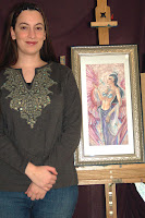
Author: Angela S.

The Snowflake Lady – Part 3 – Coloring and Final Touches

The last process post for the Snowflake Lady talked about choosing stock reference, line art, and sketch transferring. Now, it’s time to get to the fun part – coloring!

Color test for Lady Snowflake

Most of the time I like to start off with a color test which is made very quickly in several layers in Photoshop. I like to keep the background, important parts of the figure, and important wardrobe details on their own layers so I can tweak the colors individually till I’m satisfied.

A tip to arrive at color schemes you might never have thought of is to flatten your image and play with the Hue slider under the Adjustments>Hue/Saturation menu in Photoshop.  This option lets you change the colors in your image without messing around with your shading or line integrity.

I don’t do a color test for EVERY image I paint, however! Sometimes it’s fun to let the colors develop organically. Other times, I’ve spent so long inking or sketching the image that I’m afraid to mess it up, so I do all the prep I can before touching it.

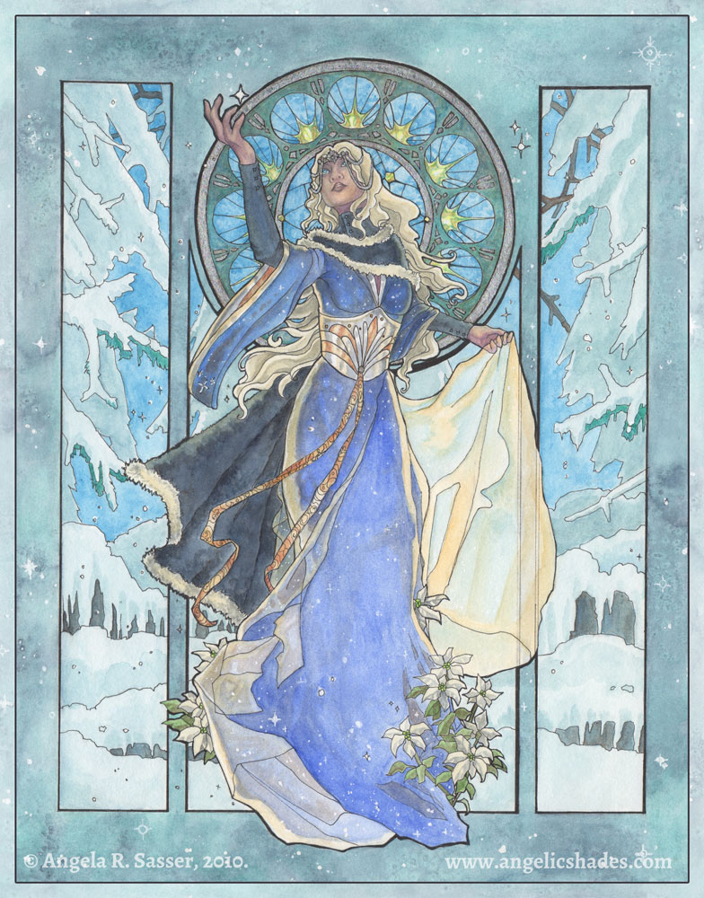
With nerves steeled, painting begins!  She was a very tough customer because all the blues were fighting for dominance.  The original idea to make the inner window pane an antique gold failed horribly and just didn’t gel with the rest of the image. I ended up having to layer various blues to make the window colors harmonize with the rest of the image.  I also used the wrong shade of yellow for the starbursts in the stained glass, which still stand out awkwardly to me.

Just goes to show you that sometimes pictures don’t work out the way we want, no matter how much planning is involved!  At the very least, watercolors are forgiving in that their translucency allows you to lift color and layer till you can get your colors talking  nicely to one another, even if the first color put down is just butt ugly.  I ended up pushing the pale yellows as a way to make the figure pop out more and to unify the overall colors more than originally planned in the color test. I used white gel pen and silver leafing to add the final touches of snowflakes and shine in the window tracing and throughout the image.

For a more detailed step-by-step  of my painting process, I refer you to my upcoming book, Angelic Visions!  Meanwhile, enjoy the finished Lady Snowflake:

| Greeting Cards | Post Cards | Prints |

Convention Report – Atlanta Comic Con

Returning from Atlanta Comic Con this past weekend with an odd mix of disappointment and happiness.

Sporting new vertical signage thanks to Graphic Signs Atlanta!

First off, I just want to say what a joy it was to meet David Mack and Joseph Michael Linsner (again), and now Billy Tucci, who I had no idea would be in attendance!  I picked up a bag he dropped and gave it back to him without even knowing who he was.  For those who don’t know him, Tucci is the author and artist of a comic from the 90’s called Shi, a tale of a half-Japanese, half-American woman out for revenge against the Yakuza lord who killed her father and brother. (Funny how half of my inspirational artists/writers tell tales about women out for revenge)

It was great to yack with some of my favorite comic book creators about what drove them to create their stories and what point in their life they felt that they were ready to tell them.  It was very insightful and inspiring to know that most of them really didn’t know what they were going to write about till they were in their 20’s. Maybe I’m not so far behind after all?

Meeting them was a double edged sword. I found myself surprisingly in tears Saturday night for a reason I couldn’t identify till later.  Realizing how far you still have to go can be traumatic when you’ve not had a lot of sleep, have been on a crazed underpaid work schedule, and meet so many great folks who are ‘there’ already that it makes you feel so incredibly behind in your life.  Even the ‘there’ness is an illusion, I realize. These guys worked hard to realize their creative vision and they are STILL working hard to keep doing what they love!

And so, like many of the cons up until this point this year, I took a financial hit, but learned so much from the folks in attendance.  I can only hope future cons will be a better balance of profits AND advice!  Right now, there’s a definite imbalance between the two.

As for the convention itself, I won’t be going back next year, not as a vendor (unless I have the extra money lounging around).  It was meant to be a 3 day con, but was changed to a 2 day con without notice to the vendors, or at least I did not receive any.  The contact for the artist alley changed several times and I did not receive word back on many of the questions I asked that were forwarded around to the new contacts.  Setup was fairly easy, but I felt like the management could’ve done a better job of keeping us informed.  I found most of the info I needed eventually, but had to dig through a busy complicated FAQ to find it.

The audience also did not seem very interested in what I had to sell (the Angelic Visions book, prints, masks, etc).  I got the distinct feeling that many of them were young artists there to meet and greet with their favorite creators and movie stars and not necessarily to buy things from other not-so-famous artists, something I wish I’d thought of before deciding to drop $200 on a table fee.

A gift sketch from
Joseph M. Linsner

On the plus side, I received a wonderful sketch from Joe in appreciation for the mask I gifted him at DragonCon. It was a great feeling to know he’s mounted it in his room and finds inspiration from it on a daily basis.  Also wonderful was yacking to David about gender and author identity and to Billy about how he prefers writing to drawing (something I thought I’d never hear such a talented artist say! It shined new light on my own illustrator versus writer predicament).

All in all, this con didn’t lack for amazing people to meet, which is why if I come next year, it will most likely be as a con-goer instead of as an artist.

For the usual photostream of interesting costumes and such, check out my Atlanta Comic Con album on Facebook!

The Snowflake Lady – Part 2 – Preliminary Sketches

In the last process post, I covered the basic planning sketches for The Snowflake Lady. With thumbnails and the basic gist of the image figured out, it was time to start getting detailed!

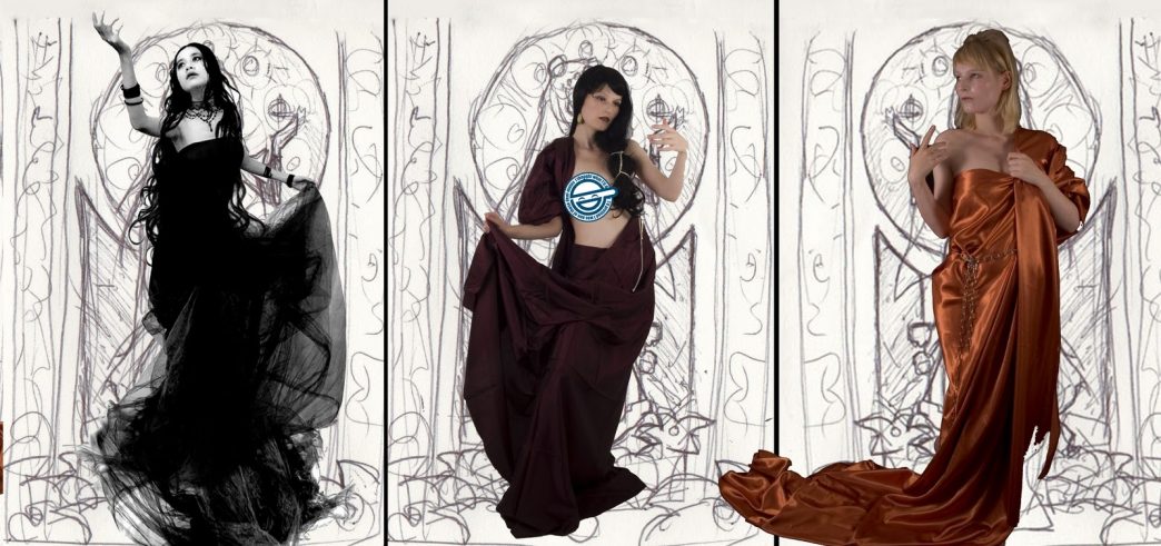
I started out by browsing my collection of stock images and seeing if there were any poses that could work for what I had in mind. I like to use photo references when they’re available to help add a level of realism that I still find difficult to draw directly out of my head.  Eventually, I narrowed my choices down to the following three poses, which all conjure the image of a graceful lady reaching for a snowflake.  I quickly dropped out the background on these images using Photoshop’s Magic Eraser tool, then overlayed them on top of my window layout:

Pose 1 courtesy of Nanfe-stock. Poses 2 & 3 courtesy
of Almudena-Stock.

Pose 1 added a level of movement to the composition with her outstretched arm, tilted head, and swirling dress.  The other two poses were both lovely, but somewhat static, in comparison.  After consulting with a few friends for a second opinion, I finally went with pose 1.

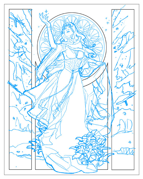
Next came a preliminary sketch done in digital blue! Which I like to use since it’s easier to transfer tell where you’ve drawn over when you are transferring the image using graphite transfer paper (or the ‘poor man’s transfer paper’, which is rubbing charcoal on the back of the image and then bearing down hard as you trace the lines on the front side).  I refined the details in this blue sketch phase, though you’ll notice I left some things generic, like the poinsettia, because it’s easier to refine specifics like that after you’re done transferring.


The stained glass window was actually designed first without the figure in front so I could get a better sense of how I wanted the patterns to look and flow.  Doing this digitally meant I could hide and unhide the figure to see how the stained glass lined up in the composition, making it easier to adjust as needed.  I also could easily copy and paste sections of the window to make it perfectly geometric instead of drawing it all by hand.  The stained glass utilizes a simple starry night theme.

Next, she was transferred to 11×14 in. illustration board where she received a good deal of refinement in pen (Copic Multiliner SP pen with a 0.1 mm and .003 mm tips).  I had to tape two 8.5×11 in. print outs together in order to cover the whole 11×14 in. piece of board.  I made a few mistakes in the stained glass while I was inking because I trusted my hands instead of using a circle template.  Too much coffee & green tea do not steady hands make!  Compass and circle templates are your friend.  I have a circular drawing ruler that’s especially useful for this purpose!

REVIEW: Tangled

This Thanksgiving, I got to see Tangled, Disney’s latest computer animated feature and a movie I had been keeping an eye on since early concept art appeared a couple years back.  I’ve always had a soft spot for the tale of the girl with the long hair, having been a girl with hair past her waist up until very recent years!  I’ve done my own rendition in comic strip format which is a far cry from this vibrantly colored movie!  I was a-flutter with excitement (and a little trepidation) at the prospect of Disney adapting this tale for the big screen.

Would Disney keep true to the compelling images of lost innocence that the original tale had, or would they sanitize it the way they’re famous for?  With happy endings and villainous deaths in off camera silhouettes?  The short answer is YES (to the sanitizing), but that is not to say that I didn’t enjoy it either! Read on for my rambly thoughts on the matter…

The Synopsis:  In a medievalesque kingdom far far away, a king and queen rejoice in the coming birth of their child, but their joy is ruined when the queen falls ill.  To cure her, they employ a potion made from the magic of a flower imbued with the healing properties of the sun.  The queen is restored to health and gives birth to a baby girl whose hair has the same power as the flower that saved her mother.  However, Mother Gothel, who had been greedily hoarding the flower’s power, finds out the child has the same abilities and spirits her away to a tower, where she uses the child’s magic hair to keep herself young.

Of course, when Rapunzel comes of age, she’s no longer happy staying in the tower and wishes to leave so she can find out what the strange lights are she views from her window once a year.  The opportunity to escape arrives in the form of Flynn Ryder, a thief who takes refuge in her tower after a heist.
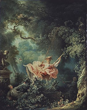
The Good:  Early concept art leaks talked about how this movie was meant to emulate the tone and atmosphere of The Swing, a painting by French rococo artist, Jean-HonorĂ© Fragonard.  This movie definitely delivers in that respect! From luscious green valleys, waterfalls, and countless flowers growing in every nook, Tangled never ceases to amaze with its charming stylization, true to its original intent of emulating the palette of lush oils.  The character animation and settings are a testament to the continued progress of computer animation with the many various ways Rapunzel utilizes her hair for daily tasks.  Gone are the days when hair looked like a texture map plastered around a character’s head with cow spit.

Looks aside, Flynn Ryder proved, as I knew he would, to be the other most enjoyable aspect of this movie for me. Voiced by Zachary Levi of Chuck fame, I felt Disney’s come yet another progressive step away from the flat and perfectly noble Princes of films past.  Then again, I have known biases towards the thiefy rogue types.  His delightful sarcasm versus Rapunzel’s naive, but sassy wit made for interesting quipping throughout.

I was also pleased to see Mother Gothel depicted true to form as a controlling, overbearing mother, and not the old hag of most depictions (for the most part). She sported a rather sexy red velvet dress and dark locks (not unlike my own depiction of Gothel, to my amusement).

But that is where things go south, for this fan.

The Bad:  I commend Disney for really trying to do something different with Prince type characters, but like the Princess and the Frog, I still felt like things moved too fast.  Suddenly Flynn and Rapunzel are singing in a boat together about how they have new meaning in life? After only knowing each other for a few days?  For a thief who had been extremely vain and smug until that point in the movie, this was a hard pill to swallow.  Just like Prince Naveen who goes from womanizing layabout to dedicated husband, it felt rushed and contrived.  The second half of the movie offers no surprises, twists, or even dialog that I hadn’t heard a thousand times before in a thousand other movies.

But no, Angela, this is Disney! They’re supposed to fall in love! Sorry, but I just cannot accept ‘this is Disney’ as an excuse for pushing characters together and fastening them with the cement glue of ‘contrived plot points’ for a happy ending.  Beauty & The Beast, which remains ever my favorite Disney movie, gradually drew The Beast and Belle together only after experiencing the worst of each other’s personalities.  Even Aladdin and Jasmine had their bumps because of her reputation as a cheeky shrew and Aladdin’s deception about his Princehood.  Aladdin, The Little Mermaid, Beauty & The Beast – these Disney movies were memorable because they gave us more tension, more development, and less candy-coating.  Characters lied, deceived, and did things they shouldn’t because they were afraid, unsure, or rebellious.  There’s a touch of that in Tangled, but I don’t think it was pushed enough. (Not to mention the musical scores for these movies are still leagues beyond Tangled, which was mediocre at best.)

My other beef – a den full of bad guys who suddenly all ‘have a dream’ and become their bestest of friends.  This happened at the end of Shrek 3. Suddenly every villain EVAR was secretly a nice guy with a secretly good and beneficial hobby who would end up being your ally for life because you shared a dream with them!  I really don’t like this pattern in kids movies. Not only does it candy coat moral expectations in life, but it really just tosses older fans like me out of the story and into sugary kiddie ridiculousness.

Should we have to dumb everything down just for kids to learn a lesson about Goodness? Wouldn’t they learn a lesson more effectively if the heroes had some real and dangerous hardships to overcome?  I look to other movies (like Guardians of G’Hoole and Coraline) for an example of how putting our heroes in real danger can help them discover their own strengths in a way that drowning the story in the viscous honey of Pure Goodness can’t.

I suppose I’m being too harsh on this movie, considering it was made to please a younger audience (despite a PG rating, buh?). It WAS enjoyable and the sort of film you can take kids of all ages too.  I just hope that in the future Disney returns to the types of daring characters that made their greatest movies great in the first place.

I, for one, am highly looking forward to Brave (formerly The Bear and the Bow) which promises a more meaningful tale about a defiant Scottish princess who unwittingly releases woe on her parents’ kingdom and must suffer the consequences of her actions.  Now that sounds like a story (and a main character) I can sink my teeth into!
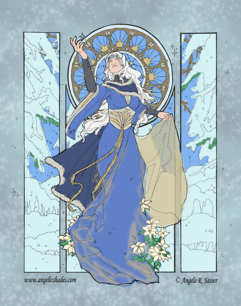
The Snowflake Lady – Part 1 – Brainstorming

Lately I’ve been working hard to beat my own procrastination for this year’s Christmas card for my family, friends, and fans. Seems I always get them out late because I always bite off more than I can chew! This year is no different with an image I’m temporarily calling ‘the Snowflake Lady’ (because, well, she’s surrounded by snowflakes and has a very snowy theme? Original, I am not.)

Brainstorming for her began with pondering on just what in particular about the last Christmas cards people liked the most.  Holiday Nouveau (my 2nd Christmas image) has been pegged as the crowd favorite, even after several years of images.  The contrast of crisp lines to soft watercolor and her Mucha-inspired pose, which leaves little white space for us to lag on, stood out to me as things which made her more successful than the others.

And so, a sketch was born!  I wanted to escape the usual green and red themes,but keep the soft stained glass look of past designs that made them so popular.  Snowflake lady emerged from the desire to conjure the delight of silver ribbons, deep wintry nights, and quiet snowfalls.  She would be more elegant than warm, an embodiment of snowy silence and the introspection of the season. (Notice her long sleeves and boot gear! I wanted a winter lady who actually looked like she was dressed halfway appropriate for the weather)

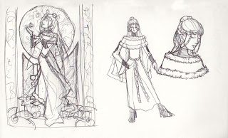
Preliminary thumbnail with fashion sketches.  

Nothing says holidays like fur trim, silver ribbons, heavy velvet, and snowflake tiaras! The full thumbnail came first so I could figure out the movement of her overall pose. The fashion sketches came next to help clarify the details of her outfit from the fuzzy mess of the thumbnail. All done on a single page of my travel 6×9 in. sketchbook in ballpoint pen with no erasing.  Working in pen keeps me from adding too much detail and taking too much time on what is meant to be a very rough idea splurge.

Upcoming Appearance: Atlanta Comic-Con

WHEN: Saturday and Sunday, Dec 4-5
WHERE: Cobb Galleria (more info)
Check this out! It’s my own spiffy vendor page!

This’ll be my first year as a vendor! I’ve always attended as the nervous geek hitting up people like Joe and Dave and gushing about how much I love their work. It’s a joy to think that this year I’ll be on the other side of the table!
I’ll be bringing the usual – prints, art cards, mousepads, glass tile necklaces, and remaining leather mask/keychain inventory. If there are any specific things you’d like me to bring along for you, let me know!

In addition to my usual fair, I’ll also have an advanced copy of Angelic Visions there for folks to flip through and will be taking pre-orders personally!  If the mail gods are with me, I’ll also have some Angelic Visions Calendars on hand!

Hope to see you cool cats there!

Remembering How to Sketch

After all the deadlines and all the projects, when you sit down at the end of the day, do you remember what it was like to do this thing you love for fun?

I know for awhile now that I forgot.  Or rather, I just couldn’t get motivated. I escaped to the world of beading and leathercrafting because it was a way to enjoy the act of creating without doing the same thing I had been doing for the 8-12 hours beforehand.  Hobbies are essential to preserving this little thing called sanity when you’re doing what you love for a living…but find yourself at the end of the day unable to do what you love because are are just out of energy to do it.  Sad to say that most of us are not endless wells (Ursala Vernon did a wonderful article that perfectly describes this feeling)

Then I discovered SKETCHAVEMBER thanks to the talented Croaky.  It’s like NaNoWriMo, but for artists, in which we draw every day of this month in hopes of making it a continuing habit.  I finally sat down and stopped thinking so damned much about what I wanted to draw! I finally figured it out. I was placing too much on the thought of drawing. I had a mental block.

If I was going to draw, I couldn’t waste a minute on ‘fun’ things!  EVERY. Single. Thing. had to be for a prospective portfolio piece or mastering a new technicque or for a commission.  Instead, I sat down (nearly) every single night this month so far and sketched without expectation or fear.  I sketched for fun and to channel all the random ideas floating around my brain.  I went with the flow instead of wondering how every little piece would further my career or projects or portfolios.

I’ve also found it so much easier to teach myself Photoshop when I wasn’t expecting to master it in a few hours.  I could just sketch for me, and nobody else, and therefore revel in the little triumphs of discovering how this or that digital brush worked for me instead of comparing myself to others who seem to speedpaint masterpieces.

So here’s to the midpoint in SKETCHAVEMBER!  I’m so happy I discovered it and that Jen got the ball rolling for all of us. Now, have a sketch flood from this month so far!

Angelic Visions – Solo Exhibition + Book Signing + Demo

If you’ll be in my neck of the woods come January, I’ll be launching a barrage of Angelic Visions events starting the first Friday of January, ALL of which will be hosted at our local gallery, Artworks on the Square!  Read on for more and your chance at prizes and pretties.

Friday, January 7th, 2011, 7-9 pm – RECEPTION & SOLO EXHIBITION

Selected artwork from Angelic Visions will be on display for the entire month of January with a reception on the 7th. Wine tasting and live music provided!

Saturday, January 15th, 2011, 7-9 pm – BOOK SIGNING PARTY

Join us in celebration of the debut of Angelic Visions!  Door prizes will be handed out to the first lucky few with prize raffles going on throughout the event.  You could win a free copy of the book, the Angelic Visions themed calendar, and other such goodies!  Food and drink will be provided, of course! Can’t have a shindig without them!

Saturday, January 22nd, 2011, 12-2 pm – TECHNIQUE DEMO

Join me for a demo on how to render skin tones in color pencil and a rundown of the basic tools of the trade.  Appropriate for all skill levels. $25 per person. (No materials required as this is a demo/lecture sort of class).

Mark your calendars!  I’ll be sprinkling reminders as these dates approach. I hope to see some of you locals there!

Also, still taking Pre-Orders, for those who are interested in the special bundle direct from the artist.

Angelic Visions – Pre-Orders OPEN!

I’ve been dropping hints here and there on the nature of Angelic Visions, a project which I have been working on for nearly a year and a half to date!  I’m happy to announce Impact Books has begun its roll out of this upcoming title, featuring a write-up and a free watercolor demo from the book over at their blog!

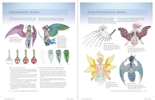
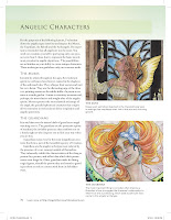
I have the advanced copy here in my hands and can attest to you that it is just gorgeous!  Like all of Impact’s books, it is a lovely gloss covered paperback chock full of rich colorful images and tons of visual aids to help ease you into the process of painting your own gorgeous heavenly creatures.

Here are some sneak peeks to sate your palettes:

In addition to pre-ordering via North Light’s shop, this book is available directly from me at this link. I’m offering the option to buy the book bundled with an ink sketch on the inside cover, a calendar, or both!  All orders of this book bought directly from me will be packaged with a shiny metallic 8×10 in. print of the cover art “Angelic Vision” and will be autographed by the artist!  Don’t forget to include your 2 word prompt for your sketch when you checkout.  
Note that pre-order bundle quantities are limited!  Order soon to procure your special copy from me!
All pre-orders will ship some time after mid-December.  Those with the sketch option may require more time for processing since I am customizing those.

Angelic Visions Calendar

It’s an exciting time here at Angelic Shades!  It’s only a few months now till my debut book, Angelic Visions: Create Fantasy Art Angels With Watercolor, Ink and Colored Pencil, releases in January of this coming year.  As a debut author, it’s my first time planning the promotion of my work on such a large scale!  I’m currently planning so many fun things for the next few months, but it’s too early to spill the beans on them just yet!

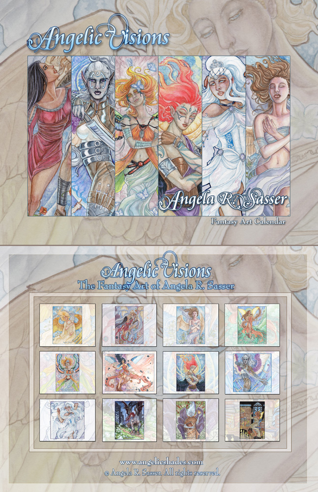
For now, I’d like to introduce you to the first in what I hope to be an exciting series of promotions for my book – the Angelic Visions Calendar!  This spiral bound booklet collects 12 months worth of heavenly figures, many which have been heretofore unpublished.  I painted each image using a variety of methods which I explore in the upcoming book.

Be the first to get a sneak peek at new work in glorious detail!  When closed, the calendar is 8.5×11 inches and opens up to 11×17 inches when hung on the wall.  It is available for purchase at the following places:

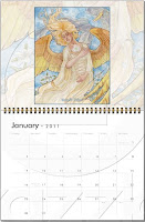
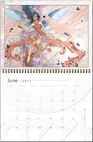
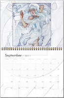
And just to sweeten the pot, here are some glimpses at a few of the calendar’s interior pages.

So much more to come soon!  Spread the word! 🙂