Month: December 2014

December 2014 Artist Q&A

Hey, everybody! It’s Christmas Eve and I’m making rum cake and looking forward to a day full of friends and good food tomorrow. In the meanwhile, here are some answers to the great questions you guys dropped for me this month!

Q.  Marion Z asks: What do you feel about the importance of studying the human figure, both clothed and nude as a fundamental education for your work?

A.  It’s inevitable. Whenever we look at a work of art, we’re always searching for the recognizable pattern of a human reflected back at us.  Even if you’re focused on drawing creatures, it’s important to know how you can create a narrative around that creature and add expression that humans can relate to so that they find it interesting.  We’re vain creatures and we love to form narrative from anything we find familiar.

Short answer, learning the human form is extremely important, especially if you’re going into a field that requires convincing characters.  Failure to express emotion, even when one is technically skilled, can be the difference between a well made work of art with no soul and a somewhat capable work of art that still manages to capture the viewer.

Q. Marion Z asks: How important to you, and what do you do for the sake of it, to include archival qualities in your work?

A.  If you want your art to last for future generations to enjoy displaying in their homes, archival quality is important.  The internet and digital capture allows us to share images like never before without degradation, but the tactile quality of an archival print or original is still the standard in home and museum display.

Q.  Marion Z asks: Given the resources available, what suggestions do you have for studio lighting, to improve, develop and understand the color and detail work that is so important in your work?

A.  I’m a huge fan of Ottlite brand lights.  They are pure daylight bulbs that help when mixing colors on your palette during traditional painting, which is so important if you’re working with pieces that require a delicate color balance to really vibe well on paper (which is like every watercolor piece I do, ever).

It’s super easy for things to come out too yellow if you paint under incandescent bulbs.  If you can’t afford fancy daylight bulbs, always try to paint by sunlight.  Sidenote, sunlight/daylight is also the best for showing the best color quality for photographing originals.

Q.  Marion Z asks: For any given media, what would you suggest for the student artist to gather for a foray into that medium?

A.  I personally don’t feel tied to any media. For me, it’s all about whatever tool gets the job done!  However, you still need to learn how a medium behaves before you can know what potential it has for your tool set as an artist.  For this, I recommend just buying a cheap set of the media you’re wanting to learn and having a play with it.  Don’t concern yourself with being a master, just have some good old fashioned fun!  Not spending a lot of money on new media lets you be able to play with it in a more guilt free way.

I also recommend picking up a good source book or two to help you be more familiar with the materials you’re trying to learn about.  For instance, I’ve been considering trying out oil painting, but there are some very particular things you need to worry out when using this media (ie. toxicity, good ventilation, proper waste disposal, etc.).  I picked up The Complete Oil Painter: The Essential Reference for Beginners to Professionals so I can take the plunge into oil painting with full knowledge of what the studio setup and other challenges of the media will be.

Q.  And final question, C. L. McCollum asks: Which is the next painting you plan to start in 2015? And why that one?

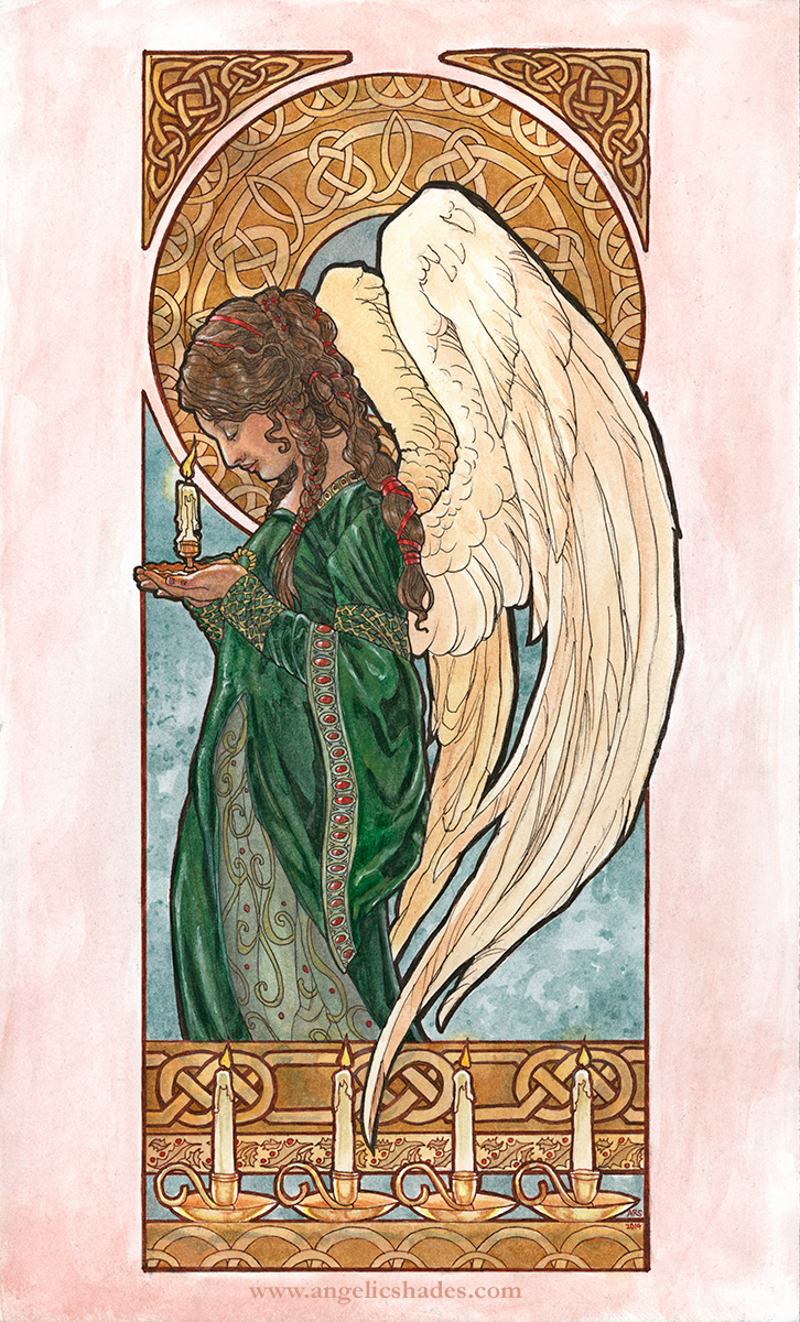
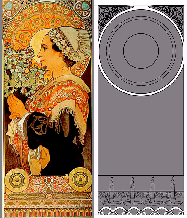
A.  I’ve been brewing on a new painting for my fantasy book cover portfolio for a long time now, but other obligations popped up keeping me from finishing it this year like I had wanted.  I’m super excited to get started on a new painting starring Melakim, one of my original characters from an original world I’ve been toying about with for years.

Melakim Wardrobe concepts

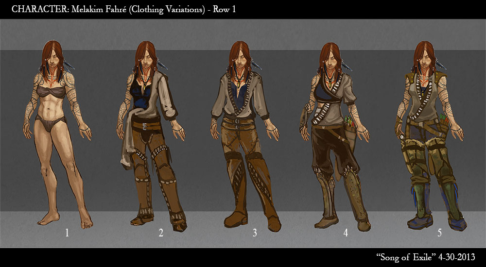
It’s going to feature all the things I love, a badass Hunter lady, lots of corvids, and a possible mix of traditional and digital a la Wylie Beckert’s graphite method that I’ve been dying to experiment with.

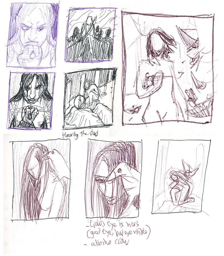
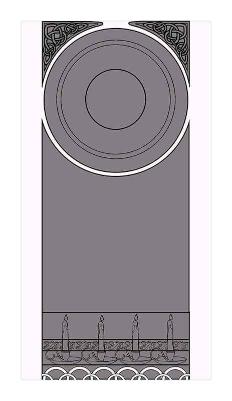
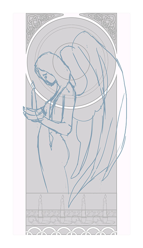
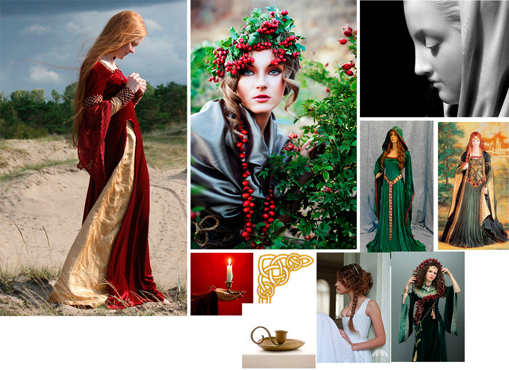
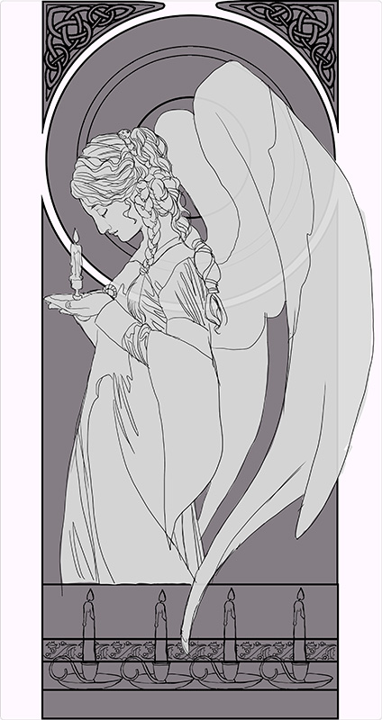
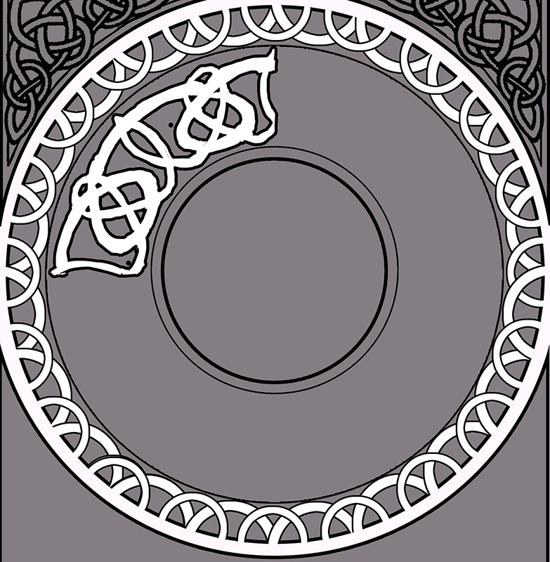
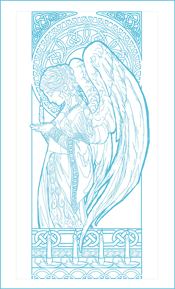
Needless to say, I am excited about this next piece!  I can’t wait for 2015!  Till then, have some thumbnails for this upcoming piece to tide you all over:

Melakim Cover sneak peek.
Tattoos? Corvids? Badass Ladies? Oh my!

Have a great holiday, everyone!  See you in 2015!

Sketch Diary: Christmas Angel Part 3

Progress continued on this painting with color testing in Photoshop.  This one was a no brainer!  I knew I wanted a more subtle color scheme that wasn’t so IN YOUR FACE CHRISTMAS!  That meant keeping colors like the strong red to a minimum and relying a nice cool green, as opposed to the more yellow green you see for Christmas motifs.

I always recommend doing a color test so you don’t end up having to start all over again because a color ruined your entire piece.  Traditional media is unforgiving like that.

christmas-angel-wip13
Digital color testing done in Photoshop CC.

The only element I was torn on were the candles.  Should they be red or white?  I ended up going with white just to keep with the theme of subtle Christmas hues.

Next, I transferred the image to the illustration board by printing out the line art, rubbing the back of the print out with a soft (6b) graphite stick, then tracing the designs with a fine point pen.  The line art is printed in blue on the print out so that when I trace the lines with a pen, I can tell where I’ve already traced.  The pressure from the tracing transfers the drawing to the board.  Be sure to wipe the excess dust off before you trace just so you don’t get speckles like I did in mine!

10301221_10152612032558458_7030449813707511526_n

I ended up going with red ribbons by the end, since her hair would have been too monotone with the green ribbons.

christmas-angel-animation
Here’s a quick gif of the process from digital sketching to paint layers.  I’ll be doing a compilation video at some point in the future, so keep an eye on my YouTube channel!


Without further ado, the finished painting!


"Christmas Angel" Watercolor and inks on 8.5x14 inch illustration board.  Cards and Art Gifts - http://www.deviantart.com/print/37246289/   Original for Sale Direct From Artist:  - Unmatted - $650   - Matted and Framed - $750  * Shipping to be determined based on your location.  E-mail me if interested.
“Christmas Angel” Watercolor and inks on 8.5×14 inch illustration board.
Cards and Art Giftshttp://www.deviantart.com/print/37246289/
Original for Sale Direct From Artist:
– Unmatted – $650
– Matted and Framed – $750
* Shipping to be determined based on your location.
E-mail me if interested.

Materials Used:

 Back to Part 1

Upcoming December Artist Q&A

i-approve-of-this-tree-christmas-cat-memeHey, everyone! I usually do a 30 minute live broadcast for my Q&A sessions, but since the holidays are busy and I’m not sure I’ll be able to broadcast from wherever we might end up, I’m doing another blog-hosted event instead!

A Couple of Changes

– The Patreon giveaway portion of the monthly sessions is now going to be held quarterly (during January, April, July, and October’s monthly broadcasts).  While my giveaways are happening less, the prize is now going to be my Patron’s choice of a custom sketch or a 50% off coupon for my shop, which is even cooler than a random thing, in my opinion!

– The Q&A sessions will still be held once a month even if I won’t be giving away something each session.  That gives us more time for mini demos and questions!

How This Month’s Session Will Work

– Leave me questions in comments here.  Ask me anything about art, life, and beyond!

– I’ll answer them in a blog post at this journal here on the 24th!

Have a great holiday season, everyone!

Sketch Diary: Christmas Angel Part 2

Before I get sucked into character details, I have to first design the frame, which I quickly do by drawing shapes in Photoshop.  I set the layer with the grey shapes that form the frame to the Blending Option, Stroke, which creates an outline around the shapes that I don’t have to manually draw myself.

I used similar partitions for the division of the frame to Mucha’s piece (why change a working formula?).  The corner knotwork, holly border, and candles were all designs I created once, then replicated multiple times and repeated across the piece.  Working digitally makes this preliminary work a lot faster

frame

A quick sketch helps me establish how I want the figure to flow through the frame and also aids with refining the rather wonky anatomy of the original thumbnail sketch:

sketchFurther reference gathering helps me collect images of candles, velvet dresses, wings, and poses that will help me make this pose look less fudged.  I lean on Pinterest very heavily for this purpose and am constantly gathering inspiration on a daily basis for my projects.

christmasangelrefboard

This is a VERY important step!  There’s nothing that can ruin a painting faster than a completely fudged pose that just looks ‘off’, unless you are very, very experienced and have done so many studies you can draw things from memory.  This is rare even for the best of artists, mind!

Gathering reference can also help you save time revising later because you didn’t get that hand quite right or didn’t get the drapery quite right.  The trick is uniting your references and reinterpreting them in such a way that you still have something unique and you don’t lose the energy of your rough sketches.

I eventually arrived at something like this for the base sketch.  At this point, everything is still on its own layer in Photoshop to allow me to re-position any element I please:

base-sketch


Now, designing the window!  The window knotwork begins with a freehand sketch that fills up 1/4th of the circle.  This 4th is then copied, pasted, and flipped horizonatally so the design is symmetrical.  I use the layer’s Blending Option set to Stroke again to create an outline automatically while I draw.

Admittedly, I’m not very structured with my circular knotwork. I sketch until it looks right, rather than drawing guidelines and graphs.

window-knots-sketch

I wanted the design to emulate a snowflake with the radial spires, so I made sure the main junctures had points in the most important places (the center lines of the shape).  I also wanted a thicker strands in this design to help fill up the space, since a design with too many thin strands would start to make the background window too busy and distract from the main character.  I used two total strands for this design, a thin strand and a thick strand.

Next, I lock the transparency on the layer and draw all the intersections of the knots.  The locked transparency keeps me from drawing outside of the shape.  The reason I draw the knots as if they were invisible is to help me clean up the angles of the strands and intersections, which were a bit sloppy before.  You can see towards the bottom of the circle where the knots are still sloppy.

window-knots-sketch2

Next, I meticulously defined the underlap/overlap pattern of the knots.  Traditionally, knotwork always has a pattern of any one strand going over and under.  I broke this pattern somewhat so the radial spires stand out, bringing emphasis to the snowflake shape.

window-knots-sketch3


Phew!  That was a lot of tedious detail (and I loved every second of it!).  A few cups of coffee later, here’s the finished line art!  I’ve changed the line work to blue so as to make it easier to tell which areas I’ve transferred when I’m transferring this to illustration board.  This line art is still a little rough as well, since I’ll be cleaning those lines up once she’s been transferred to the board.

christmas-angel-wip12

Next up: The finished painting!

Back to Part 1


Book Club: Artist As Brand Part 8 – My Website

My reading of Greg Spalenka’s Artist As Brand continues with section VIII. What Makes a Great Website/Blog.

I found the book for a great deal on the Nook.
Or you can buy it via my Amazon referral link
and give me a little kickback!
You can also buy direct from the author!
 

Blog vs Website

Section VIII talks about what makes an interesting website and blog.  I love the allusion to a website as your studio while your blog is a conversation and is more interactive.  That immediately puts into perspective how a website should reflect your style while a blog can be more conversational and more casual.

For those who don’t have much experience designing a website, this section has great tips on suggested sections (ie. About, Contact, Press, Newsletter sign up, etc.) and exactly why you’d need them.

Newsletter Strategies

Spalenka also presents great suggestions for writing newsletters. I always have a hard time figuring out what’s relevant and have had a problem having enough art to show (since my attentions/products were so split up).  My newsletter has gone quiet while I build up enough of a buffer of a new consistent body of work to talk about.

Example of Online Brand (from My Own Experience):

Shadowscapes – The Art of Stephanie Pui-Mun Law

Stephanie Pui-Mun Law immediately sprang to mind for me while I was reading.  She has a fantastic online brand identity and social media/website presentation. She must be have partnered with conversion rate optimization services to get more attention from people. Most impressively, she built most of this herself from the ground up, having been a computer science wiz before she became an artist.

Stephanie has a centralized shop on her site and I can always tell I’m on Stephanie’s sites when I see her dreamlike Celtic knotwork, watercolor textures, and soft color palette.  Her newsletter also has a similar feel and updates her fans on upcoming events, new art, new tutorials, and a monthly giveaway which all feels relevant and cohesive to her brand identity.

My Homework

These sections definitely got me thinking about how I want my Angelic Shades and The Fantasy Art of Angela R. Sasser sites to be different.


Angelic Shades Studio – Should be a vintage inspired theme with Art Nouveau flow and flourish.  Soft pale colors (blue, purple, light grey, and white).

Store should serve fine art buyers and my target audience (ie. fancy mats and framed art, postcards, greeting cards, etc.).


The Fantasy Art of Angela of Sasser – Should be elegant and sleek with just enough flourish to not make it too stark.  Black, white, or neutral with accent colors.  Words and images blended together to reflect my love of characters, stories, and narrative images.

Store should serve book lovers, gamers, and character fans. (ie. journals, bookmarks, playmats, dice bags, themed sketchbooks/storybooks, graphic novels, etc.).


Re-designing these sites with more of a specific identity in mind is definitely high up on my to-do list!

I’ve left out SO much concerning all the various resources Spalenka mentioned, so definitely go support Spalenka’s book/workshop if you are finding this blog series helpful!

Next Up: High Touch Venues – Conventions to Galleries

Book Club: Artist As Brand Part 7 – The Art of Social Media

My reading of Greg Spalenka’s Artist As Brand continues with section VII. Brand Promotion – The Art of Social Media.

I found the book for a great deal on the Nook.
Or you can buy it via my Amazon referral link
and give me a little kickback!
You can also buy direct from the author!

This section  provides a detailed list of forums and communities for networking, many of which I hadn’t heard of before.  There are a lot of sites dedicated specifically to networking ‘tribes’ (ie. Ryze.net and Tribe.net) that I have yet to tap!  I’ll have to post later over at The Muse’s Library with some thoughts on these sites and their usefulness for artists once I’ve had a chance to properly assess them.

Shop Tips

Spalenka also makes a strong argument for having a shop on your website instead of using a portal shop like the many POD sites (Zazzle, Fine Art America, etc.) or markets like Etsy.  I’ve been back and forth on this issue for years now.  Running a shop on Etsy, for instance, gives me a shop front that’s easily accessible and discoverable by a public market and is supported by the marketplace.  Etsy does take a percentage, but the setup provides a nice backbone for a shop that I didn’t have to build myself.

I’ve built shops from the ground up, spending hours upon hours perfecting it, only to have something go wrong on the technical side of things.  Not to mention the fact my website alone simply does not get the traffic of eBay or Etsy, no matter how much I promote it.  Even still, Spalenka argues that marketplace trends are always changing while your website will always be the same central location and this is very true.

Etsy, for instance, is battling with changes at a corporate level with many artists left disgruntled by the flood of wholesalers taking over the market.  Your central website, however, will never go out of style and a shop would be easy to find if it were located there.

Bearing this in mind, I aspire to create a shop front on my site using WooCommerce, which I hope will be an easy to implement plugin for this WordPress based site.  I’ll probably still use Etsy during high traffic seasons and to sell quirky cute handmade things featuring my art, but it will probably not be my main shop front anymore, granted I can get WooCommerce working!  Adding one more thing to my business re-organization to-do list.

Publicity Tips

This section also features some fantastic tips on publicity, such as ideas for blog events and links to press kit tutorials.  It’s a bit overwhelming!  I know I need to hit publicity harder, as it’s something I really haven’t relied upon. I’m just never sure where genre art like mine can find an audience and partner site to be featured on, since I don’t work with well known IP’s, nor do I have a really recognizable body of work, just yet.

Putting a pin on this section to come back later when I feel I’m finally ready with a decently sized body of consistent (theme and skillwise) work!

I’ve left out SO much concerning all the various resources Spalenka mentioned, so definitely go support Spalenka’s book/workshop if you are finding this blog series helpful!

Next Up: What Makes a Great Website/Blog

Sketch Diary: Christmas Angel Part 1

It’s that season again!  Time for this year’s Christmas painting!

Be sure to sign up for my annual Christmas list if you haven’t already.  It’s FREE and my way of spreading a little holiday cheer to you all. It’s all thanks to the wonderful support of my Patreon patrons. You guys rock!

For this year’s painting, I wanted to top last year’s, which did not have enough candles, in my opinion. I wanted MOAR candles!  There is something about these elegant points of light that always makes me think of the holidays.  From the lighting of advent wreaths to candlelit Christmas pyramids, I just love the part they play in the season and the beautiful light they cast.  This theme became my jumping off point for inspiration.

I also wanted to channel my love of Alphonse Mucha’s close up portraits.  I love the simplicity of the composition and focus on clothing and hair details instead of grand borders.  Clothing, hair, and faces being some of my favorite things to draw and paint!
mucha_portraits_by_angelasasser-d87mrl8[1]
My thumbnail sketching began on toned paper with pencil, ballpoint pen, and white color pencil.  My first sketch (top left thumbnail) drew directly upon one of Mucha’s close up portraits, mimicking the pose.

 christmas_angel_thumbnails_by_angelasasser-d87msjs[1]

The next few thumbnails focus on the concept of an angel inspired by Mucha’s portraits of ladies in profile. In the end, I chose the concept of the angel in profile because it feels more festive and cheery than my initial thumbnail.  I may just have to save the candle woman from the first thumbnail for another painting. Next year, perhaps?

The thumbnail with the asterisk by it is my winner!  The pose of the wings feels more natural and elegant and the piece just flows down through the wings, her braid, and her dress.  The other angel thumbnails felt too claustrophobic and unnatural when the wings were added.  The lines and flow were too broken up and led the eye off the page at odd places.

I’d actually do more thumbnails than this usually, but since I’m starting pretty late this year, I’ve got to make my decisions quickly or this won’t get done by Christmas!  One of these years, I’ll learn to start earlier…

Next, I’ll need to hunt for references on design motifs for the Celtic knotwork, candle holders, and the inner window.  I’ll also need to take reference photos for the angel.  The color scheme is going to be green and gold with accents of red.

The detail addict in me is so excited to dive into this one!

Next: Design motifs, rough sketches, etc.