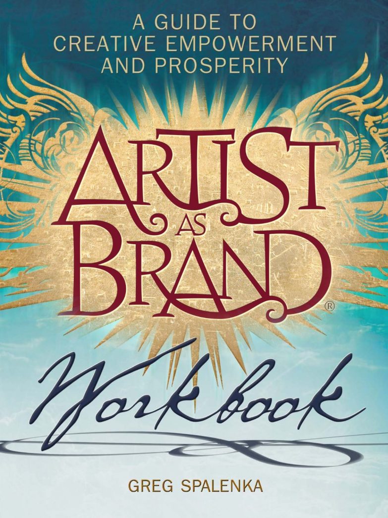
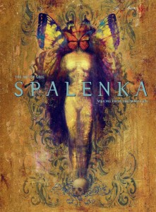
My reading of Greg Spalenka’s Artist As Brand continues with section VIII. What Makes a Great Website/Blog.
 |
|
I found the book for a great deal on the Nook.
Or you can buy it via my Amazon referral link
and give me a little kickback!
You can also buy direct from the author!
|
Blog vs Website
Section VIII talks about what makes an interesting website and blog. I love the allusion to a website as your studio while your blog is a conversation and is more interactive. That immediately puts into perspective how a website should reflect your style while a blog can be more conversational and more casual.
For those who don’t have much experience designing a website, this section has great tips on suggested sections (ie. About, Contact, Press, Newsletter sign up, etc.) and exactly why you’d need them.
Newsletter Strategies
Spalenka also presents great suggestions for writing newsletters. I always have a hard time figuring out what’s relevant and have had a problem having enough art to show (since my attentions/products were so split up). My newsletter has gone quiet while I build up enough of a buffer of a new consistent body of work to talk about.
Example of Online Brand (from My Own Experience):
Shadowscapes – The Art of Stephanie Pui-Mun Law
Stephanie Pui-Mun Law immediately sprang to mind for me while I was reading. She has a fantastic online brand identity and social media/website presentation. She must be have partnered with conversion rate optimization services to get more attention from people. Most impressively, she built most of this herself from the ground up, having been a computer science wiz before she became an artist.
Stephanie has a centralized shop on her site and I can always tell I’m on Stephanie’s sites when I see her dreamlike Celtic knotwork, watercolor textures, and soft color palette. Her newsletter also has a similar feel and updates her fans on upcoming events, new art, new tutorials, and a monthly giveaway which all feels relevant and cohesive to her brand identity.
My Homework
These sections definitely got me thinking about how I want my Angelic Shades and The Fantasy Art of Angela R. Sasser sites to be different.
Angelic Shades Studio – Should be a vintage inspired theme with Art Nouveau flow and flourish. Soft pale colors (blue, purple, light grey, and white).
Store should serve fine art buyers and my target audience (ie. fancy mats and framed art, postcards, greeting cards, etc.).
The Fantasy Art of Angela of Sasser – Should be elegant and sleek with just enough flourish to not make it too stark. Black, white, or neutral with accent colors. Words and images blended together to reflect my love of characters, stories, and narrative images.
Store should serve book lovers, gamers, and character fans. (ie. journals, bookmarks, playmats, dice bags, themed sketchbooks/storybooks, graphic novels, etc.).
Re-designing these sites with more of a specific identity in mind is definitely high up on my to-do list!
I’ve left out SO much concerning all the various resources Spalenka mentioned, so definitely go support Spalenka’s book/workshop if you are finding this blog series helpful!


