Category: walkthrough

Sketch Diary: Lady of March Part 3

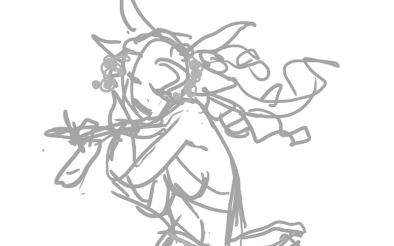
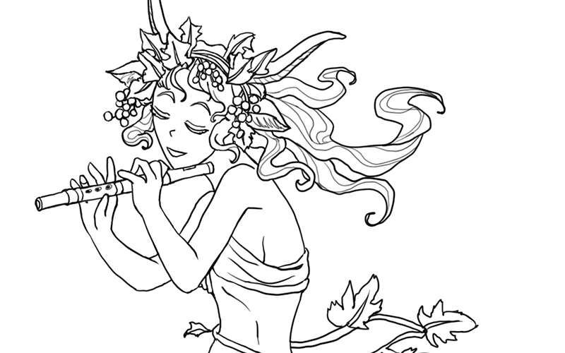
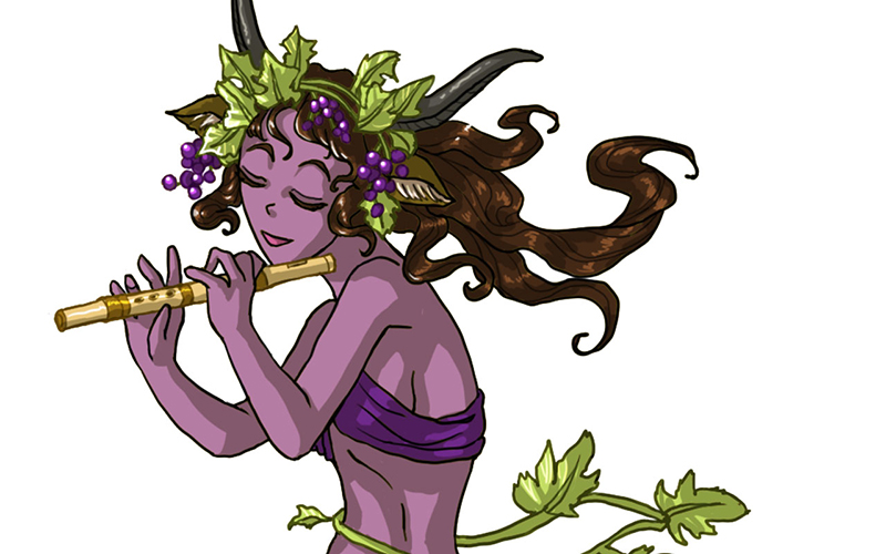
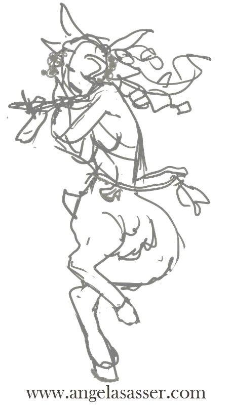
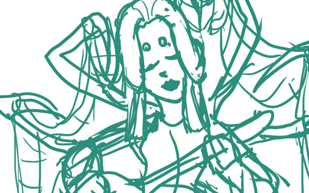
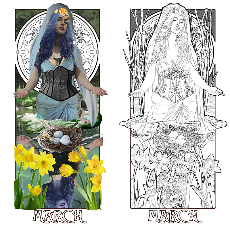
Last time, I talked about designing the narrative elements.  Now, I’m excited to start pulling everything together into a cohesive piece!  Working in Photoshop CC and using a Cintiq 21UX, I use a composite created from my reference photos as a basis for a rough line drawing.  Sometimes, it’s impossible to find the perfect pose and that’s where Photoshop can be really handy.

I’ve used the body from the photos I took, the head from another photo whose facial angle I really liked, and other reference photos (not pictured) to help me change the look and features of the model.  One of my intents for this series is that it should encompass all forms of beauty, including diverse women from different ethnicities.  I don’t want every Lady to look like me, since I’m primarily the model (a fact I hope to change once I can afford more models).

lady-of-march---composite-lowres

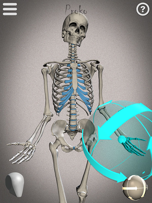
I also wanted to share this screenshot of the reference I used to draw the skeletal reflection from Proko’s Skelly app for Apple and Android.  It’s fairly easy to use and arrange with poses you can save.  I’ll definitely be using it more for study!

lady-of-march---skeletal-pose-lowres
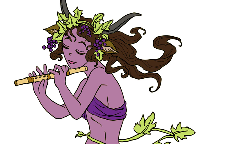
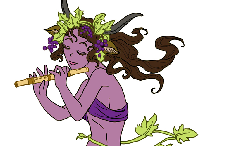
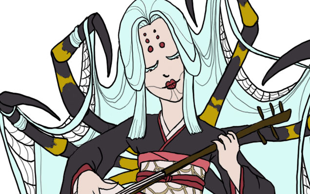
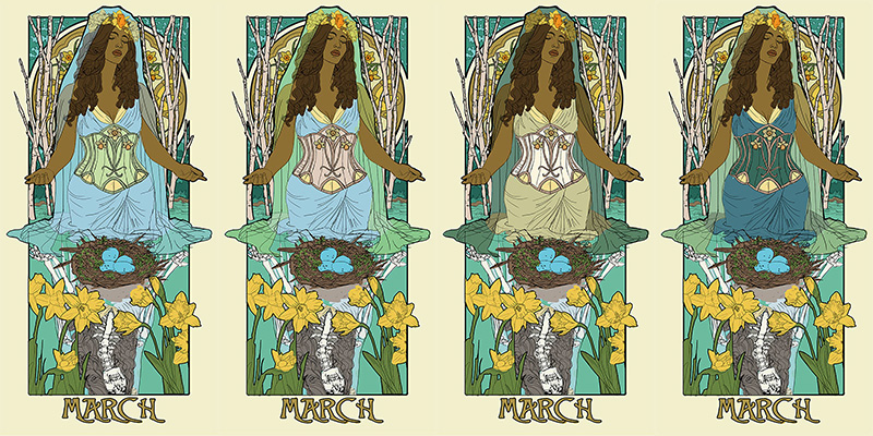
With my line art figured out, I can finally move on to testing out a basic color palette for Lady of March.  I know I want a theme indicative of Easter, so I’m mainly drawn to gold, yellow, and blue.  The first thing I do with any of the paintings in this series is to make sure the birthstone is represented also through the color palette as well. Luckily, the greenish blue hue of Aquamarine suits my concept for this piece rather well!  This color takes up the majority of the background and influences the rest as well.  The only other element I’m sure about at this point is that I want the eggs to be the bright blue of robin’s eggs, which always make me think of Spring.

I use the Hue/Saturation slider in Photoshop on each element to see what color choices might surprise me.  I explore different options, including a dark dress or a light veil.  The 1st image is perhaps too monochromatic in the clothing so that the corset stands out too much.  The contrast between the dress and veil in 2 works well while the bodice also brings out the beige of the trees from the background so there’s more color circulation throughout the piece.  The 3rd and 4th images both have a nice clear silhouette that’s intriguing, but starts to get away from my liking of stronger blues and yellows in this piece.  I should also note that I try to keep the yellows subdued throughout this piece, except for the flowers, which are the strongest focal elements.

lady-of-march---color-test-lowres
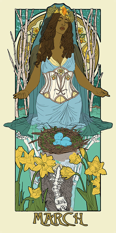
Finally, I arrived at a color palette I consider to be the best of all worlds!  The dark veil allows a strong silhouette for the figure while the pale corset and pale blue dress work well together, leaving the eggs and flowers as the most saturated symbolic elements in the piece.
lady-of-march---color-final-lowres
This has been your final sneak peek before I unveil the final painting! You can see the unveiled piece here.

Watch a time lapse of the painting:


Want to see these Sketch Diaries before everyone else?  Consider pledging at my Patreon!
You’ll get early sneak peeks plus other exclusive Rewards!

Part 1 – Conceptualization
Part 2 – Narrative Elements
Part 3 – Preliminary Drawing

Sketch Diary – Satyr


Inspiration

Today I’ll be talking about how I created Satyr for the 30 Day Monster Girl Challenge.  For my version of Satyr, I went with my own fantasy twist of a well-known figure from Greek and Roman mythology.

The Satyr of myth is usually a mischievous male with the lower body of a goat who is known to lecherously pursue nymphs and dryads.  The Satyr were also drinking buddies with Dionysus, the god of wine and merriment.

For more about the Satyr, check out one of my favorite Greek mythology resources, http://www.theoi.com.


Tools and Techniques

For this painting, I used Photoshop CC and a Wacom Cintiq 21UX.

Concept Inspiration

For my Satyr girl, I wanted to go with the theme of grapes to honor Dionysus and his wine, so she ended up with a purple complexion crowned with grapevine adornments.  Like many Satyrs, she is also a player of instruments, in this case a flute.


References

A selection from my references for Satyr.

monster-girls-satyr-refs


Art Process

Step 1. Quick digital gesture drawing done to capture the movement and energy of the pose. This isn’t very precise and is more about energy than accuracy.wip-satyr-01


Step 2:  A cleaner line art is drawn on a layer atop the gesture. I used Lazy Nezumi Pro set to ‘subtle’ to help stabilize my lines in Photoshop and make them smoother.

wip-satyr-02


Step 3:  Added a base layer of color so no background color will accidentally show through.wip-satyr-03


Step 4:  Added the flat colors after much deliberation on what her skin color should be.wip-satyr-04


Step 5:  Colorized the lines to make the grapes, grapevine, and flute stand out.wip-satyr-05


Step 6:  Added a shadow layer using warm grey above everything clipped to the Group and set to Multiply.wip-satyr-06


Step 7:  Added a highlight layer painting in white set to Overlay. Also clipped to the Group.wip-satyr-07


Step 8:  Final touches of pure white in key places such as the leaves, grapes, and hair to help lead the strengthen the focus, flow, and dimensionality of the piece.

wip-satyr-08


For more in-depth instruction on how I created this image, Pledge to any $10 and up level at my Patreon to gain access to the narrated video tutorial!  You can also buy the individual tutorial separately at my Gumroad shop, but you won’t receive the other extras you would by purchasing via Patreon.

You can watch a video preview of the tutorial for Satyr without narration here:


Sketch Diary – Monster Girl Spider

Inspiration

Jorogumo Illustration by Matthew Meyer
Jorōgumo Illustration by Matthew Meyer

Today I’ll be talking about how I created Spider for the 30 Day Monster Girl Challenge.  For my version of spider, I went with a Japanese inspired Jorōgumo.

The Jorōgumo is a mythological creature from Japanese folklore which was known for luring virile young men to their lairs, charming them with food and music, then binding them up in their webbing so they could devour them.

Jorōgumo means “binding bride” or “whore spider”, but is also a word which refers to a particular species of golden orb weaver spiders in Japan.  For more info on this fascinating folklore, check out www.yokai.com

Tools and Techniques

For this painting, I used Photoshop CC and a Wacom Cintiq 21UX.

Concept Inspiration

I took a lot of visual inspiration from the golden orb weaver (nephila clavata) of Japan.  My Spider has many of the same markings as decorative designs on her kimono and her color palette echoes the spider’s.  Her kimono is also inspired by a bride’s as a nod to the “binding bride” namesake.

References

A selection from my references. I had many more of the spider from multiple angles, but I’ll save you the nightmare fodder!

References for Spider


Process

Phase 1 – I doodled a rough sketch in turquoise to make it easier to see when I inked on top.Phase 1 Spider


Phase 2 – Line art created with a hard round brush.

Phase 2 Spider


Phase 3 – I laid in flat colors using the selection magic wand to select areas and Edit>Fill.

Phase 3 Spider


Phase 4 – A shadow layer set to Multiply was created that was clipped as a mask to the entire Group of colors.

Phase 4 Spider


Phase 5 – A final touch of highlights was added with white. The highlight layer set to Overlay.

Phase 5 Spider


Animated process GIF.
You can also watch a sped up time lapse video of the process here.

Animated Process GIF - Spider

For more in-depth instruction on how I created this image plus a downloadable PSD of the image, Pledge $10 and up on my Patreon to gain access to the narrated video tutorial!  You can also buy the individual tutorial separately at my Gumroad shop, but you won’t receive the extra art goodies you would by purchasing via Patreon.

You can watch a preview of the narrated tutorial here:


Adventures in Video Editing. Feedback Requested!

I’ve been iced in for three days straight here in Georgia so I used this accumulation of time inside to start teaching myself video editing with Camtasia Studio 8.  I’ve finally figured out how to use my mic as well, which means my videos now come with film noir voice-over narration!

Well maybe not film noir, persay, but the potential is there!

I hope you’ll watch and give me some feedback about how you like it! With luck, I’ll be doing many more of them to share.  It’s quite fun to be able to yack at you guys directly.  I always do it via walls of text here in blog posts.  It’s nice to put a voice to the text!

On that note, here are some questions for you:

  1. What kind of videos would you like to see more of?
  2. What kinds of things should I talk about during videos?
  3. If I started hosting live monthly Q&A/AMA sessions, would anyone be interested in attending?

I’d appreciate any kind of feedback you guys can give me on this matter!  I’ve already got a couple of videos up with narration, one on the making of a leather crafted barrette and the other of a walkthrough of a master copy of Gerome’s art.

I admit a lot of my current push to learn video editing is so I can start being more interactive on the net on my YouTube channel, but also on a little site called Patreon that’s causing a lot of buzz right now.

More on that later!  It’s been a time of re-structuring myself, re-focusing my career goals, and bringing even more of a polish of the vision I have for my art.

Some exciting things are a-brewing this year.  Stay tuned for more, Bat-fans!

Top Posts of 2011

I’m stealing this idea from Hayley at Eventide because it seemed like a great way to wind down the year on this journal and to remember all that’s happened here in 2011!

I started this blog waay back in 2009, which feels like forever ago, and looking back helps me realize how this blog has grown into so many interesting pathways!

My top blog posts of this year (not including popular posts from previous years that are still some of my most highly viewed topics) aaaare:

1. Evolution of an Artist’s Alley Table Parts 1 and 2
I like to keep a record of how I display my artwork for my own purposes and so others might learn from my trial and error. These posts cover how my displays for art shows have leveled up over the years! I hope it saves ya’ll money and helps you to make your wares look their best!

2. DragonCon 2011 Con Report

The con report/review for my biggest event of the year!  I like to do a con report for every con I go to so that other artists might benefit from my working experience there.  DragonCon has always been my favorite event to go to each year and I learn something new no matter what!  There are also plenty of links to great costumes and silly videos we made in this post.
3. Ezio Mask Dev Diary (Parts 1, 2, and 3)
An in-depth walkthrough of how I created my Venetian Assassin Mask inspired by Assassin’s Creed 2.
Because everyone likes free stuff! This was my first ever book giveaway and hopefully not the last!

5. Commissions, Portfolio Reviews, and Study Sources

A comprehensive blog of study sources for traditional artists wishing to learn more digital work and those interested in game art.  Also announced my call for Portfolio Reviews in this blog (which I’m still taking on an ongoing basis!)
A glimpse at some of the many pieces I had going on for this year’s DragonCon.  Many of these pieces were sold before they were properly photographed, so this entry is the only record of them!
Another artisan craft tutorial on how to set a stone in a leather mask.
An in-depth review of my experiences with Artfire, another website much like Etsy that exists to serve the handmade market.
9. Sketch Diary: Angel of January (Parts 1, 2, 3, and 4)
An in-depth walkthrough of my piece “Angel of January” detailing the creative process, working with photo references, and learning new digital tricks.
Probably the most difficult entry for me to write, as it took admitting some of my failures of being an artist this year.  It really helped me get my thoughts in order, however, and put me in a better position to start thinking of solutions!
Now, onward to 2012!  I hope that my entries continue to provide helpful info to other creative professionals!  I write this blog not just for myself, but you, the readers, so if you know of any topics you’d like to suggest for me to cover in the coming year, please feel free to suggest them here in comments!
Till next year!

Sketch Diary: Angel of January Part 4

Continuing from the last sketch diary entry detailing the battle of wills against horrible color schemes.  I wasn’t quite sure how to compose this next entry, as I couldn’t quite figure out how to record my many hours of tweaking in Photoshop nor do I want to confuse you with the cluttered mess that is my digital coloring method.

I am relatively new to digital painting so I haven’t quite figured out the most efficient way to paint yet.  How about a list of things I learned during this painting that made me fear digital coloring less instead?

Learn the use of Layer Masks and Adjustment Layers!
Being able to tweak the contrast, color, etc. of an image without destroying the integrity of your original image will save you many headaches in the end.  Layer Masks are especially helpful if you want to integrate textures into your image with a more natural feel while Adjustment layers let you tweak elements such as Levels, Contrast, etc. while still keeping your original image untouched.  For example, I used a Gradient via a Fill Adjustment Layer to get the subtle green glow in the texture of the marble behind my angel in this painting.

(Peter Morhbacher has some great tuts on using masks and integrating texture, “How to Apply Texture Without Looking Like a Douche” and “Masking Tutorial” ).

Creating convincing light beams is totally easier in digital.
Wish I could say it was my brilliant idea that resulted in the light beams coming from the top left on my painting, but it was from this jewel of a tutorial.  I used the thicker beams they mentioned in another tut by the same person.  A gal could get used to not having to mask off with tape or masking fluid or painting around the light shafts like I would in watercolor. Hoorah for saving time!
Blending takes time…even in digital.
90% of my time on this image was spent blending and blending and BLENDING some more, especially in the area of her skin.  I used default brushes set to Pen Pressure and an Intuos3 Wacom tablet to color this image. In my experience so far, if you want your image to maintain that painterly feel, it’s better to blend with brush strokes than rely on gradients or fills. It’s far too easy for things to look sleek and plastic in digital so watch yourself! 

Another trick I used to maintain a subtle texture in this painting was to insert texture from free texture sites in layers set to Overlay and attached to the various elements of my image with Clipping Masks.

For things like the skin and hair, I used roughly three default Brushes set to varying Opacity and Scatter settings. I’m sure there’s a whole world of custom brushes to discover, but these are the ones I used, in addition to the default Chalk brush, which I used to simulate the color pencil lines when I needed to touch up my color pencil layer I had scanned in from my original drawing.

A little texture goes a long way!
Critique is priceless, no matter the medium!
As much as I’d like to say this image popped out of my head sparkling and awesome, it looked like crud during a midpoint when the angel’s skin was purple, the window was floating and overwhelming, and I was frustrated with it.  That’s when turning to more experienced digital artists really saved the day! 
Sam Hogg and Stephanie Reeves gave me wonderful advice, paint overs, and encouragement and that is just what we need when learning a new medium, so don’t be afraid to check out places like CGsociety and Conceptart.org (or your own arty friends) for critique!

I did a time lapse video of all of my progress shots. Next time, I’ll try a screen recording program (any reccomendations from you guys?)

And finally, the finished image!
“Angel of January”, 11×17 in.
Digital painting over color pencil outline.
Download a wallpaper of this image.

Color Pencil Tutorial Suggestions?

So it’s been a long while since I first uploaded my Color Pencil Tools tutorial. It’s about time I got off my duff and made some new videos! I’m doing this for all you folks out there, so what would you like to know about color pencils and working with them? Here are a few topics I’m pondering thus far:

=> Coloring Skin (including different tones of skin)
=> Smooth Blending with Colorless Blenders
=> Coloring Hair
=> Coloring Feathers
=> Mixing Media with Color Pencils

Disclaimer! These tutorials will be covering the way I personally work, meaning that I may not do things by the book or how other artists do them. It may be a little while before I can produce these videos so I wanted to start gathering thoughts now!

Resources – Watercolors

QUICKIE UPDATES

– Check out my latest offerings at Esty. Lots of new pendants up! Plus a special offer for those on DeviantART.

– New paintings in my Fantasy & Scifi Gallery

+ Verdant Muse
+ Angel of Purity

Lately, I’ve been brushing up on my reading to make sure my skills are sharp for my current projects and it struck me that I should put my obsessive-compulsive researching to good use! I have a fortunate (or unfortunate) habit of collecting art books, links, and all manner of things and figured I would share what I have with you all. In turn, I hope you will suggest other good sources so I can add them to my lists!


BOOKS ON WATERCOLOR

Painting Weathered Buildings in Pen, Ink, and Watercolor by Claudia Nice
Nice’s books on watercolors are some of the best I’ve seen with plenty of suggestions on how to create textures in watercolor by blending media, using rubbing alcohol, sewing threads, and plenty of unexpected things!

Creating Textures in Pen & Ink with Watercolor by Claudia Nice
More of the same quality as the last book with tons of illustrations and a focus on creating natural forms and textures.

Dreamscapes: Creating Magical Angel, Faery & Mermaid Worlds In Watercolor by Stephanie Pui-Mun Law
This is technically meant for fantasy artists, but I find that the techniques concerning texture and design are applicable to all artists interested in watercolors. Flipping through the full color pages jammed with fantastical creatures always gets me inspired. Pui-Mun’s work also possesses a particular grace that’s often absent in most fantasy-themed art instruction books,which are generally very cartoonish with generic character designs.


ONLINE RESOURCES

The Handprint Watercolor Guide – An excellent, extensive, and easy to understand guide about everything from brushes to paints and methods.

The National Watercolor Society – A great place to consider joining. They host open exhibitions, activities, and other such things that are good for career building.

WatercolorPainting.com – A handy compilation of images, info, and free tutorials.


TUTORIALS

Bob Davies’ Tutorials – An awesome beginner’s video tutorial by bob Davies. Be sure to check out the rest of his easy to understand tutorials on watercolors, watercolor pencils, etc. I really enjoyed his voice and laid back sense of humor as well.

Watercolor Tutorial by Clap-San – A glimpse into doing a more light and airy style with watercolor by DeviantARTist, Clap-san.


Want more? Keep an eye on the Resources Section of my forum. Suggest your own resources too! What are your personal favorite resources concerning watercolors?

Forsythia Walkthrough & Angelic Inspiration

After so many serious business posts, I thought I might air out this journal with a glimpse into a walkthrough I’ve been working on lately to stretch my legs at writing instructional art direction. The first blossoms of Spring have sprung and everywhere the Forsythia have blossomed in bunches of yellow splendor. This awakening of color has inspired my latest little miniature piece, Forsythia.

Why I chose to make such a detailed piece a mini, I’ll never know.

I’ve found a good deal of inspiration as well in reading Angels: Celestial Spirits in Legend and Art by Jacqueline Carey which has brought my eye back to such old forgotten favorites as Botticelli and Weyden, among others. There are so many angels with bright multi-colored wings, gleaming peacock eyes, and other peculiar details that I never would have noticed if I hadn’t come back to these artists with a new perspective. The ol tried and true formula of the angel with white wings and a ring halo is definitely one I’m seeking to break.

Without further ado, here’s an excerpt of the first few steps of my latest work. You can view the entire walkthrough as it happens here. I’m currently about to begin the watercoloring phase.

Are my instructions easy to understand? Do you have any suggestions for how I might improve? Let me know! These tutorials are for you. I want to know what you want.