Category: Blog Posts

Critique Corner – Persephone by Maria

For today’s Critique Corner, we have an image by Maria Arnt.  Check out some of Maria’s other work before we get started!


The image up for critique is “Persephone”. Maria’s main concerns were on the use of line width and anatomy, specifically the eyes.

The paintover.

On Line Width

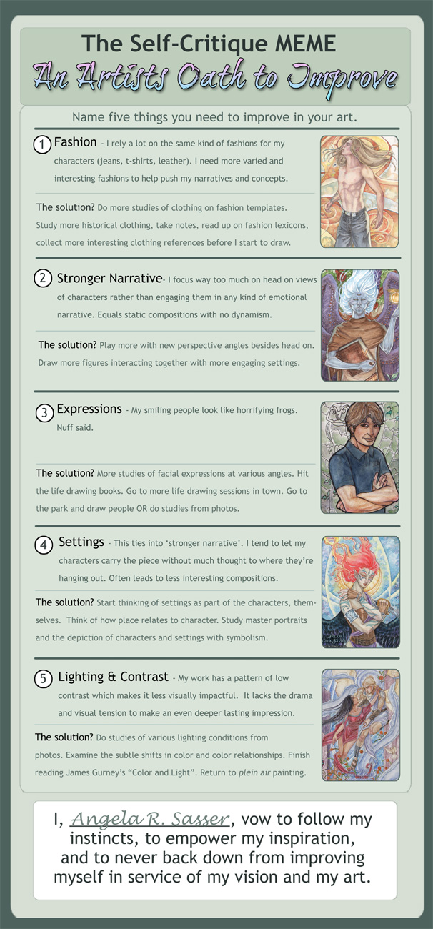
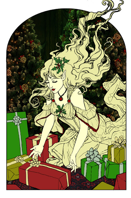
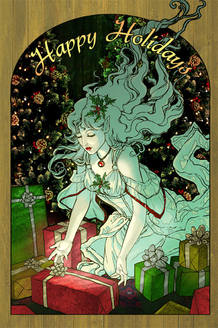
Beautiful!  You’ve never had a problem with creating wonderfully inked pieces, from what I’ve seen of your work.  I think if you want to push the lights and darks in this image that you could add hatching or screentones for shading as well.  Otherwise, cleaner lines like this generally require color to bring a stronger mood and visual impact to a piece.

The Eyes

I think the first thing we look at in this piece would be the eyes. Persephone is glancing right at us and, being the only character with a full face, our attention is brought right to her face. Your description of the piece states the following:
“Even though she’s captured by Hades, she’s discovered she has this sort of power over him–but she’s a little afraid to use it. As she eats the pomegranate seed, her eyes are both hesitant and a little daring. Are you going to stop her? She’s not completely sure she wants you to.”
However, the wide open nature of her eyes actually makes her seem more peppy and upbeat rather than hesitant or daring.  In the paintover, I chose to divert her gaze to the pomegranate seed, which I moved further away from her lips, which suggests she’s thinking of the seed and not interacting with the viewer.  One thing to remember is that even though anime eyes are indeed wide, that doesn’t mean that they can’t be various states of open or closed, which is key in creating convincing expression, even via the abstraction of anime style.  Not rendering the eyelid as you have limits the expressiveness of the eye to looking wide, surprised, or clueless.  In addition, I’d highly recommend doing a few studies of anime expressions to get a deeper understanding of how eyes and expressions are abstracted by manga style.  The ’25 essential expression’ memes are a great way to practice!
Notice how most of these manga style eyes still have eyelids (and if they don’t, the eyelid is generally implied with shading, the eyebrows compensate for the lack of expression by their angularity, or the eyes are simply drawn more slim to imply how open or closed they are):

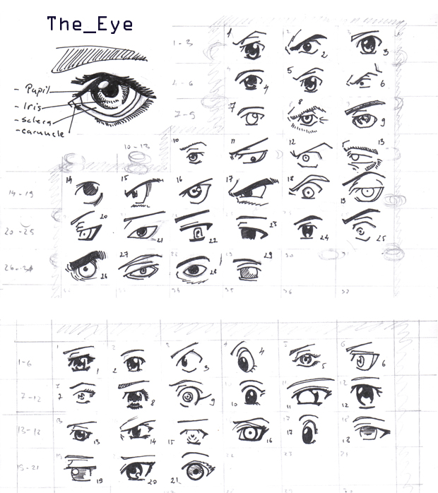
REFERENCE-Manga eyes by ~Aoi-Ne-Blue

On Other Anatomy 

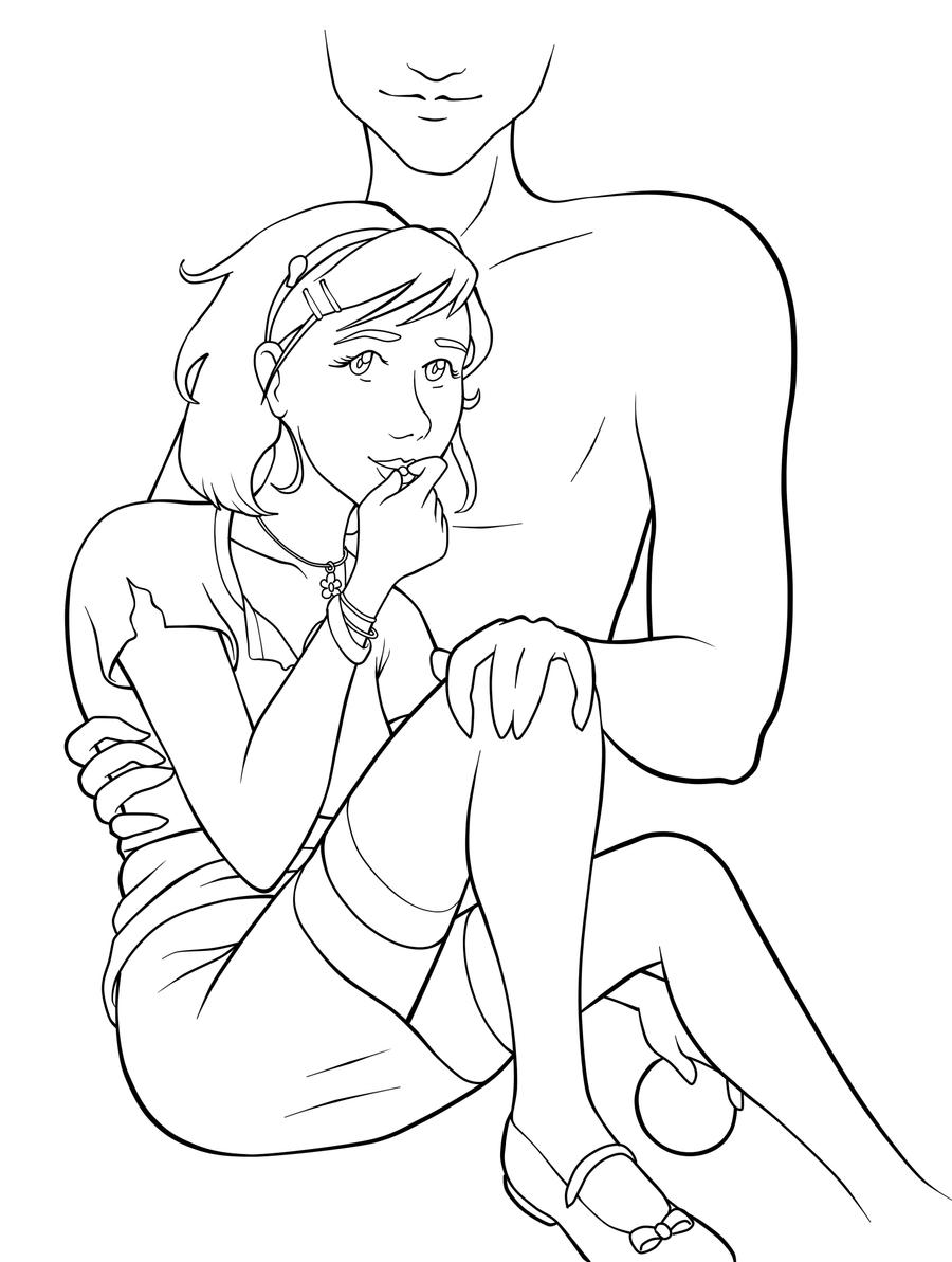
As for the rest of Persephone’s anatomy, I’ve made slight tweaks here and there. I shrank the head, as it was looking a little too large in proportion to her body.  Unless your style is SD, heads in anime usually aren’t too much larger than your standard realistic proportions, rather that the eyes are generally larger with the mouths being smaller.  I’ve also widened the wrist and slimmed her arms, as they were out of proportion to one another.  I also felt like her larger arms were detracting from her childlike presence.  Finally, I refined the anatomy of Persephone’s shoulder, as the lack of line definition and attention to the protrusion of the shoulder joints made it seem as if she had a hump in her back, due to the fact it reads as one solid muscle.

As for Hades,  he shares a similar problem as far as no definition in the joint of his shoulder and pectoral muscles, which leaves his shoulder feeling like a large solid curve, making it seem odd and disconnected.  I’ve added more definition overall to his stomach and chest and adjusted the perspective on his fingers.  Specifically, I changed the hand holding the small of her back to only show the tips of his fingers, due to the fact Persephone’s torso is showing more of a front view than a side view, meaning we wouldn’t see so much of his fingers wrapped around her because, unless his arms were very long, the points of tension where his hand is holding her would stop as they curl around her side.  Another option is to have his hand wrapped around her shoulder instead, which would be frankly an easier angle to draw and far less awkward, visually.

On Concept

All of these technical details aside, I think you could push this concept even further.  As it stands, I don’t feel like there’s much of a connection between these two, as you have implied on the description of your image (Persephone having a passive power over the infatuated Hades).  Perhaps having her glancing up at his face would help her to appear more hesitant and engage him as a force in this piece?  You could maybe even have his hand (the one grasping her leg) holding up more seeds instead, to imply even more interaction between these two.

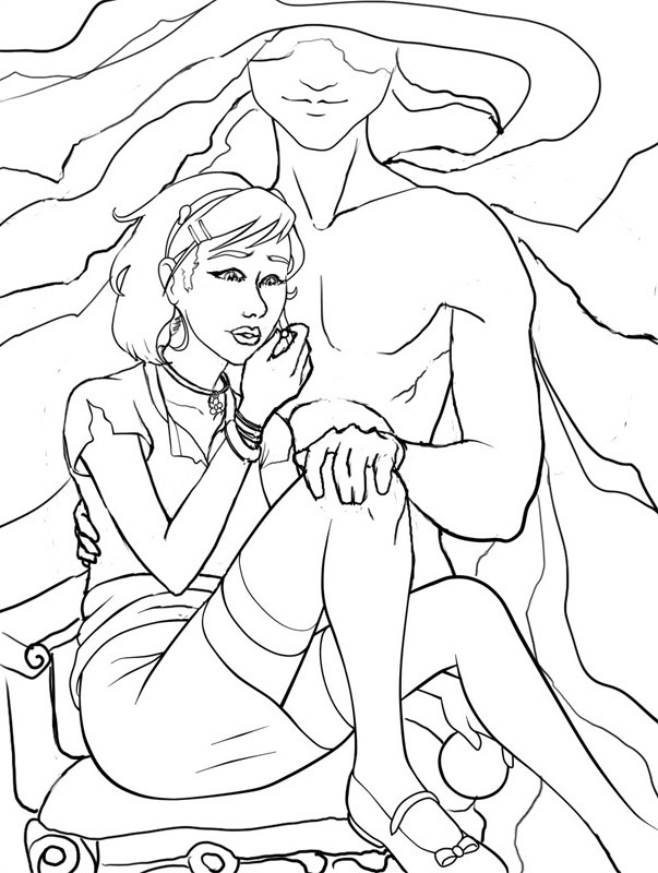
I like the fact that you don’t see all of Hades’ face, but for a devious smile.  It gives him the presence of a looming controlling shadow, which suits your description nicely.  In the paintover, I’ve added shadowy swaths radiating from his face to help fill up the space around them and add visual interest and flow to the composition.  I’ve also added a fancy chair for Persephone to be seated on to imply their regal Underworld surroundings.  You could even push that further by having ornate plates of sweets around her that Hades might have been tempting her with.

You’ve got a great start here on a strong character piece!  I hope this critique helps you out and that you’ll be following up later with a finished version I can share with my readers.  Good luck, Maria!

DISCLAIMER: I am no ‘master artist’.  I am always learning, therefore, my word is not the end all, be all.  I encourage you to use this critique to your benefit and come up with your own solutions based on them…or not!

The Artist must serve the image, even if it disobeys the critics. Go forth and CREATE!


Want to send in an image for Critique Corner? 
Read on here to find out how!

Sketch Diary: Persephone Queen of the Underworld

Recent days of self-critique have had me determined to push my fundamental skills even more this year.  To that effect, CGhub’s CharacterForge challenges have proved a really fun and loose way to play around with a predetermined concept for my own whims (while also giving me the incentive of a deadline).  The latest CharacterForge challenge was to design Persephone Queen of the Underworld.

There was just enough physical description given that I had a few concrete elements to work with while the rest was left up to my imagination.  The kidnapping of Persephone and the turning of the seasons has always been a myth near and dear to my heart, so I couldn’t resist trying this out!  It began with thumbnailing to work in the Challenge’s requirement that the image be laid out as a book cover.

Choosing a thumbnail was a tough call for me, as each one of them has something I like!  I love the dangerous gaze of the first image with the focus on character details like jewelry and her outfit.  The 2nd  has a wonderful up and down flow and an air of queenly presence the others don’t.  It boiled down to whether I wanted to go with a Persephone who was still mourning over her confinement to the Underworld or perhaps a Persephone more adjusted to her role as a queen, which, in the end, I felt worked better if she was to be entitled “Queen of the Underworld” in this composition.

I ended up going with thumbnail 4 for it’s compositional flow and the balance of a somber character who still demands some power and presence, as she does with her regal clothing and the ability to nurture a seed of life in the darkest places.  She hasn’t given up hope and obediently awaits the day she will bring Spring back to the world of the living.

I also chose the thumbnail I did because I wanted to push myself away from my usual composition habits, which generally cut the character off at the thighs. I very rarely do full figures so it was time for a change!

The next step was to figure out exactly what I wanted to dress this venerable lady in.  I got the creative juices flowing looking up fashions by Alexander McQueen and a cursory google search of catwalk fashions inspired by Greek mythology, which turned up some interesting stuff!  The 2nd dress in this group really caught my eye with the trailing gauzy fabric.  I knew then I needed LOTS of trailing gauzy fabric for that mystical smokey touch!

Image via Top and Trends Fashion Design.

I already had the basic color scheme and physical features defined by the thumbnails and Challenge description so I decided to use a more fleshed out base rather than a simple nondescript figure (which is commonly referred to as a croquis template, in fashion design terms).

I only had time to do three of these, due to time constraints.  I leaned towards the wrapped bodice style of Greek clothing with sashes and tattered edges to get across the feel of a character who has a sense of decay about her, due to her surroundings, which contrasts with her ability to remain pure and beautiful in the dank Underworld.  Again, something I like about all of them!  Eventually went with the middle because it felt like it had the most presence and flow.  There’s also something intriguing about the first dress, which I may have to revisit later (modern day corporate mogul Persephone, perhaps?).

Then began the fevered late night movie marathon to keep me awake while I worked, since I only had three days to finish!  On my ‘girl goes to underworld’ inspiration playlist:

– Legend – Girl kidnapped by giant lonely red devil for touching a unicorn (another childhood fave).
– Pan’s Labyrinth – Girl has magical adventures while living in an oppressive household. At one point journeys into the underworld realm of the Pale Man (my favorite scene!).
– Labyrinth – Girl ventures into the world of the Labyrinth to save her brother and defeat the Goblin King, who is oddly enamored with her.  Love this movie ever since  I was a kid! It’s Jim Henson at his best.

Five cups of coffee and two Cadbury bars later, we have progress!

Adobe Photoshop CS2, Wacom Cintiq 12WX.

She’s still in need of critique so I can clean her up for my portfolio. Feel free to comment on DeviantART or at WiPNation! I’d value any input on how to make her the best image she can be.
If you’re part of CGhub, go vote for me in the challenge if you like my entry! 
(Voting thread should be up soon.)

Critique Corner – “Tiger” by Kim

For the very first post in my ‘Critique Corner’ column, we have a piece by Kim Ravenfire M.  Have a sampling of Kim’s other work, for starters:


The piece up for critique today is “Tiger”:
Kim’s main concerns with this piece were basic proportions and how to make her images look more realistic in Photoshop.
The paintover:

On Colors and Textures

My first impression was that I was not surprised to hear you have background in drawing more stylized figures, Kim.  This image is very solid with bold coloration and that’s not a bad thing, persay!  Stylization can be good, but when going for a more realistic approach, keep in mind that realism is more about subtlety than showing every detail and shape.  For a furry creature, this tiger has very straight lines defining its edges (the cheeks, back, chin, etc.) and that gives the optical effect of flatness.  The solution  I went for in my paintover was to break up the fur, stripes, and edges with more brush strokes of fur texture.
As for color, realistic style calls for more subtlety in light and variation of cold and warm hues, as well.  I’ve brought a cooler tone of greenish-orange into the orange markings to bring some color variation into his coat, as well as to tie in the green of the background.  If you look closely at your tiger photo references, you’ll see that color variation they have in their coats.  It’s not a pure orange at all, but umbers, oranges, and siennas.
 
Photoshop Tips for Color Variation
A quick trick for adding subtle color variation is to paint the color you want on the highlights on a separate layer above the rest where you want variation (doesn’t matter what kind of Brush), then use the Guassian Blur filter to blur the area completely to your preference. Then, set the layer to Overlay, Lighten, or whichever Blending Mode works best (in this case, I used Screen). That usually creates a nice subtle variation without having to carefully repaint the image!
I also used a Hue/Saturation Adjustment Layer Mask to desaturate the entire piece, then masked off the center of the image so that the orange was still saturated while the rest of the image receded into a less vibrant color.  This way of creating focus by making the most detailed and brightest part of your image the focal point also helps to add realism to pieces, as Photoshop has a habit of making images naturally flat and boldly colored, if we’re not careful.  Don’t know what Adjustment Layers are? Learn them! They are super useful and save lots of time (check this tutorial for more on them).
EDIT: Another tip for color variation (which I forgot to mention during my original posting) is to start by painting on top of a pre-rendered texture.  Doing this allows for the slightest hint of textural and light complexity to shine through into your painting.
On Proportions
Looking at the nitty gritty proportions of our tiger via tiger photos shows that our subject’s nose is perhaps a little too broad, the cheeks too round, and the eyes too far apart.  I highly recommend that you do a few sketches beforehand of your creature from various angles using reference photos taken from various angles so that you can have a clearer understanding of what surfaces are involved in the bone structure. As is, the tiger’s face feels very plate-like in it’s surface shape, as if the nose, eyes, and mandible cheek fluff are all on the same surface area instead of receding into space.
The solution I used was to lessen the roundness of the cheeks while also deepening the shadows of nose.  I squared the jaw off so that it has more of it’s own distinctive shape and also moved the eyes closer together. I cheated and used the Liquify filter to push the areas into shape, but you may need to do some more layering to really make the skeletal structures and shadows convincing.  I also added cosmetic details, such as a bit of texturing and segmenting to the tiger’s nose and the very small shiny lower lip that’s usually visible on most felines.
Overall:
 
Work on breaking up your solid shapes and colors with more texture and color variation, respectively. Pay close attention to what is in focus and what is not in your compositions to bring that convincing depth of field into your work, which will really push the realism!  Finally, check out other wildlife painters.  Even if their work isn’t digital, you can still study how they translate realistic figures into the abstraction of color and how they lay out detail in their compositions.
 
“That Moment” by
Sam Hogg


Extras:
I used this wonderful brush set from Mr–Jack on DeviantART for the paintover. Maybe they’ll prove useful for you for that painterly effect!


DISCLAIMER: I am no ‘master artist’.  I am always learning, therefore, my word is not the end all, be all.  I encourage you to use this critique to your benefit and come up with your own solutions based on them…or not!

The Artist must serve the image, even if it disobeys the critics. Go forth and CREATE!


Want to send in an image for Critique Corner? 
Read on here to find out how!

In Need of Critique?

Well it seems I’m at a sort of impasse with this journal.  Lately, I’ve been returning to the basics to try and work on a few problem areas of my own art, which means working on many life drawing and technique studies.  I don’t really have anything polished enough to share, so sharing of art processes has been less of late, which leaves me with only reviews, analysis, and advice to post here currently.  I’d love to get back to the Games as Art series, but that would mean I’d need to make time to play (or replay) the games I intend to analyze, which will have to go on the backburner till I have more time.  Never fear, for once I have a few more collections of studies, I’ll certainly share them here along with what I’ve been learning!

For now, I’m wondering if any of you might be interested in a critique feature?  Do you have any images you’re working on that have you stumped?  Or are you just looking for feedback to help improve a particular piece?  I’d love to help you get some extra exposure here with my readers in addition to critique, while also helping me to sharpen my visual problem solving skills.  It is my firm belief that to grow as an artist, critique (and self-critique) are some of the most important skills we can develop!  Practicing giving critique would be helping me out as much as it would be helping you out.  I can also put a few of your other finished pieces in the post so it’s a nice little feature of your art, in addition.
Where critique posts are concerned, I would be doing a complete in-depth description and paintover/redline based on what kind of critique you’re looking for in the piece.  I am hoping to do this at least once a month, if not more (should I get enough images to critique).  This is a nice option for those of you who do not feel quite ready for the full portfolio review just yet and would rather concentrate on a single image.  Be warned though. This is for serious critique only. If you have a fragile shell, you may not want to apply as I intend to be very straightforward with constructive criticism.
For a sample of how my critiques usually go, you can peek at my critiques on DeviantART.
TO APPLY:  Send an email to angela (at) angelicshades.com with the subject line “Critique Corner” including the following in your message:

  • Your art in an attachment (or a direct link to the work)
  • A brief description of the kind of critique you’re looking for (focus on anatomy, composition, etc.)  If you’re unsure, you can just say ‘seeking general critique’.

FOLLOW UP: If you’d like me to feature your completed work that was featured previously in Critique Corner, feel free to send me a link to it once it’s done and I’ll feature it in a future Critique Corner post!  It’d be fascinating to see how you implemented the solutions suggested in these posts, or springboarded onwards to your own ideas.
So tell me. What else would my dear readers like to see in this blog?  What are your favorites posts or subjects so far?  I’d love to know so I can keep talking about what you guys want to hear!

Escaping the Void: Loneliness and the Artist

This particular topic has been nagging at me for the longest time.  I’ve talked about Work at Home Blues when I first started the freelancing life.  Now, a few years into this, I’m realizing some important things via introspection and talking to others in the same business.  Prolonged time alone is not conducive to creativity.

For as much as I thought at the beginning ‘hey it would be cool to be left alone to work on all these projects’, that just has simply not been the case.  I’ve had enough time to sit and think about what really drove my creativity when I was younger and that was being in the presence of like-minded people (artists and otherwise) during my college years.  We did plein air painting in class, where we would sit outside and reproduce a drainage ditch in watercolor.  Painting outdoors got us out of the monotonous classroom and forced us to think about the colors of the world and how they related to the colors on our palette.  The art students and crazy anime club people had a lunch table where we’d all gather, chat, and draw en masse every single day.  Talking to other artists got us excited about our ideas, and oh the jokes that pervaded those sacred lunchtime hours!

But college days are done and after those golden years of childhood come to a close, we are left to our own terrible devices.  There is no teacher over our shoulder saying ‘today you will continue to study and improve your work!’.  There’s no one to drag you outside and make you observe your own world and how it can improve your art.  It’s so tempting to stay inside and avoid going out because you’re going to ‘get more work done’ or ‘gas costs money’.  I find myself making those excuses on a daily basis and it’s led to a lack of motivation and inspiration more than once.

I feel the most inspired when I have experiences in my life driving me onward. This could be as basic as going to the park or Callaway Gardens to marvel at the simple beauty of nature (♥ the Butterfly House).  Or it can be as complicated as animators taking a trip to the Great Wall of China to make sure their project has the authentic feel of ancient Asia in their work (a la the creators of Avatar: The Last Airbender, whose concept art book I’ve been reading lately).  Creativity evolves from energy, experience, and making the unseen connections.

So how do we combat loneliness?  Get our hermit butts out of the house!  Go to sketch meets. Don’t have one in town?  Start one!  Facebook and Meetup are great tools for that.  If you’re low on funds, try your local park where it’s generally free to go look at some ducks.  There’s also the library where you can read books for free and study quietly (surprising how often we forget libraries exist!).  Join your local art society, which serves the purpose of getting your pale self out of the house and networking with a more knowledgeable crowd (this can also lead to marketing opportunities, too!).

On the note of joining art societies, I have had my own strategies of avoidance, like thinking that nobody will like me because I’m very much in the fantasy arena while most societies around here specialize in fine art landscapes and folk art.  I feel like I won’t fit in, but in my experience so far, people are there because they simply love creating art!  You are there to share the love.  Most societies will just be happy to have new members to carry on their legacy, as well.

Monotony is a killer of the human spirit. Don’t let yourself fall into the trap! Remember that solitary confinement is considered a form of punishment for a reason.

(Know of any places artists can find local meetups and sketch jams? Share in comments!  I’d love to know if there are any in the Newnan, Fayetteville, and Peachtree City, GA area, myself!)

The Importance of Self-Critique

This new year has me feeling very introspective of late.  There are 11 more months ahead of us and I have been thinking how I really want to make this year count towards making an improvement in my life and my art.  I’ve already mentioned a possible career shift, and this has moved me into vastly unfamiliar territory where I can no longer just ‘get by’ doing what I’m doing at my current skill level.  A veil of soft, plushy dream blanket has been torn away to reveal the cold, hard facts I need to realize about myself and my work.

If I want to compete in a competitive business like concept art/licensing/whatever art job I might want in the future, I’m going to have to be able to compete with people who are already in the business.  I’m going to have to sit and take a look at my own work and honestly ask myself the question “Are you as good as them?”.  I’m going to have to be the one to face up to the weaknesses in my work and make myself do what it takes to improve.  I am no longer a child nor am I a student in a classroom.  I am an adult, an independent, self-employed artist and nobody else in the world is going to make me sit and study and do the work it takes to improve except little ‘ol me.

It’s so easy to get trapped in what’s comfortable. So easy to say “yeah I’m just not good at that”.  But that is not how an artist becomes better (and it’s not how you get an art job either).  There are too many people out there who have great skill and passion.  If you have even less passion, what makes you think you’ll be picked over that passionate person?   Maybe you will, but I prefer to hedge my bets with a little more than a ‘maybe’.

These thoughts have equaled a downturn in productivity for more than a few months now, but I feel like I’m finally finding my balance again.  I’ve started doing a few studies a night now or taking time to just sit and collect inspirational references and think about what they can teach me about my work.  While the studies I’m doing right now aren’t masterpieces by any stretch of the imagination, they’re helping to build the visual vocabulary I have been lacking for whatever reason.  I’m also finding the lack of a particular strength is no longer my focus (and downfall), but rather filling that lack.  It took a lot of brow beating to get to this point, but obsessing over what exactly was lacking for too long put me in a downturn that I almost couldn’t dig out of.  It’s time to fess up.  Time to put my kicking boots on!

And on that note, I did a MEME.  I’m considering this my visual ‘strategic plan’ for what exact actions I want to take to become a better artist this year.  I may not get it all done this year, but at least I’m finally starting the process, and that is sometimes the most difficult part of improving!

(Click to Enlarge)

If you’d like to take the Artist’s Oath to Improve with me, you can download the blank template here!
I hope my triumphs and failures help somebody out there.  I hope I have the energy to keep going!
But I know it’s all going to pay off if I can keep this ball rolling.
To our success!

Top Posts of 2011

I’m stealing this idea from Hayley at Eventide because it seemed like a great way to wind down the year on this journal and to remember all that’s happened here in 2011!

I started this blog waay back in 2009, which feels like forever ago, and looking back helps me realize how this blog has grown into so many interesting pathways!

My top blog posts of this year (not including popular posts from previous years that are still some of my most highly viewed topics) aaaare:

1. Evolution of an Artist’s Alley Table Parts 1 and 2
I like to keep a record of how I display my artwork for my own purposes and so others might learn from my trial and error. These posts cover how my displays for art shows have leveled up over the years! I hope it saves ya’ll money and helps you to make your wares look their best!

2. DragonCon 2011 Con Report

The con report/review for my biggest event of the year!  I like to do a con report for every con I go to so that other artists might benefit from my working experience there.  DragonCon has always been my favorite event to go to each year and I learn something new no matter what!  There are also plenty of links to great costumes and silly videos we made in this post.
3. Ezio Mask Dev Diary (Parts 1, 2, and 3)
An in-depth walkthrough of how I created my Venetian Assassin Mask inspired by Assassin’s Creed 2.
Because everyone likes free stuff! This was my first ever book giveaway and hopefully not the last!

5. Commissions, Portfolio Reviews, and Study Sources

A comprehensive blog of study sources for traditional artists wishing to learn more digital work and those interested in game art.  Also announced my call for Portfolio Reviews in this blog (which I’m still taking on an ongoing basis!)
A glimpse at some of the many pieces I had going on for this year’s DragonCon.  Many of these pieces were sold before they were properly photographed, so this entry is the only record of them!
Another artisan craft tutorial on how to set a stone in a leather mask.
An in-depth review of my experiences with Artfire, another website much like Etsy that exists to serve the handmade market.
9. Sketch Diary: Angel of January (Parts 1, 2, 3, and 4)
An in-depth walkthrough of my piece “Angel of January” detailing the creative process, working with photo references, and learning new digital tricks.
Probably the most difficult entry for me to write, as it took admitting some of my failures of being an artist this year.  It really helped me get my thoughts in order, however, and put me in a better position to start thinking of solutions!
Now, onward to 2012!  I hope that my entries continue to provide helpful info to other creative professionals!  I write this blog not just for myself, but you, the readers, so if you know of any topics you’d like to suggest for me to cover in the coming year, please feel free to suggest them here in comments!
Till next year!

Portfolio Review: Laurie Thomas

The year draws to a close and I hope all of you had a wonderful holiday season!  To celebrate the end of yet another year here at this journal, I thought it only fitting to end with a beginning!

I’m happy to introduce the first portfolio review in what I hope to be an ongoing series.  This review is for Laurie Thomas, who sent in the following samples of her work:

See more at Laurie’s DeviantART Gallery!

Overall Impression: Laurie mentioned that she was interested in getting into games, licensing graphics for apparel, and possibly designing for movies.  From what I can tell, you’re well on your way to having a stunning portfolio, Laurie! Your colors are bold and your designs rich and detailed.  What it seems you need to do now is come up with a strategy for focusing your subject matter and presenting your portfolios in such a way as to appeal to the industries you’re hoping to enter.  I say ‘portfolios’ plural because each industry is going to expect something different!

When licensing to the apparel industry, you’ll need a large body of consistent work that will also fit well on t-shirts, bags, etc. (at least 24 pieces for presentation, so I’ve read).  Licensing companies like series of images with consistent high quality, so if you can tie together your characters into some appealing ideas (ie. birthstones, zodiac signs, gemstones, elements, etc.), you’ll have some great basic pieces to start yourself out with!  A great way to see if your art will fit on items is to upload them to Zazzle, which pre-renders your art on the item of your choice. It’s a simple way to create licensed art mock ups, which are essential for creating presentations.

You also need to be aware of the trends that sell (ie. fairies, lolita, gothic, cute things, etc.) and that means doing some research! Keep up with other artists in the industry (Anne StokesAmy BrownJasmine Becket-Griffith, etc.).  Start paying attention to the clothing brands that sell items with art similar to yours and make a note of who those companies are.  I highly stress reading Licensing 101 before you go down the licensing path. Be aware of the dangers and the options for selling your work, as there are many!  Above all, register your copyrights before licensing anything!  The US copyright office allows registration of sets of images, so that may be a cost effective way for you to go.

As for the game industry, I can see your work fitting in very well with many of the social media/networking games tailored for younger audiences with anime inclinations (ie. GaiaOnline, Facebook games, MMOs, etc).  There are also opportunities in interactive novels and manga!  I highly recommend subscribing to magazines like ImagineFX to keep up with the game art industry and scout out jobs. It’s also an excellent place to learn about presentation skills from pros, as well as techniques and shortcuts!  This advice also counts double for movies, which requires a similar skillset to concept/game artists and are also addressed in IFX.  In general, work on presenting characters, accessories, equipment, and environments.  Conceptart.org and CGhub‘s weekly challenges are great places to start building a game design portfolio. They’re also great places to learn from more experienced artists!

Strengths and Weaknesses: You already possess very highly developed technical skills, but I would watch out for making your images too detailed.  Koi for example has a lovely color palette and character, but the intricate designs, patterns, flower bursts, and clothing folds really overwhelm the eye and lead the compositional flow every which way.  A way to balance this might be to downplay the flowers, while simplifying her kimono and other details.

Speaking of those flowers, they seem a bit unfinished in comparison to the rest, which is something you’ll need to consider for your final products. If a final product is meant to be printed larger, areas that aren’t as tightly developed will appear sloppy. However, if your final product is going to be smaller (ie. Card art, small items), there’s no need to put all that detail in, because the smaller resolution will allow it to appear smoother.

Another thing to be aware of is that limiting your style to anime may shove you into a niche box.  If it’s a box you’re comfortable in, than be the best you can be in that niche and you’re bound to get attention!  However, you must also be aware that anime style in general (at least in the States), is stereotyped as being for juveniles.  It may be more difficult to get editorial illustration work with an anime style portfolio, but that is where presenting varied multiple portfolios to varying clients might serve you well.  Also, you may not even want to do any other work, and that is okay too!  It’s just that the more varied an artist you are, the higher chances you’ll be able to round up that next job to feed yourself.

By the same token, you only want to put out work you want to be hired for, else you’ll get stuck doing work you loathe.  It becomes a balancing act between getting good at the niche or adapting to something different and that’s a call every commercial artist has to make.


I hope this portfolio review has given you some food for thought, Laurie.  Best of luck from me to you and I hope to see your name in the headlines soon!  If any of my dear readers here have additional advice for Laurie, please share in comments! I am not the end all, be all and welcome anything useful others might have to add.

Interested in a Portfolio Review of your own?
Read here for more info on how to get one!

Sketch Diary – The Gift Giver Part 3 – Painting

This week has been a haze of coffee and late nights powered by holiday cookies!  The last entry ended with the finished line art, which ended up being revised several times during the course of trying to color the piece.

Luckily, digital pieces are more forgiving than watercolor! I was able to lengthen the fingers of the right hand (on the left), which seemed stubby despite being correct on the model  Sometimes when we convert photo references to line art, something is lost in translation and that is where our creative mind must work with what ‘looks’ right rather than what the photo shows, else you could end up with some very awkward anatomy.  A camera distorts things at times due to perspective and spacing, as well. 

One must also be aware of the fact that the photo reference is not the end all be all!  We must be willing to depart from it to get the most visually pleasing look, otherwise the image could end up a bit stiff!  Some artists will even hide the reference after the basics of the pose are finished, which I find is a good strategy for breaking reliance on reference.

The photo reference compared to the final line art.

The next phase of coloring began with a simple color test laying in flat colors.  I wanted the spirit to be the brightest thing in the image, so everything else was dark and saturated by comparison.  By the end, she ended up with more of a greenish blue shadow to help get the idea across that the green of the background was reflecting in her skin, despite her glow.  The starker shadow also helps her to feel more solid and rounded, despite her ghostliness, and accentuates her glow.

From this…to this:


…to this!
 
You can also view an animated time lapse of the video here:
 
All in all, I feel I’ve definitely hit a milestone with this fully digital piece!  Learning the ins and outs of Adjustment Layers and Layer Masks has really helped to open new doors for me and make my life easier.  With masks, I can save my original image without having to start over, should colors not look right. The Cintiq has also made coloring digitally feel 200% more natural than my old Intuos.  I have a good feeling that things will only get better from here on out!

Sketch Diary – The Gift Giver Part 2 – Drafting

The last sketch diary for this image talked about conceptualizing the piece.  Now that the thinking part is done, it’s time for the doing!  At the start, I had decided to do this piece digitally due to time constraints, but also to give me a chance to break in the used Cintiq 12WX that I got as an early Christmas present!
 

The rumors are true!  Cintiqs really are made with unicorn horn dust and the solidified happy thoughts of artists!  My first impressions are highly favorable and I’m really excited at the natural line weight I’m able to achieve with this tablet, thus far.  I’ll be writing up a more in-depth review of the Cintiq in a later entry. 

Long story short, I’ve had a traditional Intous3 tablet for years, but could never get used to the unintuitive feel and disconnect between my hand and what I was seeing on the monitor.  The Cintiq has eased the process by letting me see exactly what I’m drawing and responding more delicately to my hand motions. Curves are especially easier to draw because I can see precisely what I’m doing and rotate the Cintiq as needed to draw the curve more easily.

 
Having given the Cintiq a test run on this image, I can say with confidence that I can finally get a more natural comfortable workflow with my line art, if this draft is any indication!
 
We’ve gone from this…to this
 
Somewhere between sketch and draft, her hair was cut back to allow for a more controlled directional flow in the composition.  She’s also lost her wings, since they would have interfered too much with the detail in the hair.  The grey spaces and Christmas trees are placeholders until I can work something more detailed in with color in the next phase.  
 
To achieve the abstract effect for the Christmas trees, I used a stock image, then in Photoshop I went to Image>Adjustments>Posterize.  That broke the tree image down into simplified forms which blend better with the line art.  I may end up actually photomanipulating a good deal of the background due to time constraints, but we’ll see what I can dish out!  I still have a few subtle  hatching details to add to the line art, but for the most part, she is finished!