Category: composition

Eureka Moment – Composition

eu·re·ka [yoo-ree-kuh, yuh-]
( initial capital letter ) I have found (it): the reputed exclamation of Archimedes when, after long study, he discovered a method of detecting the amount of alloy mixed with the gold in the crown of the king of Syracuse.


What is a ‘Eureka Moment’?
It’s that moment when you’re trying to understand a complex concept where a particular bit of information is presented that suddenly makes all of the elements you didn’t understand before click together to make sense.


We all learn in different ways.  There’s nothing like returning to my fundamental studies in anatomy in the past month to really drive this point home.  You can explain to me a billion times about the pelvic furrow or the angle of a joint’s rotation, but I am a very visual kinesthetic learner, meaning I have to learn by doing, which means things often don’t make sense to me till after I perform many learning exercises to explore a concept.

My latest ‘Eureka Moment’ occurred while reading issue #80 of ImagineFX magazine. Many of you may think this magazine is only for digital artists, but they cover plenty of topics and offer many tools that would be useful to all artists, such as articles on color theory, features of classical illustrators, and reference photo collections on the accompanying CD.

It was one such article on analyzing composition by Dan Dos Santos that led to my recent ‘moment’.  Considering Dos Santos’ track record of gorgeous book covers featuring one or two characters, I knew he would have plenty to say on the matter! It’s tough to make a book cover really pop with just one character to work with. You have to catch the reader’s interest, visually and story-wise.  A single image has to have enough punch to make you want to learn more!

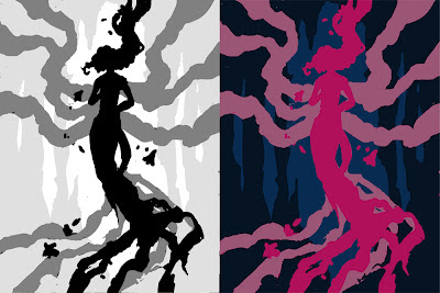
The article covers, among other things, a simple exercise you can do to break down your composition involving greyscale layers to indicate foreground, middleground, and background.  I thought I’d try it on my latest piece, Persephone Queen of the Underworld:


The Results:
Converting the image to simple shapes allowed me to get a better sense of how it was reading visually.  I discovered by doing this that while there is a nice vertical spiral throughout the composition, the bottom where her dress trails off is just a tad too busy and cuts off abruptly.  The dress ‘tendrils’ on the left side flowing out from her back also create an awkward silhouette that is disharmonious with the shapes created by the adjacent ‘tendrils’.

I also found that the relatively flat background is not creating enough narrative or visual interest in this piece.  Visually, it falls flat of framing the figure and gives us no information about her setting or story.  I asked myself ‘How many people would know this is Persephone or some kind of underworld figure if I hadn’t said so in the title?”  Originally, I wanted to keep this area simple because the flowers, swirls, and figure would be made too busy by anything more complicated than a void, but now that I ask myself the tough questions, it’s just not telling enough of her story!

Next, I tweaked with the layers of the background planes to see what I could do to create more harmony and visual interest.  I then broke down the main planes into color groups, per Dos Santos’ suggestion to keep your color groups simple to create high contrast and visual interest:

The Results:
I found that by pushing the figure upwards, I could give the flow of her dress more room to terminate in a less abrupt way, which makes a more comfortable vertical flow for the viewer’s eye through her hair, down into the core of the figure, and down through the dress.  She also has a delightful ‘tree’ shape to her now that fits well with her vegetation theme.

The energy swirl was removed, leaving the flowers to do the work of creating the spiral of energy around her, which I feel also works better to help solidify her symbolic connection to the blossoming of spring.  The background plane was tightened up from a random void of energy to the mouth of a cave with rock formations which frame the figure and tell something of her current imprisonment in the Underworld.

Now, I’m preparing myself to dive back into this piece and really make her shine!  Elements of the piece may still change in the doing, but I feel I have a much stronger idea after I’ve spent days staring at this painting and not knowing what exactly felt wrong about it.

I hope my Eureka Moment helps someone out there! If you’d like to read more on the topic of planning compositions, I highly recommend getting Issue #80 of Imagine FX and reading Dos Santos’ original article for more working examples and invaluable advice.  There are more great articles included that helped me get inspired, including the brilliant compositions of Howard Pyle.

What was your latest ‘Eureka Moment’?  Share in comments!

Critique Corner – Persephone by Maria

For today’s Critique Corner, we have an image by Maria Arnt.  Check out some of Maria’s other work before we get started!


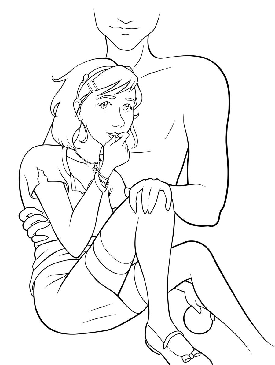
The image up for critique is “Persephone”. Maria’s main concerns were on the use of line width and anatomy, specifically the eyes.

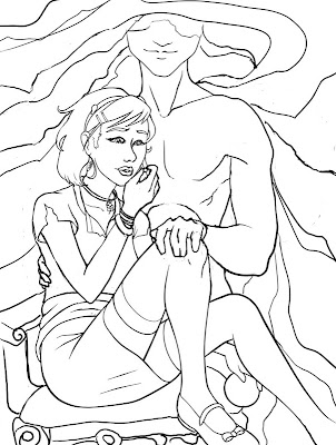
The paintover.

On Line Width

Beautiful!  You’ve never had a problem with creating wonderfully inked pieces, from what I’ve seen of your work.  I think if you want to push the lights and darks in this image that you could add hatching or screentones for shading as well.  Otherwise, cleaner lines like this generally require color to bring a stronger mood and visual impact to a piece.

The Eyes

I think the first thing we look at in this piece would be the eyes. Persephone is glancing right at us and, being the only character with a full face, our attention is brought right to her face. Your description of the piece states the following:
“Even though she’s captured by Hades, she’s discovered she has this sort of power over him–but she’s a little afraid to use it. As she eats the pomegranate seed, her eyes are both hesitant and a little daring. Are you going to stop her? She’s not completely sure she wants you to.”
However, the wide open nature of her eyes actually makes her seem more peppy and upbeat rather than hesitant or daring.  In the paintover, I chose to divert her gaze to the pomegranate seed, which I moved further away from her lips, which suggests she’s thinking of the seed and not interacting with the viewer.  One thing to remember is that even though anime eyes are indeed wide, that doesn’t mean that they can’t be various states of open or closed, which is key in creating convincing expression, even via the abstraction of anime style.  Not rendering the eyelid as you have limits the expressiveness of the eye to looking wide, surprised, or clueless.  In addition, I’d highly recommend doing a few studies of anime expressions to get a deeper understanding of how eyes and expressions are abstracted by manga style.  The ’25 essential expression’ memes are a great way to practice!
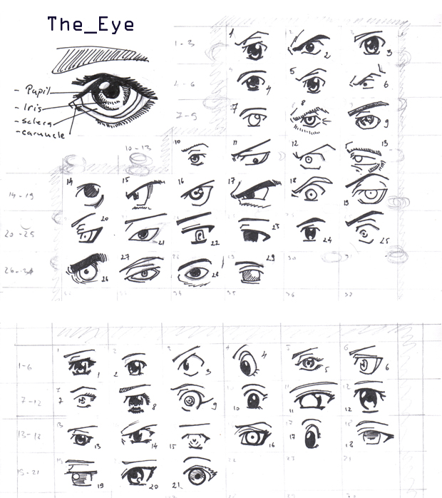
Notice how most of these manga style eyes still have eyelids (and if they don’t, the eyelid is generally implied with shading, the eyebrows compensate for the lack of expression by their angularity, or the eyes are simply drawn more slim to imply how open or closed they are):

REFERENCE-Manga eyes by ~Aoi-Ne-Blue

On Other Anatomy 

As for the rest of Persephone’s anatomy, I’ve made slight tweaks here and there. I shrank the head, as it was looking a little too large in proportion to her body.  Unless your style is SD, heads in anime usually aren’t too much larger than your standard realistic proportions, rather that the eyes are generally larger with the mouths being smaller.  I’ve also widened the wrist and slimmed her arms, as they were out of proportion to one another.  I also felt like her larger arms were detracting from her childlike presence.  Finally, I refined the anatomy of Persephone’s shoulder, as the lack of line definition and attention to the protrusion of the shoulder joints made it seem as if she had a hump in her back, due to the fact it reads as one solid muscle.

As for Hades,  he shares a similar problem as far as no definition in the joint of his shoulder and pectoral muscles, which leaves his shoulder feeling like a large solid curve, making it seem odd and disconnected.  I’ve added more definition overall to his stomach and chest and adjusted the perspective on his fingers.  Specifically, I changed the hand holding the small of her back to only show the tips of his fingers, due to the fact Persephone’s torso is showing more of a front view than a side view, meaning we wouldn’t see so much of his fingers wrapped around her because, unless his arms were very long, the points of tension where his hand is holding her would stop as they curl around her side.  Another option is to have his hand wrapped around her shoulder instead, which would be frankly an easier angle to draw and far less awkward, visually.

On Concept

All of these technical details aside, I think you could push this concept even further.  As it stands, I don’t feel like there’s much of a connection between these two, as you have implied on the description of your image (Persephone having a passive power over the infatuated Hades).  Perhaps having her glancing up at his face would help her to appear more hesitant and engage him as a force in this piece?  You could maybe even have his hand (the one grasping her leg) holding up more seeds instead, to imply even more interaction between these two.

I like the fact that you don’t see all of Hades’ face, but for a devious smile.  It gives him the presence of a looming controlling shadow, which suits your description nicely.  In the paintover, I’ve added shadowy swaths radiating from his face to help fill up the space around them and add visual interest and flow to the composition.  I’ve also added a fancy chair for Persephone to be seated on to imply their regal Underworld surroundings.  You could even push that further by having ornate plates of sweets around her that Hades might have been tempting her with.

You’ve got a great start here on a strong character piece!  I hope this critique helps you out and that you’ll be following up later with a finished version I can share with my readers.  Good luck, Maria!

DISCLAIMER: I am no ‘master artist’.  I am always learning, therefore, my word is not the end all, be all.  I encourage you to use this critique to your benefit and come up with your own solutions based on them…or not!

The Artist must serve the image, even if it disobeys the critics. Go forth and CREATE!


Want to send in an image for Critique Corner? 
Read on here to find out how!