Month: December 2010

Angelic Visions – Book Trailer Release!

In today’s competitive market, it seems one just can’t sit on a corner going ‘Hey YOU, buy my stuff!”. No sir-ree.  Nowadays, it’s all about instant gratification, shortening attention spans, and pretty pictures!

Well I’m here to provide you all of that! May I present to you the book trailer for Angelic Visions! (After this, it’ll just be boring ‘this is how I made it’ stuff, so go watch, WATCH IT NOW!) Marketing experts say I have to have one and I’m inclined to agree!

 
It feels good to arrive at this point, as if all my hard work in promoting the book has culminated in this shiny musical moving box.  Gone are the days when we would have relied on the power of printed adverts and mailings to get the most word-of-mouth going for our products!  Now it’s all YouTube and FB and their wildly viral power over the populace!  Or at least, this is what I’m expecting after this video (I shall be watching the trickle-down effect of this video like a hawk!)
I’ve gotta say that making my own trailer took less time than I thought (not counting the time I spent pondering on what elements make a good book trailer and watching over a dozen to get an idea of what I wanted to do).

And here is random list of things I learned while working on this project!:

  • Do not use famous celebrities because that just screams “I got this from Google images”
  • Do not go longer than 2 minutes or your audience will get bored (unless you have a very good reason to go on because it’s just SO riveting!)
  •  There are barely any book trailers out there for art instruction books (minus books on quilting. There are SO many book trailers that have to do with quilting, oddly.) This means WE NEED TO MAKE MORE!  Fill that niche!  Interactive illustration is definitely catching on these days.
  • A professionally shot book trailer (with actors, music, etc.) apparently goes for $20k!  Maybe once I’m a hit, I’ll consider this full package service…maybe.
As for my own trailer’s creative development, I spent about a day pondering on how best to put words to images, what images to use, and what music would go best, which culminated in the creation of this super high tech storyboard scribbled in my art pad!
I SWEAR this wasn’t written by a chicken.
Translation – the stick figures are hints of which art I thought might work best with the arrows representing which way I wanted the camera to pan across the art.  In the making, the trailer didn’t really deviate from what I had here. Short, sweet, and to the point!

Picking the music was the easy part. I knew I wanted something unobtrusive that didn’t compete with the artwork, but still interesting enough to hold a viewer’s attention.  I also knew I wanted something in the vein of Gregorian Chant, which fits angelic themes so perfectly! Luckily, I had just the song in mind from my previous dabblings in video editing, where I stumbled upon the royalty free music site of Kevin MacLeod!  He offers his music free of charge in exchange for publicity and an optional donation.

After that, it really was a matter of looking at online tutorials on my video editing software (a program called PowerDirector which came with my camcorder) and playing around with it till it looked right.  I’d already fashioned a video earlier (Song of Exile Walkthrough) to help get my feet wet with learning the ropes.
And so, a trailer is born!  I may do a few more small video promos, but for now, this one is the Humdinger, the Mothership, my newborn Frankenstein!
I do hope you enjoy it and let me know what you think!

The Snowflake Lady – Part 3 – Coloring and Final Touches

The last process post for the Snowflake Lady talked about choosing stock reference, line art, and sketch transferring. Now, it’s time to get to the fun part – coloring!

Color test for Lady Snowflake

Most of the time I like to start off with a color test which is made very quickly in several layers in Photoshop. I like to keep the background, important parts of the figure, and important wardrobe details on their own layers so I can tweak the colors individually till I’m satisfied.

A tip to arrive at color schemes you might never have thought of is to flatten your image and play with the Hue slider under the Adjustments>Hue/Saturation menu in Photoshop.  This option lets you change the colors in your image without messing around with your shading or line integrity.

I don’t do a color test for EVERY image I paint, however! Sometimes it’s fun to let the colors develop organically. Other times, I’ve spent so long inking or sketching the image that I’m afraid to mess it up, so I do all the prep I can before touching it.

With nerves steeled, painting begins!  She was a very tough customer because all the blues were fighting for dominance.  The original idea to make the inner window pane an antique gold failed horribly and just didn’t gel with the rest of the image. I ended up having to layer various blues to make the window colors harmonize with the rest of the image.  I also used the wrong shade of yellow for the starbursts in the stained glass, which still stand out awkwardly to me.

Just goes to show you that sometimes pictures don’t work out the way we want, no matter how much planning is involved!  At the very least, watercolors are forgiving in that their translucency allows you to lift color and layer till you can get your colors talking  nicely to one another, even if the first color put down is just butt ugly.  I ended up pushing the pale yellows as a way to make the figure pop out more and to unify the overall colors more than originally planned in the color test. I used white gel pen and silver leafing to add the final touches of snowflakes and shine in the window tracing and throughout the image.

For a more detailed step-by-step  of my painting process, I refer you to my upcoming book, Angelic Visions!  Meanwhile, enjoy the finished Lady Snowflake:

| Greeting Cards | Post Cards | Prints |

Convention Report – Atlanta Comic Con

Returning from Atlanta Comic Con this past weekend with an odd mix of disappointment and happiness.

Sporting new vertical signage thanks to Graphic Signs Atlanta!

First off, I just want to say what a joy it was to meet David Mack and Joseph Michael Linsner (again), and now Billy Tucci, who I had no idea would be in attendance!  I picked up a bag he dropped and gave it back to him without even knowing who he was.  For those who don’t know him, Tucci is the author and artist of a comic from the 90’s called Shi, a tale of a half-Japanese, half-American woman out for revenge against the Yakuza lord who killed her father and brother. (Funny how half of my inspirational artists/writers tell tales about women out for revenge)

It was great to yack with some of my favorite comic book creators about what drove them to create their stories and what point in their life they felt that they were ready to tell them.  It was very insightful and inspiring to know that most of them really didn’t know what they were going to write about till they were in their 20’s. Maybe I’m not so far behind after all?

Meeting them was a double edged sword. I found myself surprisingly in tears Saturday night for a reason I couldn’t identify till later.  Realizing how far you still have to go can be traumatic when you’ve not had a lot of sleep, have been on a crazed underpaid work schedule, and meet so many great folks who are ‘there’ already that it makes you feel so incredibly behind in your life.  Even the ‘there’ness is an illusion, I realize. These guys worked hard to realize their creative vision and they are STILL working hard to keep doing what they love!

And so, like many of the cons up until this point this year, I took a financial hit, but learned so much from the folks in attendance.  I can only hope future cons will be a better balance of profits AND advice!  Right now, there’s a definite imbalance between the two.

As for the convention itself, I won’t be going back next year, not as a vendor (unless I have the extra money lounging around).  It was meant to be a 3 day con, but was changed to a 2 day con without notice to the vendors, or at least I did not receive any.  The contact for the artist alley changed several times and I did not receive word back on many of the questions I asked that were forwarded around to the new contacts.  Setup was fairly easy, but I felt like the management could’ve done a better job of keeping us informed.  I found most of the info I needed eventually, but had to dig through a busy complicated FAQ to find it.

The audience also did not seem very interested in what I had to sell (the Angelic Visions book, prints, masks, etc).  I got the distinct feeling that many of them were young artists there to meet and greet with their favorite creators and movie stars and not necessarily to buy things from other not-so-famous artists, something I wish I’d thought of before deciding to drop $200 on a table fee.
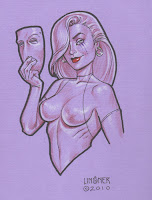
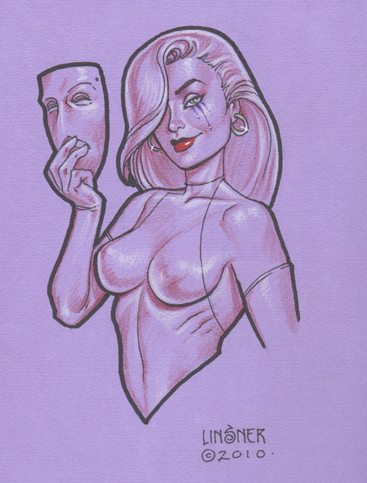
A gift sketch from
Joseph M. Linsner

On the plus side, I received a wonderful sketch from Joe in appreciation for the mask I gifted him at DragonCon. It was a great feeling to know he’s mounted it in his room and finds inspiration from it on a daily basis.  Also wonderful was yacking to David about gender and author identity and to Billy about how he prefers writing to drawing (something I thought I’d never hear such a talented artist say! It shined new light on my own illustrator versus writer predicament).

All in all, this con didn’t lack for amazing people to meet, which is why if I come next year, it will most likely be as a con-goer instead of as an artist.

For the usual photostream of interesting costumes and such, check out my Atlanta Comic Con album on Facebook!

The Snowflake Lady – Part 2 – Preliminary Sketches

In the last process post, I covered the basic planning sketches for The Snowflake Lady. With thumbnails and the basic gist of the image figured out, it was time to start getting detailed!

I started out by browsing my collection of stock images and seeing if there were any poses that could work for what I had in mind. I like to use photo references when they’re available to help add a level of realism that I still find difficult to draw directly out of my head.  Eventually, I narrowed my choices down to the following three poses, which all conjure the image of a graceful lady reaching for a snowflake.  I quickly dropped out the background on these images using Photoshop’s Magic Eraser tool, then overlayed them on top of my window layout:

Pose 1 courtesy of Nanfe-stock. Poses 2 & 3 courtesy
of Almudena-Stock.

Pose 1 added a level of movement to the composition with her outstretched arm, tilted head, and swirling dress.  The other two poses were both lovely, but somewhat static, in comparison.  After consulting with a few friends for a second opinion, I finally went with pose 1.

Next came a preliminary sketch done in digital blue! Which I like to use since it’s easier to transfer tell where you’ve drawn over when you are transferring the image using graphite transfer paper (or the ‘poor man’s transfer paper’, which is rubbing charcoal on the back of the image and then bearing down hard as you trace the lines on the front side).  I refined the details in this blue sketch phase, though you’ll notice I left some things generic, like the poinsettia, because it’s easier to refine specifics like that after you’re done transferring.


The stained glass window was actually designed first without the figure in front so I could get a better sense of how I wanted the patterns to look and flow.  Doing this digitally meant I could hide and unhide the figure to see how the stained glass lined up in the composition, making it easier to adjust as needed.  I also could easily copy and paste sections of the window to make it perfectly geometric instead of drawing it all by hand.  The stained glass utilizes a simple starry night theme.

Next, she was transferred to 11×14 in. illustration board where she received a good deal of refinement in pen (Copic Multiliner SP pen with a 0.1 mm and .003 mm tips).  I had to tape two 8.5×11 in. print outs together in order to cover the whole 11×14 in. piece of board.  I made a few mistakes in the stained glass while I was inking because I trusted my hands instead of using a circle template.  Too much coffee & green tea do not steady hands make!  Compass and circle templates are your friend.  I have a circular drawing ruler that’s especially useful for this purpose!