Category: characters

SKETCH DIARY: Tsu-Yin

I’m excited to share this character portrait of Tsu-Yin Aasha Hou Kapoor, She Who Knows Ten Thousand Things.  Daughter of high-born sorceresses and chosen of the Unconquered Sun, Tsu-Yin left a life of comfort to pursue epic adventures and a grand destiny as a Solar of the Twilight Caste!

She’s from the same tabletop roleplaying game as my character, Kalara, if you all recall meeting my gunslinging businesslady earlier this year.  Exalted is such a fun game full of amazing Eastern-inspired imagery and epic level action!

For Tsu-Yin, my brainstorming began with the many beautiful references of Indian clothing and character drawing references provided by Tsu-Yin’s creator, Minis-sketchbook.

Mood Board

mood-board-tsu-yin

Tsu-Yin’s mood board on Pinterest.

Tsu-Yin was described as excitable and energetic.  She comes from a life of comfort and is finally able to see the world for herself.  She’s also a martial artist with a snake-inspired style as well as a sorceress.  I knew from her concept I wanted a friendly and optimistic pose, something more energetic than whimsical. 

Gesture Sketches

Brainstorming began with a sheet of gesture sketches to help me discover Tsu-Yin’s personality through pose.  Finding a good compromise between energetic and aesthetically pleasing was pretty challenging!  None of my initial poses really fit her perfectly. 

ten-thousand-things-gesture Read more

SKETCH DIARY: The Uncrucified

Inspirations:

I’ve been working on a lot of tedious Art Nouveau of late and, while I love it, I decided to indulge in this little project after hours to help me unwind from the seriousness of that particular style.  I’ve been doing a lot of tabletop gaming lately, thanks to a friend who sucked me into a game of White Wolf’s Exalted setting.

This fun side project began as an urge to draw the character from our Exalted game as well as to create cover art for a short story about her that I wrote.  In our game, I play Kalara Vadras, a gunslinging Eclipse Caste, the diplomat of our Circle of players, and a no-nonsense businesswoman with a sordid past of betrayal and revenge.  Here’s one of her early character sheets.

kalara-sheet-lowres


Mood Board:

I’ve been gathering references for our game for over a year.  I love it when digital image hoarding pays off!  Kalara’s particular visual influences include Indian guns, Chinese fashion, and a generally non-Western collection of fantasy elements.

the-uncrucified-mood-board-lowres

Like this board?  You can view and Follow it on Pinterest here!

I monstress-lowresalso drew a lot of inspiration from one of my favorite comics currently being published right now – Monstress.  The art by Sana Takeda and story by Marjorie Liu are simply exquisite!

The Asian Art Deco steampunk aesthetic fit so well with what my mind’s eye conjures while we play Exalted.  Check out the cover to the comic, you’ll see what I mean!

Early on during the image’s sketch phases, I decided to push the image away from a detailed comic book style and more towards this anime-esque stylization thanks very much in part to Monstress’ influence.

Next, I did a lot of posing in front of the webcam, as opposed to thumbnail sketches.  This was meant to be a fast and fun image, so I decided to keep it simple and skip the planning step.

pose-montage-lowres

While posing, I kept in mind that I wanted her very symbolic crucifixion scar to be very noticeable to the image, which meant focusing a lot on expressive hand motions.  The 3rd pose on the far right ended up being my winner because of the diagonals that lead the viewer’s eye around.  That pose also feels the most natural and emotive.

Finally, here’s an animated GIF of my image’s evolution.

The-Uncrucified-Process-GIF

You can can watch a more in-depth video about this piece’s creation at my YouTube channel.

Final Cover Image:

The Uncrucified Cover Art

Uncropped Image:

The Uncrucified

Prints and products of this piece are available at my Etsy shop!


Like my art and want sneak peeks, special goodies, and more?
Support me on Patreon!

Homework: Concept Art Starter Kit – Design Basics

I’ve recently started up CtrlPaint’s Concept Art Starter Kit with artist, Matt Kohr, as a way to brush up my own character design skills.  While I’m not quite going into Concept Art as a profession (yet?), I still think the basic skills will improve my artist’s eye, overall.  Plus, it’s just tons of fun designing characters for my own personal projects!

https://vimeo.com/126869672

Since I’m coming mainly from an illustrator’s background, I felt like I needed to start at level 0.  I’ve read a lot of tutorials on concept design, but almost all of them assumed prior knowledge of industry jargon and familiarity.  It’s been refreshing to see something that starts off very simple with tons of visual examples.  The videos thus far are more lecture with examples than they are technique, but that’s just what I wanted and needed at this point. (Expect a review of the course kit over at The Muse’s Library once I’ve completed it!)

Shape Design covers the fundamentals of interpreting shape language and image recognition.  I tried out the suggested exercise of taking reference photos and not merely copying what I see, but trying to get a better idea about how the subject works via closer study and contouring.  The cat on the bottom right corner was drawn from memory after my studies were complete.

Exercise - Reference Studies

While this method does take longer, I think Kohr’s on to something with this more scientific approach, as I seemed to retain more info this way.  Admittedly, I’m used to copying and pasting references to get my final art done quicker.  Creating more in-depth studies is a good habit I need to get back into!

Next, I tried another suggested exercise where I took what I learned from doing my studies and drew a ‘good’ version and an ‘evil’ version of the same animal from memory using no reference.  Can you tell which one is which?

Exercise - Good vs Bad

If you guessed evil for the cat on the left and good for the cat on the right, I have succeeded!

For the evil cat, I went with the ‘modern’ body style of Siamese cat, which is sleeker and more pointed than the rounded ‘classical’ body style I used for the cat on the right.  I also made intentional choices to give the evil cat claws, pointed ears, pointed eyes, and to be showing his teeth while good cat is softer with rounded eyes and an overlarge head.  Both were drawn from memory based on what I’ve retained from my studies.

I’m looking forward to the next lesson!  Delving into the psychology of shape is utterly fascinating to me.  I think most of us understand this language instinctively, but learning how to purposefully implement it in our art can bring it to a whole other level.

Next Lesson: Design Basics 2

Sketch Diary – Monster Girl Spider

Inspiration

Jorogumo Illustration by Matthew Meyer
Jorōgumo Illustration by Matthew Meyer

Today I’ll be talking about how I created Spider for the 30 Day Monster Girl Challenge.  For my version of spider, I went with a Japanese inspired Jorōgumo.

The Jorōgumo is a mythological creature from Japanese folklore which was known for luring virile young men to their lairs, charming them with food and music, then binding them up in their webbing so they could devour them.

Jorōgumo means “binding bride” or “whore spider”, but is also a word which refers to a particular species of golden orb weaver spiders in Japan.  For more info on this fascinating folklore, check out www.yokai.com

Tools and Techniques

For this painting, I used Photoshop CC and a Wacom Cintiq 21UX.

Concept Inspiration

I took a lot of visual inspiration from the golden orb weaver (nephila clavata) of Japan.  My Spider has many of the same markings as decorative designs on her kimono and her color palette echoes the spider’s.  Her kimono is also inspired by a bride’s as a nod to the “binding bride” namesake.

References

A selection from my references. I had many more of the spider from multiple angles, but I’ll save you the nightmare fodder!

References for Spider


Process

Phase 1 – I doodled a rough sketch in turquoise to make it easier to see when I inked on top.Phase 1 Spider


Phase 2 – Line art created with a hard round brush.

Phase 2 Spider


Phase 3 – I laid in flat colors using the selection magic wand to select areas and Edit>Fill.

Phase 3 Spider


Phase 4 – A shadow layer set to Multiply was created that was clipped as a mask to the entire Group of colors.

Phase 4 Spider


Phase 5 – A final touch of highlights was added with white. The highlight layer set to Overlay.

Phase 5 Spider


Animated process GIF.
You can also watch a sped up time lapse video of the process here.

Animated Process GIF - Spider

For more in-depth instruction on how I created this image plus a downloadable PSD of the image, Pledge $10 and up on my Patreon to gain access to the narrated video tutorial!  You can also buy the individual tutorial separately at my Gumroad shop, but you won’t receive the extra art goodies you would by purchasing via Patreon.

You can watch a preview of the narrated tutorial here:

https://youtu.be/OHf8UKguL-I


IP Development Mentorship Blog Series PREVIEW

I’ve been working on tons of exciting things this week for my IP Development Mentorship with Anthony Jones and Dan LuVisi!

You can get a more in-depth peek at my world-building experience, thoughts about the mentorship process, plus sneak peeks of my personal project’s art by supporting me at any level on Patreon!

I’ll be uploading weekly blog posts of my progress *exclusively* for my Patrons there.

And now, SLEEP! This first week has been exhausting, but amazingly productive!

Once you become my Patron, you can login to start reading the first blog post in my mentorship diary here:
https://www.patreon.com/creation?hid=2433225

Sketch Diary – Nariko of Heavenly Sword – Part 1

I was challenged by an online art group I’m in to redesign a female character. This idea really appealed to me as a gamer and comic book fan, considering the amount of times as a female fan I’ve seen a character and found myself highly disappointed by the bland or over-sexualized design that detracted from the amazing female character at the core.  Some of my candidates were my heroines growing up, from She-Ra to Psylocke!

Eventually, I decided on Nariko of Heavenly Sword.  Here was a tough, driven woman who chose to sacrifice herself to an ancient sword in order to defend her people, the same people who had viewed her as a cursed outcast.

But that outfit!  I could barely take her seriously doing all of the amazing brutal fighting she does in such impractical gear, even given this was a fantasy setting.

Nariko of Heavenly Sword

And so my redesign began first with studying the designs of the other characters in the game.  A fusion of European and Asian aesthetic pervades the armor designs of Heavenly Sword.   I kept a massive private Pinterest board for this purpose.

A screenshot of part of my mood board for this painting.


I used a pre-printed fashion croquis sketchbook to knock out some quick costumes in ink and Copic marker for Nariko’s re-design.  My thought process was to simply dress Nariko more closely in the fashion of her father, who was dressed in a kimono style top and pants covered with armor in key places.  This look seemed appropriate considering the fact it was snowing and everyone else but Nariko was dressed appropriately for the climate and for the ensuing large scale battle.

I also found it baffling that while Nariko was trained to fight that she wasn’t at least wearing basic armor, even if she were not to be on the front lines or was intended to be more of a Gladiator type of fighter.

Nariko Redesign Fashion Plates
Fashion plates for Nariko’s re-design.


I chose the design on the right because I liked the way that it was both protective, channels the Gladiator-esque look of her original design with the tooled leather, and maintains the archetypal colors and shapes we’re used to for Nariko.  The one on the left had too much crimson in it, which was too closely associated with her father and also doesn’t allow her hair to be the most red and striking part of her design, as I feel it was meant to be.

Next, I did quick gesture sketches in an attempt to capture a pose that felt heroic, but would also show off this new armor design. It was a tough decision, but I eventually settled on pose 3.

Nariko gesture sketches.

And yet, still 3 was not enough!  I needed to push the heroic nature of the pose.  She was still too straight on and seemingly staring off into the distance without much interest.  Moving the camera level downwards so that we’re looking up at Nariko gives her so much more presence!  The pose also feels more dynamic.

Nariko Gesture Sketches

I have my hero.  She has her armor.  Now, it’s time to paint!

On to Part 2

Critique Corner – Persephone by Maria

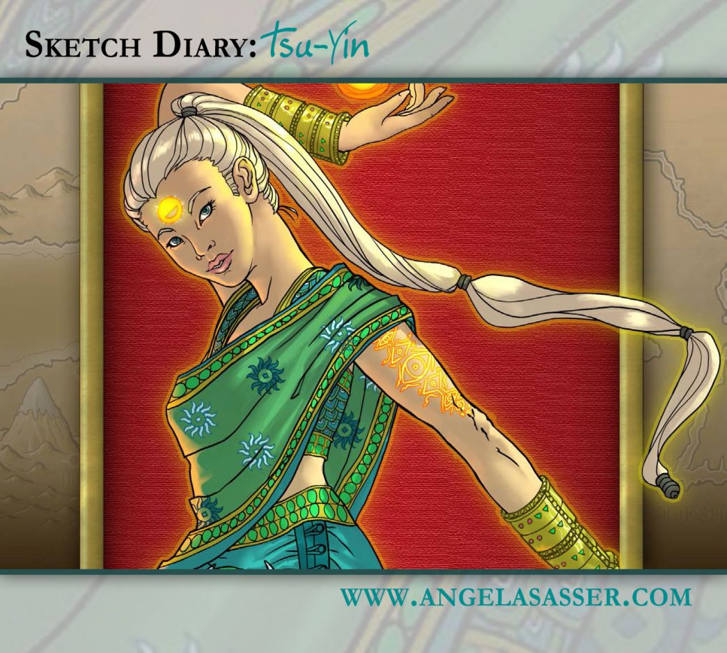
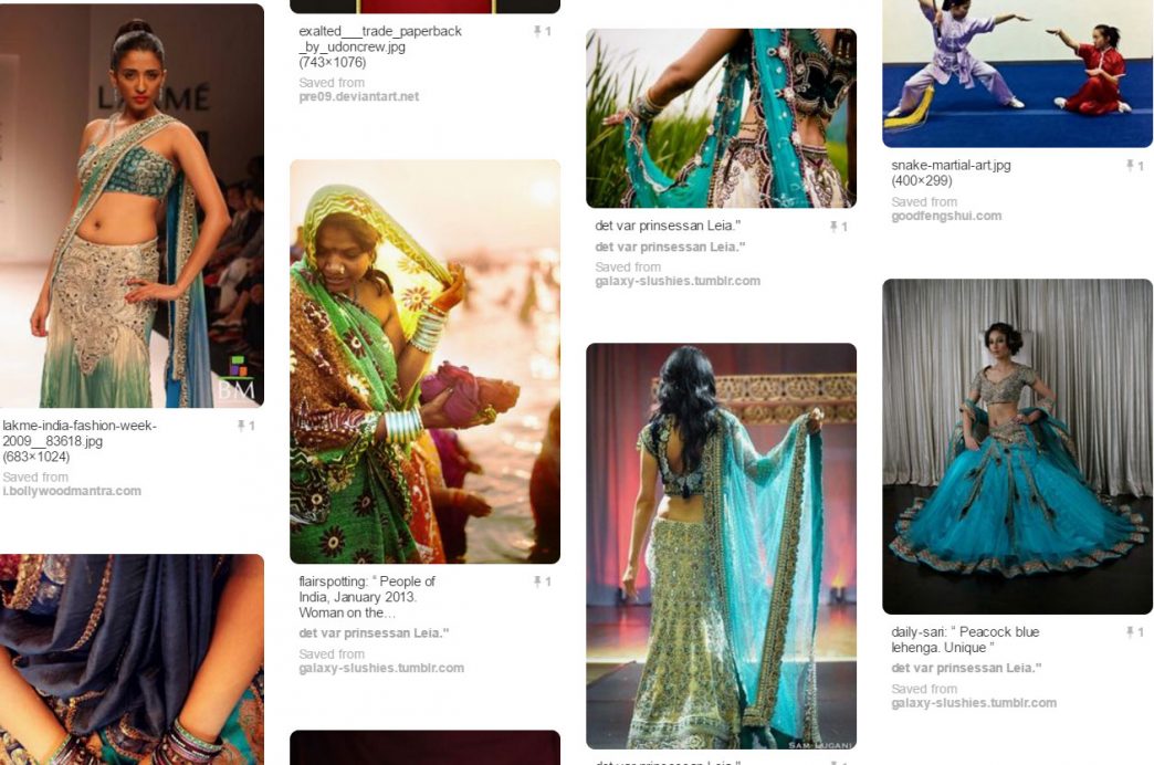
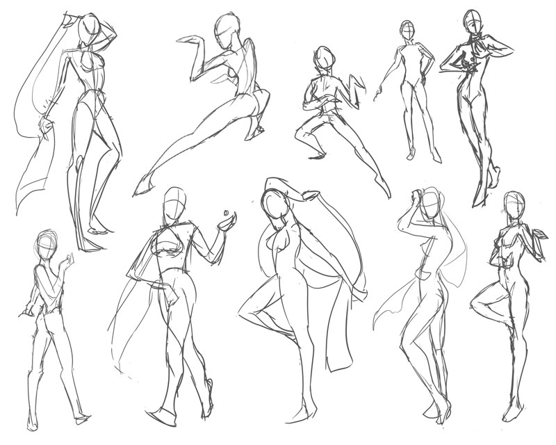
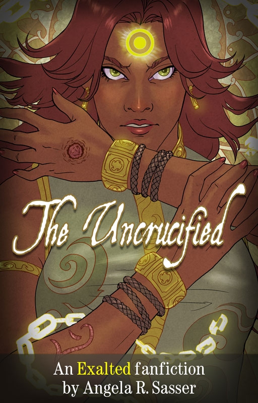
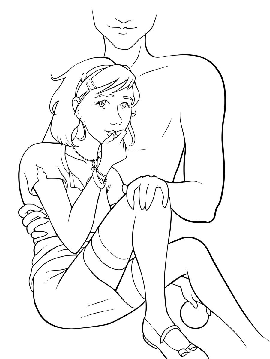
For today’s Critique Corner, we have an image by Maria Arnt.  Check out some of Maria’s other work before we get started!


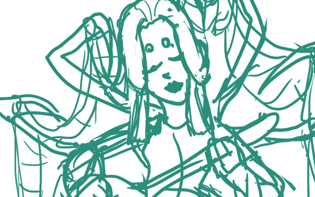
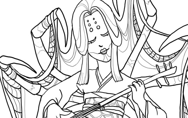
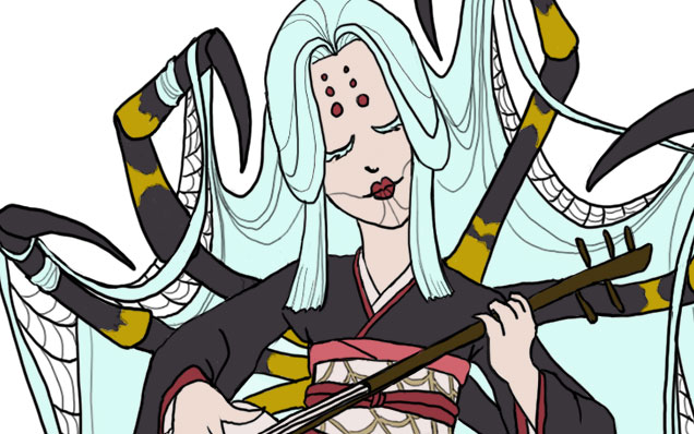
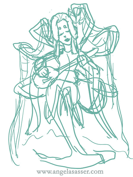
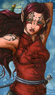
The image up for critique is “Persephone”. Maria’s main concerns were on the use of line width and anatomy, specifically the eyes.
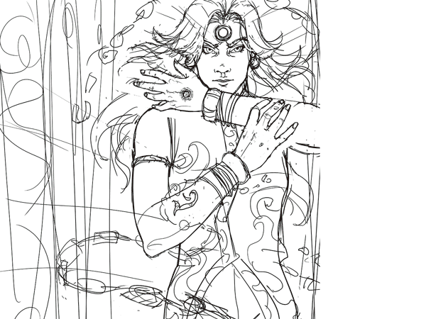
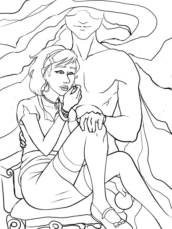
The paintover.

On Line Width

Beautiful!  You’ve never had a problem with creating wonderfully inked pieces, from what I’ve seen of your work.  I think if you want to push the lights and darks in this image that you could add hatching or screentones for shading as well.  Otherwise, cleaner lines like this generally require color to bring a stronger mood and visual impact to a piece.
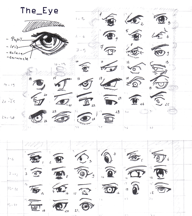
The Eyes

I think the first thing we look at in this piece would be the eyes. Persephone is glancing right at us and, being the only character with a full face, our attention is brought right to her face. Your description of the piece states the following:
“Even though she’s captured by Hades, she’s discovered she has this sort of power over him–but she’s a little afraid to use it. As she eats the pomegranate seed, her eyes are both hesitant and a little daring. Are you going to stop her? She’s not completely sure she wants you to.”
However, the wide open nature of her eyes actually makes her seem more peppy and upbeat rather than hesitant or daring.  In the paintover, I chose to divert her gaze to the pomegranate seed, which I moved further away from her lips, which suggests she’s thinking of the seed and not interacting with the viewer.  One thing to remember is that even though anime eyes are indeed wide, that doesn’t mean that they can’t be various states of open or closed, which is key in creating convincing expression, even via the abstraction of anime style.  Not rendering the eyelid as you have limits the expressiveness of the eye to looking wide, surprised, or clueless.  In addition, I’d highly recommend doing a few studies of anime expressions to get a deeper understanding of how eyes and expressions are abstracted by manga style.  The ’25 essential expression’ memes are a great way to practice!
Notice how most of these manga style eyes still have eyelids (and if they don’t, the eyelid is generally implied with shading, the eyebrows compensate for the lack of expression by their angularity, or the eyes are simply drawn more slim to imply how open or closed they are):

REFERENCE-Manga eyes by ~Aoi-Ne-Blue

On Other Anatomy 

As for the rest of Persephone’s anatomy, I’ve made slight tweaks here and there. I shrank the head, as it was looking a little too large in proportion to her body.  Unless your style is SD, heads in anime usually aren’t too much larger than your standard realistic proportions, rather that the eyes are generally larger with the mouths being smaller.  I’ve also widened the wrist and slimmed her arms, as they were out of proportion to one another.  I also felt like her larger arms were detracting from her childlike presence.  Finally, I refined the anatomy of Persephone’s shoulder, as the lack of line definition and attention to the protrusion of the shoulder joints made it seem as if she had a hump in her back, due to the fact it reads as one solid muscle.

As for Hades,  he shares a similar problem as far as no definition in the joint of his shoulder and pectoral muscles, which leaves his shoulder feeling like a large solid curve, making it seem odd and disconnected.  I’ve added more definition overall to his stomach and chest and adjusted the perspective on his fingers.  Specifically, I changed the hand holding the small of her back to only show the tips of his fingers, due to the fact Persephone’s torso is showing more of a front view than a side view, meaning we wouldn’t see so much of his fingers wrapped around her because, unless his arms were very long, the points of tension where his hand is holding her would stop as they curl around her side.  Another option is to have his hand wrapped around her shoulder instead, which would be frankly an easier angle to draw and far less awkward, visually.

On Concept

All of these technical details aside, I think you could push this concept even further.  As it stands, I don’t feel like there’s much of a connection between these two, as you have implied on the description of your image (Persephone having a passive power over the infatuated Hades).  Perhaps having her glancing up at his face would help her to appear more hesitant and engage him as a force in this piece?  You could maybe even have his hand (the one grasping her leg) holding up more seeds instead, to imply even more interaction between these two.

I like the fact that you don’t see all of Hades’ face, but for a devious smile.  It gives him the presence of a looming controlling shadow, which suits your description nicely.  In the paintover, I’ve added shadowy swaths radiating from his face to help fill up the space around them and add visual interest and flow to the composition.  I’ve also added a fancy chair for Persephone to be seated on to imply their regal Underworld surroundings.  You could even push that further by having ornate plates of sweets around her that Hades might have been tempting her with.

You’ve got a great start here on a strong character piece!  I hope this critique helps you out and that you’ll be following up later with a finished version I can share with my readers.  Good luck, Maria!

DISCLAIMER: I am no ‘master artist’.  I am always learning, therefore, my word is not the end all, be all.  I encourage you to use this critique to your benefit and come up with your own solutions based on them…or not!

The Artist must serve the image, even if it disobeys the critics. Go forth and CREATE!


Want to send in an image for Critique Corner? 
Read on here to find out how!

Sketch Diary: Persephone Queen of the Underworld

Recent days of self-critique have had me determined to push my fundamental skills even more this year.  To that effect, CGhub’s CharacterForge challenges have proved a really fun and loose way to play around with a predetermined concept for my own whims (while also giving me the incentive of a deadline).  The latest CharacterForge challenge was to design Persephone Queen of the Underworld.

There was just enough physical description given that I had a few concrete elements to work with while the rest was left up to my imagination.  The kidnapping of Persephone and the turning of the seasons has always been a myth near and dear to my heart, so I couldn’t resist trying this out!  It began with thumbnailing to work in the Challenge’s requirement that the image be laid out as a book cover.

Choosing a thumbnail was a tough call for me, as each one of them has something I like!  I love the dangerous gaze of the first image with the focus on character details like jewelry and her outfit.  The 2nd  has a wonderful up and down flow and an air of queenly presence the others don’t.  It boiled down to whether I wanted to go with a Persephone who was still mourning over her confinement to the Underworld or perhaps a Persephone more adjusted to her role as a queen, which, in the end, I felt worked better if she was to be entitled “Queen of the Underworld” in this composition.

I ended up going with thumbnail 4 for it’s compositional flow and the balance of a somber character who still demands some power and presence, as she does with her regal clothing and the ability to nurture a seed of life in the darkest places.  She hasn’t given up hope and obediently awaits the day she will bring Spring back to the world of the living.

I also chose the thumbnail I did because I wanted to push myself away from my usual composition habits, which generally cut the character off at the thighs. I very rarely do full figures so it was time for a change!

The next step was to figure out exactly what I wanted to dress this venerable lady in.  I got the creative juices flowing looking up fashions by Alexander McQueen and a cursory google search of catwalk fashions inspired by Greek mythology, which turned up some interesting stuff!  The 2nd dress in this group really caught my eye with the trailing gauzy fabric.  I knew then I needed LOTS of trailing gauzy fabric for that mystical smokey touch!

Image via Top and Trends Fashion Design.

I already had the basic color scheme and physical features defined by the thumbnails and Challenge description so I decided to use a more fleshed out base rather than a simple nondescript figure (which is commonly referred to as a croquis template, in fashion design terms).

I only had time to do three of these, due to time constraints.  I leaned towards the wrapped bodice style of Greek clothing with sashes and tattered edges to get across the feel of a character who has a sense of decay about her, due to her surroundings, which contrasts with her ability to remain pure and beautiful in the dank Underworld.  Again, something I like about all of them!  Eventually went with the middle because it felt like it had the most presence and flow.  There’s also something intriguing about the first dress, which I may have to revisit later (modern day corporate mogul Persephone, perhaps?).

Then began the fevered late night movie marathon to keep me awake while I worked, since I only had three days to finish!  On my ‘girl goes to underworld’ inspiration playlist:

– Legend – Girl kidnapped by giant lonely red devil for touching a unicorn (another childhood fave).
– Pan’s Labyrinth – Girl has magical adventures while living in an oppressive household. At one point journeys into the underworld realm of the Pale Man (my favorite scene!).
– Labyrinth – Girl ventures into the world of the Labyrinth to save her brother and defeat the Goblin King, who is oddly enamored with her.  Love this movie ever since  I was a kid! It’s Jim Henson at his best.

Five cups of coffee and two Cadbury bars later, we have progress!

Adobe Photoshop CS2, Wacom Cintiq 12WX.

She’s still in need of critique so I can clean her up for my portfolio. Feel free to comment on DeviantART or at WiPNation! I’d value any input on how to make her the best image she can be.
If you’re part of CGhub, go vote for me in the challenge if you like my entry! 
(Voting thread should be up soon.)

Characters on the Couch

I’m taking a bit of a detour today to talk about another aspect of my art that I don’t talk about as much as I’d like on this blog – characters.  You might have seen a few of my muses here and there in my art, but never quite gotten to know them, as they’re all on the sidelines while I sort out the Artist part of my career instead of the Writer.  Eventually, I want to bring characters to the forefront of my art AND writing and that is where the savvy Jeannie Campbell comes in!

Aurora Adonai, one of my
first muses.

Any writer will tell you that research is key to writing convincing, engaging scenes and never is that research more important than when you’re working with characters with psychological disorders.  We can make as many guesses as we like about the textbook definition of a psychological disorder and its effects, but this can come off as stiff, as if we’re recalling a grocery list of symptoms when we write.  That is where Jeannie comes in.  As a licensed marriage and family therapist, she has opened her couch to the analysis of our fictional brainchildren.

Last year, Jeannie did an analysis for Aurora, my unstable Elvish hitwoman.  Her analysis opened my eyes to the possibilities with this character, not only for what she is capable of, but how best to balance the darkness of her past with that element of humanity that would keep her sane and also grounded as a character.  For Aurora’s full analysis, you can read on here.

With so many characters chilling in the backstage of my brain, I plan to use Jeannie again in the future.  For that purpose, I’ll be visiting her newly opened website – The Character Therapist!

Jeannie Campbell, The Character Therapist by Elizabeth Mueller

She offers brief assessments of characters for free or a detailed assessment at $14.99.  If you sign up for her newsletter, you can get a copy of her ebook “Writer’s Guide to Character Motivation”, a handy 28 page guide to help you build your characters from the ground up.

For those of you pondering characters, I recommend giving Jeannie a shout!  Meanwhile, I’ll continue plotting ways to send more imaginary folks to fill up her proverbial waiting room.

Eventide Hijacked: The Artifice of Character

Coming to you from the fingertips of fellow fantasy enthusiast, Hayley E. Lavik:

Artist and fantasy writer Angela Sasser hijacks the blog today! Angela has hijacked the blog in the past to explore the overlaps between fantasy writing and fantasy illustration, and she’s back today to talk about dissecting fantasy characters with her cross-media point of view!

(Check out my guest post at Eventide Unmasked and join the discussion!)