Author: Angela S.
 Unlock with Patreon
Lady of March Set
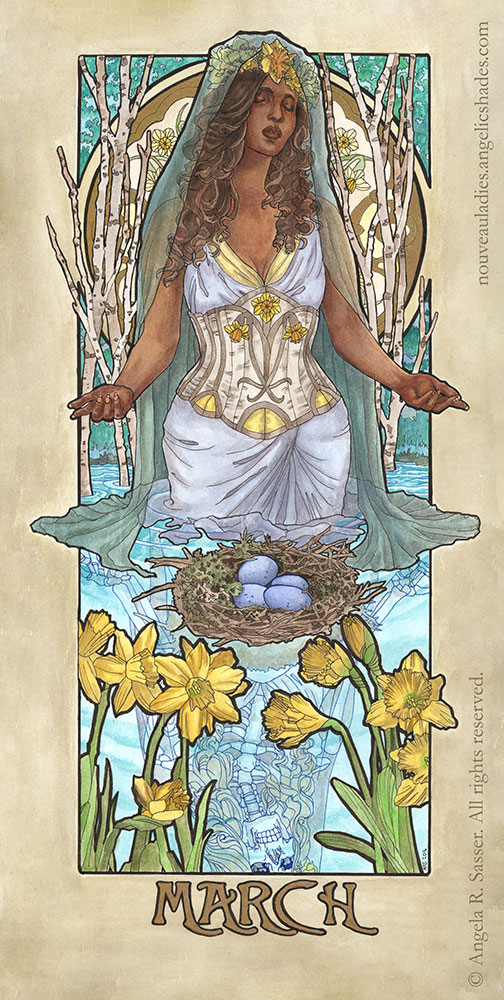
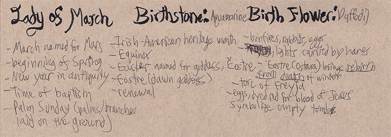
The Lady of March bears Daffodils and dons the stone of Aquamarine. The Daffodils represent chivalry and unrequited love. The Aquamarine will bring her foresight, courage, and happiness.
She ushers in a time of resurrection, renewal, and the bursting forth of new life.
Without further ado, here’s the final version of Lady of March from my Ladies of the Months series! Created with watercolors, sepia ink, and metallic liquid leaf on illustration board.
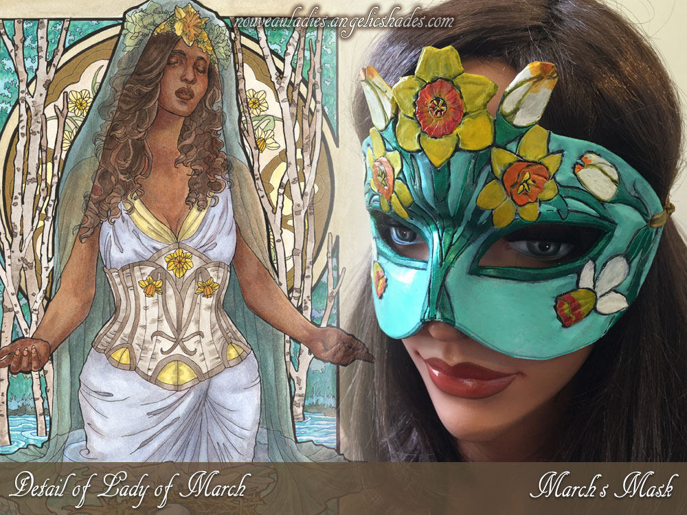
The Lady and her matching mask:
ORIGINAL ART: Available on Etsy.
ORIGINAL MASK: Available on Etsy.
OPEN EDITION PRINTS: Available on Etsy.
LIMITED EDITION PRINTS: Available only via Patreon. Read here for details.
COLORING PAGES: Available via Etsy and Gumroad.
BEHIND THE SCENES:
– Sketch Diary for the Painting
– Design Diary for the Mask
PROCESS VIDEOS:
Creating the painting:
Crafting the mask:
For more about this series, see the Ladies of the Months dedicated site!
Sketch Diary: Lady of March Part 3
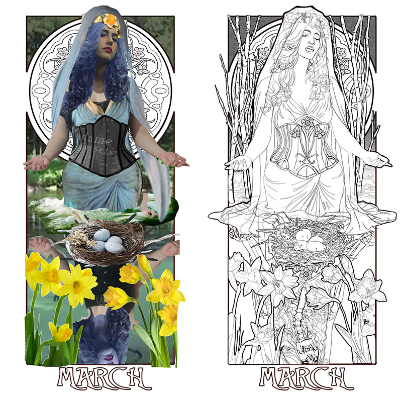
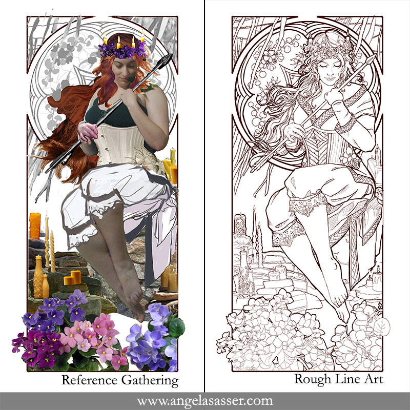
Last time, I talked about designing the narrative elements. Now, I’m excited to start pulling everything together into a cohesive piece! Working in Photoshop CC and using a Cintiq 21UX, I use a composite created from my reference photos as a basis for a rough line drawing. Sometimes, it’s impossible to find the perfect pose and that’s where Photoshop can be really handy.
I’ve used the body from the photos I took, the head from another photo whose facial angle I really liked, and other reference photos (not pictured) to help me change the look and features of the model. One of my intents for this series is that it should encompass all forms of beauty, including diverse women from different ethnicities. I don’t want every Lady to look like me, since I’m primarily the model (a fact I hope to change once I can afford more models).
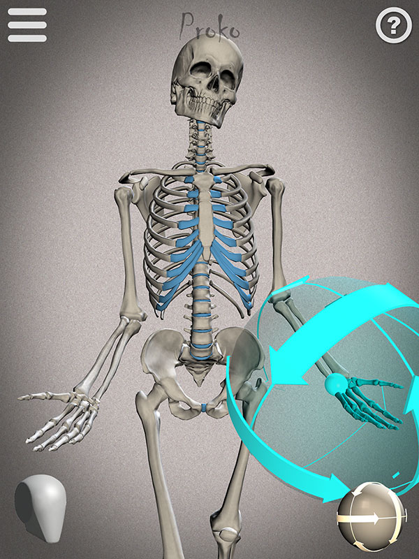
I also wanted to share this screenshot of the reference I used to draw the skeletal reflection from Proko’s Skelly app for Apple and Android. It’s fairly easy to use and arrange with poses you can save. I’ll definitely be using it more for study!
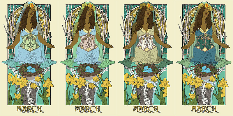
With my line art figured out, I can finally move on to testing out a basic color palette for Lady of March. I know I want a theme indicative of Easter, so I’m mainly drawn to gold, yellow, and blue. The first thing I do with any of the paintings in this series is to make sure the birthstone is represented also through the color palette as well. Luckily, the greenish blue hue of Aquamarine suits my concept for this piece rather well! This color takes up the majority of the background and influences the rest as well. The only other element I’m sure about at this point is that I want the eggs to be the bright blue of robin’s eggs, which always make me think of Spring.
I use the Hue/Saturation slider in Photoshop on each element to see what color choices might surprise me. I explore different options, including a dark dress or a light veil. The 1st image is perhaps too monochromatic in the clothing so that the corset stands out too much. The contrast between the dress and veil in 2 works well while the bodice also brings out the beige of the trees from the background so there’s more color circulation throughout the piece. The 3rd and 4th images both have a nice clear silhouette that’s intriguing, but starts to get away from my liking of stronger blues and yellows in this piece. I should also note that I try to keep the yellows subdued throughout this piece, except for the flowers, which are the strongest focal elements.
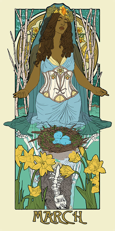
Finally, I arrived at a color palette I consider to be the best of all worlds! The dark veil allows a strong silhouette for the figure while the pale corset and pale blue dress work well together, leaving the eggs and flowers as the most saturated symbolic elements in the piece.
This has been your final sneak peek before I unveil the final painting! You can see the unveiled piece here.
Watch a time lapse of the painting:
Want to see these Sketch Diaries before everyone else? Consider pledging at my Patreon!
You’ll get early sneak peeks plus other exclusive Rewards!
Part 1 – Conceptualization
Part 2 – Narrative Elements
Part 3 – Preliminary Drawing
Sketch Diary: Lady of March Part 2
I had a general idea of the symbolism while I was sketching thumbnails in the last Sketch Diary. Now, I get to tie it all together into something more tangible than scribbles! My fear with this piece is that I wanted to cram too in with the nest, eggs, branches, veiled woman, reflection in the water, etc. The key and main focus of this composition, however, needed to be first the Lady. I was onto something with the poses I previously compiled, but they weren’t where I wanted them to be yet for this image, so I took the time out to do a photo shoot to capture the subtle pose that I wanted.
Specifically, I didn’t like the flatness of the hands in my mockup. They weren’t as expressive as they could be in the original pose (and you’ll probably see me say this a lot while searching for the right pose for a Nouveau piece). The hands needed to be more gestural and graceful, which meant much of the photo shoot was spent trying out different hand motions and head tilts. The body is the most important narrative element in Art Nouveau pieces, since a stiff figure can make an image feel posed and disconnected rather than flowing and lively.
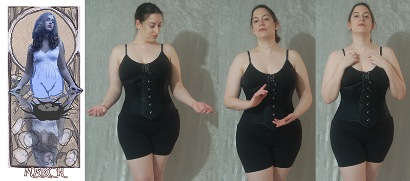
Plus an outtake for fun taken during hand gesture practice.

In the end, my final decision was a mix of the head tilt of the original pose plus the open hands of one of the poses I took. The head tilt evokes a sense of meditation and harkens back to portraits of saints in contemplation, which very much suits this Lady and her spiritual themes of rejuvenation, resurrection, and baptism. The upturned hands also speak of a deep breath, meditation, and more of a connection with the water and energy around her.
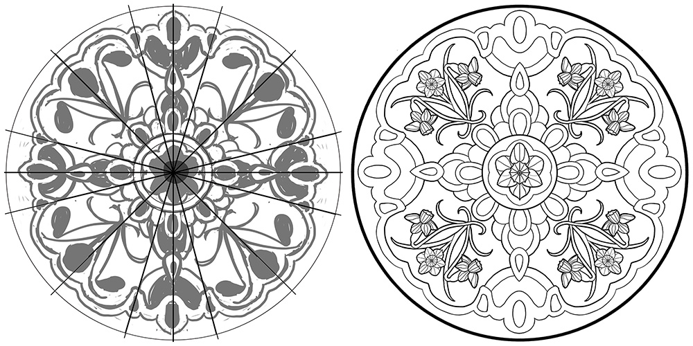
I also worked on the window design at this point, since I had a general idea of how much of it would be covered. A lot of the window was going to be revealed this time, which meant I could work on a design that covered more of the area of the window rather than focusing on accents in the outer boundaries that would need to peek out from behind the figure. I used a template of a circle I made for the previous Ladies and divided it up into sections to help make plotting out symmetrical elements easier. Once I had a small section of the design done, I copy and flip it to create the rest.
Notice my designs start out with really rough shapes first to give me an idea of how the space is used rather than jumping right into the detail of the flowers. Since I’m going with an Easter-inspired theme for Lady of March, I was inspired by faberge and decorative eggs for the window designs.
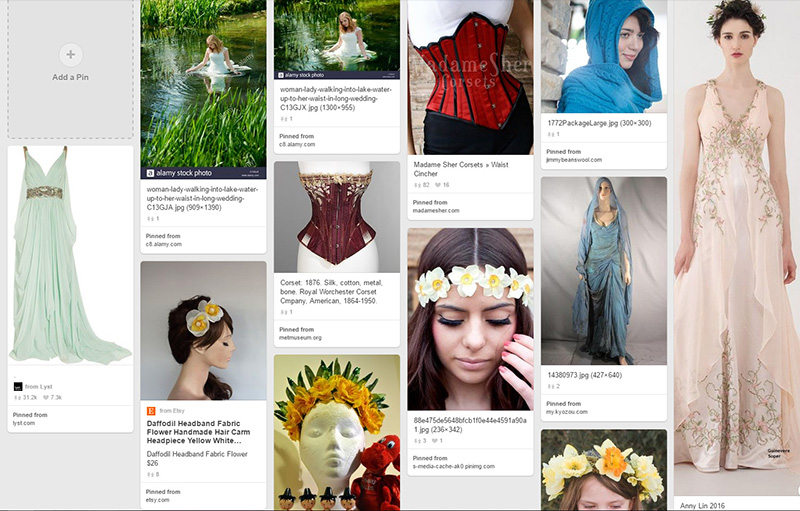
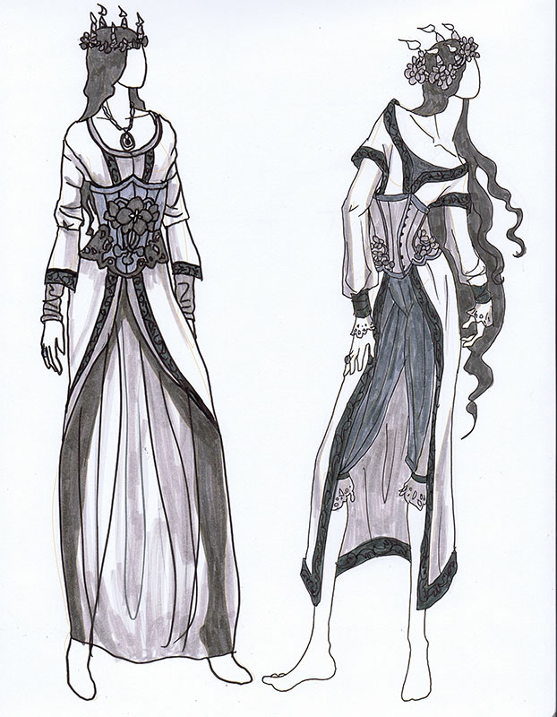
Next, I whipped out my trusty fashion croquis sketchbook and doodled a couple of quick designs to see how I wanted to handle March’s corset, which is the other key area for symbolism and decoration in this series.
As ever, Pinterest is always my first step when brainstorming for fashion (or anything else)!
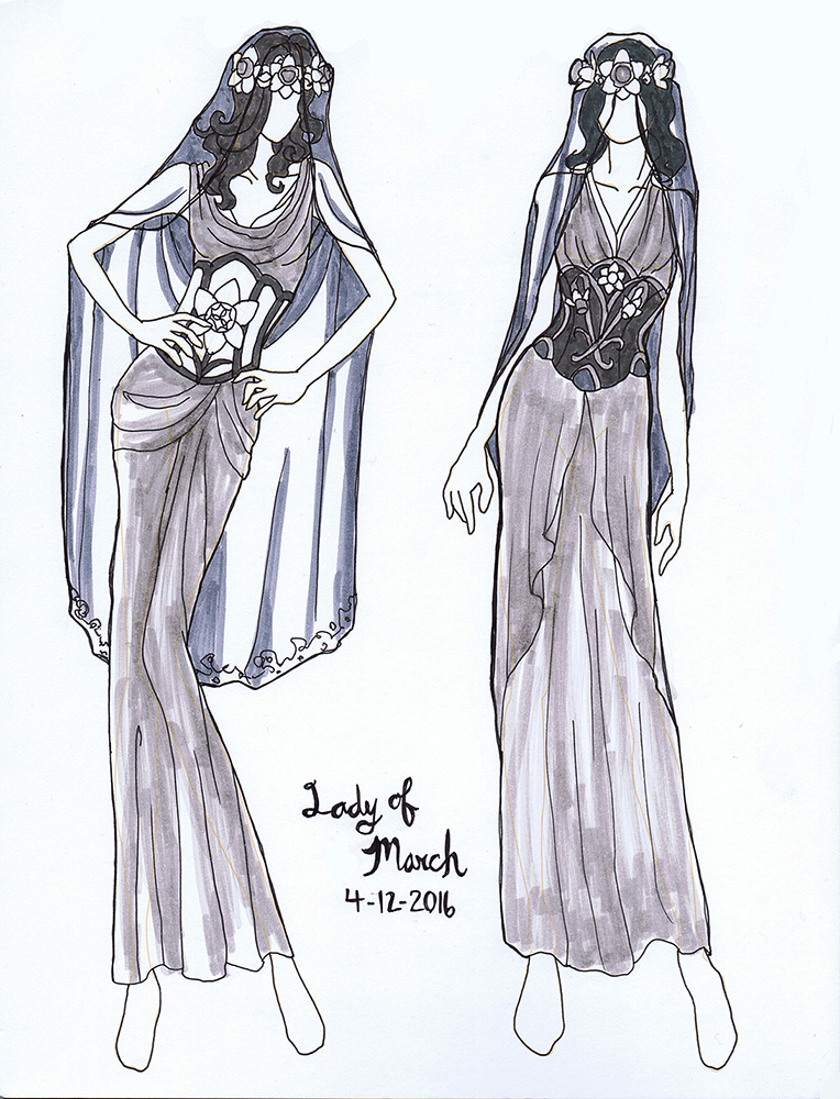 Colored and inked with my warm and cool grey markers set.
I like to use greys so I can establish the values without being tied down to any particular color scheme just yet.I ended up favoring the design on the right for the visual interest a more complex design brought to the stomach, which is located in an open and central area in the overall composition.
Want to see these Sketch Diaries before everyone else? Consider pledging at my Patreon!
You’ll get early sneak peeks plus other exclusive Rewards!
Part 1 – Conceptualization
Part 2 – Narrative Elements
Part 3 – Preliminary Drawing
SKETCH DIARY: Lady of March Part 1
Read Along: The War of Art Book 1


In the meantime, I’ve started reading The War of Art: Break Through the Blocks and Win Your Inner Creative Battles by Steven Pressfield . This book has been on the lips of a lot of independent artists I know as a must-read for motivational purposes.
Part 1 focuses on ‘resistance’. Resistance, as it is defined here, is a mercurial force that embodies our excuses, mental blocks, etc. and it comes purely from within and feeds purely from one’s own psyche. Pressfield breaks down all of the elements and characteristics of resistance in Book 1: Resistance – Defining the Enemy.
Do you say you’ll write your symphony, but that you’ll start tomorrow? That’s Resistance. Do you get caught up in a drama of life with you or your loved ones that keeps you from working on the things you really want to work on? That’s Resistance. Any form of self-sabotage or acceptance of external factors that keeps you from doing the grand, epic thing is Resistance.
My knee jerk reaction to Book 1 is that this is all pretty straightforward and unsurprising. It reads more as a collection of quotable anecdotes without solutions (which I know the future segments will go into in a deeper capacity). I also take some issue with the section which describes mental illness as a form of Resistance. And I quote:
“Attention Deficit Disorder, Seasonal Affect Disorder, Social Anxiety Disorder. These aren’t diseases, they’re marketing ploys. Doctors didn’t discover them, copywriters did. Marketing departments did. Drug companies did.”
“Depression and anxiety may be real. But they can also be Resistance.”
He’s not wrong in that sometimes we can get wrapped up in the drama and difficulty of depression and anxiety, but this feels awfully dismissive of genuine disorders of chemical imbalance or the validity of research that has helped us to understand behavior and treatment better than we have in the past. The large ‘but’ at the end doesn’t feel adequate to resolve that dismissiveness for this reader. If you need some helpful resources you can visit this site. Perhaps feeling annoyed or negatively towards some of these topics is all part of this book’s strategy to get us to feel defensive and start analyzing the reason why?
My sensitivity to this topic aside, there are also some great anecdotes I highlighted for my own inspiration. This was one of my favorites:
“Rule of thumb: The more important a call to action is to our soul’s evolution, the more Resistance we feel towards pursuing it.”
Truth, my friends!
While so far the voice of this book doesn’t connect with me as much as I’d hoped, it definitely has me examining my own sources of Resistance. Taking a deep, down look into our inner selves is what I consider to be strategic planning for artists. I know for me, my sources of Resistance look something like this:
- Confidence. I’m always afraid my skills aren’t up to par with the vision I have in my head, so I save my challenging products for the never-ending agenda of ‘later’.
- Flow. I get caught up by the fact I personally like to have large swaths of time to ‘get into a flow’, so when I know something is going to interrupt that flow (friends visiting, appointments, basically everything that is called interacting with the world, etc.), I get frustrated and don’t start a project.
- Envy. I look a lot at how motivated my artist friends who are further along than me in my career are and wonder why I can’t seem to be as motivated. This usually just sends me in a self-destructive spiral of ‘my work will never be good enough’ or an equally as damaging spiral of ‘if I work until my eyes bleed, surely I’ll get ahead?’.
The list could go on, but those are my top sources of Resistance right now that I shamefully admit to my dear readers.
I’m looking forward to reading the future sections which will hopefully move from this mood of ‘Be an inhuman machine and get over your problems instantly, you lazy, fragile human flesh bag’ and more into offering thoughtful solutions and dialog.
Onwards to Book 2: Combating Resistance – Turning Pro! In the meanwhile, I leave you with another of my favorite quotes:
“The warrior and the artist live by the same code of necessity, which dictates that the battle must be fought anew every day.”
MAR 2016 Studio Hangout – Character Theme: Fairy Tales
https://plus.google.com/events/cd8hjnp2uudjfp2euimg88k7ij8
I’m trying something a little different for this month’s studio hangout. Come watch me draw the character chosen from among my Patreon Patrons’ suggestions tomorrow afternoon, 3pm EST!
In the interest of making this easier for you guys to watch, I’m switching the monthly sketch from pencil to digital. It’s just too hard to see me draw in pencil via the webcam.
While I draw, I’ll be talking about how my month’s been, answering your questions in the Q&A panel, and rambling about my character ideation process. You guys get to find out then what prompt I chose from all of your groovy suggestions!
Can’t attend? Feel free to leave your questions here in the comments and I’ll try to get to them during the event!
EVENT LINK:
https://plus.google.com/events/cd8hjnp2uudjfp2euimg88k7ij8
See you then!
SKETCH DIARY: Lady of February Part 3
SKETCH DIARY: Lady of February Part 2