Category: Blog Posts

Happy Happy Insanity Time!

Also known as the “Pre-DragonCon Rush”

So the insanity is in full swing now with T-minus 30 days till DragonCon and still many paintings and leather crafts ahead of me!  Not to mention I have recently received some life-changing news, but I’m loathe to reveal it now until we know for more of a certainty! (Don’t worry, it is nothing bad!)

I’ve been meaning to post here about how my career is changing (which partially ties into the good news I can’t talk about yet), but that’s something for a later entry as well I think.  For now, just announcing I’m busy as HFIL, my Etsy and Artfire shops are both in vacation mode till after September 5th, and that I’ll be at DragonCon this year with bells on.  I’ll be debuting new prints of such glorious arts as these in my Print Shop and Gallery panel at the con!:

“Angel of January” 11×14 in., Pencil colored in Photoshop.
“Keeper of Secrets”, 11×14 in., Ink colored in Photoshop

You really must go see my gallery panel this year.  It will be like no display I have ever done before with paintings and leather crafts, galore!  I don’t have a table this year, but I’ll most likely be wandering the floor of the Art Show or helping Windfalcon at her table.  We’ll be at the Masked Ball on Friday as well. (Oh but I still need to figure out what to wear!)  We may very well see the return of Captain Evelyn (my pirate alter ego), if I can fit my art-fattened patooty back in that costume!  ALSO, I’ll be hosting a panel called E-Marketing for Artists 101, so check the Art Track for schedule times!

Hope to see you folks there!  If the grumpkins don’t get me first….

Sketch Diary: Angel of January Part 4

Continuing from the last sketch diary entry detailing the battle of wills against horrible color schemes.  I wasn’t quite sure how to compose this next entry, as I couldn’t quite figure out how to record my many hours of tweaking in Photoshop nor do I want to confuse you with the cluttered mess that is my digital coloring method.

I am relatively new to digital painting so I haven’t quite figured out the most efficient way to paint yet.  How about a list of things I learned during this painting that made me fear digital coloring less instead?

Learn the use of Layer Masks and Adjustment Layers!
Being able to tweak the contrast, color, etc. of an image without destroying the integrity of your original image will save you many headaches in the end.  Layer Masks are especially helpful if you want to integrate textures into your image with a more natural feel while Adjustment layers let you tweak elements such as Levels, Contrast, etc. while still keeping your original image untouched.  For example, I used a Gradient via a Fill Adjustment Layer to get the subtle green glow in the texture of the marble behind my angel in this painting.

(Peter Morhbacher has some great tuts on using masks and integrating texture, “How to Apply Texture Without Looking Like a Douche” and “Masking Tutorial” ).

Creating convincing light beams is totally easier in digital.
Wish I could say it was my brilliant idea that resulted in the light beams coming from the top left on my painting, but it was from this jewel of a tutorial.  I used the thicker beams they mentioned in another tut by the same person.  A gal could get used to not having to mask off with tape or masking fluid or painting around the light shafts like I would in watercolor. Hoorah for saving time!
Blending takes time…even in digital.
90% of my time on this image was spent blending and blending and BLENDING some more, especially in the area of her skin.  I used default brushes set to Pen Pressure and an Intuos3 Wacom tablet to color this image. In my experience so far, if you want your image to maintain that painterly feel, it’s better to blend with brush strokes than rely on gradients or fills. It’s far too easy for things to look sleek and plastic in digital so watch yourself! 

Another trick I used to maintain a subtle texture in this painting was to insert texture from free texture sites in layers set to Overlay and attached to the various elements of my image with Clipping Masks.

For things like the skin and hair, I used roughly three default Brushes set to varying Opacity and Scatter settings. I’m sure there’s a whole world of custom brushes to discover, but these are the ones I used, in addition to the default Chalk brush, which I used to simulate the color pencil lines when I needed to touch up my color pencil layer I had scanned in from my original drawing.

A little texture goes a long way!
Critique is priceless, no matter the medium!
As much as I’d like to say this image popped out of my head sparkling and awesome, it looked like crud during a midpoint when the angel’s skin was purple, the window was floating and overwhelming, and I was frustrated with it.  That’s when turning to more experienced digital artists really saved the day! 
Sam Hogg and Stephanie Reeves gave me wonderful advice, paint overs, and encouragement and that is just what we need when learning a new medium, so don’t be afraid to check out places like CGsociety and Conceptart.org (or your own arty friends) for critique!

I did a time lapse video of all of my progress shots. Next time, I’ll try a screen recording program (any reccomendations from you guys?)

And finally, the finished image!
“Angel of January”, 11×17 in.
Digital painting over color pencil outline.
Download a wallpaper of this image.

DragonCon, Important Announcements, & a LOLcat

Well…it’s T-minus 2 months till DragonCon and in that time I have 4 paintings and 18 leather pieces to finish in time to display!  Luckily, this year I don’t have to prep for stocking an entire table, just the gallery panel. 

Have a sneak peek of my layout!
See all those text squares and scribblely thumbnails?
Yeah that’s stuff I need to finish still…

I’m actually looking forward to having the freedom to wander about and schmooze with folks and maybe attend a panel or two this year!  I’ll be hosting a panel on E-Marketing for Artists 101 in the art track, so be sure to keep an eye out for an official schedule so you can come talk shameless plugging with me!

With current workload, I’m pausing commissions till September.  So if you’re currently waiting on work from me, I ask that you please be patient with my slow pace.  If you’re interested in work, never fear, for I will be keeping a waiting list in the meantime!

Now, off to work with me!  You have been warned.  When next we meet, I may look like….this:

PS.
You local peeps in the vicinity of Georgia, come on out to my art opening this Friday!  There’ll be books, bookmarks, and an entire meditation room dedicated to showing my original art. Plus the backdrop of a really cool bookstore with jewelry, gemstones, and KITTEHS! Also, free food!

C’moooon…you know you want to come!

New Product Blog & Twitter Name!

As you may have guessed from my recent poll, I’ve been pondering on ways to better reach people interested in my items for sale. I used to have a forum where I posted store listings, but it ate itself! With my items being spread across my Amazon Shop, Etsy, Zazzle, and Artfire, there seemed no efficient way to get the word out on what’s available where.

Now, I’m pleased to present the solution, the Angelic Shades Product Blog! This is the place to subscribe if you’d like to see instant listings as soon as products and special offers become available. Many of my items are Made to Order, but there are still others (like my jewelry and original art) that are one-of-a-kind, meaning once they’re gone, they’re gone! Watching the blog is the best way to get first dibs on specialty items before they’re gone and to keep up with what specials are going on where across my online outlets.

I’ve also created a Twitter username dedicated solely to product updates, for you Tweeties out there. This will help keep my main Angelic Shades Twitter from being too spammy so it can stay focused on art and fun!

If you hate leaving the safe confines of DeviantART, never fear! I’ll be posting a monthly collection of new items in one tidy Deviation once each month that you can favorite and revisit whenever you like. They’ll look a little something like this:

This should keep people from being spammed (unless they want) and help get the word out for me in a much easier to manage way!
Aah organization! I feel better now.

Sketch Diary: Angel of January Part 3

The ideas have broiled, the sketches have been kneaded to perfection, and now we reach the most difficult phase of this image for me – coloration. Normally, this is the phase that’s the most fun, but this image fought with me tooth and nail to defy my whims!

Problem #1 – Being a monthly series, I have a limited palette of pre-defined colors to work with which are restricted by the main elements, the flowers and birthstones for each month. In this case, my choices for January are garnet, carnations, and snow drops.

Add on top of that I want to have a ‘stepping into sunlight’ theme with sunbeams streaming in and the challenge becomes even more tricky! Lucky for me at least that carnations come in many colors and snowdrops are a neutral white. I’m not sure how lucky I’ll be with the rest of these angels that have flowers available in one color only!

The first idea I had was to have the realm of Spring beyond the ‘doorway’ in the image, so that bright area of contrast was fighting with me as well. I did quite a few color tests in digital and watercolor, the disasters of which I’m almost embarrassed to share:

After doing these, the idea of a glowing halo around her body
was dropped in favor of not going insane from dueling colors
and light sources.
The talented Sam Hogg took a stab at it with her digital awesome powers:

While I like the simplicity and contrast of Sam’s color scheme,
the window felt too dark for my tastes.

Springboarding from Sam’s theme, I lightened it up with
sunbeams and a sunrise themed ‘spring’ realm behind her.

Before the end of this color testing phase, I decided I wanted to try this image digitally instead of in watercolor to help me brush up on my cg skills (and also because the color richness demanded something more bold than watercolors).  To keep that subtle texture of my line art, I scanned in the color pencil outline version to use as a base to color on:

Outlined in Prismacolor Color Pencils. The color of the lines gives a deeper
optical richness to the final piece than simply using black outlines.

Eventually, I arrived at this final complimentary color scheme with orange
accents. The idea shifted to sunbeams penetrating a subterranean underworld
which pushed everything green! (Thanks to Hayley‘s critique)

 It’s at this step that I’ve added textures from free texture sites and my own references to help add texture and interest to my digital shading.  The color pencil outline layer sits above all of my other color layers and is set to Multiply so that all the color layers beneath it will be visible while maintaining their color value and the color tint of the outline layer.

The color layers each have texture layers above them set to Overlay so that the texture will be very subtle and show the colors beneath it. In the next entry, I’ll go more into depth about my digital color process. It’s all very experimental at the moment. Maybe a video will be more helpful here?

Sunbeams, glimmering dust motes, and jewels glittering in the dark await! I’m excited to get started shading this painting digitally. Got to keep my digitalart-fu strong!

Upcoming Appearance: Author Meet & Greet

If you’ll be in the area of Peachtree City, GA this weekend, I’ll be making an appearance at the Books-A-Million in The Avenue shopping center!  They’ve invited me back for a mass book signing event with other local authors.  Come say hello, chat about art, and get a free bookmark while supplies last!

I’m looking forward to seeing what other authors are in my area too.  Should be interesting to see what different sorts of genres we all do.

I’ve created a public event on Facebook for easy access to maps, dates, and location details here.  Or you can check the event calendar on my website to see what else I’ll be up to in the coming months!

Characters on the Couch

I’m taking a bit of a detour today to talk about another aspect of my art that I don’t talk about as much as I’d like on this blog – characters.  You might have seen a few of my muses here and there in my art, but never quite gotten to know them, as they’re all on the sidelines while I sort out the Artist part of my career instead of the Writer.  Eventually, I want to bring characters to the forefront of my art AND writing and that is where the savvy Jeannie Campbell comes in!

Aurora Adonai, one of my
first muses.

Any writer will tell you that research is key to writing convincing, engaging scenes and never is that research more important than when you’re working with characters with psychological disorders.  We can make as many guesses as we like about the textbook definition of a psychological disorder and its effects, but this can come off as stiff, as if we’re recalling a grocery list of symptoms when we write.  That is where Jeannie comes in.  As a licensed marriage and family therapist, she has opened her couch to the analysis of our fictional brainchildren.

Last year, Jeannie did an analysis for Aurora, my unstable Elvish hitwoman.  Her analysis opened my eyes to the possibilities with this character, not only for what she is capable of, but how best to balance the darkness of her past with that element of humanity that would keep her sane and also grounded as a character.  For Aurora’s full analysis, you can read on here.

With so many characters chilling in the backstage of my brain, I plan to use Jeannie again in the future.  For that purpose, I’ll be visiting her newly opened website – The Character Therapist!

Jeannie Campbell, The Character Therapist by Elizabeth Mueller

She offers brief assessments of characters for free or a detailed assessment at $14.99.  If you sign up for her newsletter, you can get a copy of her ebook “Writer’s Guide to Character Motivation”, a handy 28 page guide to help you build your characters from the ground up.

For those of you pondering characters, I recommend giving Jeannie a shout!  Meanwhile, I’ll continue plotting ways to send more imaginary folks to fill up her proverbial waiting room.

Sketch Diary: Angel of January Part 2

You all might remember my last sketch diary entry for this image? If not, go check it out for idea development and thumbnail sketches. Wow, has it really been nearly a YEAR since I’ve come back to this piece? Guess that burnout wave hit me harder than I thought! (More on that later, as it’s been on my mind a lot lately)

My favorite thumbnail sketch.

Next up, developing the final draft! With my favorite thumbnail sketch out of the many in mind, I shot some stock reference for myself with the idea of a veiled or draped figure stepping into sunlight to echo the themes of the emergence of Persephone (which is associated with the gemstone for January with its pomegranate seed-like clusters of garnets).

January is also named for Janus, the god of doorways and transitions, signaling the coming of the new season and new year.

This particular stock pose caught my eye most with the inquisitive angle of the head, the assymetrical sweep of the arms, and the idea of ‘stepping into the sunlight’ echoed in the pose.:

More poses at my stock gallery.
The first base sketch. The wings cover too much of the
stained glass window.

With that stock pose in mind, I did several rough sketches in Photoshop and finally arrived at a base figure, with all of my background elements on separate layers so I could tweak them individually.  This phase also involved doing a rough sketch of the stained glass window pane with its Snow Drop and Carnations motif with no attention paid to exact symmetry just yet, but rather scribbles filling out the main idea of the design and how it might integrate with the figure first.

However, I kept running into a problem with the wings.  They seemed either covered up too much of the lovely window, were too flat, or too cramped into the space I had in mind.

Too cramped and thin…
Much better flow that leads the viewer’s
eye through the figure!

With the main figure taken care of, I refined the window by copying, pasting, and flipping parts of the window as needed to create a more symmetrical shape.  I then transferred the sketch to illustration board, refining the details as I went along until I arrived at this:

Very light pencil sketch…
…which morphed into color pencil outline!

Memorial Day Sale + Studio Roast Continues!

Just a quickie post to tell you all about my weekend sale!  Get 25% off at my Angelic Shades gift shop on everything, regular AND sale price!  Slowly getting into this sale groove, as I always forget to run promotions.  So get in on this before I forget to run them again!

I’m also doing free shipping on all my items on my Etsy and Artfire shops!  Just enter the code FREESHIP when you check out.

In other news, the Studio Roast is still going strong!  The current auctions on eBay are over and everything that was on sale for round 1 is now only available via this list:

Feel free to make an offer on any of these images, if you fancy a haggle!  The next round of images will be up soon! There’re tons more where these came from to throw on the proverbial fire.

Hope you all have a good weekend!  I have a few announcements to make next time that I’m super excited about.  But next time! 😉

My First Art Fair!

After a day of rest and a couple of Advil, I’m pleased to report I have survived my first art fair!  All in all, I did fairly well for a first timer. Made back my booth fee, got suggestions from the crowd on what they wanted to see, and learned the secret of good transportation of random stuff — plastic tuberware!

What did I learn from this experience? Read on!

Start Early!

2 weeks was not enough to make even half of the items by hand that I wanted to fill up my artisan display tables. I found myself painting into the wee hours and relying on a lot of older stock I had lying around just to make my booth look presentable. First lesson learned! Start early, DO NOT STRESS YOURSELF by procrastinating!  Know your display capacities. Practice your setup in advance.  Last thing you want is it to look empty and rushed.  Also, check your current stock! I had to reorder many prints last minute because I didn’t realize I was low till that moment. Doh!

Remember Your Traffic Flow

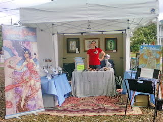
Probably the most important lesson I learned.  Day 1, I had a setup like this:
Heeey! Buy my stuff. Please? YOU KNOW YOU WANNA!

While this isn’t terrible, I think I did this because I’m so used to setting up at conventions where you put the table out front and people come up to you to talk.  This layout drives people right up to you, but what I noticed at the fair is most people will talk to you, but then not browse your wares, or they’re intimidated by your presence and just want to be left alone to shop.  I also had a technical issue where I couldn’t find the stiffeners for my walls, so I couldn’t line the sides of the booth with them, leaving it looking pretty empty on the left.

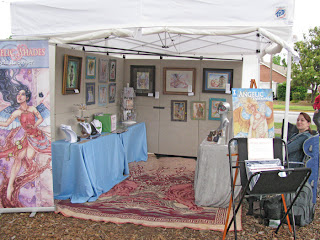
After walking around the fair a bit and getting some ideas from other artists (and fanagling walls with velcro), I ended up with a setup like this for Day 2:

Psst! Hay man. Need a kidney? Operating table in the back!

Much more open space and plenty of room for multiple browsers to go down the line of pretties!  Artist hidden away and only there if you need her to checkout or to ask questions.  More people came in this time round and didn’t have to peer over my head to come right up to the artwork.

Best Selling Items?

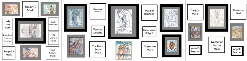
This was a huge surprise for me! I thought my crafts would do well, but I only sold a few things. Mainly I sold art cards and prints because people wanted small artwork to inspire them (but didn’t want to buy the more expensive larger pieces on the wall). I also sold a few books to people who saw my work elsewhere and liked that I offered personalized goodies for free if they bought it directly from me.  I didn’t sell a single mask.

I had a good many requests for hair brooches with chopsticks and lapel pins of the butterflies.  No doubt due to having a generally older crowd (with grandkids along) who were looking for things for their home or small gifts, of which matted/framed Fantasy art is generally not well suited for your average collector.

Next time I do an outdoor fair, I plan to carry more personal items (hair brooches and pins), more ornate masks framed in shadowboxes, and more accessible 2D art items (perhaps carved leather butterflies in framed ‘specimen’ arrangements?)  If people can see the use of an item for their home or their personal decor, I imagine they’d be more inclined to buy at these sorts of events!  I can save my fantasy art for more themed fests, like the Renaissance Faire or the cons I attend.  That’s at least one joy of being a multi-faceted artist!

Final Thoughts

I am sore and sleep-deprived far more than I ever was for a plain ol convention!  Art fairs are physically grueling work and not for those who can’t handle the hauling, unloading, and long hours.  It’s also a HUGE investment of time and money.

The fair season has only begun for me, however, so I’m not going to give up on it just yet! Being able to talk to fellow art lovers and curiosity seekers was quite enjoyable for me!  Even moreso when they would tell me they saw my work online or at the gallery next door.  Getting your face out there can be very gratifying and just as important as sales.  For my shy artist friends, however, this definitely may not be the thing for you!

If you’re a fan of my Facebook Fan Page, I’m having a sale on leftover hand-painted butterflies. Get ’em while they’re cheap because they’ll be going up on Etsy for a higher price after this week!

See one you like? Check out my sekrit sale!

Stay tuned for a post on what makes up an art fair display. Till then, I’m going to attend to the mess that is my trashed studio after an event. *cry!