Category: Blog Posts

[ Secret Sketchbook ] Website Redesign Part 3 – Galleries

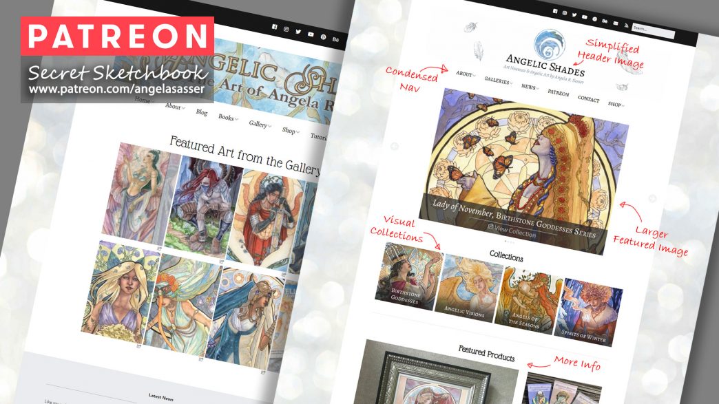
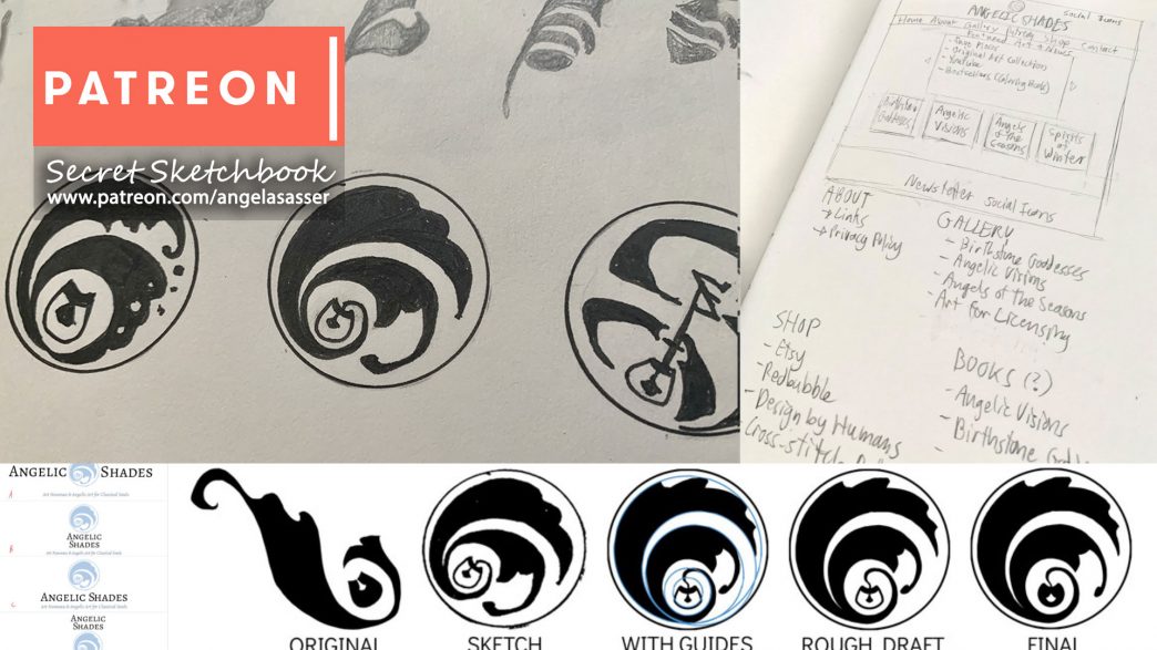
Part 1 and 2 of this series covered branding and the artist website’s front page.  This entry is all about how to show off the art with the Gallery Index and Pages!

The Gallery Index

When I first built Angelic Shades, I took the barest minimum approach and simply inserted galleries I could easily add using shortcode with the NextGEN Gallery plugin, which lets me add galleries based on tags, albums, etc.  This let me build my site quickly and easily. 

However, this old Gallery Index had some problems:

I had no title text on the page and the very barest description for my series.  For the new site, I spruced up this gallery index by adding the title text with a slightly longer description to conjure a more magical mood for my Angels of the Seasons.  Having more text on this page also makes it more crawlable by search engines looking for relevant terms not just in the meta tags, but in the content, itself.

I also put a call to action on the new layout to encourage people to click and explore the images for more info, since it’s not plainly obvious they are clickable until you hover your mouse over them.  

The thumbnails of the old page were also misaligned due to the masonry-style stacking, which made them uneven since they are not all the exact same size.  I was able to force them all to be the same height and width in the new layout.  The thumbnails also fill up the whole width of the page instead of wasting space so they show up big and beautiful on the page.  I want to showcase the art, not drive people insane with awkward visual blocks!

The Gallery Page

While NextGEN made it easy for me to insert large galleries, the image thumbnails in these galleries would click off to an awkward lightbox that made it difficult to share more about each individual piece.

My aim for the new site was to make each painting’s page more interesting to explore and provide more connection points to my Etsy and Redbubble shops.  I want to turn the viewers of my website into collectors instead of merely treating the site like an archive!

That old lightbox was just ugly!  The whole page was squished, the description was difficult to read, and the rest of the gallery’s thumbnails were hard to see.  The best thing about this lightbox was the Share buttons, which allow people to share the image to their social media accounts.  I need to find a way to add these for my new layout, but for now, I hope to rely on people being able to use browser extensions for this functionality in the new layout.

The Art

First and foremost, I wanted the art to shine on this page!  In the old site’s lightbox, it was squished and awkward in that void.  Back when I first made the old site, I was worried people would pirate my art so I uploaded very small low res images.  However, now that computers have evolved, having detailed paintings at 700 pixels max length looks fuzzy and small on higher resolution displays.  I’ve upped that max length to 1000 pixels and instead chose to use watermarks as a deterrent to piracy.

SIDENOTE: Why watermark art?  Because having a copyright notice is, in my opinion, the most powerful way to say that “These images are all visibly copyrighted on my site” so that an infringer cannot say in court “I did not know they were copyrighted” and feign ignorance.  I also know that my images are going to travel without accompanying text around the internet, especially on places like Pinterest, so it’s good to have my name and url hard coded into them.

The Description

On the new site, I’ve expanded the description of the image.  Doing so makes my art more personal and interesting to viewers, while also populating the content of the webpage with relevant keywords, which search engines like.  I like to let people know a bit about the folklore that inspired my work, any interesting methods I used to make the piece, etc.

Work-In-Progress Sub-Gallery

I’ve also chosen to add a little space where I can feature a peek at a WIP pic or, where available, links to my Sketch Diary blog posts or Patreon posts (thereby letting me pitch my Patreon as well).  Showing that an image took a lot of work raises its perceived value as a piece of art, while also providing those with curiosity the chance to explore your process.

The Featured Product & Original Availability

Showing that the original art is available makes it easier for collectors to snag a piece, while the Featured Product bar lets those who want to add more art to their lives easily find more.  My old site didn’t have any visual products like this and relied on people to dig into the navigation menu to find my shop links.  People do not like digging through complicated menus!

I also chose to put this product bar towards the bottom of the page instead of the top. I don’t want to overwhelm people with a sales pitch as soon as they land on the page.  Now, they can enjoy the art for a minute before getting towards the bottom and picking up something if they feel want to.  Redbubble and Printful have excellent products mockups available that are free to use!

My links go to Etsy and Redbubble since I do not have a native e-cart on my site.  I’ll cover what WordPress tools and themes I’m using in a future entry in this series.

Further Exploration

Finally, I’ve included the full gallery from the collection’s Gallery Index so that this art collection is easy to navigate in!  I want to always provide an easy path for further exploration when I can so that viewers can enjoy their journey through my site. Most people have internet that can handle this amount of images, while modern sites also now have a ‘lazy loading’ functionality which only loads images as a user scrolls down to them, making the loading times a bit easier on folks with less internet speed.

What’s Next?

I’ve got a long ways to go to create individual gallery pages for many of the pieces I want to feature!  While I probably won’t do this for EVERY piece of art in my ever-growing body of work, I want to do it for all of my favorites, especially the ones that have products attached.  

So if you need me, I’ll be chained to the computer forever fiddling with page blocks!

Next, I’ll provide a list of the tools I used for putting my site together.  There are some great ones that people with a bit of web savvy can employ to make great looking sites!

I hope this has given you all some insight into what many artists have to do to maintain their businesses or, if you’re an artist, some ideas for how to tidy up your  own site’s experience!

♥  Ang

[ Secret Sketchbook ] Website Redesign Part 3 – Galleries

Part 1 and 2 of this series covered branding and the artist website’s front page.  This entry is all about how to show off the art with the Gallery Index and Pages!

The Gallery Index

When I first built Angelic Shades, I took the barest minimum approach and simply inserted galleries I could easily add using shortcode with the NextGEN Gallery plugin, which lets me add galleries based on tags, albums, etc.  This let me build my site quickly and easily. 

However, this old Gallery Index had some problems:

I had no title text on the page and the very barest description for my series.  For the new site, I spruced up this gallery index by adding the title text with a slightly longer description to conjure a more magical mood for my Angels of the Seasons.  Having more text on this page also makes it more crawlable by search engines looking for relevant terms not just in the meta tags, but in the content, itself.

I also put a call to action on the new layout to encourage people to click and explore the images for more info, since it’s not plainly obvious they are clickable until you hover your mouse over them.  

The thumbnails of the old page were also misaligned due to the masonry-style stacking, which made them uneven since they are not all the exact same size.  I was able to force them all to be the same height and width in the new layout.  The thumbnails also fill up the whole width of the page instead of wasting space so they show up big and beautiful on the page.  I want to showcase the art, not drive people insane with awkward visual blocks!

The Gallery Page

While NextGEN made it easy for me to insert large galleries, the image thumbnails in these galleries would click off to an awkward lightbox that made it difficult to share more about each individual piece.

My aim for the new site was to make each painting’s page more interesting to explore and provide more connection points to my Etsy and Redbubble shops.  I want to turn the viewers of my website into collectors instead of merely treating the site like an archive!

That old lightbox was just ugly!  The whole page was squished, the description was difficult to read, and the rest of the gallery’s thumbnails were hard to see.  The best thing about this lightbox was the Share buttons, which allow people to share the image to their social media accounts.  I need to find a way to add these for my new layout, but for now, I hope to rely on people being able to use browser extensions for this functionality in the new layout.

The Art

First and foremost, I wanted the art to shine on this page!  In the old site’s lightbox, it was squished and awkward in that void.  Back when I first made the old site, I was worried people would pirate my art so I uploaded very small low res images.  However, now that computers have evolved, having detailed paintings at 700 pixels max length looks fuzzy and small on higher resolution displays.  I’ve upped that max length to 1000 pixels and instead chose to use watermarks as a deterrent to piracy.

SIDENOTE: Why watermark art?  Because having a copyright notice is, in my opinion, the most powerful way to say that “These images are all visibly copyrighted on my site” so that an infringer cannot say in court “I did not know they were copyrighted” and feign ignorance.  I also know that my images are going to travel without accompanying text around the internet, especially on places like Pinterest, so it’s good to have my name and url hard coded into them.

The Description

On the new site, I’ve expanded the description of the image.  Doing so makes my art more personal and interesting to viewers, while also populating the content of the webpage with relevant keywords, which search engines like.  I like to let people know a bit about the folklore that inspired my work, any interesting methods I used to make the piece, etc.

Work-In-Progress Sub-Gallery

I’ve also chosen to add a little space where I can feature a peek at a WIP pic or, where available, links to my Sketch Diary blog posts or Patreon posts (thereby letting me pitch my Patreon as well).  Showing that an image took a lot of work raises its perceived value as a piece of art, while also providing those with curiosity the chance to explore your process.

The Featured Product & Original Availability

Showing that the original art is available makes it easier for collectors to snag a piece, while the Featured Product bar lets those who want to add more art to their lives easily find more.  My old site didn’t have any visual products like this and relied on people to dig into the navigation menu to find my shop links.  People do not like digging through complicated menus!

I also chose to put this product bar towards the bottom of the page instead of the top. I don’t want to overwhelm people with a sales pitch as soon as they land on the page.  Now, they can enjoy the art for a minute before getting towards the bottom and picking up something if they feel want to.  Redbubble and Printful have excellent products mockups available that are free to use!

My links go to Etsy and Redbubble since I do not have a native e-cart on my site.  I’ll cover what WordPress tools and themes I’m using in a future entry in this series.

Further Exploration

Finally, I’ve included the full gallery from the collection’s Gallery Index so that this art collection is easy to navigate in!  I want to always provide an easy path for further exploration when I can so that viewers can enjoy their journey through my site. Most people have internet that can handle this amount of images, while modern sites also now have a ‘lazy loading’ functionality which only loads images as a user scrolls down to them, making the loading times a bit easier on folks with less internet speed.

What’s Next?

I’ve got a long ways to go to create individual gallery pages for many of the pieces I want to feature!  While I probably won’t do this for EVERY piece of art in my ever-growing body of work, I want to do it for all of my favorites, especially the ones that have products attached.  

So if you need me, I’ll be chained to the computer forever fiddling with page blocks!

Next, I’ll provide a list of the tools I used for putting my site together.  There are some great ones that people with a bit of web savvy can employ to make great looking sites!

I hope this has given you all some insight into what many artists have to do to maintain their businesses or, if you’re an artist, some ideas for how to tidy up your  own site’s experience!

♥  Ang
[ Secret Sketchbook ] Website Redesign Part 3 – Galleries

Part 1 and 2 of this series covered branding and the artist website’s front page.  This entry is all about how to show off the art with the Gallery Index and Pages!

The Gallery Index

When I first built Angelic Shades, I took the barest minimum approach and simply inserted galleries I could easily add using shortcode with the NextGEN Gallery plugin, which lets me add galleries based on tags, albums, etc.  This let me build my site quickly and easily. 

However, this old Gallery Index had some problems:

I had no title text on the page and the very barest description for my series.  For the new site, I spruced up this gallery index by adding the title text with a slightly longer description to conjure a more magical mood for my Angels of the Seasons.  Having more text on this page also makes it more crawlable by search engines looking for relevant terms not just in the meta tags, but in the content, itself.

I also put a call to action on the new layout to encourage people to click and explore the images for more info, since it’s not plainly obvious they are clickable until you hover your mouse over them.  

The thumbnails of the old page were also misaligned due to the masonry-style stacking, which made them uneven since they are not all the exact same size.  I was able to force them all to be the same height and width in the new layout.  The thumbnails also fill up the whole width of the page instead of wasting space so they show up big and beautiful on the page.  I want to showcase the art, not drive people insane with awkward visual blocks!

The Gallery Page

While NextGEN made it easy for me to insert large galleries, the image thumbnails in these galleries would click off to an awkward lightbox that made it difficult to share more about each individual piece.

My aim for the new site was to make each painting’s page more interesting to explore and provide more connection points to my Etsy and Redbubble shops.  I want to turn the viewers of my website into collectors instead of merely treating the site like an archive!

That old lightbox was just ugly!  The whole page was squished, the description was difficult to read, and the rest of the gallery’s thumbnails were hard to see.  The best thing about this lightbox was the Share buttons, which allow people to share the image to their social media accounts.  I need to find a way to add these for my new layout, but for now, I hope to rely on people being able to use browser extensions for this functionality in the new layout.

The Art

First and foremost, I wanted the art to shine on this page!  In the old site’s lightbox, it was squished and awkward in that void.  Back when I first made the old site, I was worried people would pirate my art so I uploaded very small low res images.  However, now that computers have evolved, having detailed paintings at 700 pixels max length looks fuzzy and small on higher resolution displays.  I’ve upped that max length to 1000 pixels and instead chose to use watermarks as a deterrent to piracy.

SIDENOTE: Why watermark art?  Because having a copyright notice is, in my opinion, the most powerful way to say that “These images are all visibly copyrighted on my site” so that an infringer cannot say in court “I did not know they were copyrighted” and feign ignorance.  I also know that my images are going to travel without accompanying text around the internet, especially on places like Pinterest, so it’s good to have my name and url hard coded into them.

The Description

On the new site, I’ve expanded the description of the image.  Doing so makes my art more personal and interesting to viewers, while also populating the content of the webpage with relevant keywords, which search engines like.  I like to let people know a bit about the folklore that inspired my work, any interesting methods I used to make the piece, etc.

Work-In-Progress Sub-Gallery

I’ve also chosen to add a little space where I can feature a peek at a WIP pic or, where available, links to my Sketch Diary blog posts or Patreon posts (thereby letting me pitch my Patreon as well).  Showing that an image took a lot of work raises its perceived value as a piece of art, while also providing those with curiosity the chance to explore your process.

The Featured Product & Original Availability

Showing that the original art is available makes it easier for collectors to snag a piece, while the Featured Product bar lets those who want to add more art to their lives easily find more.  My old site didn’t have any visual products like this and relied on people to dig into the navigation menu to find my shop links.  People do not like digging through complicated menus!

I also chose to put this product bar towards the bottom of the page instead of the top. I don’t want to overwhelm people with a sales pitch as soon as they land on the page.  Now, they can enjoy the art for a minute before getting towards the bottom and picking up something if they feel want to.  Redbubble and Printful have excellent products mockups available that are free to use!

My links go to Etsy and Redbubble since I do not have a native e-cart on my site.  I’ll cover what WordPress tools and themes I’m using in a future entry in this series.

Further Exploration

Finally, I’ve included the full gallery from the collection’s Gallery Index so that this art collection is easy to navigate in!  I want to always provide an easy path for further exploration when I can so that viewers can enjoy their journey through my site. Most people have internet that can handle this amount of images, while modern sites also now have a ‘lazy loading’ functionality which only loads images as a user scrolls down to them, making the loading times a bit easier on folks with less internet speed.

What’s Next?

I’ve got a long ways to go to create individual gallery pages for many of the pieces I want to feature!  While I probably won’t do this for EVERY piece of art in my ever-growing body of work, I want to do it for all of my favorites, especially the ones that have products attached.  

So if you need me, I’ll be chained to the computer forever fiddling with page blocks!

Next, I’ll provide a list of the tools I used for putting my site together.  There are some great ones that people with a bit of web savvy can employ to make great looking sites!

I hope this has given you all some insight into what many artists have to do to maintain their businesses or, if you’re an artist, some ideas for how to tidy up your  own site’s experience!

♥  Ang
[ Secret Sketchbook ] Website Redesign Part 3 – Galleries

Part 1 and 2 of this series covered branding and the artist website’s front page.  This entry is all about how to show off the art with the Gallery Index and Pages!

The Gallery Index

When I first built Angelic Shades, I took the barest minimum approach and simply inserted galleries I could easily add using shortcode with the NextGEN Gallery plugin, which lets me add galleries based on tags, albums, etc.  This let me build my site quickly and easily. 

However, this old Gallery Index had some problems:

I had no title text on the page and the very barest description for my series.  For the new site, I spruced up this gallery index by adding the title text with a slightly longer description to conjure a more magical mood for my Angels of the Seasons.  Having more text on this page also makes it more crawlable by search engines looking for relevant terms not just in the meta tags, but in the content, itself.

I also put a call to action on the new layout to encourage people to click and explore the images for more info, since it’s not plainly obvious they are clickable until you hover your mouse over them.  

The thumbnails of the old page were also misaligned due to the masonry-style stacking, which made them uneven since they are not all the exact same size.  I was able to force them all to be the same height and width in the new layout.  The thumbnails also fill up the whole width of the page instead of wasting space so they show up big and beautiful on the page.  I want to showcase the art, not drive people insane with awkward visual blocks!

The Gallery Page

While NextGEN made it easy for me to insert large galleries, the image thumbnails in these galleries would click off to an awkward lightbox that made it difficult to share more about each individual piece.

My aim for the new site was to make each painting’s page more interesting to explore and provide more connection points to my Etsy and Redbubble shops.  I want to turn the viewers of my website into collectors instead of merely treating the site like an archive!

That old lightbox was just ugly!  The whole page was squished, the description was difficult to read, and the rest of the gallery’s thumbnails were hard to see.  The best thing about this lightbox was the Share buttons, which allow people to share the image to their social media accounts.  I need to find a way to add these for my new layout, but for now, I hope to rely on people being able to use browser extensions for this functionality in the new layout.

The Art

First and foremost, I wanted the art to shine on this page!  In the old site’s lightbox, it was squished and awkward in that void.  Back when I first made the old site, I was worried people would pirate my art so I uploaded very small low res images.  However, now that computers have evolved, having detailed paintings at 700 pixels max length looks fuzzy and small on higher resolution displays.  I’ve upped that max length to 1000 pixels and instead chose to use watermarks as a deterrent to piracy.

SIDENOTE: Why watermark art?  Because having a copyright notice is, in my opinion, the most powerful way to say that “These images are all visibly copyrighted on my site” so that an infringer cannot say in court “I did not know they were copyrighted” and feign ignorance.  I also know that my images are going to travel without accompanying text around the internet, especially on places like Pinterest, so it’s good to have my name and url hard coded into them.

The Description

On the new site, I’ve expanded the description of the image.  Doing so makes my art more personal and interesting to viewers, while also populating the content of the webpage with relevant keywords, which search engines like.  I like to let people know a bit about the folklore that inspired my work, any interesting methods I used to make the piece, etc.

Work-In-Progress Sub-Gallery

I’ve also chosen to add a little space where I can feature a peek at a WIP pic or, where available, links to my Sketch Diary blog posts or Patreon posts (thereby letting me pitch my Patreon as well).  Showing that an image took a lot of work raises its perceived value as a piece of art, while also providing those with curiosity the chance to explore your process.

The Featured Product & Original Availability

Showing that the original art is available makes it easier for collectors to snag a piece, while the Featured Product bar lets those who want to add more art to their lives easily find more.  My old site didn’t have any visual products like this and relied on people to dig into the navigation menu to find my shop links.  People do not like digging through complicated menus!

I also chose to put this product bar towards the bottom of the page instead of the top. I don’t want to overwhelm people with a sales pitch as soon as they land on the page.  Now, they can enjoy the art for a minute before getting towards the bottom and picking up something if they feel want to.  Redbubble and Printful have excellent products mockups available that are free to use!

My links go to Etsy and Redbubble since I do not have a native e-cart on my site.  I’ll cover what WordPress tools and themes I’m using in a future entry in this series.

Further Exploration

Finally, I’ve included the full gallery from the collection’s Gallery Index so that this art collection is easy to navigate in!  I want to always provide an easy path for further exploration when I can so that viewers can enjoy their journey through my site. Most people have internet that can handle this amount of images, while modern sites also now have a ‘lazy loading’ functionality which only loads images as a user scrolls down to them, making the loading times a bit easier on folks with less internet speed.

What’s Next?

I’ve got a long ways to go to create individual gallery pages for many of the pieces I want to feature!  While I probably won’t do this for EVERY piece of art in my ever-growing body of work, I want to do it for all of my favorites, especially the ones that have products attached.  

So if you need me, I’ll be chained to the computer forever fiddling with page blocks!

Next, I’ll provide a list of the tools I used for putting my site together.  There are some great ones that people with a bit of web savvy can employ to make great looking sites!

I hope this has given you all some insight into what many artists have to do to maintain their businesses or, if you’re an artist, some ideas for how to tidy up your  own site’s experience!

♥  Ang
[ Secret Sketchbook ] Website Redesign Part 3 – Galleries

Part 1 and 2 of this series covered branding and the artist website’s front page.  This entry is all about how to show off the art with the Gallery Index and Pages!

The Gallery Index

When I first built Angelic Shades, I took the barest minimum approach and simply inserted galleries I could easily add using shortcode with the NextGEN Gallery plugin, which lets me add galleries based on tags, albums, etc.  This let me build my site quickly and easily. 

However, this old Gallery Index had some problems:

I had no title text on the page and the very barest description for my series.  For the new site, I spruced up this gallery index by adding the title text with a slightly longer description to conjure a more magical mood for my Angels of the Seasons.  Having more text on this page also makes it more crawlable by search engines looking for relevant terms not just in the meta tags, but in the content, itself.

I also put a call to action on the new layout to encourage people to click and explore the images for more info, since it’s not plainly obvious they are clickable until you hover your mouse over them.  

The thumbnails of the old page were also misaligned due to the masonry-style stacking, which made them uneven since they are not all the exact same size.  I was able to force them all to be the same height and width in the new layout.  The thumbnails also fill up the whole width of the page instead of wasting space so they show up big and beautiful on the page.  I want to showcase the art, not drive people insane with awkward visual blocks!

The Gallery Page

While NextGEN made it easy for me to insert large galleries, the image thumbnails in these galleries would click off to an awkward lightbox that made it difficult to share more about each individual piece.

My aim for the new site was to make each painting’s page more interesting to explore and provide more connection points to my Etsy and Redbubble shops.  I want to turn the viewers of my website into collectors instead of merely treating the site like an archive!

That old lightbox was just ugly!  The whole page was squished, the description was difficult to read, and the rest of the gallery’s thumbnails were hard to see.  The best thing about this lightbox was the Share buttons, which allow people to share the image to their social media accounts.  I need to find a way to add these for my new layout, but for now, I hope to rely on people being able to use browser extensions for this functionality in the new layout.

The Art

First and foremost, I wanted the art to shine on this page!  In the old site’s lightbox, it was squished and awkward in that void.  Back when I first made the old site, I was worried people would pirate my art so I uploaded very small low res images.  However, now that computers have evolved, having detailed paintings at 700 pixels max length looks fuzzy and small on higher resolution displays.  I’ve upped that max length to 1000 pixels and instead chose to use watermarks as a deterrent to piracy.

SIDENOTE: Why watermark art?  Because having a copyright notice is, in my opinion, the most powerful way to say that “These images are all visibly copyrighted on my site” so that an infringer cannot say in court “I did not know they were copyrighted” and feign ignorance.  I also know that my images are going to travel without accompanying text around the internet, especially on places like Pinterest, so it’s good to have my name and url hard coded into them.

The Description

On the new site, I’ve expanded the description of the image.  Doing so makes my art more personal and interesting to viewers, while also populating the content of the webpage with relevant keywords, which search engines like.  I like to let people know a bit about the folklore that inspired my work, any interesting methods I used to make the piece, etc.

Work-In-Progress Sub-Gallery

I’ve also chosen to add a little space where I can feature a peek at a WIP pic or, where available, links to my Sketch Diary blog posts or Patreon posts (thereby letting me pitch my Patreon as well).  Showing that an image took a lot of work raises its perceived value as a piece of art, while also providing those with curiosity the chance to explore your process.

The Featured Product & Original Availability

Showing that the original art is available makes it easier for collectors to snag a piece, while the Featured Product bar lets those who want to add more art to their lives easily find more.  My old site didn’t have any visual products like this and relied on people to dig into the navigation menu to find my shop links.  People do not like digging through complicated menus!

I also chose to put this product bar towards the bottom of the page instead of the top. I don’t want to overwhelm people with a sales pitch as soon as they land on the page.  Now, they can enjoy the art for a minute before getting towards the bottom and picking up something if they feel want to.  Redbubble and Printful have excellent products mockups available that are free to use!

My links go to Etsy and Redbubble since I do not have a native e-cart on my site.  I’ll cover what WordPress tools and themes I’m using in a future entry in this series.

Further Exploration

Finally, I’ve included the full gallery from the collection’s Gallery Index so that this art collection is easy to navigate in!  I want to always provide an easy path for further exploration when I can so that viewers can enjoy their journey through my site. Most people have internet that can handle this amount of images, while modern sites also now have a ‘lazy loading’ functionality which only loads images as a user scrolls down to them, making the loading times a bit easier on folks with less internet speed.

What’s Next?

I’ve got a long ways to go to create individual gallery pages for many of the pieces I want to feature!  While I probably won’t do this for EVERY piece of art in my ever-growing body of work, I want to do it for all of my favorites, especially the ones that have products attached.  

So if you need me, I’ll be chained to the computer forever fiddling with page blocks!

Next, I’ll provide a list of the tools I used for putting my site together.  There are some great ones that people with a bit of web savvy can employ to make great looking sites!

I hope this has given you all some insight into what many artists have to do to maintain their businesses or, if you’re an artist, some ideas for how to tidy up your  own site’s experience!

♥  Ang

[Secret Sketchbook] Website Redesign Part 2 – The Index Page

Part 2 of my Website Redesign series continues!  I discuss the importance of each section on an artist website’s front page, the purpose of the site, and other best practices.  All while using my old and new website design as a visual aid.

Pledge any amount on Patreon to access to this article.  Every little bit helps me to keep doing what I love!

[Secret Sketchbook] Angelic Shades Website Redesign Part 1

With the world of conventions basically cancelled and my insane Kickstarter schedule finally letting up, it’s time to polish my online presence!  Check out this Patreon-only post exploring my in-depth notes discussing how I’m redesigning my Art Nouveau website, including research notes, logo evolution, etc.

Pledge at least $1 to access to this article!  Every little bit helps me to keep doing what I love.

July 2020 Wrap-Up – Big Milestone, Big Burnout

Cross-posted from my Patreon blog

July has ended and it’s been a strange mix of some great milestones here, but also an acknowledgement of my continued struggle with burnout.

To start off, Kev and I packed up the FINAL Kickstarter order after a year and change of consecutive Kickstarter campaigns dedicated to the Birthstone Goddesses enamel pins!

It’s been amazing to see how fans, new and old, have turned out to support this pin series’ creation.  The pins are complete and I am so happy with them!  That’s one big project milestone for the Birthstone Goddesses complete:

(The entire series is now available in my shop!)

Now, we can sit back and get some much needed rest!  This year-long journey has shown me what my limits are as a one-person business and that I just can’t do this all by myself without sacrificing my well-being.  It shows me I can only do two Kickstarters a year at most, and that it’s super important for my creative wells to not sacrifice so much of my time painting to business upkeep, promotion, and project management.

It showed me I was very bad at taking time off as well!  It just wasn’t possible. The last few months I kept trying to take time off, but there was always something in Backerkit that needed setting up, ads to design, proofs to approved, and Kickstarter things to promote before the next deadline.  

So now for vacation take three (or four?), I’m losing count!  Now that there are no more Kickstarter things until next year, I’m taking some ACTUAL true and proper time off!  Reading this article on artists defining and struggling with their burnout really made me pause and think about some specific strategies for myself to set better resting habits!

Our creativity is a muscle that can be strained and it’s a skill they don’t teach in school.  I’m giving myself permission to have fun in August, do non-art crafty projects, and play all the video games!  And THIS TIME I will not have to worry about unavoidable Kickstarter deadlines encroaching on that all-important rest time.

Coming in August

I’ll still be sharing a new coloring page and new art.  I’ll be meandering with fun art, like Anko’s 6 Outfits Challenge, finishing more portraits for my charity drive, and sharing more creative journey posts here, for a little while.  The Birthstone Goddesses are entering their final phase for me and there’s a lot I want to tell you all about where we’re going from here, once I’ve rested a bit!

Digest of July’s Posts

New Rewards Added in July

I hope you all won’t mind seeing my continued art diversions here for a little while longer!  The Birthstone Goddesses will return momentarily, but as I’ve been going full steam ahead on them for 6 years (wow!), it’s important that I let it rest for a little while to finish off the final phase with a bang!  I’m planning some very different illustrations to be included in the art book and I am SO excited to get into something that’s less Mucha and more ME.

More soon!

 ♥ Ang

June 2020 Wrap-Up – This Month Was the Longest Year

Hey, all!  June has been extremely challenging and I don’t even know where to begin.  There are so many difficult topics to cover here.

To start, I’ve had a bit of fallout this month from posting the portrait of Kev and myself in support of Black Lives Matter.  Having to describe to people, especially close acquaintances, how this is not a terrorist movement, how ‘all lives matter’ is a dismissive statement, etc. has been exhausting (and only a fraction of what my husband has to deal with 24-7, every day of his life).  But honestly, this discourse has been long overdue.  I’m going to keep explaining and going to keep working on the charity portraits because it is important we keep speaking up and discussing difficult topics!  It’s a discussion that needs to be ongoing and ever-present beyond the hashtag trend.

Speaking of difficult topics, I also have to discuss the fallout of Noah Bradley and Sam Flegal, both who have admitted to sexual misconduct publicly this month.  As someone who helped promote Noah’s resources and classes, as well as someone who was heavily involved for years with One Fantastic Week where Sam participated as a co-host, I have been shaken to my core.  I’ve lost two major communities for networking and sharing professional practices with other artists in the span of a couple of weeks, which is nothing next to the pain of the victims that have been coming forward risking their careers and friendships to speak out.

I hope that anyone who ever saw my recommendations to these communities here was never hurt by any of their actions.  I don’t know what will become of these communities that were such major touchstones for many of my fellow artists and myself, but I do know the wildfire spread of people finally being brave enough to speak up is ultimately going to make us stronger and the community safer.

I also want to do my part here to help others, to provide alternatives for those who need them right now, which is why I’ve re-invigorated my side project, The Muse’s Library, so that I can return to more actively providing art biz advice, stock art, etc.  We desperately need more variety in the voices putting out this material for aspiring artists and I want to contribute to that.  This may mean a shake-up to this Patreon, as I  may endeavor to share more advice articles, as you have seen me do in regards to my Kickstarter etc.  I’m currently pondering how best I can bring that presence here or if it clashes too much with my Birthstone Goddesses endeavors. (If you have thoughts on this, let me know!)

This month has been disappointing and enlightening, for better or for worse.  I don’t know what’s coming next this year, but all we can do is brace, encourage one another, and face that uncertain future together!

Coming Next Month:

I HOPE that after I finish shipping all the packages for the final pins Kickstarter that I can get back to creating!  Now that the coloring page poll has been answered, I’ll continue bringing out new coloring page releases as well.  I hope to share my mini art side trip exploring Anko’s 6 Outfits Challenge also!

Digest of June’s Posts

Rewards Added in June

[ART] No More Silence + Art for Charity Drive!

EDIT 7/30/2020: Paypal has automatically closed the Money Pool so I am going to call this Charity Drive done for now!  I hope to do more drives like this in the future, as I feel it is a way we can all help good causes together.  I’ll be posting soon which charities I’ve donated to as soon as I have made the donations.  Thanks to everyone who donated!  Your generosity warms the heart.  

I know this seems a deviation from my usual art, but at the same time, I needed to make this and share it.

When my husband, Kevin, and I first started getting serious as a couple, people’s support of us turned from reluctant smiles to “Are you sure you want to date him? That could make life harder for you.”  Hearing this from people I love and respect popped the optimistic bubble I had always lived in.  

All my favorite movies and stories had taught me that I could grow up to be anything I wanted, that everyone was created equal, that I was a good person who could stand up against injustice like my heroes, but the true lesson from those around me was this…

 …I could do all those things as long as I was safe and didn’t marry a good man who I adored and who adored me because it was easier to just move on to someone ‘safer’ who was not black. The world wouldn’t change any time soon, so I should just be safe. 

Kev and I have usually been silent online about these topics for fear of upsetting anyone.  Conversations about tolerance, guilt, and racial misconceptions were best left for private one-on-one conversations with friends and family.  It’s finally the time for these conversations to happen out loud.  If we’ve learned anything from the past few weeks, it’s that so many folks are like us.  They have kept silent for a long time awaiting a single voice to give them the courage to speak out.

Now’s the time we need to choose not to be safe and comfortable. Now’s a chance to catch the world up with the fine sensibilities that we preach to our children and ourselves, but that we don’t have the same courage to live by.

I’ve used my art for examining morality in a ‘safe’ indirect way via the Fantasy genre, but if ever there was a time to be direct, it is now.  I want to be like my epic Fantasy heroes and now all of us have a chance to be!

Portraits for Charity

I’ll be creating ribbon portrait icons like the examples here for charity.  This idea was inspired by Bkomei’s icons for charity drive.  Bkomie asked that others take up this format to do good, if they can, so I’m doing my part!

If you donate $30 or more to my donation pool, I will create an icon in this style for you to show your solidarity.  Original Characters are also welcome!  100% of the money will be donated to charities supporting racial equality and providing aid to those neighborhoods currently impacted by protests.  I hope to raise at least $1k or to create 34 icon portraits.  Whichever comes first!  There is no cutoff date.

In the event kind individuals donate more than the minimum and I reach $1k faster, this charity drive will end and my art queue for icons will be closed.

How This Works:

  • Donate $30 or more to my Paypal Donation Pool here (Paypal account not required).
  • Send me your reference photos (either a photo of yourself in profile or references of your Original Character) to angelicshades(at)gmail.com
  • Your completed high res digital icon will be emailed to the address from which you emailed your references, unless otherwise requested.  EDIT: Your icon will be sent as soon as it is finished. I will not be waiting until the pool is full and the final donations are made.
  • Once I hit my goal, I will donate the money to selected charities (the receipts will be shared on my blog and on social media for confirmation).  The specific charities will be decided upon after I have done adequate research on each.  EDIT: I am open to your suggestions to which organizations I should choose!  I am currently considering the ACLU, Black Visions Collective, Campaign Zero, and Reclaim the Block.
  • I’ll update this post with a link to a queue to let people know the status of portraits.  I will be working on these icons outside of other obligations, so expect a moderate wait time.

 If you do not have the funds to donate, I encourage you to help signal boost this post, instead, and do what you can to be compassionate and outspoken about injustice in these dark times. Thanks so much for your generosity, either way!  Kev and I really wish we could be out there helping voices be heard, but due to his medical fragility as a heart and cancer patient, we have to self-isolate as much as possible right now.  I wanted to do what is within my power to do and that is to create something with art! 

Let’s be heroes, guys. Stand up.  Speak out!  Don’t be silenced by fear and comfort.  I know we have the power to change things together, because together is the only way the world can, and has, changed.

Much love,

♥ Ang

 Help Signal Boost