Part 1 and 2 of this series covered branding and the artist website’s front page. This entry is all about how to show off the art with the Gallery Index and Pages!
The Gallery Index
When I first built Angelic Shades, I took the barest minimum approach and simply inserted galleries I could easily add using shortcode with the NextGEN Gallery plugin, which lets me add galleries based on tags, albums, etc. This let me build my site quickly and easily.
However, this old Gallery Index had some problems:
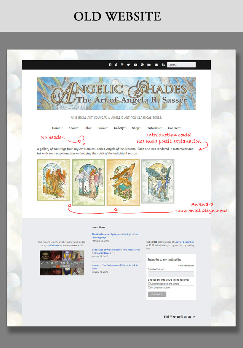
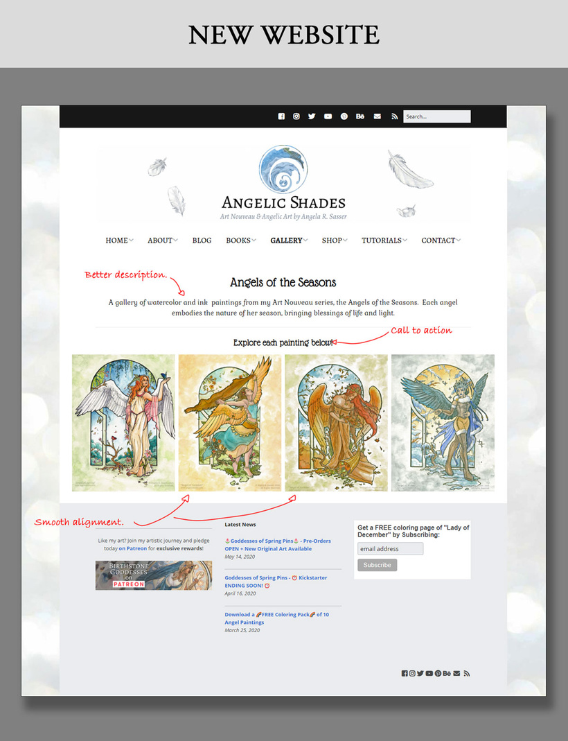
I had no title text on the page and the very barest description for my series. For the new site, I spruced up this gallery index by adding the title text with a slightly longer description to conjure a more magical mood for my Angels of the Seasons. Having more text on this page also makes it more crawlable by search engines looking for relevant terms not just in the meta tags, but in the content, itself.
I also put a call to action on the new layout to encourage people to click and explore the images for more info, since it’s not plainly obvious they are clickable until you hover your mouse over them.
The thumbnails of the old page were also misaligned due to the masonry-style stacking, which made them uneven since they are not all the exact same size. I was able to force them all to be the same height and width in the new layout. The thumbnails also fill up the whole width of the page instead of wasting space so they show up big and beautiful on the page. I want to showcase the art, not drive people insane with awkward visual blocks!
The Gallery Page
While NextGEN made it easy for me to insert large galleries, the image thumbnails in these galleries would click off to an awkward lightbox that made it difficult to share more about each individual piece.
My aim for the new site was to make each painting’s page more interesting to explore and provide more connection points to my Etsy and Redbubble shops. I want to turn the viewers of my website into collectors instead of merely treating the site like an archive!
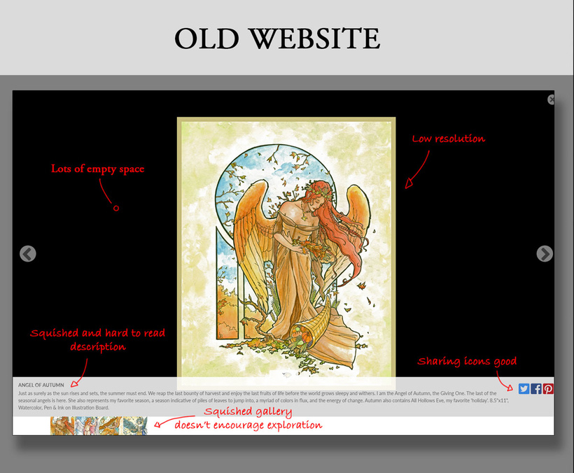
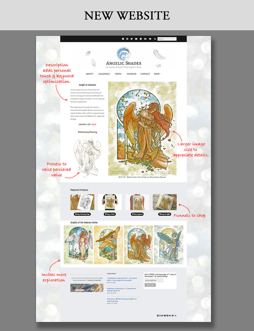
That old lightbox was just ugly! The whole page was squished, the description was difficult to read, and the rest of the gallery’s thumbnails were hard to see. The best thing about this lightbox was the Share buttons, which allow people to share the image to their social media accounts. I need to find a way to add these for my new layout, but for now, I hope to rely on people being able to use browser extensions for this functionality in the new layout.
The Art
First and foremost, I wanted the art to shine on this page! In the old site’s lightbox, it was squished and awkward in that void. Back when I first made the old site, I was worried people would pirate my art so I uploaded very small low res images. However, now that computers have evolved, having detailed paintings at 700 pixels max length looks fuzzy and small on higher resolution displays. I’ve upped that max length to 1000 pixels and instead chose to use watermarks as a deterrent to piracy.
SIDENOTE: Why watermark art? Because having a copyright notice is, in my opinion, the most powerful way to say that “These images are all visibly copyrighted on my site” so that an infringer cannot say in court “I did not know they were copyrighted” and feign ignorance. I also know that my images are going to travel without accompanying text around the internet, especially on places like Pinterest, so it’s good to have my name and url hard coded into them.
The Description
On the new site, I’ve expanded the description of the image. Doing so makes my art more personal and interesting to viewers, while also populating the content of the webpage with relevant keywords, which search engines like. I like to let people know a bit about the folklore that inspired my work, any interesting methods I used to make the piece, etc.
Work-In-Progress Sub-Gallery
I’ve also chosen to add a little space where I can feature a peek at a WIP pic or, where available, links to my Sketch Diary blog posts or Patreon posts (thereby letting me pitch my Patreon as well). Showing that an image took a lot of work raises its perceived value as a piece of art, while also providing those with curiosity the chance to explore your process.
The Featured Product & Original Availability
Showing that the original art is available makes it easier for collectors to snag a piece, while the Featured Product bar lets those who want to add more art to their lives easily find more. My old site didn’t have any visual products like this and relied on people to dig into the navigation menu to find my shop links. People do not like digging through complicated menus!
I also chose to put this product bar towards the bottom of the page instead of the top. I don’t want to overwhelm people with a sales pitch as soon as they land on the page. Now, they can enjoy the art for a minute before getting towards the bottom and picking up something if they feel want to. Redbubble and Printful have excellent products mockups available that are free to use!
My links go to Etsy and Redbubble since I do not have a native e-cart on my site. I’ll cover what WordPress tools and themes I’m using in a future entry in this series.
Further Exploration
Finally, I’ve included the full gallery from the collection’s Gallery Index so that this art collection is easy to navigate in! I want to always provide an easy path for further exploration when I can so that viewers can enjoy their journey through my site. Most people have internet that can handle this amount of images, while modern sites also now have a ‘lazy loading’ functionality which only loads images as a user scrolls down to them, making the loading times a bit easier on folks with less internet speed.
What’s Next?
I’ve got a long ways to go to create individual gallery pages for many of the pieces I want to feature! While I probably won’t do this for EVERY piece of art in my ever-growing body of work, I want to do it for all of my favorites, especially the ones that have products attached.
So if you need me, I’ll be chained to the computer forever fiddling with page blocks!
Next, I’ll provide a list of the tools I used for putting my site together. There are some great ones that people with a bit of web savvy can employ to make great looking sites!
I hope this has given you all some insight into what many artists have to do to maintain their businesses or, if you’re an artist, some ideas for how to tidy up your own site’s experience!
♥ Ang