I’d normally save this kind of article to be exclusive for my Patrons, but I wanted to share this particular article with everyone to offer a little peek behind the curtains of building a website for a creative project.
I’ve already written a Patrons-only series of articles where I go deeper into the website re-design process for my Angelic Shades site, should you want a more in-depth glimpse of why I made certain design choices, designing with my audience in mind, etc. with many visual aides that guide you through the process.
You can check out that series here as long as you’re pledged at any tier here:
- Secret Sketchbook – Website Redesign Part 1 – Planning & Layout
- Secret Sketchbook – Website Redesign Part 2 – The Index Page
- Secret Sketchbook – Website Redesign Part 3 – Galleries
The Old Site
Lately, I’ve been re-centering my art business and making sure I have a strong core presence online with my websites and social media before I move into expanding any further. The pandemic taught me that I’ve let my online presentation go lax and without the promise of consistent income from in-person events anymore, it’s been far past time to step up my online biz game!
While I have Angelic Shades as my main Art Nouveau/Fine Art site, my Gemstone Goddesses project has far outgrown the single page space it had on that site! I’ve created so much work for this project that it doesn’t fit in a single collection anymore.
I also had a problem. I started out this adventure creating with the intention of a single Birthstone Goddesses set. Somewhere along the way, my ambitions evolved and I realized it would be amazing to do more Goddesses dedicated to other gemstones, as well! Why not a Goddess for sunflowers and Sunstone and the like? And thus, my project evolved to be more inclusive with the name Gemstone Goddesses.
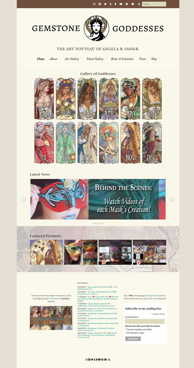
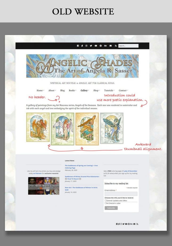
This meant that my old website that featured the Birthstone Goddesses in a calendar-inspired splash page became outdated:
The New Site
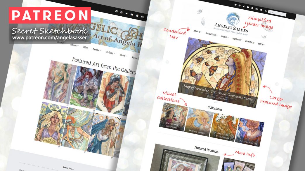
Now, my website needs to be more inclusive of other Goddesses and future-proofed for additional entries into the series. I took what I liked about the layout from my Angelic Shades redesign and applied it to my old Gemstone Goddesses site. Here’s the redesigned Angelic Shades site for reference:

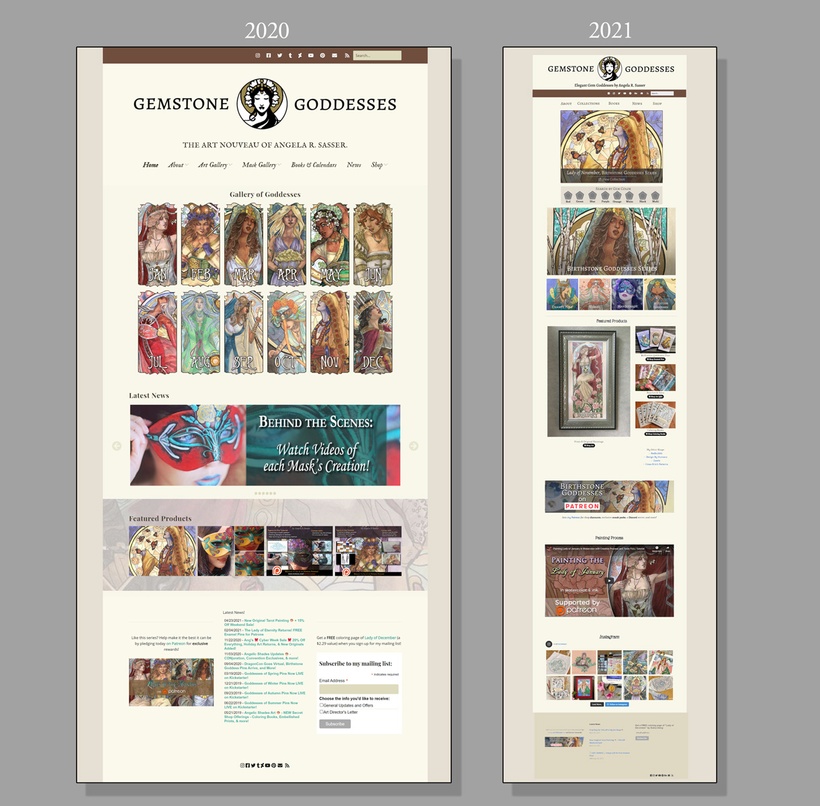
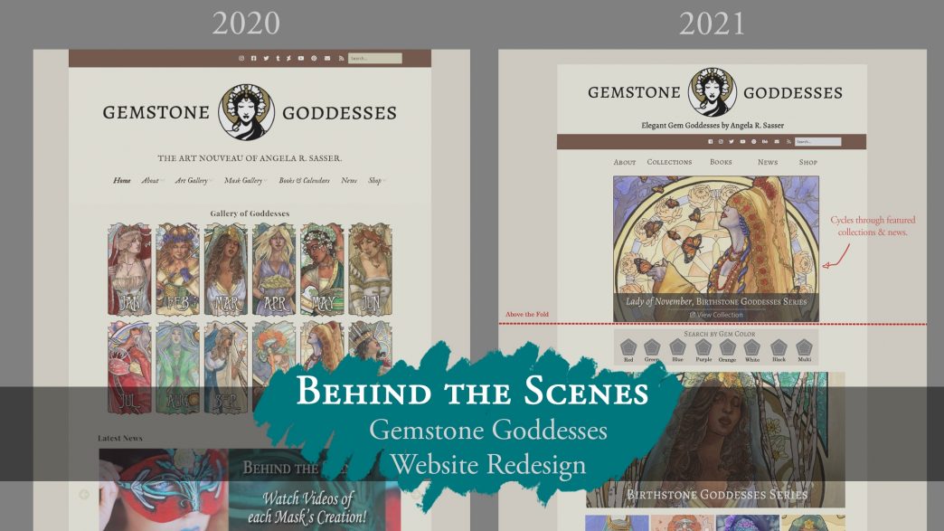
Here’s a mockup created in Photoshop of how I want the new Gemstone Goddesses site to look. The dotted line shows where the viewer will have to scroll, with everything above that line being the most important info I want my viewers to see first.
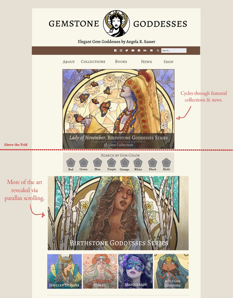
I’ve included a lot more info for viewers to explore on the new site. I’m not sure if I need to include the bar which lets folks explore by gemstone color, but I like the idea that if someone doesn’t know the name of the stone, they can search by color to find what they need. What do you all think? Would searching by gem color be useful to you?
A side by side comparison of the old vs new Gemstone Goddesses site:
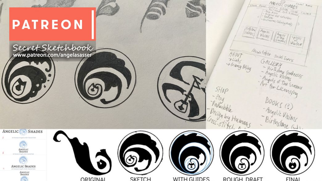
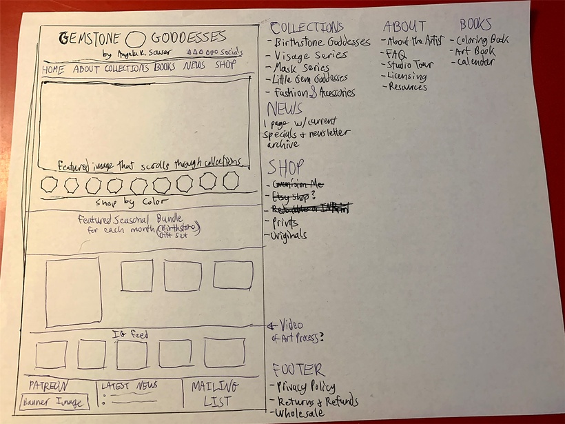
Before I even made this mockup, I did a very rough version on paper first to sort out my thoughts. This helped me figure out how to minimize the navigation menu and what sub-menus I’d like to include.
Next comes building the new layout in WordPress! I also want to re-photograph all of the Birthstone Goddesses’ framed pieces, but that may not be doable until after our house move.
I want to do something a little special when I re-launch the site. Perhaps a give away or a hidden Easter egg? We’ll see what strikes me when the site becomes closer to being a reality! For now, it’s nose to the grindstone to create all the interconnected gallery pages that will form the vast majority of this website.
I hope you enjoyed this peek behind the scenes! Working on this site may mean less art being shared for a little while since I do everything myself, but thus is the cost of wearing multiple hats for your creative business.
More soon!
❤ Ang
 Unlock with Patreon