Month: March 2015

March 2015 – Monthly Update plus HUGE News!

Hey guys! I’ve decided to write this month’s update instead of broadcast it because I’m feeling a bit under the weather (food poisoning, urgh!).  So rather than subject you all to my sick mug, I thought I’d write March’s update instead!

How’s My Month Been?

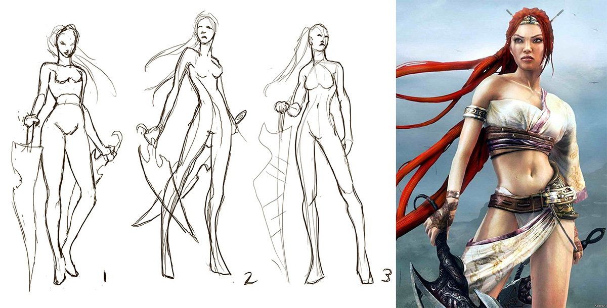
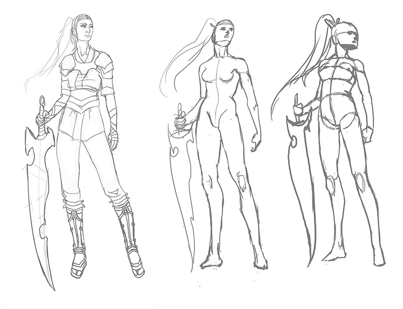
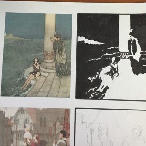
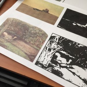
It’s been great!  I’ve been whirling between my studies with Painting Drama and Proko’s Figure Drawing Fundamentals. Here are some of the studies I’ve been working on!

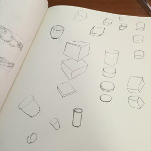
I’m slowly, but surely working my way up to 25 abstractions for my assignment. They take quite awhile so it has been a slow going process, but I’m learning so much about how compositions are arranged!  The 3D object assignment is building me up for drawing volumetric mannequins, which I’m very much looking forward to.

I’ve also been working on finishing the Rapunzel comic since it’s going to be published in an anthology later this year (more on that later as publication draws closer).  Now with more detail than ever before since I have a longer time to focus on them!


HUGE News!

And finally, saving the BIGGEST announcement for last.  I’ve put a downpayment on entering a mentorship with Dan Luvisi (of Last Man Standing fame) and Anthony Jones (of Robotpencil.org and Blizzard Entertainment fame) in May and June!  This mentorship is going to focus on IP development and I’ll be using my own novel as the IP I intend to develop for this mentorship!

You can read the syllabus here (starts on page 15).

It’s no small investment, but I’m using the pennies we’ve been pinching for SmartSchool to give it a shot.  I was a little torn, but the fact is, I’ve always felt like more of a writer-artist than purely an artist and this mentorship allows me to give both of those passions the attention they deserve. Plus, there is always next year for SmartSchool, if my pinched pennies can regenerate by then.

By the end of this mentorship, I hope to have the first two chapters written, illustrations of characters and key scenes, a perfected pitch and SO much more!  We’ll be able to talk to knowledgeable parties about their experiences in this field and receive guided instruction.

The instructors are even hoping to bring student work to San Diego Comic Con to pitch what they can to any interested parties.  They obviously can’t guarantee success, but the slim chance to be seen by the right people when I’m at that point definitely can’t hurt!

This could be HUGE, guys!

I am so excited (and a little intimidated) by what this could mean for my future!  And of course, I’ll be sharing some of my exclusive ‘behind the scenes’ work related to my novel during this intense project with my fine Patrons over at my Patreon because you guys have been amazing.  Thanks for your constant support and encouragement!

I did have a question I wanted to answer about study sources for this month’s update, but it really deserves it’s own blog post.  So, for now, I’m going to go sleep.  I have too much to do for a stomach bug to defeat me now!

See you next month where we’ll hopefully be back to a broadcast format!

Sketch Diary – Nariko of Heavenly Sword – Part 2

Now that Nariko’s design is figured out, it’s on to coloring!  I decided to try a new coloring technique called the Ambient Occlusion method.  This technique is a way to bring a structural quality to your images relatively quickly.  I used Alex Negrea’s tutorial and also this helpful process post from David Lojaya.

Here’s a breakdown of the main layers in my painting.

  1. Sketch – I produced a clean line art using the hard brush. This Sketch layer hovers above all of the other layers for the figure.  Notice I didn’t sketch in pure black, but a very dark brown so as to keep my image from looking too stark. I wanted subtle warmth and for the line art to look natural. The same goes for the AO layer, which is not pure black, but a dark brown. You can tweak this coloration later to suit the mood of your piece.
  2. Sketch+Ambient Occlusion – The Ambient Occlusion layer sits below the Sketch and Flat Color layers and above the Shadow layer and represents places that are hard for light to enter, the deepest, darkest shadows where light is ‘occluded’.  It is set to the blending option Multiply.
  3. Sketch+AO+Flat Colors – The Flat Colors are actually a group of layers, as I kept each color on its own layer just in case I wanted to change them later.  The entire group is set to the blending option Multiply so they show the AO layer beneath them.
  4. Sketch+AO+Flat Colors+Shadow – The Shadow layer was clipped to a standalone layer that masked out the entire figure to keep my shadows from going outside of the lines.  The Shadow layer is located below the Flat Colors group and above the AO layer.
  5. Final – In the final image notice I’ve actually masked out some of the Sketch layer so that the hard lines don’t look so unnatural (particularly in the area of the neck where lines are too harsh for the soft transitions there).  Lighting effects have also been applied here.


NOTE: My Patreon Patrons at the $5+ reward tier have exclusive access to my .psd file, so be sure to pitch in there if you’d like to peruse my layer structure!


Tools Used:

Deharme’s Brush set for Photoshop CC

Finally, here’s an animated GIF of my process (roughly 8 mb).

If you’d like to download wallpapers of the final image, I’ve provided the 1920×1080 size for free.

Also be sure to check out the article this image is featured in, What Women Want…In Women Characters for an interesting discussion of female character designs and representation.

The 1920×1080 wallpaper of this image. Download here.

Other sizes plus the .psd are available exclusively for my Patreon Patrons.

PRINTS AND PRODUCTS – Contact me privately if interested.

Back to Part 1


Sketch Diary – Nariko of Heavenly Sword – Part 1

I was challenged by an online art group I’m in to redesign a female character. This idea really appealed to me as a gamer and comic book fan, considering the amount of times as a female fan I’ve seen a character and found myself highly disappointed by the bland or over-sexualized design that detracted from the amazing female character at the core.  Some of my candidates were my heroines growing up, from She-Ra to Psylocke!

Eventually, I decided on Nariko of Heavenly Sword.  Here was a tough, driven woman who chose to sacrifice herself to an ancient sword in order to defend her people, the same people who had viewed her as a cursed outcast.

But that outfit!  I could barely take her seriously doing all of the amazing brutal fighting she does in such impractical gear, even given this was a fantasy setting.

Nariko of Heavenly Sword

And so my redesign began first with studying the designs of the other characters in the game.  A fusion of European and Asian aesthetic pervades the armor designs of Heavenly Sword.   I kept a massive private Pinterest board for this purpose.

A screenshot of part of my mood board for this painting.


I used a pre-printed fashion croquis sketchbook to knock out some quick costumes in ink and Copic marker for Nariko’s re-design.  My thought process was to simply dress Nariko more closely in the fashion of her father, who was dressed in a kimono style top and pants covered with armor in key places.  This look seemed appropriate considering the fact it was snowing and everyone else but Nariko was dressed appropriately for the climate and for the ensuing large scale battle.

I also found it baffling that while Nariko was trained to fight that she wasn’t at least wearing basic armor, even if she were not to be on the front lines or was intended to be more of a Gladiator type of fighter.

Nariko Redesign Fashion Plates
Fashion plates for Nariko’s re-design.


I chose the design on the right because I liked the way that it was both protective, channels the Gladiator-esque look of her original design with the tooled leather, and maintains the archetypal colors and shapes we’re used to for Nariko.  The one on the left had too much crimson in it, which was too closely associated with her father and also doesn’t allow her hair to be the most red and striking part of her design, as I feel it was meant to be.

Next, I did quick gesture sketches in an attempt to capture a pose that felt heroic, but would also show off this new armor design. It was a tough decision, but I eventually settled on pose 3.

Nariko gesture sketches.

And yet, still 3 was not enough!  I needed to push the heroic nature of the pose.  She was still too straight on and seemingly staring off into the distance without much interest.  Moving the camera level downwards so that we’re looking up at Nariko gives her so much more presence!  The pose also feels more dynamic.

Nariko Gesture Sketches

I have my hero.  She has her armor.  Now, it’s time to paint!

On to Part 2