Category: Blog Posts
 Unlock with Patreon
[VIDEO] Studio Hangout SEP 2017 [Patreon Extended Cut]
Did You Know? Unknown Nouveau
If you’ve been enjoying my Ladies of the Months series thus far, you might also enjoy the series of articles I’ve been writing here and on Patreon called Unknown Nouveau.
While Mucha is one of my strongest influences on this series, there are so many wonderful artists who emerged from the Art Nouveau movement during its prime between the 1880s and 1890’s.
The Unknown Nouveau articles focus on artists from the movement you might not have heard of, many who are also female artists who simply did not get the same attention as their male counterparts. I wanted to feature some of these lesser-known artists, as well as inspire and educate myself along the way.
You can start browsing my current Unknown Nouveau articles here.
Enjoy and let me know if you’ve heard of an unknown Art Nouveau artist who you think I should feature OR if you discover someone new from the articles who you think is amazing!
[VIDEO] Studio Hangout – August 2017 [PATREON EXTENDED CUT]
[VIDEO] Studio Hangout July 2017 – Coloring Book, DragonCon, & Kickstarter!
This video ushers in my return to sharing monthly Studio Hangouts with you guys!
In this month’s Studio Hangout, I talk about the epicness that has been July thus far! From my first coloring book published this month to all the fun things happening in the near future.
Plus, get a look at my studio chaos as I prep for DragonCon. I keep promising a proper studio tour, but it’s been so very messy!
SOON! Really!
Also, for the Q&A section I had planned for my monthly updates, I have decided to post them as separate short and sweet videos to make the questions easier to find for people.
The topic I’ll be posting soon is the question I have received quite often this month – How did I get my work published with Impact Books and Anthem?
My video answer will be coming soon later on this week!
Links in the video:
– My Birthstone Series, the Ladies of the Months
MINI TUTORIAL: Art Nouveau Hair
I did a panel on how to draw Art Nouveau style hair at JordanCon this past and thought I’d share the info and results of what I drew there live!
DISCLAIMER: This is by no means the definitive guide of Art Nouveau hair, but my own interpretation!
Inspiration Sources
If you want some gorgeous hair to get your creative juices flowing, check out the art of Alphonse Mucha and any number of the artists I’ve mentioned in the Unknown Nouveau article series. I also have several favorite study sources up at my Art Nouveau resource page.
Before You Begin…
Think about your concept. Art Nouveau isn’t all pretty ladies and flowy lines. Much of it has deep symbolic roots. What visual elements or symbols could you tie into your piece?
Art Nouveau at its visual core is about flowing lines, graceful curves, and aesthetic design, in addition to the spiritual and symbolic roots of the movement.
Source: I used an image from this evocative set of stock art by ArtReferenceSource as a base for the figure in this tutorial. Check out the rest of his gallery for even more amazing poses for use by artists!
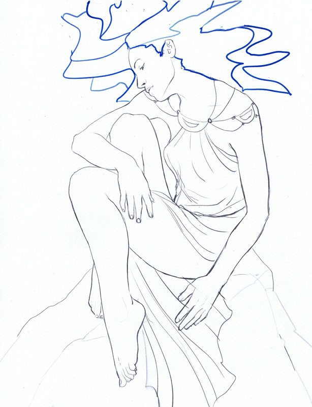
The Bad Example
I made this bad example by randomly drawing lines (and even then, it was really hard to make that beautiful base pose look bad!). I consider this an ineffective use of the Art Nouveau style because it is directionless, does not serve the compositional flow, and generally just looks a mess!

A Good Example
Now this is better! You don’t necessarily have to have the hair of a figure flowing out everywhere in your composition. This approach shows that you could have a more subtle stylized and graphic take on the hair where it has become more of a decorative shape than a realistic object.
Perhaps she is a river goddess and her hair has become the flowing waters? Perhaps she is a volcano goddess and her hair has become lava flowing down the mountain? Weaving the hair into your background elements is one way you could bring in interesting visual elements and symbols!

Another Good Example
Here we have a more traditional take on Art Nouveau hair where the lines of the hair all curve back into the face, the heart of the piece, in this case. Nearly every line in the image is smooth, curving, and gentle.
I’ve also abstracted the ends of the hair into curly decorative strands, which is another very specific quirk of the Art Nouveau style that you’ll see Mucha and his students use a lot. These curly ends add a decorative touch to the hair that’s a bit more interesting than just ending the hair.

I’m sure I could write more about this topic, but I’m ending this tutorial here before it becomes a book! I hope it gives you some basic ideas of what to do with your Art Nouveau style hair.
Do you have any favorite examples of Art Nouveau style hair? Share in the comments area, as I’d love to see them!
TUTORIAL: How I Plan A Gallery Display
(Click here for a larger view of the gallery display featured in the preview image.)
Excitement is in the air with my biggest convention of the year just around the corner – DragonCon! I have a gallery display in the Art Show, as well as prints in the Print Shop this year. I thought you all might enjoy a look into how I start prepping for such a big event!
1. Think of Your Audience
There are many different kinds of conventions in my area, from anime cons to literary cons. Before I decide what to take to any convention, I think of who is in attendance. DragonCon in the past has proven to be a high traffic event that’s attended by not only younger audiences, but older audiences and art collectors.
Chances are higher that audiences at this event will invest in a more expensive framed piece than at other events I’ve had experience with that are geared more towards children and young adults. For these other events, I might stock my gallery bay with more matted prints instead of framed originals to present a wider range of prices that aren’t stacked entirely towards the higher tier of pricing.
DragonCon’s Art Show also historically has Fantasy Art that extends into the Imaginative Realism and Fine Art vein, which means it is friendly towards Fantasy Art that leans more towards Mythic and Folkloric tones. I guessed these trends based on my own experiences with attending and selling at the show and seeing what has been displayed in the Art Show in the past.
You might also consider emailing a convention art show’s Art Director to see what they think does well at a show, since they usually have access to sales stats and first-hand insight. Getting a sense of what’s displayed in the show and what kinds of buyers attend can be helpful beforehand! When in doubt, attending a show first to get a feel for it before investing is a good idea.
2. Plan the Space
Next, I always like to make a mockup in Photoshop for any gallery bay I put my art in so that I can make the most effective use of the available space. Most gallery spaces I have experience with are hung on pegboard or grids.
When in doubt, ask the Art Show’s Director what your space will be like, as this will affect how you prepare your images for hanging. Peg board, for example, works better with framed pieces that have wire strung across the back which will more easily catch the hooks that protrude from the wall. Grids will also require images to have more breathing room because of the larger space between where display hooks can be placed.
I personally don’t like to cram my bay too full of artwork. Every piece needs breathing room, as well as room enough between the pieces to allow for bidsheets and other signage.
Planning ahead of time and knowing how much art you’ll have in your space also allows you to buy everything well in advance and all at once so you can make the most of any bulk discounts you might get with bags, backing, and prints.
I use gray and black outlines around the images in the mockup to represent the mats and the frames, respectively. This helps me get a more accurate sense of the presentation of each image and how it will look in the space, especially if I have unframed images or different sizes in the mix as well.
(NOTE: For those new to my work, the blocks that say ‘mask’ represent where I’ll be displaying the matching masquerade masks that go with the paintings. They are displayed on head forms with 9×12 inch backing.)
As for how I settled on using these particular images in my display, I went with images that have had the most positive response online and whose more fantastical elements I feel will fit in nicely with DragonCon’s crowd.
PROTIP: Also, speaking as someone who has agented for other artists, having a visual layout provided with the work if you’re expecting someone else to hang it is a godsend! It saves agents the trouble of having to figure out how to make everything fit when you only have a limited amount of time to get the art hung.
3. Promo Space
In addition to showing off the art, I also like to include promotional material (represented by the gray shapes in the mockup), such as business cards and banners with additional information. This additional information includes, for example, a graphic on the middle panel letting people know that I will also have prints available in the Print Shop and a little map of where they can find this location.
This is especially important for this display since I won’t have a table, making the Print Shop the only space in the convention where customers can buy more affordable prints of the original pieces displayed in the bay. I’ll also be using this promo space to let people know about my YouTube channels where they can watch me create my paintings and masks.
I’ll be printing this promo signage myself on cardstock paper with my Epson Artisan 1430, which makes decently sized 13×19 inch prints without me having to special order something vinyl for a more permanent solution (which I may do in the future).
The gray blocks marked as ‘cards’ are where I’ll be displaying 6 pocket business card holders filled with business cards. It’s important for customers to have a takeaway item so that they can remember to look me up later after the show, especially when I don’t have a table where I can gather their information.
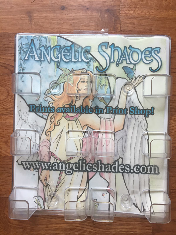
PROTIP: The card holders I have start out as clear plastic wall hangers. I alter them for display on pegboard by using a self-adhesive photo hook to convert it into being able to hang on a peg. I also print off a graphic on cardstock paper and tape it to the back of the holder which makes the holder stand out more from the dark pegboard, while also providing more valuable promo space that you can easily change out for any occasion.

4. Other Finishing Touches
Description Cards.
If I have time, I also like to include description cards for each piece to give viewers more information. For example, I could share the prose that goes with each of my birthstone Ladies or something about their creative process. If you’re in a pinch, you could use cardstock to create these cards. Pearlescent cardstock is especially eye-catching!
For a more professional museum quality look, you could display these descriptions on blocks of mat board or foam board so they have a raised appearance. You would cut the blocks to size first, then print the text off on clear adhesive labels, which you then cut to size and stick on the blocks. I use masking tape in a little roll attached to the back of the description blocks to adhere them to the pegboard.
Sold Image Placeholders.
Another final touch you might consider are Sold Image Placeholders. When a piece sells, most shows will put a piece of tape or other simple placeholder with the word ‘sold’ on it to represent where a piece might be missing from your display or they might do nothing at all, leaving a big gaping void in your display.
If you want to get fancy and are able to personally attend to your display, you could create image holders representing your paintings. These placeholders let people know what they’re missing, as well as provide additional promo space where you can plug your website or other information.
I created my placeholders by printing them on cardstock and laminating them with self-laminating sheets so that they would last a little longer for use in additional shows.
Here are some examples of placeholder sheets:

Battery Operated Lamps.
A lot of shows have abysmal lighting where your art sits in very unflattering shadow. In the past, I’ve used battery-operated LED lamps that sit on top of the panel (or can be taped there temporarily).
Questions?
I hope this look into the method behind the convention madness proved useful! How do you plan your convention displays? Do you have any tips not mentioned here? Share in comments!
– Ang
Unknown Nouveau: Jane Atché
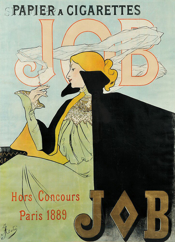
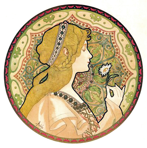
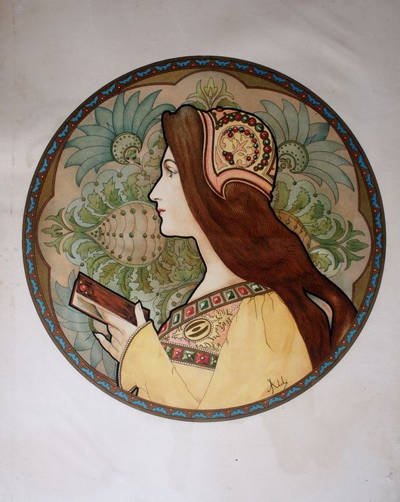
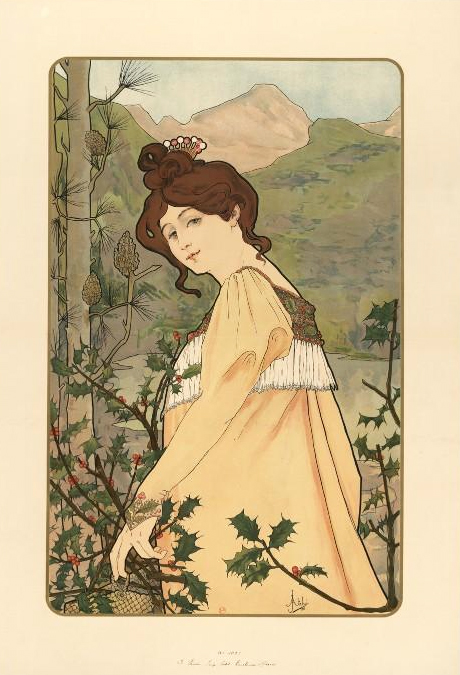
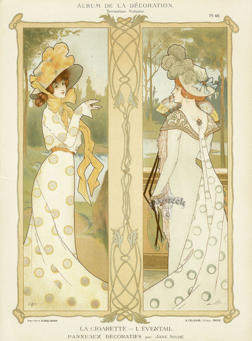
Featuring another unsung artist of the Art Nouveau movement, French artist Jane Atché . I couldn’t find much about Atché, other than that she was a pupil of Mucha, Jean-Paul Laurens and other artists while studying at the Julian Academy of art in Paris.
The influence of Mucha definitely shines through with her decorative and compositional flare. Atché brings her own sense of fashion and elegance to her figures. I only wish I could find a broader collection of her work!
See more artists in this article series here .
Unknown Nouveau: Amelia Bauerle
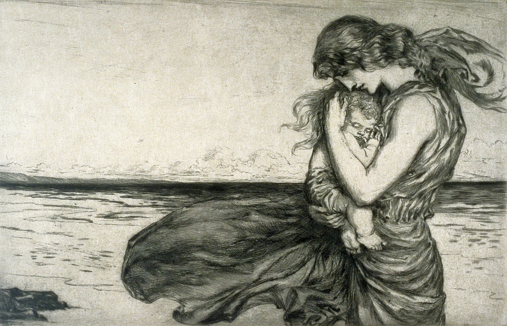
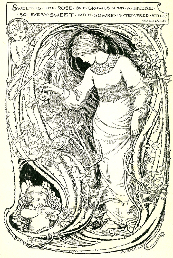
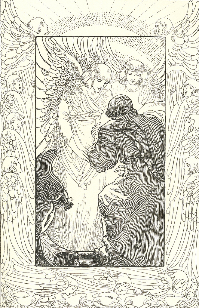
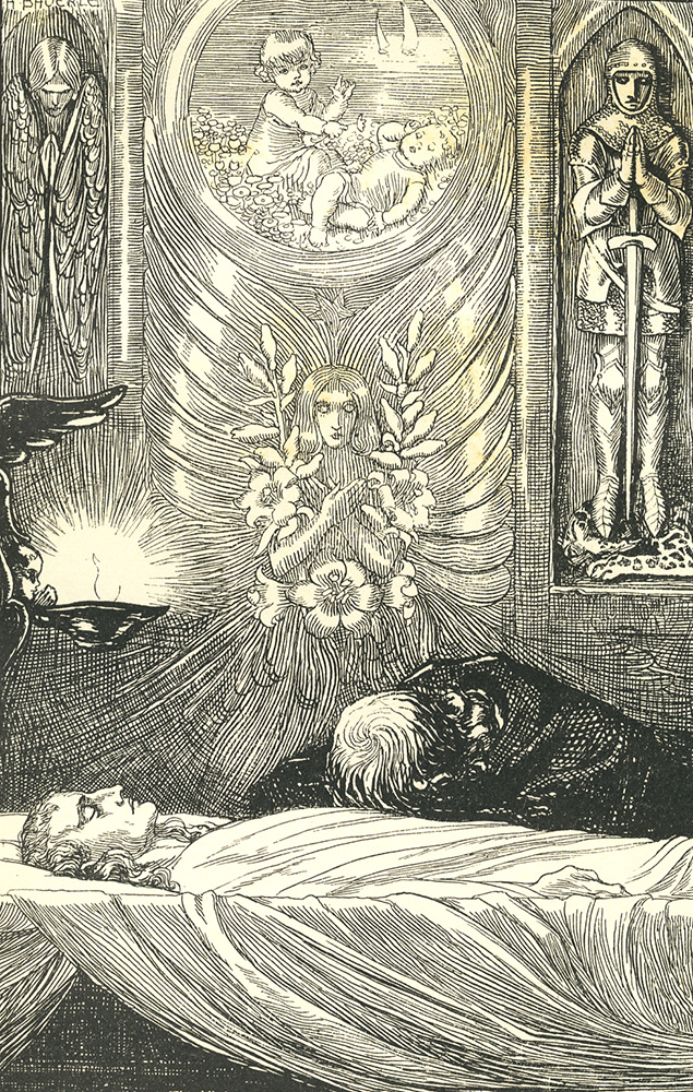
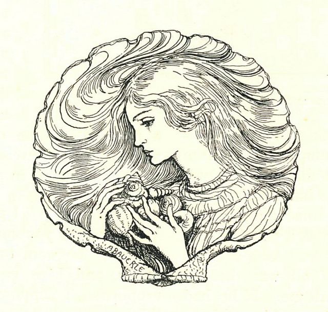
This week’s unsung artist of the Art Nouveau movement is Amelia Bauerle. Originally from London, Amelia worked as an illustrator and artist. Like many artists of the movement, she also submitted works to the The Yellow Book magazine, a collection of works of poetry, art, and other creative work of the era.
Bauerle’s work shows such delicacy of emotion and handling of line that makes her work shine, even if the majority of her work was created in black and white.
Her mermaids are a fortuitous inspiration for Mermay this month as well!
—
Read more of my Unknown Unknown series here .
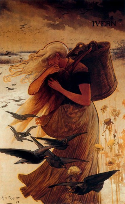
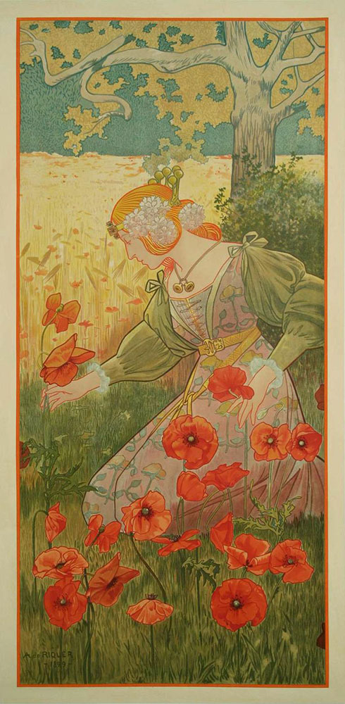
Unknown Nouveau: Alexandre de Riquer
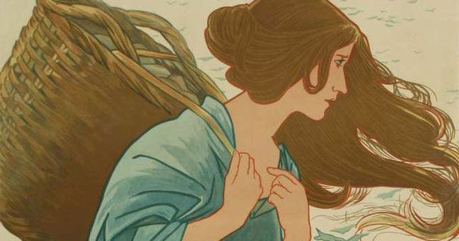
Today’s unsung artist from the Art Nouveau movement is Alexandre de Riquer , another artist from Spain where he was one of the prominent figures of the Modernism movement. He was born to an aristocratic family and studied in France.
It was in France and London where he fell in love with the graphic design of the lithographic posters of the Art Nouveau movement, a relatively new form of advertising at the time.
His prolific body of work spans everything from posters to magazines to book covers! Saying that, I wish I could find a broader collection of his work. There are so few I could dig up! I suspect I will have to dig through collections in Barcelona to find more of his beautiful work.
I love the way Riquer’s art shows more of the Japanese influence on Art Nouveau with his simplified lines and relatively flat colors.
See more articles in this series here.