Chapter II. Your Core Virtue Emblem of Spalenka’s Artist As Brand is one I was particularly looking forward to, as it deals with coming up with a logo or an emblem for your core virtue.
 |
|
I found the book for a great deal on the Nook.
Or you can buy it via my Amazon referral link
and give me a little kickback!
You can also buy direct from the author!
|
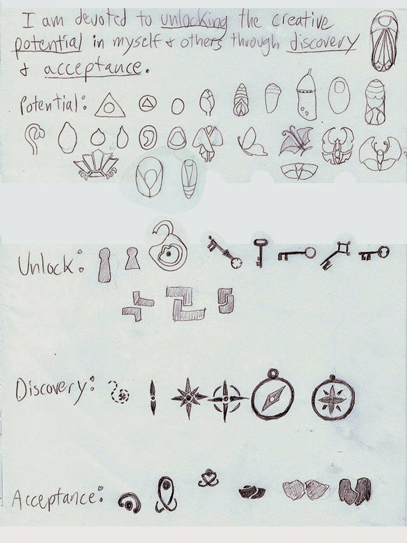
Spalenka offers a strategy for logo sketching which I found to be particularly helpful. Trying his approach helped me to break away from the geometric patterns that I was never quite happy with.
Again, I’m purposefully leaving some of this process and explanation vague. Go buy Mr. Spalenka’s book if you want the full explanation straight from the teacher! This is merely my interpretation and specific results.
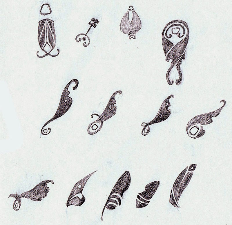
I knew I wanted something asymmetrical to represent my work, which I feel is more organic and flowing than hard lined and symmetrical. I also needed something simple enough to be iconic and easily stamped on cards and other marketing collateral.
 |
| My rough sketches for each keyword based on
Spalenka’s ideation technique. |
 |
| 2nd row, the last one on the right is my fave! What’s yours? |
This has been YEARS of frustration solved for me. I consider this book worth the money spent just on this section alone just for the help it gave me when coming closer to resolving this personal struggle I’ve had with defining a logo.

