Month: December 2011

Top Posts of 2011

I’m stealing this idea from Hayley at Eventide because it seemed like a great way to wind down the year on this journal and to remember all that’s happened here in 2011!

I started this blog waay back in 2009, which feels like forever ago, and looking back helps me realize how this blog has grown into so many interesting pathways!

My top blog posts of this year (not including popular posts from previous years that are still some of my most highly viewed topics) aaaare:

1. Evolution of an Artist’s Alley Table Parts 1 and 2
I like to keep a record of how I display my artwork for my own purposes and so others might learn from my trial and error. These posts cover how my displays for art shows have leveled up over the years! I hope it saves ya’ll money and helps you to make your wares look their best!

2. DragonCon 2011 Con Report

The con report/review for my biggest event of the year!  I like to do a con report for every con I go to so that other artists might benefit from my working experience there.  DragonCon has always been my favorite event to go to each year and I learn something new no matter what!  There are also plenty of links to great costumes and silly videos we made in this post.
3. Ezio Mask Dev Diary (Parts 1, 2, and 3)
An in-depth walkthrough of how I created my Venetian Assassin Mask inspired by Assassin’s Creed 2.
Because everyone likes free stuff! This was my first ever book giveaway and hopefully not the last!

5. Commissions, Portfolio Reviews, and Study Sources

A comprehensive blog of study sources for traditional artists wishing to learn more digital work and those interested in game art.  Also announced my call for Portfolio Reviews in this blog (which I’m still taking on an ongoing basis!)
A glimpse at some of the many pieces I had going on for this year’s DragonCon.  Many of these pieces were sold before they were properly photographed, so this entry is the only record of them!
Another artisan craft tutorial on how to set a stone in a leather mask.
An in-depth review of my experiences with Artfire, another website much like Etsy that exists to serve the handmade market.
9. Sketch Diary: Angel of January (Parts 1, 2, 3, and 4)
An in-depth walkthrough of my piece “Angel of January” detailing the creative process, working with photo references, and learning new digital tricks.
Probably the most difficult entry for me to write, as it took admitting some of my failures of being an artist this year.  It really helped me get my thoughts in order, however, and put me in a better position to start thinking of solutions!
Now, onward to 2012!  I hope that my entries continue to provide helpful info to other creative professionals!  I write this blog not just for myself, but you, the readers, so if you know of any topics you’d like to suggest for me to cover in the coming year, please feel free to suggest them here in comments!
Till next year!

Portfolio Review: Laurie Thomas

The year draws to a close and I hope all of you had a wonderful holiday season!  To celebrate the end of yet another year here at this journal, I thought it only fitting to end with a beginning!

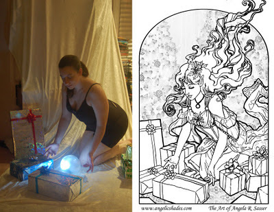
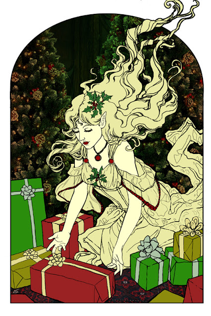
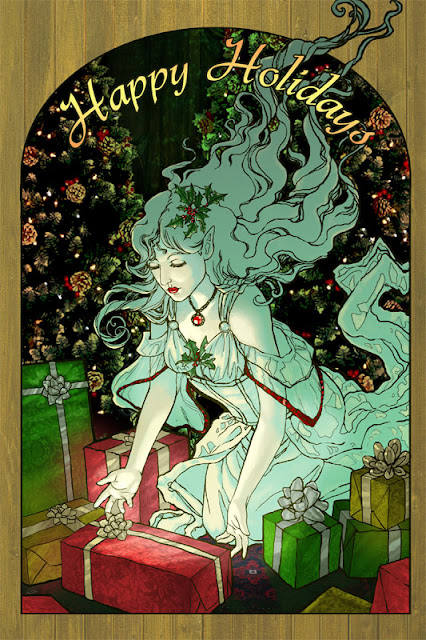
I’m happy to introduce the first portfolio review in what I hope to be an ongoing series.  This review is for Laurie Thomas, who sent in the following samples of her work:

See more at Laurie’s DeviantART Gallery!

Overall Impression: Laurie mentioned that she was interested in getting into games, licensing graphics for apparel, and possibly designing for movies.  From what I can tell, you’re well on your way to having a stunning portfolio, Laurie! Your colors are bold and your designs rich and detailed.  What it seems you need to do now is come up with a strategy for focusing your subject matter and presenting your portfolios in such a way as to appeal to the industries you’re hoping to enter.  I say ‘portfolios’ plural because each industry is going to expect something different!

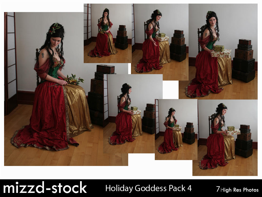
When licensing to the apparel industry, you’ll need a large body of consistent work that will also fit well on t-shirts, bags, etc. (at least 24 pieces for presentation, so I’ve read).  Licensing companies like series of images with consistent high quality, so if you can tie together your characters into some appealing ideas (ie. birthstones, zodiac signs, gemstones, elements, etc.), you’ll have some great basic pieces to start yourself out with!  A great way to see if your art will fit on items is to upload them to Zazzle, which pre-renders your art on the item of your choice. It’s a simple way to create licensed art mock ups, which are essential for creating presentations.

You also need to be aware of the trends that sell (ie. fairies, lolita, gothic, cute things, etc.) and that means doing some research! Keep up with other artists in the industry (Anne StokesAmy BrownJasmine Becket-Griffith, etc.).  Start paying attention to the clothing brands that sell items with art similar to yours and make a note of who those companies are.  I highly stress reading Licensing 101 before you go down the licensing path. Be aware of the dangers and the options for selling your work, as there are many!  Above all, register your copyrights before licensing anything!  The US copyright office allows registration of sets of images, so that may be a cost effective way for you to go.

As for the game industry, I can see your work fitting in very well with many of the social media/networking games tailored for younger audiences with anime inclinations (ie. GaiaOnline, Facebook games, MMOs, etc).  There are also opportunities in interactive novels and manga!  I highly recommend subscribing to magazines like ImagineFX to keep up with the game art industry and scout out jobs. It’s also an excellent place to learn about presentation skills from pros, as well as techniques and shortcuts!  This advice also counts double for movies, which requires a similar skillset to concept/game artists and are also addressed in IFX.  In general, work on presenting characters, accessories, equipment, and environments.  Conceptart.org and CGhub‘s weekly challenges are great places to start building a game design portfolio. They’re also great places to learn from more experienced artists!

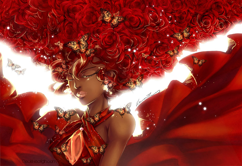
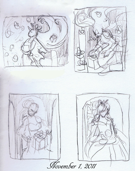
Strengths and Weaknesses: You already possess very highly developed technical skills, but I would watch out for making your images too detailed.  Koi for example has a lovely color palette and character, but the intricate designs, patterns, flower bursts, and clothing folds really overwhelm the eye and lead the compositional flow every which way.  A way to balance this might be to downplay the flowers, while simplifying her kimono and other details.

Speaking of those flowers, they seem a bit unfinished in comparison to the rest, which is something you’ll need to consider for your final products. If a final product is meant to be printed larger, areas that aren’t as tightly developed will appear sloppy. However, if your final product is going to be smaller (ie. Card art, small items), there’s no need to put all that detail in, because the smaller resolution will allow it to appear smoother.

Another thing to be aware of is that limiting your style to anime may shove you into a niche box.  If it’s a box you’re comfortable in, than be the best you can be in that niche and you’re bound to get attention!  However, you must also be aware that anime style in general (at least in the States), is stereotyped as being for juveniles.  It may be more difficult to get editorial illustration work with an anime style portfolio, but that is where presenting varied multiple portfolios to varying clients might serve you well.  Also, you may not even want to do any other work, and that is okay too!  It’s just that the more varied an artist you are, the higher chances you’ll be able to round up that next job to feed yourself.

By the same token, you only want to put out work you want to be hired for, else you’ll get stuck doing work you loathe.  It becomes a balancing act between getting good at the niche or adapting to something different and that’s a call every commercial artist has to make.


I hope this portfolio review has given you some food for thought, Laurie.  Best of luck from me to you and I hope to see your name in the headlines soon!  If any of my dear readers here have additional advice for Laurie, please share in comments! I am not the end all, be all and welcome anything useful others might have to add.

Interested in a Portfolio Review of your own?
Read here for more info on how to get one!

Sketch Diary – The Gift Giver Part 3 – Painting

This week has been a haze of coffee and late nights powered by holiday cookies!  The last entry ended with the finished line art, which ended up being revised several times during the course of trying to color the piece.

Luckily, digital pieces are more forgiving than watercolor! I was able to lengthen the fingers of the right hand (on the left), which seemed stubby despite being correct on the model  Sometimes when we convert photo references to line art, something is lost in translation and that is where our creative mind must work with what ‘looks’ right rather than what the photo shows, else you could end up with some very awkward anatomy.  A camera distorts things at times due to perspective and spacing, as well. 

One must also be aware of the fact that the photo reference is not the end all be all!  We must be willing to depart from it to get the most visually pleasing look, otherwise the image could end up a bit stiff!  Some artists will even hide the reference after the basics of the pose are finished, which I find is a good strategy for breaking reliance on reference.

The photo reference compared to the final line art.

The next phase of coloring began with a simple color test laying in flat colors.  I wanted the spirit to be the brightest thing in the image, so everything else was dark and saturated by comparison.  By the end, she ended up with more of a greenish blue shadow to help get the idea across that the green of the background was reflecting in her skin, despite her glow.  The starker shadow also helps her to feel more solid and rounded, despite her ghostliness, and accentuates her glow.

From this…to this:


…to this!
 
You can also view an animated time lapse of the video here:
 
All in all, I feel I’ve definitely hit a milestone with this fully digital piece!  Learning the ins and outs of Adjustment Layers and Layer Masks has really helped to open new doors for me and make my life easier.  With masks, I can save my original image without having to start over, should colors not look right. The Cintiq has also made coloring digitally feel 200% more natural than my old Intuos.  I have a good feeling that things will only get better from here on out!

Sketch Diary – The Gift Giver Part 2 – Drafting

The last sketch diary for this image talked about conceptualizing the piece.  Now that the thinking part is done, it’s time for the doing!  At the start, I had decided to do this piece digitally due to time constraints, but also to give me a chance to break in the used Cintiq 12WX that I got as an early Christmas present!
 

The rumors are true!  Cintiqs really are made with unicorn horn dust and the solidified happy thoughts of artists!  My first impressions are highly favorable and I’m really excited at the natural line weight I’m able to achieve with this tablet, thus far.  I’ll be writing up a more in-depth review of the Cintiq in a later entry. 

Long story short, I’ve had a traditional Intous3 tablet for years, but could never get used to the unintuitive feel and disconnect between my hand and what I was seeing on the monitor.  The Cintiq has eased the process by letting me see exactly what I’m drawing and responding more delicately to my hand motions. Curves are especially easier to draw because I can see precisely what I’m doing and rotate the Cintiq as needed to draw the curve more easily.

 
Having given the Cintiq a test run on this image, I can say with confidence that I can finally get a more natural comfortable workflow with my line art, if this draft is any indication!
 
We’ve gone from this…to this
 
Somewhere between sketch and draft, her hair was cut back to allow for a more controlled directional flow in the composition.  She’s also lost her wings, since they would have interfered too much with the detail in the hair.  The grey spaces and Christmas trees are placeholders until I can work something more detailed in with color in the next phase.  
 
To achieve the abstract effect for the Christmas trees, I used a stock image, then in Photoshop I went to Image>Adjustments>Posterize.  That broke the tree image down into simplified forms which blend better with the line art.  I may end up actually photomanipulating a good deal of the background due to time constraints, but we’ll see what I can dish out!  I still have a few subtle  hatching details to add to the line art, but for the most part, she is finished!
 

Sketch Diary – The Gift Giver Part 1 – Concepts

It’s that time of year again!  Yes, that glorious time where I rush to finish my yearly Christmas card at the last minute!  Folks seemed to enjoy last year’s sketch diary for Lady Snowflake so I thought I’d document this year’s card in much the same fashion.

It all began with trying to figure out what I wanted to do this year!  Poinsettias?  Candles?  Holly leaves?  There are so many visual motifs to play with for the season!  I put up a poll on DeviantART asking what folks have enjoyed the best and art nouveau ladies won out!  It’s true, I admit my favorite Christmas card is still the 2nd one I ever did, entitled “Holiday Nouveau”.  I wanted to bring some of the warmth and style of this piece into the newest card.  Plus, I had never used big shiny packages and bows in a card before!   There’s nothing like beautifully wrapped presents to bring cheer and excitement to the season.

With art nouveau ladies and shiny packages in mind, thumbnailing began!
 
 
Out of all of these thumbnails, the top two resonated with me the most. They have the most interesting visual flow and dynamic posing.  The top right ended up being the winner for the fact it’s completely different than all of my previous cards, as well as the fact there is more interaction between the figure and the presents, giving it more of an active story in the piece rather than ‘dainty lady posing with packages’.


Mizzd-stock‘s beautiful holiday stock also lent a hand in inspiring me for this gal’s attire:
Such beautiful hair and costume! I’m sure to bring in some of
these motifs into the finished piece.


Next, I brought the thumbnail into Photoshop and sketched directly on top of it digitally.  It took a good deal of fiddling with window shapes before I arrived at this simple single rounded archway vignette.
 
 
The flow of the piece is doing what I want to it to right now, but the anatomy and awkward angle on the torso were completely baffling me!  So I took a few reference shots of my own to try and get a more solid grip on the anatomy.  I also set up a light on the floor to act as an unearthly glow in the faerie’s skin.
 
Sadly, I am neither thin nor faerie-like, so I’ll need to do some anatomy tweaking while I’m referencing this in my piece later.
 
And that’s it for the conceptualization phase!  Stay tuned! I’ll be blogging my progress throughout the week and hope to have this finished by next weekend. Wish me luck!
 
I’m gonna need it!