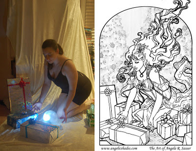
This week has been a haze of coffee and late nights powered by holiday cookies! The last entry ended with the finished line art, which ended up being revised several times during the course of trying to color the piece.
Luckily, digital pieces are more forgiving than watercolor! I was able to lengthen the fingers of the right hand (on the left), which seemed stubby despite being correct on the model Sometimes when we convert photo references to line art, something is lost in translation and that is where our creative mind must work with what ‘looks’ right rather than what the photo shows, else you could end up with some very awkward anatomy. A camera distorts things at times due to perspective and spacing, as well.
One must also be aware of the fact that the photo reference is not the end all be all! We must be willing to depart from it to get the most visually pleasing look, otherwise the image could end up a bit stiff! Some artists will even hide the reference after the basics of the pose are finished, which I find is a good strategy for breaking reliance on reference.
The next phase of coloring began with a simple color test laying in flat colors. I wanted the spirit to be the brightest thing in the image, so everything else was dark and saturated by comparison. By the end, she ended up with more of a greenish blue shadow to help get the idea across that the green of the background was reflecting in her skin, despite her glow. The starker shadow also helps her to feel more solid and rounded, despite her ghostliness, and accentuates her glow.
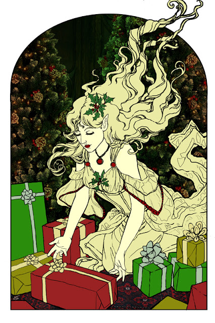 From this…to this:
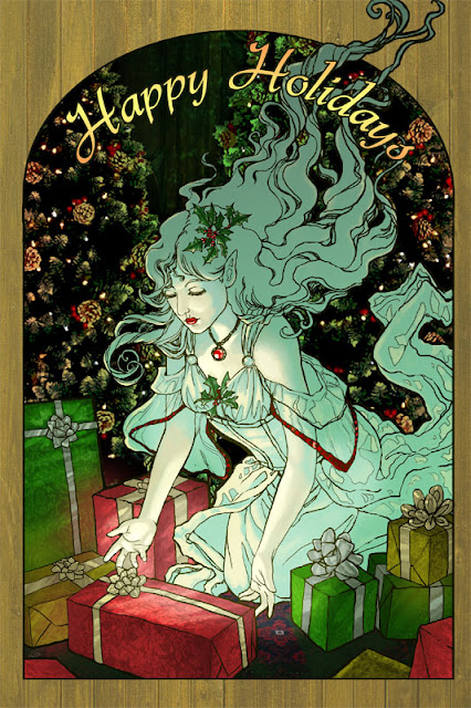 |
| …to this! |