I was challenged by an online art group I’m in to redesign a female character. This idea really appealed to me as a gamer and comic book fan, considering the amount of times as a female fan I’ve seen a character and found myself highly disappointed by the bland or over-sexualized design that detracted from the amazing female character at the core. Some of my candidates were my heroines growing up, from She-Ra to Psylocke!
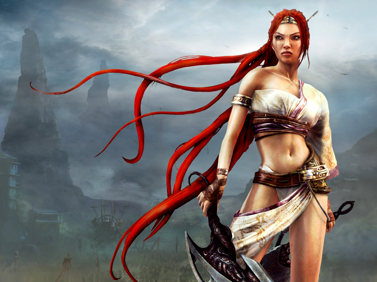
Eventually, I decided on Nariko of Heavenly Sword. Here was a tough, driven woman who chose to sacrifice herself to an ancient sword in order to defend her people, the same people who had viewed her as a cursed outcast.
But that outfit! I could barely take her seriously doing all of the amazing brutal fighting she does in such impractical gear, even given this was a fantasy setting.
And so my redesign began first with studying the designs of the other characters in the game. A fusion of European and Asian aesthetic pervades the armor designs of Heavenly Sword. I kept a massive private Pinterest board for this purpose.

I used a pre-printed fashion croquis sketchbook to knock out some quick costumes in ink and Copic marker for Nariko’s re-design. My thought process was to simply dress Nariko more closely in the fashion of her father, who was dressed in a kimono style top and pants covered with armor in key places. This look seemed appropriate considering the fact it was snowing and everyone else but Nariko was dressed appropriately for the climate and for the ensuing large scale battle.
I also found it baffling that while Nariko was trained to fight that she wasn’t at least wearing basic armor, even if she were not to be on the front lines or was intended to be more of a Gladiator type of fighter.
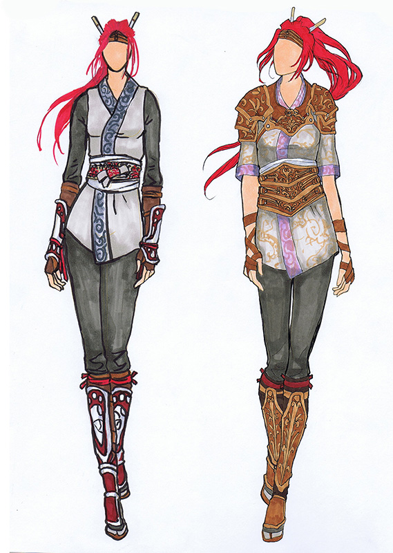
I chose the design on the right because I liked the way that it was both protective, channels the Gladiator-esque look of her original design with the tooled leather, and maintains the archetypal colors and shapes we’re used to for Nariko. The one on the left had too much crimson in it, which was too closely associated with her father and also doesn’t allow her hair to be the most red and striking part of her design, as I feel it was meant to be.
Next, I did quick gesture sketches in an attempt to capture a pose that felt heroic, but would also show off this new armor design. It was a tough decision, but I eventually settled on pose 3.
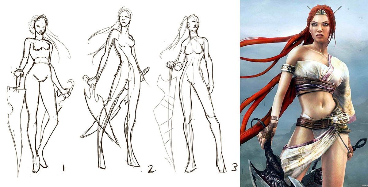
And yet, still 3 was not enough! I needed to push the heroic nature of the pose. She was still too straight on and seemingly staring off into the distance without much interest. Moving the camera level downwards so that we’re looking up at Nariko gives her so much more presence! The pose also feels more dynamic.
I have my hero. She has her armor. Now, it’s time to paint!
I don’t like this redesign, mostly because of the bottom half. It feels like it’s missing something – this not-quite-Asian style often relies on longer, coat-like tops and/or baggy pants (just look at the concept art of Master Shen you posted), so the tightly-fitting trousers and short top make it look off by putting too much emphasis on Nariko’s skinny legs (in the original design, the skirt/sash/thing diverts some attention from that).
Fair enough, Mike. To each their own! I actually had the baggy pants at first, but I didn’t like the unflattering silhouette it created when combined with the greaves, which definitely suited Master Shen better, since it made the thighs look poofy and too long on Nariko’s figure. If it was a question of movement, the pants are still loose enough to allow it and I didn’t find the pant style to be too inconsistent with the world’s design aesthetic, overall.