The last assignment was a tough one where I dealt with my ‘self-assessment’ and realized half of what I currently have in my portfolio is not even in my area of interest, personally or professionally.
The next entry in the Portfolio Building series deals with formulating a strategy. Be sure to read Jon’s original post before reading my homework, else you’re only getting half the battle!
Homework Assignment:
• Identify your “worst Image”, and share what you learned from identifying the image with someone.
• Create your “strategy” using my example as a guide
• Share what you learned about yourself, the process, or the homework with someone
My Worst Image
 |
| I still love you, Kana! |
Using my portfolio that was mentioned in
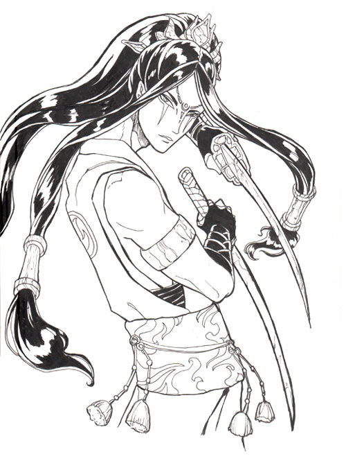
part 1, my worst image has to be
Dragon Prince. It’s not bad, technically, but it also doesn’t really create any kind of narrative within the piece. My reasoning for including it the first time was part of a scattershot strategy to include RPG interior black and white images with illustration in a Single Portfolio to Rule Them All. (Note to self: bad strategy).
I also noticed during both portfolio reviews that the reviewers passed over this image very quickly, as if they were bored by the sight of it. It also has nothing to do with my target market of book cover illustration.
He is just kind of there…looking pretty with swords. Perhaps if he were interacting more thoughtfully with a target? Perhaps if he were placed in a more interesting setting to show some hint of his world to create some interest? What story is he trying to tell? (or fellow PD students, what is the About?) What questions are the viewer asking themselves about him? None, because he’s just there with swords with nothing to challenge him, visually or compositionally.
Like many of my pieces in this portfolio, it is one central character who is not interacting with their environment or any other characters. I have a bad habit of being afraid to venture into images with grander scales of action and multiple figures. It is true some book covers have successful images with just one character, but there is always some element that draws us in, creates visual tension, and gets us asking “why”, like Jason Chan’s
King of Thorns, for example.
I instantly want to know “Why are all those people dead?” “How did he survive whatever battle just happened?” “Why does he look so damned pimptastic?” “What is that thing in his hand that looks magical and important?”
In fact, all of the covers for Lawrence’s trilogy achieve what I believe to be a pretty successful one-character set of simply AMAZING covers that make me want to read more.
My Strategy
I chose
Tor Books because many of the artists whose work I enjoy (
Dan Dos Santos,
Jason Chan, etc.) have worked for this company creating the kind of art I would like to be creating. Most of the work they produce that I enjoy tell the kinds of
mature and mythical stories with subversive characters I would like to be painting more of. Specifically, I want to specialize in covers with characters, instead of the more abstract symbol covers.
I need to be creating work in the mature, character-centric, and fantasy vein, therefore I need to create images with the following:
- Engaging characters in covers. (Preference to tattoos, mythic themes, capable females, swashbuckling males, and roguish figures, all which are luckily trending and marketable right now!)
- Easily readable compositions with areas blocked off for text, but that still feel ‘finished’ without the text.
- Semi-realistic style, which suits more dark and mature fantasy stories.
Specific Goals List (The Short Version)
You can
view The Long Version for specific image briefs, deadlines, etc.
I am narrowing my specific paintings to character-centric fantasy book covers. Starting with a realistic set of FOUR paintings, which gives me seven months starting in February till August, when I will be attending Illuxcon shortly after. That’s nearly two months per image, which should be plenty of time!
1. Kushiel’s Dart Cover – Creating my own rendition of the cover of one of my favorite fantasy novels. Covers meets my need for tattooed AND elegant ladies in a decadent mature fantasy setting.
2. Song of Exile (Ramah Cover) – A tentative cover from my own original fantasy story featuring Ramah, an exiled warrior prince. This would allow me to show a warrior from a desert setting for added portfolio variety.
3. Song of Exile (Melakim Cover) – A tentative cover from the same setting as Ramah, except featuring my demon-hunting, vampire slaying tattooed Hunter, Melakim. She would fill my quota of capable female, gritty action scene, the challenge of multiple figures, AND swashbuckling figure.
What I Learned:
I didn’t learn anything new, rather, I learned more specifically what I’ve always known. I had never been quite sure what it was that I could be drawing that made an image not just a portrait, but a book cover, which fulfills very different needs than a character simply existing in space (which is what my current portfolio is riddled with).
This exercise also got me thinking more specifically about what paintings I could put in my portfolio that aren’t just what I really enjoy drawing, but also which show that I am capable of a wider variety of subject matter beyond graceful tattooed winged women, which is what I am currently known for.
I didn’t have a strategy for the book cover industry yet so this was exceedingly helpful and much more focused than my previous attempt at putting together a strategy for the art card CCG industry.
So far, so good! The strategy is there, but can I bring it into reality??? I suppose we’ll find out!
Back to Part 1
Back to Part 2
On to Part 4 (coming soon)


Hey Ang… I think you might have missed a crucial point in the article – Jon mentions that your ‘worst image’ is actually the one you picked in part 2 – the answer to question 20 –
‘Next, I pull up that single image that came the closet to answering question #20. I’ll go over it one last time, and define all the ways that it doesn’t answer all the requirements that were identified, and see if I can dredge up a few more.
For those folks that have heard me speak on portfolios, this statement will not come as any big surprise – “Your portfolio is only as strong as your worst image. Guess what, you have just defined your worst image. The image that you have in your hand, as close as it might be to the ideal image, probably doesn’t meet 100% of the requirements that were defined.”
So technically the worst image is your Blacksent Umbra one that you defined last time. You should also post these on the site itself, as Jon’s been pretty good about responding to people’s 20 questions.
Actually, I figured that’s what he meant, but the problem is that picture isn’t actually IN my portfolio, so I went with one that is. I figure as long as we’re thinking hard about why something fits or doesn’t fit that we’re on the right path.
If I were to stick to the Blacksent cover and pretend it’s actually in my portfolio (and not just my body of work), I would have gone on about how the anatomy and perspective errors distract from the enjoyment of the piece as a whole. The composition isn’t actually that bad, though the colors and atmosphere can use a great amount of tweaking. That cover at least has us asking questions, which is a good start!
Why I chose to talk about it last entry was because, frankly, NONE of the images in that past portfolio were giving me any kind of dialog to answer the question that pertained to my focus, so I went with ‘body of work’ rather than ‘what’s in my portfolio’.
With all this in mind, I’m beginning to think maybe it should’ve been in my portfolio at some point, but it never was, oddly enough!
And no worries! I am slowly posting these to Jon’s site. I’ve posted my first answer, but haven’t gotten around to 2nd and 3rd yet. I probably will do that before I get too far.