I promised art my last post and now I’m making good! I’ve been a little silent around these parts thanks to a very serendipitous opportunity that came up to work with Wade Garret, an author who is about to publish his breakthrough dark fantasy book entitled Genesis: Book 1 of the Kingdom Come Series. I’ve been contracted to bring his characters to life in a wrap-around book cover-slash-promo-art for his world. After dabbling the past few years in licensing and portraits with the intent to verge into book covers this year, this was a challenge I was eager to take on!
Designing a book cover is a whole different beast than the art direction that comes with drawing fantasy images or just building a fanbase with your own scribblings. In my experience, this brand of painting had little to no art direction beyond the basic subject matter and the freedom to create whatever I wanted (harder than it sounds! Sometimes more specific briefs can lead to a more cohesive image).
With book covers, however, there are very specific needs to be faithful to the characters, to make it look awesome, AND to entice a very specific target audience to pick up the book from the shelf.
It began with getting to know the characters via the manuscript enough to start formulating basic thumbnails. I’m also working directly with the author instead of an art director, in this case, which means info directly from the horse’s mouth, as it were:
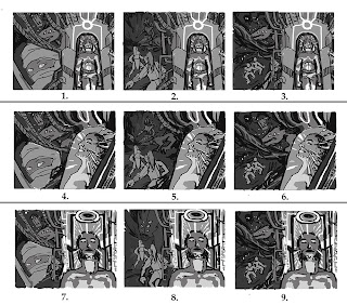 |
| After much deliberation, the winner was number 8! |
I have a 2nd version of this sheet with placeholder text treatment just to be sure the characters and composition won’t be overcrowded by font and that there was enough leeway in the compositions to allow for bleed edges. The winning thumbnail represents the culmination of our characters’ struggle to overcome a powerful ancient enemy (to find out more about that, you’ll just have to go read Wade’s blog).
We have two characters facing off with a monstrous creature on the back cover. Their placement in an outside location plus the opportunity to show off some of their wardrobe gives me an opportunity to convey the narrative’s setting, culture, and atmosphere. The coffinlike pod technology helps ground the viewer with the thread of scifi that runs through this tale of a futuristic, yet devolved world contrasted with the hint of medieval style that I’ll get to convey in the characters’ wardrobe.
But we’re not through yet! The characters and tech are still somewhat too vague, and that means doing some basic conceptualizing to get the look and feel of them down.
 |
| The pod featured in the front cover. I used Alchemy to formulate some unpredictable shapes. |
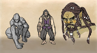 |
| Duward, the wise Durgha. |
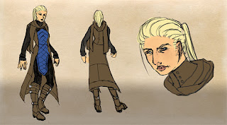 |
| Lady Sedi, the brave noble. |
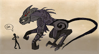 |
| The Big Bad Vhendo. This is a scrapped design, but isn’t he cute? |
Our main hero of front cover fame still needs conceptualizing. I’ll also need to do another study of the cover’s final arrangement to reflect the more concrete character designs we have now and to brush up the composition.

