Author: Angela S.

Sketch Diary: Christmas Angel Part 3

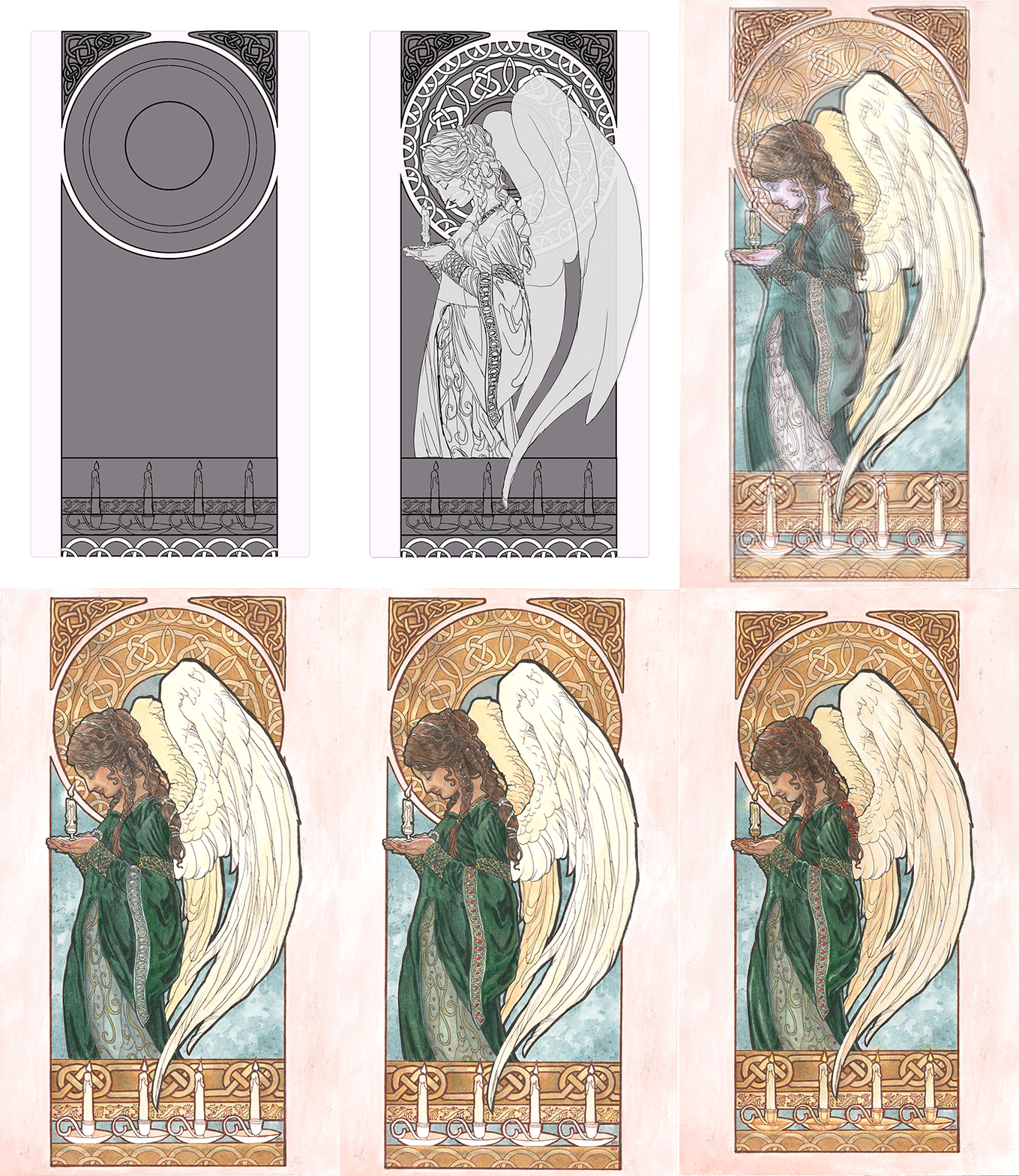
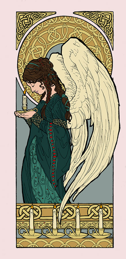
Progress continued on this painting with color testing in Photoshop.  This one was a no brainer!  I knew I wanted a more subtle color scheme that wasn’t so IN YOUR FACE CHRISTMAS!  That meant keeping colors like the strong red to a minimum and relying a nice cool green, as opposed to the more yellow green you see for Christmas motifs.

I always recommend doing a color test so you don’t end up having to start all over again because a color ruined your entire piece.  Traditional media is unforgiving like that.

christmas-angel-wip13
Digital color testing done in Photoshop CC.

The only element I was torn on were the candles.  Should they be red or white?  I ended up going with white just to keep with the theme of subtle Christmas hues.

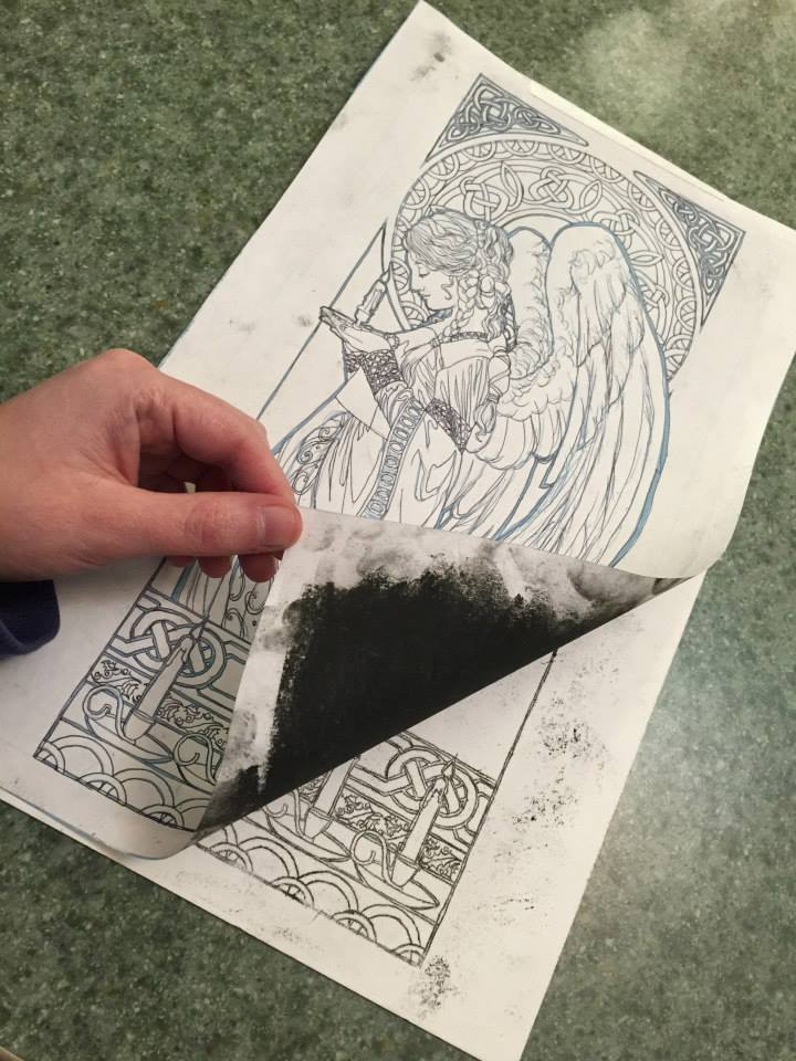
Next, I transferred the image to the illustration board by printing out the line art, rubbing the back of the print out with a soft (6b) graphite stick, then tracing the designs with a fine point pen.  The line art is printed in blue on the print out so that when I trace the lines with a pen, I can tell where I’ve already traced.  The pressure from the tracing transfers the drawing to the board.  Be sure to wipe the excess dust off before you trace just so you don’t get speckles like I did in mine!

10301221_10152612032558458_7030449813707511526_n

I ended up going with red ribbons by the end, since her hair would have been too monotone with the green ribbons.

christmas-angel-animation
Here’s a quick gif of the process from digital sketching to paint layers.  I’ll be doing a compilation video at some point in the future, so keep an eye on my YouTube channel!


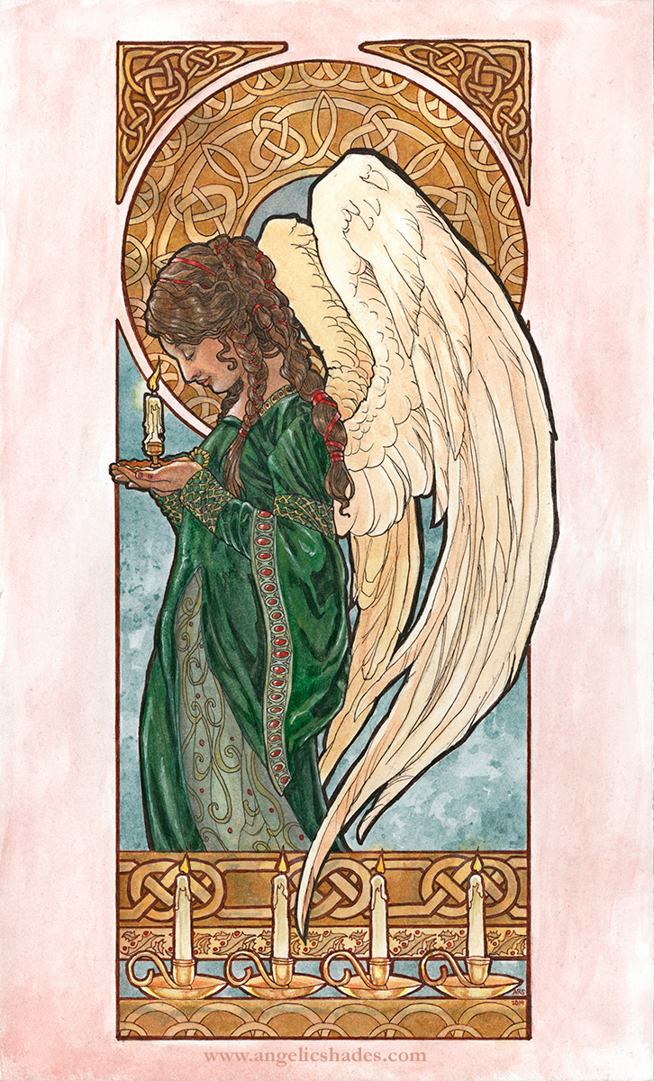
Without further ado, the finished painting!


"Christmas Angel" Watercolor and inks on 8.5x14 inch illustration board.  Cards and Art Gifts - http://www.deviantart.com/print/37246289/   Original for Sale Direct From Artist:  - Unmatted - $650   - Matted and Framed - $750  * Shipping to be determined based on your location.  E-mail me if interested.
“Christmas Angel” Watercolor and inks on 8.5×14 inch illustration board.
Cards and Art Giftshttp://www.deviantart.com/print/37246289/
Original for Sale Direct From Artist:
– Unmatted – $650
– Matted and Framed – $750
* Shipping to be determined based on your location.
E-mail me if interested.

Materials Used:

 Back to Part 1

Upcoming December Artist Q&A

i-approve-of-this-tree-christmas-cat-memeHey, everyone! I usually do a 30 minute live broadcast for my Q&A sessions, but since the holidays are busy and I’m not sure I’ll be able to broadcast from wherever we might end up, I’m doing another blog-hosted event instead!

A Couple of Changes

– The Patreon giveaway portion of the monthly sessions is now going to be held quarterly (during January, April, July, and October’s monthly broadcasts).  While my giveaways are happening less, the prize is now going to be my Patron’s choice of a custom sketch or a 50% off coupon for my shop, which is even cooler than a random thing, in my opinion!

– The Q&A sessions will still be held once a month even if I won’t be giving away something each session.  That gives us more time for mini demos and questions!

How This Month’s Session Will Work

– Leave me questions in comments here.  Ask me anything about art, life, and beyond!

– I’ll answer them in a blog post at this journal here on the 24th!

Have a great holiday season, everyone!

Sketch Diary: Christmas Angel Part 2

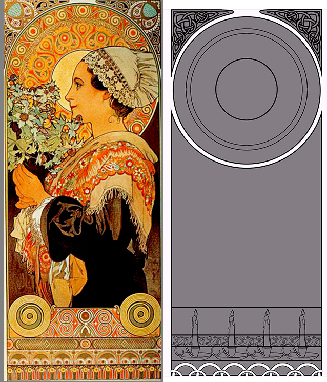
Before I get sucked into character details, I have to first design the frame, which I quickly do by drawing shapes in Photoshop.  I set the layer with the grey shapes that form the frame to the Blending Option, Stroke, which creates an outline around the shapes that I don’t have to manually draw myself.

I used similar partitions for the division of the frame to Mucha’s piece (why change a working formula?).  The corner knotwork, holly border, and candles were all designs I created once, then replicated multiple times and repeated across the piece.  Working digitally makes this preliminary work a lot faster

frame

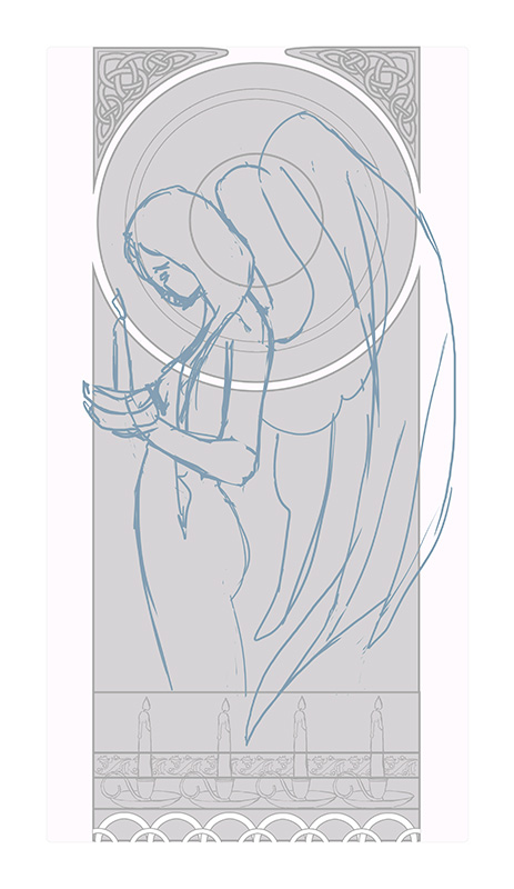
A quick sketch helps me establish how I want the figure to flow through the frame and also aids with refining the rather wonky anatomy of the original thumbnail sketch:

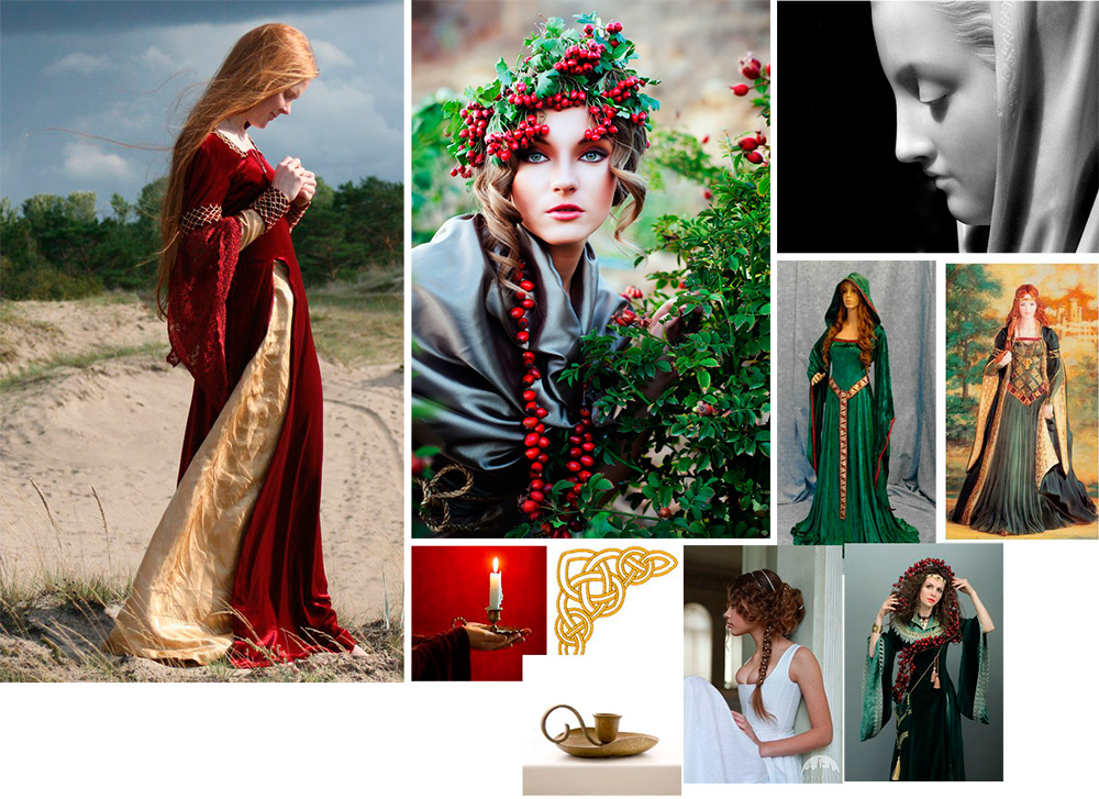
sketchFurther reference gathering helps me collect images of candles, velvet dresses, wings, and poses that will help me make this pose look less fudged.  I lean on Pinterest very heavily for this purpose and am constantly gathering inspiration on a daily basis for my projects.

christmasangelrefboard

This is a VERY important step!  There’s nothing that can ruin a painting faster than a completely fudged pose that just looks ‘off’, unless you are very, very experienced and have done so many studies you can draw things from memory.  This is rare even for the best of artists, mind!

Gathering reference can also help you save time revising later because you didn’t get that hand quite right or didn’t get the drapery quite right.  The trick is uniting your references and reinterpreting them in such a way that you still have something unique and you don’t lose the energy of your rough sketches.

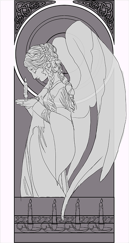
I eventually arrived at something like this for the base sketch.  At this point, everything is still on its own layer in Photoshop to allow me to re-position any element I please:

base-sketch


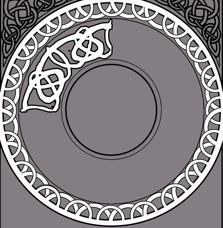
Now, designing the window!  The window knotwork begins with a freehand sketch that fills up 1/4th of the circle.  This 4th is then copied, pasted, and flipped horizonatally so the design is symmetrical.  I use the layer’s Blending Option set to Stroke again to create an outline automatically while I draw.

Admittedly, I’m not very structured with my circular knotwork. I sketch until it looks right, rather than drawing guidelines and graphs.

window-knots-sketch

I wanted the design to emulate a snowflake with the radial spires, so I made sure the main junctures had points in the most important places (the center lines of the shape).  I also wanted a thicker strands in this design to help fill up the space, since a design with too many thin strands would start to make the background window too busy and distract from the main character.  I used two total strands for this design, a thin strand and a thick strand.

Next, I lock the transparency on the layer and draw all the intersections of the knots.  The locked transparency keeps me from drawing outside of the shape.  The reason I draw the knots as if they were invisible is to help me clean up the angles of the strands and intersections, which were a bit sloppy before.  You can see towards the bottom of the circle where the knots are still sloppy.

window-knots-sketch2

Next, I meticulously defined the underlap/overlap pattern of the knots.  Traditionally, knotwork always has a pattern of any one strand going over and under.  I broke this pattern somewhat so the radial spires stand out, bringing emphasis to the snowflake shape.

window-knots-sketch3


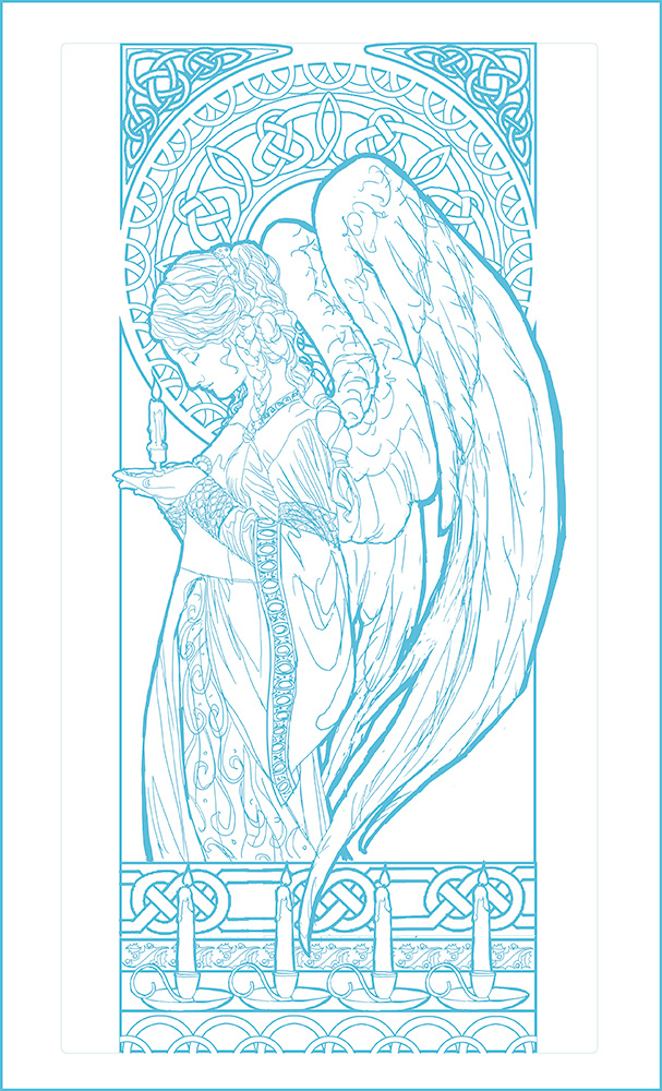
Phew!  That was a lot of tedious detail (and I loved every second of it!).  A few cups of coffee later, here’s the finished line art!  I’ve changed the line work to blue so as to make it easier to tell which areas I’ve transferred when I’m transferring this to illustration board.  This line art is still a little rough as well, since I’ll be cleaning those lines up once she’s been transferred to the board.

christmas-angel-wip12

Next up: The finished painting!

Back to Part 1


Book Club: Artist As Brand Part 8 – My Website

My reading of Greg Spalenka’s Artist As Brand continues with section VIII. What Makes a Great Website/Blog.

I found the book for a great deal on the Nook.
Or you can buy it via my Amazon referral link
and give me a little kickback!
You can also buy direct from the author!
 

Blog vs Website

Section VIII talks about what makes an interesting website and blog.  I love the allusion to a website as your studio while your blog is a conversation and is more interactive.  That immediately puts into perspective how a website should reflect your style while a blog can be more conversational and more casual.

For those who don’t have much experience designing a website, this section has great tips on suggested sections (ie. About, Contact, Press, Newsletter sign up, etc.) and exactly why you’d need them.

Newsletter Strategies

Spalenka also presents great suggestions for writing newsletters. I always have a hard time figuring out what’s relevant and have had a problem having enough art to show (since my attentions/products were so split up).  My newsletter has gone quiet while I build up enough of a buffer of a new consistent body of work to talk about.

Example of Online Brand (from My Own Experience):

Shadowscapes – The Art of Stephanie Pui-Mun Law

Stephanie Pui-Mun Law immediately sprang to mind for me while I was reading.  She has a fantastic online brand identity and social media/website presentation. She must be have partnered with conversion rate optimization services to get more attention from people. Most impressively, she built most of this herself from the ground up, having been a computer science wiz before she became an artist.

Stephanie has a centralized shop on her site and I can always tell I’m on Stephanie’s sites when I see her dreamlike Celtic knotwork, watercolor textures, and soft color palette.  Her newsletter also has a similar feel and updates her fans on upcoming events, new art, new tutorials, and a monthly giveaway which all feels relevant and cohesive to her brand identity.

My Homework

These sections definitely got me thinking about how I want my Angelic Shades and The Fantasy Art of Angela R. Sasser sites to be different.


Angelic Shades Studio – Should be a vintage inspired theme with Art Nouveau flow and flourish.  Soft pale colors (blue, purple, light grey, and white).

Store should serve fine art buyers and my target audience (ie. fancy mats and framed art, postcards, greeting cards, etc.).


The Fantasy Art of Angela of Sasser – Should be elegant and sleek with just enough flourish to not make it too stark.  Black, white, or neutral with accent colors.  Words and images blended together to reflect my love of characters, stories, and narrative images.

Store should serve book lovers, gamers, and character fans. (ie. journals, bookmarks, playmats, dice bags, themed sketchbooks/storybooks, graphic novels, etc.).


Re-designing these sites with more of a specific identity in mind is definitely high up on my to-do list!

I’ve left out SO much concerning all the various resources Spalenka mentioned, so definitely go support Spalenka’s book/workshop if you are finding this blog series helpful!

Next Up: High Touch Venues – Conventions to Galleries

Book Club: Artist As Brand Part 7 – The Art of Social Media

My reading of Greg Spalenka’s Artist As Brand continues with section VII. Brand Promotion – The Art of Social Media.

I found the book for a great deal on the Nook.
Or you can buy it via my Amazon referral link
and give me a little kickback!
You can also buy direct from the author!

This section  provides a detailed list of forums and communities for networking, many of which I hadn’t heard of before.  There are a lot of sites dedicated specifically to networking ‘tribes’ (ie. Ryze.net and Tribe.net) that I have yet to tap!  I’ll have to post later over at The Muse’s Library with some thoughts on these sites and their usefulness for artists once I’ve had a chance to properly assess them.

Shop Tips

Spalenka also makes a strong argument for having a shop on your website instead of using a portal shop like the many POD sites (Zazzle, Fine Art America, etc.) or markets like Etsy.  I’ve been back and forth on this issue for years now.  Running a shop on Etsy, for instance, gives me a shop front that’s easily accessible and discoverable by a public market and is supported by the marketplace.  Etsy does take a percentage, but the setup provides a nice backbone for a shop that I didn’t have to build myself.

I’ve built shops from the ground up, spending hours upon hours perfecting it, only to have something go wrong on the technical side of things.  Not to mention the fact my website alone simply does not get the traffic of eBay or Etsy, no matter how much I promote it.  Even still, Spalenka argues that marketplace trends are always changing while your website will always be the same central location and this is very true.

Etsy, for instance, is battling with changes at a corporate level with many artists left disgruntled by the flood of wholesalers taking over the market.  Your central website, however, will never go out of style and a shop would be easy to find if it were located there.

Bearing this in mind, I aspire to create a shop front on my site using WooCommerce, which I hope will be an easy to implement plugin for this WordPress based site.  I’ll probably still use Etsy during high traffic seasons and to sell quirky cute handmade things featuring my art, but it will probably not be my main shop front anymore, granted I can get WooCommerce working!  Adding one more thing to my business re-organization to-do list.

Publicity Tips

This section also features some fantastic tips on publicity, such as ideas for blog events and links to press kit tutorials.  It’s a bit overwhelming!  I know I need to hit publicity harder, as it’s something I really haven’t relied upon. I’m just never sure where genre art like mine can find an audience and partner site to be featured on, since I don’t work with well known IP’s, nor do I have a really recognizable body of work, just yet.

Putting a pin on this section to come back later when I feel I’m finally ready with a decently sized body of consistent (theme and skillwise) work!

I’ve left out SO much concerning all the various resources Spalenka mentioned, so definitely go support Spalenka’s book/workshop if you are finding this blog series helpful!

Next Up: What Makes a Great Website/Blog

Sketch Diary: Christmas Angel Part 1

It’s that season again!  Time for this year’s Christmas painting!

Be sure to sign up for my annual Christmas list if you haven’t already.  It’s FREE and my way of spreading a little holiday cheer to you all. It’s all thanks to the wonderful support of my Patreon patrons. You guys rock!

For this year’s painting, I wanted to top last year’s, which did not have enough candles, in my opinion. I wanted MOAR candles!  There is something about these elegant points of light that always makes me think of the holidays.  From the lighting of advent wreaths to candlelit Christmas pyramids, I just love the part they play in the season and the beautiful light they cast.  This theme became my jumping off point for inspiration.

I also wanted to channel my love of Alphonse Mucha’s close up portraits.  I love the simplicity of the composition and focus on clothing and hair details instead of grand borders.  Clothing, hair, and faces being some of my favorite things to draw and paint!
mucha_portraits_by_angelasasser-d87mrl8[1]
My thumbnail sketching began on toned paper with pencil, ballpoint pen, and white color pencil.  My first sketch (top left thumbnail) drew directly upon one of Mucha’s close up portraits, mimicking the pose.

 christmas_angel_thumbnails_by_angelasasser-d87msjs[1]

The next few thumbnails focus on the concept of an angel inspired by Mucha’s portraits of ladies in profile. In the end, I chose the concept of the angel in profile because it feels more festive and cheery than my initial thumbnail.  I may just have to save the candle woman from the first thumbnail for another painting. Next year, perhaps?

The thumbnail with the asterisk by it is my winner!  The pose of the wings feels more natural and elegant and the piece just flows down through the wings, her braid, and her dress.  The other angel thumbnails felt too claustrophobic and unnatural when the wings were added.  The lines and flow were too broken up and led the eye off the page at odd places.

I’d actually do more thumbnails than this usually, but since I’m starting pretty late this year, I’ve got to make my decisions quickly or this won’t get done by Christmas!  One of these years, I’ll learn to start earlier…

Next, I’ll need to hunt for references on design motifs for the Celtic knotwork, candle holders, and the inner window.  I’ll also need to take reference photos for the angel.  The color scheme is going to be green and gold with accents of red.

The detail addict in me is so excited to dive into this one!

Next: Design motifs, rough sketches, etc.

Book Club: Artist As Brand Part 6 – My Market Niche

My reading of Greg Spalenka’s Artist As Brand continues with section VI. Creating Your Market Niche.

I found the book for a great deal on the Nook.
Or you can buy it via my Amazon referral link
and give me a little kickback!
You can also buy direct from the author!
 

This section covers a lot of ground concerning how to establish a connection with your target market and present yourself in such a way that you can find and appeal to your audience while preserving their loyalty and encouraging them to invest in you as a business.  This is particularly relevant to artists who rely on a symbiotic relationship between themselves and collectors to maintain their income.

This section reinforces the advice I’ve been hearing from other successful artists I know that having great art is the best starting point, but selling your passion and your story is where the magic happens.

But who is my audience?  I’ve struggled with this for years because I started out wanting to go one direction (concept art and book covers) and being drawn towards another (angelic art, Art Nouveau, and mask-making).  In the end, I just did everything, burned myself out big time, and realized I was not really making the kind of advancement in my career that I wanted.

My artistic identity was like someone changing the channel back and forth and never deciding on something to watch.  I’ve had some folks interested in my work, but I’m pretty sure if I had a more unified identity that I would be more successful than I am now.

This has been the reason for me splitting up my current identity into several faces.  I hope this will help my audience more easily identify with my work and locate what they’re interested in.  For those who have been asking how the heck I handle it all, truth is, I haven’t really been doing it well in the past!

All of these ‘brands’ used to be thrown together under the umbrella of Angelic Shades Studio.  Now, they’ve each been given their own real estate completely separate from one another.  Cover art is going to be my focus from now on, while the rest will be side projects I attend to when I have the time outside of this endeavor.

So Who is My Audience?

What do they do?  What do they love?  What do they spend money on?  I did the initial brainstorming for this in my Vision Board.


For Art by Angela Sasser (Fantasy book covers and character driven art)

Audience – Usually readers and/or writers, Magic the Gathering fans, Kushiel’s Dart fans (thanks to my Kushiel cover project), Game of Thrones quiz, folklore enthusiasts, 18+ and up demographic, both male and female.  May be able to expand into a fine art gallery audience if the topics are more surreal or based on mythology (ie. Flowery Mythology series).

Current experience shows most of my customers who buy my character-driven fantasy work are interested in buying prints and books with a more specific narrative, bookmarks, or other book-related things.


For Angelic Shades Studio (Angelic art and Art Nouveau)

Audience – New Age enthusiasts, Angel therapists, decorative art enthusiasts, generally female, 18 years old and up.  Current experience shows most customers seem to be buying gifts for others, usually for moms or wives.

May expand out into fine art gallery audience with the Art Nouveau pieces and to a younger demographic with more fun series (ie. Cake Dresses and Butterfly Masque).  My Angelic Visions art instruction book appeals to art students, but not necessarily to my main buyers.


For Angelic Artisan (Masks and custom accessories)

Audience – Cosplayers, Renaissance festival attendees, mask lovers.  Generally an older demographic with expendable income and a passion for costuming.  Most are interested in buying cosplay masks or other accessories to help them channel their favorite fandoms and original charaters.


For The Muse’s Library (Art-related book/product reviews, art marketing articles, and stock art resources)

Audience – Art students, working artists, game artists, and art educators, creative professionals, art entrepreneurs, usually 18+ up demographic.  Best-sellers so far have been the stock art, since these resources can be used directly in artists’ personal projects for free with a fee for commercial use.   Most of my target audience for this brand are passionate about art, mastering their skills, promoting their creative businesses, and saving money.


Writing this all out really helps me focus on purposefully targeting people rather than accidentally stumbling upon fans.  As ever, this doesn’t cover half the info provided in the book! Go support Spalenka if you’ve found the information I’ve been writing about useful.

Next up: VII. Brand Promotion: The Art of Social Media
Book Club: Artist As Brand Part 5 – Declaring My Name!

My reading of Greg Spalenka’s Artist As Brand continues with section V.  Declare Your Name – Taglines, Blurbs, Business Cards.

I found the book for a great deal on the Nook.
Or you can buy it via my Amazon referral link
and give me a little kickback!
You can also buy direct from the author!

Spalenka gives a plethora of examples about how a business name can say a lot about you, but also cautions about being influenced by your ‘tribe’ to change what your identity represents.

I experienced this exact thing when showing off my logo from this workshop to my family.  They all saw a shrimp or a squid.  I’ll admit to an aquatic vibe to my logo, but I still feel it represents me very nicely.  I won’t be changing it any more than it takes to bring it more towards a wing/cocoon/seed vibe.  Feedback can be helpful, but it can also be dangerous, especially when you respect the critiquers!  It ends up being more about pleasing them than your original idea, if you aren’t careful.

Cannot unsee the shrimp/squid in my logo now…

A more serious example would be my past experiences with being cautioned away from the book cover industry by very embittered artists I respected.  These artists were my ‘tribe’ and they were so very detrimental to my development.  Stick to your core beliefs!  This is all about having faith in your ideas and skills.

Next up, taglines.  I’ve never really had one before and I feel that has been to my detriment!  My ‘Angelic Shades’ name was a catch-all I started years ago for all of my art, but now I realize that using it this way just made it a very unclear brand with an unclear target audience.

Now, it seems I’ve splintered my business into several brands, all which I can link back into some form or fashion to my core virtue of ‘unlocking potential through discovery‘.  Here are the taglines I came up with for them:

Angelic Shades Studio (My Art Nouveau and angelic art brand)

Creator of Whimsical Art Nouveau and Angelic Art for Classical Souls.

Angelic Artisan (My masks and leather crafts brand)

Revealing the Being Within through Masquerade.

Angela Sasser Art (Fantasy covers and character art brand. This brand will possibly combine my fantasy author identity as well, should I ever choose to publish any stories.)

Exploring Humanity through Mythic Visions.

The Muse’s Library (A new brand I’m working on inspired by this workshop!)

Creative Resources for Artists by an Artist.

Thinking about these concepts has helped me better understand what I’m attempting to do with my varied areas of interests and creative output.  (You guys remember that CRAZY Vision Board I did).

Somewhere along the way with this workshop, I realized yet another facet within Angelic Shades and that is my passion for providing resources (reviews, stock art, etc.) for other artists.  I’ve finally given this passion a name in the form of The Muse’s Library, thanks to this workshop.  More on that later!

Other useful info included in this section:

  • Strategies for engaging people in conversation that extends beyond “I draw stuff” (aka. your 30 second elevator speech/blurb). This is especially useful if you’re bad at small talk, like most artists I know, including myself!
  • Tips for creative and unusual business card design.
As ever, pick up the book and support the author if you want to learn more!  There’s so much I can’t capture here in my blog entries.
Next up: VI. Creating Your Market Niche
Back to Part 4
Back to Part 1

Book Club: Artist As Brand Part 4 – Plan the Brand

My reading of Greg Spalenka’s Artist As Brand continues with section IV. Plan the Brand.

I found the book for a great deal on the Nook.
Or you can buy it via my Amazon referral link
and give me a little kickback!
You can also buy direct from the author!


A lot of this section talked about the concept of job security being an illusion.  This comes up a lot in books I’ve read about creative professionals because so much of our downfall is that constant fear of where money for bills is going to come from.
We struggle, we burn out, and then we get sucked back into the trap of ‘security’ and all the people in our lives (our ‘tribe’, as Spalenka calls it) help reinforce this illusion of safety because it is what they believe to be the most prudent way to go about one’s life.  We want to please these people we care about, so we define our success by their values.
Unlike a more stable “real” job, there is no veil of safety convincing us that because we’ve worked 30 years at Such-and-Such Incorporated that we’ll always have that income and nice, cushy benefits.  Freelancers have no such safety net.  We must accept the truth of the world as it is. (Though that doesn’t mean we can’t be smart about it by planning ahead, either.)
If this were a live reading, I would’ve stood up and cheered at the end of this section.  My whole thesis was based around the fact that audiences are evolving and finding new ways to connect with artists and that the old traditional methods of connecting via institutions were becoming obsolete. I believe this to be true.  Our modern age has allowed artists so many diverse ways to profit that aren’t constrained to one institution or the other.  We are more in control in our destinies than ever we have been!
The rest of this section covered the familiar territory of describing the cost effectiveness and thought process behind planning products and ideas for varied income.  It’s a good rundown if you’re brand new to thinking about what goes into making products or considering less common income streams for artists, such as art licensing.  With several working examples provided.
Random Note – I learned from this section that the founder of Etsy is a young wood worker who was going to start a furniture company.  That company became Etsy, which is what he would’ve named his furniture company.  Cool!
The homework from this section was to start building a Business Plan starting with several prompts about products, including projecting how complex they will be, how long they will take, etc.
Including all of that would make this entry super long, so I’ll just list off some of the products this book has me considering for my business:
  • Stock reference photos for artists.  I’ve been doing this in a small capacity, but now I feel like it’s something I should be spending more time doing.
  • Educational resources for artists (ie. book reviews, product reviews, etc.). I’ve been doing this via my blog, but have never considered making it a commodity for my business.
  • Yearly sketchbooks based on themes.  Having themes and a yearly time table would help focus my very flighty muse!  Inspired by Cory Godbey’s interview over at One Fantastic Week.
I’ve really been supercharged by this book! It has encouraged me to zero in on where my passions really are and to step back from other projects that were less appealing to my core interests.As always, there’s SO much I’m leaving vague.  Be sure to pick up the book from the links at the top if you’ve found any of this useful!

Next:  V: Declare Your Name – Taglines, Blurbs, Business Cards

Go back to Part 1

Go back to Part 3

Book Club: Artist As Brand Part 3 – My Vision Board

My reading of Greg Spalenka’s Artist As Brand continues with section III. Your Vision Board.

I found the book for a great deal on the Nook.
Or you can buy it via my Amazon referral link
and give me a little kickback!
You can also buy direct from the author!

This section focused on another visual brainstorming exercise meant to help you visually map your passions and interests and connect them with products, people, and places.  I found a lot of value in doing this because I have a lot of interests, from video games to art marketing to folklore and beyond!  It’s always so difficult for me to narrow down my projects and focus, which has been a constant challenge for me over the years.

View a larger version of my map here.

I went a little insane and fit as much on the board as I could.  What a crazy web I wove!  The text at the bottom represents the connections I drew with colored lines between my top three activities from the first circle, the products I can produce, and the people and venues I could reach those people through.

That’s a pretty powerful thing to figure out for yourself!  So many of us just throw art out there with no thought put into who that art is meant to resonate with.  Creating with purpose seems a valuable way to focus your time and energies and make your brand more consistent, which is something a lot of novice artists don’t do when they’re first starting out (I’m guilty of it, myself!).

I also made a .psd template, since one wasn’t provided in the book. Feel free to download it here for your own use.

Download the blank template I made here.

As ever, I have left some details of this exercise (such as the explanation of Mind, Body, and Spirit and other instruction) vague on purpose to encourage you to purchase the book.  It’s a really worthwhile read thus far and I would recommend it based on the helpfulness of the exercises I’ve already completed!

Next up, IV.  Plan the Brand
 
Go on to Part 4. (coming soon!)