Author: Angela S.

CON REPORT: DragonCon 2015

I’m back from DragonCon and have a massive head cold as a souvenir!  Before I disappear with hot tea and meds, I thought I’d post about how my DragonCon went.

This year was an odd duck for me.  I had no table, which is the first time I’ve been without one for a couple of years.  I was completely okay with that, however, because it meant that I got to actually experience the con by attending interesting panels, costume watching, and networking with people rather than being tied to one place.

I went to a wide range of panels, from the history of Persian dance to indie game development (panel notes forthcoming).  I somehow never made it by the dealer’s room since venturing anywhere outside of the Hyatt just seemed like too much effort.  The Hilton for the game dev track was as far as I made it.

I also ran two panels for other artists entitled Social Media for Artists 101 and 102!  Any event where I can play Duck Army as an ice breaker is a good event.  The attendees at my panel were all very enthusiastic and willing to share resources. Thanks for making it a great first run for 102,  everyone! (NOTE: You can find the PowerPoint files of my presentations here.)

ART SHOW

John, Anne, Heidi, and the other staff ran a tight ship, as always!  It was an experimental year for me in that I left my masks and Art Nouveau work at home and only displayed my digital fantasy work in the show this year, an intimidating decision!  I was happily surprised that two of my canvas prints (Oathbound and Kushiel’s Dart) found new homes!  I did decently in the print shop, though I have a few extra playmats and dice bags still available if anyone’s after them.  Use code DRAGONCON to get 15% off at my shop right now!

dragoncon-2015-gallery-bay
A panoramic shot of my large gallery bay. From left to right, Kushiel’s Dart, Enchained Wind, Keeper of Secrets, Oathbound, Persephone Queen of the Underworld, The Lotus Dancer, and Dreaming Butterfly.
File Sep 10, 10 47 00 AM
See more of these amazing cosplayers here.

FAVORITE MOMENT:

We walked by a guy in the skybridge dressed as a herald from Assassin’s Creed.  He was putting up posters on the walls every few feet.  I heard tales of cosplayers dressed as Assassins zipping by and tearing them down later.  When we asked him how many posters he had, he said 250.  I am highly amused by this kind of clever fun.  I didn’t get a picture of him, but I got one of his poster, which was really well done!

BEST COSTUME:

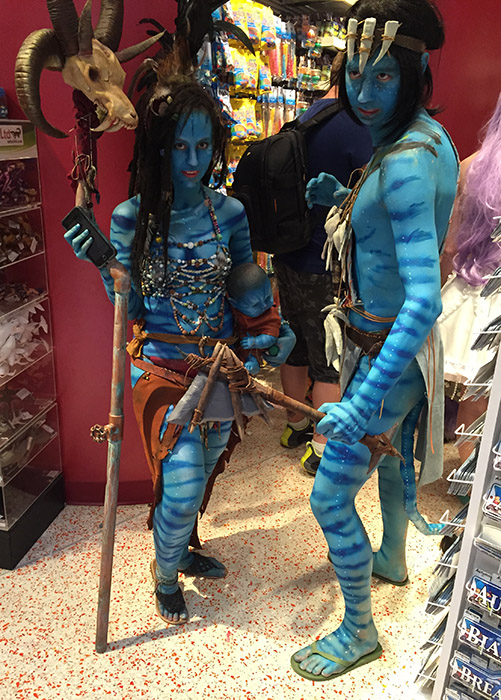
I snapped a pic of this amazing pair dressed as Na’vi from
Avatar during the Night at the Aquarium.  That baby looked so very real. It was quite creepy (and awesome)!  It’s the dedication to full body paint and detail that made this the best costume I saw all con.  While the Night at the Aquarium was great for costumes, they had all of the lights turned off in the displays this year, which made it really hard to see any fish.  How I wish I’d gone to the philharmonic concert instead.

WHAT DID I LEARN?

I always like to think about what I can learn from looking at the displays and presentations of artists, but this year’s revelation was on a deeper level. Instead, I got a lesson in creativity and motivation from attending the panels on creativity and writing this year.

The advice from a lot of the authors there was that comparing yourselves to others was the quickest way to burn out.  Most of us in the creative industry are just trying to get by and/or create something that we love.  You can partially measure that success by money, but other times, it’s the victory of just having made the thing since, more than likely, creating art is not really going to pay all the bills until a very long time out.  Most of us are in that dreaded ‘gap’ and those who would be at the top are not always guaranteed to stay that way.  Focus on making good art and stop comparing yourself to others.

And that’s a wrap!  You can see more of my DragonCon photos of some of the cool swag I picked up in Artist Alley and other moments over at my Instagram.  Till next time!
Mentorship Slots Available!

EDIT: I’ve updated the Casual Mentorship after some feedback. Now with more bang for your buck!  Also added a more in-depth explanation of exactly what the Portfolio Review and Art Marketing sessions would involve.

Last year, I tentatively opened up the Creative Consulting section of my website.  Now, I’m excited to roll out Mentorship slots via my Patreon reward tiers!  I’ve had a few requests from other artists who wanted to have a deeper educational experience than my painting critiques, which I offer via redlines and paint overs.  I’m currently offering two types of mentorships:

The Casual Mentorship

You will receive:

  • A monthly personalized 30 minute long Portfolio Review OR Art Marketing Consultation (EDIT: changed this previously from being a one-time session). You may also pay for additional sessions separately (see my rates here).
  • A single paint-over per month for your work in need of critique!  Additional paint-overs can be purchased separately (see my rates here).  A narrated video of your critique will be recorded and uploaded privately for you to view at your leisure on my YouTube channel. Paint-over videos will be fully detailed, providing advice and study resources. See an example of how detailed my critiques can be here.
  • A .PSD of your paintover which you’re free to use as a base will also be sent to you!
  • I am YOUR personal Art Cheerleader!  I’m at YOUR disposal when you need advice!  E-mail me any time and I will give you advice on studying, resources, and other art-related topics.

The Full Mentorship

You will receive:

  • A monthly personalized hour long Portfolio Review OR Art Marketing Consultation. You may alternate which one you prefer each month.
  • Up to three paint-overs a month for your work in need of critique! A narrated video of your critique will be recorded and uploaded privately for you to view at your leisure on YouTube. Paint-over videos will be fully detailed, providing advice and study resources. See an example of how detailed my critiques can be here – http://angelasasser.deviantart.com/critique/.
  • You will also receive a .PSD of your paintover which you’re free to use as a base.
  • Just like the Casual Mentorship, I’m at YOUR disposal when you need advice on studying, resources, etc.!

EDIT:  What are the Portfolio Review and Art Marketing Sessions?

The Portfolio Review and Art Marketing sessions would be hour long online chats that we have together via Hangouts or Skype to discuss your needs during the mentorship.  The Portfolio Review would focus on your art and any concerns you have related to your work and techniques while the Art Marketing session would be mainly focused on your business and marketing efforts.

If there happens to be time left after we’ve discussed the primary topic, we can always talk about other things, but I like to keep the sessions focused on a primary concern so as not to overwhelm us with information.

Extra, Extras!

In addition to the mentorship perks, you’ll receive a slew of other goodies I’m offering via Patreon that come with my Mentorship reward tiers, including wallpapers of my art, monthly tutorial videos, and more!  See the Rewards section of my Patreon page for the full details on what other rewards are included.

I’m only offering a limited number of slots right now so I can make sure that each student will have the dedicated attention they deserve, but this may change in the future, should this venture prove successful!  For those who might be new to my work and would like to know more about my credentials, you can read more about my experience here.

Have any questions or comments?  Feel free to comment on this journal or email me!

IP Development Mentorship Blog Series PREVIEW

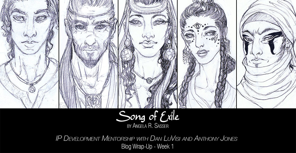
I’ve been working on tons of exciting things this week for my IP Development Mentorship with Anthony Jones and Dan LuVisi!

You can get a more in-depth peek at my world-building experience, thoughts about the mentorship process, plus sneak peeks of my personal project’s art by supporting me at any level on Patreon!

I’ll be uploading weekly blog posts of my progress *exclusively* for my Patrons there.

And now, SLEEP! This first week has been exhausting, but amazingly productive!

Once you become my Patron, you can login to start reading the first blog post in my mentorship diary here:
https://www.patreon.com/creation?hid=2433225

March 2015 – Monthly Update plus HUGE News!

Hey guys! I’ve decided to write this month’s update instead of broadcast it because I’m feeling a bit under the weather (food poisoning, urgh!).  So rather than subject you all to my sick mug, I thought I’d write March’s update instead!

How’s My Month Been?

It’s been great!  I’ve been whirling between my studies with Painting Drama and Proko’s Figure Drawing Fundamentals. Here are some of the studies I’ve been working on!

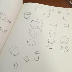
I’m slowly, but surely working my way up to 25 abstractions for my assignment. They take quite awhile so it has been a slow going process, but I’m learning so much about how compositions are arranged!  The 3D object assignment is building me up for drawing volumetric mannequins, which I’m very much looking forward to.

I’ve also been working on finishing the Rapunzel comic since it’s going to be published in an anthology later this year (more on that later as publication draws closer).  Now with more detail than ever before since I have a longer time to focus on them!


HUGE News!

And finally, saving the BIGGEST announcement for last.  I’ve put a downpayment on entering a mentorship with Dan Luvisi (of Last Man Standing fame) and Anthony Jones (of Robotpencil.org and Blizzard Entertainment fame) in May and June!  This mentorship is going to focus on IP development and I’ll be using my own novel as the IP I intend to develop for this mentorship!

You can read the syllabus here (starts on page 15).

It’s no small investment, but I’m using the pennies we’ve been pinching for SmartSchool to give it a shot.  I was a little torn, but the fact is, I’ve always felt like more of a writer-artist than purely an artist and this mentorship allows me to give both of those passions the attention they deserve. Plus, there is always next year for SmartSchool, if my pinched pennies can regenerate by then.

By the end of this mentorship, I hope to have the first two chapters written, illustrations of characters and key scenes, a perfected pitch and SO much more!  We’ll be able to talk to knowledgeable parties about their experiences in this field and receive guided instruction.

The instructors are even hoping to bring student work to San Diego Comic Con to pitch what they can to any interested parties.  They obviously can’t guarantee success, but the slim chance to be seen by the right people when I’m at that point definitely can’t hurt!

This could be HUGE, guys!

I am so excited (and a little intimidated) by what this could mean for my future!  And of course, I’ll be sharing some of my exclusive ‘behind the scenes’ work related to my novel during this intense project with my fine Patrons over at my Patreon because you guys have been amazing.  Thanks for your constant support and encouragement!

I did have a question I wanted to answer about study sources for this month’s update, but it really deserves it’s own blog post.  So, for now, I’m going to go sleep.  I have too much to do for a stomach bug to defeat me now!

See you next month where we’ll hopefully be back to a broadcast format!

Sketch Diary – Nariko of Heavenly Sword – Part 2

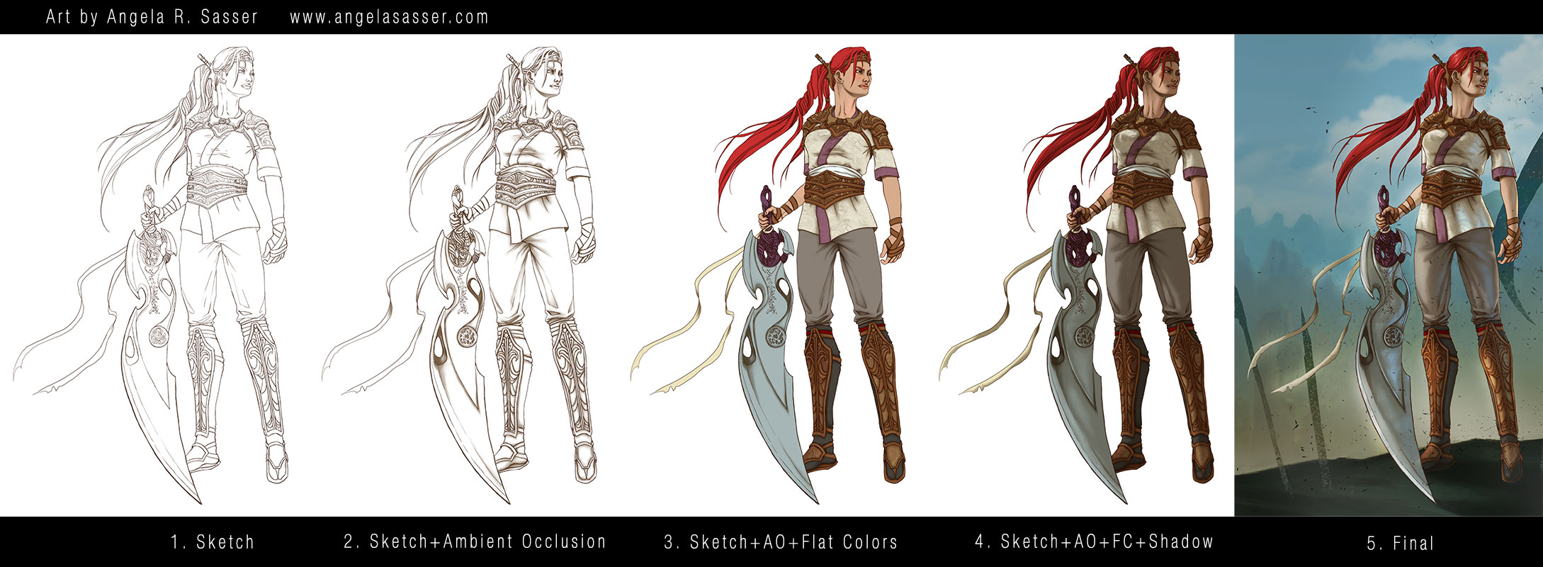
Now that Nariko’s design is figured out, it’s on to coloring!  I decided to try a new coloring technique called the Ambient Occlusion method.  This technique is a way to bring a structural quality to your images relatively quickly.  I used Alex Negrea’s tutorial and also this helpful process post from David Lojaya.

Here’s a breakdown of the main layers in my painting.

  1. Sketch – I produced a clean line art using the hard brush. This Sketch layer hovers above all of the other layers for the figure.  Notice I didn’t sketch in pure black, but a very dark brown so as to keep my image from looking too stark. I wanted subtle warmth and for the line art to look natural. The same goes for the AO layer, which is not pure black, but a dark brown. You can tweak this coloration later to suit the mood of your piece.
  2. Sketch+Ambient Occlusion – The Ambient Occlusion layer sits below the Sketch and Flat Color layers and above the Shadow layer and represents places that are hard for light to enter, the deepest, darkest shadows where light is ‘occluded’.  It is set to the blending option Multiply.
  3. Sketch+AO+Flat Colors – The Flat Colors are actually a group of layers, as I kept each color on its own layer just in case I wanted to change them later.  The entire group is set to the blending option Multiply so they show the AO layer beneath them.
  4. Sketch+AO+Flat Colors+Shadow – The Shadow layer was clipped to a standalone layer that masked out the entire figure to keep my shadows from going outside of the lines.  The Shadow layer is located below the Flat Colors group and above the AO layer.
  5. Final – In the final image notice I’ve actually masked out some of the Sketch layer so that the hard lines don’t look so unnatural (particularly in the area of the neck where lines are too harsh for the soft transitions there).  Lighting effects have also been applied here.


NOTE: My Patreon Patrons at the $5+ reward tier have exclusive access to my .psd file, so be sure to pitch in there if you’d like to peruse my layer structure!


Tools Used:

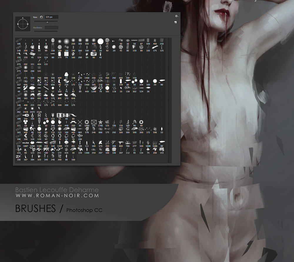
Deharme’s Brush set for Photoshop CC

Finally, here’s an animated GIF of my process (roughly 8 mb).

If you’d like to download wallpapers of the final image, I’ve provided the 1920×1080 size for free.

Also be sure to check out the article this image is featured in, What Women Want…In Women Characters for an interesting discussion of female character designs and representation.

The 1920×1080 wallpaper of this image. Download here.

Other sizes plus the .psd are available exclusively for my Patreon Patrons.

PRINTS AND PRODUCTS – Contact me privately if interested.

Back to Part 1


Sketch Diary – Nariko of Heavenly Sword – Part 1

I was challenged by an online art group I’m in to redesign a female character. This idea really appealed to me as a gamer and comic book fan, considering the amount of times as a female fan I’ve seen a character and found myself highly disappointed by the bland or over-sexualized design that detracted from the amazing female character at the core.  Some of my candidates were my heroines growing up, from She-Ra to Psylocke!

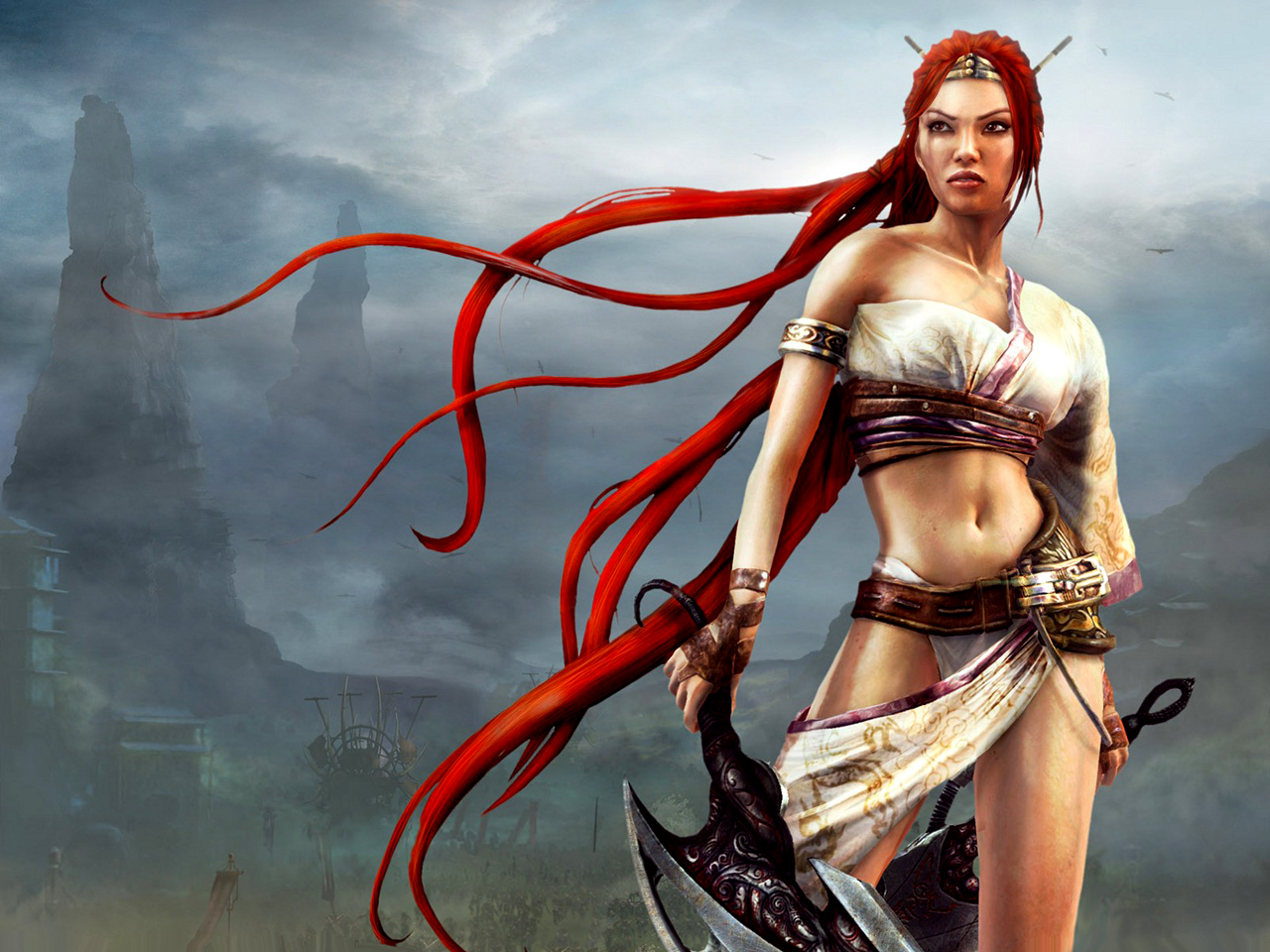
Eventually, I decided on Nariko of Heavenly Sword.  Here was a tough, driven woman who chose to sacrifice herself to an ancient sword in order to defend her people, the same people who had viewed her as a cursed outcast.

But that outfit!  I could barely take her seriously doing all of the amazing brutal fighting she does in such impractical gear, even given this was a fantasy setting.

Nariko of Heavenly Sword

And so my redesign began first with studying the designs of the other characters in the game.  A fusion of European and Asian aesthetic pervades the armor designs of Heavenly Sword.   I kept a massive private Pinterest board for this purpose.

A screenshot of part of my mood board for this painting.


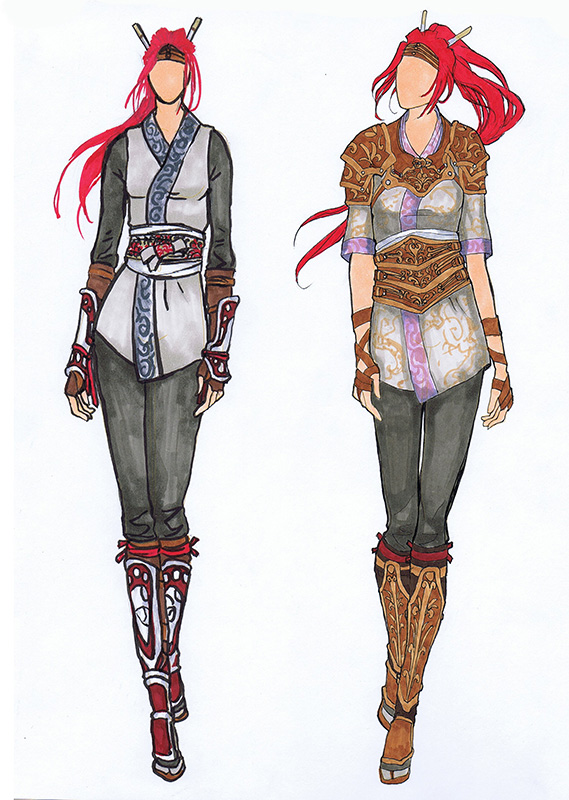
I used a pre-printed fashion croquis sketchbook to knock out some quick costumes in ink and Copic marker for Nariko’s re-design.  My thought process was to simply dress Nariko more closely in the fashion of her father, who was dressed in a kimono style top and pants covered with armor in key places.  This look seemed appropriate considering the fact it was snowing and everyone else but Nariko was dressed appropriately for the climate and for the ensuing large scale battle.

I also found it baffling that while Nariko was trained to fight that she wasn’t at least wearing basic armor, even if she were not to be on the front lines or was intended to be more of a Gladiator type of fighter.

Nariko Redesign Fashion Plates
Fashion plates for Nariko’s re-design.


I chose the design on the right because I liked the way that it was both protective, channels the Gladiator-esque look of her original design with the tooled leather, and maintains the archetypal colors and shapes we’re used to for Nariko.  The one on the left had too much crimson in it, which was too closely associated with her father and also doesn’t allow her hair to be the most red and striking part of her design, as I feel it was meant to be.

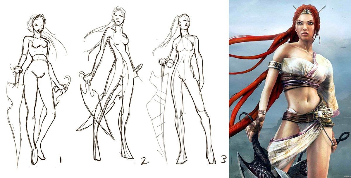
Next, I did quick gesture sketches in an attempt to capture a pose that felt heroic, but would also show off this new armor design. It was a tough decision, but I eventually settled on pose 3.

Nariko gesture sketches.

And yet, still 3 was not enough!  I needed to push the heroic nature of the pose.  She was still too straight on and seemingly staring off into the distance without much interest.  Moving the camera level downwards so that we’re looking up at Nariko gives her so much more presence!  The pose also feels more dynamic.

Nariko Gesture Sketches

I have my hero.  She has her armor.  Now, it’s time to paint!

On to Part 2

Proko’s Figure Drawing Fundamentals – Lesson 2 Homework

figure-drawing-fundamentals-blog-template

You can watch the free version of this lesson here!
However, the premium version is longer and more resources and examples are provided.

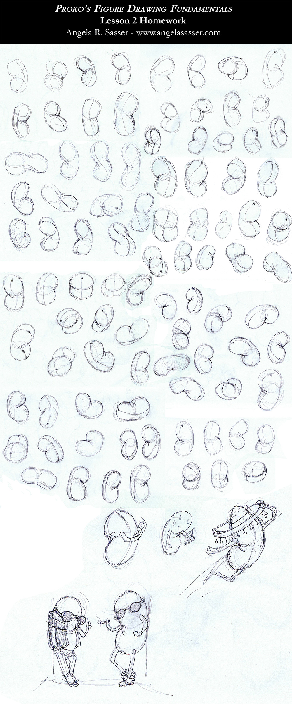
Beans, beans, BEANS!  I’m continuing my lessons with Proko’s Figure Drawing Fundamentals class with the lesson on simplifying the motion of the torso.  When I first saw this exercise, I kind of laughed to myself.  What could a bean tell us about the torso?  Wasn’t this too simple?

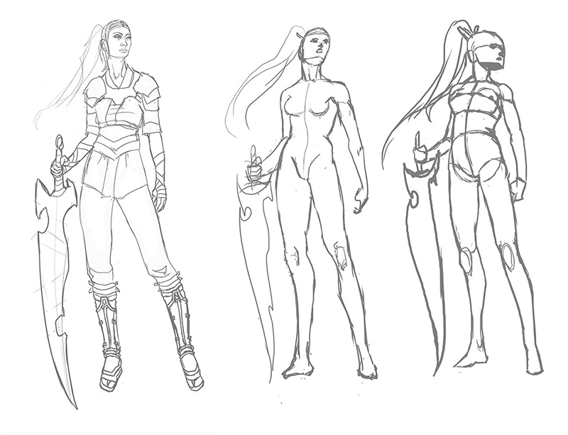
I wasn’t saying that later when I was about 70 beans in and I realized that there was so much more information being transmitted in this exercise than I realized.  When a torso bends and twists, creases and tension are expressed in various ways.  This is such a subtle lesson in physics that can really bring volume to your figure drawings!  Here’s an example with a current work-in-progress of mine.

nariko-redesign-wip-3

The first pose is very straight forward and also very stiff, while the second pose pushes the dynamism a bit more, but still seems so stiff.  I employed the ‘bean’ method in the 3rd pose to try and capture the subtle twist and lean of the torso combined with the foreshortening of the lower camera angle.  Already, the pose is looking much better and has more weight to it than the others, which didn’t quite pay respect to the physics of the torso.

And now the beans! Here’s a sketch dump of all of the ones I sketched for this lesson.  I’ve been doing the recommended 100 sketches before moving on from a lesson.

The biggest challenge for me was figuring out how the creases turn when a torso is twisting.  I have no advice on this issue except to practice and observe!  Foreshortening, torsion, and eye level play a big part in what overlaps what and I am only scratching the surface of this concept, even after drawing this many beans.

I also believe that learning something so subtle as this requires practicing and drawing, rather than reading advice about doing it.  It just kind of clicks in your brain when practicing, which is why I think in this case drawing numerous sketches like Proko recommends to be very useful (and essential)!

I’m definitely excited to move on to the Robo Bean, which is the next step up in complexity from this base form in a later lesson.

Of course, I couldn’t help having a little fun by the end of this assignment illustrating random bean puns.  A cookie for you if you can guess which ones they are!

Previous Lesson:  Gesture
Next Lesson: Structure Basics (coming Soon!)

Proko’s Figure Drawing Fundamentals – Lesson 1 Homework

pinterest-blog-preview-template

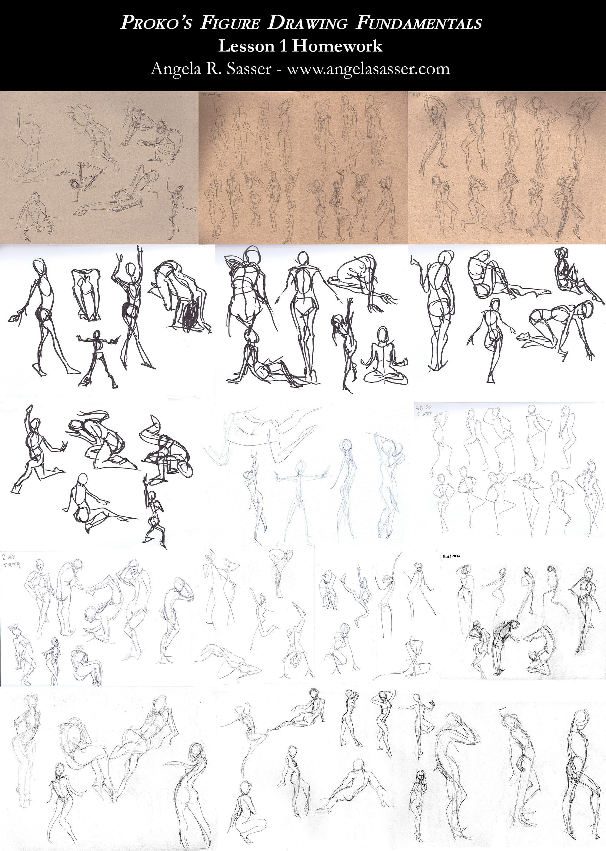
I’m taking a small break from my book club posts for Artist As Brand to share something different instead, as the next part of the AAB blog series involves some intense homework that’s taking me longer than usual.  In the meantime, enjoy a look at the gesture sketches I’ve been doing for Stan Prokopenko’s Figure Drawing Fundamentals course over the past few months! (If you missed my first impression post about this course, read on here to get an overview of what the class is about!)

The first lesson covers the topic of gesture drawing, a topic which most artists usually dismiss as quick, simple practice drawings.  I’ve realized even after taking several life drawing classes in college that my art was missing something.  I’m fairly well practiced drawing the human figure, but the people in my paintings were lacking something.  The muscles were all generally in the correct place, but my figures were stiff and lacking expressiveness.  Having observed the first lesson in Proko’s curriculum, I’m certain now that the stiffness of my figures is mainly a result of not understanding the importance of gesture.

As Proko suggested, I did 100+ sketches until I felt like I understood the difference between copying what I see and capturing the energy and flow of a pose (aka. the gesture).  This montage collects most of the sketches I did starting with the oldest ones at the top and the newest ones at the bottom. Be sure to check out slot games uk to have great time with the new high quality slot games. 

Click to enlarge the image.


What I’ve Learned

Copying a pose is not gesture.  I realize that in my previous life drawing lessons, I thought that I was supposed to copy the volume of a pose and nothing more.  Having a timer while drawing also had the opposite effect it was meant to have.  It was meant to force me to simplify, but mostly I just reacted to a timer by rushing through.  I became more concerned with replicating what I saw when I should have been focusing on the expressive line of the form, the flow of the pose, and the potential for exaggeration.  This meant that my result was an approximation of my model, which may or may not result in a good sense of flow in my drawn pose.  Being aware of gesture will also help me when utilizing reference photos for my pieces.  Copying directly from what I’ve seen in photos can also result in a stiff, soulless pose.  Being more familiar with gesture means I can know where to push and pull the pose from a reference photo.

Contour is not gesture.  I can tell from my early poses in this montage I was very concerned with the container shape and contour details of the body.  Gesture should focus on the flow and expressive potential of the figure, even if it doesn’t follow the laws of physics at all times.  Adding the proper details later on is what will tie all the parts together.   I think of comic book art as a perfect example of this principle of gesture at work.  Figures are usually pushed past what is photorealistic gesture because that brings a sense of emotion and excitement to the characters.

Scribbled gestures are not helpful.  Proko actually posted a very helpful video about why sloppy lines are a bad habit.  I am definitely guilty of this!  I notice by the end of this montage, my lines became cleaner.  When I allowed myself to be sloppy previously, I was attempting to ‘feel out’ the gesture by making lots of lines till I discovered the right one.  This made me lazy and less observant of the form and pose I was trying to replicate.  By simplifying my mark-making, I force myself to actually really look and learn from what I see, rather than diving in and rushing to finish.

I already feel like this first lesson has helped me tremendously when drawing characters and pushing the dynamism in my poses.  Even still, there’s a lot to learn, considering I’m only at the beginning!  I also understand that I’m never going to stop learning when it comes to this skill, which is at the heart of drawing good anatomy, but also in composing interesting compositions.

Stay tuned because I plan to keep track of my progress in this class in later entries!

Next Lesson: The Bean

December 2014 Artist Q&A

Hey, everybody! It’s Christmas Eve and I’m making rum cake and looking forward to a day full of friends and good food tomorrow. In the meanwhile, here are some answers to the great questions you guys dropped for me this month!

Q.  Marion Z asks: What do you feel about the importance of studying the human figure, both clothed and nude as a fundamental education for your work?

A.  It’s inevitable. Whenever we look at a work of art, we’re always searching for the recognizable pattern of a human reflected back at us.  Even if you’re focused on drawing creatures, it’s important to know how you can create a narrative around that creature and add expression that humans can relate to so that they find it interesting.  We’re vain creatures and we love to form narrative from anything we find familiar.

Short answer, learning the human form is extremely important, especially if you’re going into a field that requires convincing characters.  Failure to express emotion, even when one is technically skilled, can be the difference between a well made work of art with no soul and a somewhat capable work of art that still manages to capture the viewer.

Q. Marion Z asks: How important to you, and what do you do for the sake of it, to include archival qualities in your work?

A.  If you want your art to last for future generations to enjoy displaying in their homes, archival quality is important.  The internet and digital capture allows us to share images like never before without degradation, but the tactile quality of an archival print or original is still the standard in home and museum display.

Q.  Marion Z asks: Given the resources available, what suggestions do you have for studio lighting, to improve, develop and understand the color and detail work that is so important in your work?

A.  I’m a huge fan of Ottlite brand lights.  They are pure daylight bulbs that help when mixing colors on your palette during traditional painting, which is so important if you’re working with pieces that require a delicate color balance to really vibe well on paper (which is like every watercolor piece I do, ever).

It’s super easy for things to come out too yellow if you paint under incandescent bulbs.  If you can’t afford fancy daylight bulbs, always try to paint by sunlight.  Sidenote, sunlight/daylight is also the best for showing the best color quality for photographing originals.

Q.  Marion Z asks: For any given media, what would you suggest for the student artist to gather for a foray into that medium?

A.  I personally don’t feel tied to any media. For me, it’s all about whatever tool gets the job done!  However, you still need to learn how a medium behaves before you can know what potential it has for your tool set as an artist.  For this, I recommend just buying a cheap set of the media you’re wanting to learn and having a play with it.  Don’t concern yourself with being a master, just have some good old fashioned fun!  Not spending a lot of money on new media lets you be able to play with it in a more guilt free way.

I also recommend picking up a good source book or two to help you be more familiar with the materials you’re trying to learn about.  For instance, I’ve been considering trying out oil painting, but there are some very particular things you need to worry out when using this media (ie. toxicity, good ventilation, proper waste disposal, etc.).  I picked up The Complete Oil Painter: The Essential Reference for Beginners to Professionals so I can take the plunge into oil painting with full knowledge of what the studio setup and other challenges of the media will be.

Q.  And final question, C. L. McCollum asks: Which is the next painting you plan to start in 2015? And why that one?

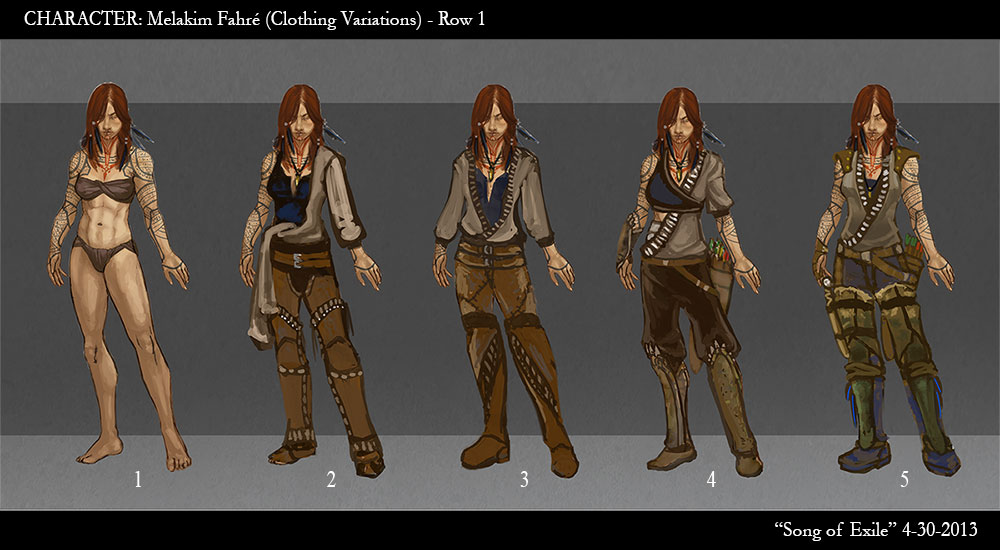
A.  I’ve been brewing on a new painting for my fantasy book cover portfolio for a long time now, but other obligations popped up keeping me from finishing it this year like I had wanted.  I’m super excited to get started on a new painting starring Melakim, one of my original characters from an original world I’ve been toying about with for years.

Melakim Wardrobe concepts

It’s going to feature all the things I love, a badass Hunter lady, lots of corvids, and a possible mix of traditional and digital a la Wylie Beckert’s graphite method that I’ve been dying to experiment with.

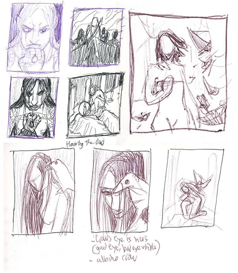
Needless to say, I am excited about this next piece!  I can’t wait for 2015!  Till then, have some thumbnails for this upcoming piece to tide you all over:

Melakim Cover sneak peek.
Tattoos? Corvids? Badass Ladies? Oh my!

Have a great holiday, everyone!  See you in 2015!