Category: Uncategorized
 Unlock with Patreon
SKETCH DIARY: Lady of July Part 4
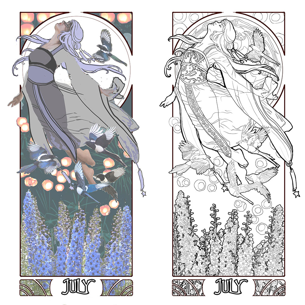
Here we are at the final stretch before I transfer this painting to paper! This part seems as easy as coloring in the major forms to look pretty, but I assure you it isn’t, or at least it’s never that easy for me! I agonized with how to make these colors harmonize while still featuring the July birthstone of Ruby as a central theme.
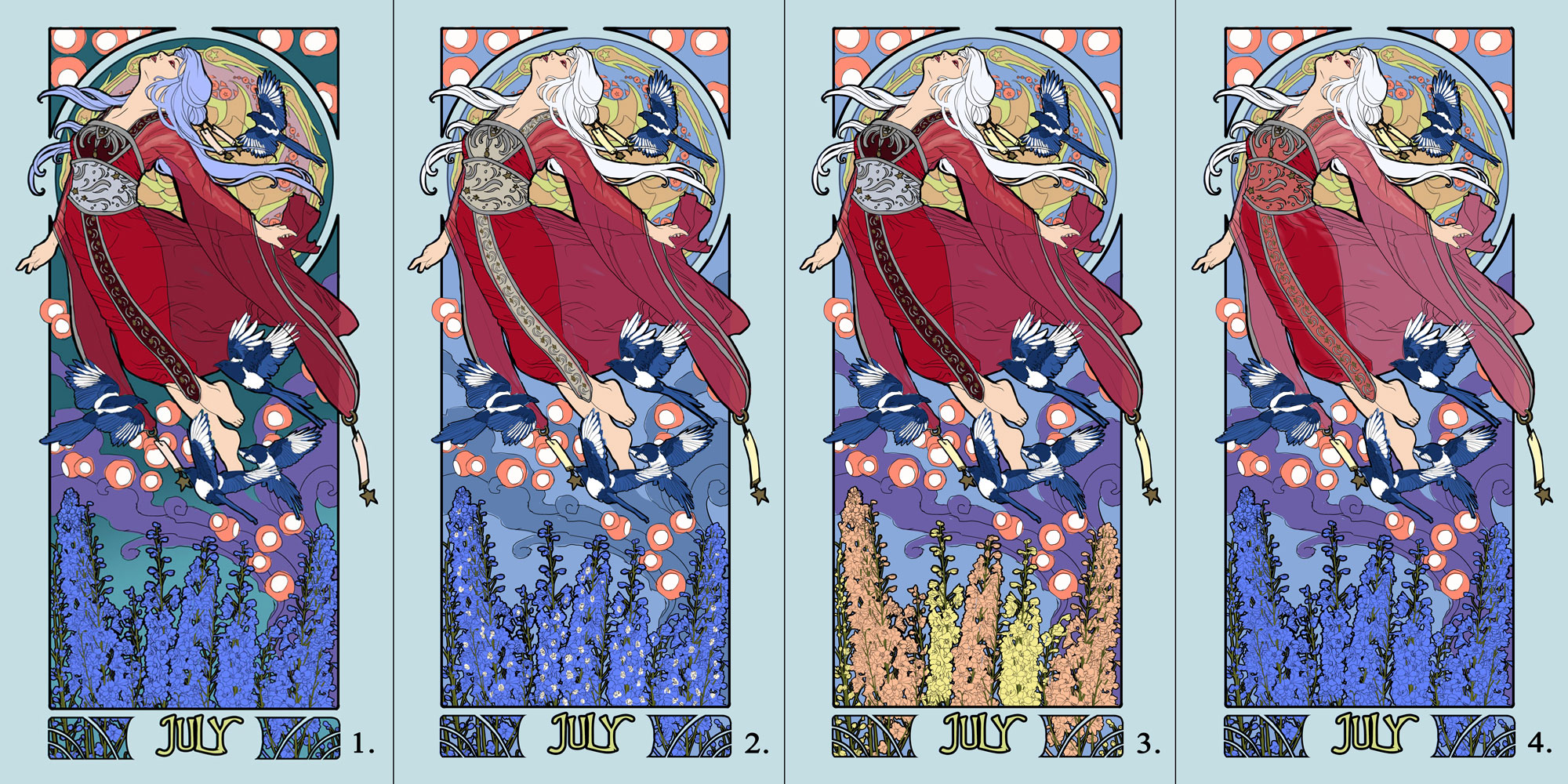
Number 1 was my first instinct for color. The teal of the background really pops the ruby red of the Lady. However, with purple, blue, and orange mixed in, there were too many primary colors that were fighting for dominance. Not to mention the overall scheme was too dark, causing the Lady to be lost in dark values.
Lightening up the background in the next iterations helped to keep the magpies from being lost in the darkness. Number 3 was interesting, but the orange flowers just draw too much attention away from the Lady and make the image feel too busy, since they start to harmonize more with the lanterns as a visual element. I like the lighter orange in the trim and sheer cloth. Number 2 is my favorite out of these for bringing visual interest back into the flowers, while still keeping them relatively subtle. The lighter trim also draws the eye down through the figure, accentuating the curving flow of the hair as well.
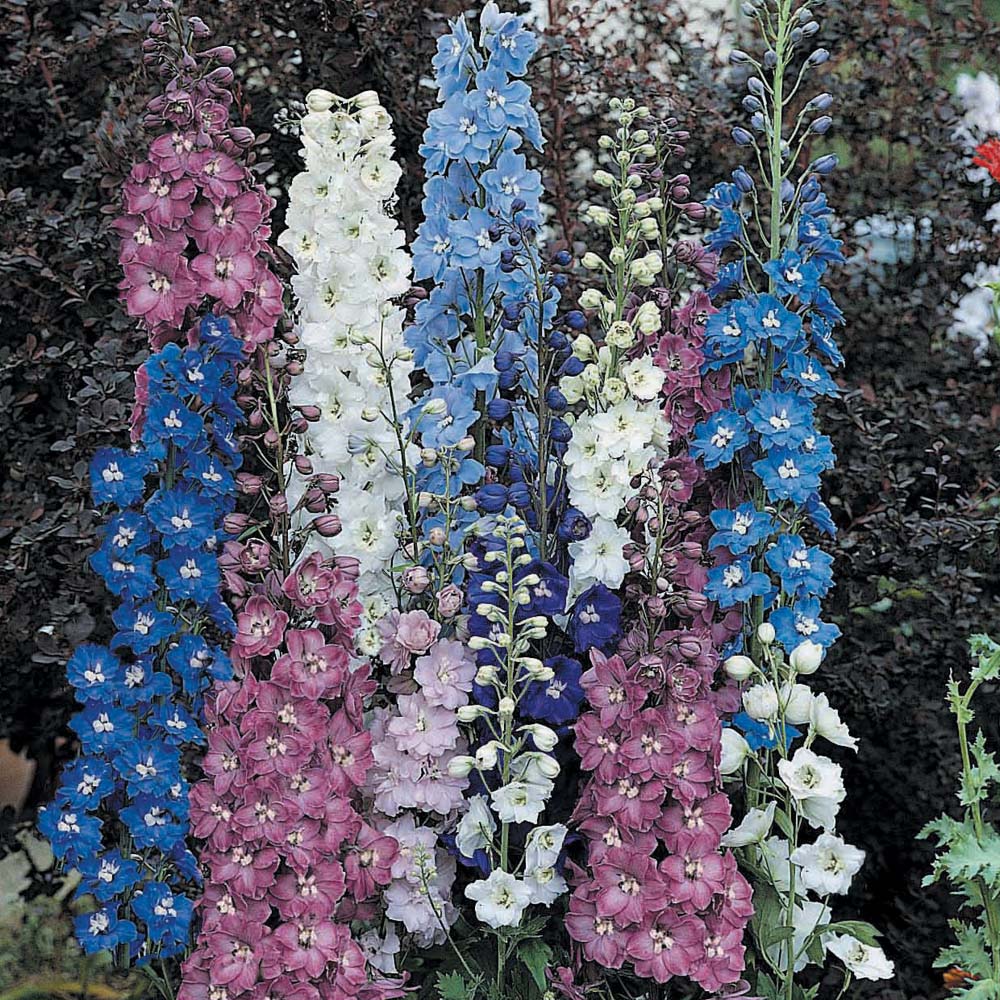
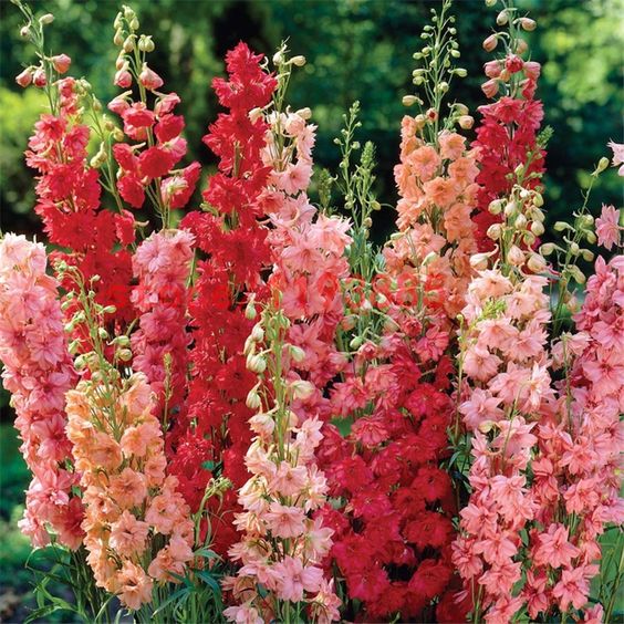
Ah how difficult this was! I just have to share what amazing variations I’ve found in the Larkspur (Delphinium) plant so you can see why my muse went in a hundred different directions. That being said, I can’t wait to see what people will do with the coloring pages for this Lady!
And now it’s time to FINALLY start transferring the line art to paper and start inking this Lady! Stay tuned to my social media outlets for little inking videos and such. This next part goes fast, thanks to all the prep, so hopefully she’ll be done very, very soon! Stay tuned!
If you’d like to pre-order a print of this Lady, check out my Reward tiers on Patreon that will let you get a simple open edition print OR a super swanky limited edition gold leafed print!
This has been your Patreon-only sneak peek.
Thanks so much for your support!
SKETCH DIARY: Lady of July Part 3
After I figured out my source inspiration for Lady of July in the Qixi and Tanabata festivals, she came together rather quickly! I had the perfect pose in mind to depict her free flying nature thanks to this lovely pose by dazzle-stock on DeviantART, which served as a base.
I arranged my elements, keeping in mind I wanted a simple background of a night sky to push the brightness of the lanterns and also to keep the image from being too busy since the main figure and elements were already very detailed. I changed the pose by adding her far arm and refining the arc of the body with a different pose for the legs. This gave her a stronger upwards arc and sense of direction.
Next, I moved on to the window design, which proved more challenging than I expected! The figure covers a good deal of the window, which meant the main decorative elements needed to be on the outer edge of the window. The window also needed to have larger shapes in it so that it didn’t overwhelm the complexity of the main elements, which was a challenge with the detailed nature of Larkspur!
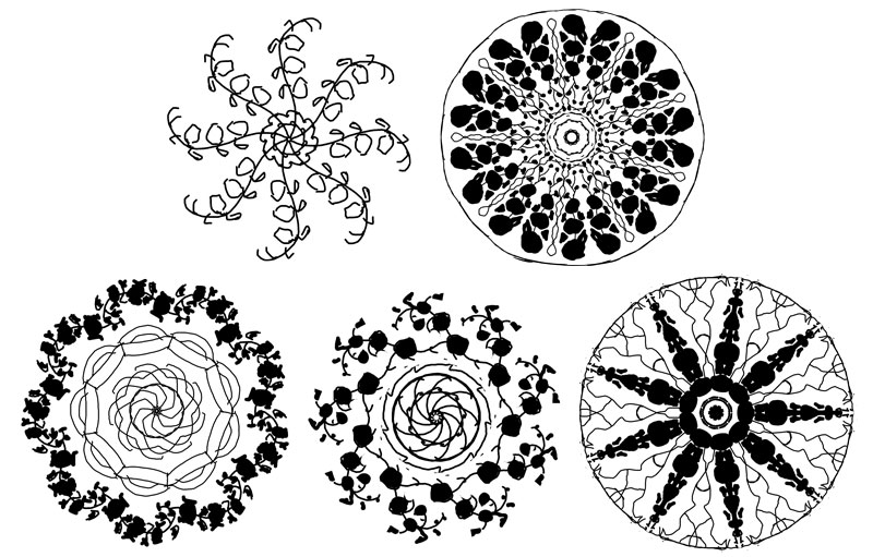
I went through a few variations before I found something that felt right! These all felt a little too generic, with just the Larkspur and the lines. The 3rd design with the tiling started to put me on the right track with an Asian-inspired tile feel. I eventually settled on a final design inspired by the undulating star explosion caused by fireworks, which fit the themes of July so well! The Larkspur became much more simplified as tendrils of abstract elements emulating the ‘arms’ of a firework’s shape.

With all of my line art figured out, it’s time to enter the final phase of prep where I figure out the colors and finally transfer this painting to paper!
This has been your Patreon-only sneak peek.
Thanks so much for your support!
SKETCH DIARY: Lady of July Part 2
Now that I have a general gist of the pose and layout I want from my thumbnail sketches, I move on to creating the fashions for Lady of July. Thinking on the romantic origins of Tanabata and Qixi, I found myself drawn to the graceful flow of ancient Chinese Hanfu dresses. This style of clothing creates a fantastical element with its highly decorative representations in historical fantasy movies and costumery. I also knew from the beginning I wanted to incorporate the star themes in the wish talismans of Tanabata.
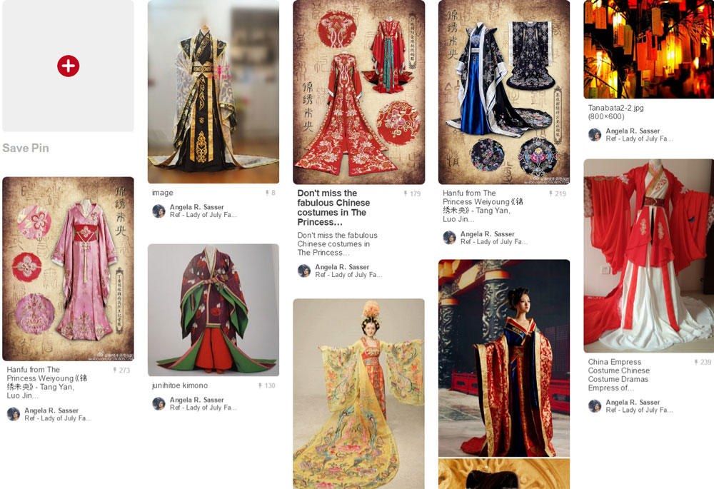
The Hanfu style also shares many characteristics with Japanese kimono, which helped me to push Lady of July’s fashion into a more fantastical realm, as I don’t want her to represent any specific period or culture. Using my trusty croquis sketchbook, I worked up a couple of variations in gray marker.
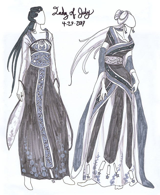 In doing these variations, I wanted an outfit that would flow with her figure and also be light and airy, which makes the gauzy sleeves of the outfit on the left more fitting.
The 2nd variation on the right explored a more layered, regal feel utilizing more of the talismans in the design. I like this look quite a lot, though it feels too heavy and restrictive for this free flying Lady!
If you look closely in the trim and sashes, I went with the decorative theme of shooting stars, again in homage to the Star festival and her kinship with the sky. I’ve also worked in her Larkspur birth flower as a decorative element in the print of her skirt and sleeves.
In the end, I suspect I’ll be utilizing an outfit which relies mainly on elements of the design on the left, but with the star talismans and pale hair of the design on the right.
I realized in laying in basic values with the greys that I liked the idea of her hair being an unearthly white, as the final figure will be against a night sky. This would help the figure stand out from the sky, as well as give her a supernatural presence as if she is the embodiment of a star.
I realize the further I go along with this series, the more fantastical these Ladies are becoming. Not necessarily a bad thing!
Which outfits do you like? What do you think of the fantastical direction I might be going with this one? Let me know in comments! Next up, I’ll be working on the composition and window designs. Stay tuned!
This has been your Patreon-only sneak peek.
Thanks so much for your support!
DESIGN DIARY: Ladies of the Months Logo
As most of you know, I’ve been neck deep in the Ladies of the Months series for the past couple of years! I’m over halfway done with the whole set of 12 paintings (and matching masks). It’s high time I created a logo for this project! Having a logo would provide the perfect professional touch to my branding! I could use a sticker for envelopes, a symbol for a letterhead, or a stamp on wrapping. Imagine the possibilities!
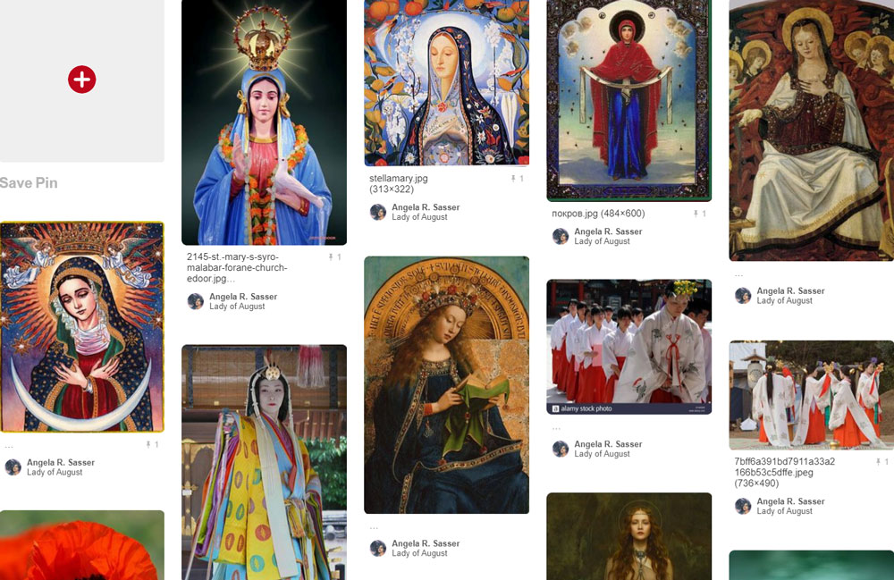
As ever, Pinterest was the first place I turned to for brainstorming!
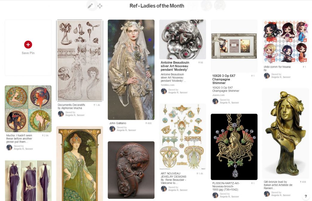
I actually began design work for this series when I first started the project, but the process has been difficult for me. I don’t have much practice designing with text. I’m also my worst client! I wasn’t sure exactly what I wanted, but I knew what I didn’t want, which was every design I seemed to come up with. I started with random doodling with some common Art Nouveau shapes to get the creative juices flowing. The biggest problem with many of these designs is that they were too detailed to be clear and legible logos. I wanted to include 12 circles to represent the birthstones, but this seemed to be asking too much!
![]()
![]() Next, I did even more sketches using an ideation exercise I learned from Greg Spalenka’s Artist As Brand book. He suggested brainstorming for logos by using keywords from your brand and creating pictographs for the words. Then, you could use the pictographs as starting shapes. I went with the words ‘time’ and ‘beauty’ and came up with some interesting shapes that pervaded the logo ideas from this point onwards.
Next, I did even more sketches using an ideation exercise I learned from Greg Spalenka’s Artist As Brand book. He suggested brainstorming for logos by using keywords from your brand and creating pictographs for the words. Then, you could use the pictographs as starting shapes. I went with the words ‘time’ and ‘beauty’ and came up with some interesting shapes that pervaded the logo ideas from this point onwards.
None of the logos from the pictograph sheet really worked either. They were still too complex or just didn’t capture the themes in an appealing way. I was getting closer to what I wanted, however!
My design-minded friend, Sam Hogg, also took a bash at the Ladies logo, which helped me get more ideas of how to incorporate text as well as design, something I honestly hadn’t been thinking about! Again, I found myself more attracted to the self-contained logos, like the one on the bottom left of Sam’s sheet. I can’t express how important and helpful it was at this point that I had someone to bounce ideas off of! Having feedback helped me get outside of my own head and limitations
![]()
As serendipity would have it, I received my copy of Mucha’s Le Pater during this process, which inspired the moon-shaped container form in the next sheet. Next, I researched countless references of Art Nouveau jewelry and cameos to see how Art Nouveau masters of the past utilized the shape of a woman’s head with a decorative backdrop. I liked the container shape of a circle, but also the asymmetry the flowing hair creates, especially in number 4.
![]()
At this point, I left the design for awhile. The ideas needed to gestate! When I finally returned to my favorite idea on the last sheet, I decided to use it as another starting point, exploring the idea of bringing the mask back into the design, since the masks are also part of the series. I also saw this sketch from Mucha’s Documents Decoratifs that triggered my ‘eureka’ moment. I finally knew what I wanted!
I eventually ditched the mask in favor of simplification, as it is the flowers and the Lady who are still the most central themes of this series. The middle logo in the bottom row is the one I’ve chosen to finalize, as it combines the appeal of the asymmetrical flowing hair with the container shape of the circle. It hits all my sweet spots and manages to include flowers that aren’t overbearing!
![]()
I hope you’ve enjoyed your Patreon-only sneak peek at this historic milestone in the Ladies of the Months’ development.
Stay tuned for the final logo reveal!
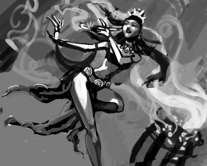
Sketch Diary: Dreaming Butterfly v2
Concept and Inspiration
 |
| A detail of Dreaming Butterfly. |
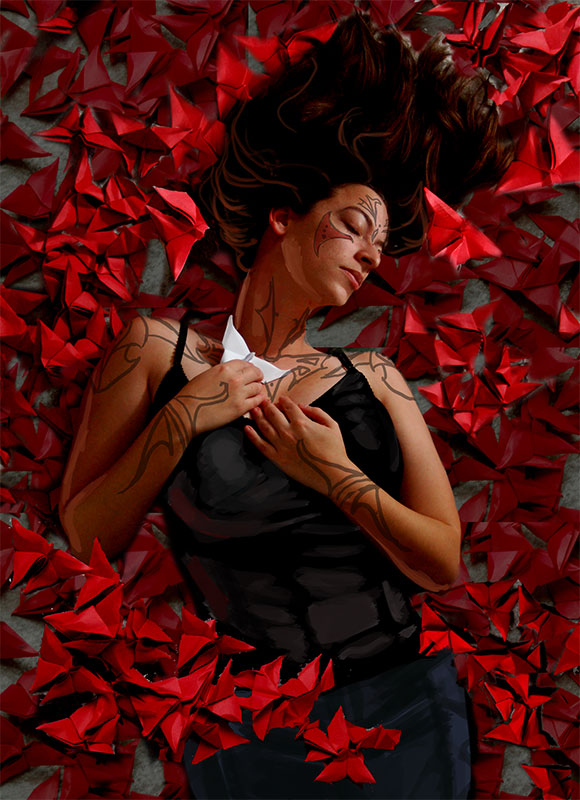
I’m currently working on a painting I hope to include in my portfolio which is a redo of one of my most popular (and personal favorite) pieces entitled Dreaming Butterfly. The character in this piece is Aurora, my old Shadowrun character who was the first character I really got attached to during my dice-rolling days.
She is like my own Pepper, for those of you who know Artgerm over at DA. I’m always using Aury to experiment with new art styles, random fashions, and whatever comes to mind. While she may disappear from my gallery at times, I always come crawling back to her when my muse is in search of inspiration. Ironically, she almost always comes out looking peaceful and surrounded by symbolic butterflies when she’s actually an ill-temper, foul-mouthed, speed ganger Yakuza Elf, but I digress.
I admit to having ulterior motives for composing this piece, namely so I have something new to submit to DeviantART’s Draw it Again contest due on the 30th of this month and for The Rising Stars competition IFX and Corel are running (due next month). Yup, that’s right! I double-dip my chips!
Thumbnailing
I came up with just four thumbnails for this because I felt I had nailed my concept in the very first one, which was the closest to the original piece. I still like the 2nd one a lot, which may become another painting in the future. I’m trying a new method of thumbnailing on kraft paper so that the brown of the paper acts as a midtone, with ink and white color pencil acting as my shadow and highlights. That way, I am not using white paper to start off with, which sometimes confuses my sense of value and tone.

Gathering Reference
I’ve taken Dan Dos Santos and Justin Gerard‘s advice from Dragon*Con to heart when it comes to shooting my own reference photos. The theory is that if you merely use a publicly available stock photo, you’re inviting the chance that another artist will have used the same stock photo to compose a very similar image. It’s true that I can almost instantly recognize mjranum-stock‘s photos as soon as I see them.
So in the interest of being unique, I lit and photographed my own reference photos, totaling at around 100 I had to sift through for the perfect shot. This involved folding 47 red origami butterflies as well as roping a family member into helping out or using the self-timer while I got up and down and up and down to line up the camera and then rush back to lay on the ground before the timer went off. The results speak for themselves:

(I plan to post the ‘rejects’ from this photo shoot for public use up at my stock art account, so keep an eye on that gallery!)
Preparatory Painting
I ended up using the top right pose, rotating it 90 degrees then tweaking the neck so there was more of a flowing S-curve through the body and composition. I also replicated the butterflies in the background to make it seem as if she’s laying in a bed of red butterflies (no relation to that scene from American Beauty!)
Now, I’m hopeful I can just blast through the painting phase without having to alter my composition and anatomy on the fly so much, which I’ve been prone to do in the past. I’ve figured out these complicated aspects in the planning phase first, which is a new habit for me. I suspect my biggest challenges from here on out will be making this look less like a photomanip and more like my own painting, as I am doing this digitally.
If I can get a screen capture app working, I may be hopping on my Livestream channel while I paint, we’ll see! If so, I’ll be making such announcements on my DeviantART, Facebook, and Twitter streams.
Finally, keep up at this painting’s WIPnation thread to see a step-by-step comparison of each phase of this image and give redlines and crits. I highly recommend participating at this website, as it’s a great resource for critique, as well as a good archive of your own workflow for your own educational purposes.
Sketch Diary: The Lotus Dancer
In the last entry I talked about how I’m working on a portfolio to target playing card and RPG book art industries. Much to my joy, I’ve found that my own set of original characters and stories lend themselves quite well to this kind of subject matter. I have been longing for ages to get back to writing about my own characters, but writing has always taken a back seat to improving my art.
Now, it seems I can finally combine these passions by exploring these characters visually for character-driven art for my portfolio, starting with card art. What is card art? The best examples I can think of are the lovely works created for Magic the Gathering and World of Warcraft playing card games. Many of these card games include the kinds of things I love to draw and are a great entry level field for me to start in. Competition is high, but there are plenty of game companies out there and we all have to start somewhere, don’t we?
Card art entails working on images with character and narrative driven compositions. Studying the World Of Warcraft: The Art Of The Trading Card Game Vol. 1 provided me with fantastic insight into the quality of art I can expect to match and the usual mode of presentation for characters and settings within the card format. Most cards involve a single character with compositions that emphasize easily identifiable shapes and movement, since a card is meant to be printed at a smaller size. I was pleasantly surprised as well at the amount of traditional art included in this collection. Most would have you believe trad art is dead, as far as illustration goes, but this gave me a glimmer of hope (despite the fact I still intend to work more digitally now for my own benefit).
To get started with my first mock art card, I began by writing myself a brief of the character concept so I have more specific direction. A lot of my own original characters and worlds are still not quite fleshed out, so this forces me to solidify a few concepts so that they more easily translate into a visual mode.
CARD BRIEF – The Lotus Dancer
“A desert oasis kingdom setting. Lotus Dancers specialize in ‘captive’ audiences high on the smoke of lotus, their costumes reflecting this connection to the flower. They use the altered states of their onlookers to create a dreamlike atomsphere with twisting smoke, twirling scarves, and flowing hair. They move as if they were casting a spell on their onlookers. The bells on their costume create accompanying music as they dance.
If one has the money, they might even be able to afford a ‘private’ audience. Their nack for getting close to incapacitated political figures at gatherings has proven a perfect cover for assassins in the past.”
The Doodle Sheet
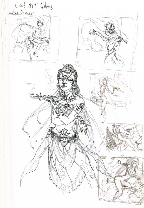
I always start with one of these as a ‘getting to know you‘ exercise. Typically done without reference so that I can channel the mental image without any visual biases. Also done in pen so I won’t obsess too much about making the doodle too detailed. This is where I rough out basic ideas for compositions.
The last few thumbnails towards the bottom of the sheet show how I’ve tilted the perspective for a more interesting skew, as if we were one of the entranced onlookers. It also made it easier to fit in more of the dancer’s body in motion, which just wasn’t fitting in the card format otherwise.
The Reference Sheet
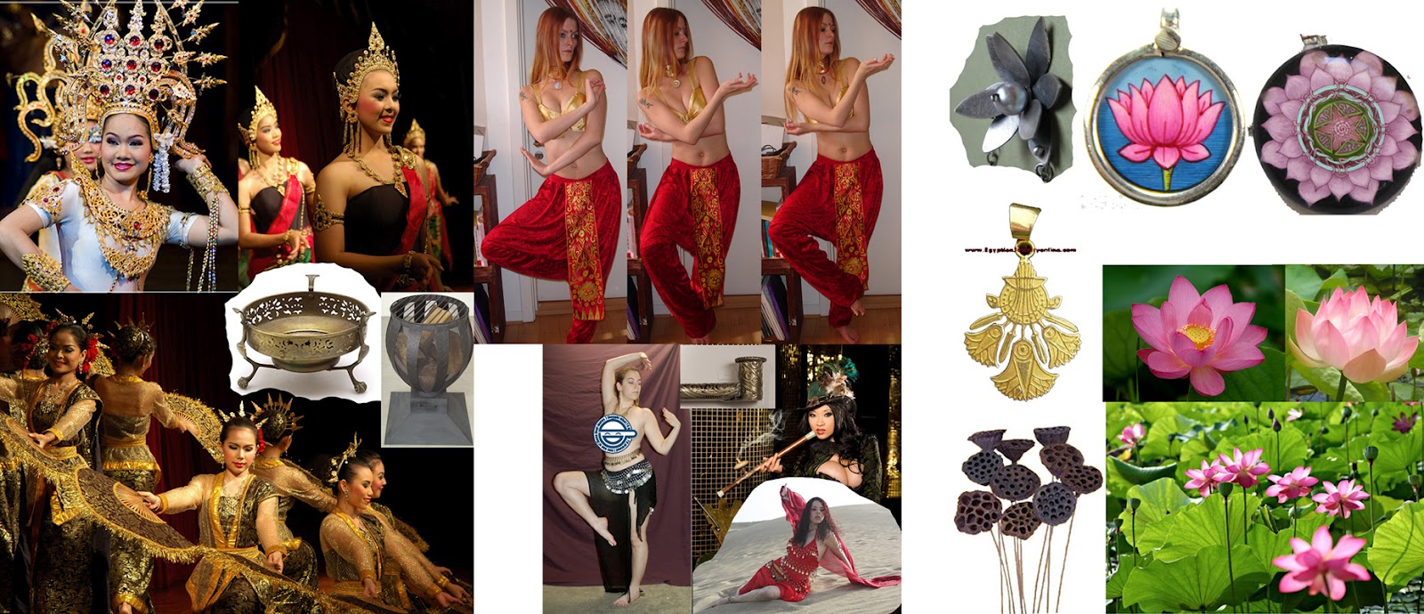
I also gather references from my own stock art poses and all over the net, baring in mind that lotuses have been translated into many visual forms, from more naturalistic to the abstract lotuses we see in Egyptian art. A big challenge will be to make her setting read as a fantasy setting and not too heavily inspired by one culture or another. These references will all play a big part of the detail in her costume and decor of the background hall she’s dancing in.
The last thumbnail on the bottom right of the doodle sheet won out for the delightful curve of the dancer’s body through the composition. I took the scan of the thumb into Photoshop, which leads us to…
The Tonal Study
I’m trying something different and working in grayscale to establish tones first. This should, in theory, help me to more efficiently come up with a composition with strong tonal focus that will be effective for the card art size. I ended up tweaking the arm from the thumbnail so that it leads the eye through the page more without closing off the figure, where I would like to show more costume detail.
I’m also trying to overcome my propensity for work with low contrast and minimal settings as well as my habit to work in far too many layers digitally so that I take far too long tweaking every detail. I’m making a concerted effort to be fearless and paint all on one (or two) layers! One for figure, one for background. Possibly anther for tattoos and costume. Having too many layers has resulted in huge files that slow down my computer so I must find a way to solve this workflow problem.
Next: The Gritty Details
See this image’s thread over at WipNation.com for step-by-step process shots
See this image’s thread over at WipNation.com for step-by-step process shots
Introducing a New Co-op Blog for Artist Improvement!
Hey, everyone! I’ve been a busy bee over here prepping for the summer con season and really trying to get serious about pursuing my career goals. Blogging has been really helpful for me in this respect. Running my own journal helps me remember how far I’ve come and encourages me to keep creating new work to share with everyone. I adore reading other art blogs like Muddy Colors and The ArtOrder, where so many talents meet and share their knowledge in blog posts. I always wanted to be a part of a co-op blog like these, but I had no idea how to get involved in one, so I started my own!
I don’t have a lot of time to post at another blog, as I know other artists don’t either, and that is why this blog is pretty stress free! The idea came to me when I noticed so many friends of mine posting art ‘to do’ lists online sharing the art exercises and themes they wanted to do to improve their work.
So I thought to myself, why not run a blog where we do these progressive exercises together? Here is the intro to my new co-op blog entitled Artist Ambition.

My name is Angela and I am a fantasy Artist and founder of this blog. I already have an art blog of my own, but this one is different. I want Artist Ambition to be a joint effort for multiple artists to continuously improve their art, to share the progression of their skills, and to nurture that passion to push themselves as artists.
The journey of the artist can be a long and lonely one while we are striving to improve. It’s easy to get demotivated and talk about improving your skills, but to never do what needs to be done. Now, with other artists watching, we are accountable for our own actions, we can encourage each other, and we can succeed!
To find out more about how you can participate, read on at the blog’s FAQ.
I can have up to 100 participating artists, so right now, we are pretty open to new people! There is no time requirement, other than that you should try to participate at least once a month by posting an exercise for others to do OR trying out an exercise yourself. Once I reach 100 artists, I’ll start culling people who are inactive, but that will probably take us awhile.
Now, here’s to our success!
Movie Spotlight: Re-cycle
I was going to write an entry on Inception, what with all the buzz it’s been causing lately. But by saying that I didn’t really enjoy it all that much, I probably would be going against the grain of popular opinion. No I didn’t necessarily enjoy Inception, though I did find it at least halfway intelligent and thought-provoking unlike the majority of movies that came out over the summer season.
I went in expecting wild dreamscapes and an emotional thriller and I came out with the same kind of unsatisfied “eh” as I did after Shutter Island. It was good, but it could have been better. It could have been pushed more. More characterization, more world-building, just…more. It fell flat in a few places for me (I’ll probably go into this in a later entry after I’ve had a chance to re-watch it and sort out my feelings in regards to this movie).
The main reason I didn’t enjoy Inception lies in my own expectations for a dream world. I wanted a taste of the wild side! For a movie that explored the depths of subconscious wastelands, it was particularly drab and mundane. However, a dreamer can come to accept many strange things in a dream without necessarily finding it absurd. The excuse in Inception was that absurdities would make a dream unstable so that a dreamer knew they were dreaming.
Sure, there’s a city street that bends in half in the movie, but this wasn’t weird enough for me. After all, I’ve dreamed of zombie brides and melting houses and completely accepted those scenarios as ‘real’ at the time I was dreaming them. Obviously, my tastes are a little more on the surreal side!
With those surreal tastes in mind, I’d like to put the spotlight on the little gem of an Asian film called Re-cycle (which inspired said dream of undead brides and melting houses) from the renowned Pang Brothers. For those who crave the dreamlands of the strange and unusual, I invite you to consider the story of Ting-yin, a young novelist struggling to come up with a followup to her best-selling trilogy of romance novels. After erasing her failed draft, she begins to see strange, unexplainable things.
The untold novel begins to seep into her world, where she finds herself haunted by her own character, who is horribly malformed because she was never given shape by her creator. Pulled into an unstable dreamland built on the bones of forgotten things, Ting-yin must confront one strange vision after another to find her way out.
From heaps of lost toys to caves of fetuses, this movie only gets stranger by the moment. By the time you get to the forest of forgotten suicides, you’ll feel like you’re in Dante’s Inferno, surmounting circles of sinners to find a way through Hell.
I’m not generally squeamish or affected by movies of this sort, but something in the layered concoction of surreal happenings in this film really stuck with me. So much so that I had the doozie of a dream that inspired my old painting, Risen. (more description about that dream at the link). Re-cycle may make no sense when you describe the plot, but it’s the journey through a world rife with pure imagery that really makes it fascinating to me.
So if you have a hankering for the strange and unusual dreamscapes, give Re-cycle a look! It’s available for instant play via Netflix and has been released on DVD. While Inception has its place as a smart psychological thriller with surreal influences, Re-cycle and The Cell will always be the ultimate surreal dreamscape movies for me.
Guest Post – World-Building: Animal Lore
My series of guest posts continues at Eventide Unmasked. Join my latest discussion on animal lore. What is it? How can you implement it into your stories effectively? Tips, tricks, and examples at the link!
World-Building – Animal Lore
Hello all! Angela here again for a Wacky Wednesday guest post. Hayley’s been talking a lot lately about world-building so I thought I’d chime in with a particular niche in the world-building skillset – animal lore.
What is animal lore?
Animal lore differs from generic mythology for the fact that it specifically involves creatures which are a part of the natural or supernatural order of things in any given story’s setting. Some real world examples include Hayley’s infamous black dog, bringer of ill portent, the European and Asian dragons, unicorns, and all manner of beasts we can conjure up with a quick jaunt through our childhood memories.
Animals often convey the mythical beginnings of our universe, shedding light on mysteries that inform a culture’s mystical practices and even methods of dress. The raven who created the world, the spider whose web brings life, or the coyote who stole the secret of fire. A culture rich in animal lore also suggests a culture close to nature, magic, and the mysteries of the world. Most cultures with deep ties to Animalism are less inclined towards industrialization and generally less reliant on science and technology (a situation ripe for tension and change, if you’re looking for inspiration prompts!).
(Read on at the full blog post)