Category: tutorials

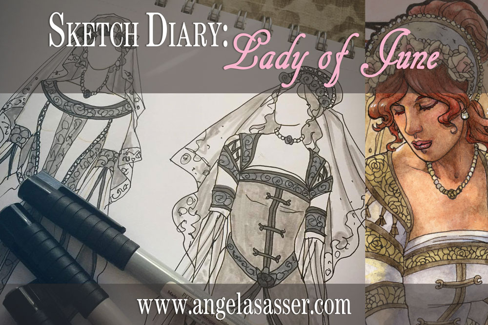
SKETCH DIARY: Lady of June

My journey continues this month with Lady of June!  Lady of November represented a milestone of high quality and attention to detail in this series that was hard to beat!  How could I make the rest of the Ladies as good as November?  That was the difficult challenge I set for myself as I moved on to this month and ventured into the first of the Ladies of summertime!

After the dark whimsy of Lady of November, we’ve returned to the Ladies of Summer!  Admittedly, this Lady has been a challenge thus far.  While November had a lot of amazing imagery to play with, June is more of a subtle time of year.  Its celebration of youthfulness and young brides reminds of May’s themes, with one of the only unique events being the Summer Solstice.  I’ve been struggling to find Lady of June’s unique visual story to make her different enough from the other Ladies, but that’s what research is all about!

MOOD BOARD

One of the most prominent themes I found while researching the Summer Solstice via Pinterest image gathering was the celebration of Litha and the Sun Wheel.  The Solstice celebrates the reigning power of the Sun.  The Sun Wheel was an old tradition where a representation of the sun was set aflame and rolled down a hill to symbolize its shifting phases.  As soon as I saw the Wheel, I knew it’d be the perfect inspiration for the mandala window!

RESEARCH NOTES

Research for the Ladies always begins with the origin of the month’s name.  In this case, June was named for Juno, the goddess of marriage and well-being of women.  She was also wife to Jupiter/Zeus.  I look across different cultures and see what about this time of year strikes a chord with humanity.  June in the northern hemisphere is a high point of Summer, a time of divination, and a powerful phase of feminine power.

Writing notes helps me to search out the imagery and symbolism I want to include in this Lady’s painting.  I think of flowers, plants, and brides.  The symbol of the well as a tool of divination also struck a chord with me, which is why it shows up so much in my thumbnail sketches.


 THUMBNAIL SKETCHES

Many of these thumbnails explore using water in a well or pond as a divination tool.  2 and 4 feel a little close to Lady of March, with 4 feeling a bit more like a representation of Vanity.  3 captures a more traditional bridal theme, while 1, 5, 6, and 7 seem to capture that theme of a bride searching for her love in the reflection for a more unified theme.  In the end, my favorites are 1, 5, and 6, with 5 and 6 having the clearest shapes and classical feel.

Character Posing

Read more

Sketch Diary – Winter Offering

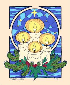
Inspiration: Every year I do a painting to spread the cheer of the winter holidays to my fans, friends, and family.  Keeping in that tradition, I created this piece entitled “Winter Offering” for 2015.

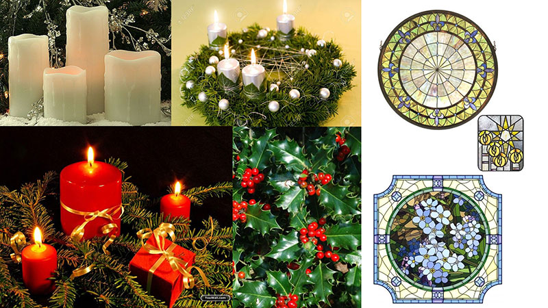
I wanted to capture the quiet warmth of candles, which are one of my favorite decorative elements of the season, and pay homage to some of the Celtic traditions that define the holidays with the presence of evergreen holly and pine.  I also wanted a celestial theme for the window to represent the dark, cold winter nights which the light guides us through.

Tools and Techniques

For this painting, I used Photoshop CC and a Wacom Cintiq 21UX.

References

ref-winter-offering

A selection from my references. 

Art Process

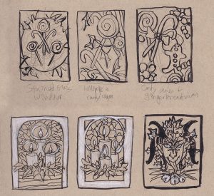
Step 1 – Thumbnail sketching with ink and white color pencil on toned paper to find the right idea. At first, I wanted to do a candy theme, but the candles struck me with their simplicity and elegance. The Krampus one was also a fun contender, but I decided to save him for another time.

wip-candles-thumbnails 

Step 2 –  Reference gathering! I looked at many Tiffany glass windows, wreaths, and white candles for inspiration.  I keep a secret reference board for my yearly holiday images on Pinterest.

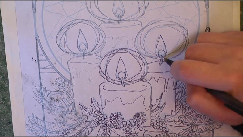
Step 3 – I did a rough sketch in Photoshop keeping loose and quick.  The sketch was then printed out and refined with pencil sketching on top of the lightly printed line work.

christmas-2015

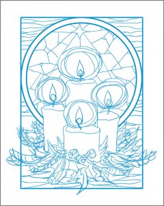
Step 4 – This refined sketch was then scanned in and the lines turned blue so they could be easily transferred.  I also used the same refined sketch to do a digital color test so I had an idea of my colors before I put paint on paper.

winter-offering-color-test

Step 5 – The refined sketch with blue line work was then printed and transferred with graphite dust applied to the back of the printout.

transfer-process

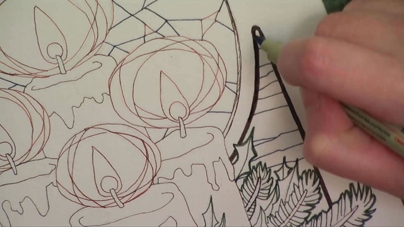
Step 6 – The transferred line work on the illustration board were inked with various colors of mechanical pens for visual contrast and interest.

colored-ink

Step 7 – The ink drawing was finished with watercolor paints.

You can also watch the 5 minute time lapse video of how I created this painting here!

For more in-depth instruction on how I created this image, including the brands of materials I used, tips on creating a stained glass style in watercolor, etc., pledge to any $10 and up level on my Patreon to gain access to the narrated video tutorial!

You can also buy the individual tutorial separately at my Gumroad shop, but you won’t receive the other extras you would by purchasing via Patreon.

Sketch Diary – Monster Girl Spider

Inspiration

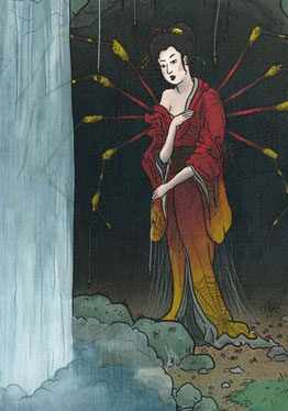
Jorogumo Illustration by Matthew Meyer
Jorōgumo Illustration by Matthew Meyer

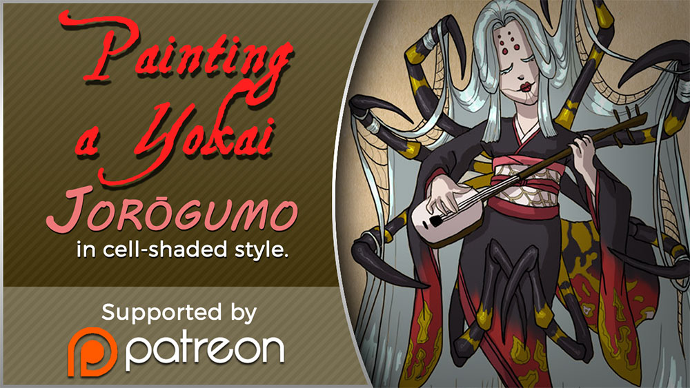
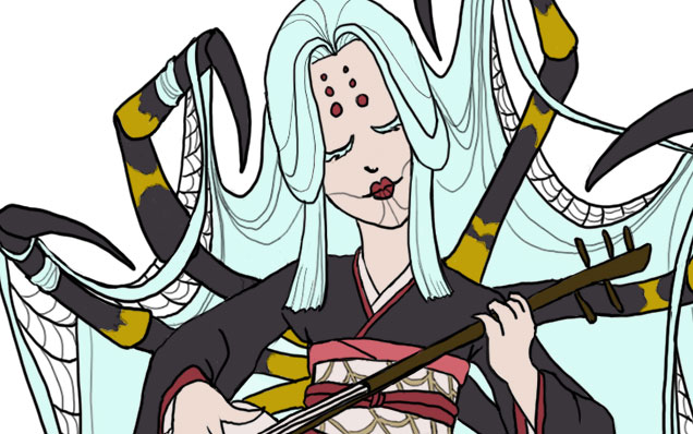
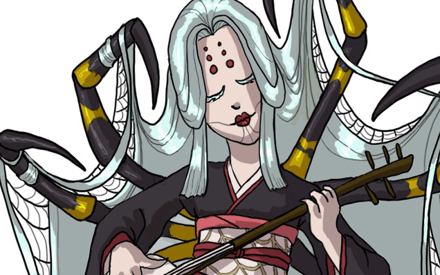
Today I’ll be talking about how I created Spider for the 30 Day Monster Girl Challenge.  For my version of spider, I went with a Japanese inspired Jorōgumo.

The Jorōgumo is a mythological creature from Japanese folklore which was known for luring virile young men to their lairs, charming them with food and music, then binding them up in their webbing so they could devour them.

Jorōgumo means “binding bride” or “whore spider”, but is also a word which refers to a particular species of golden orb weaver spiders in Japan.  For more info on this fascinating folklore, check out www.yokai.com

Tools and Techniques

For this painting, I used Photoshop CC and a Wacom Cintiq 21UX.

Concept Inspiration

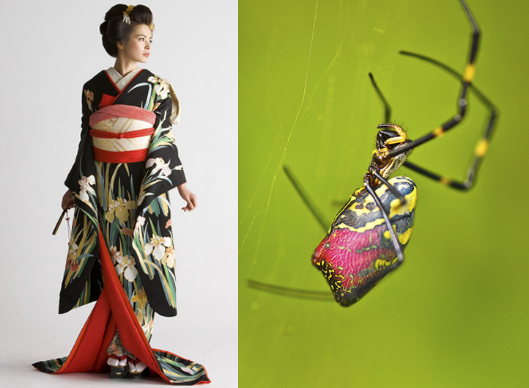
I took a lot of visual inspiration from the golden orb weaver (nephila clavata) of Japan.  My Spider has many of the same markings as decorative designs on her kimono and her color palette echoes the spider’s.  Her kimono is also inspired by a bride’s as a nod to the “binding bride” namesake.

References

A selection from my references. I had many more of the spider from multiple angles, but I’ll save you the nightmare fodder!

References for Spider


Process

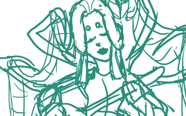
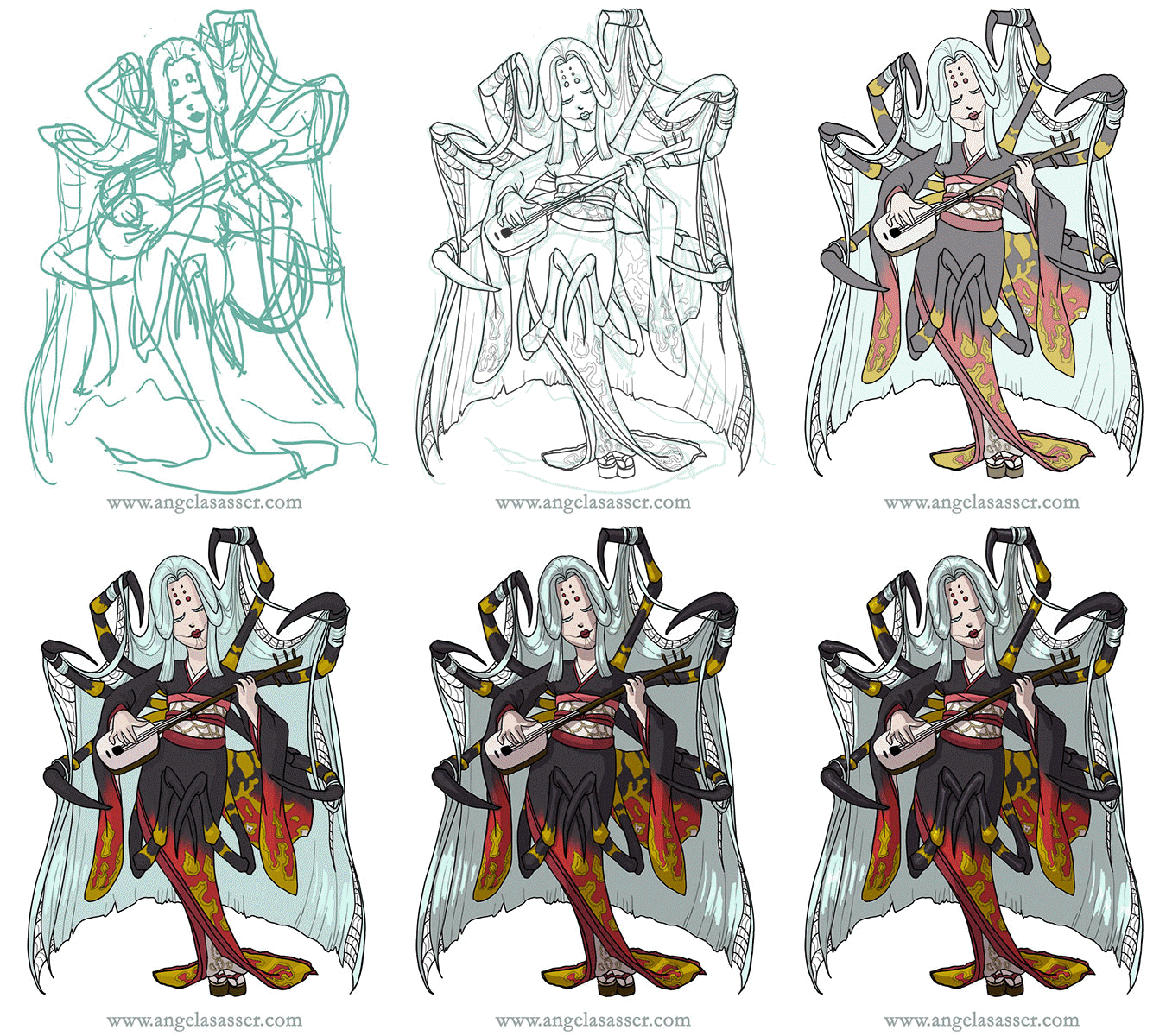
Phase 1 – I doodled a rough sketch in turquoise to make it easier to see when I inked on top.Phase 1 Spider


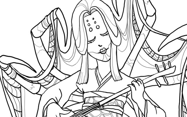
Phase 2 – Line art created with a hard round brush.

Phase 2 Spider


Phase 3 – I laid in flat colors using the selection magic wand to select areas and Edit>Fill.

Phase 3 Spider


Phase 4 – A shadow layer set to Multiply was created that was clipped as a mask to the entire Group of colors.

Phase 4 Spider


Phase 5 – A final touch of highlights was added with white. The highlight layer set to Overlay.

Phase 5 Spider


Animated process GIF.
You can also watch a sped up time lapse video of the process here.

Animated Process GIF - Spider

For more in-depth instruction on how I created this image plus a downloadable PSD of the image, Pledge $10 and up on my Patreon to gain access to the narrated video tutorial!  You can also buy the individual tutorial separately at my Gumroad shop, but you won’t receive the extra art goodies you would by purchasing via Patreon.

You can watch a preview of the narrated tutorial here:

https://youtu.be/OHf8UKguL-I


TUTORIAL – Rapunzel Comic in Woodcut Style

I’ve created a tutorial video for how I made a comic strip in a digital woodcut style for my Rapunzel comic!  I walk you through how I designed the panel layouts to the finished product giving helpful tips along the way.  A .PSD file of my comic strip is also included for your perusal!

To see this video, you’ll need to pledge to me on Patreon at the $10+ level!  Alternatively, you can also buy this tutorial individually via my Gumroad shop, but you won’t get any of the extra perks that Patreon gives you (ie. wallpapers, sneak peeks, etc.).

You can watch a 4 minute preview of this video at my YouTube channel.

I did not use any special brushes for this creation. Only the default round hard brush set to Pen Pressure!  I hope you enjoy this glimpse into my process for this month’s creation. If you have any questions, don’t hesitate to ask in comments!

Sketch Diary – Nariko of Heavenly Sword – Part 2

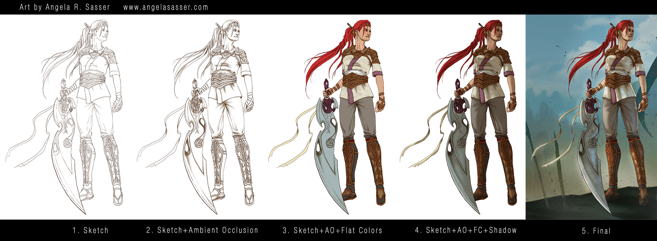
Now that Nariko’s design is figured out, it’s on to coloring!  I decided to try a new coloring technique called the Ambient Occlusion method.  This technique is a way to bring a structural quality to your images relatively quickly.  I used Alex Negrea’s tutorial and also this helpful process post from David Lojaya.

Here’s a breakdown of the main layers in my painting.

  1. Sketch – I produced a clean line art using the hard brush. This Sketch layer hovers above all of the other layers for the figure.  Notice I didn’t sketch in pure black, but a very dark brown so as to keep my image from looking too stark. I wanted subtle warmth and for the line art to look natural. The same goes for the AO layer, which is not pure black, but a dark brown. You can tweak this coloration later to suit the mood of your piece.
  2. Sketch+Ambient Occlusion – The Ambient Occlusion layer sits below the Sketch and Flat Color layers and above the Shadow layer and represents places that are hard for light to enter, the deepest, darkest shadows where light is ‘occluded’.  It is set to the blending option Multiply.
  3. Sketch+AO+Flat Colors – The Flat Colors are actually a group of layers, as I kept each color on its own layer just in case I wanted to change them later.  The entire group is set to the blending option Multiply so they show the AO layer beneath them.
  4. Sketch+AO+Flat Colors+Shadow – The Shadow layer was clipped to a standalone layer that masked out the entire figure to keep my shadows from going outside of the lines.  The Shadow layer is located below the Flat Colors group and above the AO layer.
  5. Final – In the final image notice I’ve actually masked out some of the Sketch layer so that the hard lines don’t look so unnatural (particularly in the area of the neck where lines are too harsh for the soft transitions there).  Lighting effects have also been applied here.


NOTE: My Patreon Patrons at the $5+ reward tier have exclusive access to my .psd file, so be sure to pitch in there if you’d like to peruse my layer structure!


Tools Used:

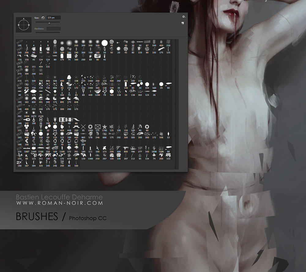
Deharme’s Brush set for Photoshop CC

Finally, here’s an animated GIF of my process (roughly 8 mb).

If you’d like to download wallpapers of the final image, I’ve provided the 1920×1080 size for free.

Also be sure to check out the article this image is featured in, What Women Want…In Women Characters for an interesting discussion of female character designs and representation.

The 1920×1080 wallpaper of this image. Download here.

Other sizes plus the .psd are available exclusively for my Patreon Patrons.

PRINTS AND PRODUCTS – Contact me privately if interested.

Back to Part 1


VIDEO: Lady of January Tutorial – Part 1 – Creative Process and Design

This video dropped earlier this week for my Patreon Patrons and Kickstarter Backers. Now here it is for the public!  Enjoy and feel free to leave any questions in the comments.

I plan to post the next part with the actual painting process next week.  Again, if you’re a KS Backer or a Patreon Patron, you’ll see it before everyone else.

My Kickstarter project could still use your help!  If you know anyone who might be interested in my project, please spread the word to them.  It’d be much appreciated!

Adventures in Video Editing. Feedback Requested!

I’ve been iced in for three days straight here in Georgia so I used this accumulation of time inside to start teaching myself video editing with Camtasia Studio 8.  I’ve finally figured out how to use my mic as well, which means my videos now come with film noir voice-over narration!

Well maybe not film noir, persay, but the potential is there!

I hope you’ll watch and give me some feedback about how you like it! With luck, I’ll be doing many more of them to share.  It’s quite fun to be able to yack at you guys directly.  I always do it via walls of text here in blog posts.  It’s nice to put a voice to the text!

On that note, here are some questions for you:

  1. What kind of videos would you like to see more of?
  2. What kinds of things should I talk about during videos?
  3. If I started hosting live monthly Q&A/AMA sessions, would anyone be interested in attending?

I’d appreciate any kind of feedback you guys can give me on this matter!  I’ve already got a couple of videos up with narration, one on the making of a leather crafted barrette and the other of a walkthrough of a master copy of Gerome’s art.

I admit a lot of my current push to learn video editing is so I can start being more interactive on the net on my YouTube channel, but also on a little site called Patreon that’s causing a lot of buzz right now.

More on that later!  It’s been a time of re-structuring myself, re-focusing my career goals, and bringing even more of a polish of the vision I have for my art.

Some exciting things are a-brewing this year.  Stay tuned for more, Bat-fans!

Critique Corner – Persephone by Maria

For today’s Critique Corner, we have an image by Maria Arnt.  Check out some of Maria’s other work before we get started!


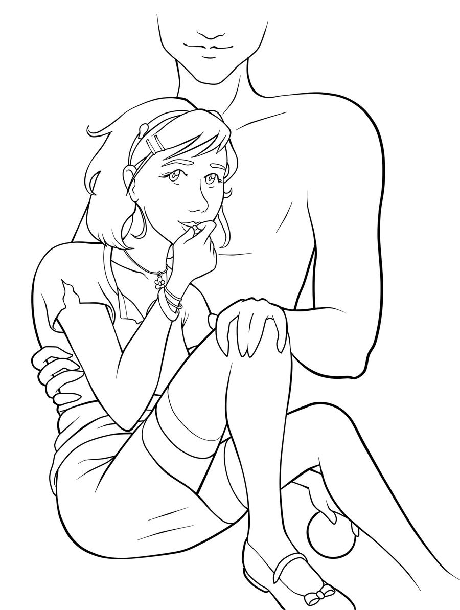
The image up for critique is “Persephone”. Maria’s main concerns were on the use of line width and anatomy, specifically the eyes.

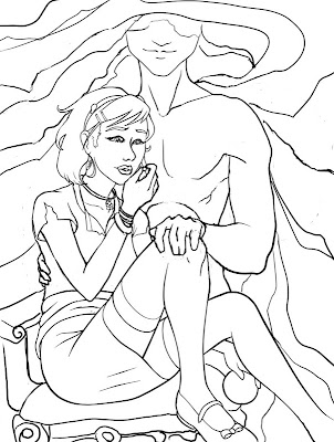
The paintover.

On Line Width

Beautiful!  You’ve never had a problem with creating wonderfully inked pieces, from what I’ve seen of your work.  I think if you want to push the lights and darks in this image that you could add hatching or screentones for shading as well.  Otherwise, cleaner lines like this generally require color to bring a stronger mood and visual impact to a piece.

The Eyes

I think the first thing we look at in this piece would be the eyes. Persephone is glancing right at us and, being the only character with a full face, our attention is brought right to her face. Your description of the piece states the following:
“Even though she’s captured by Hades, she’s discovered she has this sort of power over him–but she’s a little afraid to use it. As she eats the pomegranate seed, her eyes are both hesitant and a little daring. Are you going to stop her? She’s not completely sure she wants you to.”
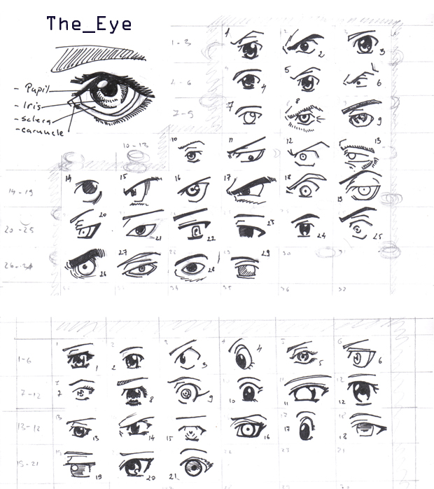
However, the wide open nature of her eyes actually makes her seem more peppy and upbeat rather than hesitant or daring.  In the paintover, I chose to divert her gaze to the pomegranate seed, which I moved further away from her lips, which suggests she’s thinking of the seed and not interacting with the viewer.  One thing to remember is that even though anime eyes are indeed wide, that doesn’t mean that they can’t be various states of open or closed, which is key in creating convincing expression, even via the abstraction of anime style.  Not rendering the eyelid as you have limits the expressiveness of the eye to looking wide, surprised, or clueless.  In addition, I’d highly recommend doing a few studies of anime expressions to get a deeper understanding of how eyes and expressions are abstracted by manga style.  The ’25 essential expression’ memes are a great way to practice!
Notice how most of these manga style eyes still have eyelids (and if they don’t, the eyelid is generally implied with shading, the eyebrows compensate for the lack of expression by their angularity, or the eyes are simply drawn more slim to imply how open or closed they are):

REFERENCE-Manga eyes by ~Aoi-Ne-Blue

On Other Anatomy 

As for the rest of Persephone’s anatomy, I’ve made slight tweaks here and there. I shrank the head, as it was looking a little too large in proportion to her body.  Unless your style is SD, heads in anime usually aren’t too much larger than your standard realistic proportions, rather that the eyes are generally larger with the mouths being smaller.  I’ve also widened the wrist and slimmed her arms, as they were out of proportion to one another.  I also felt like her larger arms were detracting from her childlike presence.  Finally, I refined the anatomy of Persephone’s shoulder, as the lack of line definition and attention to the protrusion of the shoulder joints made it seem as if she had a hump in her back, due to the fact it reads as one solid muscle.

As for Hades,  he shares a similar problem as far as no definition in the joint of his shoulder and pectoral muscles, which leaves his shoulder feeling like a large solid curve, making it seem odd and disconnected.  I’ve added more definition overall to his stomach and chest and adjusted the perspective on his fingers.  Specifically, I changed the hand holding the small of her back to only show the tips of his fingers, due to the fact Persephone’s torso is showing more of a front view than a side view, meaning we wouldn’t see so much of his fingers wrapped around her because, unless his arms were very long, the points of tension where his hand is holding her would stop as they curl around her side.  Another option is to have his hand wrapped around her shoulder instead, which would be frankly an easier angle to draw and far less awkward, visually.

On Concept

All of these technical details aside, I think you could push this concept even further.  As it stands, I don’t feel like there’s much of a connection between these two, as you have implied on the description of your image (Persephone having a passive power over the infatuated Hades).  Perhaps having her glancing up at his face would help her to appear more hesitant and engage him as a force in this piece?  You could maybe even have his hand (the one grasping her leg) holding up more seeds instead, to imply even more interaction between these two.

I like the fact that you don’t see all of Hades’ face, but for a devious smile.  It gives him the presence of a looming controlling shadow, which suits your description nicely.  In the paintover, I’ve added shadowy swaths radiating from his face to help fill up the space around them and add visual interest and flow to the composition.  I’ve also added a fancy chair for Persephone to be seated on to imply their regal Underworld surroundings.  You could even push that further by having ornate plates of sweets around her that Hades might have been tempting her with.

You’ve got a great start here on a strong character piece!  I hope this critique helps you out and that you’ll be following up later with a finished version I can share with my readers.  Good luck, Maria!

DISCLAIMER: I am no ‘master artist’.  I am always learning, therefore, my word is not the end all, be all.  I encourage you to use this critique to your benefit and come up with your own solutions based on them…or not!

The Artist must serve the image, even if it disobeys the critics. Go forth and CREATE!


Want to send in an image for Critique Corner? 
Read on here to find out how!