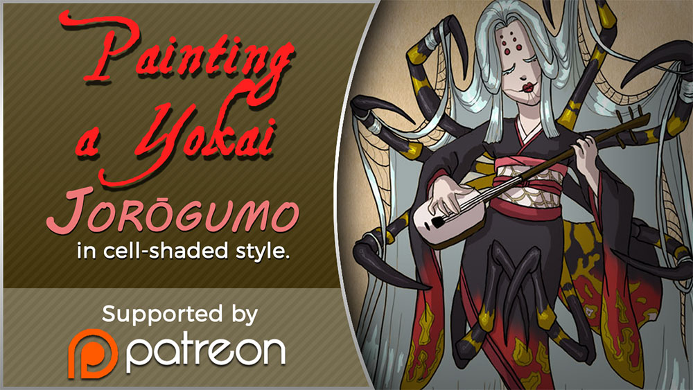
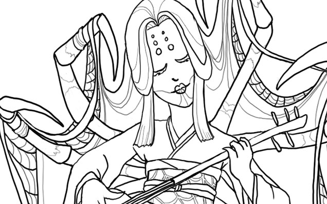
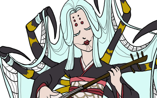
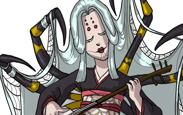
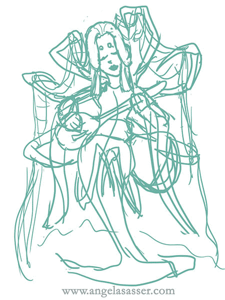
For the very first post in my ‘Critique Corner’ column, we have a piece by Kim Ravenfire M. Have a sampling of Kim’s other work, for starters:
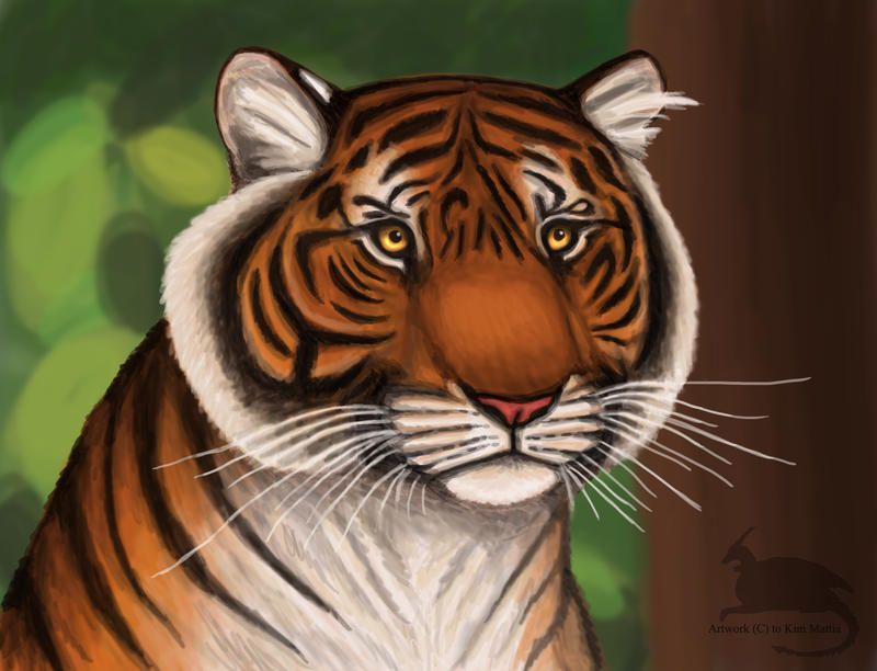
The piece up for critique today is “Tiger”:
Kim’s main concerns with this piece were basic proportions and how to make her images look more realistic in Photoshop.
The paintover:
On Colors and Textures
My first impression was that I was not surprised to hear you have background in drawing more stylized figures, Kim. This image is very solid with bold coloration and that’s not a bad thing, persay! Stylization can be good, but when going for a more realistic approach, keep in mind that realism is more about subtlety than showing every detail and shape. For a furry creature, this tiger has very straight lines defining its edges (the cheeks, back, chin, etc.) and that gives the optical effect of flatness. The solution I went for in my paintover was to break up the fur, stripes, and edges with more brush strokes of fur texture.

As for color, realistic style calls for more subtlety in light and variation of cold and warm hues, as well. I’ve brought a cooler tone of greenish-orange into the orange markings to bring some color variation into his coat, as well as to tie in the green of the background. If you look closely at your tiger photo references, you’ll see that color variation they have in their coats. It’s not a pure orange at all, but umbers, oranges, and siennas.
Photoshop Tips for Color Variation
A quick trick for adding subtle color variation is to paint the color you want on the highlights on a separate layer above the rest where you want variation (doesn’t matter what kind of Brush), then use the Guassian Blur filter to blur the area completely to your preference. Then, set the layer to Overlay, Lighten, or whichever Blending Mode works best (in this case, I used Screen). That usually creates a nice subtle variation without having to carefully repaint the image!
I also used a Hue/Saturation Adjustment Layer Mask to desaturate the entire piece, then masked off the center of the image so that the orange was still saturated while the rest of the image receded into a less vibrant color. This way of creating focus by making the most detailed and brightest part of your image the focal point also helps to add realism to pieces, as Photoshop has a habit of making images naturally flat and boldly colored, if we’re not careful. Don’t know what Adjustment Layers are? Learn them! They are super useful and save lots of time (check
this tutorial for more on them).
EDIT: Another tip for color variation (which I forgot to mention during my original posting) is to start by painting on top of a pre-rendered texture. Doing this allows for the slightest hint of textural and light complexity to shine through into your painting.
On Proportions
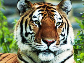
Looking at the nitty gritty proportions of our tiger via tiger photos shows that our subject’s nose is perhaps a little too broad, the cheeks too round, and the eyes too far apart. I highly recommend that you do a few sketches beforehand of your creature from various angles using reference photos taken from various angles so that you can have a clearer understanding of what surfaces are involved in the bone structure. As is, the tiger’s face feels very plate-like in it’s surface shape, as if the nose, eyes, and mandible cheek fluff are all on the same surface area instead of receding into space.
The solution I used was to lessen the roundness of the cheeks while also deepening the shadows of nose. I squared the jaw off so that it has more of it’s own distinctive shape and also moved the eyes closer together. I cheated and used the Liquify filter to push the areas into shape, but you may need to do some more layering to really make the skeletal structures and shadows convincing. I also added cosmetic details, such as a bit of texturing and segmenting to the tiger’s nose and the very small shiny lower lip that’s usually visible on most felines.
Overall:
Work on breaking up your solid shapes and colors with more texture and color variation, respectively. Pay close attention to what is in focus and what is not in your compositions to bring that convincing
depth of field into your work, which will really push the realism! Finally, check out other wildlife painters. Even if their work isn’t digital, you can still study how they translate realistic figures into the abstraction of color and how they lay out detail in their compositions.
 |
“That Moment” by
Sam Hogg |
Extras:
I used this
wonderful brush set from Mr–Jack on DeviantART for the paintover. Maybe they’ll prove useful for you for that painterly effect!
DISCLAIMER: I am no ‘master artist’. I am always learning, therefore, my word is not the end all, be all. I encourage you to use this critique to your benefit and come up with your own solutions based on them…or not!
The Artist must serve the image, even if it disobeys the critics. Go forth and CREATE!
Want to send in an image for Critique Corner?
Read on here to find out how!