 |
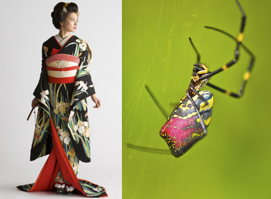
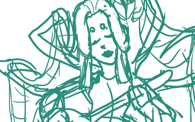
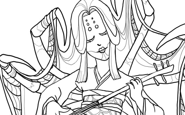
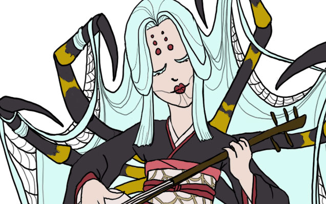
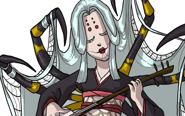
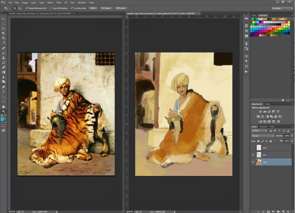
| My master copy of a traditional painting with digital paint. |
It’s been a frustrating and gratifying experience for me as a watercolor and color pencil artist to switch to painting digitally. There are so many glorious things about digital just as there are so many things that can make it really difficult to master.
Here are some of my random observations on the digital painting experience as someone with a background in traditional painting.
1. Digital is NOT Faster
No, digital is not faster. Perhaps it is if you aren’t trying to replicate the look of traditional paint. But in my experience, particularly when replicating a painterly look in digital, you’re going to spend a lot of time layering and layering just to get rid of the pure plastic colors that digital brushes apply by default.
There are some ways around this mechanical computer generated look, such as scanning in your own textures from traditionally painted swatches and programming them into your brushes.
Corel Painter and Photoshop have brushes you can program to emulate this randomness, but it’s not as good as the real thing just yet. There are still too many patterns that are predictable that the eye recognizes, like computerized paper texture, which contributes to that sameness that so many digital pieces have that I mentioned earlier.
Plus, if you’re a control freak like me, you’ll spend many an hour trying to paint everything at the same level of detail until you realize that zooming out makes all that work for naught.
2. Addiction to Layers
It is so tempting when you first start painting digitally to just have everything on multiple layers. Why wouldn’t you? You can control all the things ever and make everything PERFECT! Don’t fall into the trap! Merge your layers when you can. For one, merging layers is easier on your computer if you don’t have a lot of processing power to spare and makes your files less humongous.
Another advantage of merging your layers is that you can retain those ‘mistakes’ that make traditional paintings have that lovely painterly feel to them. Painting over your mistakes instead of deleting them creates a ghost or haze that makes your edges feel more organic, while merely selecting and deleting leaves a perfect edge. Our human eyes are very keen to patterns and perfection, which can make an image seem harsh and plastic, a very common occurrence that makes many digital paintings have a certain sameness to them.
A suggestion if you’d like to change your image later is to save your selections as Channels, that way you can still retain the advantages of painting on one layer.
3. Addiction to Undo Button
Now that I’ve had the ability to Undo every tiny mistake, Step Backwards, Step Forewards, and change every little pixel, a weird thing has happened when I sit down with a traditional pencil and drawing pad. I am downright afraid that I’m going to mess it up! My ultimate power of control is gone and I’ve lost my confidence with dealing with traditional media. If I pick the wrong color, that’s it, game over, man. GAME OVER!
It’s going to take some re-training to get my confidence back that it’s okay to make mistakes. Digital has made me the ultimate control freak, whereas traditional media is all about letting go of that control and accepting the somewhat randomized results of how the media works, especially with something like watercolor. For me being the control freak that I am, traditional media helps to balance my propensity for spending too long trying to make everything perfect.
4. Mark-Making Still Matters
At least if you want to achieve a painterly quality in your digital work. A lot of folks assume you can just drop a fill into a digital canvas and you’re done. While you can achieve certain kinds of highly stylized effect like this, if you’re aiming for a more realistic painterly organic effect, your lines still matter. Blending takes time and care and usually the same awareness of your marks and how you’re using them to define contour as you would have as a traditional painter.
Also, things that might happen more naturally with traditional media, such as the pooling and blending of colors that form that wonderful randomness in your skyline take dedicated effort to achieve in digital. In digital, randomness is carefully constructed. You have to add the randomness to your skin pores to make that surface convincing. It doesn’t just happen thanks to the properties of your paper, glazing, and pigments. Filters and Brushes with custom effects can help. They get better with every version of Photoshop, but they still have a ways to go. I haven’t used Painter much, but I hear it’s getting better at this as well.
5. Shiny Plastic People
I don’t know why, but when I first got into digital, I assumed it’d be easier to paint skin. There were all these nifty tools and pore brushes and amazing things that seemed to do all the work for me!
Nope. All I got for about a year of painting people digitally was shiny plastic grey people or shiny plastic pink people. It took master copies, many failed practice paintings trying different techniques, and brushing up on my color theory to really start bringing life to my skintones.
I still think every time I paint a person digitally that I try a different technique each time. The more I paint digitally, the more I realize it isn’t about how you do it and any one right way, it’s about doing whatever it takes to get a good looking end result!
6. Missing that Good Ol’ Tactile Feeling
For as amazing as digital is, I’ve found I still can’t get the same finesse with my lines, especially with inking. Cintiqs are amazing things made of unicorn dust and the tears of artists, but you still have to rotate the canvas with Rotate View, which takes that many seconds longer than just turning your canvas in real life. I am personally just faster at working with sketching and inking on paper, which I hope to integrate in my upcoming digital pieces.
 |
|
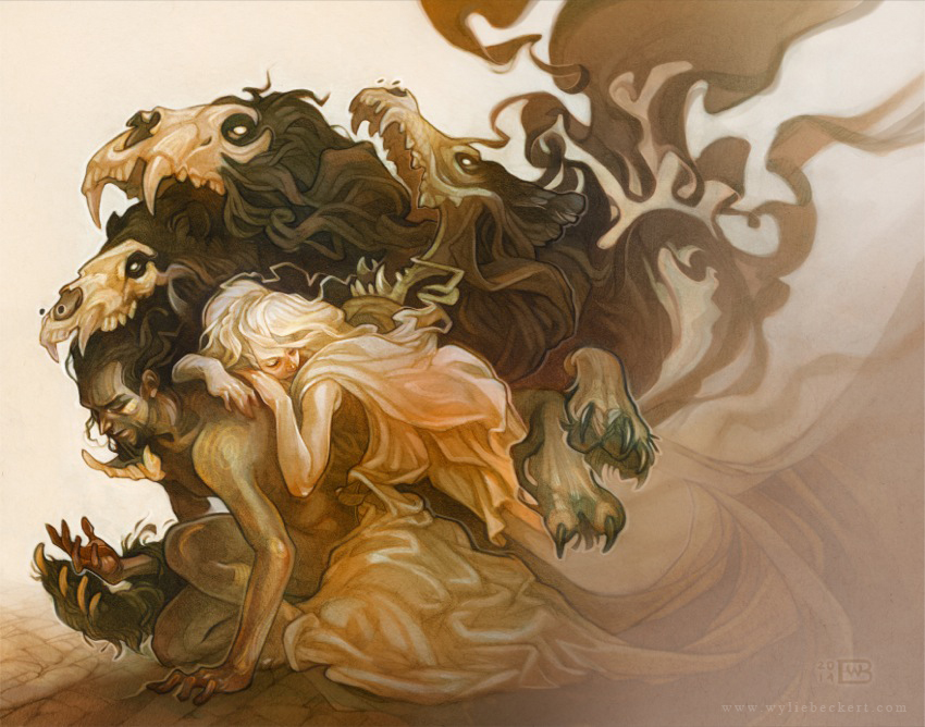
Here’s just one example of Wylie’s
amazing combination of graphite
and digital.
|
I used to think I shouldn’t mix media like that because I wouldn’t know how to categorize it online or that the purists would hate me (leftovers from my own snooty traditional art program brainwashing), but now I realize I just don’t care as long as I get a cool image in the end that tells the story I want to tell.
See the work of Wylie Beckert as a great example of what you can do when you free your mind to the potential of combining traditional and digital.
7. Layer Masks are Your Friends
Learn them. Love them! I used to paint everything the hard way and then curse myself when I’ve made a mistake I can’t take back because I’ve overpainted or deleted my original layer. Layer masks allow you to retain your original work and visually change it without having to commit to those changes. I’m probably speaking voodoo moon language right now to those who have no clue what layer masks are. To you, I say start here. Learn, my grasshoppers. You will not be sorry!
And yeah sure it may lead to the ‘Undo Addiction’ I was previously talking about, but that’s okay! As long as you have the useful potential of layer masks available to you, you might as well use it and face your Undo addiction later like I’m doing. You’ll get over it…eventually.
So why do I keep painting digitally if it seems like it drives me crazy?
– I don’t have to keep the paintings under my bed. I am seriously out of space for storing them in our apartment (and parents’ basement). No, I don’t want to pay for environmentally controlled storage because I am cheap/broke and that type of storage is friggin expensive.
– Being able to change an image indefinitely comes in handy! When a traditional painting is done, I usually can’t change it much. However, if something ever bothers me about a digital piece or a client requests a change, I can most likely go back and fix it after it’s done. This is also a double-edged sword which sometimes makes me feel like my work is never done with any particular digital piece, leading to obsessive necromancing of my older pieces.
Also, if I mess up in the middle of a piece, I don’t have to start it from scratch as I would if it were traditionally painted. I can simply alter what segment of the image I need to.
– Solvents are dangerous and I don’t want them near me. I would try oil painting if I could, which is really the effect I’m trying to achieve in digital, but there is no ventilation in this apartment. Experimenting with water-based oils and non-ventilation friendly solvents is going to take time I don’t want to commit at current (and again that storage issue).
– Because I can play with color schemes in a fun way that lends itself to discovery (IE. love me some Hue slider!)
– Digital images are great for clients who need their images easily scaled to different products and sizes without having to go through the process of having to scan/photograph a large traditionally painted piece.
– On the occasion I want to animate parts of an image, digital is SOOOooo much easier to do this with!
For me, digital is an extremely useful and versatile tool. While I understand why someone would find a traditional piece to have more sentimental value because an artist was able to touch it and pour their soul into every stroke, I’m the kind of artist who doesn’t paint for the process (at least on most occasions).
I paint for the final image and the story it tells.
Digital expands my vocabulary for visual storytelling in unexpected ways that I have learned to love and that have made my journey so much more efficient in many ways!
So I ask you, purely digital artists, what are the challenges you face trying to learn traditional media? It’d be fascinating to hear from the other side of the learning divide!