Category: creative process

Anatomy of a Book Cover – Genesis Part 1

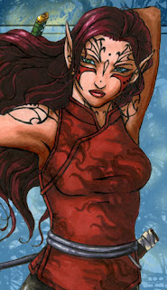
I promised art my last post and now I’m making good!  I’ve been a little silent around these parts thanks to a very serendipitous opportunity that came up to work with Wade Garret, an author who is about to publish his breakthrough dark fantasy book entitled Genesis: Book 1 of the Kingdom Come Series.  I’ve been contracted to bring his characters to life in a wrap-around book cover-slash-promo-art for his world.  After dabbling the past few years in licensing and portraits with the intent to verge into book covers this year, this was a challenge I was eager to take on!

Designing a book cover is a whole different beast than the art direction that comes with drawing fantasy images or just building a fanbase with your own scribblings.  In my experience, this brand of painting had little to no art direction beyond the basic subject matter and the freedom to create whatever I wanted (harder than it sounds! Sometimes more specific briefs can lead to a more cohesive image).

With book covers, however, there are very specific needs to be faithful to the characters, to make it look awesome, AND to entice a very specific target audience to pick up the book from the shelf.

It began with getting to know the characters via the manuscript enough to start formulating basic thumbnails.  I’m also working directly with the author instead of an art director, in this case, which means info directly from the horse’s mouth, as it were:

After much deliberation, the winner was number 8!

I have a 2nd version of this sheet with placeholder text treatment just to be sure the characters and composition won’t be overcrowded by font and that there was enough leeway in the compositions to allow for bleed edges.  The winning thumbnail represents the culmination of our characters’ struggle to overcome a powerful ancient enemy (to find out more about that, you’ll just have to go read Wade’s blog).

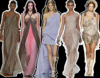
We have two characters facing off with a monstrous creature on the back cover.  Their placement in an outside location plus the opportunity to show off some of their wardrobe gives me an opportunity to convey the narrative’s setting, culture, and atmosphere.  The coffinlike pod technology helps ground the viewer with the thread of scifi that runs through this tale of a futuristic, yet devolved world contrasted with the hint of medieval style that I’ll get to convey in the characters’ wardrobe.

But we’re not through yet!  The characters and tech are still somewhat too vague, and that means doing some basic conceptualizing to get the look and feel of them down.

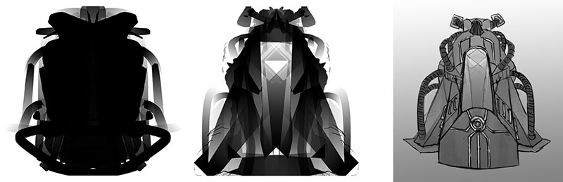
The pod featured in the front cover.
I used Alchemy to formulate some unpredictable shapes.

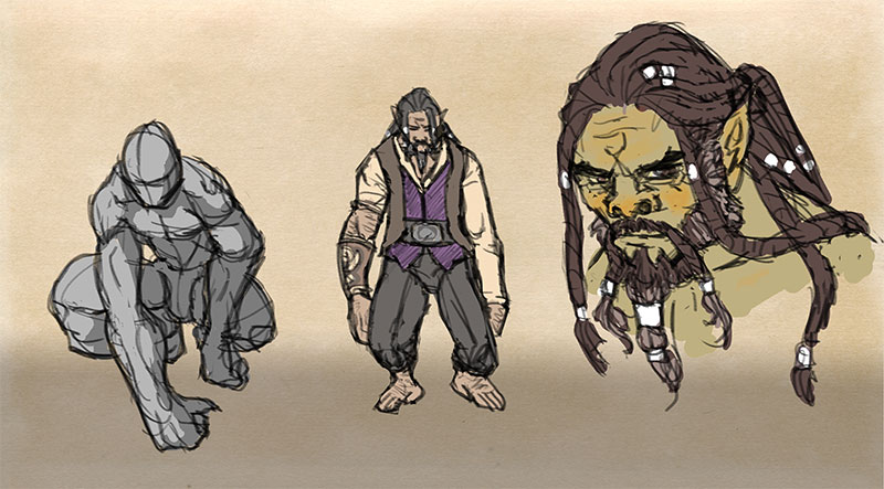
Duward, the wise Durgha.

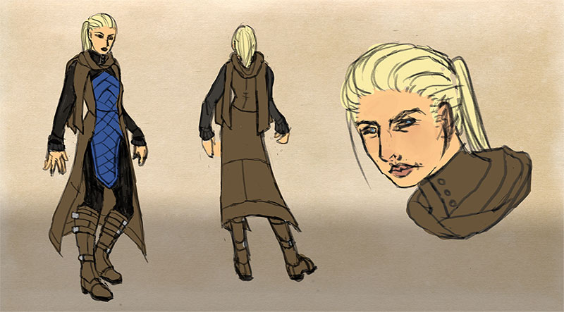
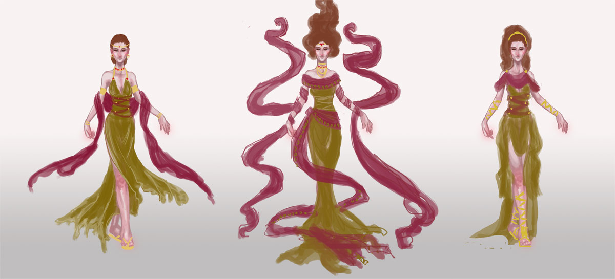
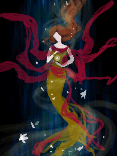
Lady Sedi, the brave noble.

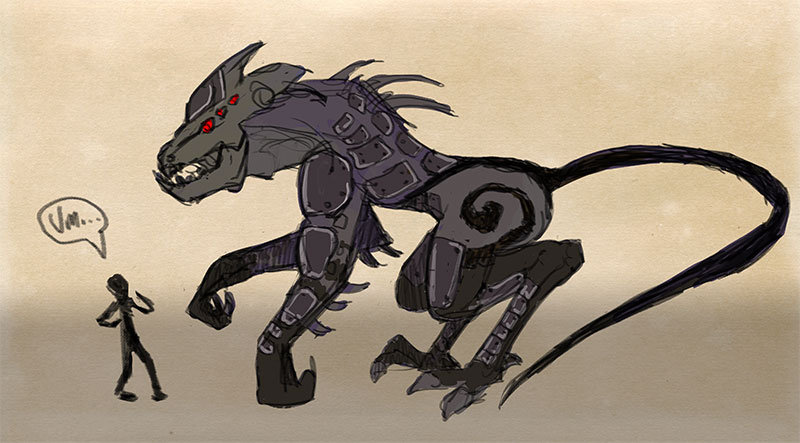
The Big Bad Vhendo.
This is a scrapped design, but isn’t he cute?

Our main hero of front cover fame still needs conceptualizing.  I’ll also need to do another study of the cover’s final arrangement to reflect the more concrete character designs we have now and to brush up the composition.

And all this happens before we even get to drawing the draft!  Who knew?
More sketches and the finished product to come in Part 2!

What I Learned from NaNoWriMo

I think I’ve only just today recovered from the sleep deprivation that was last month’s flurry of creative writing called NaNoWriMo.

For those who don’t know it, it stands for National Novel Writing Month, in which you attempt to write a 50,000 word draft in 30 days!

Some folks have even moved on to perfecting their draft from this month into actual novels.  Winners get the self-satisfaction of having met such a goal, as well as a 50% off code for the incredibly useful novel/screenwriting/etc. literary organization software, Scrivener.

I didn’t manage to make it to 50k words (more like 18k), but what a learning experience it was!  Here are a few things I learned during this wild writing ride:

1.  Refreshing the Creative Well – The most important thing I learned is that having an outlet from your main craft which you can pursue without too much expectation can really refresh your inspirational well!  I’ve been feeling so tired and overwhelmed lately and participating in NaNo was just the shot in the arm I needed to find my motivation again.  Thankfully, the characters I’ve been exploring for NaNo have given me the right kind of urges to illustrate my own scenes, draw concept sheets, and much, much more!  It’s an amazing cross-pollination of inspiration.

If you’d like to read some snippets from my NaNo Novel, you can check them out here to see what I’m talking about. (WARNING! Unedited raw draft stuff plus some cursing. Melakim is quite the foul-mouth.  I love her.♥)

–  A Ceremony for Creative Thought – I was made pointedly aware that I have an actual ceremony for my creative process when it comes to writing.  It requires doing something to transition my brain from ‘work mode’ to ‘writing mode’ by resetting it with either exercise and/or an episode of something brainless (like One Piece) to empty my head of work thoughts.

I must then have coffee and something sweet before I sit down to keep me going the whole time, lest I stop and have to retrieve a snack partway and ruin the flow.  I also must write after everyone is asleep because any interruption throws me out of my flow.  Music was a particularly powerful tool for keeping me in the ‘mood’ of the story. I began my nights almost every night by listening to Song of Exile for Ramah’s scenes and What the Water Gave Me for Melakim’s scenes. (I’ve got a whole playlist for novel writing, if anyone’s especially curious what I listen to)

Getting immersed is important for me. All e-mail notifications and social media outlets are banned from my sight while I am doing this.  I need to apply this to my art time too. I have a bad habit of hawk-eyeing my e-mail, messengers, and other things while I work and it probably does  make me less productive than I could be.

– Sleep Deprivation is Unproductive – I haven’t done this many late nights in a row since college.  I can’t say that pushing myself this way really ended up making me more productive, in the end. Maybe it is for short term bursts just to get words on paper, but I think I prefer to be much well paced and less sleep crazed as I continue to write this draft in the future. Not sleeping does not help my mood or creativity, but rather causes me to doze off in the middle of trying to think of the more mundane details of a story while I’m writing.  It needs to be a balance of keeping our bodies healthy AND being properly productive.

– Routine Equals Productivity and Accountability – By the same token, scheduling myself to write almost every night really gave me a sense of accountability for doing this activity.  It made me look forward to it each night and set a high bar that something, ANYthing needed to be done at this point in time, or I am returning to old habits where I’d convince myself the tiny accomplishment wasn’t worth it because it would never amount to anything.  I think I need to push my art and drawing time the same way if I really want to get to the next level in my skills.  Those tiny studies and sketches are going to equal improvement, no matter how insignificant they might feel, at first.

All in all, it was an amazing experience!  I am hopeful that by the time the next NaNoWriMo rolls around, I’ll have a full draft to be editing.  Or maybe I’ll use it as an excuse to write the adventures of that immortal Gypsy vagabond that’s been chilling in the Neglected Characters Bar in the back of my head?  You never know!

So did any of you do NaNoWriMo?  What did you learn about yourself from this experience?  How has this informed your other creative habits?  Share with me in comments!

Eureka Moment – Composition

eu·re·ka [yoo-ree-kuh, yuh-]
( initial capital letter ) I have found (it): the reputed exclamation of Archimedes when, after long study, he discovered a method of detecting the amount of alloy mixed with the gold in the crown of the king of Syracuse.


What is a ‘Eureka Moment’?
It’s that moment when you’re trying to understand a complex concept where a particular bit of information is presented that suddenly makes all of the elements you didn’t understand before click together to make sense.


We all learn in different ways.  There’s nothing like returning to my fundamental studies in anatomy in the past month to really drive this point home.  You can explain to me a billion times about the pelvic furrow or the angle of a joint’s rotation, but I am a very visual kinesthetic learner, meaning I have to learn by doing, which means things often don’t make sense to me till after I perform many learning exercises to explore a concept.

My latest ‘Eureka Moment’ occurred while reading issue #80 of ImagineFX magazine. Many of you may think this magazine is only for digital artists, but they cover plenty of topics and offer many tools that would be useful to all artists, such as articles on color theory, features of classical illustrators, and reference photo collections on the accompanying CD.

It was one such article on analyzing composition by Dan Dos Santos that led to my recent ‘moment’.  Considering Dos Santos’ track record of gorgeous book covers featuring one or two characters, I knew he would have plenty to say on the matter! It’s tough to make a book cover really pop with just one character to work with. You have to catch the reader’s interest, visually and story-wise.  A single image has to have enough punch to make you want to learn more!

The article covers, among other things, a simple exercise you can do to break down your composition involving greyscale layers to indicate foreground, middleground, and background.  I thought I’d try it on my latest piece, Persephone Queen of the Underworld:


The Results:
Converting the image to simple shapes allowed me to get a better sense of how it was reading visually.  I discovered by doing this that while there is a nice vertical spiral throughout the composition, the bottom where her dress trails off is just a tad too busy and cuts off abruptly.  The dress ‘tendrils’ on the left side flowing out from her back also create an awkward silhouette that is disharmonious with the shapes created by the adjacent ‘tendrils’.

I also found that the relatively flat background is not creating enough narrative or visual interest in this piece.  Visually, it falls flat of framing the figure and gives us no information about her setting or story.  I asked myself ‘How many people would know this is Persephone or some kind of underworld figure if I hadn’t said so in the title?”  Originally, I wanted to keep this area simple because the flowers, swirls, and figure would be made too busy by anything more complicated than a void, but now that I ask myself the tough questions, it’s just not telling enough of her story!

Next, I tweaked with the layers of the background planes to see what I could do to create more harmony and visual interest.  I then broke down the main planes into color groups, per Dos Santos’ suggestion to keep your color groups simple to create high contrast and visual interest:

The Results:
I found that by pushing the figure upwards, I could give the flow of her dress more room to terminate in a less abrupt way, which makes a more comfortable vertical flow for the viewer’s eye through her hair, down into the core of the figure, and down through the dress.  She also has a delightful ‘tree’ shape to her now that fits well with her vegetation theme.

The energy swirl was removed, leaving the flowers to do the work of creating the spiral of energy around her, which I feel also works better to help solidify her symbolic connection to the blossoming of spring.  The background plane was tightened up from a random void of energy to the mouth of a cave with rock formations which frame the figure and tell something of her current imprisonment in the Underworld.

Now, I’m preparing myself to dive back into this piece and really make her shine!  Elements of the piece may still change in the doing, but I feel I have a much stronger idea after I’ve spent days staring at this painting and not knowing what exactly felt wrong about it.

I hope my Eureka Moment helps someone out there! If you’d like to read more on the topic of planning compositions, I highly recommend getting Issue #80 of Imagine FX and reading Dos Santos’ original article for more working examples and invaluable advice.  There are more great articles included that helped me get inspired, including the brilliant compositions of Howard Pyle.

What was your latest ‘Eureka Moment’?  Share in comments!

Critique Corner – Persephone by Maria

For today’s Critique Corner, we have an image by Maria Arnt.  Check out some of Maria’s other work before we get started!


The image up for critique is “Persephone”. Maria’s main concerns were on the use of line width and anatomy, specifically the eyes.

The paintover.

On Line Width

Beautiful!  You’ve never had a problem with creating wonderfully inked pieces, from what I’ve seen of your work.  I think if you want to push the lights and darks in this image that you could add hatching or screentones for shading as well.  Otherwise, cleaner lines like this generally require color to bring a stronger mood and visual impact to a piece.

The Eyes

I think the first thing we look at in this piece would be the eyes. Persephone is glancing right at us and, being the only character with a full face, our attention is brought right to her face. Your description of the piece states the following:
“Even though she’s captured by Hades, she’s discovered she has this sort of power over him–but she’s a little afraid to use it. As she eats the pomegranate seed, her eyes are both hesitant and a little daring. Are you going to stop her? She’s not completely sure she wants you to.”
However, the wide open nature of her eyes actually makes her seem more peppy and upbeat rather than hesitant or daring.  In the paintover, I chose to divert her gaze to the pomegranate seed, which I moved further away from her lips, which suggests she’s thinking of the seed and not interacting with the viewer.  One thing to remember is that even though anime eyes are indeed wide, that doesn’t mean that they can’t be various states of open or closed, which is key in creating convincing expression, even via the abstraction of anime style.  Not rendering the eyelid as you have limits the expressiveness of the eye to looking wide, surprised, or clueless.  In addition, I’d highly recommend doing a few studies of anime expressions to get a deeper understanding of how eyes and expressions are abstracted by manga style.  The ’25 essential expression’ memes are a great way to practice!
Notice how most of these manga style eyes still have eyelids (and if they don’t, the eyelid is generally implied with shading, the eyebrows compensate for the lack of expression by their angularity, or the eyes are simply drawn more slim to imply how open or closed they are):

REFERENCE-Manga eyes by ~Aoi-Ne-Blue

On Other Anatomy 

As for the rest of Persephone’s anatomy, I’ve made slight tweaks here and there. I shrank the head, as it was looking a little too large in proportion to her body.  Unless your style is SD, heads in anime usually aren’t too much larger than your standard realistic proportions, rather that the eyes are generally larger with the mouths being smaller.  I’ve also widened the wrist and slimmed her arms, as they were out of proportion to one another.  I also felt like her larger arms were detracting from her childlike presence.  Finally, I refined the anatomy of Persephone’s shoulder, as the lack of line definition and attention to the protrusion of the shoulder joints made it seem as if she had a hump in her back, due to the fact it reads as one solid muscle.

As for Hades,  he shares a similar problem as far as no definition in the joint of his shoulder and pectoral muscles, which leaves his shoulder feeling like a large solid curve, making it seem odd and disconnected.  I’ve added more definition overall to his stomach and chest and adjusted the perspective on his fingers.  Specifically, I changed the hand holding the small of her back to only show the tips of his fingers, due to the fact Persephone’s torso is showing more of a front view than a side view, meaning we wouldn’t see so much of his fingers wrapped around her because, unless his arms were very long, the points of tension where his hand is holding her would stop as they curl around her side.  Another option is to have his hand wrapped around her shoulder instead, which would be frankly an easier angle to draw and far less awkward, visually.

On Concept

All of these technical details aside, I think you could push this concept even further.  As it stands, I don’t feel like there’s much of a connection between these two, as you have implied on the description of your image (Persephone having a passive power over the infatuated Hades).  Perhaps having her glancing up at his face would help her to appear more hesitant and engage him as a force in this piece?  You could maybe even have his hand (the one grasping her leg) holding up more seeds instead, to imply even more interaction between these two.

I like the fact that you don’t see all of Hades’ face, but for a devious smile.  It gives him the presence of a looming controlling shadow, which suits your description nicely.  In the paintover, I’ve added shadowy swaths radiating from his face to help fill up the space around them and add visual interest and flow to the composition.  I’ve also added a fancy chair for Persephone to be seated on to imply their regal Underworld surroundings.  You could even push that further by having ornate plates of sweets around her that Hades might have been tempting her with.

You’ve got a great start here on a strong character piece!  I hope this critique helps you out and that you’ll be following up later with a finished version I can share with my readers.  Good luck, Maria!

DISCLAIMER: I am no ‘master artist’.  I am always learning, therefore, my word is not the end all, be all.  I encourage you to use this critique to your benefit and come up with your own solutions based on them…or not!

The Artist must serve the image, even if it disobeys the critics. Go forth and CREATE!


Want to send in an image for Critique Corner? 
Read on here to find out how!

Sketch Diary: Persephone Queen of the Underworld

Recent days of self-critique have had me determined to push my fundamental skills even more this year.  To that effect, CGhub’s CharacterForge challenges have proved a really fun and loose way to play around with a predetermined concept for my own whims (while also giving me the incentive of a deadline).  The latest CharacterForge challenge was to design Persephone Queen of the Underworld.

There was just enough physical description given that I had a few concrete elements to work with while the rest was left up to my imagination.  The kidnapping of Persephone and the turning of the seasons has always been a myth near and dear to my heart, so I couldn’t resist trying this out!  It began with thumbnailing to work in the Challenge’s requirement that the image be laid out as a book cover.

Choosing a thumbnail was a tough call for me, as each one of them has something I like!  I love the dangerous gaze of the first image with the focus on character details like jewelry and her outfit.  The 2nd  has a wonderful up and down flow and an air of queenly presence the others don’t.  It boiled down to whether I wanted to go with a Persephone who was still mourning over her confinement to the Underworld or perhaps a Persephone more adjusted to her role as a queen, which, in the end, I felt worked better if she was to be entitled “Queen of the Underworld” in this composition.

I ended up going with thumbnail 4 for it’s compositional flow and the balance of a somber character who still demands some power and presence, as she does with her regal clothing and the ability to nurture a seed of life in the darkest places.  She hasn’t given up hope and obediently awaits the day she will bring Spring back to the world of the living.

I also chose the thumbnail I did because I wanted to push myself away from my usual composition habits, which generally cut the character off at the thighs. I very rarely do full figures so it was time for a change!

The next step was to figure out exactly what I wanted to dress this venerable lady in.  I got the creative juices flowing looking up fashions by Alexander McQueen and a cursory google search of catwalk fashions inspired by Greek mythology, which turned up some interesting stuff!  The 2nd dress in this group really caught my eye with the trailing gauzy fabric.  I knew then I needed LOTS of trailing gauzy fabric for that mystical smokey touch!

Image via Top and Trends Fashion Design.

I already had the basic color scheme and physical features defined by the thumbnails and Challenge description so I decided to use a more fleshed out base rather than a simple nondescript figure (which is commonly referred to as a croquis template, in fashion design terms).

I only had time to do three of these, due to time constraints.  I leaned towards the wrapped bodice style of Greek clothing with sashes and tattered edges to get across the feel of a character who has a sense of decay about her, due to her surroundings, which contrasts with her ability to remain pure and beautiful in the dank Underworld.  Again, something I like about all of them!  Eventually went with the middle because it felt like it had the most presence and flow.  There’s also something intriguing about the first dress, which I may have to revisit later (modern day corporate mogul Persephone, perhaps?).

Then began the fevered late night movie marathon to keep me awake while I worked, since I only had three days to finish!  On my ‘girl goes to underworld’ inspiration playlist:

– Legend – Girl kidnapped by giant lonely red devil for touching a unicorn (another childhood fave).
– Pan’s Labyrinth – Girl has magical adventures while living in an oppressive household. At one point journeys into the underworld realm of the Pale Man (my favorite scene!).
– Labyrinth – Girl ventures into the world of the Labyrinth to save her brother and defeat the Goblin King, who is oddly enamored with her.  Love this movie ever since  I was a kid! It’s Jim Henson at his best.

Five cups of coffee and two Cadbury bars later, we have progress!

Adobe Photoshop CS2, Wacom Cintiq 12WX.

She’s still in need of critique so I can clean her up for my portfolio. Feel free to comment on DeviantART or at WiPNation! I’d value any input on how to make her the best image she can be.
If you’re part of CGhub, go vote for me in the challenge if you like my entry! 
(Voting thread should be up soon.)

Critique Corner – “Tiger” by Kim

For the very first post in my ‘Critique Corner’ column, we have a piece by Kim Ravenfire M.  Have a sampling of Kim’s other work, for starters:


The piece up for critique today is “Tiger”:
Kim’s main concerns with this piece were basic proportions and how to make her images look more realistic in Photoshop.
The paintover:

On Colors and Textures

My first impression was that I was not surprised to hear you have background in drawing more stylized figures, Kim.  This image is very solid with bold coloration and that’s not a bad thing, persay!  Stylization can be good, but when going for a more realistic approach, keep in mind that realism is more about subtlety than showing every detail and shape.  For a furry creature, this tiger has very straight lines defining its edges (the cheeks, back, chin, etc.) and that gives the optical effect of flatness.  The solution  I went for in my paintover was to break up the fur, stripes, and edges with more brush strokes of fur texture.
As for color, realistic style calls for more subtlety in light and variation of cold and warm hues, as well.  I’ve brought a cooler tone of greenish-orange into the orange markings to bring some color variation into his coat, as well as to tie in the green of the background.  If you look closely at your tiger photo references, you’ll see that color variation they have in their coats.  It’s not a pure orange at all, but umbers, oranges, and siennas.
 
Photoshop Tips for Color Variation
A quick trick for adding subtle color variation is to paint the color you want on the highlights on a separate layer above the rest where you want variation (doesn’t matter what kind of Brush), then use the Guassian Blur filter to blur the area completely to your preference. Then, set the layer to Overlay, Lighten, or whichever Blending Mode works best (in this case, I used Screen). That usually creates a nice subtle variation without having to carefully repaint the image!
I also used a Hue/Saturation Adjustment Layer Mask to desaturate the entire piece, then masked off the center of the image so that the orange was still saturated while the rest of the image receded into a less vibrant color.  This way of creating focus by making the most detailed and brightest part of your image the focal point also helps to add realism to pieces, as Photoshop has a habit of making images naturally flat and boldly colored, if we’re not careful.  Don’t know what Adjustment Layers are? Learn them! They are super useful and save lots of time (check this tutorial for more on them).
EDIT: Another tip for color variation (which I forgot to mention during my original posting) is to start by painting on top of a pre-rendered texture.  Doing this allows for the slightest hint of textural and light complexity to shine through into your painting.
On Proportions
Looking at the nitty gritty proportions of our tiger via tiger photos shows that our subject’s nose is perhaps a little too broad, the cheeks too round, and the eyes too far apart.  I highly recommend that you do a few sketches beforehand of your creature from various angles using reference photos taken from various angles so that you can have a clearer understanding of what surfaces are involved in the bone structure. As is, the tiger’s face feels very plate-like in it’s surface shape, as if the nose, eyes, and mandible cheek fluff are all on the same surface area instead of receding into space.
The solution I used was to lessen the roundness of the cheeks while also deepening the shadows of nose.  I squared the jaw off so that it has more of it’s own distinctive shape and also moved the eyes closer together. I cheated and used the Liquify filter to push the areas into shape, but you may need to do some more layering to really make the skeletal structures and shadows convincing.  I also added cosmetic details, such as a bit of texturing and segmenting to the tiger’s nose and the very small shiny lower lip that’s usually visible on most felines.
Overall:
 
Work on breaking up your solid shapes and colors with more texture and color variation, respectively. Pay close attention to what is in focus and what is not in your compositions to bring that convincing depth of field into your work, which will really push the realism!  Finally, check out other wildlife painters.  Even if their work isn’t digital, you can still study how they translate realistic figures into the abstraction of color and how they lay out detail in their compositions.
 
“That Moment” by
Sam Hogg


Extras:
I used this wonderful brush set from Mr–Jack on DeviantART for the paintover. Maybe they’ll prove useful for you for that painterly effect!


DISCLAIMER: I am no ‘master artist’.  I am always learning, therefore, my word is not the end all, be all.  I encourage you to use this critique to your benefit and come up with your own solutions based on them…or not!

The Artist must serve the image, even if it disobeys the critics. Go forth and CREATE!


Want to send in an image for Critique Corner? 
Read on here to find out how!

In Need of Critique?

Well it seems I’m at a sort of impasse with this journal.  Lately, I’ve been returning to the basics to try and work on a few problem areas of my own art, which means working on many life drawing and technique studies.  I don’t really have anything polished enough to share, so sharing of art processes has been less of late, which leaves me with only reviews, analysis, and advice to post here currently.  I’d love to get back to the Games as Art series, but that would mean I’d need to make time to play (or replay) the games I intend to analyze, which will have to go on the backburner till I have more time.  Never fear, for once I have a few more collections of studies, I’ll certainly share them here along with what I’ve been learning!

For now, I’m wondering if any of you might be interested in a critique feature?  Do you have any images you’re working on that have you stumped?  Or are you just looking for feedback to help improve a particular piece?  I’d love to help you get some extra exposure here with my readers in addition to critique, while also helping me to sharpen my visual problem solving skills.  It is my firm belief that to grow as an artist, critique (and self-critique) are some of the most important skills we can develop!  Practicing giving critique would be helping me out as much as it would be helping you out.  I can also put a few of your other finished pieces in the post so it’s a nice little feature of your art, in addition.
Where critique posts are concerned, I would be doing a complete in-depth description and paintover/redline based on what kind of critique you’re looking for in the piece.  I am hoping to do this at least once a month, if not more (should I get enough images to critique).  This is a nice option for those of you who do not feel quite ready for the full portfolio review just yet and would rather concentrate on a single image.  Be warned though. This is for serious critique only. If you have a fragile shell, you may not want to apply as I intend to be very straightforward with constructive criticism.
For a sample of how my critiques usually go, you can peek at my critiques on DeviantART.
TO APPLY:  Send an email to angela (at) angelicshades.com with the subject line “Critique Corner” including the following in your message:

  • Your art in an attachment (or a direct link to the work)
  • A brief description of the kind of critique you’re looking for (focus on anatomy, composition, etc.)  If you’re unsure, you can just say ‘seeking general critique’.

FOLLOW UP: If you’d like me to feature your completed work that was featured previously in Critique Corner, feel free to send me a link to it once it’s done and I’ll feature it in a future Critique Corner post!  It’d be fascinating to see how you implemented the solutions suggested in these posts, or springboarded onwards to your own ideas.
So tell me. What else would my dear readers like to see in this blog?  What are your favorites posts or subjects so far?  I’d love to know so I can keep talking about what you guys want to hear!

Top Posts of 2011

I’m stealing this idea from Hayley at Eventide because it seemed like a great way to wind down the year on this journal and to remember all that’s happened here in 2011!

I started this blog waay back in 2009, which feels like forever ago, and looking back helps me realize how this blog has grown into so many interesting pathways!

My top blog posts of this year (not including popular posts from previous years that are still some of my most highly viewed topics) aaaare:

1. Evolution of an Artist’s Alley Table Parts 1 and 2
I like to keep a record of how I display my artwork for my own purposes and so others might learn from my trial and error. These posts cover how my displays for art shows have leveled up over the years! I hope it saves ya’ll money and helps you to make your wares look their best!

2. DragonCon 2011 Con Report

The con report/review for my biggest event of the year!  I like to do a con report for every con I go to so that other artists might benefit from my working experience there.  DragonCon has always been my favorite event to go to each year and I learn something new no matter what!  There are also plenty of links to great costumes and silly videos we made in this post.
3. Ezio Mask Dev Diary (Parts 1, 2, and 3)
An in-depth walkthrough of how I created my Venetian Assassin Mask inspired by Assassin’s Creed 2.
Because everyone likes free stuff! This was my first ever book giveaway and hopefully not the last!

5. Commissions, Portfolio Reviews, and Study Sources

A comprehensive blog of study sources for traditional artists wishing to learn more digital work and those interested in game art.  Also announced my call for Portfolio Reviews in this blog (which I’m still taking on an ongoing basis!)
A glimpse at some of the many pieces I had going on for this year’s DragonCon.  Many of these pieces were sold before they were properly photographed, so this entry is the only record of them!
Another artisan craft tutorial on how to set a stone in a leather mask.
An in-depth review of my experiences with Artfire, another website much like Etsy that exists to serve the handmade market.
9. Sketch Diary: Angel of January (Parts 1, 2, 3, and 4)
An in-depth walkthrough of my piece “Angel of January” detailing the creative process, working with photo references, and learning new digital tricks.
Probably the most difficult entry for me to write, as it took admitting some of my failures of being an artist this year.  It really helped me get my thoughts in order, however, and put me in a better position to start thinking of solutions!
Now, onward to 2012!  I hope that my entries continue to provide helpful info to other creative professionals!  I write this blog not just for myself, but you, the readers, so if you know of any topics you’d like to suggest for me to cover in the coming year, please feel free to suggest them here in comments!
Till next year!

Sketch Diary: Angel of January Part 4

Continuing from the last sketch diary entry detailing the battle of wills against horrible color schemes.  I wasn’t quite sure how to compose this next entry, as I couldn’t quite figure out how to record my many hours of tweaking in Photoshop nor do I want to confuse you with the cluttered mess that is my digital coloring method.

I am relatively new to digital painting so I haven’t quite figured out the most efficient way to paint yet.  How about a list of things I learned during this painting that made me fear digital coloring less instead?

Learn the use of Layer Masks and Adjustment Layers!
Being able to tweak the contrast, color, etc. of an image without destroying the integrity of your original image will save you many headaches in the end.  Layer Masks are especially helpful if you want to integrate textures into your image with a more natural feel while Adjustment layers let you tweak elements such as Levels, Contrast, etc. while still keeping your original image untouched.  For example, I used a Gradient via a Fill Adjustment Layer to get the subtle green glow in the texture of the marble behind my angel in this painting.

(Peter Morhbacher has some great tuts on using masks and integrating texture, “How to Apply Texture Without Looking Like a Douche” and “Masking Tutorial” ).

Creating convincing light beams is totally easier in digital.
Wish I could say it was my brilliant idea that resulted in the light beams coming from the top left on my painting, but it was from this jewel of a tutorial.  I used the thicker beams they mentioned in another tut by the same person.  A gal could get used to not having to mask off with tape or masking fluid or painting around the light shafts like I would in watercolor. Hoorah for saving time!
Blending takes time…even in digital.
90% of my time on this image was spent blending and blending and BLENDING some more, especially in the area of her skin.  I used default brushes set to Pen Pressure and an Intuos3 Wacom tablet to color this image. In my experience so far, if you want your image to maintain that painterly feel, it’s better to blend with brush strokes than rely on gradients or fills. It’s far too easy for things to look sleek and plastic in digital so watch yourself! 

Another trick I used to maintain a subtle texture in this painting was to insert texture from free texture sites in layers set to Overlay and attached to the various elements of my image with Clipping Masks.

For things like the skin and hair, I used roughly three default Brushes set to varying Opacity and Scatter settings. I’m sure there’s a whole world of custom brushes to discover, but these are the ones I used, in addition to the default Chalk brush, which I used to simulate the color pencil lines when I needed to touch up my color pencil layer I had scanned in from my original drawing.

A little texture goes a long way!
Critique is priceless, no matter the medium!
As much as I’d like to say this image popped out of my head sparkling and awesome, it looked like crud during a midpoint when the angel’s skin was purple, the window was floating and overwhelming, and I was frustrated with it.  That’s when turning to more experienced digital artists really saved the day! 
Sam Hogg and Stephanie Reeves gave me wonderful advice, paint overs, and encouragement and that is just what we need when learning a new medium, so don’t be afraid to check out places like CGsociety and Conceptart.org (or your own arty friends) for critique!

I did a time lapse video of all of my progress shots. Next time, I’ll try a screen recording program (any reccomendations from you guys?)

And finally, the finished image!
“Angel of January”, 11×17 in.
Digital painting over color pencil outline.
Download a wallpaper of this image.

Characters on the Couch

I’m taking a bit of a detour today to talk about another aspect of my art that I don’t talk about as much as I’d like on this blog – characters.  You might have seen a few of my muses here and there in my art, but never quite gotten to know them, as they’re all on the sidelines while I sort out the Artist part of my career instead of the Writer.  Eventually, I want to bring characters to the forefront of my art AND writing and that is where the savvy Jeannie Campbell comes in!

Aurora Adonai, one of my
first muses.

Any writer will tell you that research is key to writing convincing, engaging scenes and never is that research more important than when you’re working with characters with psychological disorders.  We can make as many guesses as we like about the textbook definition of a psychological disorder and its effects, but this can come off as stiff, as if we’re recalling a grocery list of symptoms when we write.  That is where Jeannie comes in.  As a licensed marriage and family therapist, she has opened her couch to the analysis of our fictional brainchildren.

Last year, Jeannie did an analysis for Aurora, my unstable Elvish hitwoman.  Her analysis opened my eyes to the possibilities with this character, not only for what she is capable of, but how best to balance the darkness of her past with that element of humanity that would keep her sane and also grounded as a character.  For Aurora’s full analysis, you can read on here.

With so many characters chilling in the backstage of my brain, I plan to use Jeannie again in the future.  For that purpose, I’ll be visiting her newly opened website – The Character Therapist!

Jeannie Campbell, The Character Therapist by Elizabeth Mueller

She offers brief assessments of characters for free or a detailed assessment at $14.99.  If you sign up for her newsletter, you can get a copy of her ebook “Writer’s Guide to Character Motivation”, a handy 28 page guide to help you build your characters from the ground up.

For those of you pondering characters, I recommend giving Jeannie a shout!  Meanwhile, I’ll continue plotting ways to send more imaginary folks to fill up her proverbial waiting room.