Category: conceptual design

Homework: Concept Art Starter Kit – Design Basics

I’ve recently started up CtrlPaint’s Concept Art Starter Kit with artist, Matt Kohr, as a way to brush up my own character design skills.  While I’m not quite going into Concept Art as a profession (yet?), I still think the basic skills will improve my artist’s eye, overall.  Plus, it’s just tons of fun designing characters for my own personal projects!

https://vimeo.com/126869672

Since I’m coming mainly from an illustrator’s background, I felt like I needed to start at level 0.  I’ve read a lot of tutorials on concept design, but almost all of them assumed prior knowledge of industry jargon and familiarity.  It’s been refreshing to see something that starts off very simple with tons of visual examples.  The videos thus far are more lecture with examples than they are technique, but that’s just what I wanted and needed at this point. (Expect a review of the course kit over at The Muse’s Library once I’ve completed it!)

Shape Design covers the fundamentals of interpreting shape language and image recognition.  I tried out the suggested exercise of taking reference photos and not merely copying what I see, but trying to get a better idea about how the subject works via closer study and contouring.  The cat on the bottom right corner was drawn from memory after my studies were complete.

Exercise - Reference Studies

While this method does take longer, I think Kohr’s on to something with this more scientific approach, as I seemed to retain more info this way.  Admittedly, I’m used to copying and pasting references to get my final art done quicker.  Creating more in-depth studies is a good habit I need to get back into!

Next, I tried another suggested exercise where I took what I learned from doing my studies and drew a ‘good’ version and an ‘evil’ version of the same animal from memory using no reference.  Can you tell which one is which?

Exercise - Good vs Bad

If you guessed evil for the cat on the left and good for the cat on the right, I have succeeded!

For the evil cat, I went with the ‘modern’ body style of Siamese cat, which is sleeker and more pointed than the rounded ‘classical’ body style I used for the cat on the right.  I also made intentional choices to give the evil cat claws, pointed ears, pointed eyes, and to be showing his teeth while good cat is softer with rounded eyes and an overlarge head.  Both were drawn from memory based on what I’ve retained from my studies.

I’m looking forward to the next lesson!  Delving into the psychology of shape is utterly fascinating to me.  I think most of us understand this language instinctively, but learning how to purposefully implement it in our art can bring it to a whole other level.

Next Lesson: Design Basics 2

Sketch Diary: Persephone Queen of the Underworld

Recent days of self-critique have had me determined to push my fundamental skills even more this year.  To that effect, CGhub’s CharacterForge challenges have proved a really fun and loose way to play around with a predetermined concept for my own whims (while also giving me the incentive of a deadline).  The latest CharacterForge challenge was to design Persephone Queen of the Underworld.

There was just enough physical description given that I had a few concrete elements to work with while the rest was left up to my imagination.  The kidnapping of Persephone and the turning of the seasons has always been a myth near and dear to my heart, so I couldn’t resist trying this out!  It began with thumbnailing to work in the Challenge’s requirement that the image be laid out as a book cover.

Choosing a thumbnail was a tough call for me, as each one of them has something I like!  I love the dangerous gaze of the first image with the focus on character details like jewelry and her outfit.  The 2nd  has a wonderful up and down flow and an air of queenly presence the others don’t.  It boiled down to whether I wanted to go with a Persephone who was still mourning over her confinement to the Underworld or perhaps a Persephone more adjusted to her role as a queen, which, in the end, I felt worked better if she was to be entitled “Queen of the Underworld” in this composition.

I ended up going with thumbnail 4 for it’s compositional flow and the balance of a somber character who still demands some power and presence, as she does with her regal clothing and the ability to nurture a seed of life in the darkest places.  She hasn’t given up hope and obediently awaits the day she will bring Spring back to the world of the living.

I also chose the thumbnail I did because I wanted to push myself away from my usual composition habits, which generally cut the character off at the thighs. I very rarely do full figures so it was time for a change!

The next step was to figure out exactly what I wanted to dress this venerable lady in.  I got the creative juices flowing looking up fashions by Alexander McQueen and a cursory google search of catwalk fashions inspired by Greek mythology, which turned up some interesting stuff!  The 2nd dress in this group really caught my eye with the trailing gauzy fabric.  I knew then I needed LOTS of trailing gauzy fabric for that mystical smokey touch!

Image via Top and Trends Fashion Design.

I already had the basic color scheme and physical features defined by the thumbnails and Challenge description so I decided to use a more fleshed out base rather than a simple nondescript figure (which is commonly referred to as a croquis template, in fashion design terms).

I only had time to do three of these, due to time constraints.  I leaned towards the wrapped bodice style of Greek clothing with sashes and tattered edges to get across the feel of a character who has a sense of decay about her, due to her surroundings, which contrasts with her ability to remain pure and beautiful in the dank Underworld.  Again, something I like about all of them!  Eventually went with the middle because it felt like it had the most presence and flow.  There’s also something intriguing about the first dress, which I may have to revisit later (modern day corporate mogul Persephone, perhaps?).

Then began the fevered late night movie marathon to keep me awake while I worked, since I only had three days to finish!  On my ‘girl goes to underworld’ inspiration playlist:

– Legend – Girl kidnapped by giant lonely red devil for touching a unicorn (another childhood fave).
– Pan’s Labyrinth – Girl has magical adventures while living in an oppressive household. At one point journeys into the underworld realm of the Pale Man (my favorite scene!).
– Labyrinth – Girl ventures into the world of the Labyrinth to save her brother and defeat the Goblin King, who is oddly enamored with her.  Love this movie ever since  I was a kid! It’s Jim Henson at his best.

Five cups of coffee and two Cadbury bars later, we have progress!

Adobe Photoshop CS2, Wacom Cintiq 12WX.

She’s still in need of critique so I can clean her up for my portfolio. Feel free to comment on DeviantART or at WiPNation! I’d value any input on how to make her the best image she can be.
If you’re part of CGhub, go vote for me in the challenge if you like my entry! 
(Voting thread should be up soon.)

Games as Art: Fatal Frame III

A long time ago in entries past, I rambled about the inspiring designs of games like Folklore and the beautiful grotesqueries of Fatal Frame. I wanted to come back to those discussions in what I hope to be an ongoing series on this journal (yes another one) featuring games I feel move beyond mere entertainment into the realm of being a work of art.

I love games, the art that goes into them, the music, and the increasing quality of storytelling we’re seeing as the industry progresses for example Mu Origin Europe.  With my current career choices leading me down a possibly game-related path, it seemed only natural to start exploring this passion of mine and connecting the dots of inspiration, artistry, and industry. I enjoy games and casinos, by reading these casino FAQs, you can learn more about me and how I developed a passion for online gambling games.


So let me introduce you to 
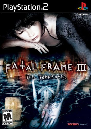
Fatal Frame III: The Tormented, a little known horror game that came out in 2005 exclusively to the PS2.  The story revolves around a young photographer named Rei Kurosawa. Barely a year before the start of the story, Rei lost her boyfriend, Yuu, in a car accident, which she blames herself for.  Rei begins to unravel mentally when she experiences a hallucination of her boyfriend beckoning to her during a photo shoot at an abandoned house.
She begins to dream of a sprawling mansion,Yuu beckoning her deeper into its depths.  Ghostly priests and priestesses bow at her presence and she soon finds herself staring up into their faces as four young priestesses line up silver stakes with her hands and feet, chanting a lullaby while they nail her into the ground.
 
A scene from Rei’s initial dream. Surrounded by four singing
priestesses.
 
The Manor of Sleep.
The game untangles the mystery of this ‘Manor of Sleep’ and the urban legend that those who visit it will either be reunited with their departed loved ones, or disappear from the real world with nothing left of them but ashes after 7 days.  One need not have played the past games to enjoy this one, though those who played the previous games will recognize familiar faces and recurring locales. At android4fun.net you will find all the latest android games and app, all free to download.
 
The game features three playable characters who all have varying abilities which allow them access to different parts of the Manor of Sleep with the main combat mechanic involving the use of an old fashioned camera to exorcise violent spirits who attack you. If you need more thrilling games like this that would surely put a jolt in your body, you can experience them on sites such as roulette online.
 
This is where the game really starts to play tricks on the mind.  Unlike many other horror games where you have to run or are able to combat your monstrous enemies with brute force, Fatal Frame (true of the entire series) forces you to stare at them as long as possible so you can get the best ‘shot’ of them with your camera, and therefore the most points.  We must face our fears and look them dead in the eye.
 
Facing our fears up close and personal.
Rei and Miku’s huge apartment must
cost them a fortune in rent in Japan!
If that weren’t nerve-wracking enough, the game’s story unfolds in day and night chapters, the day sections taking place in Rei and her assistant, Miku’s, apartment, while the night chapters start with Rei falling asleep and dreaming of the same ghostly mansion each time.  She starts in the same location almost every night, giving us a feel of deja vu each time she awakens to the same terrible situation.  Each night she must venture deeper and deeper into the Manor’s depths and uncover its terrible secrets, cementing the sense of impending doom in the Player every time she awakens.
 
Sure enough, as the game unfolds, the horror of the dream world begins to invade the safe realm of the apartment, pushing the tension of the story and the desperation of the characters to a breaking point by the end.  
 
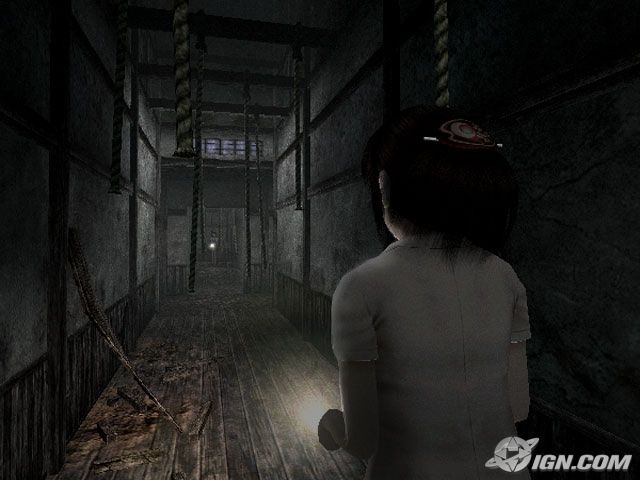
Eventually Miku becomes embroiled in the mansion as well and we see her view of the Manor of Sleep where she, too, is searching for a loved one, and a ghost that has plagued her own family.  Those who played the first game will feel that tightening sense of dread when they see the hints of the Rope Ritual from the first game in the familiar dreamscapes that invade the Manor’s geography and cast us deeper into the unfamiliar.
 
Those of us who played the first game will know to fear this hallway.


Ritual sacrifice plays a large roll in making Fatal Frame as immersive and terrifying as it is.  Each game forces us to unravel the mystery at the heart of each central ritual and what has caused so many tormented spirits to remain on earth. These mysteries usually involve the troubled lives of the main characters, and therefore the Player, who empathizes with the trials of the characters as we descend deeper and deeper into madness with them.  This tie to Japanese Shinto ritual also provides one of the strongest visual motifs for the series, which is permeated with eerily beautiful images of corrupted priestesses and picturesque temples destroyed by past cataclysms.  We, the Player, peel back layers of mythos through documents, love letters, old photographs, decrepit film reels, and snippets of flashbacks presented via cg scenes overlaid with dated film texture, all utilizing a subtle design sensibility that submerges us in a world of old, forgotten things now coming to light.
 
Fatal Frame III takes the Player beyond a mere product digested for entertainment and into another realm of emotion, utilizing all the tricks of charged atmosphere, clever audio-visual queues, involved storytelling, and subdued design to create a wholly unique experience in gaming. A pity such a game will probably never see widespread acclaim, being as niche as it is, but it’s my hope this entry will have at least shed some new light on an old gem some of you might appreciate!
 
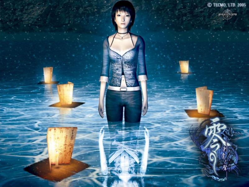
For now, I leave you with more shots to haunt you into the Halloween weekend:
Rei stands amid lanterns sent out for the dead.
A great example of the creepy beauty in this horror game.


Forgotten Shinto rituals and shrines give this game an eerie atmosphere
saturated by folkore.
 
Just one of the many creepy ghosts with such fascinating
details that make you want to both run away and look harder.
While outright gore is rare, the game relies more on hints
of gruesome ceremonies to drive the tension.
Just a note – that’s not a massage table.

Finally, we have a video of the intro section of the game I described above:


Commissions, Portfolio Reviews, and Study Sources

So a lot of big changes have been stewing in the pot for me.  With the decision to switch focus to more concept oriented work, I’ve been gathering resources to study not just design and the game industry, but also sources to help me in this challenging transition from traditional to digital media.  I’ve also realized I need to step up my fundamentals, especially anatomy, perspective, and my old enemy – the background environment!

I feel like I’m going back to school again, which is kind of exciting!  I miss studying and learning new things and even considered picking up some classes here at SCAD-Atlanta again with my alumni discount, but I figure I would try the self-study route first and see what happens before getting myself into more student debt than I already have. I learned about student discount squirrel, its an amazing site that has discounts for everything! It definitely helps me since I am on a tight budget.  No doubt this is going to be a willpower-driven endeavor, but I CAN do this!

I feel like I’m shooting myself in the foot here, but due to the amount of time I should be studying instead of toiling into the night on commissions, I am shutting down private commissions UNLESS they have no deadlines whatsoever.  I’m still going to finish the ones in my queue, but from now on, you will only be able to purchase custom work from me based on what is available in the Custom Items section of my Etsy shop (masks, keychains, pendants, earrings, etc. Mainly my crafts).  I am still available for commercial and corporate work, however!  I do need money, but I need my sanity more!

Rather than feel like I’m taking something away from you guys, I figured I’d offer something new – Portfolio Reviews!  If you would like me to look at your work and provide constructive criticism of your strengths and weaknesses, send me an email with a link to 8-10 pieces, your name, a bit about what industry you’re aiming for, and your website link with the SUBJECT: Portfolio Review.  If you don’t know what industry you’re aiming for, let me know and I can always suggest what comes to mind in my humble opinion based on the work you present to me.  It’s a great way to get your work featured here, which I’ll be doing once a week once I have somebody to feature!

Finally, I figured I’d share my list of study sources just in case anyone else is curious or going through this same transition.  I’m on the lookout for more sources also, if anyone has any suggestions!:

Anatomy Books:
ImagineFX Presents: Anatomy – A nice collection of common problem anatomy areas complete with many charts, photos, and contour drawings by top notch artists. I snagged this one digitally for a low cost.

Atlas of Human Anatomy for the Artist – This is a somewhat dated book, but the section on different body types, expressions, and the effect of aging are exceedingly useful! Also, you can’t beat $6 for a used copy.

Figure Drawing: Design and Invention – Breaking down the body into simplified shapes and contours. I love the approach of the gesture method used to establish the energy of a pose first before trying to construct the heavier lines, muscles, and forms. Energy is important and I feel this book is going to help me with my stiff figure problems.

Digital Coloring Books:

Imagine FX Presents: Fantasy Workshop – I’m a big fan of ImagineFX magazine for its inspiring tutorials and wonderful art from the game industry. This collection gathers many of the artists from their first run of magazines for specific techniques and tricks with screenshots for how the effects were achieved digitally.  Unlike the 2nd book, which just gathers pre-existing workshops.
Digital Painting in Photoshop – Just a basic book on Photoshop tools. I know most of it, but there are some holes in my knowledge as far as file processing and setting up workspace and workflow. Sometimes it’s good to get back to essentials, especially when you’re self-taught and might have some glaring knowledge holes that could come to light in a digital job.
Digital Masters Collection: Volume 1 – Digital Painting Techniques – A straight up digital fantasy and scifi art book with instructions on how each image was made from pros in the industry.
Concept Art Books:
Avatar: The Last Airbender (The Art of the Animated Series) – Admittedly motivated by wanting this for my personal collection, but what better way to learn than to study this series that has inspired me so greatly?  I intend to learn much from the designs which are so similar to the subject matter I’d love to be hired for, with particular attention paid to how they had to simplify the designs to work for television animation.

Game Art: Creation, Direction, and Careers – Also somewhat dated (as they’re still talking about looking forward to nextgen systems like ps3), but the info on what sort of staff makes up a video game development company and what one should expect in their job is golden!

Instructional Videos:
CGMWORKSHOPS – A wonderful channel on YouTube showcasing the videos of various master artists and designers.

FZDSCHOOL – A channel on YouTube featuring videos from an amazing school of design with easy to follow videos on basic design concepts and digital painting techniques.

TheArtDepartment.org – An offshoot of conceptart.org for their instructional workshops. Amazingly, I just noticed in checking the site this morning that their videos are STILL on sale for $7.99!  Personally, I’ve grabbed their workshops on color, composition, and perspective with a few of Jason Chan’s character videos.
And that’s all for now!  Let the learning begin.  My sponge brain is ready!  Or perhaps it’s just spongy from all those marker fumes…hrmmm…

Sketch Diary: Angel of January Part 1

Faerie Escape Atlanta has definitely monopolized my time of late and drawn me deep into a frenzy of leather carving, rather than my usual 2D fair. Normally, I’d lament not drawing or painting anything for months, but this is a much needed break after being hard at work for nearly a year and a half making all new work for Angelic Visions.

That doesn’t mean I’ve forgotten my other projects, however! I know many of you like to see the creative process, so here’s a little peek into my next big series, the Angels of the Months.

I started this series a couple of years ago with the Angel of December, but was never quite satisfied with the amount of empty space left behind the figure and the window so never got past December.  This was a design problem that needed solving.

So with a glint in my eye and a pen in my hand, redesign began!

I like to draw thumbnails almost exclusively in BIC ballpoint pen because it is a very ‘loose’ medium. Ballpoint pen responds very well to pressure, meaning you can get very light pencil-like marks by pressing lightly or pressing harder for darker lines. It’s the controllability of the pencil without the fuss of erasing.  Not being able to erase is also a good thing for me. Since these are just thumbnails, I didn’t want to spend ages on them, which I very well might if given the option to erase!  I banged these thumbnails out in an hour or so.

The first thumbnail took the idea of the original Angel of December and translated her into a wholly new composition. The full figure was cropped to allow more detail to be poured into the face, costume, and wings.  The 2nd, 3rd, and 4th thumbnails deal with the Angel of January, whose themes include stepping into sunlight and the inclusion of a pomegranate as an allusion to Persephone.  I played with the pose trying to figure out the design problem of the wings.  Did I want them attached to the figure? As decorative carvings in the stone to the sides? Folded? Spread?  Nothing seemed to fit the composition the way I wanted.  Everything was too static with no flow!
Finally, the 5th thumbnail represents my ‘Eureka’ moment.  Turning the composition to a landscape format allowed me to fit more of the gorgeous wing flow while also allowing more space for a full-fledged stained glass window, an element I thoroughly enjoyed drawing in the original Angel of December.  This landscape format also works better for inclusion in a calendar format, which is a future plan I have for this series.
Next came the sketch phase where I doodled a more detailed concept of the figures.  Again, playing with both the December and January angels.  I continued the theme of January having a very Greek vibe.  Still pondering how to include the pomegranate and if it will clash with the Carnations and Snowdrops which are going to be included in her portrait.  I also photographed my own artistic references to help get my creative juices flowing.
And that’s where I’ve left off for now!  The concept continues to percolate in the noggin while I prep for my next rush of shows.  I’ve never had so many in one year so it’s been a learning experience for me to find the time to work AND to prep products for sale.
Once I get further along, I’ll be sure to keep you all updated!

Confessions of an Artist 5 – Why Sketch?

It’s been a long time since my last confession, where we talked about the nightmares of storing art incorrectly. Lately, I’ve come to realize a bad habit about myself that I’m desperately trying to break.

I don’t sketch.

By ‘don’t sketch’ I mean, instead of doing thumbnails or studies, I like to hop right onto the canvas and sketch, let the drawing go where it wants to, and then paint away! While this may work for some folks, more often than not, it’s led to the too-late realization of compositional problems, anatomy errors, or dysfunctional color schemes that made me not as satisfied with my work as I wanted to be or should be.

You may ask yourself, why take the time to sketch when you already know what you want to do? Why bother with sketching at all when it’s not guaranteed that you’ll use a sketch for anything? Just go straight to the finish line!

Only recently have I started to do more thumbnail drawings to figure out the best composition for an idea (a practice my college professors always pushed on me and one which I always rebelled against). But I’m not on my own time anymore, I’m on the clock. When my work is for a company, I just can’t let the pencil loose and trust it’s going to be the best it can be. I have more than just myself to satisfy and even then I shouldn’t just let my standards slip when I AM working for myself, either because I’m in a rush or just don’t feel like doing preliminary sketches thanks to the impatient niggling of my muse.

This realization was especially reinforced when I saw Stephanie Pui-Mun Law’s Major Arcana Tarot book, a lovely compilation including her thought processes and the many sketch revisions she did for each card in the Majors suit. I was amazed by the fact she went through so many sketches before arriving at any single figure.

For instance, in the Justice card, she went through multiple figural sketches. In each sketch, she evolved her symbols and improved her composition, from a sword to a feather (for truth), from a classical blindfolded Justice to a figure with blind eyes. Sketching and toying with the concept helped her to arrive at something more profound and dynamic, in the end, than it would have been if she merely sped through the concept. Even then, many of her ‘discarded’ sketches ended up being used for later work, making it even more worth it to play around with sketch ideas because it helped to prompt even more ideas for future artwork.

So while I may get fussy at the idea of not being able to explode into drawing the final composition that’s bursting to get out of my head, sometimes the muse needs to sloow down. Enjoy a nice cup of tea and coax that coy idea out with thumbnails and sweet nothings.

How about yourselves? Do you find it hard to sketch? How do you go about developing your ideas for a concept? My confessional is always open!

IMAGE SOURCE:
“Justice” by Stephanie Pui-Mun Law