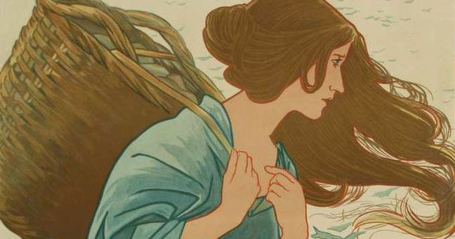
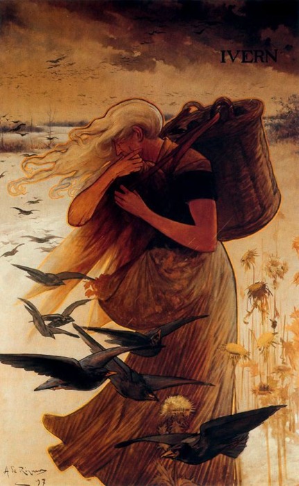
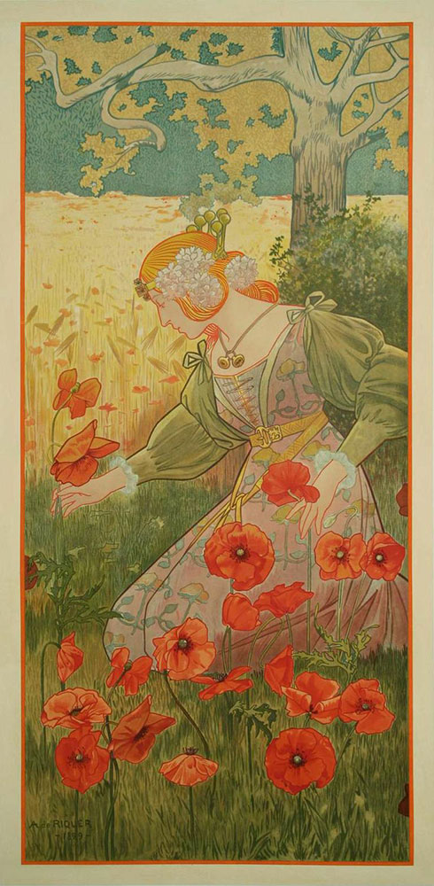
Today’s unsung artist from the Art Nouveau movement is Alexandre de Riquer , another artist from Spain where he was one of the prominent figures of the Modernism movement. He was born to an aristocratic family and studied in France.
It was in France and London where he fell in love with the graphic design of the lithographic posters of the Art Nouveau movement, a relatively new form of advertising at the time.
His prolific body of work spans everything from posters to magazines to book covers! Saying that, I wish I could find a broader collection of his work. There are so few I could dig up! I suspect I will have to dig through collections in Barcelona to find more of his beautiful work.
I love the way Riquer’s art shows more of the Japanese influence on Art Nouveau with his simplified lines and relatively flat colors.
Here we are finally at the merry month of May with the Ladies of the Months series! So many of my closest friends and loved ones are May babies, I knew that this month needed to be extra special!
As ever, brainstorming begins with research. I start by looking into the meaning and namesake of the month of May. May is purportedly named for the Greek goddess Maia, meaning ‘the midwife’, with the month also the time the Romans venerated Bona Dea,”The Good Goddess”. I focused my research on cultures of the northern hemisphere, as they tend to celebrate similar seasons. For this series, I’ve focused much on the themes of the shifting beauty of nature, which reflects itself in countless ways in the way that people celebrate holidays around the year.
May Day, Beltane, and the May Queen traditions (among others) all informed the thematic image for Lady of May that was growing in my mind. The month of May conveys the start of Summer, blooming flowers, the celebration of youth, and the height of our abundant life before the harvest and the cold of winter begin to creep in.
In the end, I envisioned the Lady of May as a dancing, joyful young woman crowned with flowers, the May Queen who celebrates the height of summer.
Fashion Design
So far, this particular Lady has gone even smoother than any of the past Ladies! The ideas have come together rather quickly and I’m excited to move forward. With my theme of a dancer chosen, I began by exploring different kinds of dancers in my reference hunt on Pinterest.
For Lady of May, the imagery from the season that resonated with me from my research was the May queen’s crown of flowers and her connection with dancing, youth, and joy. My reference hunt led me to beautiful recreations of Slavic flower crowns and the dancers of the Bharatanatyam tradition. The wardrobe of the dancers and the idea that a dancer becomes an instrument for the expression of spirit resonated with my concept for Lady of May, who is in and of herself, an embodiment of the spirit of the month. The fresh flowers crowning the hair of Indian brides also made it onto my mood board as another lovely example of the tradition of crowning women with flowers for symbolic and sacred purposes.
While Lady of May is inspired by all of these themes, I still wanted her to represent a wholly unique interpretation that doesn’t tie specifically to any particular culture, as all of the Ladies in the series are meant to represent their own unique embodiments of spirit. As such, Lady of May’s fashion sketches combined inspiration from both Indian and Japanese dancers.
Lady of May’s Fashion Plates. Drawn on a pre-printed croquis sketchbook.
With each Lady, I try to tie their birth flower into their wardrobe. Notice the Lily of the Valley imprint on her belts and the Hawthorn in her ponytail and sash. The design on the trim of the dress on the right is indicative of the red berries that both Lily of the Valley and Hawthorn have. Fun Flower Fact: The Lily of the Valley’s berries are quite poisonous while the Hawthorn flower’s berries can actually be used to treat a number of ailments!
Window Design Elements
Next, it was time to design the window! I went a little overboard with detail on this design because I wanted to emulate the intricate designs of Indian mandalas, while bringing an Art Nouveau flair with the Hawthorn and Lily of the Valley motifs.
Left: First Sketch. Middle: Alternate design. Right: Final design.
The first sketch I made for the design was too simplistic while the next one was too detailed because of the layers of borders. In the end, the final design was a balance between the two.
References, Composition, & Color Test
With the window design and fashion of Lady of May figured out, it was time to bring it all together into a single drawing! I created a collage of reference photos to help give me a more grounded guideline to use for the line art. This collage includes things like bits of scarves, flowers, hair, jewelry, all cobbled together to make something vaguely similar to the final look I’m going for. From this collage, I create a line art base that I carefully tweak to match my own imaginary elements.
As for the composition, The Lady’s wardrobe elements, window, and foreground flowers are so complex that I decided to go with a very simple background that implies the trailing ribbons of the Maypole tradition. These ribbons also help reinforce the flow of her pose. There are some tangents I still need to fix in the line art (the way her left foot and left side of her skirt touch the background flowers), but I can fix those when I transfer the lines to paper. For now, the next step is a color test!
Making the choice for what colors to use for these paintings has been one of the most challenging tasks for creating this series. If the colors are off, she might not represent her birthstone well. Lady of May needs to represent Emerald, but also too much green in this composition will make it flat and uninteresting, while not providing good focus and flow for a viewer. I did quick color flats in Photoshop to test out different options before I put paint to paper. It’d be far too easy to mess this up by skipping this step!
Well, this didn’t help me out much because I love all of these choices! 2 and 4 are my favorite options because I like the clear silhouette of each one. The contrast between the dress and the sari in 2 is lovely, but is there enough green in this to represent Emerald? The contrast between the sari and dress in 4 is also nice, but is there too much green now? Ah choices!
The Final Painting
In the end, I chose the 2nd color scheme, but with a cool grey background to make the warm colors pop with contrast.
View Lady of May’s completed painting and mask set here.
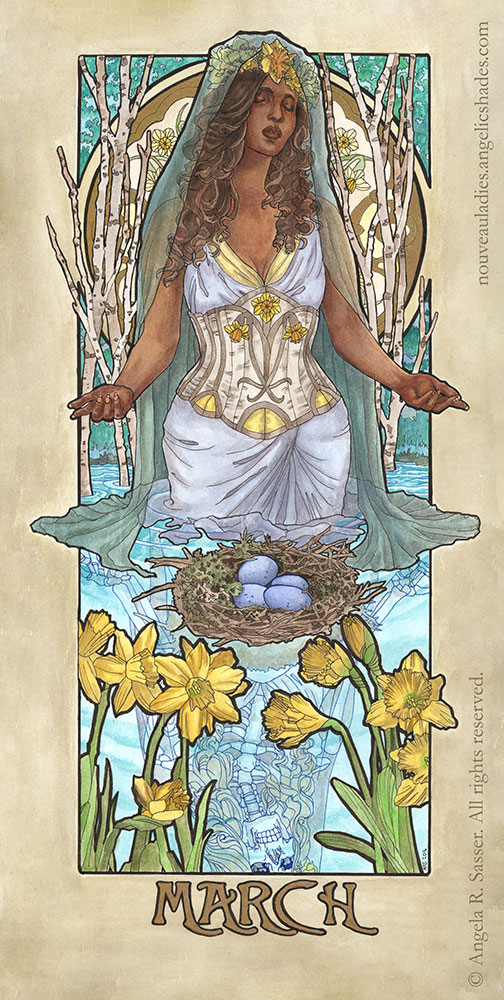
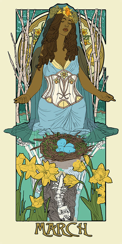
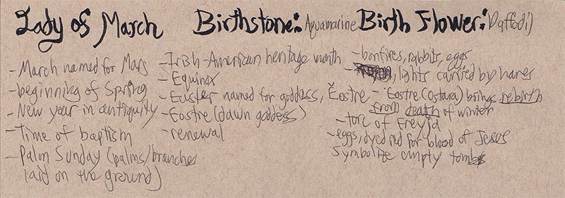
The Lady of March bears Daffodils and dons the stone of Aquamarine. The Daffodils represent chivalry and unrequited love. The Aquamarine will bring her foresight, courage, and happiness.
She ushers in a time of resurrection, renewal, and the bursting forth of new life.
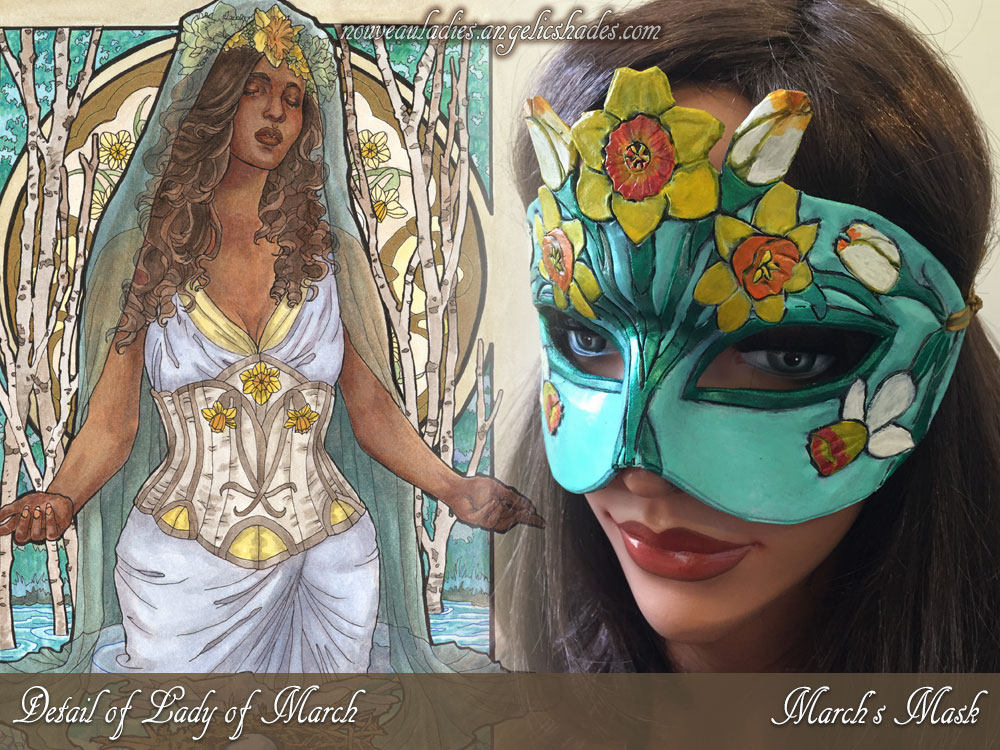
Without further ado, here’s the final version of Lady of March from my Ladies of the Months series! Created with watercolors, sepia ink, and metallic liquid leaf on illustration board.
The Lady and her matching mask:
ORIGINAL ART: Available on Etsy.
ORIGINAL MASK: Available on Etsy.
OPEN EDITION PRINTS: Available on Etsy.
LIMITED EDITION PRINTS: Available only via Patreon. Read here for details.
COLORING PAGES: Available via Etsy and Gumroad.
Last time, I talked about designing the narrative elements. Now, I’m excited to start pulling everything together into a cohesive piece! Working in Photoshop CC and using a Cintiq 21UX, I use a composite created from my reference photos as a basis for a rough line drawing. Sometimes, it’s impossible to find the perfect pose and that’s where Photoshop can be really handy.
I’ve used the body from the photos I took, the head from another photo whose facial angle I really liked, and other reference photos (not pictured) to help me change the look and features of the model. One of my intents for this series is that it should encompass all forms of beauty, including diverse women from different ethnicities. I don’t want every Lady to look like me, since I’m primarily the model (a fact I hope to change once I can afford more models).
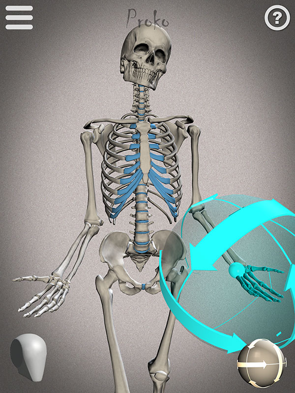
I also wanted to share this screenshot of the reference I used to draw the skeletal reflection from Proko’s Skelly app for Apple and Android. It’s fairly easy to use and arrange with poses you can save. I’ll definitely be using it more for study!
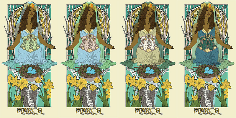
With my line art figured out, I can finally move on to testing out a basic color palette for Lady of March. I know I want a theme indicative of Easter, so I’m mainly drawn to gold, yellow, and blue. The first thing I do with any of the paintings in this series is to make sure the birthstone is represented also through the color palette as well. Luckily, the greenish blue hue of Aquamarine suits my concept for this piece rather well! This color takes up the majority of the background and influences the rest as well. The only other element I’m sure about at this point is that I want the eggs to be the bright blue of robin’s eggs, which always make me think of Spring.
I use the Hue/Saturation slider in Photoshop on each element to see what color choices might surprise me. I explore different options, including a dark dress or a light veil. The 1st image is perhaps too monochromatic in the clothing so that the corset stands out too much. The contrast between the dress and veil in 2 works well while the bodice also brings out the beige of the trees from the background so there’s more color circulation throughout the piece. The 3rd and 4th images both have a nice clear silhouette that’s intriguing, but starts to get away from my liking of stronger blues and yellows in this piece. I should also note that I try to keep the yellows subdued throughout this piece, except for the flowers, which are the strongest focal elements.
Finally, I arrived at a color palette I consider to be the best of all worlds! The dark veil allows a strong silhouette for the figure while the pale corset and pale blue dress work well together, leaving the eggs and flowers as the most saturated symbolic elements in the piece.
This has been your final sneak peek before I unveil the final painting! You can see the unveiled piece here.
Watch a time lapse of the painting:
Want to see these Sketch Diaries before everyone else? Consider pledging at my Patreon!
You’ll get early sneak peeks plus other exclusive Rewards!
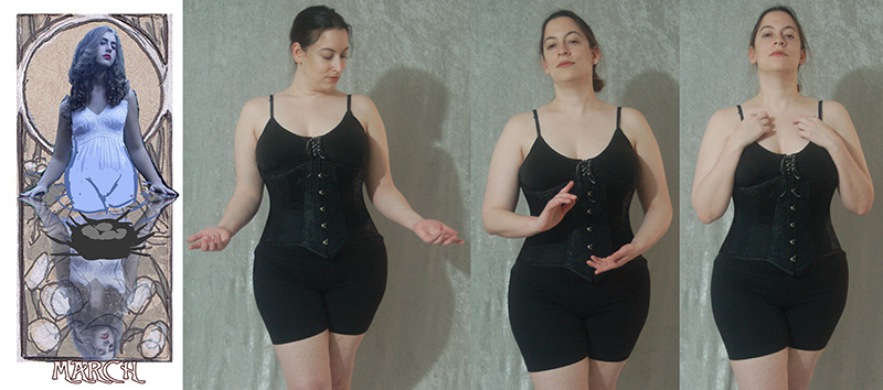
I had a general idea of the symbolism while I was sketching thumbnails in the last Sketch Diary. Now, I get to tie it all together into something more tangible than scribbles! My fear with this piece is that I wanted to cram too in with the nest, eggs, branches, veiled woman, reflection in the water, etc. The key and main focus of this composition, however, needed to be first the Lady. I was onto something with the poses I previously compiled, but they weren’t where I wanted them to be yet for this image, so I took the time out to do a photo shoot to capture the subtle pose that I wanted.
Specifically, I didn’t like the flatness of the hands in my mockup. They weren’t as expressive as they could be in the original pose (and you’ll probably see me say this a lot while searching for the right pose for a Nouveau piece). The hands needed to be more gestural and graceful, which meant much of the photo shoot was spent trying out different hand motions and head tilts. The body is the most important narrative element in Art Nouveau pieces, since a stiff figure can make an image feel posed and disconnected rather than flowing and lively.
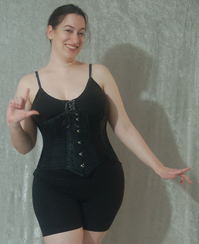
Plus an outtake for fun taken during hand gesture practice.
In the end, my final decision was a mix of the head tilt of the original pose plus the open hands of one of the poses I took. The head tilt evokes a sense of meditation and harkens back to portraits of saints in contemplation, which very much suits this Lady and her spiritual themes of rejuvenation, resurrection, and baptism. The upturned hands also speak of a deep breath, meditation, and more of a connection with the water and energy around her.
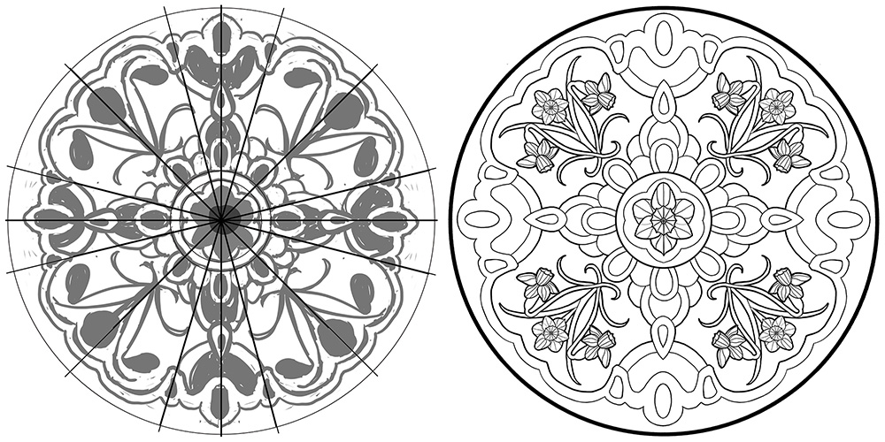
I also worked on the window design at this point, since I had a general idea of how much of it would be covered. A lot of the window was going to be revealed this time, which meant I could work on a design that covered more of the area of the window rather than focusing on accents in the outer boundaries that would need to peek out from behind the figure. I used a template of a circle I made for the previous Ladies and divided it up into sections to help make plotting out symmetrical elements easier. Once I had a small section of the design done, I copy and flip it to create the rest.
Notice my designs start out with really rough shapes first to give me an idea of how the space is used rather than jumping right into the detail of the flowers. Since I’m going with an Easter-inspired theme for Lady of March, I was inspired by faberge and decorative eggs for the window designs.
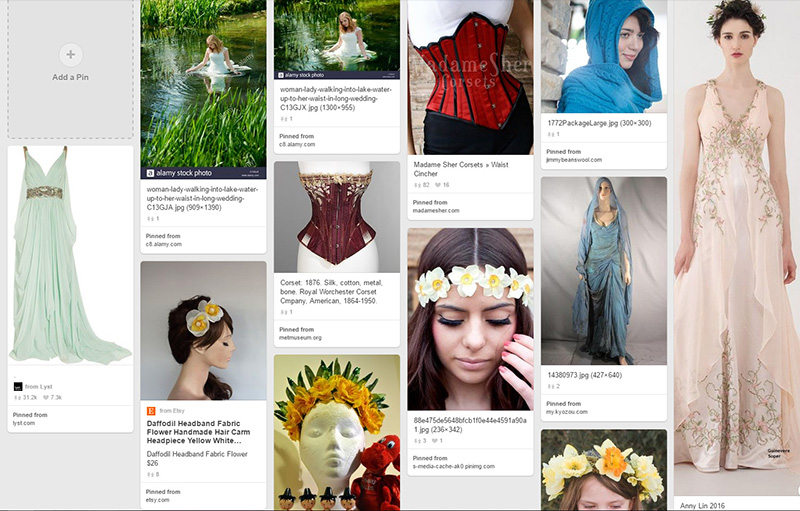
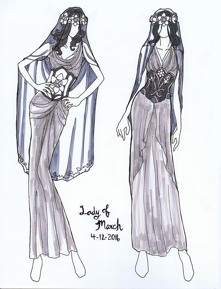
Next, I whipped out my trusty fashion croquis sketchbook and doodled a couple of quick designs to see how I wanted to handle March’s corset, which is the other key area for symbolism and decoration in this series.
As ever, Pinterest is always my first step when brainstorming for fashion (or anything else)!
Colored and inked with my warm and cool grey markers set.
I like to use greys so I can establish the values without being tied down to any particular color scheme just yet.I ended up favoring the design on the right for the visual interest a more complex design brought to the stomach, which is located in an open and central area in the overall composition.
Want to see these Sketch Diaries before everyone else? Consider pledging at my Patreon!
You’ll get early sneak peeks plus other exclusive Rewards!
Inspiration:Every year I do a painting to spread the cheer of the winter holidays to my fans, friends, and family. Keeping in that tradition, I created this piece entitled “Winter Offering” for 2015.
I wanted to capture the quiet warmth of candles, which are one of my favorite decorative elements of the season, and pay homage to some of the Celtic traditions that define the holidays with the presence of evergreen holly and pine. I also wanted a celestial theme for the window to represent the dark, cold winter nights which the light guides us through.
Tools and Techniques
For this painting, I used Photoshop CC and a Wacom Cintiq 21UX.
References
A selection from my references.
Art Process
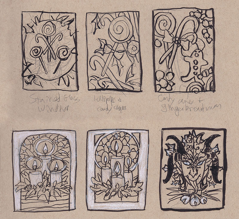
Step 1 – Thumbnail sketching with ink and white color pencil on toned paper to find the right idea. At first, I wanted to do a candy theme, but the candles struck me with their simplicity and elegance. The Krampus one was also a fun contender, but I decided to save him for another time.
Step 2 – Reference gathering! I looked at many Tiffany glass windows, wreaths, and white candles for inspiration. I keep a secret reference board for my yearly holiday images on Pinterest.
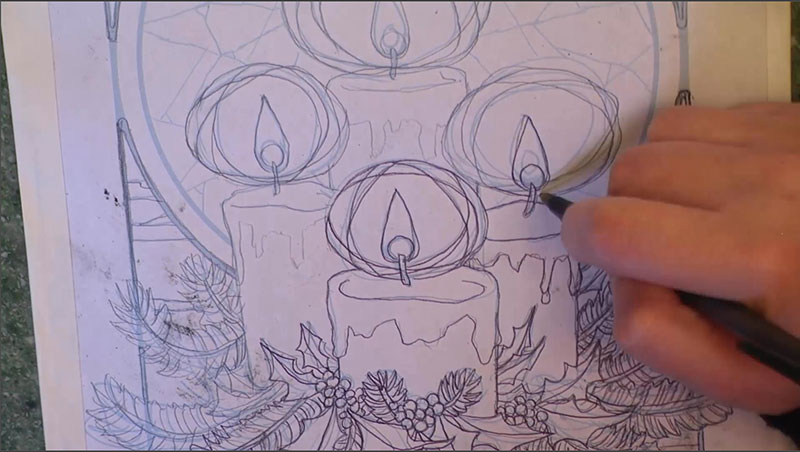
Step 3 – I did a rough sketch in Photoshop keeping loose and quick. The sketch was then printed out and refined with pencil sketching on top of the lightly printed line work.
Step 4 – This refined sketch was then scanned in and the lines turned blue so they could be easily transferred. I also used the same refined sketch to do a digital color test so I had an idea of my colors before I put paint on paper.
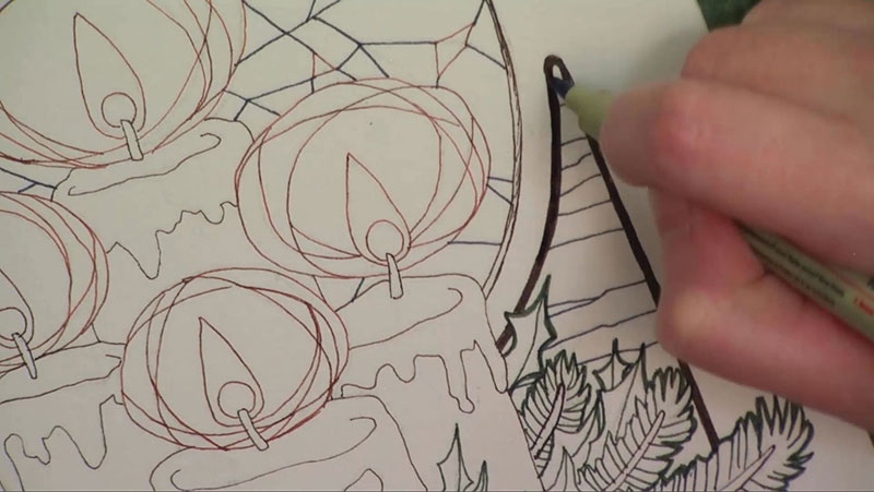
Step 5 – The refined sketch with blue line work was then printed and transferred with graphite dust applied to the back of the printout.
Step 6 – The transferred line work on the illustration board were inked with various colors of mechanical pens for visual contrast and interest.
Step 7 – The ink drawing was finished with watercolor paints.
You can also watch the 5 minute time lapse video of how I created this painting here!
For more in-depth instruction on how I created this image, including the brands of materials I used, tips on creating a stained glass style in watercolor, etc., pledge to any $10 and up level on my Patreon to gain access to the narrated video tutorial!
You can also buy the individual tutorial separately at my Gumroad shop, but you won’t receive the other extras you would by purchasing via Patreon.
This video dropped earlier this week for my Patreon Patrons and Kickstarter Backers. Now here it is for the public! Enjoy and feel free to leave any questions in the comments.
I plan to post the next part with the actual painting process next week. Again, if you’re a KS Backer or a Patreon Patron, you’ll see it before everyone else.
My Kickstarter project could still use your help! If you know anyone who might be interested in my project, please spread the word to them. It’d be much appreciated!


 Unlock with Patreon
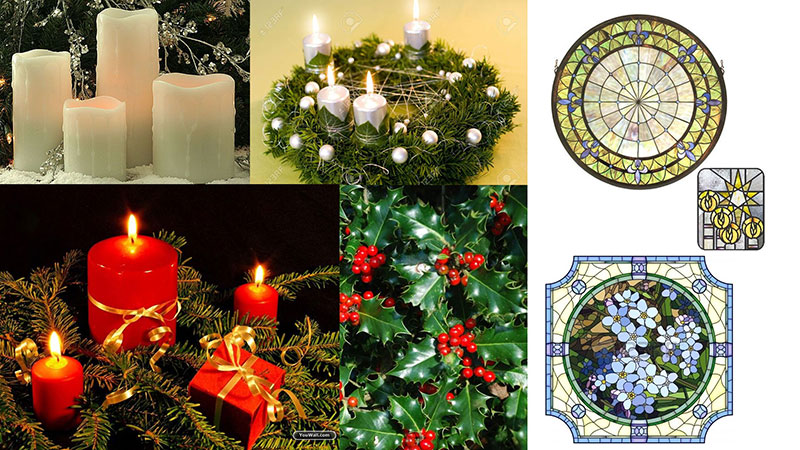


