Category: advice

CofaA: Fear & Your Own Self-Worth

It’s a cold fear that sinks into the pit of your stomach.  You’ve just gotten a request for a commission you’ve been hoping will come for a long time. You know the one. The job that’s not a $10 portrait, but a job that is remotely in the price range the GAG guide says you should be charging.  You calmly send your reply and state your price and hope that you aren’t scaring away your potential client with a garishly high price that is sure to convince them never to work with you again.  You’re a dime a dozen. Any artist can do your job!  So you quote your price lower before you even begin just so they realize what a deal they’re getting and stick with you.

And therein lies the fallacy of it all.


Talking SRS BIZNESS today.

I’ve been dealing with this fear and second-guessing of myself for a long time since I decided to get a little more serious about my commission rates some years ago. Gone are the days of charging $10 commissions on DeviantART just to make a little extra pocket change to attend my favorite con.  Commissions, for me, have become a matter of paying bills.  I can no longer afford my previous low rate when I have to be the responsible adult and pay my own loan bills, credit cards for bad credit, etc.  When one needs to make a living instead of pocket change, those prices aren’t just low, they’re simply impossible! (Unless you have a day job to fall back on, that is)  By my math, I need to be making $40 an hour to even afford a decent living as a self-employed artist paying for my own benefits.  You can guess how many times that’s happened…and it’s not even because people aren’t willing to pay, though that is a part of it.

I fear those days of accepting less before I was truly ready to be paid for my work ruined me.  I became too accepting of being paid too little. I HAD to be cheap to be competitive. (Big Mistake Number One)  Years of doing this has  resulted in my present self being literally scared I’m charging too much for my work.  I get a lump of fear in my throat when I quote someone, fearing that the price will be too high and they’ll say no. I have to willfully repeat to myself “Another job will come along. Do not panic.”  I have to trick myself into thinking that YES. I am worth it!  YES there ARE people out there who are willing to pay what I quote them.  It’s embarrassing to admit this as a professional, but it’s something I’ve been willfully trying to change in myself for the past few years.  Since I’ve adopted this attitude, I have realized this isn’t just a half-truth I’m tricking myself into.  The people who connect with my work have found me and hired me and I’m working on making that a more regular occurrence!

One strategy that has helped me mitigate these fears with my clients has been to quote them the average price range for their job as provided in the GAG guide.  This helps the client, who is usually ignorant of such industry standard rates, to know what they should be paying an artist.  It also helps me feel justified in my asking price.  Most clients don’t want to willfully underpay anyone.  They generally understand that times are difficult for all right now and are willing to negotiate a middle ground for a price that makes everyone happy.  If the job falls through, than at least they’re now educated in what most professionals will ask for as a rate and have more respect for your work being perceived as expensive, and therefore more professional than someone else charging pennies for what is generally going to be lesser quality work.  Your rates can and will determine your perceived value as an artist and balancing that notion with your own honest impression of your skills is a balancing act one has to learn when becoming a professional.

Then there is the matter of other artists who have the same fears I do, who go about charging less for their work when they should be charging more.  It’s a free country, so you can do this, right?  Technically, yes, but just remember that when you as an artist charge less than you’re worth, you cast the false impression to your customers (and anyone they might refer to you) that the perceived value of art, as a whole, is less than what it should be.  Lowballing prices cheapens the worth of art as an industry and makes it that much more difficult for all artists to ask a fair price.  It’s an epidemic of fear and low self-worth we live in as artists and we need to face this as a community by encouraging and educating one another.

Remember, we are worth it.  Every artist is unique with their own expression, experience, and execution that forge their professional identity.  Earning pocket change is fine, but remember to raise your prices and be fearless doing so once your work improves.  Remember also that it is easier to lower prices than it is to raise them.

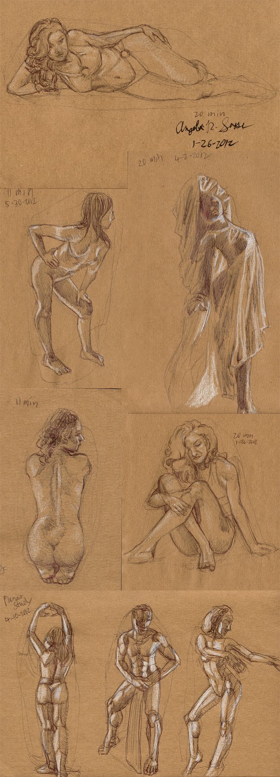
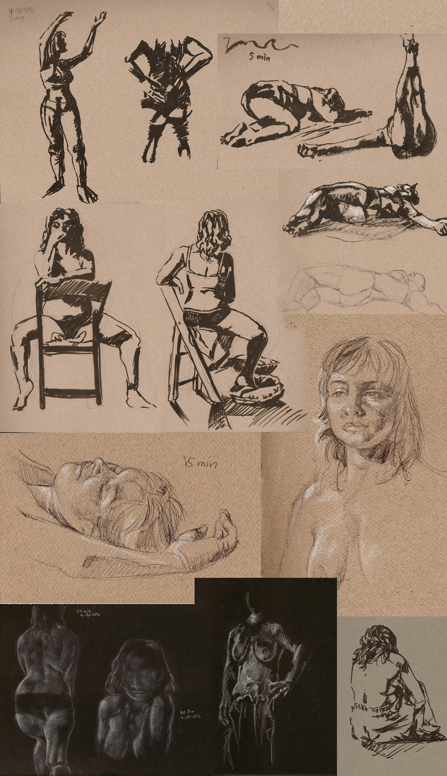
Better yet, save accepting commissions for when your skills are more developed so that you can be serious about your asking price from the get-go and avoid falling into the pitfalls that can come about from charging too cheaply.  Spend the time you would be working on pocket change commissions on developing a portfolio instead, which will help you to get a better paying job in the long run.

This is the advice I wish someone had given me years ago when I first got the notion in my head that I’d like to make a living drawing pretty pictures and now I’m giving it to you.

This will be my last post for a while with DragonCon and commissions sucking up all my time and what a doozy it was!  I’d like to know if others share my fears?  How have you dealt with them?  Discuss in comments!

DragonCon 2012 To-Do List

This year is going to be my biggest year yet at DragonCon!  I’ll have a table in the artist alley, a large gallery bay, and a 3D display table in addition to all the rest!  This will also be my first year giving a panel on the basics of leather mask-making (Saturday at 7pm during the con).  I thought it would be a good exercise to share my tentative to-do list for this year’s con just to give everyone an idea of the hecticness.

–  Shoot and edit videos of segments for the mask-making demo.
–  Finish “War Prince” and “Lotus Dancer” paintings.
–  Craft 6 leather masks to add to the displays.
–  Create head displays for masks (touch up ones from last year that are damaged).
–  Double mat 10 art cards and embellish each mat with a themed drawing.
–  Order canvas prints of centerpieces.
–  Order bookmarks (order vinyl sleeves and tassles for bookmarks).
–  Make prints for the print shop and table (what a time to break in a new printer!)
–  Make sure I have enough bags and backing for all the prints.
–  Program barcodes for products at my table. Train with the new scanner between now and Dragoncon.
–  Compile portfolio for black and white interior artwork and full color character art for tabletop game companies.
–  Sign up for portfolio reviews. Still need to research which companies are represented at DragonCon and what kind of art they’re looking for.
–  Make some kind of freebie for any interested AD’s. A sketchbook? Bookmarks? Mini Calendar? Brochure? Not sure yet…

Have a sneak peek of my art gallery panel layout, for the curious:
I almost always lose my layout during setup so it’s nice to have a backup
here on the blog just in case I lose it.

To be honest, I’ve never pursued portfolio reviews at DragonCon before. It’s always been too intimidating and I never felt like I had enough of the right kinds of pieces.  Now, I feel I have a better idea  of what I am trying to be hired for and better work, to boot.  We’ll see, though!  I suspect I will be in for a cold splash of reality, but it’s one I hope that will help me to improve my presentation, overall! I’m also going to experiment with presenting my portfolio on an ipad. Yay for hand-me-down electronics!

So let the mad rush begin! May the coffee flow free and the chocolate be plentiful!

Out With the Old, In With the New

Persephone. A new direction?

We’ve headed into the final round of my charity auction (for now), and I’ve got to say it’s been a roller coaster of emotion for me!  I’ve said goodbye to so many of my old pieces in the past couple of weeks, some of which sold for only a dollar.  I’ve made my peace with this, however, as I’d much rather see these pieces go to homes that will appreciate them, rather than sit in my basement gathering dust. GONE, they are, and now I feel a weight lifted knowing that this old work is not present for me to rely on anymore as the base of my body of work.

I feel like having my old work around encouraged me to be less productive. It’s easy to get comfortable when certain pieces have met with some success.  Now that they’re gone, I feel an even greater push to be productive to fill that hole in my closet. I’d ideally like to be able to produce at least one fully thought out and detailed piece a month, but it just hasn’t happened for me for one reason or another.

It’s funny to think that my work will be different now, if Persephone is a portent of things to come.  I’m afraid of not being able to present a cohesive body of work anymore since my old work still makes up the majority of the prints I sell.    As such, I’ve been slowly retiring older prints (many which I already have in the CLEARANCE section of my shop) and gradually re-branding myself with newer work more pertinent to the industries I’m aiming for.  There is such a massive undertaking of creating completely new bodies of work ahead of me!  I have to wonder if most artists go through this shedding of skin? This metamorphosis of imagery, style, and media?  Surely, I am not the only one who shifts their colors throughout their career?  I wonder if we just never see the older work of the pros we know, so we always assume they knew what they were doing from the get-go.

On that note, I’ve been thinking long and hard about just what industry it is I’d like to target right now, with the good advice from friends in said industries and art communities to guide my way.  The hard facts are that my work and fundamental skills need to be more polished to get into concept art, which is my ultimate goal.  Neither do I currently have the ability to relocate to the places where I’ll find those kinds of jobs with my significant other’s career in the mix as well.  His career takes priority right now because I am simply not ready to enter into the field I’d like to pursue, while he has advanced to the point in his field that he is ready to enter the next level.

This is one of the many challenges of having romantic relationships as an artist.  Moving can be difficult when you have to prioritize one person over the other to make sure your bills are paid, while you also have to be honest to yourself about what your potential is at the given time.  By the same token, we are so incredibly lucky to be able to advance together and provide constant support for one another.  While one person is building strength, another can man the wheel.

However, all is not lost, as there are other art fields which seem suiting for me.  Playing card art, book covers, and interior art for rpgs have caught my eye, since they all tie in to my favorite subject matter (fantasy, scifi, and character-driven works) and, for the most part, allow you to work remotely.  It’s a way to suit my needs and develop my skills while still being in an industry I can be passionate about!

I’m excited about this course correction of mine and have been brainstorming on a list of subjects I’d like to depict in a targeted portfolio for each.  I shall have to ramble on what I’m thinking of doing later, however, because this blog entry is already long enough!

Thanks to all of you who drop words of support here and in other online communities.  I feel like a flag in the wind sometimes with no control over where life is taking me.  Words of encouragement can mean so much to build the kind of positive attitude I need to reach my goals.  I started this blog to document a journey from amateur to professional and I feel like I’m finally on a course that’s not as unrealistic as it used to be.  I have goals, steps, and everything I need to get there. Now it is up to the art to pave the way!

Let the productivity begin!

Eureka Moment – Composition

eu·re·ka [yoo-ree-kuh, yuh-]
( initial capital letter ) I have found (it): the reputed exclamation of Archimedes when, after long study, he discovered a method of detecting the amount of alloy mixed with the gold in the crown of the king of Syracuse.


What is a ‘Eureka Moment’?
It’s that moment when you’re trying to understand a complex concept where a particular bit of information is presented that suddenly makes all of the elements you didn’t understand before click together to make sense.


We all learn in different ways.  There’s nothing like returning to my fundamental studies in anatomy in the past month to really drive this point home.  You can explain to me a billion times about the pelvic furrow or the angle of a joint’s rotation, but I am a very visual kinesthetic learner, meaning I have to learn by doing, which means things often don’t make sense to me till after I perform many learning exercises to explore a concept.

My latest ‘Eureka Moment’ occurred while reading issue #80 of ImagineFX magazine. Many of you may think this magazine is only for digital artists, but they cover plenty of topics and offer many tools that would be useful to all artists, such as articles on color theory, features of classical illustrators, and reference photo collections on the accompanying CD.

It was one such article on analyzing composition by Dan Dos Santos that led to my recent ‘moment’.  Considering Dos Santos’ track record of gorgeous book covers featuring one or two characters, I knew he would have plenty to say on the matter! It’s tough to make a book cover really pop with just one character to work with. You have to catch the reader’s interest, visually and story-wise.  A single image has to have enough punch to make you want to learn more!

The article covers, among other things, a simple exercise you can do to break down your composition involving greyscale layers to indicate foreground, middleground, and background.  I thought I’d try it on my latest piece, Persephone Queen of the Underworld:


The Results:
Converting the image to simple shapes allowed me to get a better sense of how it was reading visually.  I discovered by doing this that while there is a nice vertical spiral throughout the composition, the bottom where her dress trails off is just a tad too busy and cuts off abruptly.  The dress ‘tendrils’ on the left side flowing out from her back also create an awkward silhouette that is disharmonious with the shapes created by the adjacent ‘tendrils’.

I also found that the relatively flat background is not creating enough narrative or visual interest in this piece.  Visually, it falls flat of framing the figure and gives us no information about her setting or story.  I asked myself ‘How many people would know this is Persephone or some kind of underworld figure if I hadn’t said so in the title?”  Originally, I wanted to keep this area simple because the flowers, swirls, and figure would be made too busy by anything more complicated than a void, but now that I ask myself the tough questions, it’s just not telling enough of her story!

Next, I tweaked with the layers of the background planes to see what I could do to create more harmony and visual interest.  I then broke down the main planes into color groups, per Dos Santos’ suggestion to keep your color groups simple to create high contrast and visual interest:

The Results:
I found that by pushing the figure upwards, I could give the flow of her dress more room to terminate in a less abrupt way, which makes a more comfortable vertical flow for the viewer’s eye through her hair, down into the core of the figure, and down through the dress.  She also has a delightful ‘tree’ shape to her now that fits well with her vegetation theme.

The energy swirl was removed, leaving the flowers to do the work of creating the spiral of energy around her, which I feel also works better to help solidify her symbolic connection to the blossoming of spring.  The background plane was tightened up from a random void of energy to the mouth of a cave with rock formations which frame the figure and tell something of her current imprisonment in the Underworld.

Now, I’m preparing myself to dive back into this piece and really make her shine!  Elements of the piece may still change in the doing, but I feel I have a much stronger idea after I’ve spent days staring at this painting and not knowing what exactly felt wrong about it.

I hope my Eureka Moment helps someone out there! If you’d like to read more on the topic of planning compositions, I highly recommend getting Issue #80 of Imagine FX and reading Dos Santos’ original article for more working examples and invaluable advice.  There are more great articles included that helped me get inspired, including the brilliant compositions of Howard Pyle.

What was your latest ‘Eureka Moment’?  Share in comments!

Studies for April 2012

I spoke of studies in a previous entry and now here they are!  April was a very productive month to get off my bum and really make good on all those promises I’ve made to myself to get better at anatomy by drawing and drawing until I can draw no more.  I’ve realized if I want to get to the point of making a living at what I’m doing, I’m going to have to get better and keep up the push!

This month’s studies were accomplished through a number of life drawing sessions I attended live or using the Pixelovely tool when I didn’t have the time to leave the house.  Pixelovely draws from a wonderful pool of well-lit stock photos and lets you choose the state of undress and gender of your models, as well as how long you want a session to be (with automated breaks!). I highly recommended it if you don’t have access to live models.

These are just some of the studies. Had to leave some out for post length sake.
Studies ranging between 30 seconds and
5 minutes. View high-res version.
Studies ranging from 11 to 20 minutes.
View high-res version.
Various studies from a live session at Bohemian Circus Night. at the
Apache here in Atlanta.


What did I learn?
Mainly, I’m learning to loosen up and not be so obsessed with detail.  Sketching mainly in pen without the ability to erase or with a brush pen allowed me to focus on shadows and forms instead of getting caught up in all the technical side of things.  I find if we get caught up in details, we miss the energy of the model and what makes a pose interesting in the first place (something that would serve me well in depicting characters, I think!).

I learned a lot about the trouble areas of the face, such as the juncture of the nose and lips and how light falls there (especially in the Bohemian Circus Night sketches).  Reflected light from the floor and one’s own skin also caught my eye this month.  I noticed also the most successful studies are the ones that paid attention to peak highlights, or where the light is strongest on the elements which protrude outwards (elbows, tips of noses, etc) while highlights are more soft shifts across smoother areas, like cheeks, foreheads, and the subtle muscles of the back.

Next Month’s Challenge to Myself:
Tackling hands, feet, man-crotches, and facial expressions.  Basically getting into those very specific areas of anatomy trouble for me. Going to try and do 100 sketches of each!

It’s funny how we pick up little tidbits of knowledge from staring at the same figure in a different situation or from a different angle. Some things just ‘click’, but you’ll never get that click unless you’re always looking at the same thing and thinking about how it works constantly because the human form is just so complex.  I’ve had life drawing classes in the past, but that knowledge tends to fade if you aren’t practicing all the time.  Here’s hoping keeping the knowledge fresh will link up to all of the other art I’m making right now! I trust it will in that way that knowledge sticks in the back of your mind informing you in ways you aren’t even aware of.

So what are you all working on?  How are you challenging yourselves and keeping your art form going strong?  Share in comments!

Artists and Health Issues Part 2

I got some great feedback from folks on the last post concerning artists and health issues and thought I’d share some of the tips with everyone. I also forgot to mention a few other tactics that I’ll go ahead and share here:

 
Get a proper desk! –  I didn’t mention that half of what caused my neck and shoulder issues was working on a computer desk that was about 5 inches too low for me for a matter of years.   It was never meant as a computer desk and, as such, I was always hunching further over it in order to type.  My monitors were not eye level either, even though I had them propped up on books. Monitors should always be eye level or just below eye level so you are not looking down and constantly stressing your neck.  I’ve since gotten another desk, but damage had already been done.
 
As for art desks, try to get one that you can slant and adjust the height, which also helps you from hunching and looking downwards all the time.  Another tip if you have a desk you can’t adjust is to get a tabletop easel to stand your artwork on so it will be eye level, or at least not laying flat on your desk so you have to hunch and look down all the time.
 
Get a proper chair!  – Kind of goes with get a good desk!  A crappy chair at the art or computer desk can do just as much damage to your posture as sitting like a gargoyle can.  High stools are great if you like to paint on an easel and want to sit down instead of stand up.  Your back should be straight while your elbows at a 90 degree angle to your keyboard.  Personally, I am investing in one of these kneeling chairs for when I work at the computer because it looks so comfy and encourages you to sit up straight to maintain proper balance.  Best of all, it seems you can get them for fairly cheap!  There are all sorts of fancy chairs that adjust to the human form, but they’re almost all too expensive for my shoestring budget.
 
Go swimmin’! –  This was great advice from a commentor who is also a physician.  Swimming is low impact so there’s less chance of pulling a muscle or hurting your joints doing some crazy exercise you’re unfamiliar with. You don’t need to be doing olympic laps either, you can even have a flotation device, it doesn’t matter, you just need to move.  Plus, it’s fun!  I love to swim so I was glad to hear this advice.  I do so miss underwater tea parties from when I was little.  Time to bring them back!
 

Snack healthy – I forgot to mention this in the last entry, but some of my low energy came from just grabbing whatever was around when I felt like nibbling.  I’ve since replaced potato chips and chocolate with bananas and Greek yogurt. Both are extremely healthy for you, bananas providing tons of potassium and other vitamins and energy, while Greek yogurt has probiotic properties, the protein also filling you up longer than other snacks. Getting a Body Contouring Scottsdale is probably one of the healthiest things I ever did for my body too.

Nuts (like almonds and cashews) are also good to munch on and tide you over till the next meal time. I’m always snacking on these throughout the day to keep my energy levels up and it’s worked wonders for me. A girlfriend of mine once told me eating healthy is especially important for women’s health, im talking yeast, and when spends all day sitting, well, need I go on? There’s still the occasional chocolate, for what artist in her right mind would give chocolate up completely??  Plus, dark chocolate has antioxidants so I can make exceptions for it.

 
As for my own health status?  It’s the last week of physical therapy for me and I’m doing great!  I’ll have to keep up the exercises for my shoulders, neck, and back even after our last session this week, but that’s going to be good for me in the long run.  I have been using a lot of resistance bands for training and they provide simple low impact exercises I can do from the comfort of my own home.  Some of the stretches seem almost too simple, but the soreness is surprising!
 
I feel less like I’m going to end up like the humans did in Wall-E (ie. boneless blobs without social lives) since I started the physical therapy and started working from the studio as well.  I am doing great and I thank all of you for your well wishes and support!
 
Now, go forth and create! (And remember to take breaks!)

Artists and Health Issues

There has been a disturbing pattern emerging the longer I work a creative job, one I’m especially beginning to appreciate now that I’m in my second week of physical therapy for ‘repetitive shoulder stress’ and an ‘unstable shoulder joint’.  This occurrence after a year of ignoring shoulder aches and soreness was quite the wake up call for me.  The ability to use my arm is my livelihood and being incapacitated in any major fashion could be disastrous!  Luckily, my issue is only a moderate one which physical therapy is helping, but there is a bigger picture at work here.

Thinking back on things, I have gained about 15 pounds since I started working long hours at the computer and art desk.  I’ve had stretches of mental and physical fatigue caused by overworking, tight deadlines, and just being downright lonely.  Sometimes I’m so passionate and excited about my job, I just keep working and working without taking any breaks. Other times, I just can’t get motivated. There is no inspiration, and worse, I start to lose hope that this job is not worth the mental and physical pain it causes me.

I can’t help but feel much of the downturn in my overall health has come from a decrease in physical activity and social interaction.  I feel loads better this year now that I have made a concerted effort to change a few bad habits.  These are some of the things I’ve done that have helped to improve my health lately:

– Taking regular breaks. It’s so incredibly easy to just keep working and working in a job that you are so passionate about!  I learned the hard way if you don’t get up at least once an hour from the computer or art desk, you’re really doing damage to your neck, back, and shoulders.  Nowadays, I have to get up or damage my joint more.  I take a moment each hour to go and talk to whoever might be home, take a small walk around the yard, or to do a few Yoga stretches.  I find the Tree the Warrior, and the Cobra poses to be particularly helpful for my sore back and neck pains (and are pretty easy to do).

– Taking regular walks.  I don’t have a lot of time to run to the gym, so mainly I just take 30 minutes out of the morning and evening to go on walks.  There’s a gorgeous country road right near our house which I can walk on for this amount of time and never hit the end.  A plus side is the healthy population of hawks, squirrels, blue birds, owls, and wildlife that dart around me while I walk. It’s soothing for me to get away from the technology and meditate while I walk to the sound of nature.

– Visiting a gallery and being social.  Internet friends keep me sane, but getting out of the house once a week to visit the local gallery helps me to meet other real living, breathing people who I can talk to, who are generally just as interested in art as I am.  After long hours working alone, it sometimes feels like my life is passing me by while I’m toiling away trying to make a living at an unappreciated, underpaid job.  A coating of stoic disapproval starts to settle on me and I have to shake it off by getting OUT, or risk getting really demotivated for my work.  I’ve started attending local art organization meetings recently as well, which has been great for meeting other artists trying to make a business out of their artistic identity (we are not alone in our insanity!).

It’s also been nice gathering a group of friends on Skype once a month for a ‘drink and draw’ event.  There’s just something nice about being able to listen to people I don’t see often and draw random stuff.  Using Skype also leaves your hands free so you can talk instead of type to chat!  Great for actually getting art done at the same time.  This has been especially nice when I can’t afford to go to the local drink and draw because it takes gas and parking fees and, you know, finding a way to drive back later once I’ve sobered up.  Drinking in the comfort of one’s own home is (theoretically) safer.

– Working in a studio vs. working at home. Today was the first day of working at a small rental studio instead of at our house and I can already feel the productivity juices flowing! (Pics and video to come soon!)  The space is a modest $200 a month ($100 since I’m sharing with my mom).  Being there instead of at home has allowed me to focus solely on creative thought and the projects I have to work on, whereas at home, I am always compelled to clean the house (considering my workspace is my bedroom and office AND studio, it’s very easy to fall into chaos).  I also get distracted by what other family members are doing, or am around negative influences that don’t provide the encouraging and positive attitude I need to maintain my level of productivity.

Another perk of the studio is that I can talk to the other artists there and not feel like a hermit.  I can also talk to any customers that wander in and peddle my wares directly, which helps to put a face on my work, and theoretically encourages them to buy.  I plan to add classes at the gallery to my repertoire of skills and activities as well, which will give me valuable practice at conveying ideas to others.

So I hope that this has been helpful to anyone who might be reading this and has found that the work-at-home freelancing artist is not near as glamorous as you expected it to be.  Good luck to you, and remember to take regular breaks!  I wonder what kind of health issues related to your creative work you all have dealt with and how you have dealt with them?  Please share in comments!

Gaps of Knowledge

It’s been nothing but work-work-work for me these days while I focus on getting my Etsy shop set up as my main outlet. I seem to have taken an unannounced hiatus from conventions this year, with book signings, Faerie Escape, and DragonCon being the only things on the schedule thus far. It’s been a much needed step back to figure out where I want to go, how I want to survive in the meantime, and what exactly I need to learn to make myself more viable in my chosen field. While I’m pretty confident in my traditional media, I feel like I still have so much to learn as far as digital rendering goes.

Slowly but surely, I’m completing new digital pieces and learning so much with each one, but still there is always more to learn when it comes to using such expansive programs as Photoshop, Painter, and Illustrator (haven’t touched the last one much, but I feel I should at least know the basics of it for my own good and to make my list of skills that much more appealing). I’m hoping at some point in the future I can take some of the courses at the Computer Graphics Master Academy, but that will have to wait till I have the extra funds. Wow, what a class list, though! I could just spend half my life in there learning it all.

So here’s me, feeling daunted by all the skills I need to brush up on (figure drawing, digital coloring, conceptualizing, lighting, etc. etc. etc.) and it begs the question do artists and creative professionals in general ever stop learning? I suppose that’s what makes our field so interesting (and challenging) to be in. 

For now, I am simply self-teaching and gradually clawing through the reading list of study sources I compiled earlier and a host of The Art Department videos I caught on sale. So much to learn, so little time! Baby steps, Angela, baby steps. Hoping all this knowledge sticks at some point or another. Just have to keep up the repetition till it does!

Till then, I’m afraid I don’t have much interesting to post or share here while I’m in Learning Mode, beyond some studies.  You all like studies, yes?  Prepare for the LEARNING!

Critique Corner – Persephone by Maria

For today’s Critique Corner, we have an image by Maria Arnt.  Check out some of Maria’s other work before we get started!


The image up for critique is “Persephone”. Maria’s main concerns were on the use of line width and anatomy, specifically the eyes.

The paintover.

On Line Width

Beautiful!  You’ve never had a problem with creating wonderfully inked pieces, from what I’ve seen of your work.  I think if you want to push the lights and darks in this image that you could add hatching or screentones for shading as well.  Otherwise, cleaner lines like this generally require color to bring a stronger mood and visual impact to a piece.

The Eyes

I think the first thing we look at in this piece would be the eyes. Persephone is glancing right at us and, being the only character with a full face, our attention is brought right to her face. Your description of the piece states the following:
“Even though she’s captured by Hades, she’s discovered she has this sort of power over him–but she’s a little afraid to use it. As she eats the pomegranate seed, her eyes are both hesitant and a little daring. Are you going to stop her? She’s not completely sure she wants you to.”
However, the wide open nature of her eyes actually makes her seem more peppy and upbeat rather than hesitant or daring.  In the paintover, I chose to divert her gaze to the pomegranate seed, which I moved further away from her lips, which suggests she’s thinking of the seed and not interacting with the viewer.  One thing to remember is that even though anime eyes are indeed wide, that doesn’t mean that they can’t be various states of open or closed, which is key in creating convincing expression, even via the abstraction of anime style.  Not rendering the eyelid as you have limits the expressiveness of the eye to looking wide, surprised, or clueless.  In addition, I’d highly recommend doing a few studies of anime expressions to get a deeper understanding of how eyes and expressions are abstracted by manga style.  The ’25 essential expression’ memes are a great way to practice!
Notice how most of these manga style eyes still have eyelids (and if they don’t, the eyelid is generally implied with shading, the eyebrows compensate for the lack of expression by their angularity, or the eyes are simply drawn more slim to imply how open or closed they are):

REFERENCE-Manga eyes by ~Aoi-Ne-Blue

On Other Anatomy 

As for the rest of Persephone’s anatomy, I’ve made slight tweaks here and there. I shrank the head, as it was looking a little too large in proportion to her body.  Unless your style is SD, heads in anime usually aren’t too much larger than your standard realistic proportions, rather that the eyes are generally larger with the mouths being smaller.  I’ve also widened the wrist and slimmed her arms, as they were out of proportion to one another.  I also felt like her larger arms were detracting from her childlike presence.  Finally, I refined the anatomy of Persephone’s shoulder, as the lack of line definition and attention to the protrusion of the shoulder joints made it seem as if she had a hump in her back, due to the fact it reads as one solid muscle.

As for Hades,  he shares a similar problem as far as no definition in the joint of his shoulder and pectoral muscles, which leaves his shoulder feeling like a large solid curve, making it seem odd and disconnected.  I’ve added more definition overall to his stomach and chest and adjusted the perspective on his fingers.  Specifically, I changed the hand holding the small of her back to only show the tips of his fingers, due to the fact Persephone’s torso is showing more of a front view than a side view, meaning we wouldn’t see so much of his fingers wrapped around her because, unless his arms were very long, the points of tension where his hand is holding her would stop as they curl around her side.  Another option is to have his hand wrapped around her shoulder instead, which would be frankly an easier angle to draw and far less awkward, visually.

On Concept

All of these technical details aside, I think you could push this concept even further.  As it stands, I don’t feel like there’s much of a connection between these two, as you have implied on the description of your image (Persephone having a passive power over the infatuated Hades).  Perhaps having her glancing up at his face would help her to appear more hesitant and engage him as a force in this piece?  You could maybe even have his hand (the one grasping her leg) holding up more seeds instead, to imply even more interaction between these two.

I like the fact that you don’t see all of Hades’ face, but for a devious smile.  It gives him the presence of a looming controlling shadow, which suits your description nicely.  In the paintover, I’ve added shadowy swaths radiating from his face to help fill up the space around them and add visual interest and flow to the composition.  I’ve also added a fancy chair for Persephone to be seated on to imply their regal Underworld surroundings.  You could even push that further by having ornate plates of sweets around her that Hades might have been tempting her with.

You’ve got a great start here on a strong character piece!  I hope this critique helps you out and that you’ll be following up later with a finished version I can share with my readers.  Good luck, Maria!

DISCLAIMER: I am no ‘master artist’.  I am always learning, therefore, my word is not the end all, be all.  I encourage you to use this critique to your benefit and come up with your own solutions based on them…or not!

The Artist must serve the image, even if it disobeys the critics. Go forth and CREATE!


Want to send in an image for Critique Corner? 
Read on here to find out how!

Critique Corner – “Tiger” by Kim

For the very first post in my ‘Critique Corner’ column, we have a piece by Kim Ravenfire M.  Have a sampling of Kim’s other work, for starters:


The piece up for critique today is “Tiger”:
Kim’s main concerns with this piece were basic proportions and how to make her images look more realistic in Photoshop.
The paintover:

On Colors and Textures

My first impression was that I was not surprised to hear you have background in drawing more stylized figures, Kim.  This image is very solid with bold coloration and that’s not a bad thing, persay!  Stylization can be good, but when going for a more realistic approach, keep in mind that realism is more about subtlety than showing every detail and shape.  For a furry creature, this tiger has very straight lines defining its edges (the cheeks, back, chin, etc.) and that gives the optical effect of flatness.  The solution  I went for in my paintover was to break up the fur, stripes, and edges with more brush strokes of fur texture.
As for color, realistic style calls for more subtlety in light and variation of cold and warm hues, as well.  I’ve brought a cooler tone of greenish-orange into the orange markings to bring some color variation into his coat, as well as to tie in the green of the background.  If you look closely at your tiger photo references, you’ll see that color variation they have in their coats.  It’s not a pure orange at all, but umbers, oranges, and siennas.
 
Photoshop Tips for Color Variation
A quick trick for adding subtle color variation is to paint the color you want on the highlights on a separate layer above the rest where you want variation (doesn’t matter what kind of Brush), then use the Guassian Blur filter to blur the area completely to your preference. Then, set the layer to Overlay, Lighten, or whichever Blending Mode works best (in this case, I used Screen). That usually creates a nice subtle variation without having to carefully repaint the image!
I also used a Hue/Saturation Adjustment Layer Mask to desaturate the entire piece, then masked off the center of the image so that the orange was still saturated while the rest of the image receded into a less vibrant color.  This way of creating focus by making the most detailed and brightest part of your image the focal point also helps to add realism to pieces, as Photoshop has a habit of making images naturally flat and boldly colored, if we’re not careful.  Don’t know what Adjustment Layers are? Learn them! They are super useful and save lots of time (check this tutorial for more on them).
EDIT: Another tip for color variation (which I forgot to mention during my original posting) is to start by painting on top of a pre-rendered texture.  Doing this allows for the slightest hint of textural and light complexity to shine through into your painting.
On Proportions
Looking at the nitty gritty proportions of our tiger via tiger photos shows that our subject’s nose is perhaps a little too broad, the cheeks too round, and the eyes too far apart.  I highly recommend that you do a few sketches beforehand of your creature from various angles using reference photos taken from various angles so that you can have a clearer understanding of what surfaces are involved in the bone structure. As is, the tiger’s face feels very plate-like in it’s surface shape, as if the nose, eyes, and mandible cheek fluff are all on the same surface area instead of receding into space.
The solution I used was to lessen the roundness of the cheeks while also deepening the shadows of nose.  I squared the jaw off so that it has more of it’s own distinctive shape and also moved the eyes closer together. I cheated and used the Liquify filter to push the areas into shape, but you may need to do some more layering to really make the skeletal structures and shadows convincing.  I also added cosmetic details, such as a bit of texturing and segmenting to the tiger’s nose and the very small shiny lower lip that’s usually visible on most felines.
Overall:
 
Work on breaking up your solid shapes and colors with more texture and color variation, respectively. Pay close attention to what is in focus and what is not in your compositions to bring that convincing depth of field into your work, which will really push the realism!  Finally, check out other wildlife painters.  Even if their work isn’t digital, you can still study how they translate realistic figures into the abstraction of color and how they lay out detail in their compositions.
 
“That Moment” by
Sam Hogg


Extras:
I used this wonderful brush set from Mr–Jack on DeviantART for the paintover. Maybe they’ll prove useful for you for that painterly effect!


DISCLAIMER: I am no ‘master artist’.  I am always learning, therefore, my word is not the end all, be all.  I encourage you to use this critique to your benefit and come up with your own solutions based on them…or not!

The Artist must serve the image, even if it disobeys the critics. Go forth and CREATE!


Want to send in an image for Critique Corner? 
Read on here to find out how!