Month: May 2017

Unknown Nouveau: Jane Atché

Featuring another unsung artist of the Art Nouveau movement, French artist Jane Atché .  I couldn’t find much about Atché, other than that she was a pupil of Mucha, Jean-Paul Laurens and other artists while studying at the Julian Academy of art in Paris.

The influence of Mucha definitely shines through with her decorative and compositional flare.  Atché brings her own sense of fashion and elegance to her figures.  I only wish I could find a broader collection of her work!

See more artists in this article series here .

Unknown Nouveau: Amelia Bauerle

This week’s unsung artist of the Art Nouveau movement is Amelia Bauerle.  Originally from London, Amelia worked as an illustrator and artist.  Like many artists of the movement, she also submitted works to the The Yellow Book magazine, a collection of works of poetry, art, and other creative work of the era.

Bauerle’s work shows such delicacy of emotion and handling of line that makes her work shine, even if the majority of her work was created in black and white.

Her mermaids are a fortuitous inspiration for Mermay this month as well!


Read more of my Unknown Unknown series here .

Unknown Nouveau: Alexandre de Riquer

Today’s unsung artist from the Art Nouveau movement is Alexandre de Riquer , another artist from Spain where he was one of the prominent figures of the Modernism movement.   He was born to an aristocratic family and studied in France.  

It was in France and London where he fell in love with the graphic design of the lithographic posters of the Art Nouveau movement, a relatively new form of advertising at the time.

His prolific body of work spans everything from posters to magazines to book covers!  Saying that, I wish I could find a broader collection of his work.  There are so few I could dig up!  I suspect I will have to dig through collections in Barcelona to find more of his beautiful work.

I love the way Riquer’s art shows more of the Japanese influence on Art Nouveau with his simplified lines and relatively flat colors.

See more articles in this series here.

SKETCH DIARY: Lady of July Part 4

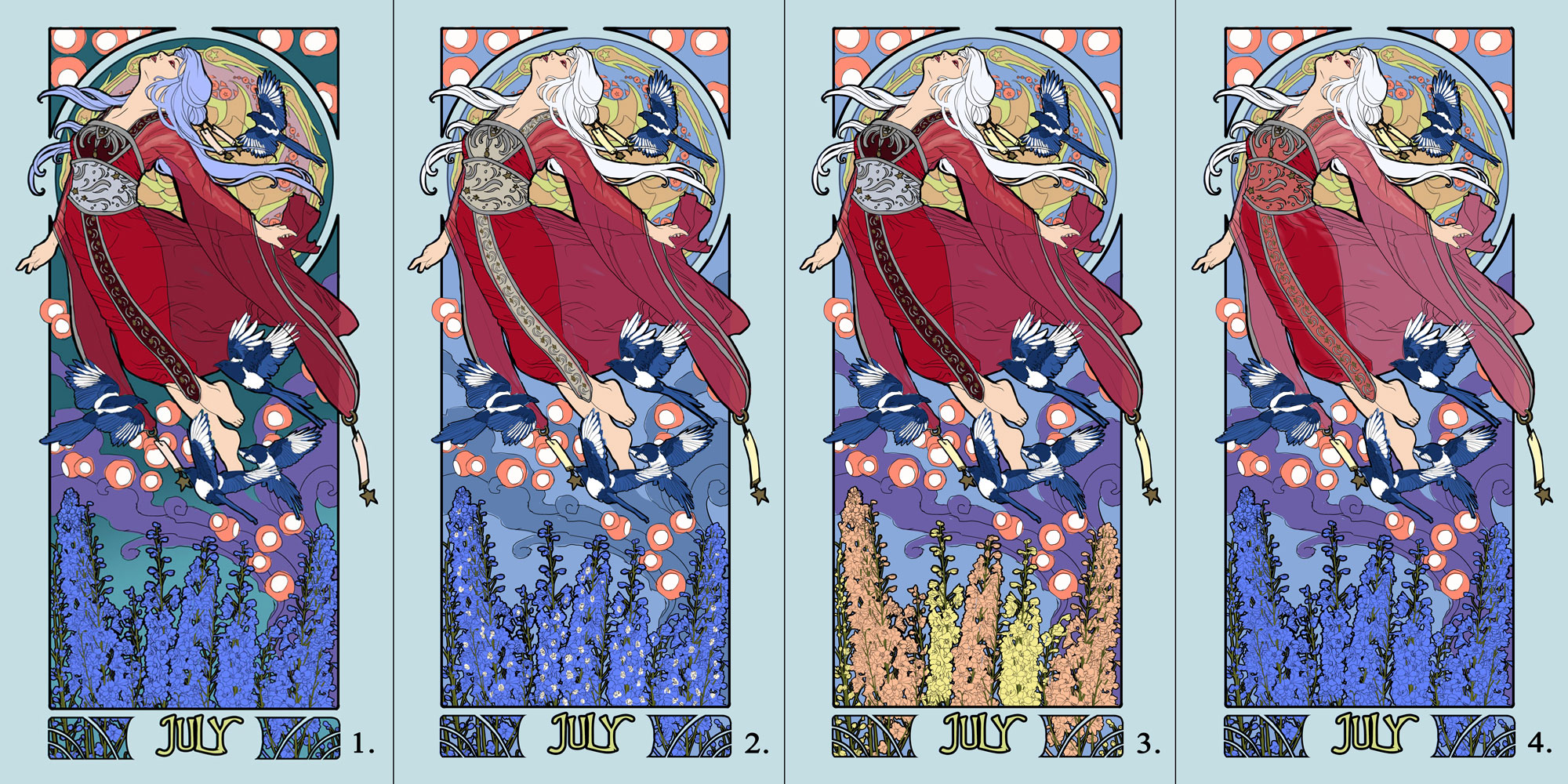
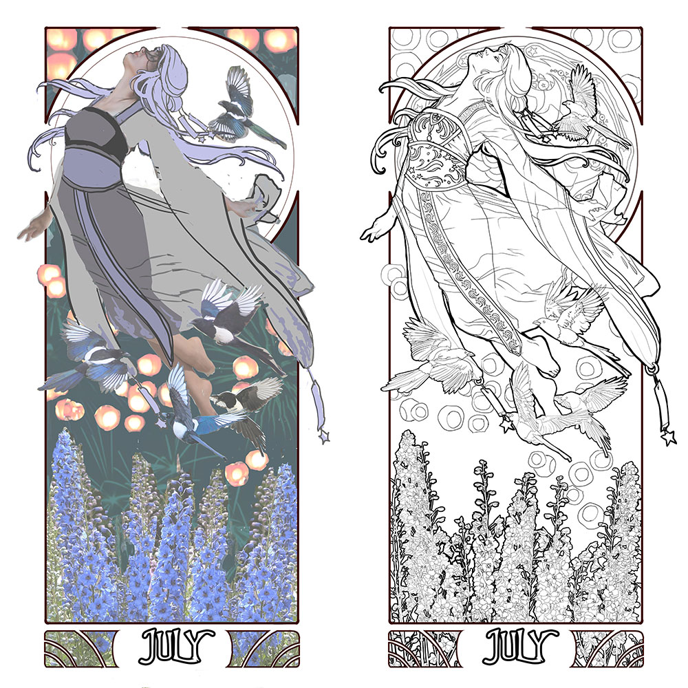
Here we are at the final stretch before I transfer this painting to paper!  This part seems as easy as coloring in the major forms to look pretty, but I assure you it isn’t, or at least it’s never that easy for me! I agonized with how to make these colors harmonize while still featuring the July birthstone of Ruby as a central theme.

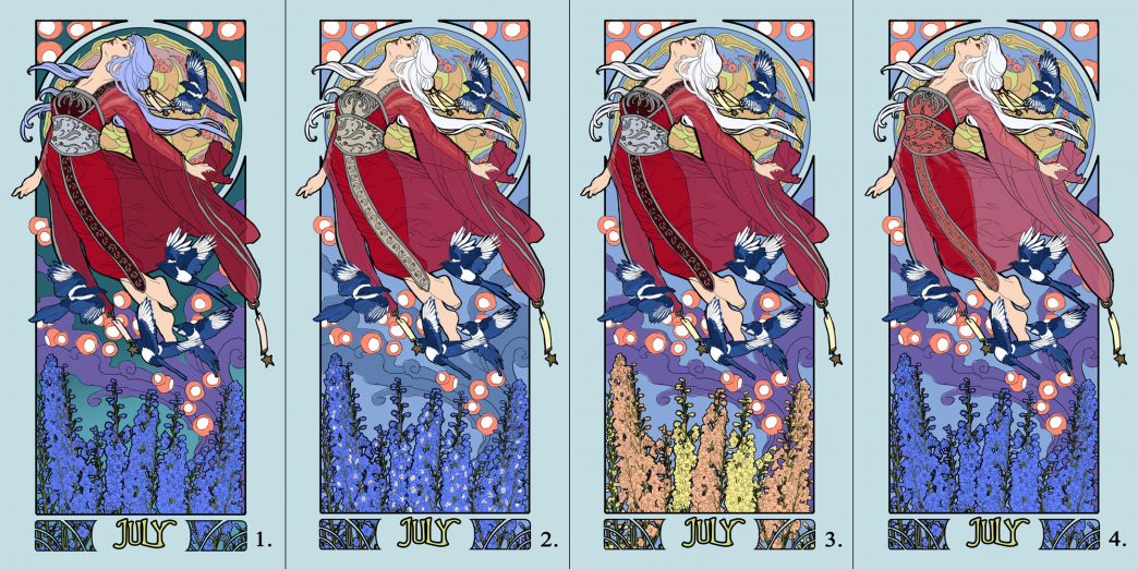
Number 1 was my first instinct for color.  The teal of the background really pops the ruby red of the Lady. However, with purple, blue, and orange mixed in, there were too many primary colors that were fighting for dominance.  Not to mention the overall scheme was too dark, causing the Lady to be lost in dark values.

Lightening up the background in the next iterations helped to keep the magpies from being lost in the darkness.  Number 3 was interesting, but the orange flowers just draw too much attention away from the Lady and make the image feel too busy, since they start to harmonize more with the lanterns as a visual element.  I like the lighter orange in the trim and sheer cloth.  Number 2 is my favorite out of these for bringing visual interest back into the flowers, while still keeping them relatively subtle.  The lighter trim also draws the eye down through the figure, accentuating the curving flow of the hair as well.

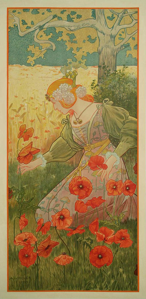
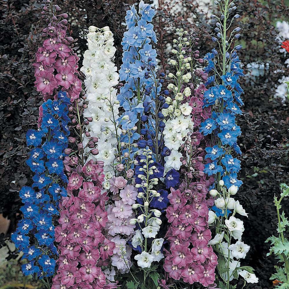
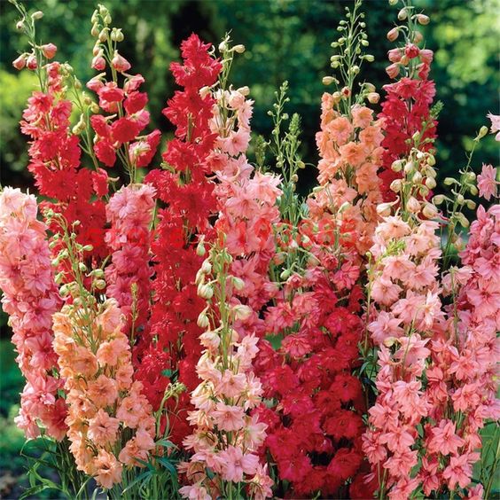
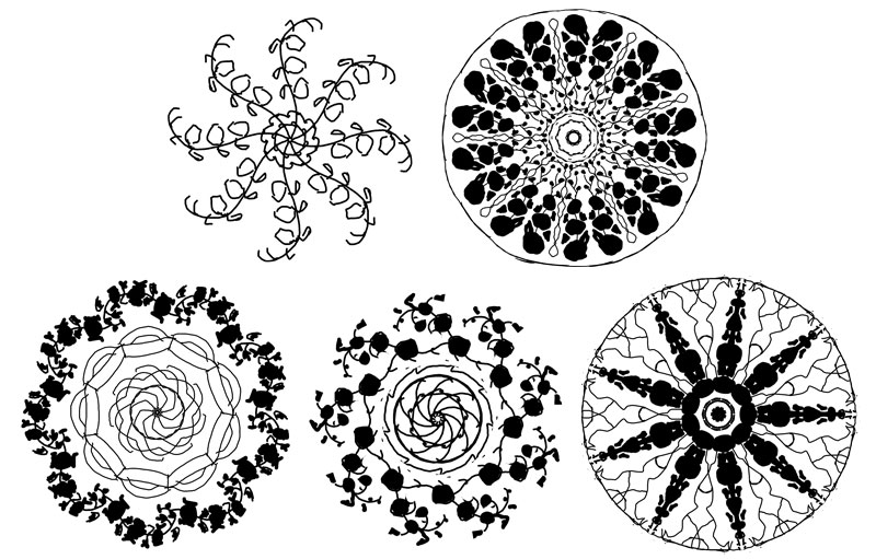
Ah how difficult this was!  I just have to share what amazing variations I’ve found in the Larkspur (Delphinium) plant so you can see why my muse went in a hundred different directions.  That being said, I can’t wait to see what people will do with the coloring pages for this Lady!

And now it’s time to FINALLY start transferring the line art to paper and start inking this Lady!  Stay tuned to my social media outlets for little inking videos and such.  This next part goes fast, thanks to all the prep, so hopefully she’ll be done very, very soon!  Stay tuned!

If you’d like to pre-order a print of this Lady, check out my Reward tiers on Patreon that will let you get a simple open edition print OR a super swanky limited edition gold leafed print!

This has been your Patreon-only sneak peek.
Thanks so much for your support!

SKETCH DIARY: Lady of July Part 3

After I figured out my source inspiration for Lady of July in the Qixi and Tanabata festivals, she came together rather quickly!  I had the perfect pose in mind to depict her free flying nature thanks to this lovely pose by dazzle-stock on DeviantART, which served as a base.  

I arranged my elements, keeping in mind I wanted a simple background of a night sky to push the brightness of the lanterns and also to keep the image from being too busy since the main figure and elements were already very detailed.  I changed the pose by adding her far arm and refining the arc of the body with a different pose for the legs.  This gave her a stronger upwards arc and sense of direction.

Next, I moved on to the window design, which proved more challenging than I expected!  The figure covers a good deal of the window, which meant the main decorative elements needed to be on the outer edge of the window.  The window also needed to have larger shapes in it so that it didn’t overwhelm the complexity of the main elements, which was a challenge with the detailed nature of Larkspur!

Sketched in the Amaziograph iPad app.

I went through a few variations before I found something that felt right!  These all felt a little too generic, with just the Larkspur and the lines.  The 3rd design with the tiling started to put me on the right track with an Asian-inspired tile feel.  I eventually settled on a final design inspired by the undulating star explosion caused by fireworks, which fit the themes of July so well!  The Larkspur became much more simplified as tendrils of abstract elements emulating the ‘arms’ of a firework’s shape.

With all of my line art figured out, it’s time to enter the final phase of prep where I figure out the colors and finally transfer this painting to paper!

This has been your Patreon-only sneak peek.
Thanks so much for your support!

Unknown Nouveau: Gaspar Camps

While I’m busy grinding away braincells on Lady of July ‘s many flower buds, I wanted to introduce you to another Art Nouveau artist I had never heard of!  Gaspar Champs hailed from Spain and spent a large part of his career in France.  He was very heavily influenced by Mucha, so much so that he became known as the ‘Catalan Mucha’.

Like my previous feature of Élisabeth Sonrel , I love how Camps brought his own unique flair to Alphonse Mucha’s line style.  At times, Camps’ work feels more abstract with his figures melting into the details of his images.

I also love the sense of light bouncing in his more painterly work.  What a joy it was to discover him!

If you want to see more of these art features, view them all at once here .